Alo Yoga
.webp)
Alo Yoga
Introduction
Alo Yoga has built one of the most recognisable athleisure brands of the last decade. Founded in Los Angeles and now worn globally, the brand sits comfortably alongside big brand names like Lululemon, Nike Yoga, and Skims in the premium activewear space. Its positioning is clear: fashion-forward performance wear that transitions seamlessly from studio to street.
On the surface, Alo Yoga does many things right. The brand identity is consistent. The aesthetic is polished. The product photography is aspirational. For a customer encountering the brand for the first time in markets like the US or UAE, the perception is instantly premium.
But strong branding does not automatically translate to a high-performing digital experience. At Suplex, our UX/UI and web performance experts analysed Alo Yoga’s website through the lens of navigation clarity, conversion optimisation, trust signals, and technical performance. What we found was a website that looks refined, but underperforms on several foundational UX principles that directly impact user confidence and purchase decisions.
What Alo Yoga’s Website Does Well
1. A consistent and recognisable brand environment
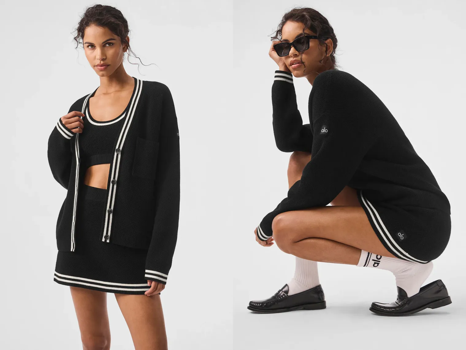
From the moment you land on the site, Alo Yoga’s brand language is unmistakable. The typography, colour palette, photography, and spacing work together cohesively, creating a calm and premium visual environment. This consistency reinforces trust, especially for returning users who already associate the brand with quality and refinement. The website feels aligned with Alo Yoga’s offline presence and social content, which is not always easy to achieve at scale. The brand never feels fragmented or confused across touchpoints.

2. Clean visual presentation and editorial appeal
The website leans into a magazine-like aesthetic rather than a cluttered retail interface. This works well for a lifestyle-led brand, allowing products to feel aspirational rather than transactional. The imagery is strong, the layouts breathe, and nothing feels visually overwhelming at all. For users who are browsing casually or exploring the brand for inspiration, this approach creates a pleasant and engaging first impression. However, ease of browsing does not always equal ease of decision-making. This is where the experience begins to break down.

Where the User Experience Starts to Falter
1. Missing Category Hierarchy on the Homepage
The homepage relies heavily on surface-level groupings such as:
- Style Guide
- Timeless Colors
- Trending Now
- Bestsellers
These are not true shopping categories. They function more like editorial labels.
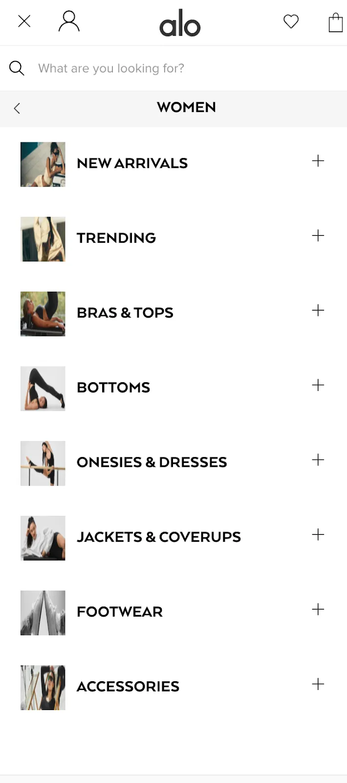
For an apparel brand operating at scale, users expect immediate access to clear entry points such as:
- Men / Women
- Tops / Bottoms
- Outerwear
- Seasonal edits
The absence of this structure forces users to explore rather than decide. Exploration works for inspiration but then it fails for intent-driven shopping. Users with a window shopping mindset or just browsing mindset might be okay with this, but the users with a clear purchase goal may abandon the journey early and move to competitor sites that offer faster product discovery.
2. A Misleading “Style Guide” Section
The “Style Guide” label suggests a curated breakdown of use cases like athleisure, studio wear, work-friendly pieces, or lounge essentials.
Instead, users are taken to:
- Up to 50% off
- New for women
- New for men
- Outerwear

These are promotions and product states, not styles. While these are valid commercial categories, presenting them as a style guide creates a disconnect between label and content. This mismatch creates friction and a strong cognitive distrust. When labels do not deliver what they promise, users begin to question the logic of the site as a whole and over a period of time, this reduces confidence in navigation and increases bounce rates on the brand’s website.
3. Absence of ratings and reviews on product pages
For a premium or mid-premium brand, the lack of visible ratings and reviews is a significant gap. Social proof is not optional in modern e-commerce. It is a trust accelerator. First-time buyers rely heavily on social proof to validate decisions around fit, comfort, and quality. Competitors like Skims do this exceptionally well. Their product pages feature detailed reviews, fit feedback, usage context, and real customer validation. This reassures buyers and reduces hesitation.
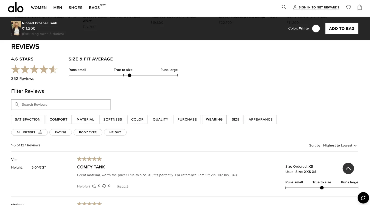
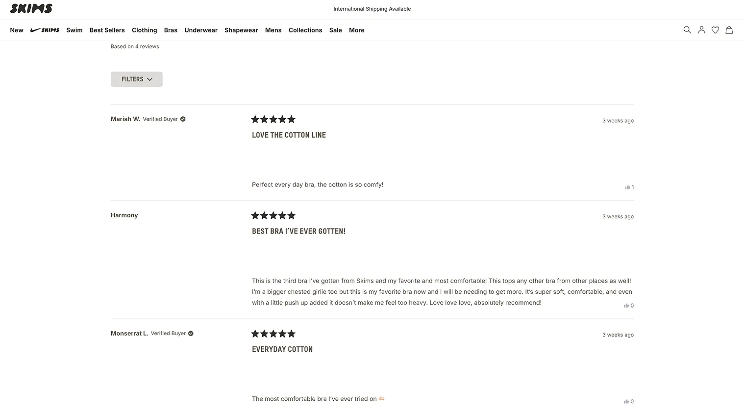
Alo Yoga’s decision to omit this layer means users must rely solely on brand reputation and visuals, which can limit trust for new customers and slow down decision-making. New customers have no reassurance mechanism. This increases uncertainty, especially at higher price points, and can push users to abandon carts or seek validation elsewhere.
4. Limited depth in product information
Product descriptions remain minimal and aesthetic-led. While this works for repeat buyers, it under-serves first-time customers. While the visual presentation of Alo Yoga’s products is strong, the informational depth does not always match the price point. Details around fabric behaviour, real-world usage, and fit guidance are relatively minimal. In a category where comfort and performance are critical, this can leave users uncertain, especially when comparing Alo Yoga with competitors that invest more heavily in descriptive reassurance like Skims. Assumptions by the customers might increase Alo Yoga’s return rates and reduce the conversion confidence, especially in international markets like USA & UAE.
Suplex Ratings and Final Assessment
Beyond visual structure and content flow, Alo Yoga’s website also shows gaps at a technical performance level. During our evaluation, the site received an F score for cache control and expires headers, a foundational performance metric that directly affects load efficiency.
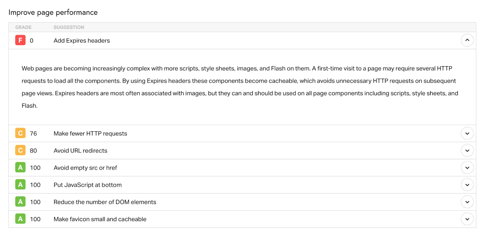
In simple terms, this means the website does not efficiently cache assets like images, scripts, and stylesheets. When a user revisits the site, the browser reloads these elements instead of retrieving them from cache. This increases load time, especially on mobile or slower connections. Modern users as we all know are extremely impatient when it comes to online shopping. While this may not be immediately obvious to every user, it compounds over time, especially on mobile devices, subtly affecting the speed, engagement, conversion and retention rate of the brand’s website. This is more of a foundational technical issue and not a case of an advanced optimisation.
Hence, taking all of this into account, Suplex rates Alo Yoga’s website at 3 out of 5. This score does not reflect weak branding or poor intent. Instead, it highlights missed opportunities at a foundational level. The website looks premium, but it does not consistently function like a high-performing premium e-commerce experience. Addressing navigation clarity, trust signals, product depth, and technical hygiene would significantly strengthen its ability to convert and scale.
About Suplex
Suplex is a UX/UI design and website development agency based in Dubai, working with brands across fashion, wellness, food, and lifestyle categories worldwide. We specialise in conversion-led UX design, e-commerce website development, performance optimisation & mobile-first digital experiences. If you are building or evolving a digital presence and need your platform to perform better, you can connect with us directly through the link beside this article.
Hi, I’m Rishabh Jain
I believe great design has the power to shape perception, build trust, and move businesses forward. That belief is what led me to found Suplex Design Studio, a global branding and packaging studio working with FMCG and D2C brands across markets.I started suplex at 25 with a clear intent, to create design that is strategic, thoughtful, and commercially meaningful. By 28, the studio had scaled globally, guided by a strong foundation in Integrated Design that I developed during my academic journey in London, where I was honoured with the Dean’s Award.
Over the years, I’ve had the opportunity to work with 100+ brands, from Fortune 500 organizations to family-run businesses, helping them build packaging and brand systems that create recall, relevance, and long-term value.
Suplex’s work has been recognized internationally, including the Manifest Award (2024), the Clutch Global Award (2025), and features on platforms such as Packaging of the World, The Dieline, and the World Brand Design Society.
None of this would be possible without the people behind the work. I’m deeply grateful to the suplex team, whose commitment, creativity, and attention to detail turn ideas into meaningful brand experiences every day.
At the heart of my work is a simple philosophy, design should be intentional, honest, and built to last, and that continues to guide everything we create at suplex.


Let’s Make It Happen
E-Commerce Success Stories

%201.webp)


.webp)
.webp)
Build Your D2C Business The Right Way
Build It With Suplex.


