Lululemon
.webp)
Lululemon
Introduction
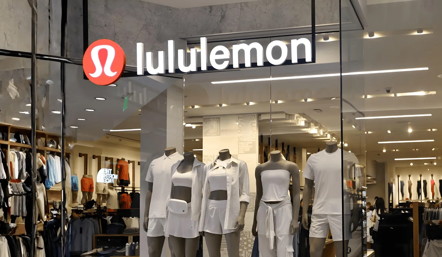
Lululemon is one of the most influential names in modern activewear. What started as a yoga-focused brand in Canada has grown into a global lifestyle label, sitting alongside brands like Nike, Under Armour, and Alo Yoga in the premium athleisure category. The brand has built deep cultural equity around performance, mindfulness, and everyday movement, and its products enjoy a really strong loyalty across the US, UAE, and other global markets.

With that level of brand power, expectations from its digital experience are naturally high. At Suplex, our UX/UI and web performance team analysed Lululemon’s website across navigation, conversion behaviour, brand expression, and mobile usability. Let us dive right into it.

What Lululemon’s Website Does Well
Straightforward navigation that reduces friction
Lululemon’s strongest digital asset is its navigation. The structure is clear, predictable, and easy to understand. Users can quickly find men’s and women’s categories, move between product types, and filter without any sort of friction. There are no unnecessary visual distractions, no experimental layouts, and no moments where users feel lost or unsure of where to go next.

This simplicity works well for intent-driven shoppers. Customers who know what they are looking for can reach products quickly, which saves time and supports higher buying intent. In that sense, the website behaves more like a utility than a discovery platform, which can be effective for a brand with strong offline recall and repeat customers.
Where the Experience Starts to Break Down
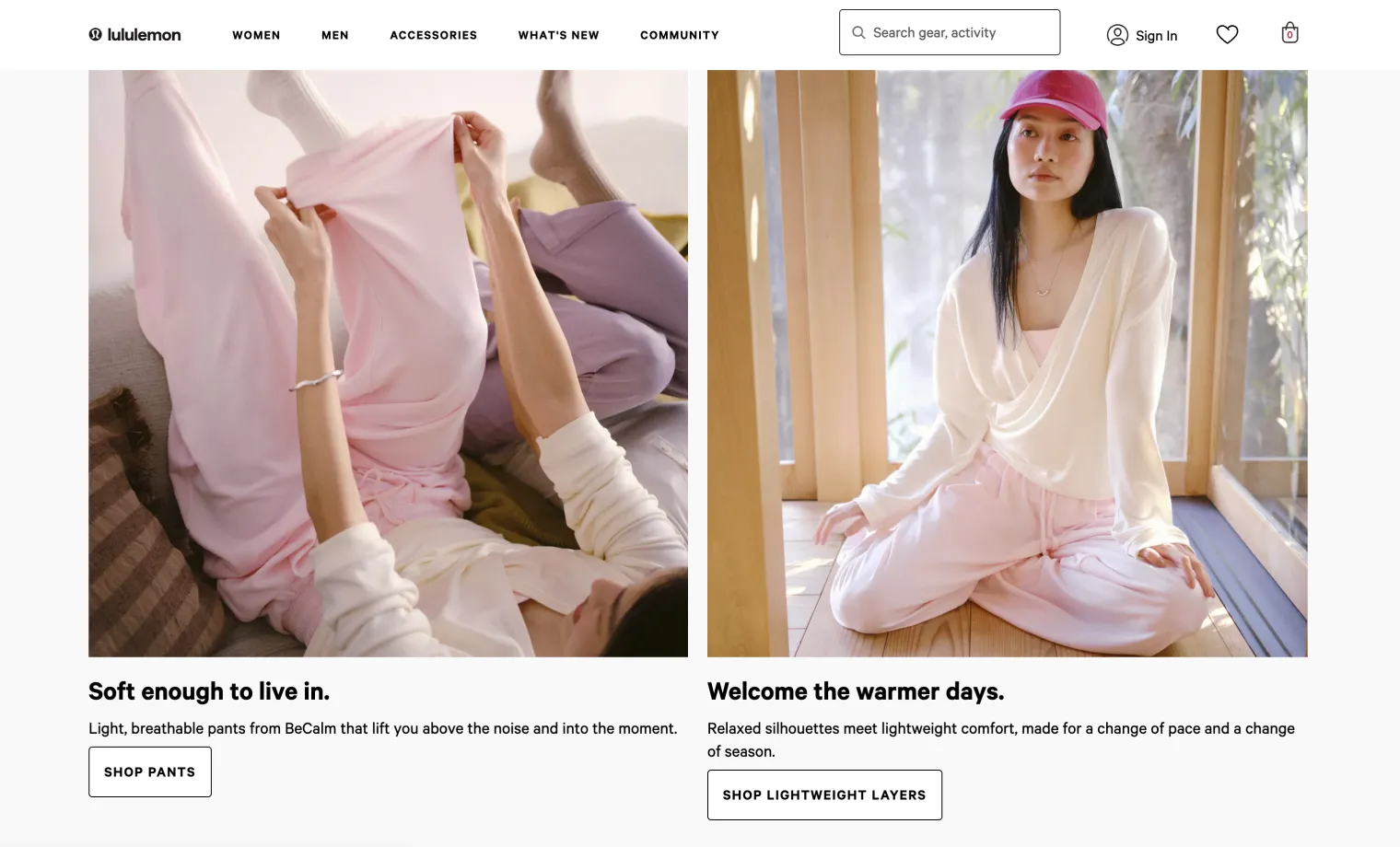
1. Lack of urgency in promotional communication
While the site runs seasonal campaigns such as a winter sale, the messaging remains very mid and sort of passive. There are no timelines, no end dates, and no contextual nudges that encourage faster decision-making in the minds of the customer browsing through Lululemon’s website. Without signals like “ending soon” or “limited window,” promotions feel extremely static rather than time-sensitive.
.webp)
For users browsing casually, this reduces momentum. For users who are undecided, it removes the emotional push that often turns consideration into conversion. In a category where alternatives are just a swipe away, the absence of urgency can quietly delay purchases or send users elsewhere to compare.
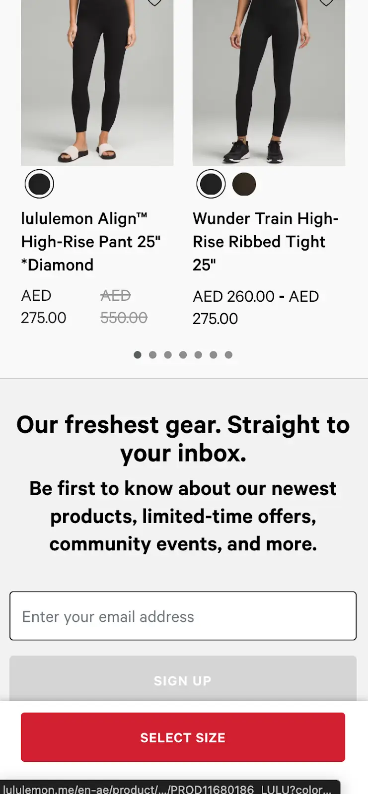
2. Missing ratings and reviews as trust signals
Like Alo Yoga, Lululemon does not prominently surface ratings and reviews on its product pages. For a brand operating at a premium price point, this is a notable gap. New customers, especially those encountering the brand online for the first time, rely on peer validation to assess fit, comfort, durability, and real-world use.

Competitors like Skims have leaned heavily into this, using detailed reviews to reduce hesitation and guide decision-making. In contrast, Lululemon places the entire burden of trust on brand reputation alone. For loyal customers this may be enough, but for first-time buyers, the lack of social proof can introduce doubt and slow down the purchase journey or sometimes even lead to complete abandonment at the time of checkout.
3. Generic brand expression at a visual level
One of the more significant issues is how interchangeable the website feels visually. If the Lululemon logo were to be removed, the interface could easily belong to another large athletic or lifestyle brand. The photography, layouts, and overall UI do not carry a distinct visual signature that immediately signals the minds of the customers that “omg, this is Lululemon.”


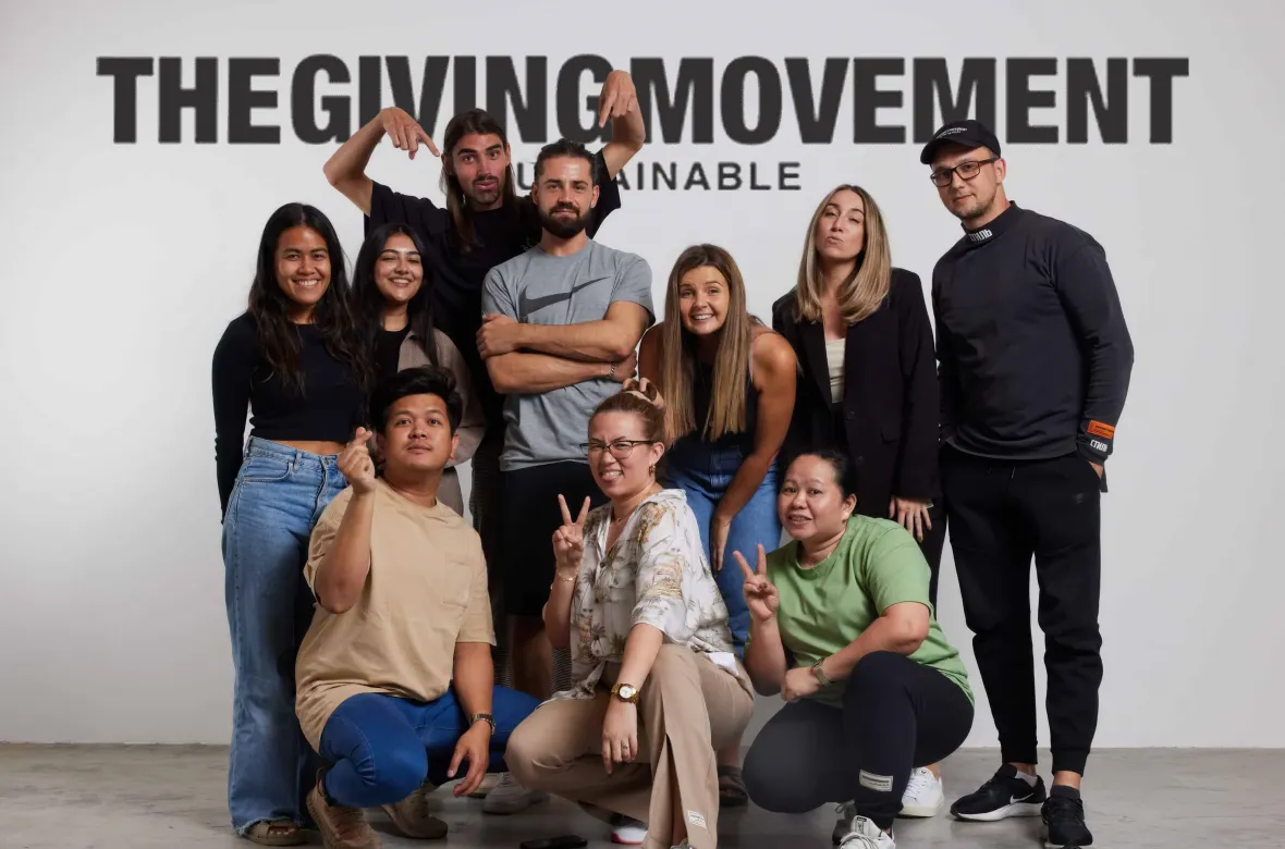
When compared to platforms like Skims, Under Armour, or The Giving Movement, the difference becomes clear. Those websites use composition, visual rhythm, and editorial framing to express brand personality beyond the logo. Lululemon’s site, by comparison, feels functional but anonymous, which is a missed opportunity for a brand with such a strong identity offline.

.webp)

4. Inefficient use of mobile screen real estate
The most critical issue emerges on mobile, where the majority, almost 99% of e-commerce traffic now lives. The interface relies heavily on large blocks, oversized sections, and generous spacing. While this creates a clean look, it also forces users to scroll excessively and tap repeatedly just to explore basic options.
Important information is spread out instead of being prioritised within the visible screen area. Unlike well-structured editorial layouts or even traditional newspapers that convey hierarchy within limited space, Lululemon’s mobile experience underutilises the available real estate. Over time, this leads to fatigue, frustration, and higher bounce rates, particularly for users trying to compare multiple products side by side rather quickly.
Suplex Rating and Final Assessment
From a technical and experiential standpoint, Lululemon’s website performs adequately but not exceptionally. While navigation is intuitive, the platform lacks several elements that modern premium e-commerce experiences rely on: urgency cues, social proof, distinctive brand expression, and efficient mobile layouts.
Taken together, these gaps do not indicate poor execution, but they do suggest a conservative digital approach that prioritises safety over optimisation. For a brand of Lululemon’s scale and influence, this restraint limits how effectively the website can convert, reassure, and differentiate.
Based on our evaluation, Suplex rates Lululemon’s website at 3 out of 5. The foundation is solid, but the experience does not fully reflect the strength of the brand itself. With improvements in mobile optimisation, trust-building elements, and visual identity, the platform could perform far closer to its market position.
About Suplex
Suplex is a UX/UI design and website development agency based in Dubai, working with brands across fashion, wellness, food, and lifestyle categories globally. We help businesses improve how their digital platforms are structured, navigated, and experienced, with a strong focus on conversion, usability, and performance.
If you’re evaluating your digital experience or planning a redesign, you can connect with us through the link beside this article.
Hi, I’m Rishabh Jain
I believe great design has the power to shape perception, build trust, and move businesses forward. That belief is what led me to found Suplex Design Studio, a global branding and packaging studio working with FMCG and D2C brands across markets.I started suplex at 25 with a clear intent, to create design that is strategic, thoughtful, and commercially meaningful. By 28, the studio had scaled globally, guided by a strong foundation in Integrated Design that I developed during my academic journey in London, where I was honoured with the Dean’s Award.
Over the years, I’ve had the opportunity to work with 100+ brands, from Fortune 500 organizations to family-run businesses, helping them build packaging and brand systems that create recall, relevance, and long-term value.
Suplex’s work has been recognized internationally, including the Manifest Award (2024), the Clutch Global Award (2025), and features on platforms such as Packaging of the World, The Dieline, and the World Brand Design Society.
None of this would be possible without the people behind the work. I’m deeply grateful to the suplex team, whose commitment, creativity, and attention to detail turn ideas into meaningful brand experiences every day.
At the heart of my work is a simple philosophy, design should be intentional, honest, and built to last, and that continues to guide everything we create at suplex.


Let’s Make It Happen
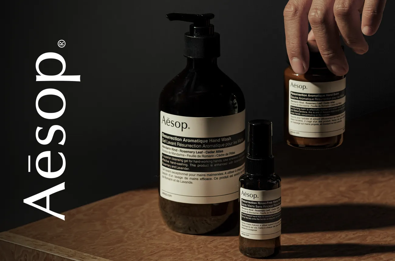
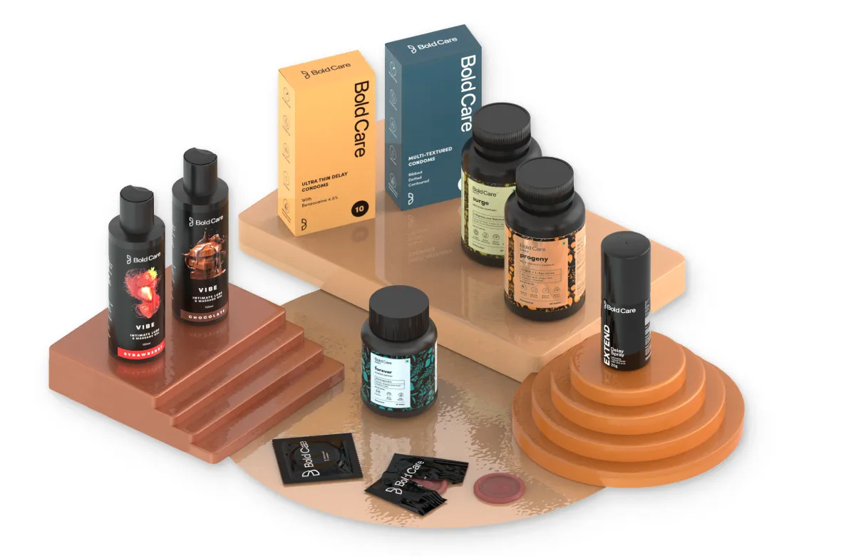
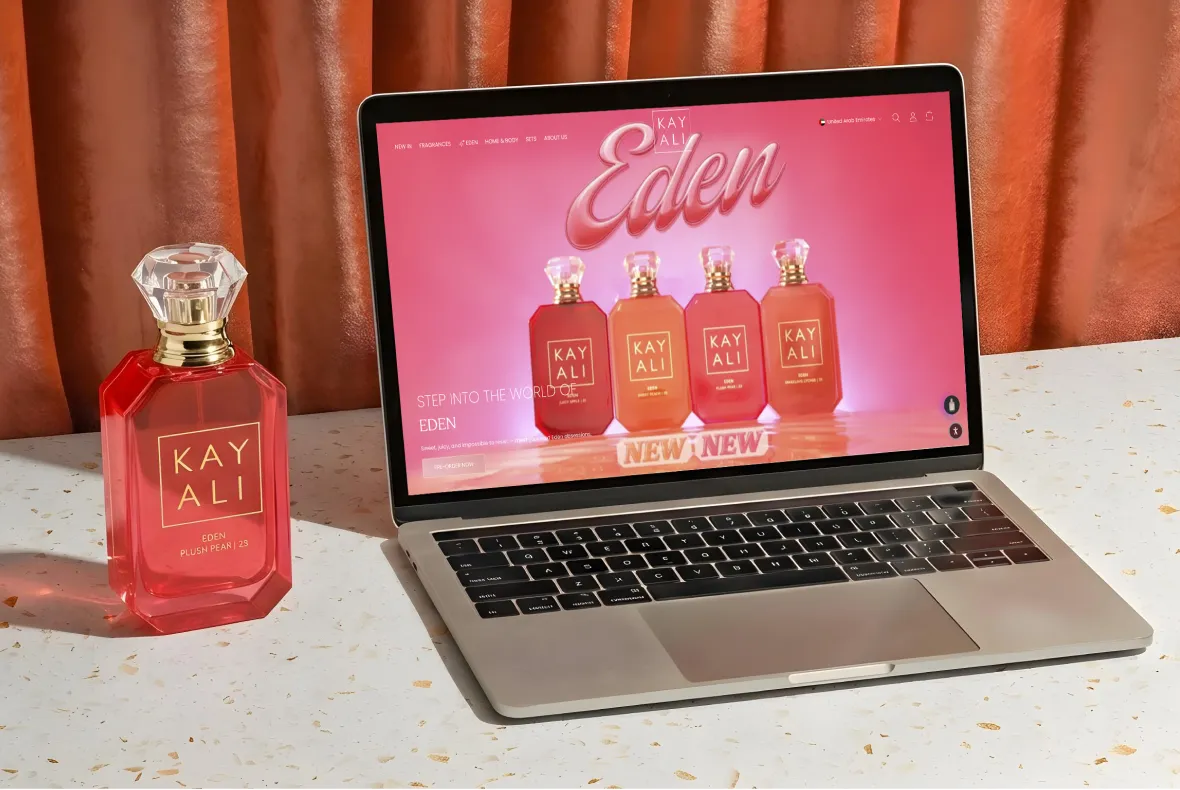
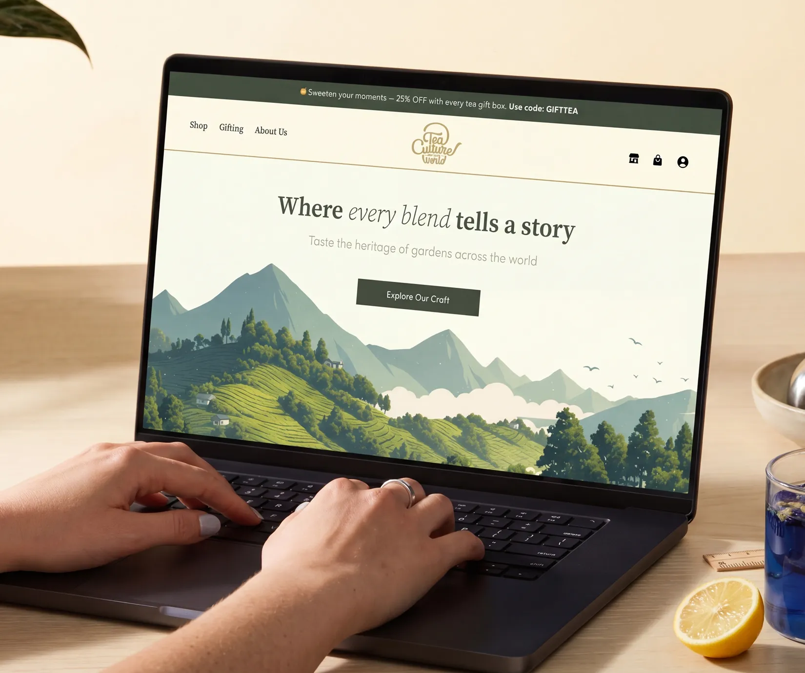
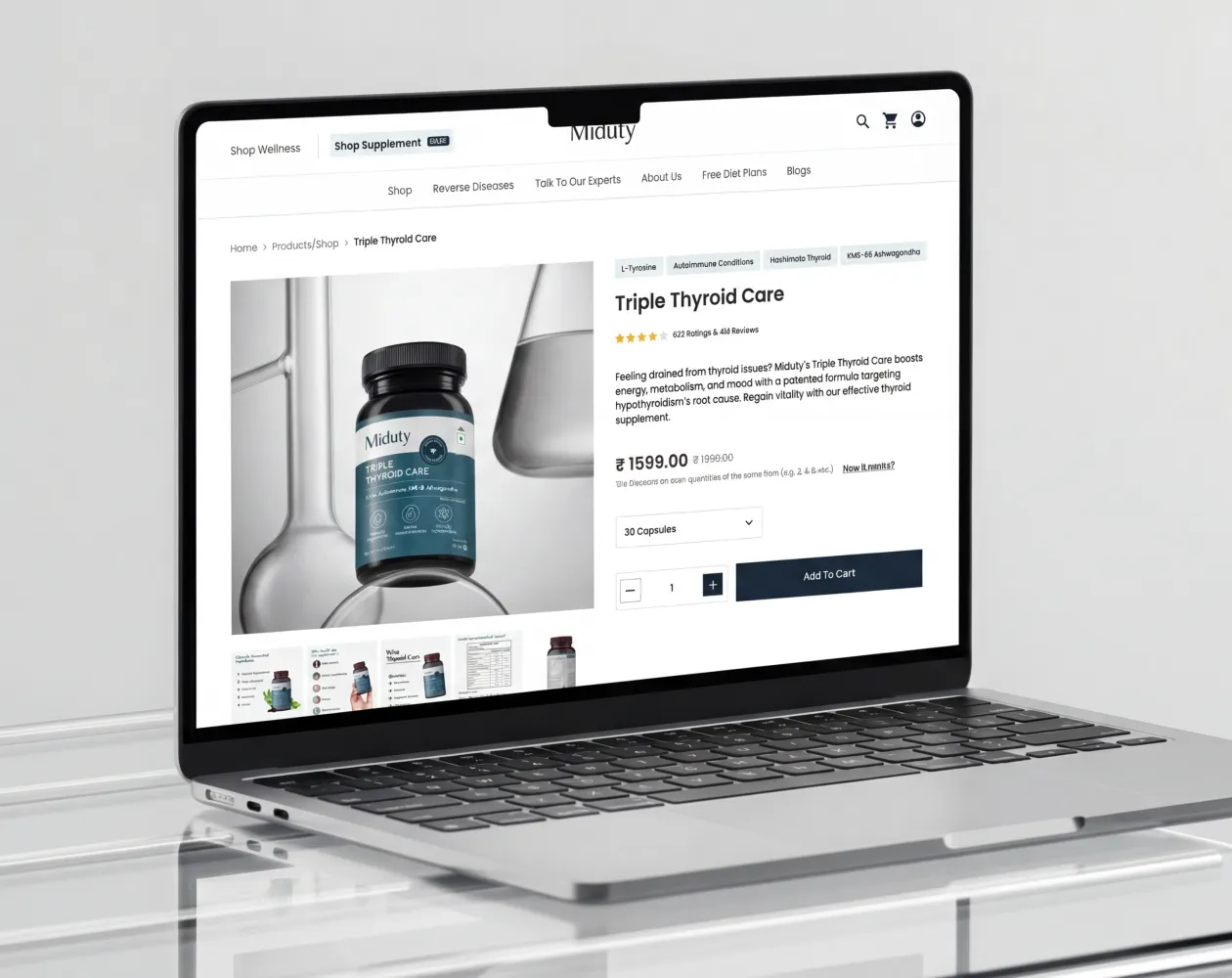
E-Commerce Success Stories

%201.webp)

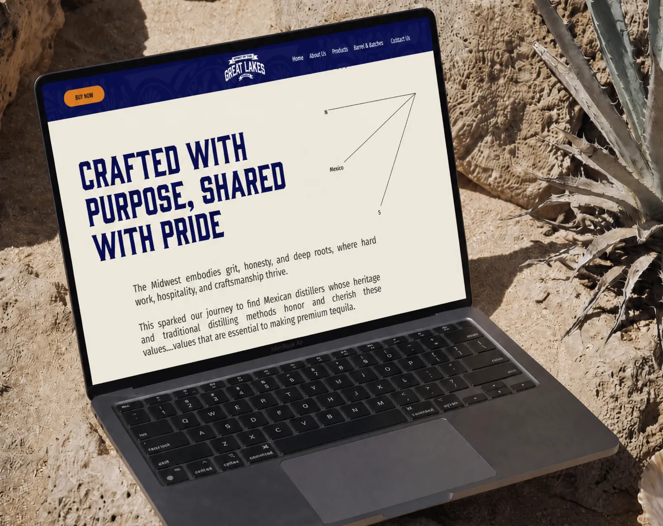

.webp)
.webp)
Build Your D2C Business The Right Way
Build It With Suplex.


