Boost Mobile Sales Fast with Smart Ecommerce Optimization
.avif)
Boost Mobile Sales Fast with Smart Ecommerce Optimization
More than 73% of global ecommerce sales will happen on mobile by 2028, according to Statista. In the UAE alone, mobile commerce accounts for over 60% of all online transactions and the country has one of the highest smartphone penetration rates in the world, above 98%.
Despite this, most ecommerce stores are still designed desktop-first and mobile-patched. The result: slow, cluttered experiences that lose customers before they even see the product page.
Mobile optimization means building your store so it loads fast, looks clean, and converts users on small screens across every device and every connection speed.
This blog covers exactly how to do that, from design decisions and page speed to checkout flows and Gulf-specific considerations.
Why Mobile Optimization Is No Longer Optional for Ecommerce
This section frames the opportunity. If you're not taking mobile seriously, you're handing revenue to competitors who are.
Mobile Traffic Has Already Overtaken Desktop
The shift happened years ago. Desktop is now the secondary channel. In 2024, mobile accounted for approximately 77% of global retail website visits.
Revenue share lags but only because of poor mobile UX, not because mobile users spend less.The UAE context makes this even sharper. Smartphone penetration sits at 98%+, among the highest globally.
Residents rely on mobile phones for banking, food delivery, entertainment and increasingly, shopping. A poor mobile experience in this market is not a missed opportunity it is an active barrier to sales.
What this means in practice: a high mobile bounce rate is not a traffic quality problem. It is a UX problem.
Google's Mobile-First Indexing Changes Everything
Since 2019, Google has crawled and ranked websites based on their mobile version, not desktop. If your mobile site is slower, has missing content, or delivers a broken layout, those issues directly hurt your search rankings regardless of how good your desktop experience is.
Three specific signals now form part of Google's Core Web Vitals ranking framework:
- LCP (Largest Contentful Paint): How fast the main content loads. Target: under 2.5 seconds.
- INP (Interaction to Next Paint): How fast the page responds to user actions. Replaced FID in March 2024. Target: under 200ms.
- CLS (Cumulative Layout Shift): Whether elements jump around as the page loads. Target: under 0.1.
Failing these thresholds does not just hurt user experience. It directly reduces your organic search visibility.
The Mobile Conversion Gap and How to Close It
Average mobile ecommerce conversion rate: 1.8 - 2.2%. Average desktop conversion rate: 3–3.5%. That gap represents real, recoverable revenue.
The gap exists because of three overlapping problems: slow load times, unclear navigation, and friction-heavy checkout flows. None of these are inevitable. They are design and engineering choices and they can be fixed.
Closing even half the gap on a store doing AED 500,000/month in mobile revenue means an additional AED 250,000+ with no increase in ad spend.
1. Design for Mobile First, Not Mobile Last
Mobile-first design is not a trend. It is a methodology that forces you to make hard decisions about what actually matters on a small screen and then scale up from there.
What Mobile-First Design Actually Means
Mobile-first means you design the smallest screen experience before anything else. You start with constraints limited space, one-thumb interaction, variable connection speeds and build upward to tablet and desktop.
The opposite approach (designing for desktop and then squeezing it into mobile) almost always produces cluttered, slow, hard-to-use mobile experiences.
Content hierarchy matters more on small screens because there is no peripheral space for secondary information. Every element needs to earn its place.
Navigation, CTAs and pricing should be immediately visible. Everything else goes below the fold or into expandable sections.
One specific principle worth applying from the start: thumb-zone design. Research by Steven Hoober and Fitt's Law studies show that most smartphone users interact with one thumb.
The natural reach zone on a 6-inch screen sits in the lower-centre to lower-right area. Place your primary CTAs, Add to Cart, Checkout, Search where thumbs naturally land. Avoid putting critical interactions at the top corners.
Responsive vs. Adaptive Design: Which Is Right?
Both are viable, but they solve the problem differently.
For most ecommerce stores on Shopify, WooCommerce or Magento responsive design with mobile-first CSS is the right starting point. Adaptive design adds complexity and maintenance overhead that most businesses do not need.
Suplex Design builds mobile-first responsive experiences for ecommerce brands across the Gulf, starting from how users actually browse not from a desktop layout that gets retrofitted.
Touch-Friendly UI Elements
Designing for touch means sizing elements for fingers, not cursors. Google recommends a minimum tap target size of 48x48 pixels. Smaller than that and users miss taps, hit the wrong element and leave.
Specific rules to follow:
- Buttons should be at least 44–48px tall with adequate padding around them
- Space between tappable elements should be at least 8px to prevent accidental taps
- Remove hover-dependent interactions entirely they do not work on touch screens
- Use full-width buttons for primary CTAs on mobile, particularly on product and cart pages
- Keep form fields tall enough (minimum 44px) so they are easy to tap and type into
2. Page Speed Is a Revenue Driver, Not a Technical Nicety
Every second of delay costs you conversions. This is not a theory, it is measured data. A 1-second delay in mobile load time reduces conversions by up to 7%, according to a Google and Deloitte study of 53 brands.
How Slow Load Times Kill Mobile Conversions
53% of mobile users abandon a page if it takes more than 3 seconds to load (Google). Most ecommerce stores load in 4–8 seconds on mobile. That means the majority of stores are haemorrhaging traffic before the homepage even finishes rendering.
In the UAE, 5G coverage is strong in urban areas. But a meaningful portion of regional traffic comes from users in Saudi Arabia, Oman, Kuwait and Bahrain markets with more varied connectivity.
Optimising only for flagship iPhones on 5G means you are missing a large segment of your actual audience.
The load time benchmark to aim for: under 2.5 seconds for LCP, measured on a mid-range Android device on a simulated 4G connection.
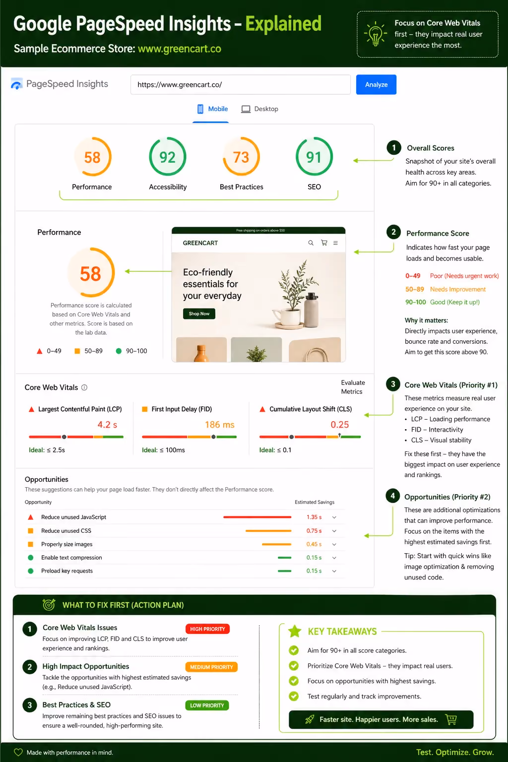
Core Web Vitals: What to Prioritise
Core Web Vitals are Google's three key page experience metrics. Each directly affects both user experience and search rankings.
LCP (Largest Contentful Paint) This measures how long the main content element usually a hero image or product photo takes to appear. Target: under 2.5 seconds. Common causes of slow LCP on ecommerce sites include oversized images, render-blocking JavaScript, and slow server response times.
INP (Interaction to Next Paint) Introduced as a confirmed ranking signal in 2024, INP measures how quickly a page responds after a user taps a button or link. Target: under 200ms. Heavy JavaScript bundles are the most common culprit.
CLS (Cumulative Layout Shift) This measures visual stability how much elements move around as the page loads. A page that shifts layout while a user is trying to tap a button creates frustration and erodes trust. Target: under 0.1. Reserve explicit space for images, ads, and embeds so they do not push content around on load.
Practical Speed Optimisation Techniques
- Image format: Convert all images to WebP or AVIF. Both deliver significantly smaller file sizes than JPEG or PNG with equivalent visual quality. WebP is supported by 97%+ of browsers.
- Image compression: Use tools like Squoosh or Sharp to compress images before upload. A product image that does not need to exceed 200KB should never be uploaded at 2MB.
- Lazy loading: Only load images when they enter the viewport. Apply loading="lazy" to all below-the-fold images.
- CDN implementation: A Content Delivery Network serves assets from servers geographically close to the user. For UAE and Gulf stores, choose a CDN with Middle East points of presence Cloudflare, Fastly, and AWS CloudFront all offer this.
- JavaScript optimisation: Defer non-critical JavaScript, eliminate unused code, and split bundles so only the code needed for the current page loads.
- Minification: Minify CSS, JavaScript, and HTML to remove whitespace and comments without changing functionality.
- Eliminate render-blocking resources: Move non-critical CSS and JS to load after the main content renders.
On Shopify specifically, app bloat is a major speed killer. Every third-party app adds JavaScript to every page. Audit your installed apps regularly and remove any that are not actively contributing to conversions.
3. Navigation That Works With One Thumb
Navigation on mobile is not a scaled-down version of desktop navigation. It is a different design problem one that requires clear hierarchy, minimal options, and persistent access to the tools users need most.
Simplify Your Mobile Menu
The hamburger menu (three horizontal lines) has become the default mobile navigation pattern. It works, but it is not always the best choice. The tab bar, a persistent bottom navigation bar, offers faster access to core sections because it is always visible without a tap to open it.
For most ecommerce stores, consider this hierarchy:
- Maximum 5–7 top-level categories in the main menu
- Sticky header with logo, search icon, and cart icon always visible
- A bottom navigation bar for key sections: Home, Shop, Search, Account, Cart
- Avoid deep menu nesting, if users need more than two taps to find a category, restructure it
The cart and search icons should always be visible. These are the two most frequently used navigation elements on a product discovery journey.
Mobile Search Is Your Hidden Conversion Tool
Users who search on an ecommerce site convert at 2–3 times the rate of users who browse. Search users have higher intent they know what they want. If your search function is hard to find, slow, or returns poor results, you are losing your most motivated visitors.
What good mobile search looks like:
- A persistent search icon in the header, or a full-width search bar on the homepage
- Autocomplete that surfaces results within 100–150ms of typing
- Typo tolerance so "summer dress" still returns relevant results
- Visual search results showing product images, not just text links
Recommended tools: Algolia (fastest, most flexible), Searchanise (Shopify-native), Fast Simon (AI-powered, strong for fashion and lifestyle). Each integrates with Shopify and WooCommerce.
Filtering and Sorting on Mobile
Filtering is where mobile ecommerce often breaks down. A desktop sidebar with 15 filter options becomes a nightmare on a 6-inch screen.
Effective mobile filtering:
- Use a full-screen overlay for filters it gives enough space for users to make selections
- Group filters logically (Size, Colour, Price, Material) rather than listing them all flat
- Show a sticky "Apply Filters" button at the bottom of the overlay
- Display the count of results that will appear after applying filters ("Show 34 results")
- Avoid forcing users to scroll through more than 8–10 options before seeing an "Apply" button
Collapsible filter panels work adequately for stores with fewer filter types. For stores with complex product catalogues apparel, electronics, furniture the full-screen overlay almost always performs better.
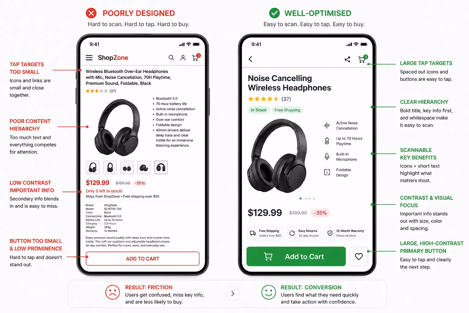
4. Product Pages That Convert on Small Screens
The product page is where buying decisions happen. On mobile, you have one screen width and variable thumb reach to persuade someone to add to cart.
Images and Video
Product images are the most important conversion element on a product page. On mobile, they occupy the full screen width they need to earn that space.
Standards for mobile product imagery:
- High-resolution images that support pinch-to-zoom without pixelating
- Minimum 3–5 images per product: front, back, detail, lifestyle, flat lay
- Short product videos under 15 seconds, set to autoplay on mute users can tap to unmute
- Swipe-enabled image gallery (not arrow buttons arrows are too small to tap reliably)
360° product views are growing in UAE retail, particularly for footwear, electronics, and accessories. AR try-on (via tools like Shopify AR or third-party integrations) is being adopted by beauty, eyewear, and furniture brands.
If your product category lends itself to it, the investment is worth evaluating conversion lifts of 20–40% have been reported by brands using AR on product pages.
Product Descriptions for Mobile Readers
Long product descriptions are fine but not above the fold on mobile. Structure product information in layers:
- Above the fold: Product name, price, key variant (size/colour selector), and Add to Cart button
- Immediately below: 3–5 bullet points covering the key benefits or specs
- Further down: Accordion sections for full specifications, sizing guide, materials, and shipping info
Accordion sections are particularly effective on mobile. They keep the page compact while allowing users who want detail to access it without scrolling past walls of text. Each section (Specs, Sizing, Shipping) expands on tap and collapses when the user is done.
Make stock status prominent and clear. "In Stock," "Only 3 Left," and "Out of Stock" should be visible without scrolling. Scarcity indicators when accurate measurably increase add-to-cart rates.
Social Proof Placement
Social proof should appear before the user has to scroll past the product images and add-to-cart button. This means placing it early in the page hierarchy.
Optimal placement:
- Star rating and review count directly below the product title
- A one-line pull quote from a top review near the Add to Cart button
- Full review section accessible further down the page
- UGC (user-generated) photos integrated into the product image gallery not separated into a different section
On mobile, a product with 4.7 stars and 234 reviews displayed prominently converts better than the same product with those elements buried below the fold.
5. Mobile Checkout Optimisation: Where Most Stores Lose Sales
Checkout is where most ecommerce revenue is lost. The Baymard Institute reports an average cart abandonment rate of 70.19% across all devices and mobile abandonment rates are consistently higher than desktop. Most of those abandonments are preventable.
Reduce Checkout Steps to the Minimum
Every additional step in checkout is a chance for the user to leave. The goal is to get from cart to order confirmation in as few steps as possible.
Guest checkout must be the default. Forcing account creation before purchase is one of the most reliably conversion-killing mistakes in ecommerce. The Baymard Institute found it is the second most common reason for checkout abandonment. Let users check out as guests, then offer account creation after the order is placed.
Single-page vs multi-step checkout: for mobile, a well-designed multi-step checkout with a clear progress indicator (Step 2 of 3) can outperform a single page with many fields because it feels less overwhelming. Three steps maximum: Delivery Details, Payment, Confirmation.
Mobile Payment Methods That Gulf Shoppers Expect
Payment method selection directly affects checkout completion. Offering the right options for your market reduces payment-related abandonment.
For UAE and Gulf ecommerce stores:
A store in the UAE that does not offer Apple Pay and at least one BNPL option is leaving measurable revenue behind. Suplex integrates all major Gulf payment gateways as standard when building ecommerce stores for the region.
Form Design for Mobile
Forms are where checkout UX most frequently fails on mobile. The principles are simple:
- Correct keyboard type per field: Use inputmode="numeric" for phone numbers and card numbers so the numeric keypad appears automatically, not the letter keyboard
- Enable browser autofill: Use standard HTML autocomplete attributes so browsers can fill in name, address, email, and card details automatically
- Inline validation: Show errors as users complete each field, not after they tap submit. A form that errors out on submission forces users to hunt for problems most will not bother
- Minimise required fields: Ask only for what you absolutely need. Shipping to the UAE does not require a county field. Remove anything unnecessary
- Address lookup: Integrate a tool like Google Places Autocomplete for address fields users tap to select their address rather than typing it manually
Trust Signals at Checkout
By the time a user reaches checkout, most trust decisions have already been made. But the checkout page needs to reinforce them.
At minimum, your mobile checkout should show:
- SSL padlock indicator or "Secure Checkout" badge
- Clear, concise return and refund policy link (not a full page a one-line summary with a link)
- Real-time shipping estimate based on the delivery address entered
- Recognisable payment logos (Visa, Mastercard, Apple Pay) near the payment section
These elements do not need to be large. They need to be visible and credible.
6. Performance Considerations for the UAE and Gulf Markets
The Gulf ecommerce market is not a monolith. Optimising for Dubai on a flagship iPhone is not the same as optimising for the full regional audience.
Network Conditions and Device Diversity
UAE has strong 5G coverage in Dubai and Abu Dhabi. But regional traffic includes users from Saudi Arabia (largest ecommerce market in the Middle East), Kuwait, Bahrain, Qatar, and Oman where connectivity varies more by area.
Device diversity is the other variable. While UAE consumers trend toward flagship devices (iPhone 14, Samsung Galaxy S-series), mid-range Android devices are more prevalent across the wider Gulf.
Optimising only for high-end hardware means your site may load well in your own hands but perform poorly for a significant portion of your actual customers.
Test your store on:
- A mid-range Android device (Xiaomi Redmi, Samsung A-series)
- Simulated 4G connection (use Chrome DevTools network throttling)
- Markets beyond UAE: open Google Search Console and check Core Web Vitals by country
Arabic (RTL) Language and Localisation
If your store serves Arabic-speaking customers which most Gulf stores should, RTL (right-to-left) layout is not optional. It affects every visual element on the page.
Key RTL considerations for ecommerce:
- Text alignment shifts to right; text flows right to left
- Navigation menus mirror: items that sit on the left in LTR move to the right in RTL
- Icons with direction (arrows, chevrons, sliders) need to be mirrored a left-pointing arrow in LTR navigation becomes a right-pointing arrow in RTL
- Number formatting follows Arabic conventions in some contexts
- Button placement and checkout progress indicators flip horizontally
Font selection also matters. Arabic typefaces designed for screen rendering IBM Plex Arabic, Cairo, Tajawal are significantly more readable than generic system fonts. Use Google Fonts Arabic or self-host for consistent rendering.
Beyond layout: culturally appropriate imagery increases relevance and trust. Representation matters, as do colour associations (green carries religious significance; white is associated with mourning in some regional contexts) and the avoidance of imagery that conflicts with local values.
WhatsApp Commerce Integration
WhatsApp is the dominant messaging platform across the Gulf. It is not a secondary channel, it is often the primary way customers communicate with businesses.
WhatsApp Business API enables:
- Automated order confirmations sent to the customer's WhatsApp number
- Shipping updates and delivery notifications
- Cart abandonment recovery messages (open rates on WhatsApp are 5–10x higher than email)
- Customer support conversations handled within WhatsApp
Click-to-WhatsApp CTAs on product pages ("Chat with us about this product") and the checkout page ("Need help? Chat with us now") reduce friction for customers who have questions that might otherwise prevent purchase.
For Gulf ecommerce stores, WhatsApp integration is one of the highest-ROI additions you can make to a mobile commerce experience.
7. Progressive Web Apps (PWAs): The Middle Ground Between App and Website
Building a native app is expensive. Optimising only a website leaves capability on the table. PWAs occupy the space between the two and for many ecommerce businesses, they are the right answer.
What Is a PWA for Ecommerce?
A Progressive Web App is a website that uses modern browser capabilities to deliver an app-like experience. Users can install it from their browser to their home screen no App Store or Play Store required.
Once installed, it behaves similarly to a native app: it loads fast, works with limited connectivity, and can send push notifications.
Noon, the UAE-based ecommerce platform, uses a PWA approach to deliver consistent mobile performance across Android and iOS without the overhead of maintaining two separate native apps. Jumia and H&M have done the same.
PWA vs. Native App vs. Mobile Website
The main trade-off with PWAs: they cannot access all native device features (Bluetooth, NFC, some camera functions) and do not appear in App Stores by default, reducing discoverability for users who search for apps.
When Should You Build a PWA?
PWAs deliver the best ROI in specific situations:
- You have a mid-to-large store with significant repeat purchase traffic (repeat customers benefit most from the installed experience and push notifications)
- Your customer base skews Android-heavy (PWA capabilities are stronger on Chrome/Android)
- You are seeing high app abandonment rates on your existing native app
- You want to reduce the overhead of maintaining separate iOS and Android codebases
- Your audience is in markets where app download friction is high
For new ecommerce brands entering the Gulf market, starting with a high-performance mobile website is the right first step. If the business scales to the point where a dedicated app-like experience is justified, PWA is worth evaluating before committing to native development.
8. Personalisation and AI on Mobile
Personalisation is not a luxury feature. When done correctly, it directly increases average order value, repeat purchase rate, and the percentage of sessions that end in a transaction.
Personalised Product Recommendations
AI-driven product recommendations on mobile work best when they are contextually relevant, not just based on what is broadly popular.
Effective recommendation placements on mobile:
- Homepage: Personalised based on browsing history and purchase history "Picked for you" or "Continue browsing"
- Product pages: "Frequently bought together" and "You might also like" shown below the add-to-cart button
- Cart page: "Customers also bought" one of the highest-converting upsell placements in ecommerce
- Post-purchase: "Complete the look" or "Related products" in the order confirmation email
The key distinction between good and poor recommendations: good recommendations are based on individual behaviour data. Poor recommendations are category-wide bestsellers relabelled as "personalised." Users can tell the difference.
Tools worth evaluating: LimeSpot and Frequently Bought Together for Shopify; Nosto and Clerk.io for larger or multi-platform stores.
AI-powered search personalisation adjusts search results based on individual user behaviour showing a customer who always buys in size M the size M option first, for example. Fast Simon and Searchanise both offer this on Shopify.
Push Notifications Done Right
Push notifications on a PWA or via a web push service can outperform email for certain use cases. But the difference between useful push notifications and annoying ones is large and users who opt out do not come back.
Rules for effective mobile push:
- Abandoned cart recovery: Send within 1–2 hours of abandonment. A concise message with the product name and image outperforms a generic "You left something behind" message
- Back-in-stock alerts: High intent, high conversion users who signed up for these explicitly want the product
- Frequency cap: No more than 2–3 push notifications per week per user unless they have opted into more frequent updates (sale alerts, new arrivals)
- Geo-triggered notifications: For brands with physical stores in UAE malls, proximity-based push notifications ("You're near our Dubai Mall store check today's exclusive offers") can drive foot traffic
For Gulf brands, WhatsApp notifications (via WhatsApp Business API) often outperform web push because users are already active in the app. The two channels complement each other rather than compete.
9. Mobile SEO Best Practices for Ecommerce
Mobile SEO is not a separate discipline from general ecommerce SEO. It is what ecommerce SEO is now, because Google ranks your mobile experience.
Structured Data and Rich Snippets
Schema markup tells Google what your page contains, enabling rich results enhanced listings in search with prices, ratings, and availability displayed directly in the SERP.
For ecommerce, implement:
- Product schema: Name, description, price, availability, SKU, image URL
- Review/Rating schema: Aggregate rating and review count shows stars directly in search results
- BreadcrumbList schema: Displays your category hierarchy in the search snippet, improving click-through rates on mobile SERPs where space is limited
Google's AI Overviews (the AI-generated summaries now appearing above organic results) frequently pull information from pages with well-implemented structured data. Schema is no longer just an SEO tactic it is a prerequisite for appearing in AI-generated search answers.
Voice Search Optimisation
Voice search queries are conversational. "Where can I buy running shoes in Dubai" performs differently in search than "buy running shoes Dubai." Voice users are often further along in the buying process.
To capture voice search traffic:
- Include conversational, long-tail phrases naturally in product descriptions and category copy
- Add an FAQ section to key pages using FAQ schema markup FAQs are structured exactly the way voice queries are phrased
- Answer specific questions your customers are likely to ask: "Does this ship to Abu Dhabi?" "What size should I order if I normally wear a 38?"
The FAQ section at the end of this post is structured this way each question mirrors a real search query, with a direct, factual answer.
Mobile-Specific Technical SEO
A few technical checks that are specific to mobile:
- Viewport meta tag: Every page must include <meta name="viewport" content="width=device-width, initial-scale=1">. Without it, Google cannot properly assess your mobile layout
- No intrusive interstitials: Pop-ups that block the main content on mobile especially on load are penalised by Google. This includes full-screen newsletter sign-up overlays that appear immediately. Use slide-in banners or exit-intent pop-ups instead
- Canonical tags: If you are running separate mobile and desktop URLs (m.yoursite.com vs yoursite.com), canonical tags must be correctly configured to avoid duplicate content issues. Most modern stores on Shopify or WooCommerce use responsive design and do not have this problem, but it is worth verifying
How Suplex Approaches Mobile Ecommerce Design
Mobile optimisation is not a one-time project. It requires regular audits, testing, and design decisions that are made with commercial outcomes in mind, not just aesthetics.
At Suplex, mobile performance is the baseline not an addition. When building or redesigning ecommerce stores for brands across the UAE and Gulf region, the team starts with mobile UX before ever designing the desktop experience.
Every project covers Core Web Vitals targets, checkout flow design, Gulf-specific payment integration, and Arabic RTL layout where required.
The work spans Shopify store builds, custom Shopify themes, UX design for ecommerce platforms and conversion rate optimization for existing stores.
Recent projects include mobile-first builds for brands in food and beverage, fashion, health, and lifestyle categories including work for UAE-based brands like Kimi Cafe (Android and iOS app) and Miduty (Shopify D2C store).
If your store's mobile conversion rate is below where it should be, or you are building a new store and want to get the mobile experience right from the start, the Suplex team offers ecommerce audits and strategy consultations directly with the founders. Book a call here.
FAQs
Q1: What is mobile ecommerce optimization?
Mobile ecommerce optimization is the process of improving your online store's performance, design, and user experience specifically for smartphone and tablet users. It includes page speed improvements, touch-friendly navigation, simplified checkout, and mobile-responsive layouts all aimed at increasing conversions from mobile traffic.
Q2: What is a good mobile ecommerce conversion rate?
The average mobile ecommerce conversion rate sits between 1.8% and 2.2% globally. Desktop typically converts at 3–4%. The gap is largely caused by poor UX, slow load times, and complex checkout flows. Stores that optimise specifically for mobile regularly see rates above 3%.
Q3: How does mobile optimization affect SEO rankings?
Google uses mobile-first indexing, meaning it crawls and ranks your site based on its mobile version. Poor mobile performance, slow load times, broken layouts, intrusive pop-ups directly impacts your search rankings. Core Web Vitals scores (LCP, INP, CLS) are confirmed ranking signals.
Q4: Should I build a mobile app or optimise my mobile website?
For most ecommerce businesses, optimising the mobile website or building a PWA delivers better ROI than a native app. Native apps require significant development investment and depend on users downloading them. A well-optimised mobile site or PWA reaches users immediately with no friction.
Q5: What mobile payment methods should I offer in the UAE?
In the UAE, Apple Pay and Google Pay are widely used. BNPL options like Tabby and Tamara have strong adoption across the Gulf. Cash on delivery remains relevant in some markets. Offering at least 3–4 payment options at checkout significantly reduces drop-off rates.
Q6: What are Core Web Vitals and why do they matter for ecommerce?
Core Web Vitals are Google's page experience metrics: LCP (loading speed), INP (responsiveness), and CLS (visual stability). They directly influence your search rankings and user experience. For ecommerce, failing these thresholds often correlates with higher bounce rates and lower conversions.
Q7: How do I optimise my mobile checkout to reduce cart abandonment?
Enable guest checkout by default. Integrate digital wallets (Apple Pay, Google Pay). Minimise form fields. Use inline validation. Display trust signals (SSL, return policy, delivery estimate) clearly. Aim for a 2–3 step maximum checkout flow on mobile.
Hi, I’m Rishabh Jain
I believe great design has the power to shape perception, build trust, and move businesses forward. That belief is what led me to found Suplex Design Studio, a global branding and packaging studio working with FMCG and D2C brands across markets.I started suplex at 25 with a clear intent, to create design that is strategic, thoughtful, and commercially meaningful. By 28, the studio had scaled globally, guided by a strong foundation in Integrated Design that I developed during my academic journey in London, where I was honoured with the Dean’s Award.
Over the years, I’ve had the opportunity to work with 100+ brands, from Fortune 500 organizations to family-run businesses, helping them build packaging and brand systems that create recall, relevance, and long-term value.
Suplex’s work has been recognized internationally, including the Manifest Award (2024), the Clutch Global Award (2025), and features on platforms such as Packaging of the World, The Dieline, and the World Brand Design Society.
None of this would be possible without the people behind the work. I’m deeply grateful to the suplex team, whose commitment, creativity, and attention to detail turn ideas into meaningful brand experiences every day.
At the heart of my work is a simple philosophy, design should be intentional, honest, and built to last, and that continues to guide everything we create at suplex.


Let’s Make It Happen
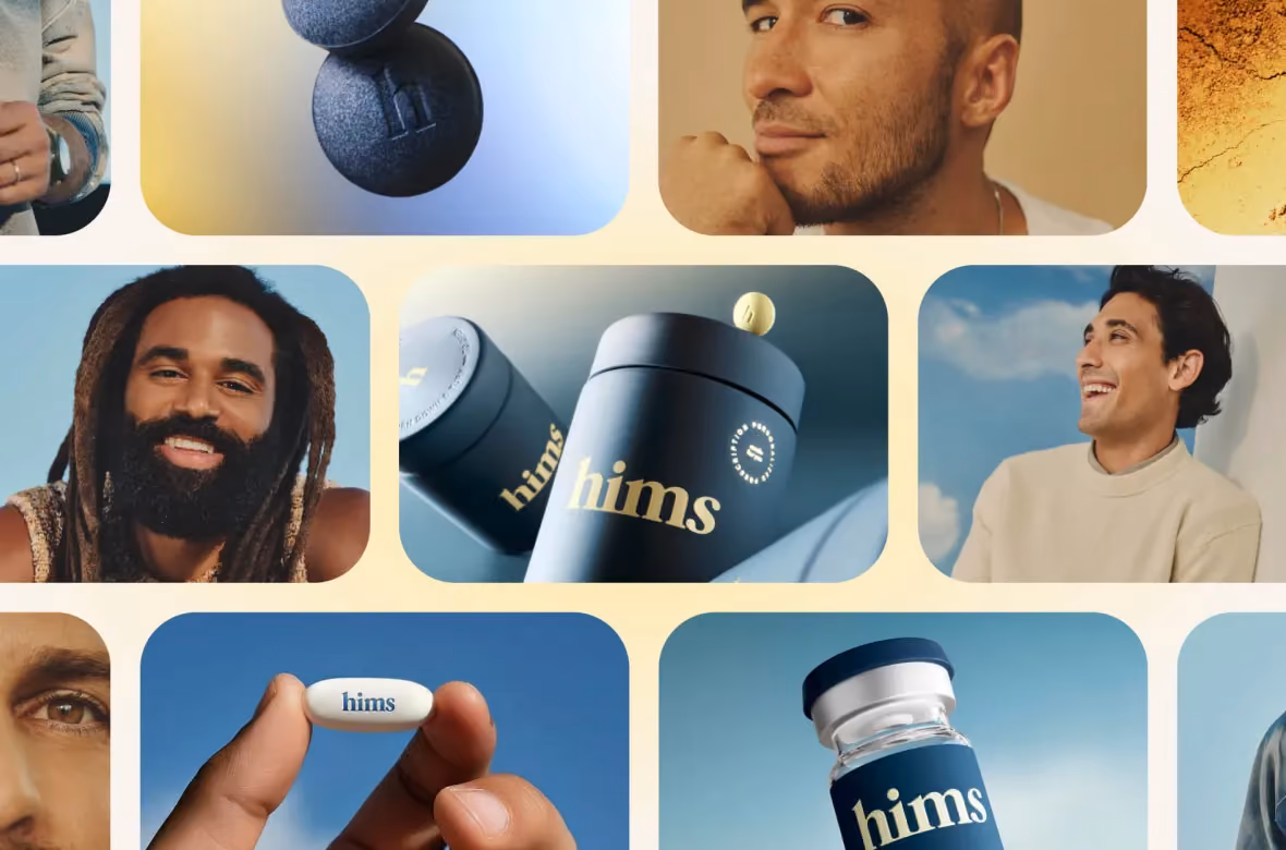
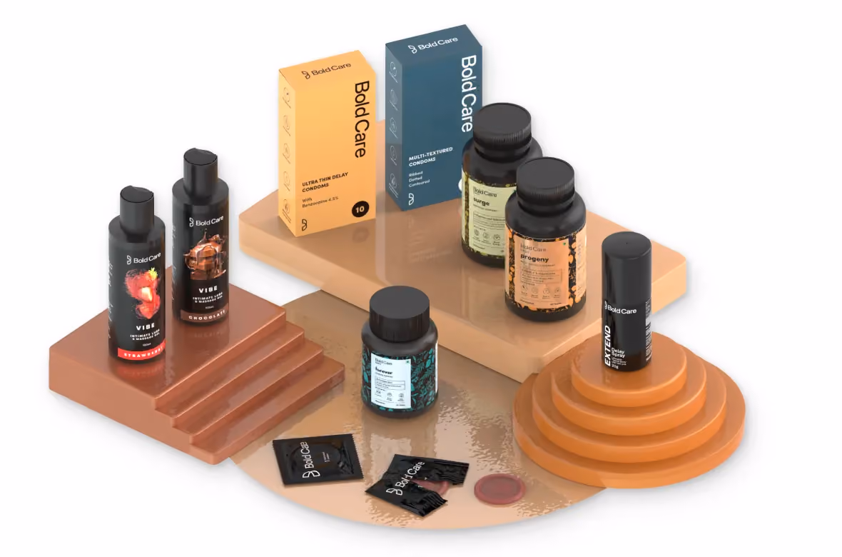
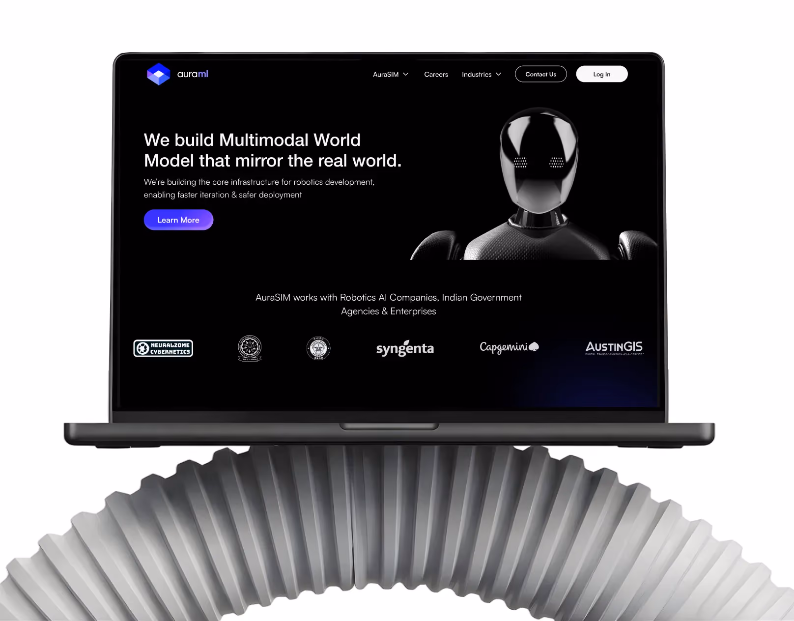
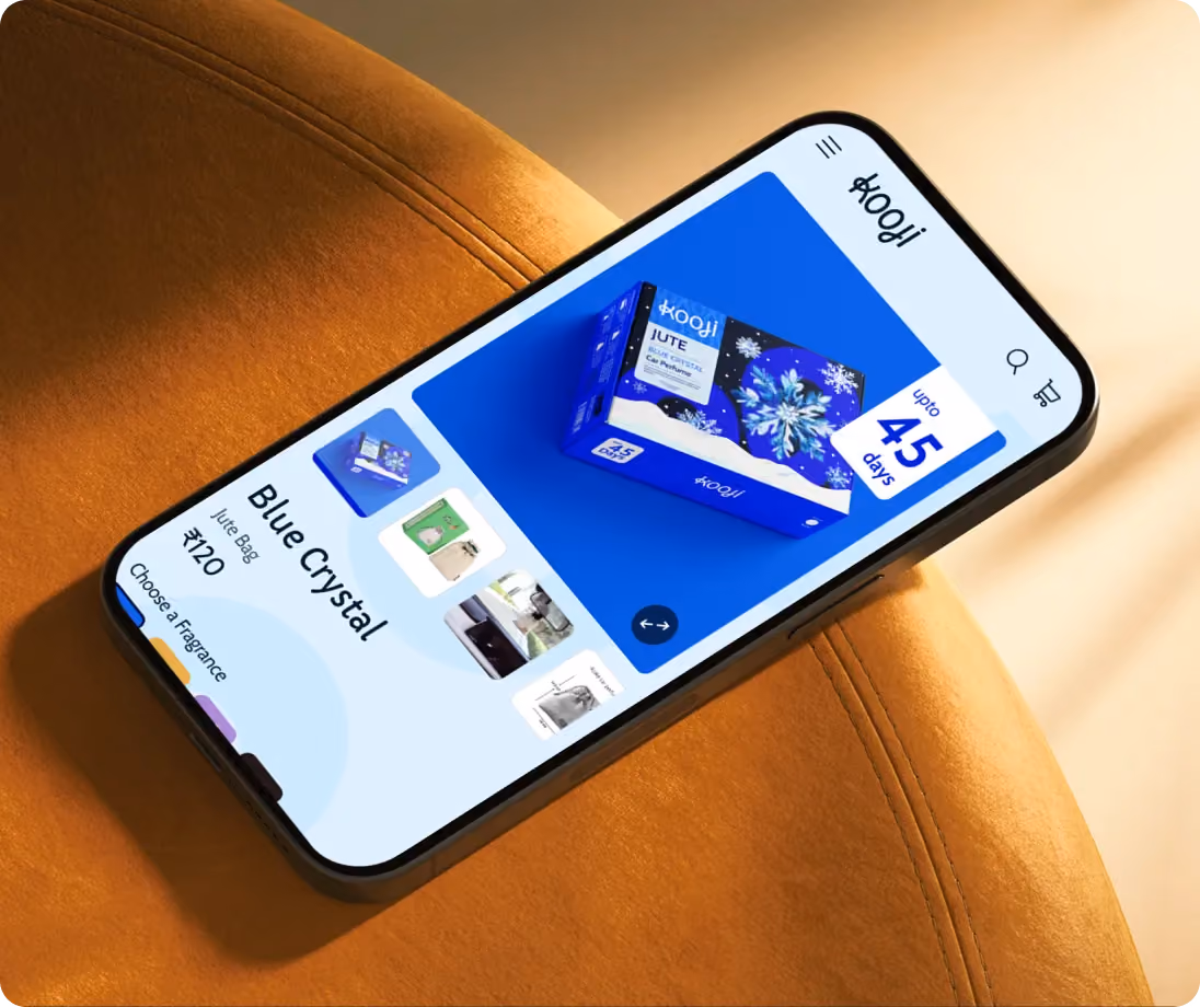
E-Commerce Success Stories
%201.avif)


.avif)
.avif)
Build Your D2C Business The Right Way
Build It With Suplex.


