Bigtoe
Project Overview
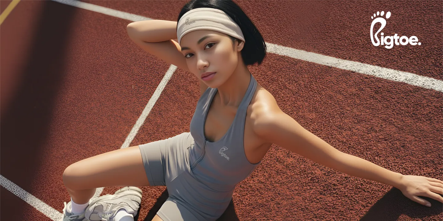
Suplex collaborated with Bigtoe to design a seamless digital experience that reflects its barefoot training philosophy. The website was designed to support intuitive navigation and effective lead generation, while clearly communicating Bigtoe’s mission to support individuals aged 40+ in their fitness journey.
The result was a performance-led platform that translated Bigtoe’s vision into a focused digital experience, supporting both user engagement and conversions.
User Personas
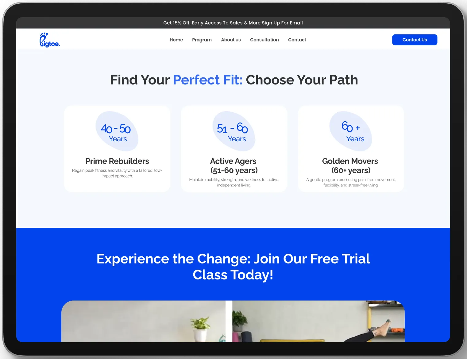
To guide the UX strategy, our team at Suplex developed detailed user personas for Bigtoe, identifying three primary audience groups. These included Active Professionals looking for time-efficient fitness solutions, Wellness Seekers focused on balanced and sustainable wellbeing, and Fitness Enthusiasts interested in exploring alternative training methods.
These personas informed key design decisions, ensuring the website spoke directly to Bigtoe’s audience and supported meaningful engagement.
Information Architecture
Suplex designed a structured information architecture to support smooth navigation and a well-defined user journey. Key sections included programme pages that clearly presented Bigtoe’s training offerings, an About Us page that communicated the brand’s purpose, and strategically placed calls to action to support lead generation. This structure made essential information easy to access while guiding users towards key actions.
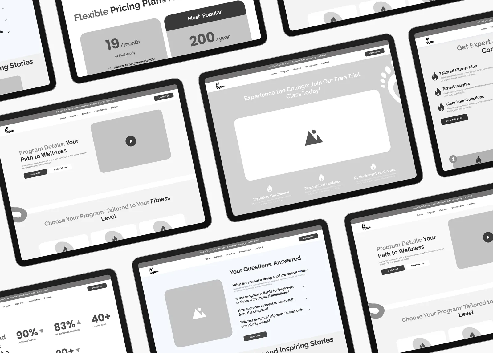
Wireframes
Based on research and user insights, detailed wireframes were developed to define the website’s structure, layout, and content flow. These wireframes acted as a functional blueprint, ensuring navigation felt straightforward and content was presented with intent. This stage helped align usability with Bigtoe’s goals and audience expectations before moving into visual design.
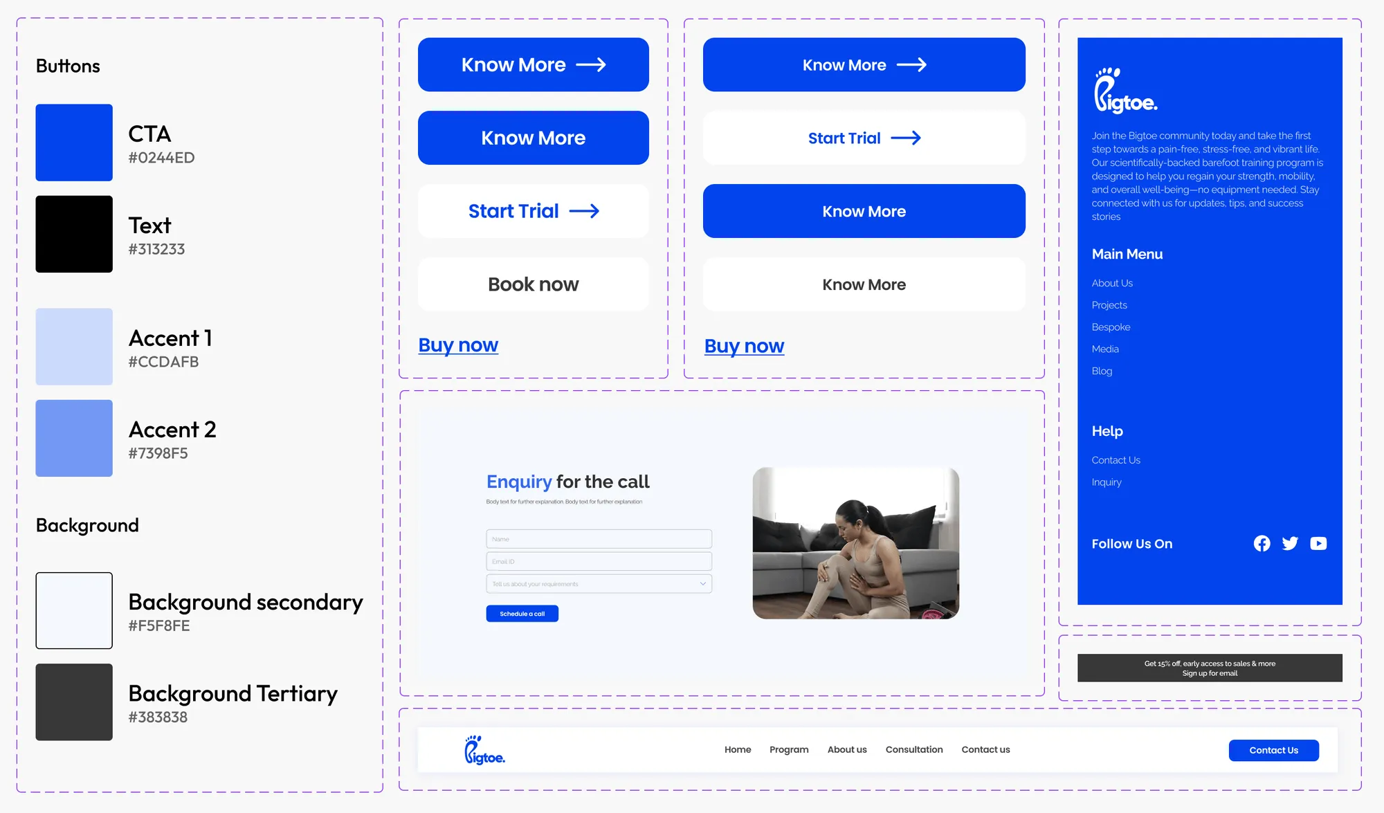
Colours and Typography
Suplex selected blue as the primary brand colour to reflect Bigtoe’s calm and considered approach to wellness. Raleway was chosen as the typeface for its modern yet approachable character, supporting readability while reinforcing the brand’s positioning. Together, these elements formed a cohesive visual language applied consistently across the website.

Design System
A design system was created to maintain consistency across all digital touchpoints. UI components, typography, spacing, and interaction patterns were standardised to ensure the interface felt cohesive, scalable, and well resolved.
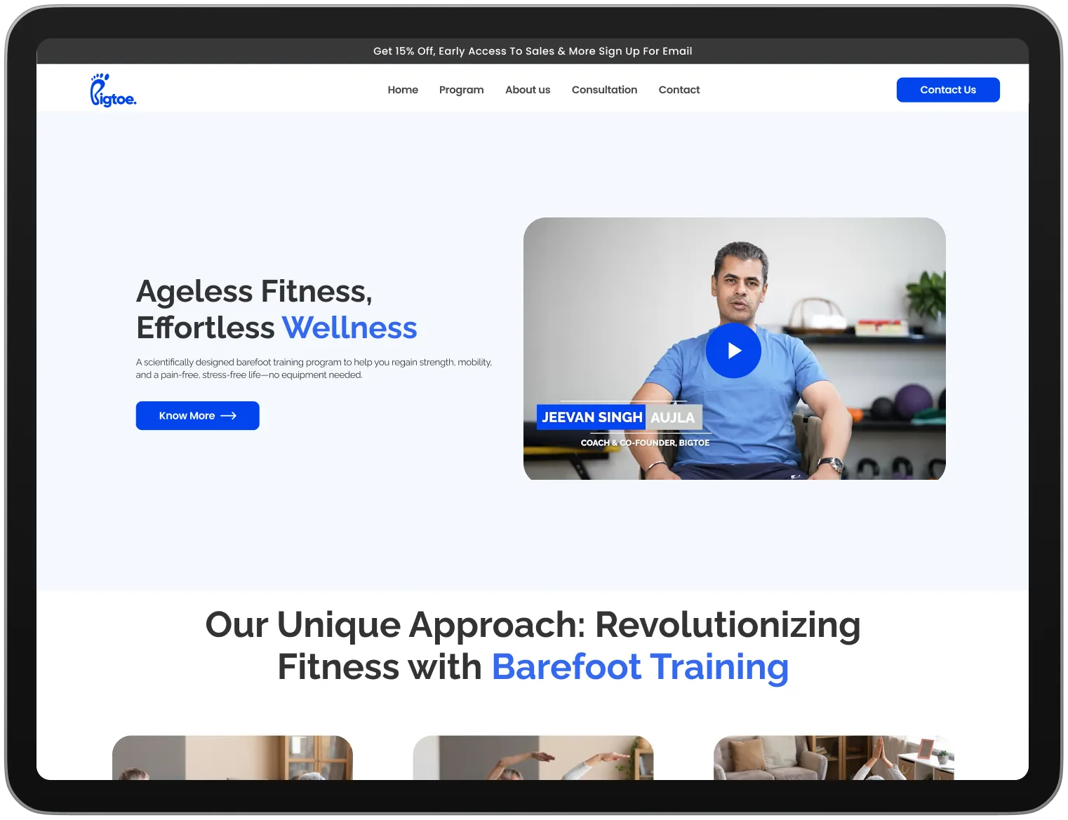
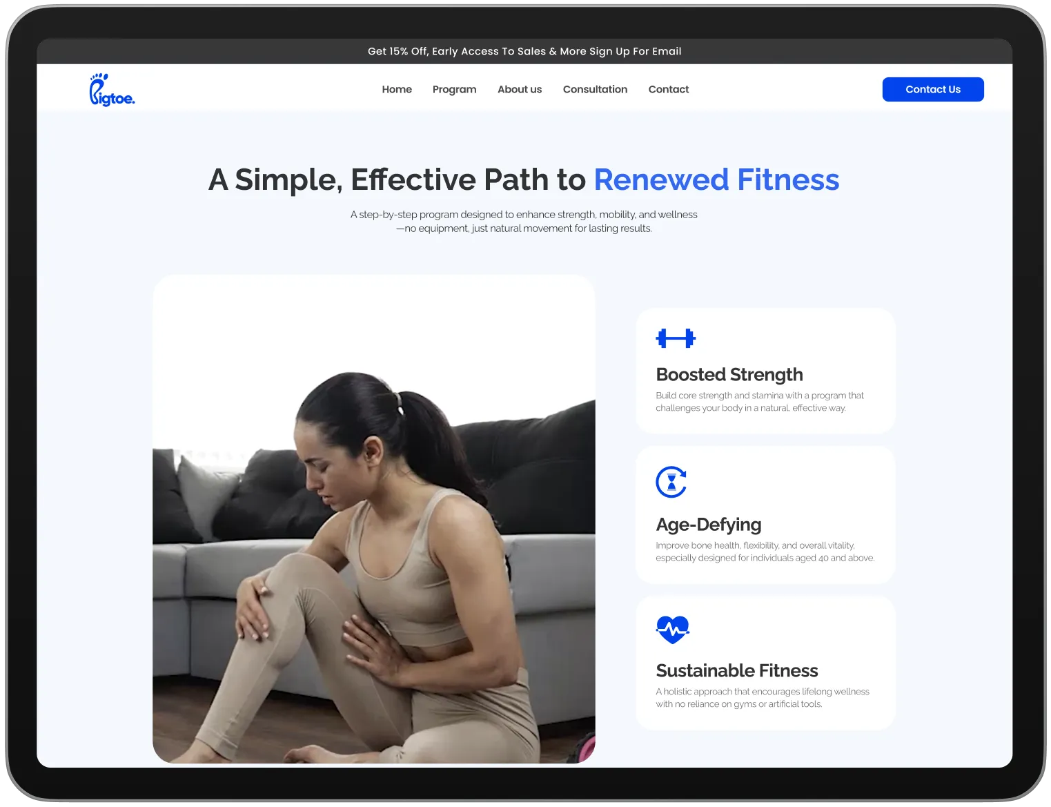
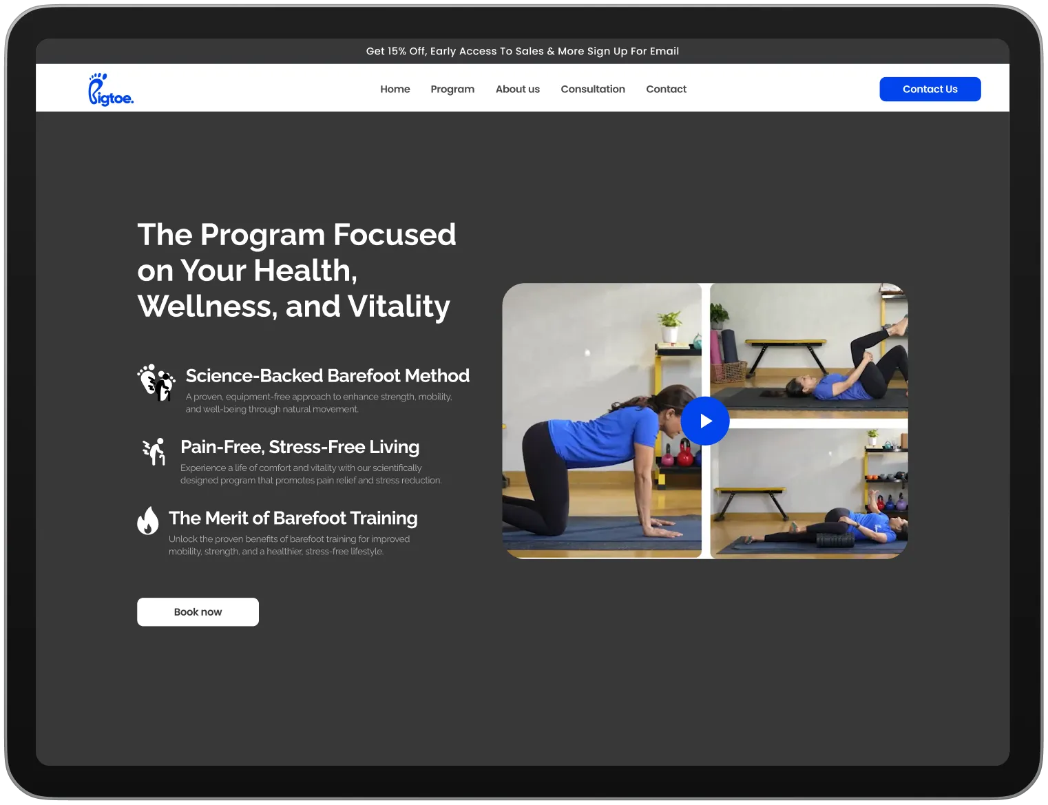
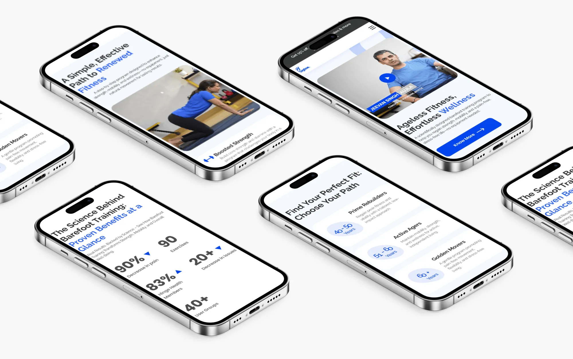
Final Screens
The final UI screens delivered to Bigtoe brought together visual design and functional structure into a cohesive website experience. The finished platform supported smooth navigation and effective lead capture while reflecting the brand’s identity.
The client feedback was highly positive about the work done by our team at Suplex, with appreciation for both the visual execution and the website’s ability to support engagement and growth.
Let’s Make It Happen
Other Work You May Like

AuraML
How Confetti helped AuraSIM shift from a simulation tool to the brand that makes physical AI feel ready for the real world.
Miduty
Suplex built a Shopify-website for Miduty to grow their D2C nutracutical sales in India
Kimi Cafe
We helped Kimi Cafe launch their Android & iOS app in Dubai to increase customer loyalty & market their new menu items
Kooji
Built a Shopify store for Kooji to grow the e-commerce sales for their premium car-perfumes in India
Build Your D2C Business The Right Way
Build It With Suplex.


