
Miduty
Project Overview
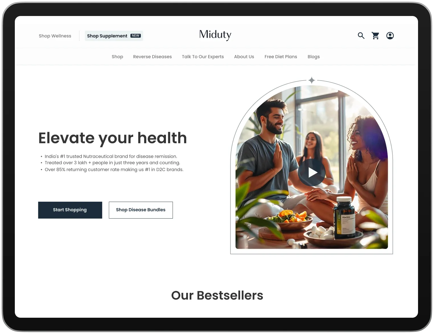
Suplex partnered with Miduty to strengthen its digital presence through a carefully considered UX and UI design process. The project spanned user research, persona development, information architecture, wireframing, and the creation of a cohesive visual language, including colour, typography, and interface styling.
Each stage was rooted in Miduty’s mission to empower women, resulting in a website experience that balanced clarity, functionality, and visual appeal. The final outcome delivered a seamless and engaging digital interface that resonated strongly with both the client and its audience.
User Personas
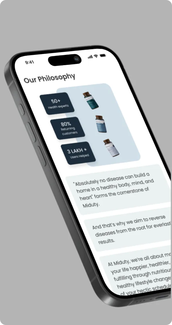
The UX process began with the development of detailed user personas to better understand Miduty’s core audience and their challenges. These included concerns around declining confidence, unmet skincare promises, and the difficulty of finding products they could genuinely trust. By recognising their need for reliable solutions that fit naturally into busy lifestyles, the experience was shaped to feel intuitive, reassuring, and authentic. This user-first approach helped build trust while reinforcing Miduty’s purpose-led positioning.
Information Architecture
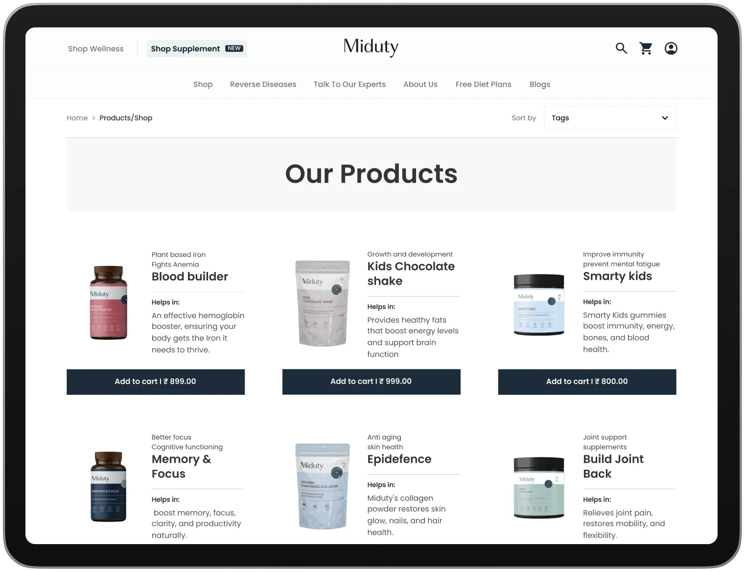
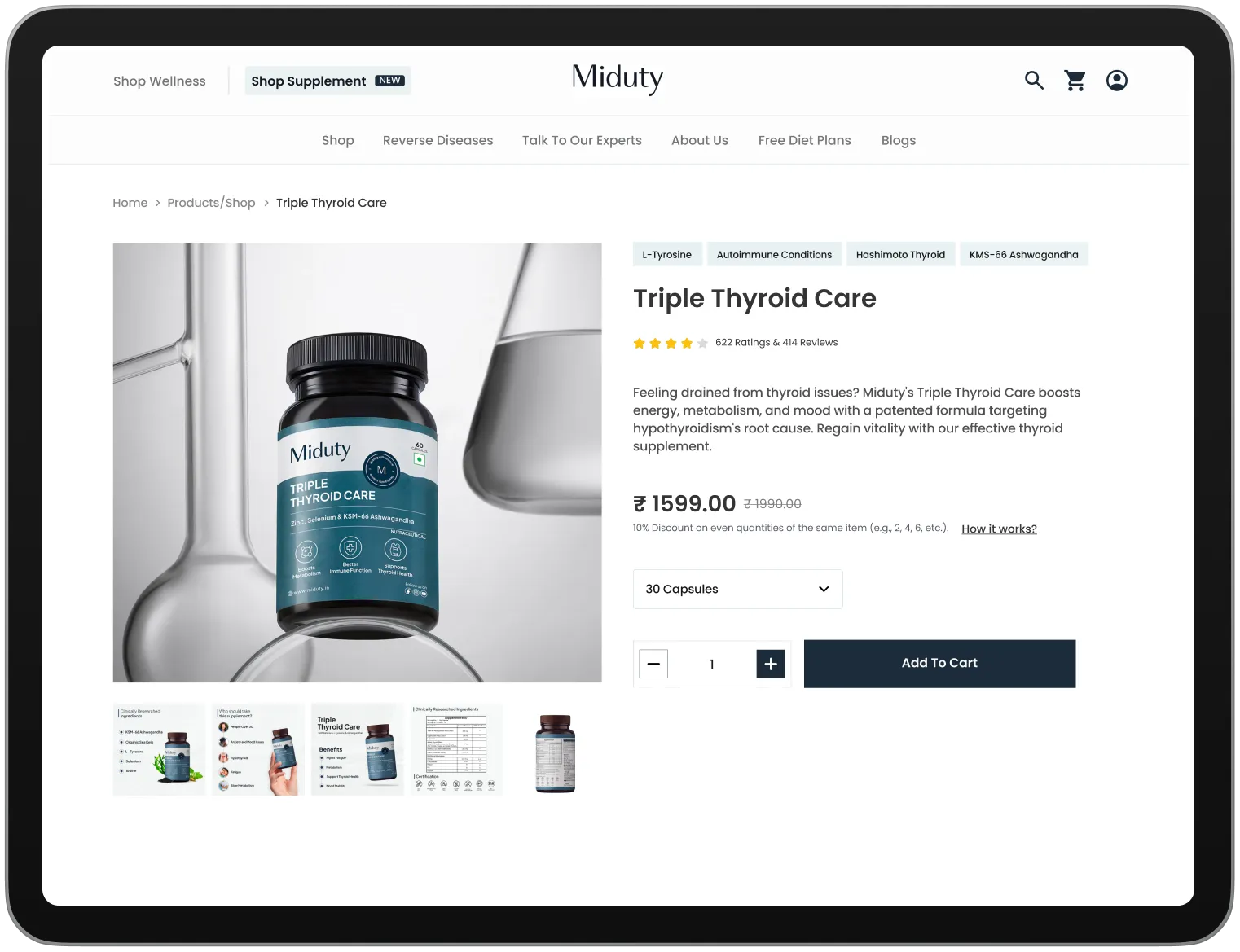
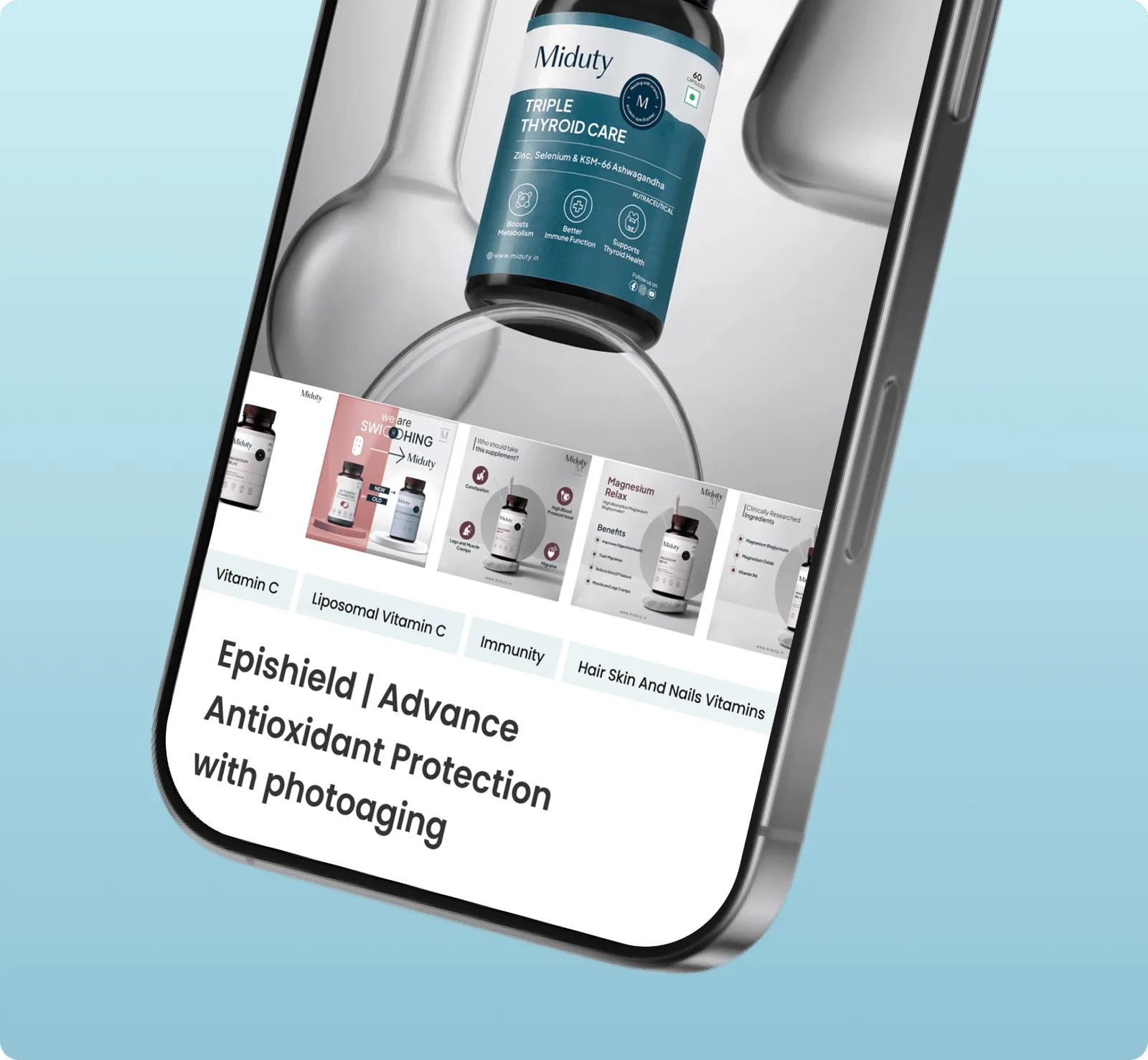
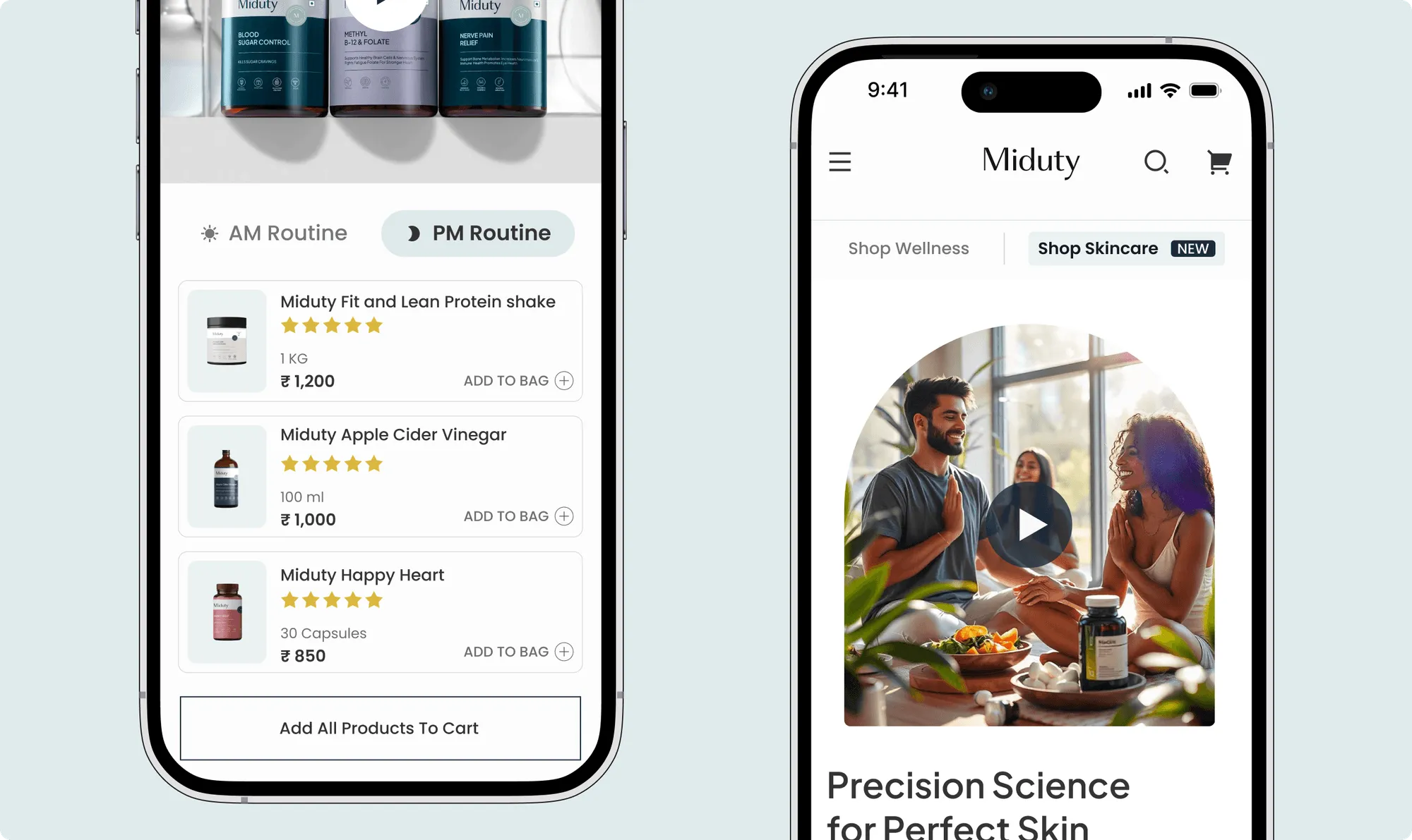
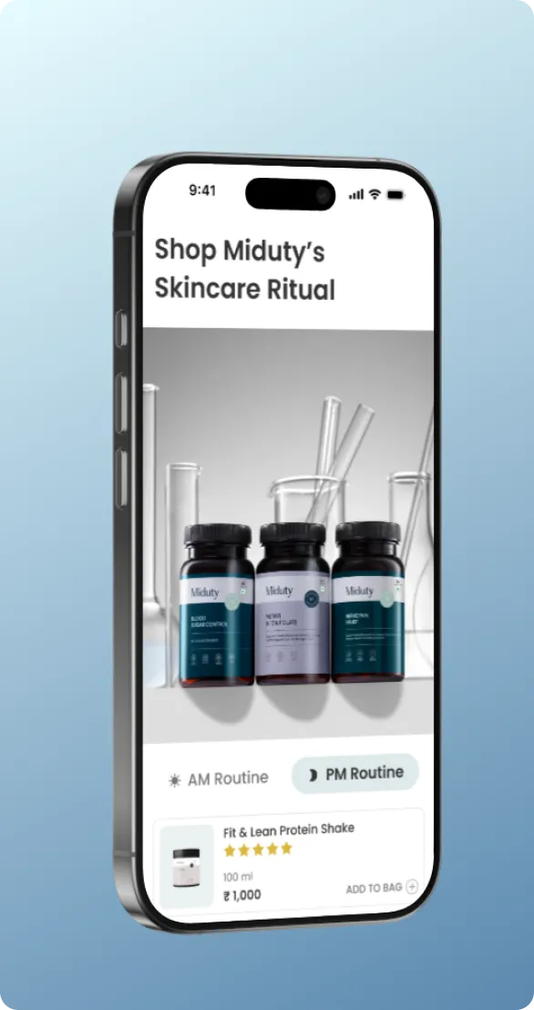
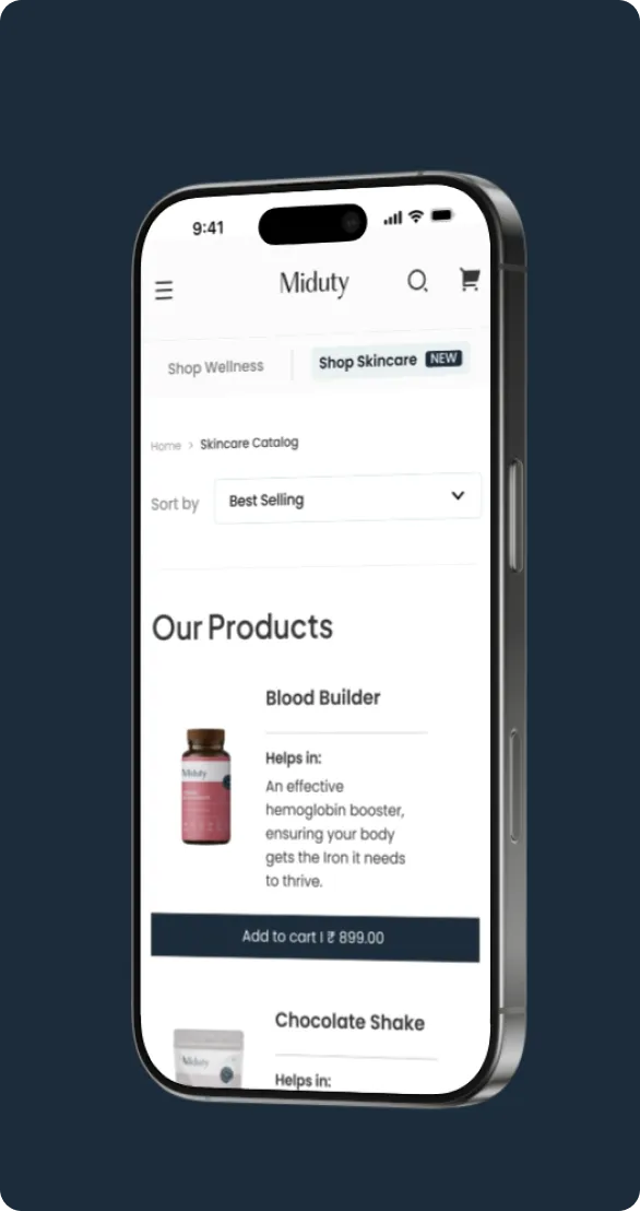
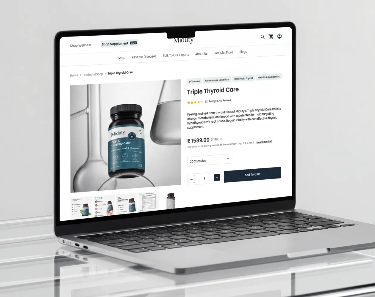
Suplex designed a clear and structured information architecture to support ease of navigation and a frictionless browsing experience. Key pages such as the homepage, product listing, product detail pages, about us, and terms and conditions were thoughtfully organised to ensure logical flow and accessibility. This clarity in structure enabled users to find essential information effortlessly, reinforcing Miduty’s aim of delivering a simple, empowering, and user-friendly digital journey.
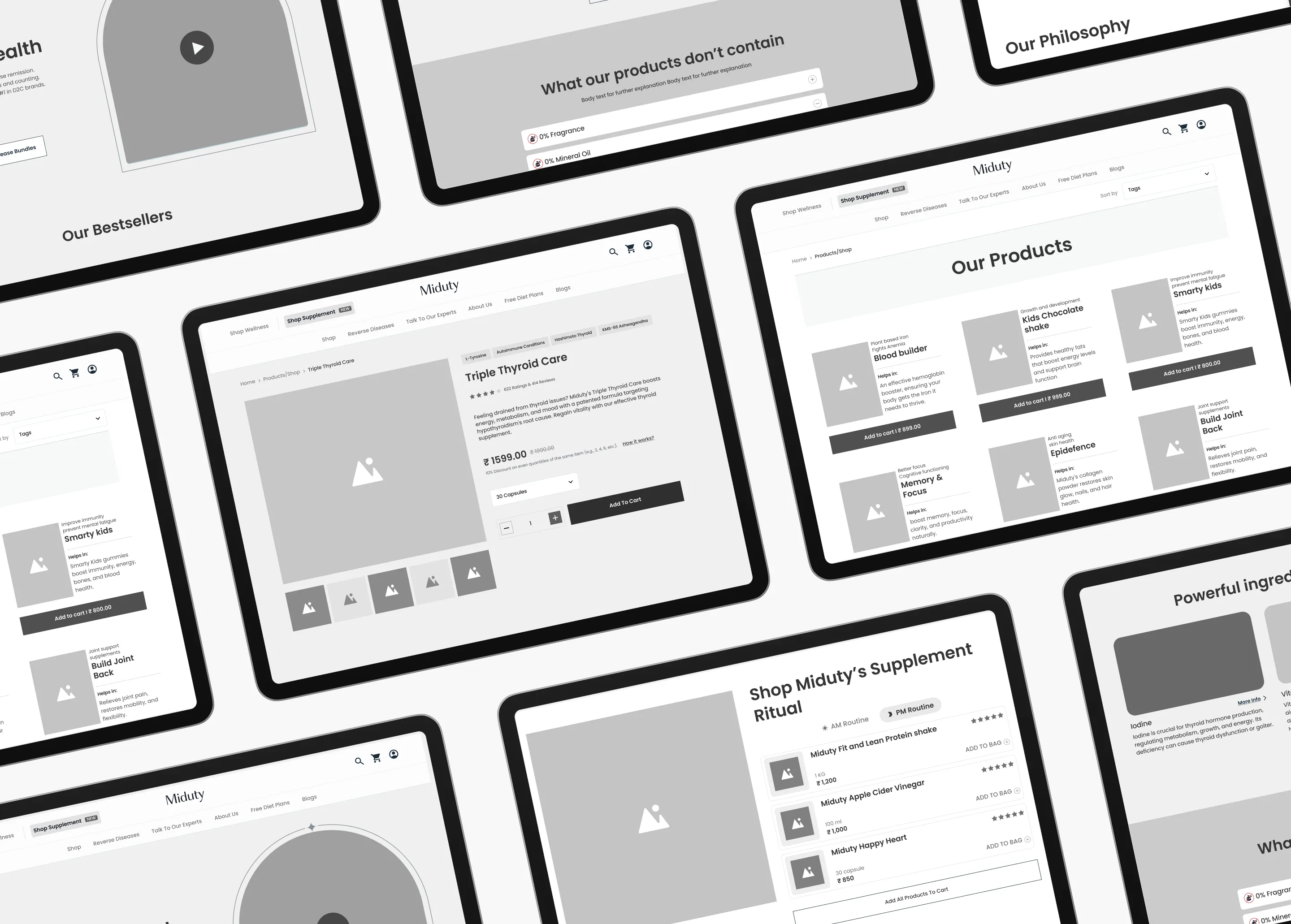
Wireframes
Detailed wireframes were created to map out the website’s layout, interactions, and content hierarchy before moving into visual design. These wireframes acted as a functional blueprint, ensuring every element served a clear purpose within the user journey. This stage played a critical role in aligning usability, navigation, and interaction design with Miduty’s broader vision of simplifying self-care through a well-considered digital experience.
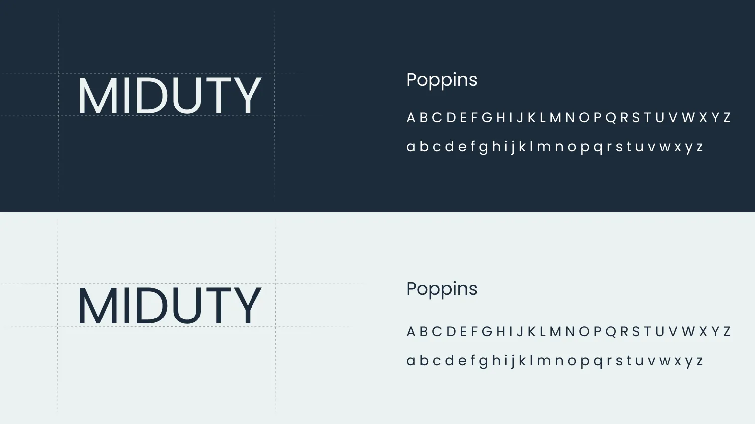
Colours and Typography
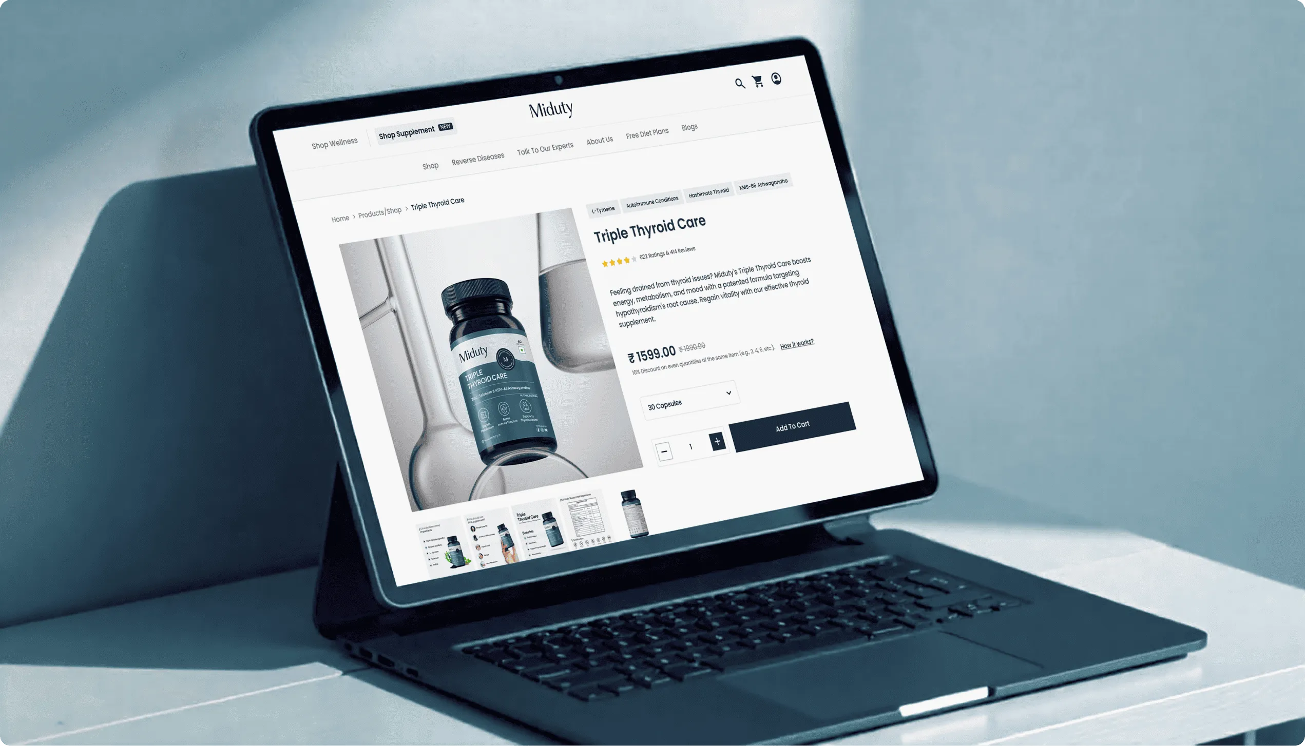
As part of the UI design, our team at Suplex developed a refined colour palette using black, blue, aqua, and white. These colours were selected to communicate trust, calmness, and clarity, while maintaining a contemporary and professional look across the interface.
Poppins typography was chosen for its clean and approachable character, supporting readability and visual consistency throughout the website. Together, the colours and type created a cohesive design system that aligned with Miduty’s brand identity and digital goals.
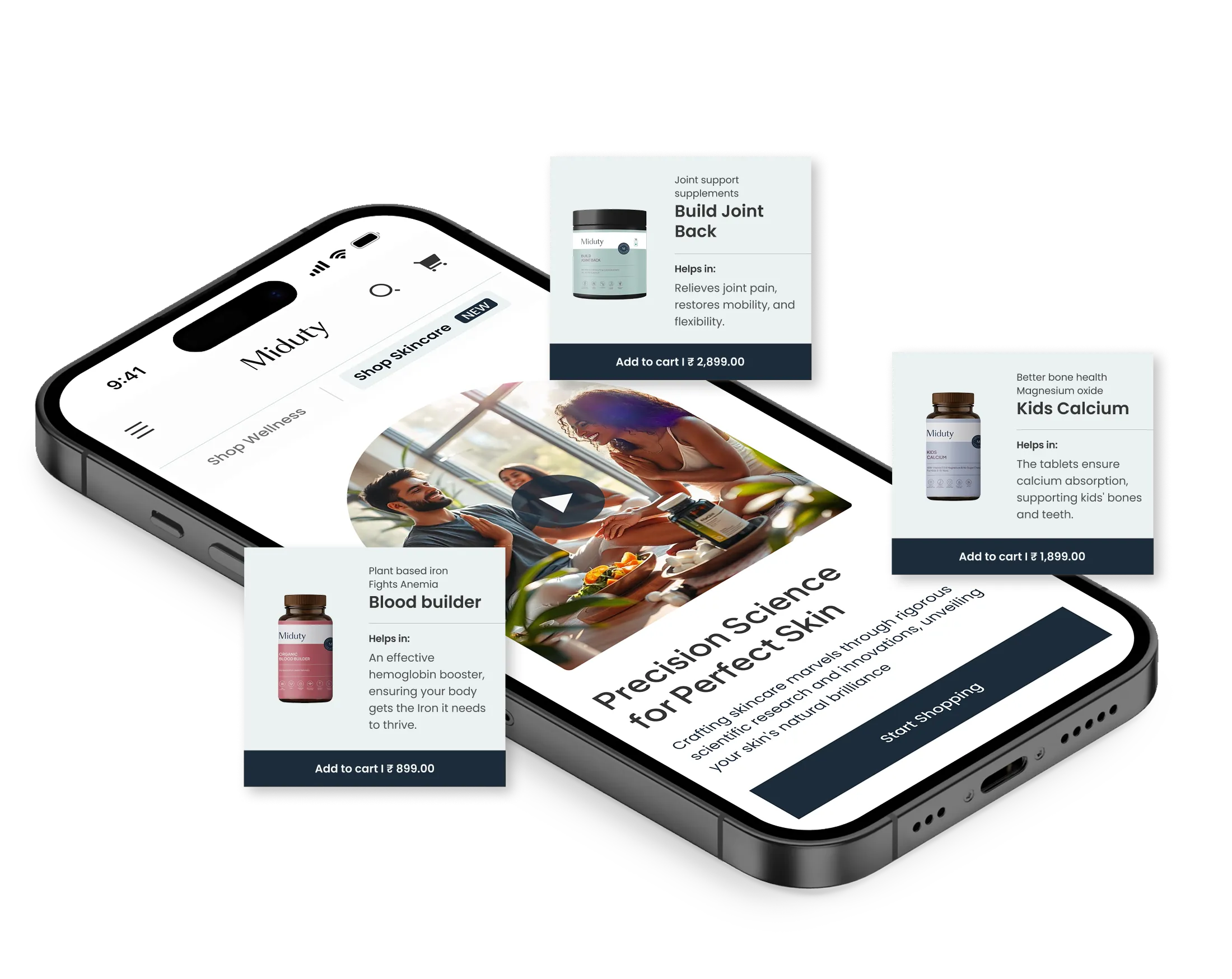
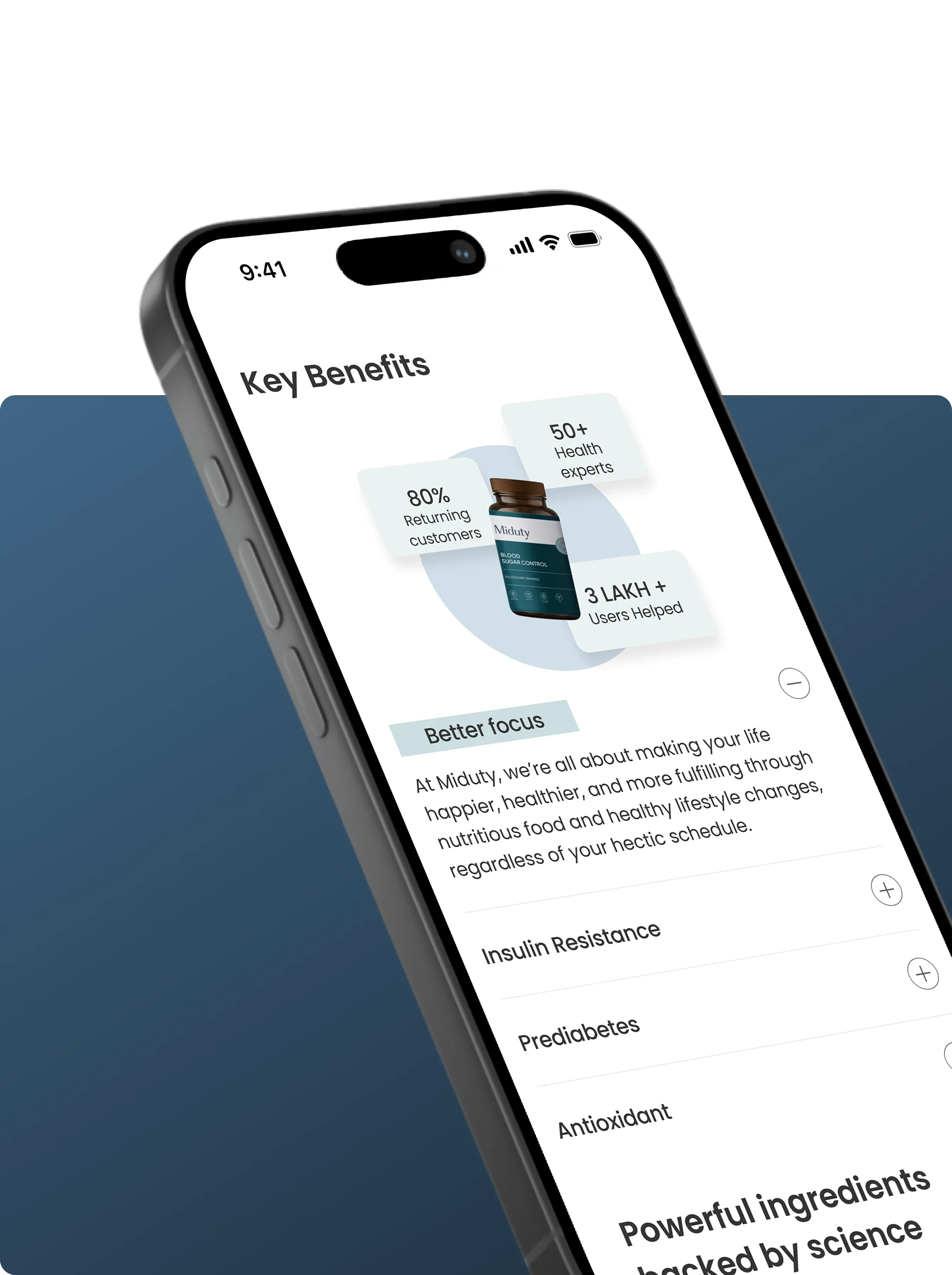
Design System
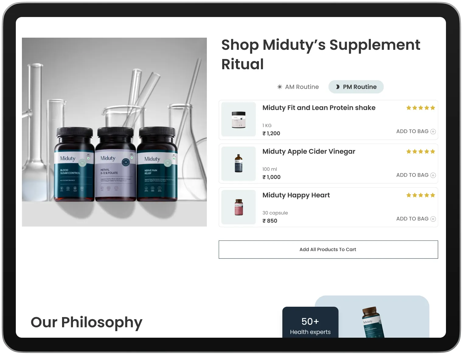
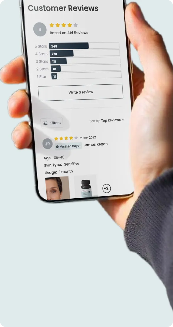
The final UI screens were brought together into a cohesive design system that reflected both functionality and visual coherence. The interface captured Miduty’s brand ethos while delivering an intuitive and engaging website experience.
The client response was highly positive, with the team appreciating how seamlessly the UX, UI, and visual language translated their vision into a digital product designed to connect meaningfully with their audience.


Let’s Make It Happen
Other Work You May Like

AuraML
How Confetti helped AuraSIM shift from a simulation tool to the brand that makes physical AI feel ready for the real world.
Miduty
Suplex built a Shopify-website for Miduty to grow their D2C nutracutical sales in India
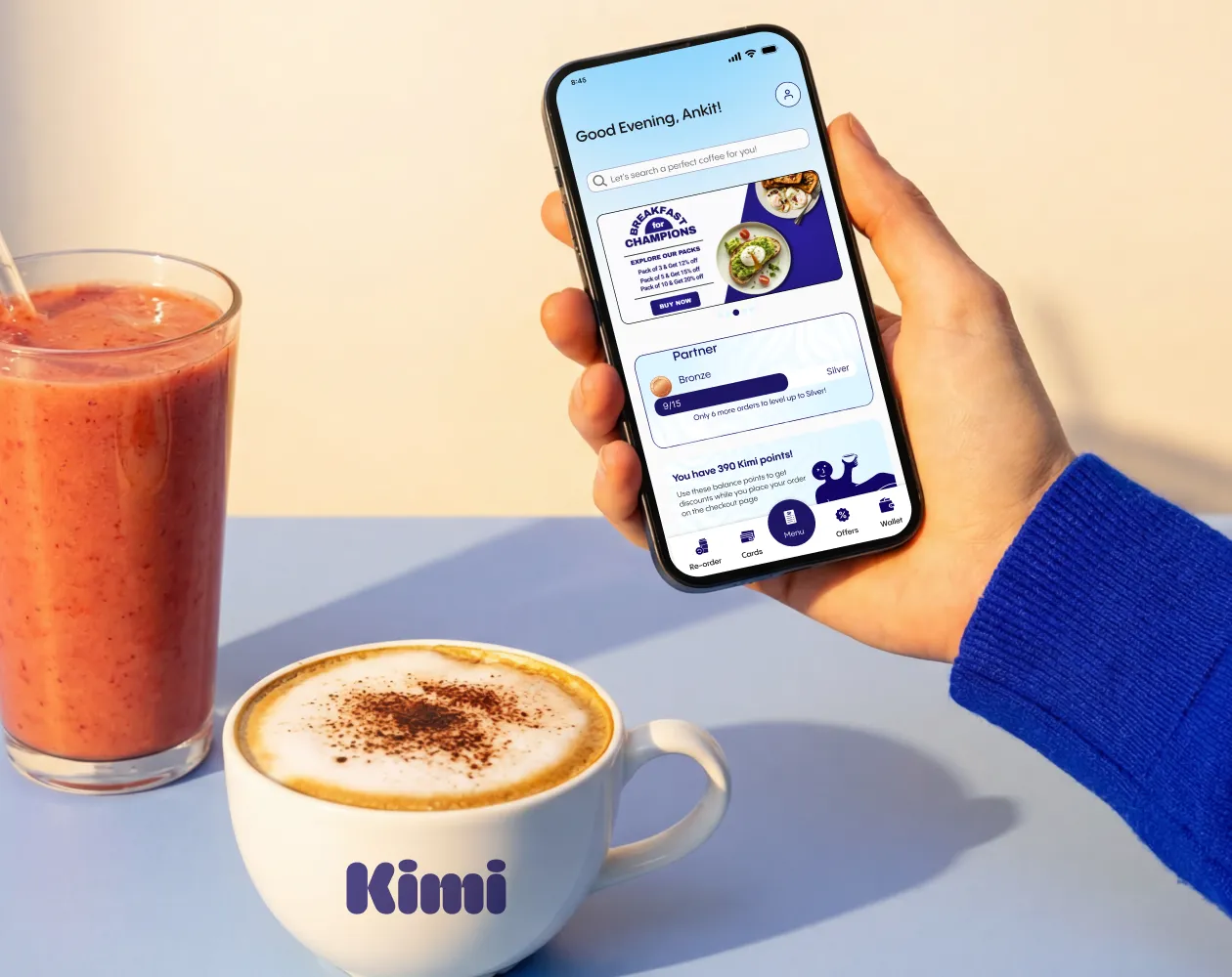
Kimi Cafe
We helped Kimi Cafe launch their Android & iOS app in Dubai to increase customer loyalty & market their new menu items
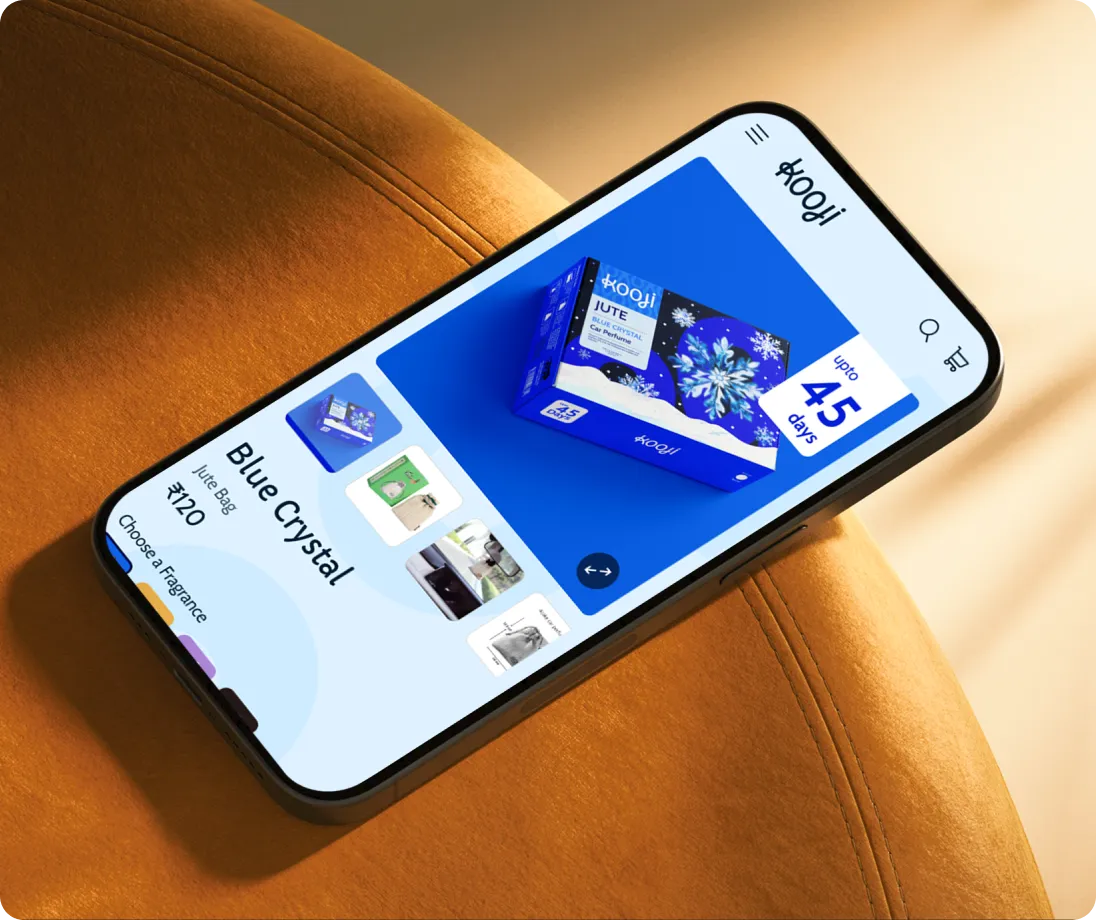
Kooji
Built a Shopify store for Kooji to grow the e-commerce sales for their premium car-perfumes in India
Build Your D2C Business The Right Way
Build It With Suplex.


