Competitor Analysis
Competitor Analysis in UX Design
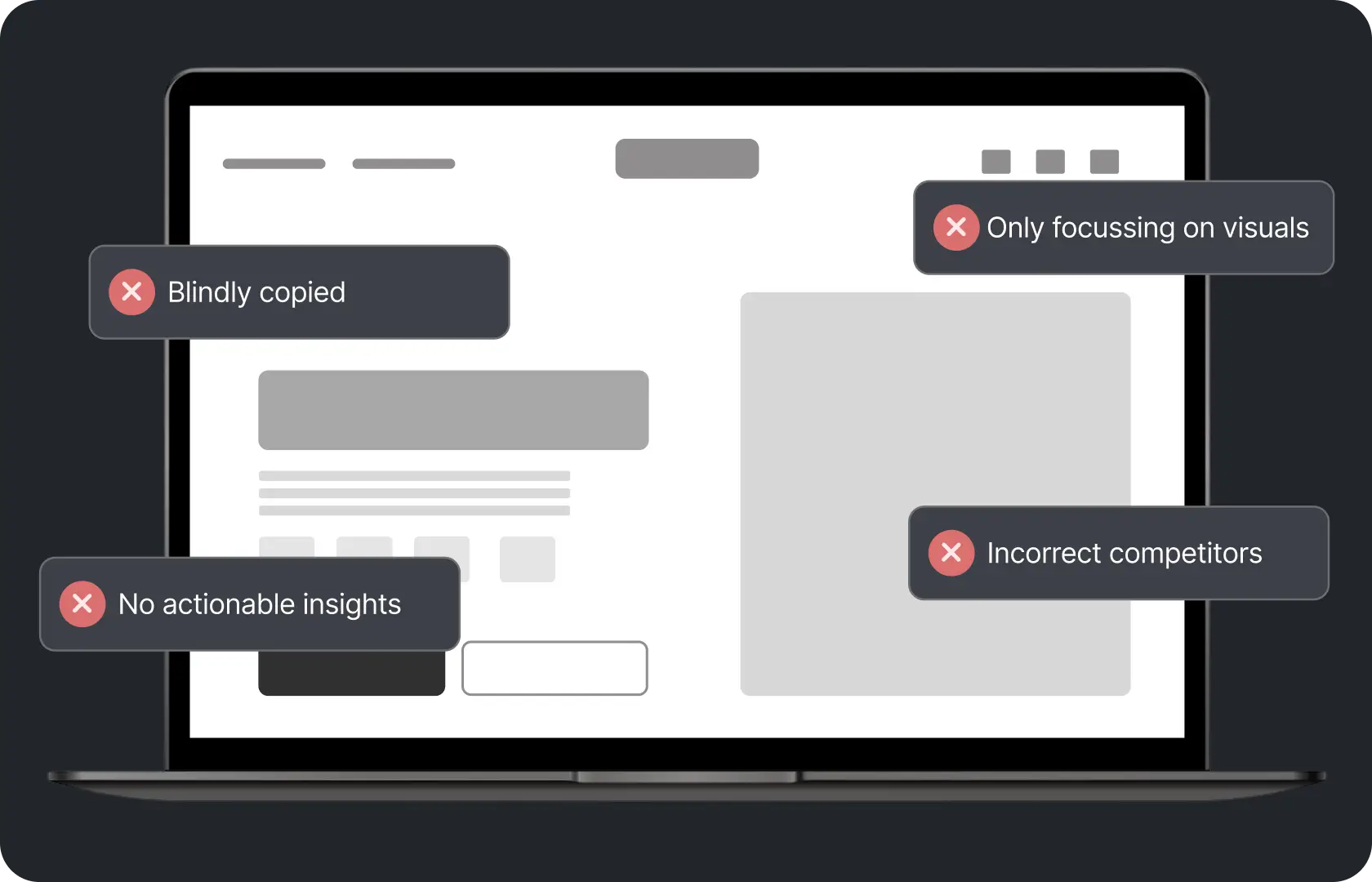
Here is what competitor analysis looks like at most D2C brands. Someone on the team bookmarks three competitor websites, checks them when they remember, screenshots a few pages into a folder somewhere, and calls it done. That folder is never opened again.
That is not competitor analysis. That is a liability disguised as a process.
The brands that design products people actually prefer to use have usually done something different before they designed anything. They mapped how the category works. Which patterns are standard, which are breaking convention in interesting ways, where competitors are creating friction they have stopped noticing, and where the actual gaps are. That mapping is what makes design decisions defensible rather than subjective.
At Suplex Design, our team runs UX competitor analysis for D2C brands across India, the UAE, the US, the UK, and Singapore. Structured, specific, and built to inform the design work that follows. Not to fill a slide in a kickoff deck.
What UX Competitor Analysis Actually Is
Not a brand audit. Not a marketing comparison. Not a feature matrix.
UX competitor analysis looks at how competitors have built their digital experience. How they structured their navigation and information architecture. How they sequence the buying journey from category to product page to checkout. Where they place trust signals and what kind they use. How their mobile experience compares to desktop. How they handle search, filtering, and product discovery.
The goal is not to find things to copy. It is to understand what the category has normalised, what is working for buyers in that space, and where conventions have created gaps. Most UX problems are not unique to the brand experiencing them. They are category patterns that everyone has inherited and nobody has questioned.
How Suplex Design Runs UX Competitor Analysis
You will find that most agencies treat competitor analysis as a one-time deliverable at the start of a project. Produce it, file it, move on. At Suplex Design, our team treats it as a foundation the rest of the design work is built on. Specific enough to drive real decisions. Not general enough to justify any direction.
Picking the Right Competitors
The competitor set matters more than most brands realise.
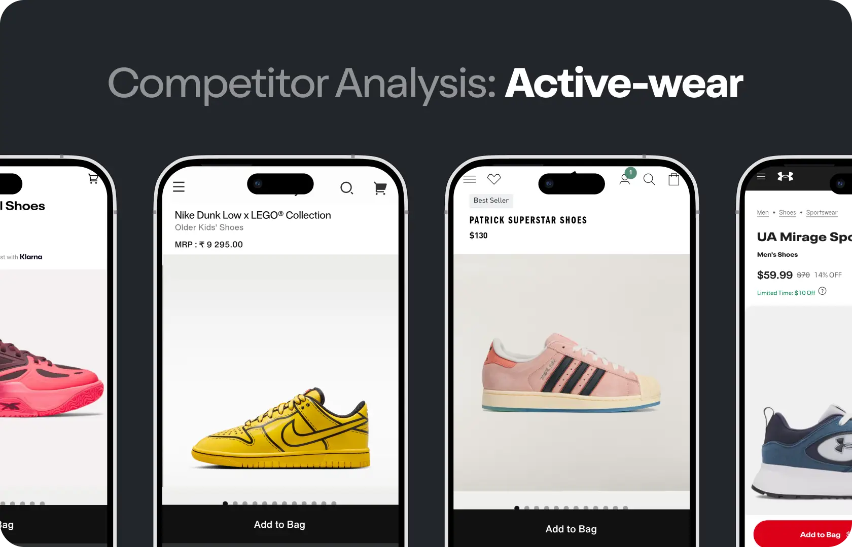
Direct competitors are obvious. Same product, same audience, same category. But the most useful UX insights often come from indirect and aspirational brands. A premium wellness brand might learn more from studying Ritual's product page architecture than from its closest local competitor. In categories where the Indian or UAE market is still developing its conventions, global benchmarks from brands like Glossier, Warby Parker, or Away show what a more mature version of the category looks like.
Our team selects four to six competitors for each analysis. Direct, indirect, and aspirational. The aspirational ones are often the most useful because they show what is possible when category conventions are not treated as constraints.
What We Actually Map
Information architecture first. How the navigation is structured, what is in the primary nav versus secondary, how collections are named and organised, how search behaves. This tells you how the competitor thinks about the buyer's mental model of the category.
Then user flows. We go through the key journeys as a buyer would. Category to product page. Product page to add to cart. Cart to checkout. Every decision point, every piece of information provided, every moment of friction. Friction is usually where the most interesting design opportunities sit.
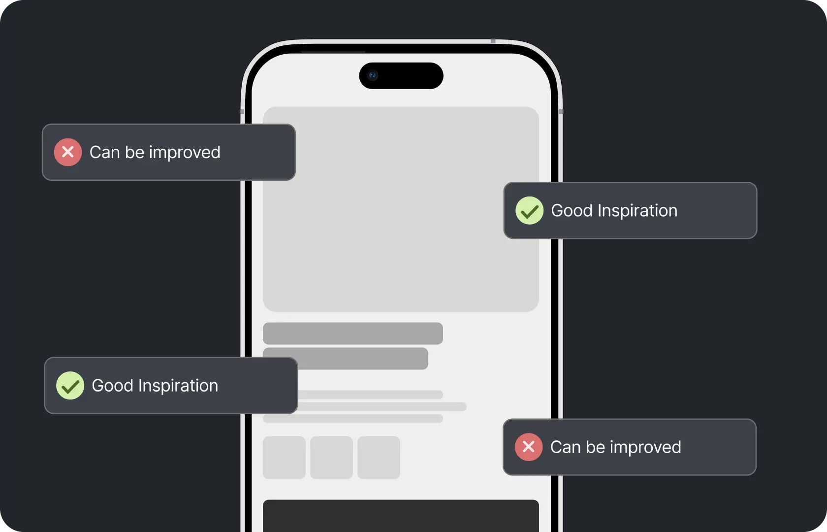
Trust signals. Where they appear, what type they are, how they are sequenced relative to the buying decision. A brand that buries reviews below the fold has made a decision about social proof. A brand that puts star ratings immediately under the product title has made the opposite one. Both are observable and both have implications.
Mobile experience. Tested on real devices, not just a browser inspector. Many e-commerce experiences look acceptable in a responsive preview and genuinely frustrating on an actual phone. We test on real mid-range Android devices because that is the primary browsing context for buyers across India and large parts of the UAE.
What the Output Looks Like
Not a deck of screenshots with captions. That is the version that gets filed and forgotten.
The output from a Suplex Design analysis is a structured map of category patterns, specific design decisions competitors have made and why they probably made them, the friction points that are consistent across the category, and a clear picture of where the gaps are. It is designed to be used during IA and wireframing, not as a standalone document the team references once.
The design team should be able to pick it up at any point in the project and answer the question: what are we doing differently here, and why? The analysis makes that possible.

Tools Behind UX Competitor Analysis
Suplex Design uses Figma for mapping and documenting the analysis, real devices and browsers for testing competitor experiences rather than relying on emulators, Google PageSpeed Insights and Lighthouse for performance benchmarking, and structured evaluation frameworks adapted from heuristic analysis principles. Where competitor apps are in scope, we download and use them on actual iOS and Android devices rather than reviewing screenshots.
Is UX Competitor Analysis Right for You Right Now?
Worth asking before you commit.
Redesigning a store or building a new product from scratch? Competitor analysis should happen before wireframes. Designing without it means designing without knowing what the category has already established as normal. That creates risk in both directions. You might follow conventions that are creating friction because you did not know there was an alternative. Or you might break conventions that are working because you did not know they were there.
Iterating on something specific rather than redesigning? A focused analysis on just that section, the checkout, the product page, the search experience, is often more useful than a broad one. We scope it to what will actually inform the decisions being made.
Common Mistakes in UX Competitor Analysis
Predictable. Consistent. Almost universal.
- Analysing competitors from the brand's perspective rather than the buyer's. The team evaluates what they notice as designers or founders. A real buyer going through the same journey notices completely different things.
- Looking only at direct competitors and missing the indirect and aspirational ones that often carry the most useful design intelligence.
- Reviewing competitor experiences on desktop when the majority of the target audience is on mobile. The mobile experience is often significantly different and significantly worse, and that difference is where the most actionable insights sit.
- Producing something that describes what competitors are doing without translating observations into design implications. "Competitor X puts reviews above the fold" is an observation. What it means for the hierarchy of your product page is the insight. Most analyses stop at the observation.
- Running it once at the start of a project and never revisiting it as the design evolves and new questions come up.
Competitor analysis that produces observations without implications is not analysis. It is a library.
Why UX Competitor Analysis Matters for D2C Brands
Buyers come to a product with expectations shaped by every other product they have used in the same space. When a design departs from those expectations in a way that is not clearly better, buyers experience friction even if they cannot say why.
A product page that breaks category conventions in a way that confuses buyers is not being innovative. It is losing conversions to a competitor whose page feels familiar because the buyer has encountered that pattern before. Competitor analysis tells you which conventions are worth challenging and which are there for a reason.
For D2C brands entering established categories, this matters particularly. The category has already trained buyer expectations. Understanding those expectations, and specifically where they create frustration, is what allows a new brand to design something that feels instantly right rather than asking buyers to relearn something they already know how to do elsewhere.
How Suplex Design Approaches UX Competitor Analysis for Your Brand
Every analysis at Suplex Design is scoped to the specific product, the specific category, and the specific design decisions it needs to inform. There is ideally no standard template and no generic competitor set. The competitor selection, the evaluation criteria, and the output format are shaped by what the design work is actually going to need from it.
Starting a redesign? Building something new? Not sure what your category is doing well and what it is quietly getting wrong? Get in touch with Suplex Design.

Frequently Asked Questions
What does UX competitor analysis from Suplex Design include?
Competitor selection across direct, indirect, and aspirational brands, mapping of IA, user flows, trust signals, mobile experience, and performance, and a structured output that translates observations into design implications. Not screenshots with captions. Something the design team can use when making actual decisions about the product.
How much does UX competitor analysis cost at Suplex Design?
A focused analysis of four to six competitors across a specific product type typically starts from around $800 at Suplex Design. Broader analyses covering more competitors or more complex categories cost more. We scope it clearly so the cost reflects what is actually being delivered.
How long does it take?
Usually one to two weeks from kickoff, depending on the number of competitors and whether apps are in scope alongside web. We do not rush it. An analysis that misses something because it was done quickly defeats the purpose.
Do you include international competitors or only local ones?
Both, and the international ones are often the more useful half. For many categories in India and the UAE, global brands show what a more mature version of the category looks like before local competitors have got there. Understanding that benchmark is useful for a brand that wants to be ahead of where the category is going, not just where it currently is.
Can you run the analysis on a competitor's app as well as their website?
Yes. We download and use competitor apps on real iOS and Android devices, not through screenshots or emulators. The app experience is often significantly different from the web experience, and in categories where app usage is high, understanding both matters. We scope to whatever surfaces are relevant to the design decisions being made.
Let’s Make It Happen
Shopify Success Stories

AuraML
How Confetti helped AuraSIM shift from a simulation tool to the brand that makes physical AI feel ready for the real world.
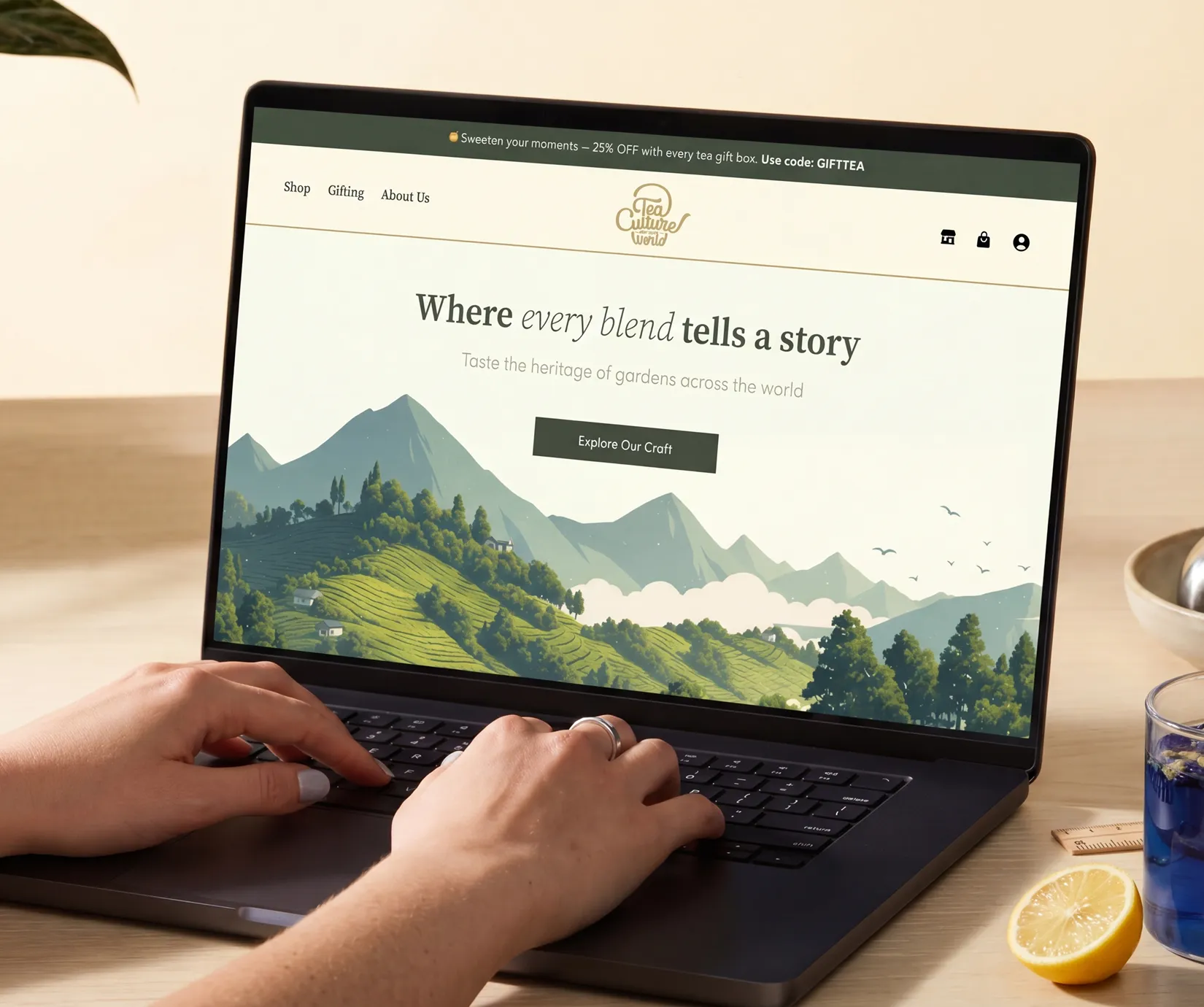
Tea Culture of the World
How Suplex made 120 teas from across the world feel like a discovery rather than a decision.
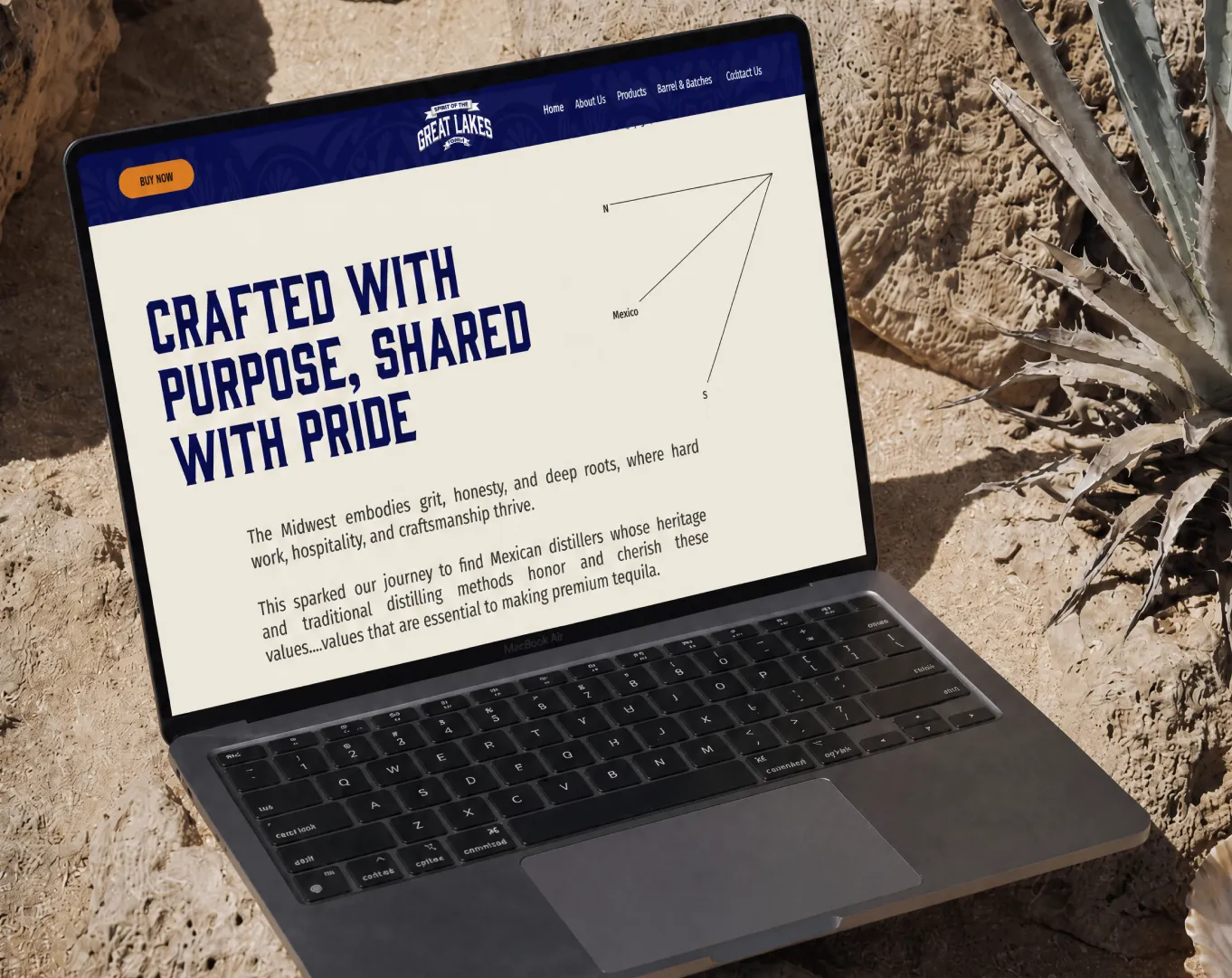
Great Lakes
How Suplex built a full stack website for a Midwest tequila brand with a real production story.
Why Suplex?
World Class Aesthetics
.webp)
Profitable E-Commerce
.webp)
Build A Brand
.webp)
Build Your D2C Business The Right Way
Build It With Suplex.


