Data Analytics & Optimisation
Data Analytics and Optimisation in UX Design
Building the product is not where the work ends. It is in fact actually where the real information starts arriving. Because a store or app that has been live for three months has something no wireframe or research phase can produce actual data from real buyers doing real things. Which pages they are leaving from. Where they are clicking on a product page and what they are completely ignoring. How far they scroll before they give up on a collection page. Which checkout step loses the most people. All of this is sitting in the analytics and in the session recordings, if anyone is actually reading it.
Most teams are not. Or they are reading the surface numbers without getting to the specific behaviour underneath them. A 1.8 percent conversion rate is a number. Understanding that 40 percent of mobile visitors are tapping on an image that is not clickable, creating a dead zone on the product page that is quietly costing add-to-carts, is an insight. Those are different things, and only one of them tells you what to change.
At Suplex Design, UX data analytics and optimisation is the work of reading what real buyers are actually doing, finding the problems in that behaviour, and fixing them. Iteratively. After launch, not just before it.
What UX Analytics and Optimisation Covers
Analytics is the setup and reading of the data. Correct GA4 event tracking so the funnel is visible. Heatmaps and session recordings so behaviour on individual pages is visible. Funnel analysis so drop-off points are quantified. Exit surveys so there is qualitative context for what the numbers are showing.
Optimisation is what happens with what the analytics reveals. Identifying the specific problems. Forming hypotheses about what would fix them. Testing changes. Implementing what works. And running the cycle again.
The reason these two things belong together is that analytics without optimisation is just reporting. And optimisation without good analytics is just guessing. The value is in the loop. Set up the data correctly, read it properly, act on it, and measure whether the action worked. That loop is what compounds over time into meaningfully better conversion rates.
How Suplex Design Approaches UX Analytics and Optimisation
Most teams approach this backwards. They have analytics running, they notice a problem in the numbers, and they jump to a solution. A redesign of the product page. A new checkout layout. A different trust signal placement. The change gets made and the number moves, or it does not, and nobody is completely sure why either outcome happened. At Suplex Design, our team starts with the data before the diagnosis and the diagnosis before the intervention. The specific sequence matters.
Analytics Audit and Setup
The first question is always whether the analytics are actually correct. GA4 event tracking is not something that configures itself correctly out of the box, especially on Shopify. The default integration handles some events. It misses others. Add to cart events frequently fire on every product page load rather than on actual user interaction. Purchase events sometimes double-count. Sessions from the brand's own team get mixed in with real buyer sessions unless filters have been set up.
We have audited stores at Suplex Design where the conversion rate displayed in the analytics dashboard was meaningfully different from the actual rate because the event tracking had not been set up correctly. Decisions about the product were being made on numbers that did not reflect what was happening. That is a serious problem and it is more common than most brands realise.
Before reading any data, we verify it is accurate. Correct GA4 event tracking across the full ecommerce event set. Purchase event verification. Bot and staff traffic filtering. Session recording tool setup. Exit survey configuration where the scope includes it. Data quality is not glamorous work. It is the foundation everything else sits on.
Funnel Analysis
Once the data is clean, then we read the funnel. GA4 funnel exploration shows the conversion rate at each step from a defined entry point to purchase. Category page to product page. Product page to add to cart. Cart to checkout initiation. Checkout to purchase. Each transition has a benchmark for stores at this traffic volume, price point, and category. Anything significantly below benchmark is a signal worth investigating.
The funnel also needs to be read by segment. Conversion rate by device type tells a completely different story from blended conversion rate. A store converting at 2 percent overall might be converting at 3.5 percent on desktop and 1.2 percent on mobile. Those are two different problems with two different solutions. The blended number hides both of them.
We also read funnel data by traffic source. Organic search visitors behave differently from paid social visitors. Email traffic behaves differently from direct. A high drop-off rate on the product page for paid social traffic might indicate the ad creative is creating an expectation the product page is not meeting, not a product page problem at all.
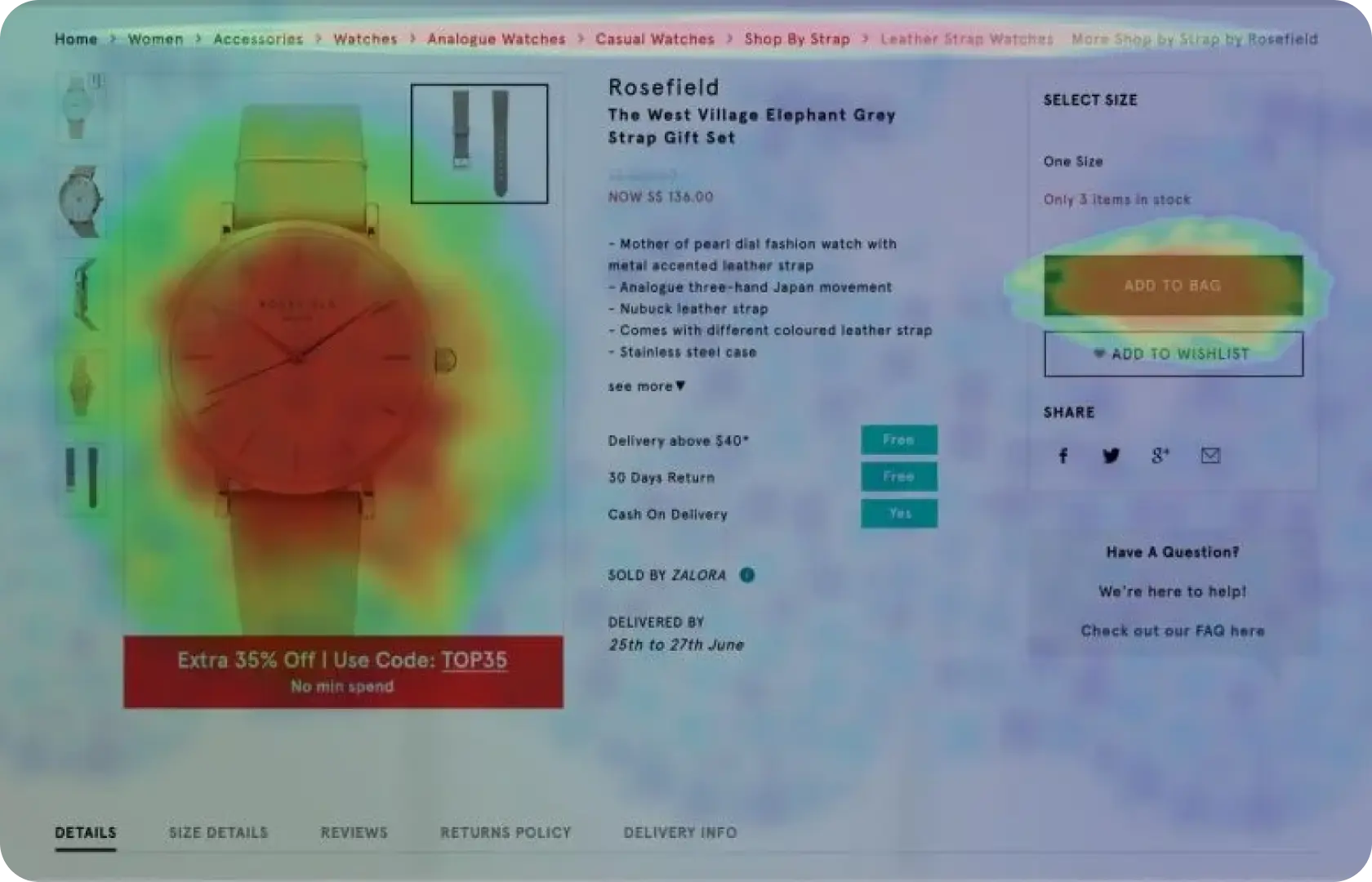
Heatmaps and Session Recordings
Numbers tell you where, but recordings tell you why. Heatmaps show the aggregate pattern of where buyers click, tap, and scroll on a page. A click heatmap that shows high engagement on a non-clickable image tells you buyers expect that image to do something. A scroll heatmap that shows 70 percent of mobile buyers leaving before they reach the add-to-cart button tells you the button needs to move up, not that there is a messaging problem below the fold.
Session recordings go deeper. Rather than aggregate patterns, they show individual buyer journeys. A buyer who loads the product page, scrolls down looking for something, scrolls back up, and then leaves without adding to cart. What were they looking for? The size guide? The return policy? Shipping costs? Watching enough sessions surfaces the answer, and it is almost always a specific piece of missing or hard-to-find information rather than a vague feeling that the page could be better.
At Suplex Design, we use Hotjar or Microsoft Clarity for heatmaps and session recordings. The tool choice depends on the store's size and the depth of analysis required. Microsoft Clarity is free and suitable for most stores. Hotjar provides more segmentation and filtering capability for stores where we need to isolate specific buyer cohorts.
Identifying and Prioritising Problems
The analytics will surface more problems than there is capacity to fix simultaneously. Prioritisation is the real discipline. We rank identified UX problems by two factors. Commercial impact, meaning how much fixing this is likely to move the conversion rate or average order value. And implementation effort, meaning how much design and development work the fix requires. High-impact fixes that are low effort come first. High-impact fixes that require significant development come next, with proper scoping. Low-impact fixes regardless of effort come last, or not at all.
This prioritisation prevents a common mistake, which is fixing the most visible or most complained-about problem rather than the one with the highest commercial return. The team's most persistent internal frustration is not always the buyer's biggest conversion barrier.
Testing and Iteration
Some changes are obvious enough to implement directly. Move a trust signal above the fold. Add a size guide link to the variant selector. Shorten a checkout form field that is asking for information the order process does not require.
Others are hypotheses that need testing before committing to a permanent change. When the fix involves meaningful design or copy changes, or when the data supports more than one plausible hypothesis about the cause, an A/B test produces better information than either guessing or debating. Tests are run through Optimizely, VWO, or Google Optimize depending on the store's setup and traffic volume, with pre-defined success metrics and a minimum runtime before calling a winner.
The output of each test feeds the next hypothesis. Over time, this cycle produces a store that has been shaped by actual buyer behaviour rather than the team's assumptions about it.

Tools Used in UX Analytics and Optimisation
Suplex Design uses GA4 for quantitative funnel analysis and event tracking, Hotjar or Microsoft Clarity for heatmaps and session recordings, Maze for moderated and unmoderated remote user testing where qualitative validation is needed, and Optimizely, VWO, or Google Optimize for A/B testing. Exit surveys are configured through Hotjar or through dedicated survey tools depending on the targeting requirements. All analytics setups are verified for accuracy before any analysis begins.
Is UX Analytics and Optimisation Right for You?
A few questions worth asking first like…Is the store live and generating traffic? If yes, the data exists and reading it properly is one of the highest-return activities available. If the store is not yet live, analytics setup is still the right investment, because the first few months of live data are the most informative and wasting them on poorly configured tracking is expensive in the long run.
Does the team know what is actually causing the conversion rate to be where it is? If the honest answer is no, that is the situation UX analytics is built for. The data is there. It just needs to be read correctly and acted on.
Is there design and development capacity to implement fixes? Analytics without the capacity to act on what is found is only half the value. If there is no bandwidth to change anything, the timing might not be right for a full analytics and optimisation engagement.
Common Mistakes in UX Analytics and Optimisation
The same ones. Consistently.
- Reading blended metrics rather than segmented ones. A blended conversion rate hides the device, source, and product-level differences that contain the actual information worth acting on.
- Not verifying the analytics setup before drawing conclusions from it. Incorrect event tracking produces incorrect data, and incorrect data produces confident decisions that make things worse rather than better.
- Using heatmaps and session recordings on the wrong pages. Most teams set these up on the homepage. The homepage is almost never where the conversion problem is. Product pages and checkout steps are where the data is most commercially relevant.
- Fixing the most visible problem rather than the highest-impact one. The most discussed internal issue is not always the biggest conversion driver. Prioritisation by commercial impact rather than team attention produces better outcomes.
- Running A/B tests that end early. A test called at 60 percent statistical confidence is not a test. It is a guess with extra steps. Tests need to run to significance on a pre-defined sample size, and that sample size needs to be calculated before the test starts, not when the team gets impatient.
- Treating analytics as a one-time setup rather than an ongoing practice. The first audit produces improvements. The discipline of reading the data monthly and iterating consistently is what produces compound gains over time.
Why UX Analytics and Optimisation Matters
A product that was launched without ongoing analytics and optimisation is a product that stops improving the moment it goes live. The design reflects what the team believed about buyers before launch. The data that arrives after launch contains the corrections. Most teams never fully read those corrections. The product stays as it was on day one, with tweaks made based on gut feel rather than evidence.
For D2C brands spending meaningfully on acquisition, this matters commercially. The same budget driving traffic to a store with a conversion rate of 1.5 percent and a store with a conversion rate of 2.5 percent produces a very different revenue outcome. That gap is not usually closed by spending more on ads. It is closed by understanding what is stopping the traffic from converting and fixing it.
Companies that treat analytics and optimisation as a continuous practice rather than a post-launch cleanup project see compounding improvements. Each iteration makes the next one more informed. Over twelve months of consistent work, the cumulative effect on conversion rate is considerably larger than what any single redesign project produces.
How Suplex Design Approaches UX Analytics and Optimisation for Your Brand
Every analytics engagement at Suplex Design starts by verifying the data before reading it and reading it properly before acting on it. There is ideally no standard report template and no generic list of things to fix. The problems are specific to the product, the buyer, and the traffic mix. The fixes follow from those specific problems.
Store live but not converting the way it should? Not sure what the analytics are actually telling you? Want the post-launch data to actually drive improvements? Get in touch with Suplex Design.

Frequently Asked Questions
What does UX analytics and optimisation from Suplex Design include?
Analytics audit and correct setup across GA4, heatmaps, and session recordings, funnel analysis by device and traffic source, identification and prioritisation of UX problems by commercial impact, A/B testing design and execution for high-value hypotheses, and implementation of confirmed improvements. For new stores, we also set up the full analytics stack before launch so the first months of data are usable.
How much does UX analytics work cost at Suplex Design?
An initial analytics audit and problem identification engagement typically starts from around $900 at Suplex Design. Ongoing optimisation retainers where we run the cycle continuously are scoped separately based on the depth of testing and implementation involved. We scope clearly before starting so both sides know what is included.
How long before we see results from analytics and optimisation work?
The audit and problem identification phase typically takes two to three weeks. Initial improvements from quick wins, the changes that do not require A/B testing, often show up in conversion data within four to six weeks. Compounding gains from sustained optimisation work over multiple iterations are visible over a three to six month period. This is not a one-sprint fix. The brands that see the biggest lifts are the ones that treat it as an ongoing practice.
Our analytics are already set up. Can you just help with the optimisation work?
Yes, though we will always verify the analytics setup before acting on it. We have encountered too many stores where the existing analytics looked correct but were producing inaccurate data because of tracking configuration issues. If the data is clean and the setup is verified, we move straight to reading and acting on it. If not, the audit comes first.
Do you provide ongoing support after the initial engagement?
Yes, absolutely. Suplex Design offers ongoing analytics and optimisation support for brands that want to run the cycle continuously. The value of this work compounds over time. A single engagement surfaces and fixes the most obvious problems. Ongoing work keeps finding the next layer of improvements as the product evolves and the traffic mix changes.
Let’s Make It Happen
Shopify Success Stories

AuraML
How Confetti helped AuraSIM shift from a simulation tool to the brand that makes physical AI feel ready for the real world.

Tea Culture of the World
How Suplex made 120 teas from across the world feel like a discovery rather than a decision.

Great Lakes
How Suplex built a full stack website for a Midwest tequila brand with a real production story.
Why Suplex?
World Class Aesthetics
.webp)
Profitable E-Commerce
.webp)
Build A Brand
.webp)
Build Your D2C Business The Right Way
Build It With Suplex.


