Global Aesthetic Audit
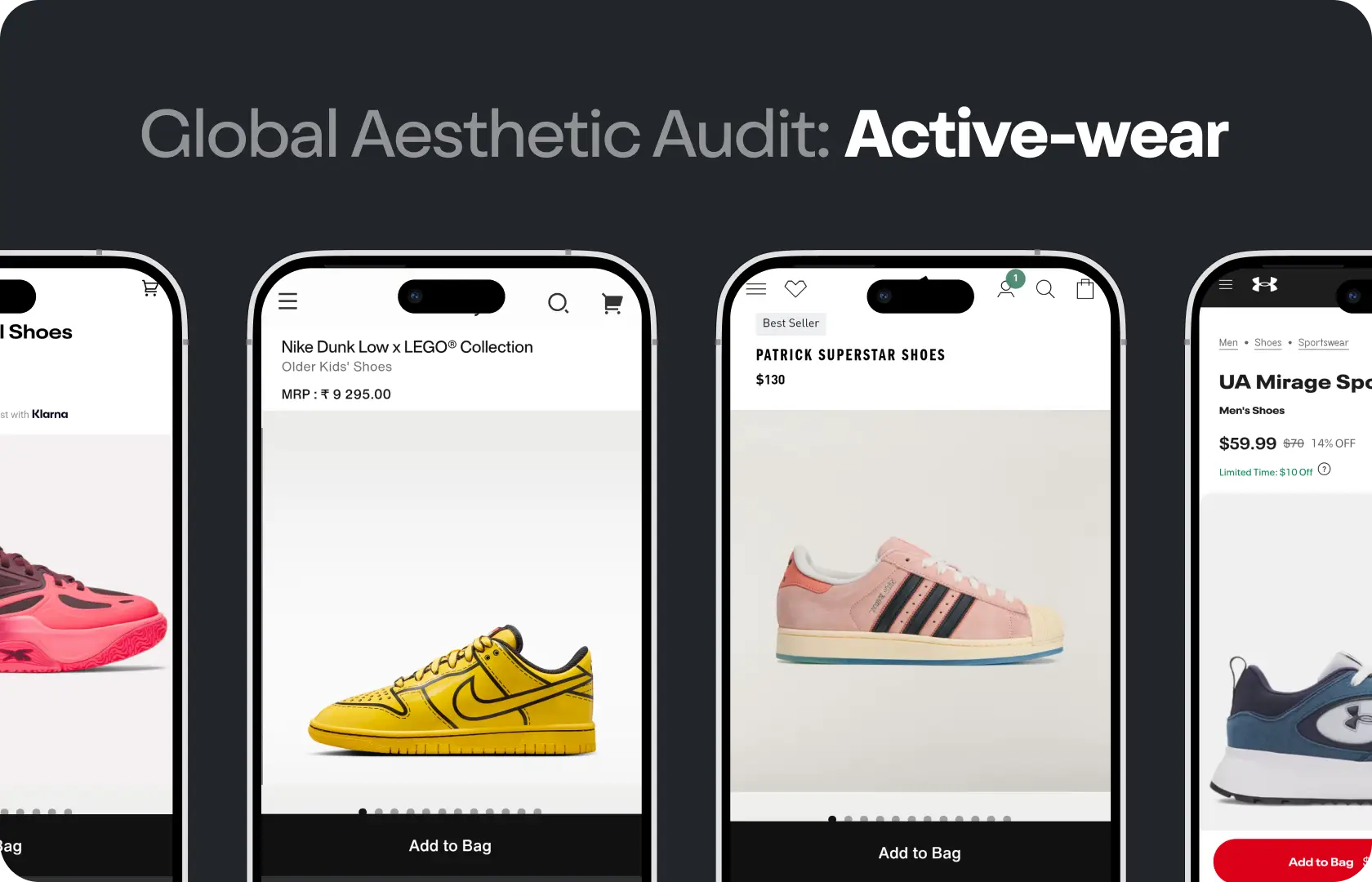
Global Aesthetic Audit in UI Design
When did you last look at your store the way a first-time buyer looks at it? Not someone who knows the brand, knows the product, and has context for every design decision that was made over the past two years. A person who has never heard of the brand, arrived from an ad or a search result, and is forming a view in the first three seconds about whether this is something worth their attention. That view is almost entirely visual. Before they have read a word of copy, before they have checked the price, the visual experience has already told them something about the brand.
The trouble is that the team closest to the product is the least able to see it this way. You stop noticing the inconsistencies. You know what the design is trying to communicate even when it is not quite communicating it. You have seen the homepage so many times that the hierarchy that confused the last round of user testers feels obvious to you. An aesthetic audit from Suplex Design is the outside view. Structured, specific, and honest about what is working and what is quietly undermining the visual credibility of the brand.
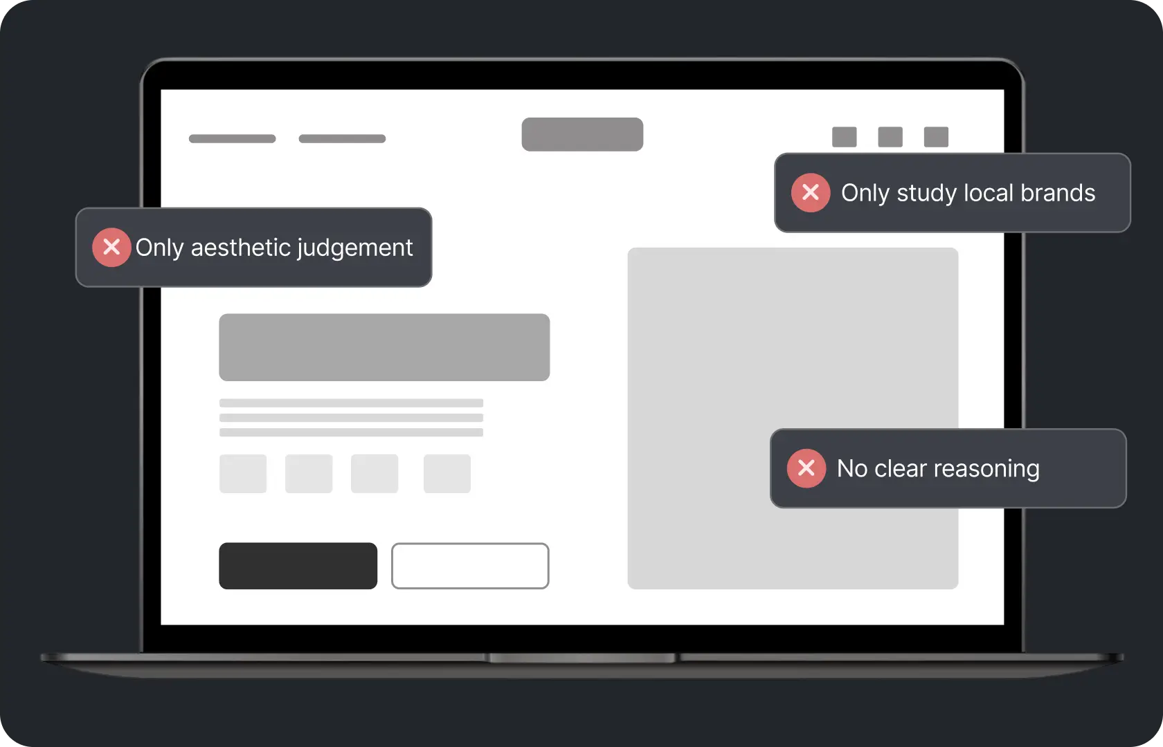
What a Global Aesthetic Audit Actually Is
A structured review of the visual experience as a buyer encounters it, across every key page type and on the devices the actual audience uses. Global in this context means comprehensive. It covers every surface and every page type rather than a review of the homepage alone. Collection pages. Product pages. Cart and checkout. Blog or editorial pages if they exist. Email templates. The experience does not start and end on the homepage and neither does the audit.
The audit looks at the visual design through a commercial lens. Not whether something is beautiful in the abstract but whether it is doing the job it needs to do. Whether it is building trust or eroding it. Whether it is directing attention to the right places or scattering it. Whether it looks like a brand a buyer can rely on or like something that was put together quickly and has not been revisited since.

How Suplex Design Runs a Global Aesthetic Audit
The audit is run as a buyer first and as a designer second. What that means in practice is that we go through the experience as a real buyer would, on real devices, before we start annotating design decisions. The buyer experience comes first. The design analysis follows from it.
Visual Hierarchy
Visual hierarchy is the organisation of visual elements so that the eye moves through a page in an order that supports the commercial goal.
On a product page, the hierarchy question is whether buyers are seeing the product clearly, understanding immediately what it is and who it is for, encountering the trust signals at the moment they need them, and reaching the call to action having had the right information in the right sequence. When the hierarchy is wrong, the page can contain everything a buyer needs and still not convert them, because the information arrived in the wrong order.
We review hierarchy on every key page type in the audit, on mobile first and then on desktop, noting any moments where the visual weight of elements does not match their commercial importance. An oversized decorative image drawing attention before the product name and price. A CTA buried below a lengthy description. Review stars placed below the fold on mobile where they cannot support the add-to-cart decision. Each of these is a hierarchy problem with a specific fix.
Visual Consistency
Inconsistency is a trust problem because when button styles differ between the homepage and the product page, when heading sizes are not following a clear typographic scale, when the spacing between elements varies without a discernible logic, the store starts to feel unfinished. Buyers cannot always name what bothers them about a design that lacks consistency. They just feel slightly less confident in the brand. That confidence reduction shows up in conversion rate.
The audit maps every significant inconsistency across page types. Button variants. Heading size application. Card layouts across collection grids. Form field styling. Navigation behaviour. Badge and label design. Spacing and padding. These are not small details when they compound across a full shopping experience. A fashion brand improved mobile conversions by 17 percent after adjusting font weights and CTA placement based on a UI audit finding. The change was small. The impact was not.
Typography and Legibility
Most typography problems on D2C stores are not visible on a large desktop monitor under good lighting. They are very visible on a mid-range Android phone, held at arm's length, under average indoor lighting.
Body text at 14px that looks fine on a 1440px display is genuinely hard to read on a 375px screen. Line lengths that work at desktop width create dense, hard-to-parse blocks of text when they collapse on mobile. Low contrast between text and background, particularly for product descriptions and return policy text, fails buyers who are reading quickly and fails accessibility standards at the same time.
Our team at Suplex Design tests typography legibility at real mobile sizes on real devices. We measure contrast ratios against WCAG AA standards where relevant. And we document every instance where the typographic choices are creating friction rather than clarity for a buyer trying to get the information they need.
Colour and Contrast
Colour does three things in a digital product. It carries brand identity. It directs attention. And it communicates meaning through convention, green for confirmation, red for error, muted tones for secondary information.
When colour is working well, all three of these functions are operating simultaneously without the buyer consciously noticing any of them. When it is not working, attention goes to the wrong places, the brand feels inconsistent, and actions that should feel easy become visually ambiguous.
The audit reviews how colour is being used across every page type. Whether the primary action colour is being reserved for primary actions or diluted by appearing on non-interactive elements. Whether the contrast between text and background is sufficient across all colour combinations used. Whether the colour palette is being applied consistently or accumulating variations that have drifted from the original system.
Imagery and Photography Quality
The photography on a D2C store does more work than most brands give it credit for. For a product a buyer cannot physically touch, the imagery is the product. The resolution, the lighting, the styling, the consistency across products, and the alignment between how the photography feels and the price point being asked. A premium skincare brand with flat, poorly lit product shots is telling buyers something about quality that no amount of copy can fully undo. A value brand with photography that looks more expensive than the product is creating expectations it cannot meet on delivery.
We review photography quality, consistency, and contextual appropriateness across the product range. We note where imagery is working as a trust builder and where it is creating doubt. We also flag technical issues like inconsistent background treatment, visible compression artefacts, and images sized incorrectly for their containers, all of which degrade the visual quality of the page independently of how good the underlying photography is.
Trust Signals and Their Placement
Trust signals only work if they appear at the moment the buyer needs them. Reviews, security badges, payment method logos, return policy summaries, brand press coverage, real-use photography. Each of these addresses a specific buyer hesitation. If they are placed below the fold on mobile, or after the call to action rather than before it, or in a visual format that does not draw the eye, they are present on the page but not doing their job.
The audit maps every trust signal on every key page type and evaluates whether its placement matches the moment of hesitation it is designed to address. On a product page, the return policy needs to appear before the buyer is asked to commit to adding to cart. A trust badge that appears in the footer has been placed where almost nobody looks.
The Output
The output of a Suplex Design aesthetic audit is a prioritised set of findings grouped by commercial impact and implementation effort. Quick wins that can be addressed in CSS or content changes come first. Structural changes that require design and development effort are scoped and sequenced separately. Every finding is explained in terms of what it is costing the brand commercially, not just what the design rule says it should be.

Tools Used in the Global Aesthetic Audit
Suplex Design uses Figma for documenting and annotating findings, real iOS and Android devices for testing the visual experience at the sizes and contexts buyers actually encounter, browser developer tools for measuring spacing and contrast, contrast checking tools for WCAG AA verification, and Hotjar or Microsoft Clarity for heatmap context where the client has these set up. We also review competitor benchmarks from the competitor analysis work where that has been done, because the audit findings are most useful when placed in the context of what the category is doing.
Is a Global Aesthetic Audit Right for You Right Now?
A few indicators that make an audit timely are that if the store has been live for more than a year and nobody has done a structured visual review. The product range or the brand visual identity has changed and the store has not been updated to reflect it. The store was built by developers rather than designers and the visual system was never properly established. The team suspects the store is visually below the standard of the category but cannot pinpoint specifically why or what to prioritise.
If the store was recently redesigned from scratch and is already visually consistent and well-structured, a full aesthetic audit is probably not the most valuable use of the budget right now. A focused review of a specific section, the checkout, the product page, the collection grid, might be more appropriate.
Common Mistakes That Aesthetic Audits Consistently Surface
The same ones. Almost every time.
- Typography that is legible on desktop and genuinely difficult to read on a mid-range mobile device, usually because the font size, line height, or line length was set for a large screen and never reviewed at small breakpoints.
- Call to action buttons that appear in multiple colour variants across different page types, eroding the visual signal that one colour = primary action.
- Photography that is inconsistent in treatment across the product range, particularly when new products have been added over time without maintaining the original photography style.
- Trust signals placed below the fold on mobile, after the add-to-cart button rather than before it, where they arrive too late to support the buying decision.
- Spacing that was set for desktop and creates either tight, cramped layouts or excessive whitespace on mobile without being reviewed at mobile sizes.
- Low contrast text that looks fine on a calibrated studio monitor and fails in average ambient lighting on a phone screen.
At Suplex Design, we find most of these in most stores we audit. Not because the teams that built them were careless. Because these problems accumulate over time as the store grows and nobody has done a comprehensive visual review from the outside.
Why a Global Aesthetic Audit Matters for D2C Brands
Visual credibility is trust before words. A buyer forms an impression about a brand in the first three seconds of encountering a page. That impression is almost entirely visual. It determines whether they read further, or scroll a little, or leave. The conversion rate downstream from that first impression is shaped by it.
For D2C brands competing in categories where buyers have multiple alternatives at similar price points, the visual experience is often the differentiator. Not the only one. But the one that shapes whether a buyer gives the brand enough of their attention to discover the product quality, the brand story, and the reason to choose this over the alternatives.
An audit does not produce a beautiful store by itself. What it produces is a clear picture of where the visual experience is working against the brand and a prioritised plan for fixing it. That plan, acted on, produces a store that builds the trust it needs to convert the traffic it has.
How Suplex Design Approaches Global Aesthetic Audits for Your Brand
Every aesthetic audit at Suplex Design is run against the specific brand, the specific category, and the specific audience. There is ideally no generic checklist applied uniformly to every store. The standards for visual credibility are different in premium skincare than in value fashion. The trust signals that matter in a high-consideration purchase differ from those in a low-cost impulse category. The audit reflects those differences.
Store live but not converting the way it should? Visual experience feels off but nobody can name specifically why? Want an honest external view before a redesign brief is written? Get in touch with Suplex Design.

Frequently Asked Questions
What does a global aesthetic audit from Suplex Design cover?
Visual hierarchy across every key page type, consistency of UI elements across the full experience, typography legibility at real mobile sizes, colour and contrast, photography quality and consistency, and trust signal placement and effectiveness. The output is a prioritised findings document that separates quick wins from structural changes, with commercial reasoning behind every recommendation.
How much does an aesthetic audit cost at Suplex Design?
A comprehensive aesthetic audit for a D2C store covering all key page types typically starts from around $800 at Suplex Design. Stores with large product ranges, multiple market variants, or app surfaces in scope cost more. We scope clearly before starting.
How long does a global aesthetic audit take?
Usually one to two weeks from start to delivery of the findings document, depending on the size of the store and the number of page types being reviewed. We do not rush this. An audit that misses the most commercially significant finding because it was done too quickly defeats the purpose.
Is this a UX audit or a UI audit?
It is a UI audit specifically. It focuses on the visual design layer, hierarchy, consistency, typography, colour, imagery, and trust signal placement. It does not cover user flows, information architecture, or conversion funnel analysis. Those are covered by separate UX audit and analytics engagements at Suplex Design. A full product review often involves both, and we can scope that if it is what is actually needed.
Can you help implement the changes after the audit?
Yes, absolutely. Suplex Design can handle design and development implementation of audit findings after delivery. A lot of our UI design engagements start with an audit and move into implementation. The audit tells us exactly what to fix and why, which makes the implementation work considerably more targeted than a redesign project started from a blank brief.
Let’s Make It Happen
Shopify Success Stories

AuraML
How Confetti helped AuraSIM shift from a simulation tool to the brand that makes physical AI feel ready for the real world.

Tea Culture of the World
How Suplex made 120 teas from across the world feel like a discovery rather than a decision.
Great Lakes
How Suplex built a full stack website for a Midwest tequila brand with a real production story.
Why Suplex?
World Class Aesthetics
.webp)
Profitable E-Commerce
.webp)
Build A Brand
.webp)
Build Your D2C Business The Right Way
Build It With Suplex.


