Mobile-First Design
Mobile-First Design in UI Design
Over 70 percent of global e-commerce traffic comes from mobile devices. In India, that number is higher. In the UAE it is close to 80 percent. And yet most D2C stores are still designed on a desktop screen, by a designer using a laptop, for a buyer who is almost certainly on a phone.
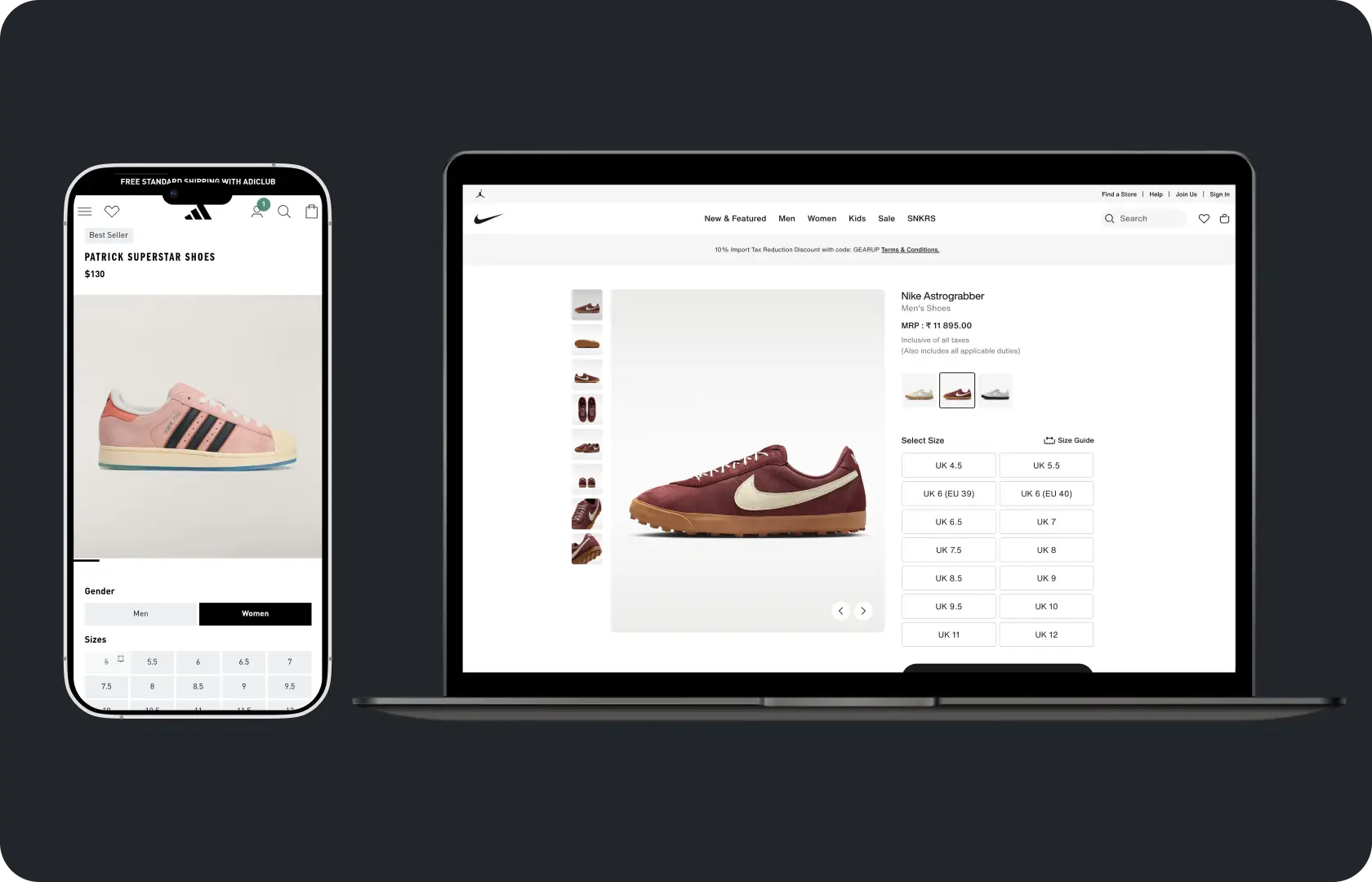
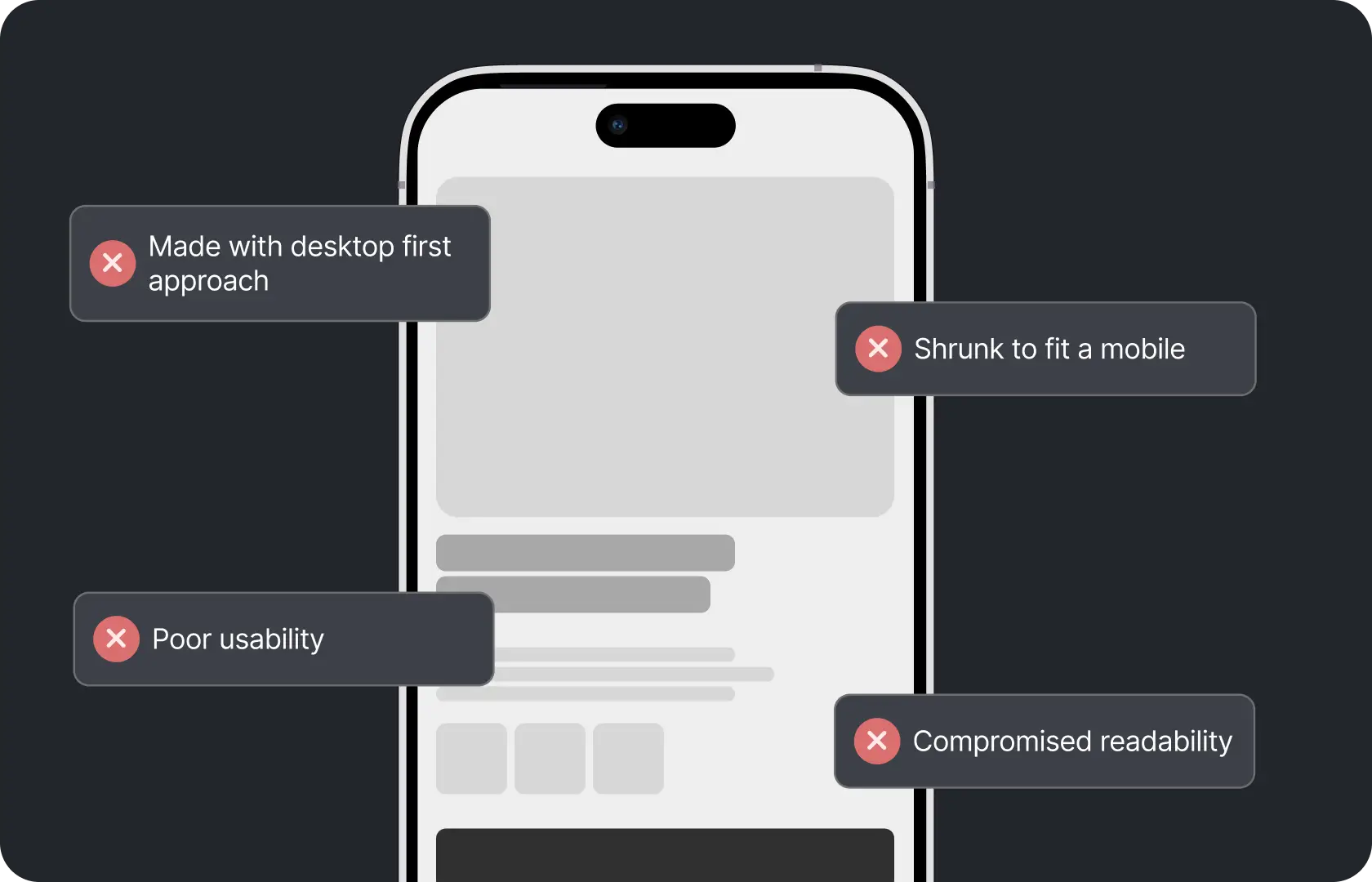
The result is a mobile experience that feels like a compressed desktop. Elements that were designed to sit side by side end up stacked. Type that was comfortable at 1440px becomes cramped at 375px. Buttons that were easy to click with a mouse require more precision to tap than a thumb naturally offers. The experience works, technically. But it does not feel like it was designed for the device the buyer is actually using.
Mobile-first design is not about making a store look good on mobile. It is about making decisions for mobile first, so the experience is genuinely designed for the context where most buyers encounter the brand, rather than adapted from a context they rarely use.
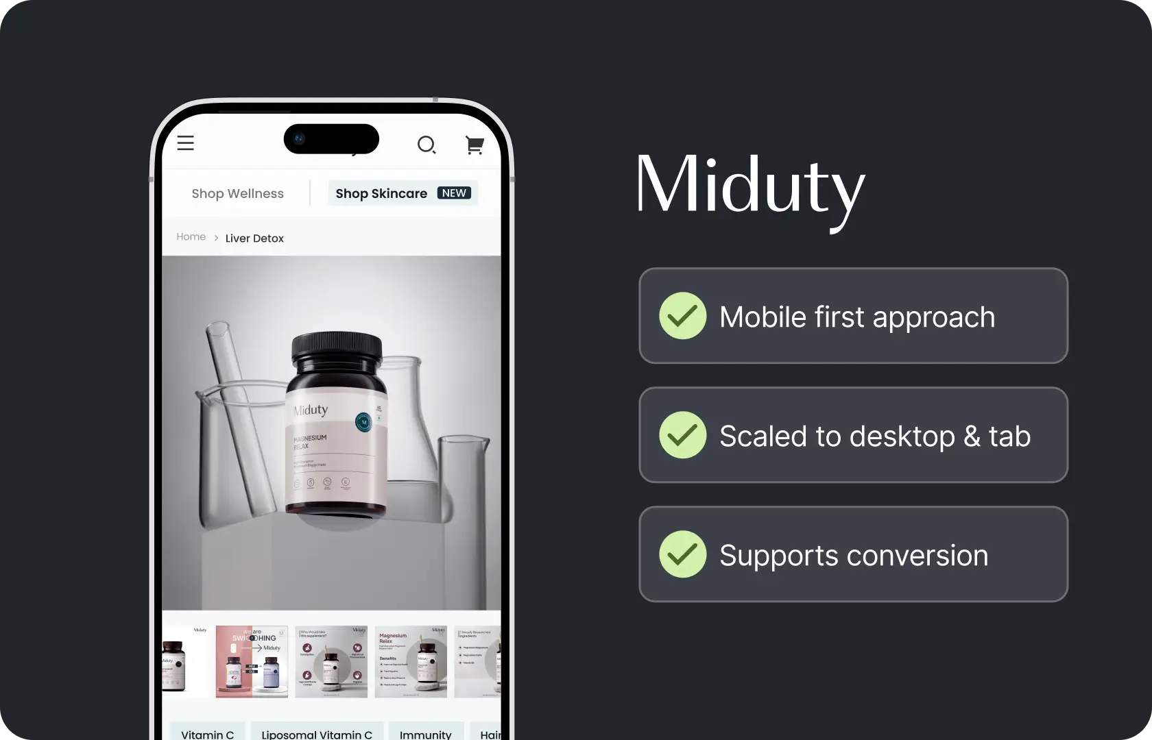
At Suplex Design, our team builds UI mobile-first as a default. Not as a responsive afterthought. The mobile layout is where the design thinking starts, and the desktop layout expands from it rather than the other way around.
What Mobile-First Design Actually Means
Not just a responsive site. Something more specific than that.
A responsive site resizes. A mobile-first design was made for mobile to begin with. The scroll order, the hierarchy, the tap target sizes, the content density, the way navigation is structured, the checkout flow, all of these are decided at the mobile stage because that is the primary context. Desktop is then the larger canvas version of decisions that have already been made.
The difference shows up in small ways that compound. On a responsive-scaled desktop design, the mobile product page hierarchy is often: hero image, product title, price, description, then add to cart. On a genuinely mobile-first design, the hierarchy is intentional: what does a buyer need to see first on a small screen to make a decision, and how does that sequence build confidence toward the action? Those are different questions and they produce different layouts.
How Suplex Design Approaches Mobile-First Design
Every design decision at Suplex Design starts on a 375px frame in Figma. Not because 375px is the only screen size that matters but because designing at the most constrained size forces hierarchy decisions that carrying upward naturally. When you have limited vertical space and a thumb as the primary input device, every element has to earn its position.
Hierarchy for the Thumb, Not the Cursor
A cursor is precise. A thumb is not.
Tap targets on mobile need to be large enough for confident interaction without requiring the kind of precision that a mouse naturally provides. Apple's Human Interface Guidelines recommend a minimum tap target size of 44 by 44 points. Google's Material Design guidelines put the minimum at 48 by 48dp. Most stores we review at Suplex Design have interactive elements significantly smaller than these thresholds, particularly in navigation and in cart and checkout interfaces.
Mobile-first design at Suplex Design means every interactive element is sized for comfortable thumb use before desktop styling is applied. Links that are too close together. Secondary nav items that require precise tapping. Quantity selectors that are too small to adjust reliably without accidentally triggering something else. All of these get caught and corrected at the mobile design stage rather than discovered during QA after the design has been built.
Scroll Order as Hierarchy
On desktop, multiple elements can share visual importance simultaneously. The layout handles them in two dimensions. On mobile, the scroll order is the hierarchy. What appears first gets the most attention. Full stop.
This makes the scroll order decision one of the most commercially important choices in a mobile-first design. On a product page: what does the buyer see when they land? What do they scroll to next? Where does the add-to-cart button appear relative to the trust signals that support the decision to add? Is the return policy visible before the buyer is asked to commit or after? Each of these is a scroll order question with a direct conversion implication.
At Suplex Design, scroll order decisions on mobile are made explicitly and documented in the wireframe before visual design begins. The visual design then expresses those decisions. It does not make them.
Navigation for Small Screens
Navigation on mobile is a fundamentally different problem from desktop navigation. A desktop site can have a persistent top navigation bar with multiple items visible simultaneously. On mobile, the navigation typically collapses into a hamburger menu or a bottom navigation bar, and the buyer has to actively choose to open it rather than scanning it passively.
This changes what needs to go in the navigation and how it is structured. Categories that a desktop buyer might discover by scanning the navigation need to be surfaced more actively on mobile, through homepage sections, collection page links, and search. The navigation architecture on mobile has to work with the reality that many buyers will never open the hamburger menu at all.
Our team of UX and UI designers at Suplex Design designs mobile navigation with this behaviour in mind. What do buyers who do not open the menu need to be able to find from the homepage and category pages directly? How is search positioned and styled to encourage use as a discovery tool rather than a last resort? How many levels of nesting can the navigation support before buyers stop drilling down and abandon the search entirely?
Typography and Content Density at Small Sizes
Content that works at desktop density does not work on mobile.
Paragraph text that is comfortable to scan at 1200px width becomes a wall of text when it collapses to 375px. Long product descriptions that a desktop buyer might skim in a sidebar become a scroll commitment on mobile that most buyers do not make. Image and text combinations that are balanced on desktop often stack awkwardly on mobile with too much dead space between them.
Mobile-first design means making content density decisions at the mobile stage. What is the right amount of text on a product page for a mobile buyer who is scanning, not reading? How does a two-column comparison grid translate to a single column stack without losing the comparative structure that made it useful? These are editorial and structural decisions, not just styling ones, and they need to be made deliberately rather than left to the responsive layout to figure out automatically.
Mobile Checkout Design
Checkout is where mobile-first design matters most commercially and where it is most often done least well.
A checkout flow that requires a buyer to type their full address into small text fields, switch between keyboards multiple times, and scroll up to correct errors they cannot see because the keyboard has pushed the form fields off screen is a checkout that is losing orders. Not occasionally. Consistently.
On Shopify's standard checkout, the customisation options are limited. On Shopify Plus with Checkout Extensibility, more is possible. In both cases, our team at Suplex Design reviews the mobile checkout experience with the specific lens of: what does a buyer on a phone with a keyboard open actually encounter at each step, and what can we do within the platform's constraints to make that encounter as frictionless as possible.
Autofill enabled. Address autocomplete configured. Pay with Apple Pay or Google Pay offered as prominent options to skip the manual address entry entirely. Progress indicators that tell buyers how many steps remain. Error messages that appear adjacent to the field rather than at the top of the page where they disappear above the keyboard. Each of these is a mobile checkout decision made at the design stage.
Testing on Real Devices
Browser responsive preview is not mobile testing.
A browser inspector simulates screen size. It does not simulate touch, scroll inertia, keyboard behaviour, or the processing speed of a real device. Designs that look and feel fine in a browser tool frequently have interaction problems on actual phones that are only visible when a real thumb is navigating a real screen on a device with real hardware constraints.
At Suplex Design, we test on real mid-range Android devices because that is the primary device profile for buyers in India and large parts of the UAE. We also test on current and previous-generation iPhones. We test at real font sizes, with real keyboards opening on form inputs, on real connection speeds. If something works in the browser and breaks on the device, the browser result is the false positive.

Tools Used in Mobile-First Design
Suplex Design designs in Figma starting at 375px mobile frames, with a shared component library built at mobile sizes and scaled for desktop. Prototyping is done in Figma for stakeholder review and user testing before development begins. Physical device testing is done on real iOS and Android hardware at multiple screen sizes. For performance review of mobile pages post-build, we use Google PageSpeed Insights, Lighthouse, and real-device Chrome dev tools to assess load time and interaction behaviour under realistic conditions.
Is Mobile-First Design What Your Store Needs?
Worth checking your analytics before answering.
If more than 60 percent of your traffic is on mobile, which it almost certainly is for a D2C brand targeting India, the UAE, the UK, or the US, and your mobile conversion rate is significantly below your desktop conversion rate, the gap is almost certainly a mobile design problem. Not a product problem. Not a pricing problem. A design problem.
If you are building a new product and have not yet designed anything, starting mobile-first from the beginning is the right approach. It does not take longer than designing desktop-first and adapting. It produces a better outcome for the majority of your buyers.
If your mobile experience already performs well and the conversion rate gap between mobile and desktop is small, mobile-first redesign is probably not the priority. A focused review of specific problem areas might be more appropriate than a comprehensive redesign.
Common Mistakes in Mobile Design
The same ones across every store we have reviewed.
- Designing on desktop and adapting to mobile as a final step, which produces mobile layouts that feel like smaller versions of the desktop rather than experiences designed for how people actually use phones.
- Tap targets that are too small for reliable interaction without the precision of a cursor, particularly in navigation, form fields, and cart interactions.
- Content density designed for a desktop reading pace that becomes overwhelming on mobile, where buyers are scanning rather than reading and have less patience for dense copy.
- Not offering accelerated checkout options like Apple Pay and Google Pay as prominent alternatives to manual address entry, which is the single most friction-heavy part of a mobile checkout.
- Testing mobile experience only in a browser responsive preview rather than on real devices, missing interaction problems that only appear under actual touch and keyboard conditions.
- Treating mobile as a single device type when the range from a small 375px iPhone SE to a 430px iPhone 15 Pro Max to a 768px tablet requires meaningfully different layout decisions.
At Suplex Design, mobile-first is the default. These mistakes are structural, not incidental, and they do not get corrected by responsive CSS alone.
Why Mobile-First Design Matters for D2C Brands
M-commerce is projected to account for over 4.5 trillion USD in global sales by the end of 2025. That is not a trend worth monitoring. It is the current reality of where buyers are and how they shop.
For D2C brands, mobile is not a secondary channel. It is the primary one. The buyer who sees an ad on Instagram is on their phone. The buyer who clicks through from an email is usually on their phone. The buyer who searches for the product after hearing about it from a friend is on their phone. A store that is designed primarily for desktop and adapted for mobile is designed for the minority of the purchase journey and adapted for the majority of it.
The conversion rate gap between a well-designed mobile experience and a poorly adapted one is significant. And unlike acquisition, which requires ongoing spend to maintain, a better mobile design improves conversion on every session from the day it goes live. It is a one-time design investment with a compounding revenue return.
How Suplex Design Approaches Mobile-First Design for Your Brand
Every mobile-first design project at Suplex Design starts at 375px in Figma and works upward. There is ideally no desktop concept that gets adapted down. The hierarchy, the scroll order, the navigation structure, the checkout flow, all of these decisions are made at mobile and expressed at desktop. The mobile buyer is the primary buyer. The design reflects that.
Mobile conversion rate lower than desktop? Building something new and want to get mobile right from the beginning? Current mobile experience feels like a compromise rather than a design? Get in touch with Suplex Design.

Frequently Asked Questions
What does mobile-first design from Suplex Design include?
UI design starting at 375px mobile frames in Figma, scroll order and hierarchy decisions made at mobile stage, tap target sizing for reliable thumb interaction, mobile navigation design, mobile checkout review and optimisation within platform constraints, typography and content density adapted for small screens, and testing on real iOS and Android devices before handoff to development.
How much does mobile-first UI design cost at Suplex Design?
It depends on the scope. A focused mobile-first redesign of the key conversion pages, product page, collection page, and checkout, typically starts from around $1,500 at Suplex Design. A full mobile-first UI design for a complete D2C store or app costs more. We scope clearly before starting so the cost reflects what is being delivered.
Is mobile-first design different from responsive design?
Yes, and the difference matters. Responsive design means the layout adapts across screen sizes. Mobile-first means the layout was designed for the smallest screen first and scaled upward. A responsive site can be designed desktop-first and still technically respond to mobile. Mobile-first means the design decisions were made with mobile as the primary context, which produces a better mobile experience than desktop-first adaptation does.
Do you design for specific mobile devices or just screen sizes?
Both. We design at standard breakpoints, 375px, 390px, 430px for common mobile sizes and 768px for tablet, but we also test on real physical devices. A mid-range Android device and a current iPhone behave differently in ways that screen sizes alone do not capture, particularly around keyboard behaviour, scroll inertia, and touch responsiveness. Real device testing is part of every mobile-first engagement at Suplex Design.
Do you provide support after the mobile-first design goes to development?
Yes, absolutely. Suplex Design stays involved through the development phase to review mobile implementation against the designs, test on real devices as components are built, and flag anything that drifts from the intended mobile experience before it ships. Mobile implementation frequently introduces small discrepancies that are easy to fix during development and harder to fix after launch.
Let’s Make It Happen
Shopify Success Stories
AuraML
How Confetti helped AuraSIM shift from a simulation tool to the brand that makes physical AI feel ready for the real world.

Tea Culture of the World
How Suplex made 120 teas from across the world feel like a discovery rather than a decision.
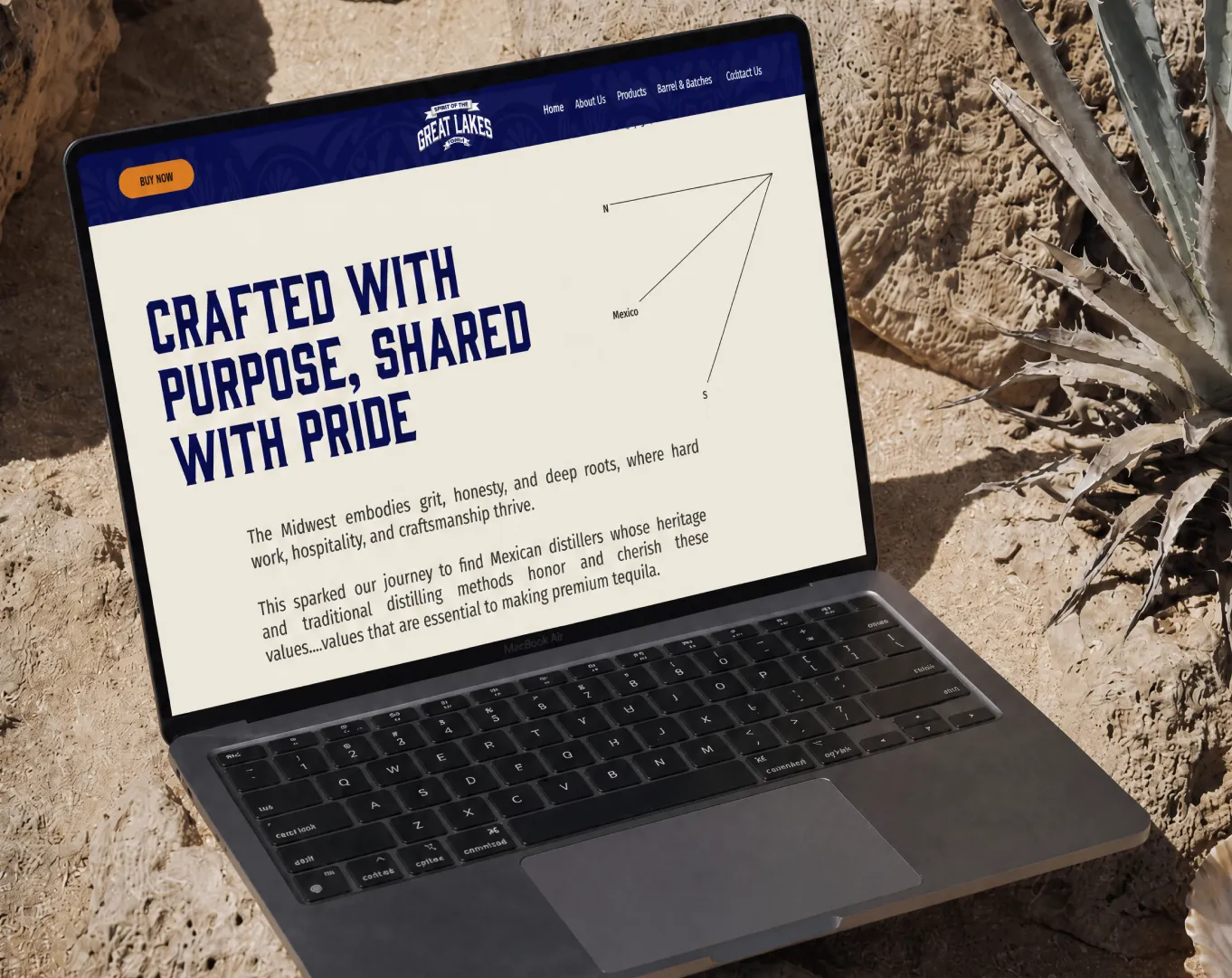
Great Lakes
How Suplex built a full stack website for a Midwest tequila brand with a real production story.
Why Suplex?
World Class Aesthetics
.webp)
Profitable E-Commerce
.webp)
Build A Brand
.webp)
Build Your D2C Business The Right Way
Build It With Suplex.


