Responsive Design
Responsive Design in UI Design
Responsive is one of those words that gets used so often it has started to lose meaning.
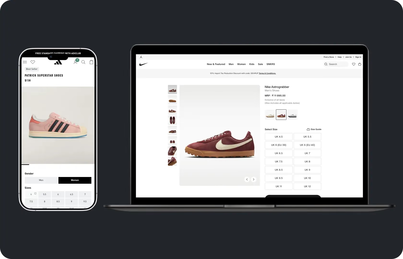
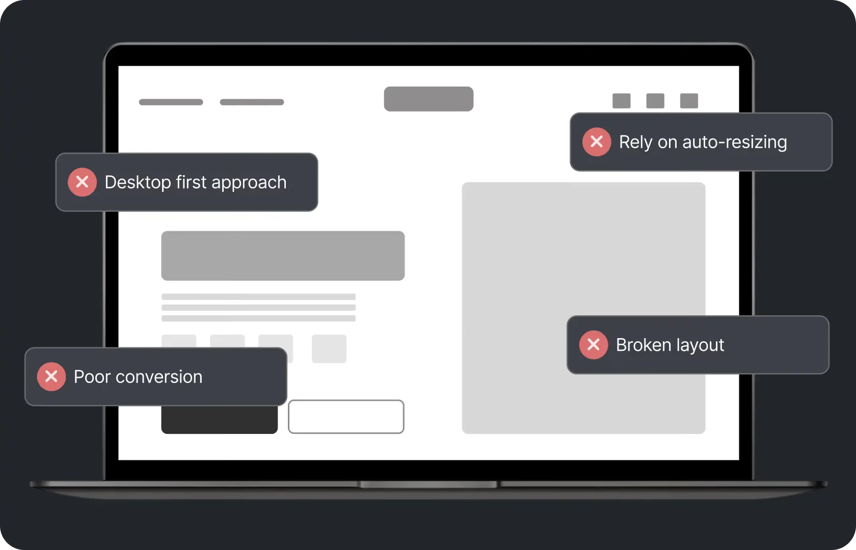
Most stores built in the last five years are technically responsive. They resize when the screen changes. The layout does not break at mobile sizes. The images scale. The navigation collapses into a hamburger. And yet anyone who has reviewed session recordings of buyers on phones knows that technically responsive and genuinely good on mobile are not the same thing. A layout can resize and still create friction. Content can collapse into a single column and still be in the wrong order for the device. Tap targets can be present and still too small to hit reliably.
Responsive design done properly is not about making a layout resize. It is about making deliberate decisions at each breakpoint about how the content should be presented, prioritised, and interacted with given the specific context of each screen size. Those decisions cannot be made automatically by CSS. Someone has to make them.
At Suplex Design, responsive design is a design discipline, not a development checkbox.
What Responsive Design Actually Requires
Three things working together. Fluid layout. Flexible content. Deliberate breakpoints.
Fluid layout means the grid adapts across screen sizes using relative units rather than fixed pixel widths, so the proportional relationship between elements is maintained as the viewport changes rather than elements overflowing their containers or snapping awkwardly.
Flexible content means images scale within their containers, text wraps cleanly at any width, and embedded media like video adjusts to the available space without breaking out of its parent element.
Deliberate breakpoints are the design decisions. At which specific screen widths does the layout need to change, and how does it change? A three-column product grid that works at 1280px needs a different structure at 768px and a different one again at 375px. Each of those transitions is a design decision, not a default. The choice of when to break and what to do at each break shapes the experience more than any single screen size does.

How Suplex Design Approaches Responsive Design
Content-first. Then layout. Then breakpoints where the layout needs to change.
This sequence matters more than it sounds. A common mistake in responsive design is defining breakpoints around device sizes, designing for each device as a separate target, and hoping the space between those targets takes care of itself. What that produces is a design that works at the exact sizes it was tested at and breaks in between. Content-first breakpoint design instead asks: at what point does this layout start to look wrong or feel cramped, and what needs to change at that point? The breakpoint is defined by the content's behaviour, not by a device specification.
Breakpoint Strategy
In 2025 and 2026, the range of screen sizes a D2C store needs to serve is wider than it has ever been.
Small phones at 320 to 375px. Standard phones at 390 to 430px, which is where the majority of mobile traffic lands. Large phones at 430 to 480px. Tablets in portrait at around 768px. Small laptops and tablets in landscape at 1024px. Standard desktops at 1280 to 1440px. Large screens at 1920px and above. Each of these has different spatial constraints, different typical content expectations, and different interaction patterns.
At Suplex Design, breakpoint strategy is defined before visual design begins, as part of the IA and wireframing work. We identify which transitions are the most commercially significant for the specific product, typically the mobile to tablet transition and the tablet to desktop transition, and make those breakpoint decisions explicitly rather than leaving them to the responsive framework defaults. For most D2C stores, the mobile breakpoints are where the most careful attention is needed because that is where the most buyers are.
Component-Level Responsiveness
Page-level responsive design is not enough.
A product card that works in a four-column grid on desktop needs a different structure when it appears as a single full-width item on mobile. A navigation bar that shows five items horizontally on desktop needs a completely different architecture on mobile. A hero section that places text beside an image on desktop typically stacks them vertically on mobile, but whether the image goes above or below the text and how much of each is shown depends on which is more important to the buyer at that screen size.
At Suplex Design, component-level responsiveness is designed in Figma with explicit variants for each key breakpoint. Not just desktop and mobile. The intermediate sizes as well, particularly for tablet, which is often the most overlooked breakpoint and the one where layout decisions between the mobile and desktop approaches are most likely to produce something that feels awkward at both rather than good at either.
Typography Across Breakpoints
Type that is comfortable to read at desktop does not automatically read well at mobile sizes.
Heading sizes that work at 1440px are often disproportionately large on mobile, pushing content below the fold before a buyer has seen enough to make a decision. Body text that is legible at a comfortable desktop reading distance can be too small on a phone held at arm's length. Line lengths that work at 1200px column width become very long on tablet if the type scale has not been adjusted at the tablet breakpoint.
A typographic scale for a responsive design has different values at each breakpoint. Not just the base size but the heading hierarchy, the line height, the letter spacing, and the maximum line length. Our team of UI designers at Suplex Design defines these at each breakpoint in the design system rather than treating typography as a single set of values that applies everywhere. Fluid typography using CSS clamp is also considered for projects where the development stack supports it, since it allows type to scale continuously between breakpoints rather than jumping at defined widths.
Images and Media
An image that is the right size on desktop is almost certainly too large a file to be loading on mobile.
Responsive images mean serving different image sizes at different breakpoints. Not the same image scaled by CSS. Different source files, sized appropriately for the viewport, delivered via srcset attributes so the browser requests the right file for the screen it is rendering on. A desktop hero image at 1440px wide might need to be 2880px wide to look sharp on a retina screen. Serving that same file on a 375px mobile screen is serving approximately 15 times more image data than the mobile context requires, and the buyer is paying for that in load time.
Responsive design at Suplex Design includes image breakpoint specifications as part of the design deliverable. We document which image sizes are needed at each breakpoint and at what density, so the development team implements srcset correctly rather than defaulting to a single image file that is either too large for mobile or too small for retina displays.
Interaction Patterns by Device
Hover states are a desktop concept. Tooltips triggered on hover do not exist on touch screens. Dropdown menus that open on hover require a tap-then-tap-again interaction on mobile that few buyers will bother with. These are not edge cases. They are consistent interaction differences between pointer-based and touch-based devices that responsive design needs to account for.
Our team at Suplex Design designs interaction states for both input types. Hover states are defined for desktop. Active and focus states are defined for touch. Navigation patterns that use hover on desktop are redesigned for tap interaction on mobile rather than adapted. Tooltips that rely on hover are replaced with toggleable information panels or inline text on mobile. These decisions are made in the design, not left for development to figure out in CSS.
Testing Across Real Breakpoints
Browser responsive inspector tools are useful for initial review. They are not a substitute for real device testing.
At Suplex Design, we test responsive designs on real iOS and Android devices at multiple screen sizes before sign-off. We look at what actually happens when a keyboard opens on a form field and whether the submit button remains accessible. We look at how images load on a realistic mobile connection speed. We look at whether scrolling behaviour feels natural or whether there are momentum scroll issues on iOS. We look at how the layout handles system font size changes when a buyer has increased their phone's text size in accessibility settings.
None of these are visible in a browser preview. All of them affect the buyer experience.

Tools Used in Responsive Design
Suplex Design works in Figma with explicit breakpoint variants at 375px, 390px, 768px, 1280px, and 1440px as standard, with additional breakpoints defined where the content requires them. Component libraries are built with responsive variants at each key breakpoint. Physical iOS and Android devices are used for testing, alongside BrowserStack for coverage across device and browser combinations not available in the studio. For implementation, we work with the development team to ensure srcset image breakpoints, fluid typography where applicable, and container queries where the tech stack supports them.
Is a Responsive Design Review Right for You?
A few situations where it is.
Your store was built several years ago and the responsive behaviour was never properly reviewed or updated. Device screen sizes have shifted significantly since 2020 and layouts built for the device landscape of that year often have problems at the sizes common in 2025 and 2026.
Your mobile conversion rate is significantly below your desktop rate and you have already ruled out the obvious causes like checkout friction and product page hierarchy. Responsive layout problems at specific breakpoints can create friction that is invisible in desktop testing and very visible in mobile session recordings.
You are building a new product and want to get the responsive behaviour right from the beginning rather than retrofitting it after the visual design is completed.
Common Mistakes in Responsive Design
Consistent. Predictable. Often discovered after launch.
- Defining breakpoints around specific device sizes rather than around where the content breaks. This produces designs that work at the exact sizes tested and look awkward in between.
- Designing for desktop and mobile only, skipping tablet breakpoints entirely. Tablet traffic is a smaller proportion of mobile traffic but represents a meaningfully different layout context that desktop layouts often handle poorly.
- Serving the same image file at all screen sizes, delivering unnecessarily large files to mobile devices and slowing load times without any visual benefit.
- Leaving hover-state interactions in place on mobile where they create confusing tap-twice behaviour for a function that should be accessible with a single tap.
- Using fixed pixel values for type and spacing rather than relative units, which makes the layout rigid rather than genuinely fluid between breakpoints.
- Testing responsive design only in a browser inspector rather than on real devices, missing keyboard, scroll, and touch interaction problems that only appear under real mobile conditions.
At Suplex Design, responsive design is reviewed at real breakpoints on real devices as a standard part of the design process, not as a QA step at the end of development.
Why Responsive Design Matters for D2C Brands
The device landscape for D2C buyers has never been more fragmented. A brand targeting buyers in India is reaching people on a wider range of screen sizes and device capabilities than a brand targeting the US or UK, where the device range is narrower and the average device is more capable. A buyer on a Jio 4G connection on a mid-range Realme phone has a completely different interaction context from a buyer on a fibre connection on a MacBook Pro. Both deserve an experience that was designed for them.
Responsive design is the design discipline that makes that possible. Not by building different products for different devices. By making design decisions at each breakpoint that reflect the constraints and expectations of the buyer in that context.
For D2C brands investing in paid acquisition across markets, responsive design quality has a direct effect on campaign ROAS. Traffic from a mobile ad that lands on a poorly responsive product page converts at a lower rate than the same traffic landing on a well-responsive one. The ad cost is identical. The conversion rate is not. The difference is in the design.
How Suplex Design Approaches Responsive Design for Your Brand
Every responsive design project at Suplex Design starts with breakpoint strategy before visual design begins, and ends with real device testing before handoff to development. There is ideally no assumed device list and no default breakpoint structure. The breakpoints are defined by the content and by where the traffic actually comes from for the specific brand.
Existing store with responsive problems you cannot pinpoint? Building something new and want the responsive behaviour designed properly from the start? Get in touch with Suplex Design.

Frequently Asked Questions
What does responsive design work from Suplex Design include?
Breakpoint strategy defined before visual design begins, component-level responsive variants at each key breakpoint in Figma, typographic scale decisions at each breakpoint, image breakpoint specifications for correct srcset implementation, interaction pattern design for both pointer and touch input, and real device testing on iOS and Android before handoff. For existing stores, a responsive review identifying where the current layout is creating friction at specific breakpoints.
How much does responsive design work cost at Suplex Design?
A focused responsive review and fix for an existing store typically starts from around $900 at Suplex Design. A full responsive design built into a new product from the beginning is scoped as part of the overall UI design engagement. We scope clearly before starting so the cost reflects the actual scope.
How is responsive design different from mobile-first design?
Mobile-first is a design philosophy: start at the smallest screen and scale up. Responsive is the technical and design implementation of that: fluid layouts, flexible content, and deliberate breakpoints that work across every screen size. At Suplex Design, we do both. Mobile-first is where we start. Responsive design is how we ensure it works across the full range of devices the brand's buyers are using.
How many breakpoints should a D2C store design for?
Typically four to five for most D2C stores: small mobile around 375px, standard mobile around 390 to 430px, tablet at 768px, standard desktop at 1280px, and large desktop at 1440px. Additional breakpoints are added where the content specifically requires them. The principle is to add a breakpoint where the layout starts to look wrong, not to cover every device size on a list. We define this during the breakpoint strategy phase before design begins.
Do you provide support during development to ensure responsive implementation is correct?
Yes, absolutely. Suplex Design stays involved during development to review responsive implementation against the design specifications, test on real devices as components are built, and flag breakpoint issues before they go live. Responsive problems that are caught during development are straightforward CSS changes. The same problems found after launch require a development sprint to fix and may have been affecting conversions in the meantime.
Let’s Make It Happen
Shopify Success Stories

AuraML
How Suplex helped AuraSIM shift from a simulation tool to the brand that makes physical AI feel ready for the real world.

Tea Culture of the World
How Suplex made 120 teas from across the world feel like a discovery rather than a decision.

Great Lakes
How Suplex built a full stack website for a Midwest tequila brand with a real production story.
Why Suplex?
World Class Aesthetics
.webp)
Profitable E-Commerce
.webp)
Build A Brand
.webp)
Build Your D2C Business The Right Way
Build It With Suplex.


