User-Flow Design
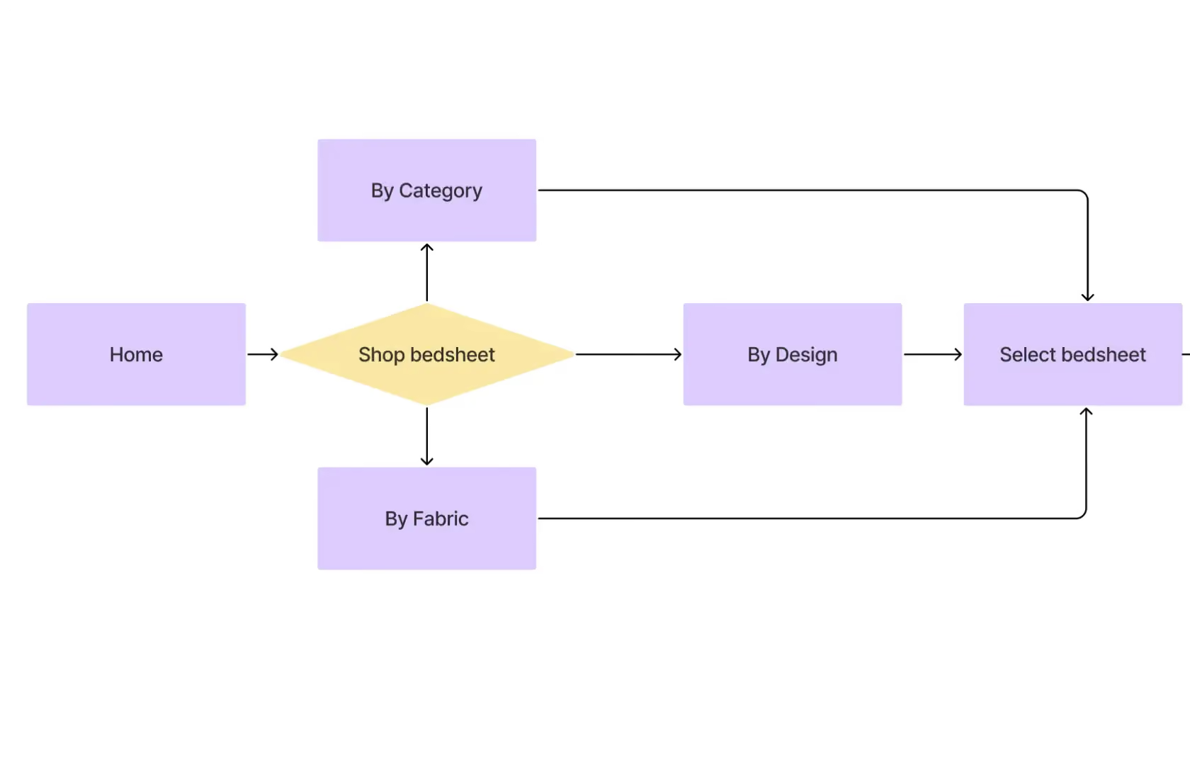
User Flow Design in UX
Most conversion problems are not what they look like. A brand sees low add-to-cart rates and assumes the product page needs a redesign. A brand sees high checkout abandonment and decides to add more trust signals. But the decision to change is made before anyone has mapped what buyers are actually doing when they navigate the store. What specific path they took to get to that page. What happened at the moment they dropped off. What question was left unanswered right before they left.
That is a user flow problem and it actually looks like a dozen other problems until someone maps it. At Suplex Design, our team maps user flows for D2C and e-commerce brands before making any changes to the product. Not afterwards. The mapping is what tells us where the problem actually is, which is usually not where the team assumed it was.
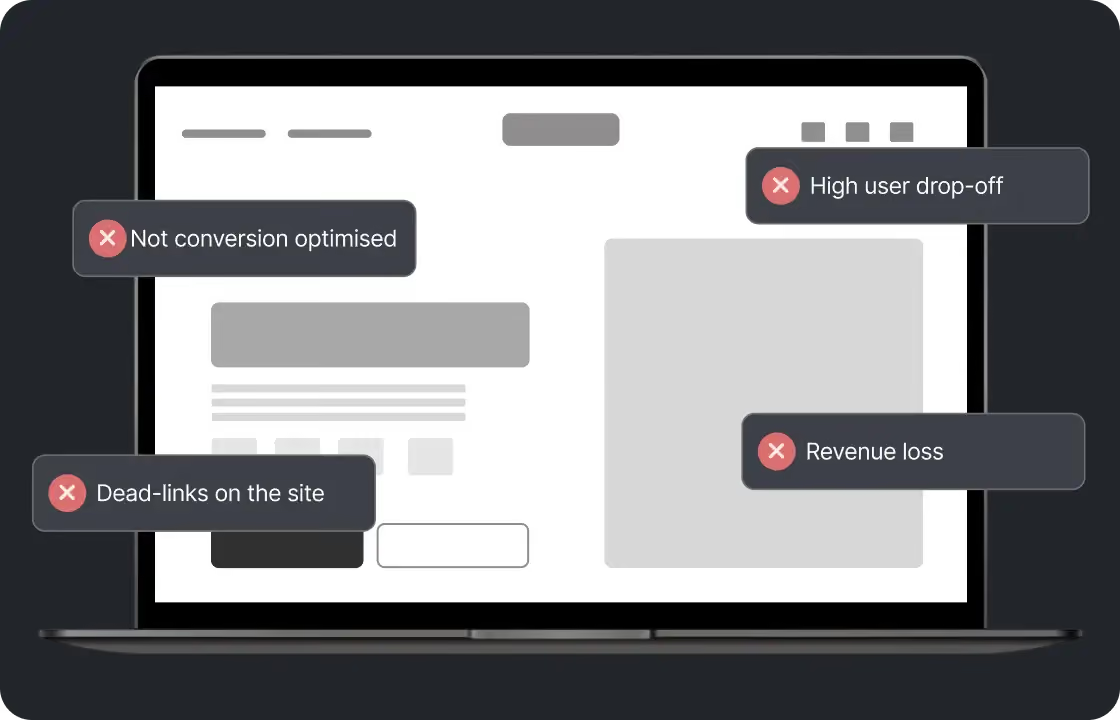
What a User Flow Actually Is
A user flow is the sequence of steps a real buyer takes from their entry point to the action the brand wants them to complete.
Not an idealised path or the journey the team designed the product around, but the path real buyers actually take, including the wrong turns, the backtracking, the moments of hesitation, and the points where they leave.
Talking about the distinction between user flows and related concepts, it is worth being clear. A user journey is the full picture of a customer's relationship with a brand across all touchpoints and over time. A task flow is the most granular version, the specific steps to complete a single action. A user flow sits in between. It covers the decision process a buyer goes through to accomplish a specific objective, like finding and purchasing a product, from a specific entry point, like a paid ad landing on a collection page.
For D2C e-commerce, the flows that matter most are usually four. Discovery to product page. Product page to checkout. Checkout to order confirmation. And post-purchase to repeat visit. Every one of these has decision points where buyers choose to continue or leave. Every one of them has moments where the design either supports that decision or creates friction around it.

How Suplex Design Approaches User Flow Design
You will find that a lot of flow work gets done on whiteboards by people who know the product well. At Suplex Design, our team works differently. We start from user behaviour data before we start from assumptions. What the analytics say about where buyers are actually going. What heatmaps and session recordings show about what they are actually doing. What exit surveys reveal about what they were thinking when they left. The flows we map reflect reality first. Then we redesign them.
Current Flow Audit
Before mapping what the flow should be, we map what it actually is. We use GA4 funnel reports and path exploration tools to trace how buyers are currently moving through the store. Which entry points are producing the most traffic. Which pages buyers are visiting before they add to cart or abandon. Which checkout steps are losing the most people and at what rate. This data is available to most brands. It is rarely used to its full potential because nobody has sat down and mapped it into an actual flow diagram.
We layer qualitative data on top. Session recordings from Hotjar or Microsoft Clarity show what specific buyers did on specific pages. Not aggregate behaviour. Individual journeys. That distinction matters because aggregate data can hide the specific patterns that are causing the most damage. A session recording of twelve buyers all stopping at the same moment on a product page tells you something an average time-on-page metric cannot.
Identifying the Breaks
Every flow has breaks. Places where the design asks buyers to do something that does not feel natural at that moment. A checkout that requests account creation before showing the price. A product page that puts the add-to-cart button below the fold on mobile. A navigation path that sends buyers into a dead end when they try to backtrack.
Some of these are obvious once you look. Others require the current flow to be mapped in full before the pattern becomes visible. We have reviewed stores at Suplex Design where the team had been aware of a high cart abandonment rate for months without realising that a single friction point in the checkout, an unexpected field requesting information most buyers considered unnecessary, was responsible for the majority of it. The break is not always at the point where buyers drop off. It is often one or two steps before it, at the moment the decision to leave was actually made. Good flow analysis traces backwards from the drop-off point to find where the problem started.
Redesigning the Flow
Once the current flow is mapped and the breaks are identified, we redesign the flow before touching any screens.
Flow redesign is not visual. It is structural. It asks: what information does the buyer need at each step to feel confident enough to take the next one? What decision are they making here, and what would make that decision easier? What is being asked of them at this moment, and is this the right moment to ask it?
A checkout that asks for an account before showing shipping costs is asking the buyer to commit before giving them the information they need to commit. Moving account creation to after the order confirmation is a flow change. It does not require a redesign. Just a different sequence. But it consistently improves checkout completion rates because it removes the request at the moment of highest friction.
At Suplex Design, flow decisions like this are made and documented before wireframes begin. The wireframes then express the flow, rather than the flow being figured out during wireframing. That sequence produces better outcomes and fewer revisions.
Mapping Flows for Each Entry Point
A buyer who arrives from a paid ad landing on a specific product page is not on the same flow as a buyer who arrives from organic search and lands on a collection page. Both need to reach checkout, but the path, the prior context, and the information they have already been given are different. Designing as if they are the same buyer is a mistake most stores make.
Our team at Suplex Design maps flows separately for the key entry points the brand drives traffic to. Homepage. Collection pages. Product pages via paid social. Product pages via organic search. Each flow starts from the entry point with the actual context a buyer from that source would have. The product page for a cold traffic buyer who has never heard of the brand needs to do more work than the same page for a retargeting audience who has already visited the site twice.
Mobile Flow Review
A flow that works on desktop often has different problems on mobile. Not just visual ones. Structural ones.
The sequence of information on a mobile screen is determined by scroll order. What appears first gets the most attention. What is below the fold on mobile gets significantly less. A trust signal that sits beside the add-to-cart button on desktop appears well below it on mobile if the layout stacks vertically. The signal arrives after the decision point rather than before it. Same content, different flow. Different conversion result.
We test flows on real devices because this kind of problem is invisible in a browser responsive preview and very visible in practice. Talking about the scale of the issue, over 70 percent of e-commerce traffic arrives on mobile in most of the markets Suplex Design works in. Getting the mobile flow right is not secondary work. It is the primary job.

Tools Used in User Flow Design
Suplex Design uses Figma for documenting and sharing user flow diagrams, GA4 and Shopify Analytics for quantitative flow data, Hotjar and Microsoft Clarity for heatmaps and session recordings, and Maze for remote user testing of proposed flows where the project scope includes validation with real buyers. Flows are documented as annotated diagrams rather than lists of steps, because visual representation makes the decision points and branches easier to review and challenge with the wider team.
Is User Flow Design Right for You Right Now?
Honestly, it depends on where the problem is. Building something new? Map the flows before wireframing. Every time. Wireframes built on an unmapped flow end up expressing a structure the team assumed was right rather than one that has been validated against how real buyers behave.
Running an existing store with conversion problems? A flow audit is often the fastest way to find out what is actually causing them. Not a redesign, not a new campaign, not a different product photography style. Just mapping what buyers are doing and where they are stopping.
No conversion problem and everything performing well? Probably not the moment for a full flow project. Though a review of the mobile flow for your top-traffic product pages is almost always worth doing. We have never done one at Suplex Design that did not surface at least one thing worth fixing.
Common Mistakes in User Flow Design
Consistent across every store we have reviewed. Without exception.
- Mapping ideal flows rather than actual ones. The team documents how the store was designed to be used, not how buyers are actually using it. These are consistently different, and the gap between them is where most conversion problems live.
- Treating checkout as a single step rather than a sequence of decision points. Each screen in the checkout is its own micro-flow with its own friction risks. Analysing checkout as a block rather than as a series of individual moments misses most of what is happening.
- Designing flows for a single entry point and applying them everywhere. A buyer arriving from a brand search has a completely different prior context from one arriving from a cold traffic paid ad. The flow needs to account for that difference.
- Skipping mobile flow review. The flow on mobile is structurally different from the desktop flow in ways that matter commercially. Reviewing only one is reviewing half the problem.
- Fixing the wrong step. Drop-off data shows where buyers leave. It does not show where the decision to leave was made. Those are often different points in the flow, and fixing the drop-off point without fixing the actual cause produces changes that do not move the numbers.
At Suplex Design, flow work is structured to catch all of these before any wireframing begins. Because redesigning a flow is a whiteboard conversation. Redesigning a wireframe is a project.
Why User Flow Design Matters for D2C Brands
Every break in a flow is a conversion that did not happen. At enough volume, those unconverted sessions are a significant revenue number. And the uncomfortable thing about flow problems is that they do not disappear on their own. They compound. Every buyer who abandons at the same friction point is a signal the store has been sending for weeks or months without anyone reading it.
For D2C brands investing in paid acquisition, flow quality has a direct multiplier on ad spend efficiency. The same ad driving traffic to a store with a clean flow and a store with a broken one produces a different number of orders. Not a different quality of traffic. The same traffic. Just a different conversion rate because the flow either supports the decision to buy or creates friction around it.
For brands building new products, user flow design before wireframing is one of the most reliable ways to avoid expensive revisions later. The earlier a structural problem is found in a design process, the cheaper it is to fix. Finding it in the flow diagram costs a conversation. Finding it in a finished wireframe costs a redesign. Finding it after development costs a rebuild.
How Suplex Design Approaches User Flow Design for Your Brand
Every flow project at Suplex Design starts from data, not from assumptions. The current behaviour first. The problems identified from that behaviour second. The redesigned flow third. And wireframes only once the flow is agreed. That sequence is not how most flow work gets done. It is why the work we do produces fewer surprises downstream.
Conversion lower than it should be and not sure where the actual problem is? Building something new and want flows mapped before the wireframes begin? Get in touch with Suplex Design.

Frequently Asked Questions
What does user flow design from Suplex Design include?
A current flow audit using GA4 and session recording data, identification of the specific breaks and friction points in each key journey, redesigned flows documented as annotated diagrams before wireframing begins, and separate mobile flow review across real devices. For new products we also map flows from each key entry point before any screen design begins.
How much does user flow design cost at Suplex Design?
A focused flow audit and redesign for one or two key journeys typically starts from around $800 at Suplex Design. Projects covering the full set of flows across a complex store or app with multiple entry points and user types cost more. We scope clearly before starting so the number reflects what is actually being delivered.
How long does user flow design take?
Usually one to three weeks depending on the number of flows being mapped and whether user testing is included to validate the redesigned versions. A focused flow audit for a specific problem in an existing store is towards the shorter end. A full flow mapping exercise for a new product across all entry points takes longer. We confirm the timeline during scoping.
Do you map flows for apps as well as web stores?
Yes. The process is the same regardless of the surface. What changes is the platform-specific interaction conventions and the technical constraints that affect what sequences are possible. A mobile app checkout flow has different structural options from a Shopify web checkout, and the flow documentation reflects those differences rather than applying a generic template.
Can you help fix a specific flow problem without redesigning the whole store?
Yes, and this is actually one of the more common engagements at Suplex Design. A focused flow audit on the checkout, or the product page to add-to-cart journey, or the post-purchase retention flow, can surface and fix specific problems without touching anything else. The scope is defined by where the commercial problem is, not by an assumption that everything needs to be reviewed at once.
Let’s Make It Happen
Shopify Success Stories
AuraML
How Suplex helped AuraSIM shift from a simulation tool to the brand that makes physical AI feel ready for the real world.

Tea Culture of the World
How Suplex made 120 teas from across the world feel like a discovery rather than a decision.

Great Lakes
How Suplex built a full stack website for a Midwest tequila brand with a real production story.
Why Suplex?
World Class Aesthetics
.webp)
Profitable E-Commerce
.webp)
Build A Brand
.webp)
Build Your D2C Business The Right Way
Build It With Suplex.


