12 Signs Your Ecommerce Website Needs a Redesign (+ Decision Guide)
.avif)
12 Signs Your Ecommerce Website Needs a Redesign (+ Decision Guide)
If your store's conversion rate is falling, bounce rate is climbing or checkout completions are dropping, your site design is likely part of the problem. Most ecommerce brands wait too long.
They treat a website like a one-time project rather than a commercial asset that needs to perform. By the time the symptoms are obvious, you've already lost revenue you'll never recover.
This article walks you through 12 concrete signs that point to a redesign, and ends with a decision framework to help you figure out exactly what level of change your store needs.
Sign 01: Your Conversion Rate Is Low and Getting Worse
Your CVR is the single most important commercial metric on your site. It tells you what percentage of visitors are actually buying. The global ecommerce benchmark sits at roughly 2.5–3%. Anything below 1% is a problem worth taking seriously.
The mistake most brands make is assuming low CVR is a traffic problem. It usually isn't. Pull your funnel data in GA4 and look at where users drop off. If the exit happens on product pages, the issue is likely trust or information quality.
If it's at checkout, it's almost always friction too many steps, not enough payment options, or forced account creation.
What to check in GA4:
- Purchase funnel: session → product view → add to cart → checkout → purchase
- Drop-off percentage at each stage
- Device breakdown, mobile vs desktop CVR gap often reveals mobile UX problems
In the UAE and broader Gulf market, mobile-first shoppers are highly comparison-driven. A slow or confusing experience doesn't just cost you a sale. It sends that customer directly to a competitor who makes the experience easier.
A conversion rate optimization audit, done before any design work begins, is the starting point for every ecommerce redesign project Suplex takes on. Design decisions made without data tend to solve the wrong problems.

Sign 02: Your Site Is Slow and Users Won't Wait
Page speed isn't a technical nice-to-have. It's a revenue variable. A 1-second delay in load time reduces conversions by approximately 7%. At scale, that's significant money.
Google's Core Web Vitals Largest Contentful Paint (LCP), Interaction to Next Paint (INP) and Cumulative Layout Shift (CLS) are now confirmed ranking signals. Your site's performance directly affects where you appear in search results.
What the benchmarks look like:
Test your site at Google PageSpeed Insights and run it on mobile, most ecommerce traffic in the UAE is mobile-first and mobile scores are nearly always worse than desktop.
The most common causes of poor scores are uncompressed images (the biggest offender by far), excessive JavaScript from third-party apps and widgets, shared hosting that buckles under traffic spikes, and bloated themes generating too many HTTP requests on every page load.
These are solvable problems, but in many cases they require structural changes rather than surface-level fixes which is why they show up as a redesign trigger rather than a quick patch.
Sign 03: Your Mobile Experience Is Broken
As per Statista, over 80% of ecommerce purchases are made on mobile. If you're still treating mobile as a secondary experience, you're designing for the minority and losing the majority. Your mobile experience is the experience and it needs to be treated that way from the start of any design process, not as an afterthought.

Responsive Design and Mobile-First Design Are Not the Same Thing
There's a distinction most brands miss, and it matters commercially. A responsive site adjusts its layout to fit smaller screens it was designed for desktop and adapted down. A mobile-first site is designed for small screens from the start, then scaled up.
The UX quality gap between the two approaches is significant, especially in complex flows like checkout and product filtering.
A Technically Responsive Site Can Still Be Completely Broken on Mobile
Tap targets too small to press without zooming in, navigation collapsed into a hamburger menu with too many nested levels, horizontal scrolling that cuts off content, images taking four seconds to load on a mobile connection, checkout forms that fail to trigger the correct keyboard type all of these are mobile UX failures that responsive CSS alone won't fix.
They require intentional design decisions built around how a person actually uses a phone to shop. These are exactly the problems that drive mobile CVR into the ground while desktop numbers look acceptable, masking the real scale of the issue in aggregate data.
Google's Mobile-First Indexing Makes the Damage Compound
Google primarily crawls and indexes the mobile version of your site. A poor mobile experience doesn't just frustrate users, it suppresses your organic rankings, reducing the number of customers who find you in the first place.
Sign 04: Your Design Looks Outdated and Shoppers Notice
The reason visual design matters commercially isn't aesthetics for their own sake, it's trust. Nielsen Norman Group research shows users form design judgements within 50 milliseconds of landing on a page. T
hat snap judgement happens before they've read a word or seen a product. It's involuntary, and it's heavily influenced by visual presentation quality.
In Premium Markets, a Dated Website Creates Immediate Credibility Doubt
In markets like the USA, UK, Dubai and Abu Dhabi, where consumers interact daily with premium international brands both online and in flagship retail environments, a dated website creates immediate credibility doubt.
The mental calculation a shopper runs is straightforward: if this brand hasn't invested in its own presentation, should I trust it with my money and data?
The Signs of an Outdated Design Aren't Always Dramatic
Inconsistent typography across pages signals a site assembled over time rather than designed as a system. Heavy use of generic stock photography strips out authenticity. Cluttered above-the-fold layouts that try to announce too many things at once push users to leave rather than engage.
A visual language that predates flat and minimal UI conventions, drops shadows on every element, gradient buttons, skeuomorphic icons dates the site even when the products are current.
The absence of clear visual hierarchy, where nothing guides the eye toward the primary CTA, leaves users deciding where to look rather than what to do next.
The Damage Is Most Severe at Premium and Mid-to-High Price Points
If your product is priced at AED 300 and your site looks like it was built in 2014, that gap between price and presentation creates friction most customers won't push through.
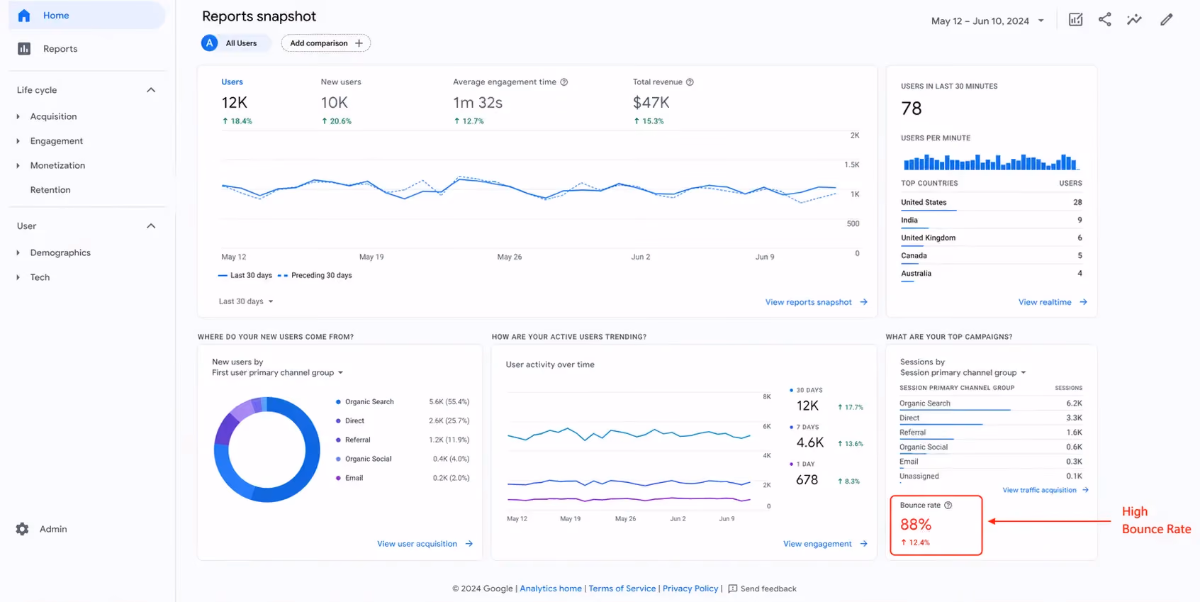
Sign 05: Your Bounce Rate Is High and Users Leave Without Engaging
For ecommerce, a bounce rate above 55–65% is worth investigating. Before you treat any number as alarming, understand what GA4 means by an unengaged session: a session lasting less than 10 seconds with no conversion event and no second page view.
That specific metric is what you should track and act on, not a broad session count.
High Bounce Rates Almost Always Trace Back to a Small Set of Causes
Weak above-the-fold content gives users no clear reason to keep scrolling, no value proposition, nothing that communicates "you're in the right place." A slow First Contentful Paint means the page takes too long to render anything useful and users leave before content loads.
A mismatch between what your ads promised and what the landing page delivers a user who clicked a specific product offer and arrived at a generic homepage will leave immediately. And the absence of a legible reason to buy here versus Amazon.ae or Noon, which in the UAE is the baseline comparison most shoppers are running before they've scrolled once.
Before Commissioning a Redesign, Watch What Real Users Actually Do
Install Microsoft Clarity, it's free and provides session recordings and heatmaps without developer involvement. Watch what real users do in the first 10 seconds on your most-visited pages.
The recordings consistently reveal behaviour that no analytics dashboard surfaces, and they'll either confirm a design problem or point to a traffic quality issue that a redesign won't fix.
Sign 06: Your Checkout Process Loses Customers
The global average cart abandonment rate is 70.19% (Baymard Institute). Some abandonment is unavoidable, people browse without intent to buy. But a significant portion of that 70% is caused by checkout friction that a redesign can fix.
Some of that abandonment is unavoidable. People browse and compare without intent to purchase immediately. But a significant share of that 70% is caused by checkout friction that a redesign can directly fix, and that's where recoverable revenue sits.
The Most Damaging Checkout Failures Are Well Documented
Forced account creation before purchase is the single biggest drop-off trigger. Many users will not create an account to complete a first purchase with an unfamiliar brand, regardless of how good the product is.
Too many form fields, especially when shipping and billing addresses are treated as separate forms with no address lookup, adds unnecessary steps at exactly the moment a user's intent is highest.
Delivery costs that only appear at the final confirmation step create a trust violation that abandonment data consistently confirms. A checkout that doesn't save progress if a user is interrupted will lose a meaningful share of mobile users who switch apps mid-purchase.
The MENA-Specific Gap Is Where Most Sites Leave the Most Money
Cash-on-delivery remains a preferred payment method across the Gulf, particularly in Saudi Arabia and among first-time online shoppers in the UAE who haven't yet built trust with a new brand.
Buy-now-pay-later platforms, Tabby and Tamara have substantial market penetration in both the UAE and KSA. These are not niche options for a small audience.
For certain product categories, a checkout that excludes them is a checkout that structurally underperforms in this market.
Payment Infrastructure Your Customers Expect Needs to Be Present
Suplex Design builds Tabby and Tamara integration as standard for UAE and GCC-focused ecommerce stores. The payment infrastructure your customers expect needs to be present before the experience can be considered complete.
Sign 07: Your SEO Rankings Are Dropping
Design and SEO share infrastructure. A poorly designed site creates ranking problems that quality content alone cannot solve, because the problems are structural rather than editorial.
Duplicate product pages without canonical tags, broken internal links from old migrations, missing structured data on product and category pages, slow server response times and Core Web Vitals failures that trigger Google's page experience signals each of these is an architectural problem.
Publishing more blog posts or adding more products won't fix them.
A Poorly Managed Redesign Can Undo Years of Ranking Progress
The risk most brands underestimate is what a poorly managed redesign can do to existing rankings.
A site that has accumulated domain authority, quality backlinks, and ranking pages over several years can lose a large share of its organic traffic within days if a platform migration doesn't include proper 301 redirect mapping from old URLs to new ones. Google doesn't automatically connect your new URL structure to the old one.
Without explicit redirects in place before launch, the ranking equity of every old URL is abandoned. Recovering from that typically takes months and costs significantly more than the SEO audit would have cost upfront.
The Technical SEO Work Needs to Happen Before Design Begins, Not After
When Suplex runs an ecommerce redesign, the technical SEO audit and full redirect mapping are completed before design begins.
Rankings built over years shouldn't be handed back to a competitor because a migration wasn't planned properly.
Sign 08: Your Site Doesn't Reflect Your Current Brand
Businesses evolve faster than websites do. Products change, positioning shifts, price points rise, and the customer profile you're targeting in year five looks different from year one.
When your website still reflects the company you outgrew two or three years ago, the disconnect affects how both returning and new customers perceive you.
The Homepage Is Usually Where the Gap Is Most Visible
Messaging that references products or audience segments you've moved away from, imagery that doesn't match your current product quality or updated packaging.
A colour palette that contradicts your offline brand assets and a tone of voice in the copy that no longer represents how the brand communicates today.
All of these signal stagnation to a visitor who knows nothing else about your business.
This Is a Distinct Issue From Visual Design Dating Though the Two Often Appear Together
A site can be visually modern and still carry outdated brand positioning. A site can receive a visual refresh and still speak to the wrong customer with the wrong message.
Both problems need to be addressed together which is why a redesign that updates UX and structure without revisiting the brand expression underneath often produces results that feel incomplete and don't move the commercial metrics they were meant to.
Sign 09: Your Product Pages Don't Convert
Product pages are where the sale is won or lost. They are the most commercially critical pages on your site, and most ecommerce brands significantly underinvest in them compared to the homepage.
A High-Converting Product Page Requires Several Elements Working in Combination
Multiple high-quality images covering different angles, lifestyle context, and zoom capability give buyers the confidence to purchase something they can't physically inspect.
Customer reviews and ratings positioned prominently not buried below a long description provide the social proof that influences decision-making.
A clear, visible CTA above the fold on mobile means users don't need to scroll past three paragraphs of copy to take action.
Product copy that anticipates and addresses the top three objections a buyer has, rather than reciting a feature list copied from a manufacturer spec sheet, does the actual selling work.
Cross-sell and upsell logic that surfaces genuinely relevant products contributes meaningfully to average order value.
Signs of a Failing Product Page Are Straightforward to Spot
A single image from a supplier catalogue, no reviews section or zero entries on an established product, generic descriptions that could apply to any product in the category, no related products logic and an add-to-cart button that requires significant scrolling to reach on mobile each of these is a conversion problem with a known fix.
In the GCC Market, Social Proof Carries More Weight Than in Many Western Ecommerce Contexts
Peer recommendations and visible customer ratings directly influence purchase behaviour, particularly for first-time buyers encountering a brand they haven't purchased from before.
A product page with zero reviews even if the product is excellent and the design is clean carries a trust deficit that shows up directly in its conversion rate.
Sign 10: Your Site Isn't Integrated With Current Tools
This is the most consistently under-covered sign in competing articles on this topic and it's the one that most often forces a rebuild rather than a redesign.
It also tends to affect brands that have grown and whose sites haven't kept pace with the operational complexity that growth creates.
Older Ecommerce Sites Accumulate Tool Layers That Eventually Break Down
A CRM connected via manual CSV export. A loyalty platform that requires admin intervention to update. An analytics setup that needs developer involvement to generate any non-standard report.
An inventory system that doesn't communicate with the storefront in real time, creating stock discrepancy problems that customer service teams spend hours managing every week.
At some point, the cost of maintaining those workarounds in developer time, operational friction and lost revenue from the errors they produce exceeds what any plugin or patch can fix.
The Warning Signs Are Operational, Not Just Technical
Teams doing manual CSV exports to sync inventory between the store and a warehouse system. A developer is required for basic tasks like setting up a discount rule.
A platform running on an end-of-life version with no security updates.
Real-time personalisation or multi-currency pricing being structurally impossible on the current architecture without prohibitively expensive custom development.
At This Point, a Like-for-Like Redesign on the Existing Platform Won't Be Sufficient
This is where headless commerce architecture becomes worth exploring and separating the frontend experience layer from the backend commerce logic allows either to be updated independently.
Modern tools to be integrated without platform constraints and the business to scale without hitting the architectural ceiling that monolithic platforms impose.
Suplex handles platform consultation as part of its scoping process for this reason. The right platform decision has to precede the design work, not follow it.
Sign 11: Your Competitors Have Overtaken You Online
You don't need a gut feel for this. It's measurable, and the audit takes less than an hour.
Run a competitor's URL through PageSpeed Insights and compare the scores against yours directly.
Browse their site on mobile and time the full path from the homepage to a completed purchase, noting every friction point. Examine their product page structure.
How many images are shown, where social proof sits, where the CTA is on mobile. Use SimilarWeb's free tier to estimate their organic traffic trend against yours over the past six to twelve months. The comparison will show you exactly where the gap is and how large it has become.
In the UAE, the UX Benchmark Has Been Raised Sharply
Amazon.ae, Noon and Namshi alongside international DTC brands that have entered the Gulf market with localised digital experiences have reset what shoppers expect.
Independent retailers competing in the same categories cannot win on price alone against players with the logistics infrastructure and brand recognition these platforms carry.
The experience has to be good enough to justify buying from a smaller, less familiar brand and in 2026, that means fast, mobile-optimised, trustworthy, and frictionless all the way through checkout.
If a Competitor Has a Better Site Than Yours, a Share of Your Customers Are Already Going to Them That is not a marketing problem or a pricing problem. It's a product problem and in ecommerce, your website is the product.
Sign 12: Your Site Has Security and Compliance Issues
This sign gets almost no coverage in competing articles and it carries the highest legal and reputational exposure of any issue on this list.
The Security Failures Are Visible to Users and Penalised by Google
An expired SSL certificate triggers a "Not Secure" browser warning that stops the vast majority of users before they've seen a single product.
Conversion on a flagged page drops to near zero. HTTP-served pages within an otherwise HTTPS site create mixed content errors that browsers surface visibly and that Google treats negatively.
Outdated CMS plugins with known vulnerabilities are actively targeted by automated bots if your site is running extensions that haven't been updated in eighteen months, the risk is real.
The absence of a Content Security Policy header leaves you exposed to cross-site scripting attacks that can inject malicious code into your pages without any visible alarm.
WCAG Accessibility Standards Are Gaining Legal Relevance Across GCC Markets
Designing for accessibility, proper colour contrast ratios, full keyboard navigability, screen reader compatibility is no longer a consideration limited to large enterprise brands.
A redesign is the correct moment to close these compliance gaps. Addressing them after launch costs significantly more in both development time and potential legal exposure.
Redesign vs. Refresh vs. Rebuild: Which Do You Actually Need?
Most articles on this topic give you a list of symptoms and leave you to work out the right solution on your own. This section closes that gap with a clear decision matrix.
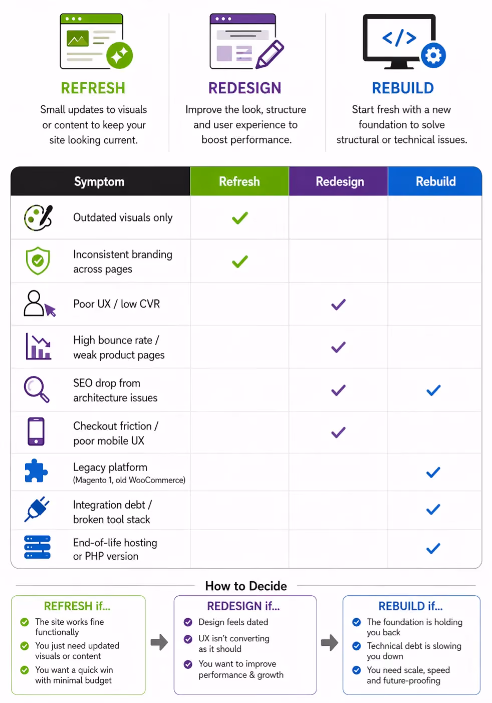
What each option means in practice:
Refresh: Surface-level updates: new colour palette, updated imagery, font changes. No changes to structure, navigation, or platform. Takes 2–4 weeks. Works only when the underlying UX and architecture are sound.
Redesign: Rethinking UX, layout, information architecture, and conversion flows. Involves wireframing, user flow analysis, and full visual design. The platform stays the same. Takes 6–12 weeks depending on scope.
Rebuild: New platform, new architecture, new everything. Necessary when the current platform is limiting the business. Takes 3–6 months. More complex migrations multi-language, multi-currency, large catalogue take longer.
Phased approach: If a full rebuild isn't viable right now, prioritise the pages with the most commercial impact. Homepage, product detail pages, and checkout account for the majority of conversion.
Redesigning these three before touching the rest of the site is a lower-risk way to start recovering CVR without a full shutdown.
How Suplex Approaches Ecommerce Redesigns
Suplex is a design-led ecommerce studio based in Dubai, UAE. The work spans UX strategy, UI design, Shopify development, and conversion optimization for brands ranging from D2C health and wellness to F&B, fashion, and consumer goods across the UAE and internationally.
The process doesn't start with design. It starts with a commercial audit looking at where the site is losing money, what the funnel data says, and what the mobile experience actually feels like before a single wireframe gets drawn. Design decisions made without that foundation tend to be expensive guesses.
Clients include Miduty (D2C nutraceuticals), Kimi Cafe (Dubai mobile app) and a growing portfolio of UAE and international ecommerce brands. The work spans Shopify builds, custom Shopify themes, conversion rate optimization and full platform rebuilds.
If you recognise more than three of these signs in your store, it's worth having a conversation. See what Suplex does →
Frequently Asked Questions
How often should you redesign your ecommerce website?
Every 3–5 years is a reasonable baseline, but time isn't the right trigger. If your bounce rate is rising, conversions are falling, or Core Web Vitals are failing, act sooner regardless of when the last redesign happened. Waiting for a calendar milestone while your CVR drops is an expensive choice.
How much does an ecommerce website redesign cost in the UAE?
A UX refresh starts from roughly AED 15,000–30,000. A full redesign with custom development ranges from AED 50,000 to AED 250,000 or more, depending on platform, integrations, and scope.
A rebuild of a large catalogue on a new platform can go beyond this. The more useful frame: what is a 1% CVR improvement worth to your business per month? That's the ROI conversation.
Does a website redesign help SEO?
It can, but only when managed correctly. A redesign that improves page speed, fixes site architecture, and addresses Core Web Vitals will improve rankings.
A platform migration without proper 301 redirect mapping can destroy existing organic traffic. SEO planning has to happen before, not after, the design work begins.
What is the difference between a website redesign and a website refresh?
A refresh updates surface-level elements colours, images, fonts without touching the underlying structure or UX. A redesign rethinks layout, navigation, information architecture, and conversion flows.
A refresh addresses how the site looks. A redesign addresses how the site performs.
How long does an ecommerce website redesign take?
A focused UX redesign typically takes 6–12 weeks. A full rebuild with custom development and integrations takes 3–6 months.
Complex migrations involving multi-language support, multi-currency pricing, or a large product catalogue will take longer depending on platform complexity.
What should I look for in an ecommerce redesign agency?
An ecommerce-specific portfolio (not general web design), a process that includes conversion auditing before design begins, demonstrates familiarity with your platform, and measurable results not just visual outputs. Ask to see before-and-after CVR data or specific case studies, not just portfolio screenshots.
Can a website redesign actually increase sales?
Yes, when it fixes genuine UX problems. Reducing checkout friction, improving load time, and building product pages that actually convert these have direct, measurable revenue impact.
A 1% CVR improvement on a store generating AED 1M per month is AED 10,000 in additional monthly revenue. The math is straightforward.
Hi, I’m Rishabh Jain
I believe great design has the power to shape perception, build trust, and move businesses forward. That belief is what led me to found Suplex Design Studio, a global branding and packaging studio working with FMCG and D2C brands across markets.I started suplex at 25 with a clear intent, to create design that is strategic, thoughtful, and commercially meaningful. By 28, the studio had scaled globally, guided by a strong foundation in Integrated Design that I developed during my academic journey in London, where I was honoured with the Dean’s Award.
Over the years, I’ve had the opportunity to work with 100+ brands, from Fortune 500 organizations to family-run businesses, helping them build packaging and brand systems that create recall, relevance, and long-term value.
Suplex’s work has been recognized internationally, including the Manifest Award (2024), the Clutch Global Award (2025), and features on platforms such as Packaging of the World, The Dieline, and the World Brand Design Society.
None of this would be possible without the people behind the work. I’m deeply grateful to the suplex team, whose commitment, creativity, and attention to detail turn ideas into meaningful brand experiences every day.
At the heart of my work is a simple philosophy, design should be intentional, honest, and built to last, and that continues to guide everything we create at suplex.


Let’s Make It Happen
E-Commerce Success Stories
%201.avif)


.avif)
.avif)
Build Your D2C Business The Right Way
Build It With Suplex.


