AuraML
About The Client

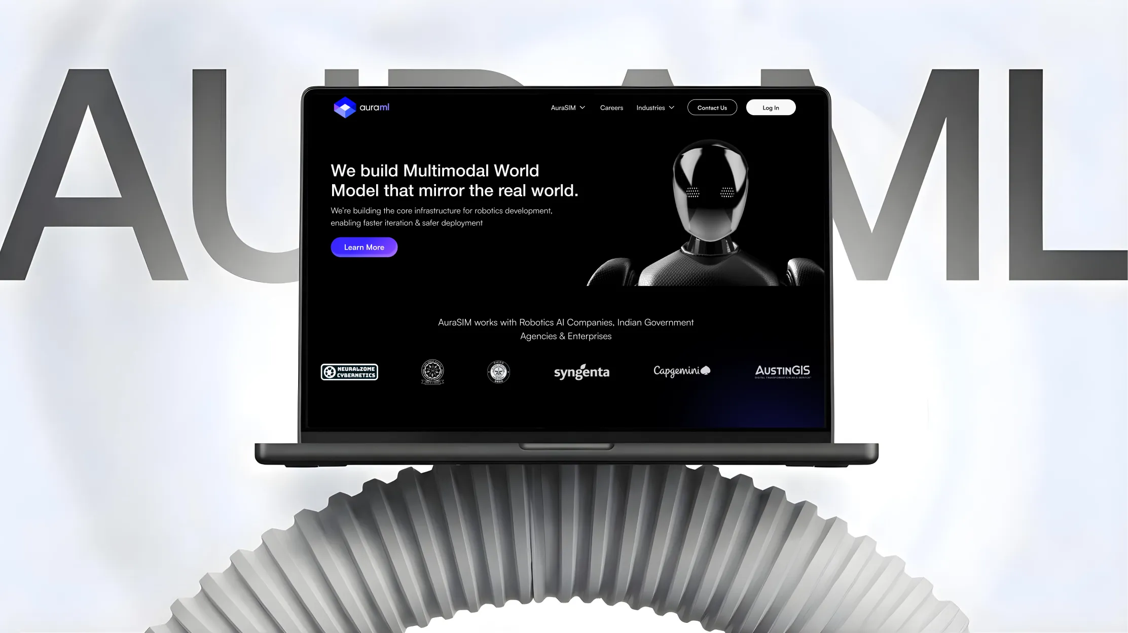
AuraSIM is the flagship platform by AuraML Technologies, a Bengaluru-based deep tech company building multimodal world models for robotics across industrial automation, defence, logistics, and aerospace. Founded in 2023 by Arjun Gupta and Ayush Sharma, AuraML focuses on creating the intelligence layer required to train and deploy robots at scale.
Suplex partnered with AuraML to build the complete brand identity and platform experience for AuraSIM. The goal was to stop sounding like every other robotics software company and start communicating the one thing engineers actually need, which is a deep, earned trust in a category where failure carries real consequences.
The Challenges
Every competitor in robotics software leads with specs: latency numbers, sensor ranges, deployment timelines. The messaging treats the platform like hardware or infrastructure. The result is a sea of technically accurate brands that feel completely interchangeable.
Robotics teams operating at the edge of physical AI face higher stakes than most software categories. A robotic system failing is not abstract. It directly impacts operations, downtime, and cost.
- The category was saturated with similar technical messaging
- Existing communication lacked differentiation and clarity
- Engineers needed proof of reliability, not promises
Engineers have already read the whitepapers. They understand the sim-to-real gap. What they are looking for is a system they can trust before they trust it with machines.
Our Solution
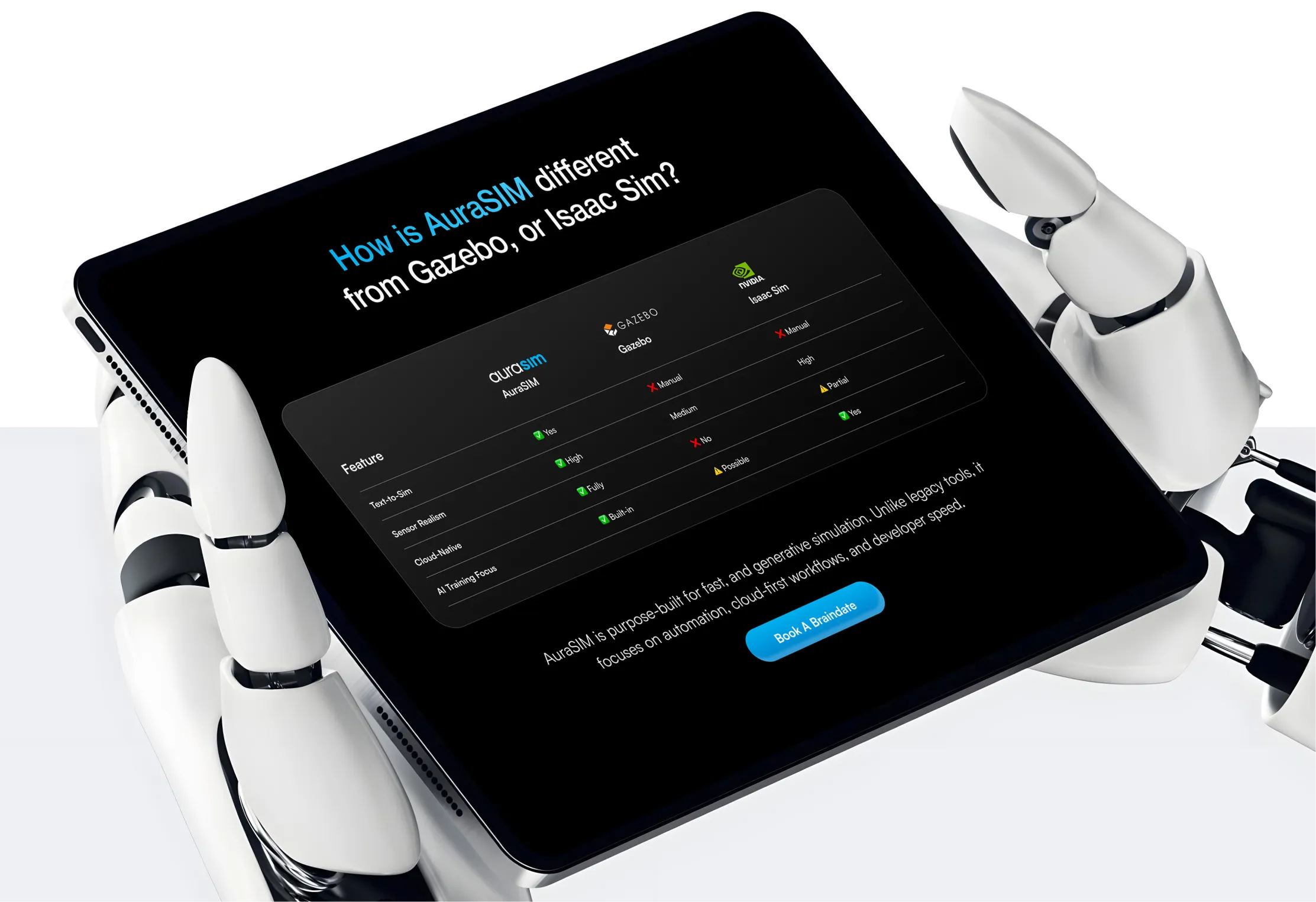
The shift in AuraSIM was not about adding more features or explaining the product better. It was about deciding what the product actually represents in the ecosystem and then building everything around that idea. AuraSIM was repositioned from a simulation engine to the intelligence layer that prepares robots for real-world deployment.
Positioning the Product as Intelligence
The real shift wasn’t building a better simulation engine, it was in deciding that the simulation is intelligence. Once that idea locked in, every other decision followed. The visual language moved from cold technical diagrams to heat-mapped motion trails. The UI stopped looking like a developer dashboard and started feeling like a window into thinking.
The Audience We Designed For
We spoke directly to the people who have shipped code to physical machines and felt the specific weight of what happens next to robotics engineers, autonomy leads, and CTOs in industrial automation, defence, logistics, and agriculture. These teams don’t move fast and break things. They move deliberately because the cost of being wrong is measured in downtime, not sprint cycles. They weren’t looking for another vendor. They were looking for a system they could commit to before the first robot ever rolled out.
The Brand Voice We Built
The tone is technically precise but never clinical. It speaks with the confidence of a team that has already solved the problem they’re describing.
Approved lines include:
- “Train smarter. Simulate better. Perform beyond.”
- “We don’t simulate perfection. We simulate reality.”
- “Robots learn how to react, not just act.”
We deliberately avoided anything that sounded like generic tech marketing. No plug-and-play promises or “future of robotics is here” hype, but a voice conveys inevitability, not urgency.
The Visual System We Created
The aura as logo mark
We turned the heat-map trails that engineers already see in telemetry data into the core logo. It doesn’t show a robot, in fact it shows the intelligence moving between them. When you look at it, you see a system of thinking.
Glass morphism as UI philosophy
The entire interface uses layered, translucent glass surfaces with light refraction and depth. Glass is present and see-through at the same time — exactly what a platform that makes invisible machine intelligence visible should feel like.
3D depth as spatial honesty
Environments, motion paths, and sensor outputs render with real dimensional weight. Engineers don’t think in flat diagrams; they think in warehouses, assembly lines, and uneven terrain. The interface meets them in that mental model.
Dark, depth-first environments
Deep neutrals, glass-lit accents, and luminous active-system glows create a sense that you’re looking into the platform, not at it.
The Final Outcome
Before this, AuraSIM felt like another strong product in a category where everything sounds similar. The technology was solid, but it wasn’t immediately clear why it mattered or how it was different. After the redesign, that confusion drops off early as the engineers landing on the site don’t have to work to understand the intent. They get what the platform is trying to do, and more importantly, why it exists.
The bigger shift is in how the product is perceived. It no longer feels like a tool you try out. It feels like something you consider building around. The identity, the interface, and the way it communicates all point in the same direction, which makes the product easier to trust before it’s even used. And in a category like this, that changes the kind of conversations the team ends up having.
If you are building in robotics, physical AI, or any high-stakes technical category and need a brand system that earns trust before it explains features, Suplex knows exactly how to get you there.
“The work is clear, comprehensive, and well-executed!”
%207.webp)


Book a call directly with our founders
Other Work You May Like

AuraML
How Confetti helped AuraSIM shift from a simulation tool to the brand that makes physical AI feel ready for the real world.
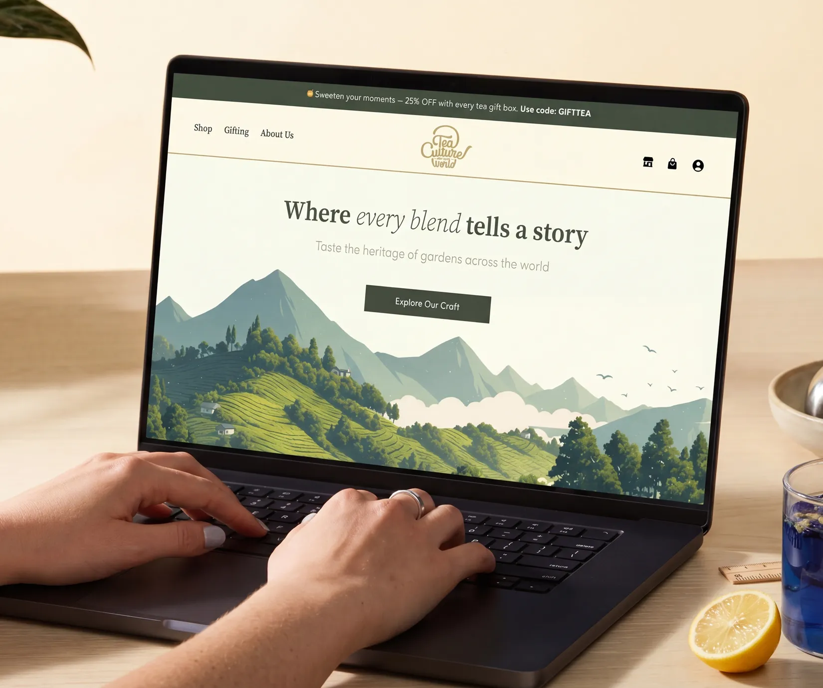
Tea Culture of the World
How Suplex made 120 teas from across the world feel like a discovery rather than a decision.
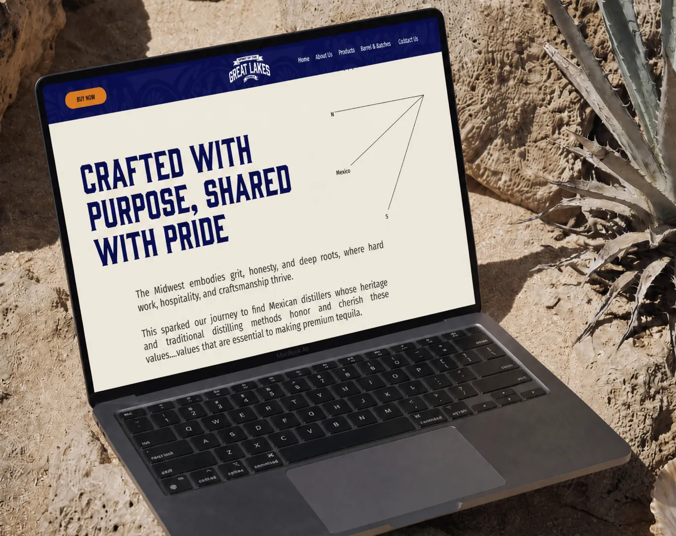
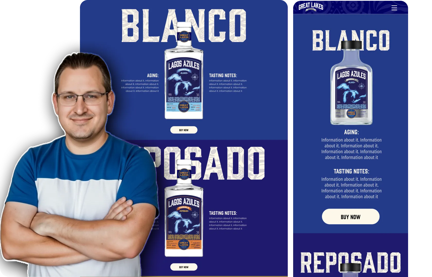
Great Lakes
How Suplex built a full stack website for a Midwest tequila brand with a real production story.
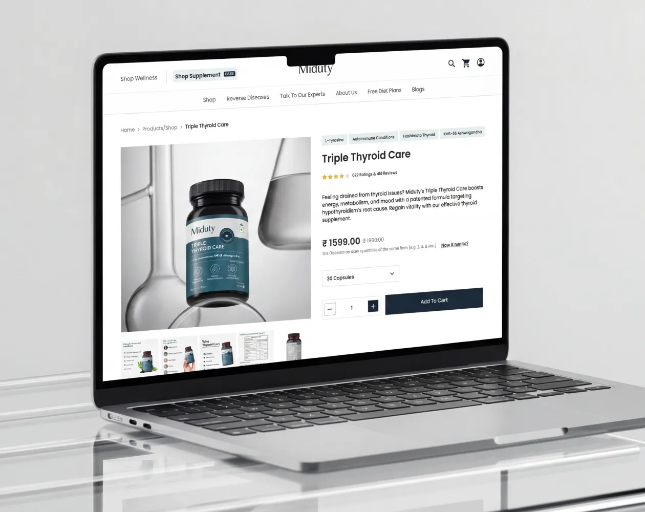
Miduty
Suplex built a Shopify-website for Miduty to grow their D2C nutracutical sales in India
Build Your D2C Business The Right Way
Build It With Suplex.


