
Tea Culture Of The World
About The Client

Tea Culture of the World was founded in 2010 by Dr. Rupali Ambegaonkar in Mumbai, and the founder's background matters more than it might seem at first. A doctor who builds a tea company isn't making a lifestyle choice. She's making an argument that what you drink every day should be held to a higher standard and hence the very same philosophy runs through everything the brand does, from how it sources to how it talks about what's in the cup.
The range spans 120 blends sourced from estates across Japan, Vietnam, China, India, South Africa, and Morocco. Each origin has its own character like Sacred Japan, Spiced Morocco, Mystic Vietnam. These aren't marketing territories, they're the actual sourcing story made visible. The brand serves a premium D2C audience who treat their morning brew as a ritual, and a B2B hospitality market that includes Hyatt, Air India, Four Seasons, and Reliance. Holding both of those audiences in one digital experience, without the site feeling split, was the design challenge Suplex came in to solve.
The Challenges
A catalogue of 120 products is genuinely difficult to design for. Most e-commerce solutions to that problem are variations of the same answer with better filters, more categories, and a search bar. All of which put the burden of knowing what you want onto the person who came to the site precisely because they didn't know yet.
Tea is also a category where the language used to describe products, single estate, first flush, mouthfeel, caffeine profile, is deeply familiar to enthusiasts and completely alienating to everyone else. A brand with serious sourcing credentials and serious B2B partnerships still needs to welcome the person who just wants something that helps them wind down at 10pm.
The site also needed to carry two very different kinds of trust. The kind that convinces a first-time D2C buyer to spend on a premium tea brand they've only just discovered. And the kind that convinces a procurement head at a hotel chain that this is a brand worth putting in every room.
The Solution
Shop by Mood or Need
The decision that changed how the whole site worked was moving the primary navigation layer away from the product category and towards an emotional state. Instead of asking a visitor to know whether they wanted green or oolong or loose leaf before they'd even landed properly, the site meets them with a question like how do you want to feel?
Energise. Relax. Glow. Cleanse. Focus. Five entry points that map onto real moments in a real day, and surface the right products without the visitor having to understand the taxonomy of tea to get there. It sounds like a small shift but in practice it changes the entire feeling of browsing the catalogue from something overwhelming into something that feels like it was put together with you in mind.
Bringing the Sourcing Story into the Interface
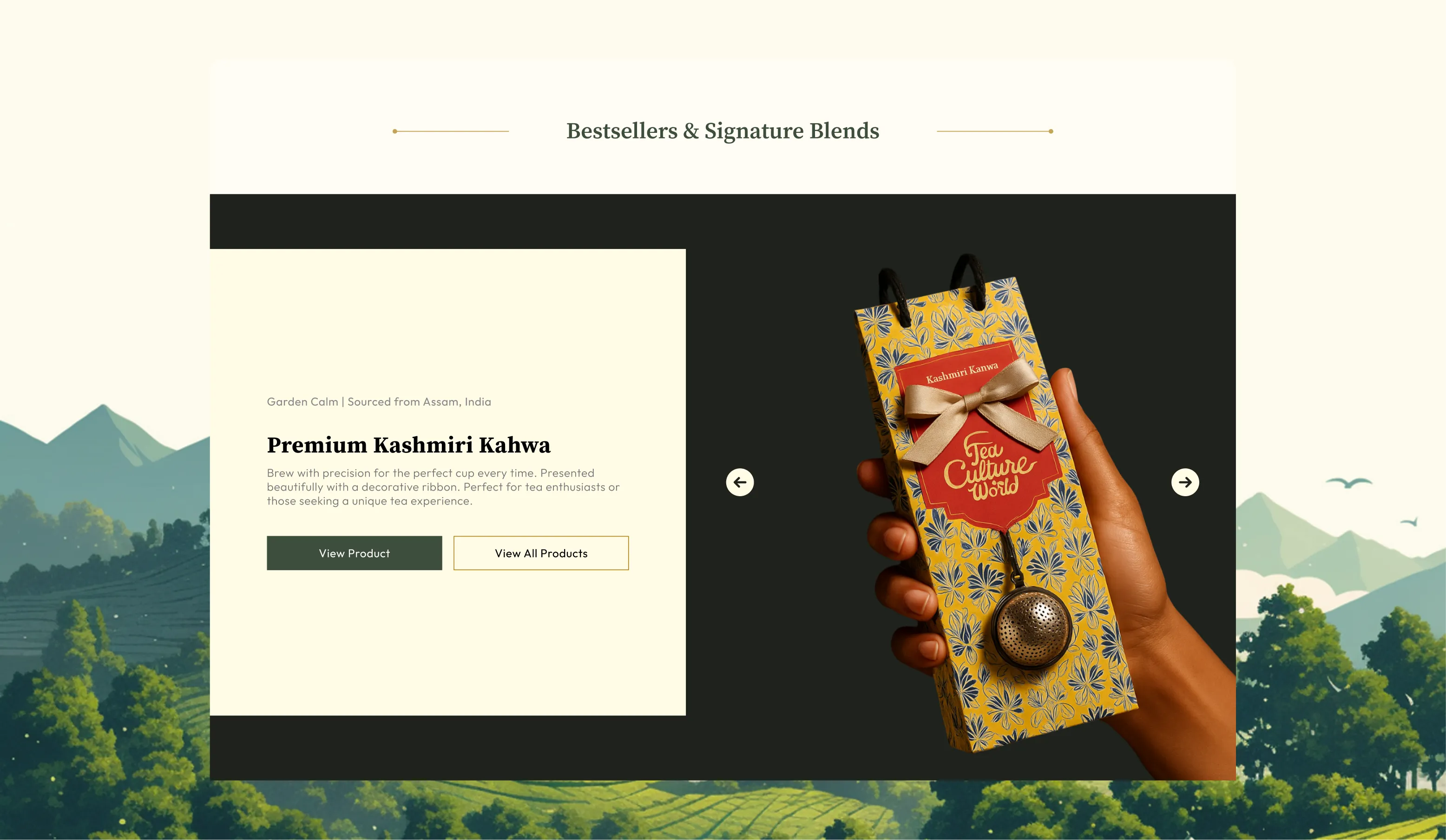
The geographic sourcing isn't a footnote in TCW's brand. It's the whole argument. Japan, Morocco, Vietnam, India, each origin carries a different history, a different growing tradition, a different set of flavours that can't be replicated anywhere else. The redesign built that into the visual and navigational experience of the site rather than leaving it merely on the About page.
Each sourcing territory has its own atmospheric identity within the site. Sacred Japan feels like one thing. Spiced Morocco feels like another. The effect is that moving through the product catalogue becomes something closer to a journey than a shopping session, which is exactly what a brand built around the idea of tea as ritual should feel like.
A Product Page Built for Confidence
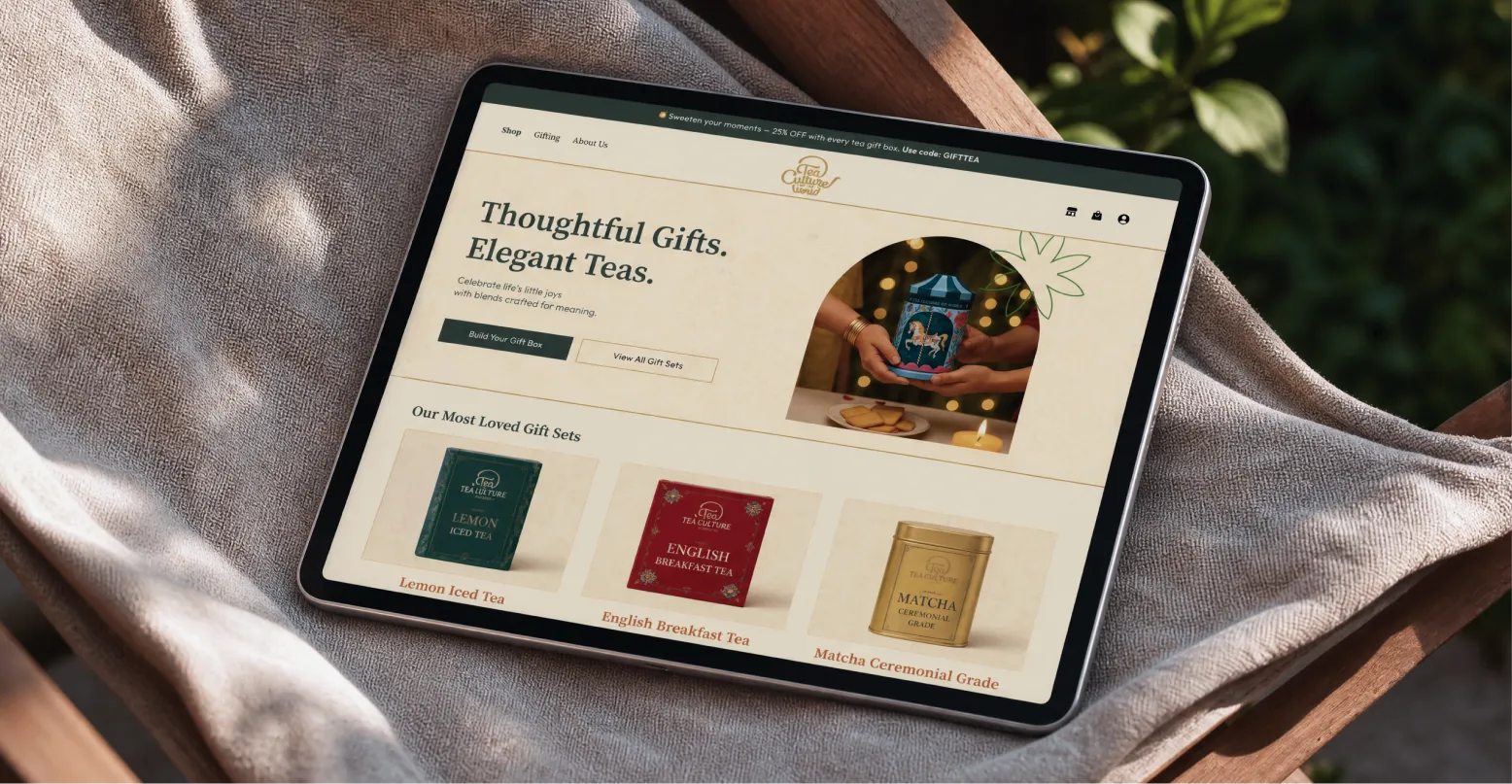
The product detail page was one of the most considered parts of the redesign. The brief was that a first-time buyer looking at an unfamiliar blend should leave the page feeling more certain about making the purchase. The solution was to design the PDP as an editorial experience rather than a standard product listing.
Sensory attributes laid out clearly aroma, taste, mouthfeel, caffeine level, best time to drink. An ingredient visualisation that shows what's actually inside the blend. A brewing guide designed as a ritual rather than a set of instructions. Taken together, these give someone who has never tried the product enough to make a confident decision without needing to read a single review.
Custom Iconography Throughout
A visual language of custom icons runs across the entire site, covering wellness benefits, tea categories, brewing steps, and product attributes. It's the kind of detail that holds a complex digital experience together without the visitor ever consciously noticing it. When iconography is done well, navigation feels intuitive. When it's done poorly, or borrowed from a generic library, the site feels like it belongs to no one in particular. The TCW icon system was built specifically for this brand and this category, and it shows in how coherent the experience feels across very different sections of the site.
Corporate Gifting and Hospitality as a Separate Surface
TCW's associations with Hyatt, Air India, Reliance, and Four Seasons aren't a side note. They're a significant part of what the brand is and where it operates. A procurement decision-maker evaluating the brand for a hotel group needs a completely different experience from a consumer buying a gift for a friend.
Suplex designed the corporate gifting and hospitality section as its own conversion surface, with three distinct audience paths, hospitality, wellness, and corporate, each with its own pitch logic, a brochure download, and an enquiry flow. The B2B trust signals were also deliberately surfaced on the D2C homepage, not because they're relevant to every visitor, but because seeing Air India and Hyatt in the same breath as a brand you're about to spend on changes how you feel about spending on it.
The Final Outcome
Tea Culture of the World now has a digital experience that matches what the brand actually is. A 120-blend global sourcing house with genuine wellness credentials and serious hospitality partnerships, presented in a way that a first-time visitor can navigate comfortably and a returning customer can move through with ease.
The mood-based navigation reduced the friction of entering a deep catalogue. The geographic world-building gave the sourcing story a visual presence it didn't have before. The product pages give buyers what they need to feel certain. And the corporate section handles a B2B conversation that the rest of the site wasn't built to have.
If you have a brand with genuine depth and a digital presence that isn't doing it justice, that's the kind of problem Suplex was built to solve.
“The work is clear, comprehensive, and well-executed!”
%207.webp)


Book a call directly with our founders
Other Work You May Like
AuraML
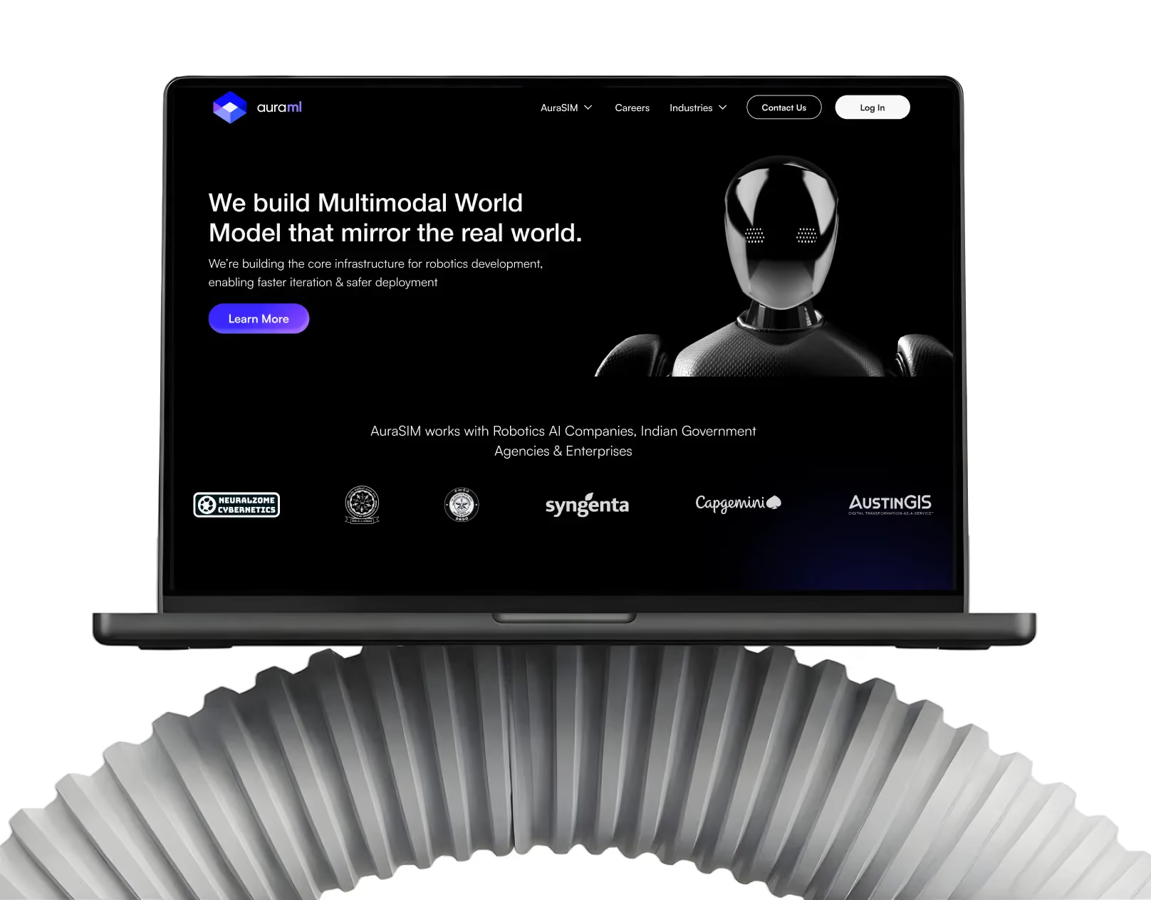
How Suplex helped AuraSIM shift from a simulation tool to the brand that makes physical AI feel ready for the real world.

Tea Culture of the World
How Suplex made 120 teas from across the world feel like a discovery rather than a decision.

Great Lakes
How Suplex built a full stack website for a Midwest tequila brand with a real production story.

Miduty
Suplex built a Shopify-website for Miduty to grow their D2C nutracutical sales in India
Build Your D2C Business The Right Way
Build It With Suplex.


