AuraML
About The Client

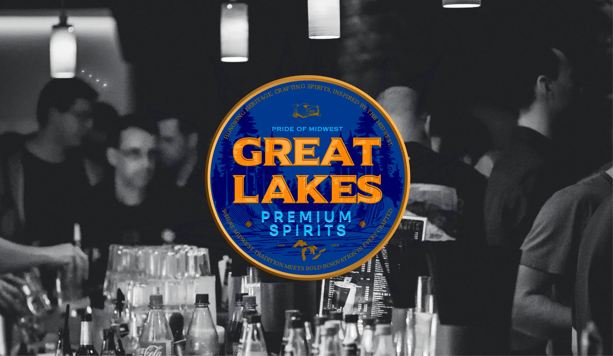
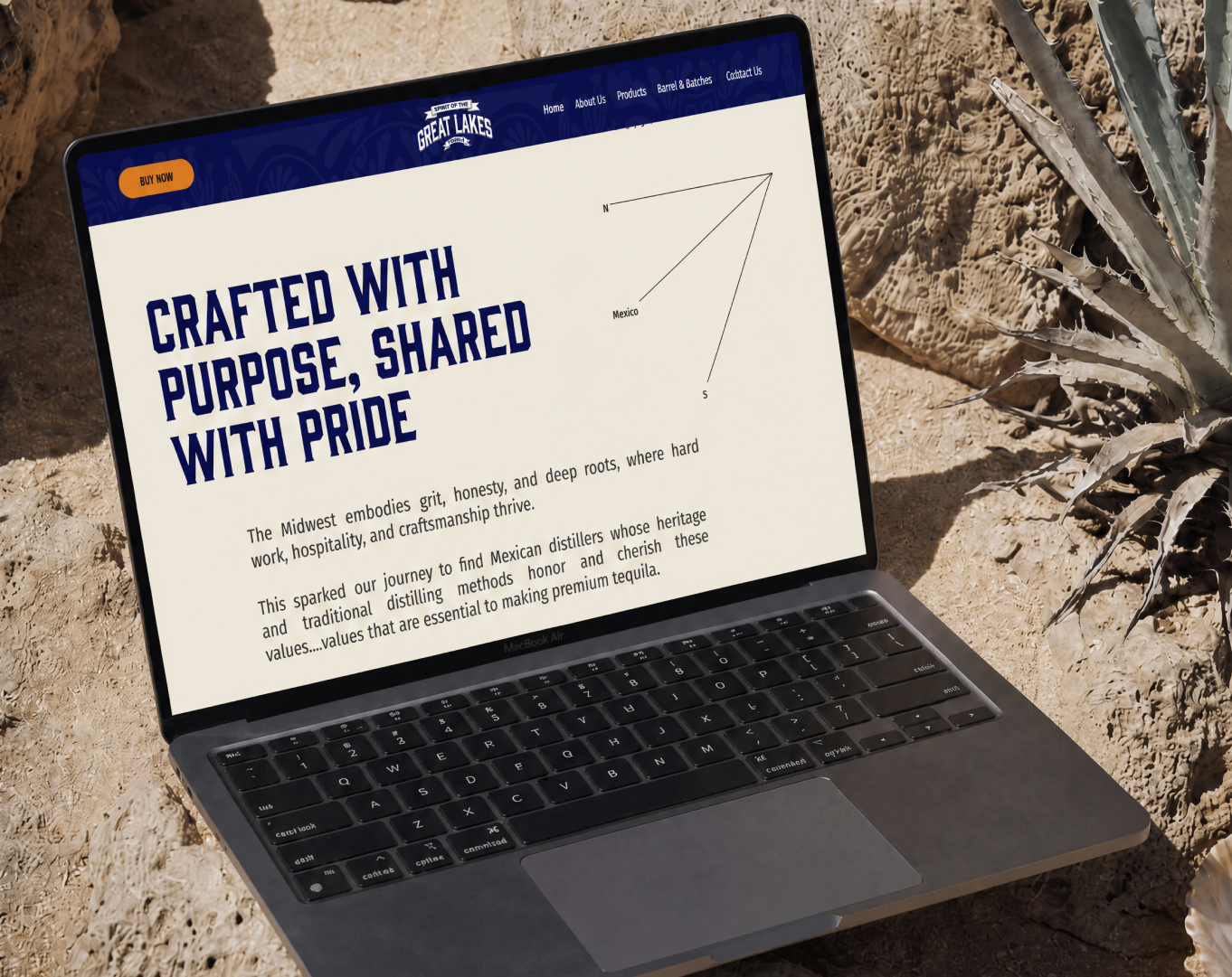
Great Lakes Premium Spirits is a Midwest-born tequila brand, and the geography matters more than it might seem. The Great Lakes region has a specific relationship with doing things properly, the actual way people there tend to operate. That sensibility is what the brand was built on, and then went looking for a spirit that could match it.
They found it in the highland region of Jalisco. Blue agave is grown for six years before it's touched, cooked slowly, fermented in open-air, distilled in small batches, and aged in barrels that previously held bourbon, whiskey, or chardonnay. Additive-free, every bottle numbered to a specific batch and barrel. The production story is genuinely interesting, which is rarer than it sounds in a category that has learned to make ordinary tequila sound extraordinary. Suplex came in to build a website that could finally & actually communicate it.
The Challenges
A premium spirits buyer researching a purchase online is not browsing casually. They've already filtered out the brands that feel like marketing exercises. What they're doing now is looking for something they can actually understand and trust before they spend it. Great Lakes had the product to satisfy that standard. The website wasn't set up to meet that buyer where they were.
The barrel traceability system, which is one of the genuinely unusual things about the brand, had almost no presence online. The three expressions, Blanco, Reposado, and Anejo, were presented without enough context for someone new to tequila to choose between them with any real confidence. And the founding story, two regions, two sets of values, one spirit, was scattered across the site with nothing holding the pieces together.
The site also needed to do something that most spirits websites don't attempt. Communicate the depth of the production process without turning the experience into a technical document. The buyer who reads everything and the buyer who reads almost nothing both needed to leave with the same impression that this is a brand worth trusting.
Designing for Someone Who Does Their Research
The target buyer here is American, premium-minded, and used to making considered purchases. They read about production methods. They compare aging processes. They want to feel like they understand what they're spending on before the bottle arrives. The entire UX was built around that person and the specific questions they bring to a spirits website.
The Solution
The Logic Behind the Architecture
The information architecture came from one observation that on this site, more information doesn't create friction but removes it. A buyer who understands how the agave was grown, how the barrel was chosen, and what the aging period actually did to the flavour profile is a buyer who is significantly closer to a purchase than one who just saw a nice bottle on a dark background. So the site was structured to give that buyer everything they needed, in the right order, without making them work for it.
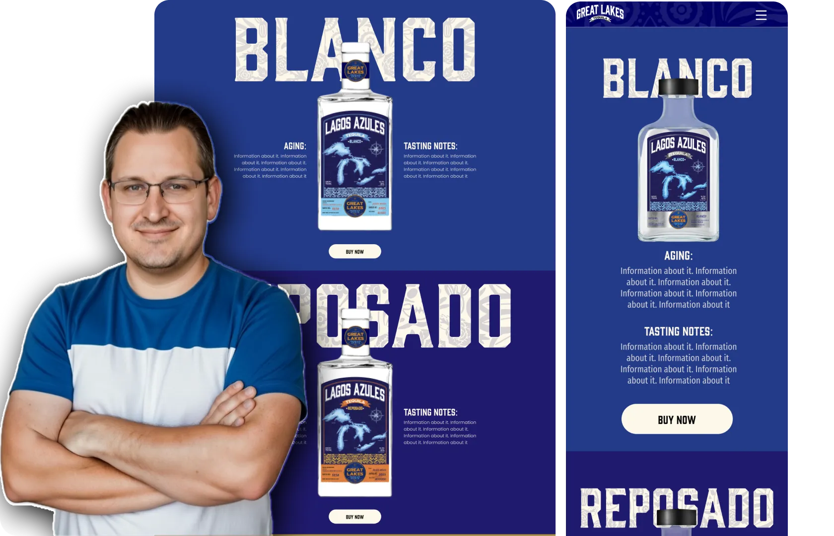
Product Pages That Do the Selling
Each expression got its own page built around what a real buyer actually wants to know. Not just tasting notes, though those are there, but aging classification, barrel type, what the previous spirit in the wood contributed to the flavour, appearance, nose, ABV. Laid out the same way across all three so someone comparing Reposado and Anejo for the first time can do it without having to hold information in their head from two separate pages.
The aging timeline section was one of the more considered decisions in the whole project. Barrel aging is a concept that means everything to a tequila enthusiast and very little to someone just starting to care about what they're drinking. The timeline makes it visual and readable without being condescending about it.
Barrel and Batches
This was the section that mattered most. Every Great Lakes bottle carries a series number, and most people buying the bottle had no idea what that number meant or why it should mean anything to them. The page Suplex built around it changes that. It tells the complete story of each barrel like what spirit previously lived in the wood, when it was filled, how long the tequila rested, and what all of that does to what ends up in the glass. It's this kind of transparency that turns a one-time purchase into a brand relationship. Nobody else in the category was doing it. The website was built to make sure you noticed.
Visual Direction
The palette draws from the two landscapes the brand lives between. The sun-baked earth tones of an agave field in Jalisco and the deep, grounded blues of the Great Lakes. Amber warmth from aged oak running through both. The badge logo, circular and heritage-coded, sits on every page with a quiet confidence that doesn't need to announce itself.
Product photography puts the bottle somewhere real throughout. A bar top, terracotta clay, the edge of a field. Never floating in studio white. Always belonging to a place, because the whole brand is built on belonging to two of them.
Built in Webflow
The full site was built and shipped in Webflow by the same team that designed it. What was in Figma is what went live, no translation errors, no developer handoff gaps. The Barrel and Batches system, the aging timeline, the product profiles, all of it functioning exactly as designed, responsive across every device a premium buyer might be using when they finally decide to commit.
The Final Outcome
Before this project, Great Lakes had a product that deserved to be taken seriously and a website that wasn't helping anyone arrive at that conclusion. The story was there. The craft was real. The barrel system was genuinely unusual. However none of it was landing.
After the redesign, Great Lakes now has a digital experience that matches what the product actually is. A visitor who shows up curious leaves with enough to make a confident decision, and often with the sense that they've just discovered something they're going to keep coming back to. That second part is the harder thing to design for and the more valuable outcome. In a spirits category where the best brands build decades-long preferences rather than single purchases, a website that earns that kind of first impression is doing exactly what it should.
If you have a premium product with a genuine story behind it and a digital presence that isn't doing it justice, that's exactly the kind of problem our team of UX & UI experts at Suplex Design can totally solve.
“The work is clear, comprehensive, and well-executed!”
%207.webp)


Book a call directly with our founders
Other Work You May Like

AuraML
How Confetti helped AuraSIM shift from a simulation tool to the brand that makes physical AI feel ready for the real world.
Great Lakes
How Suplex built a full stack website for a Midwest tequila brand with a real production story.
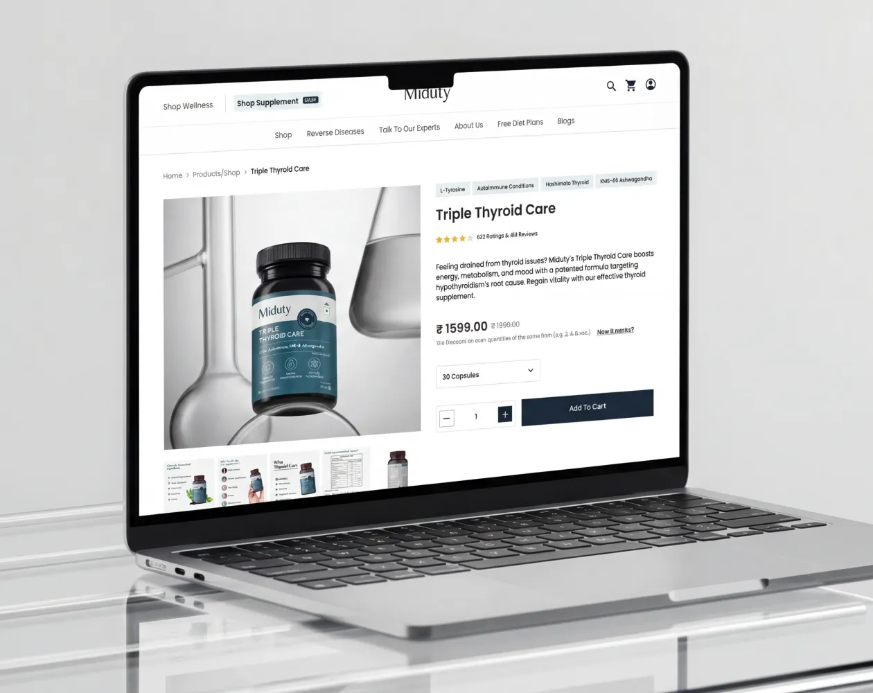
Miduty
Suplex built a Shopify-website for Miduty to grow their D2C nutracutical sales in India
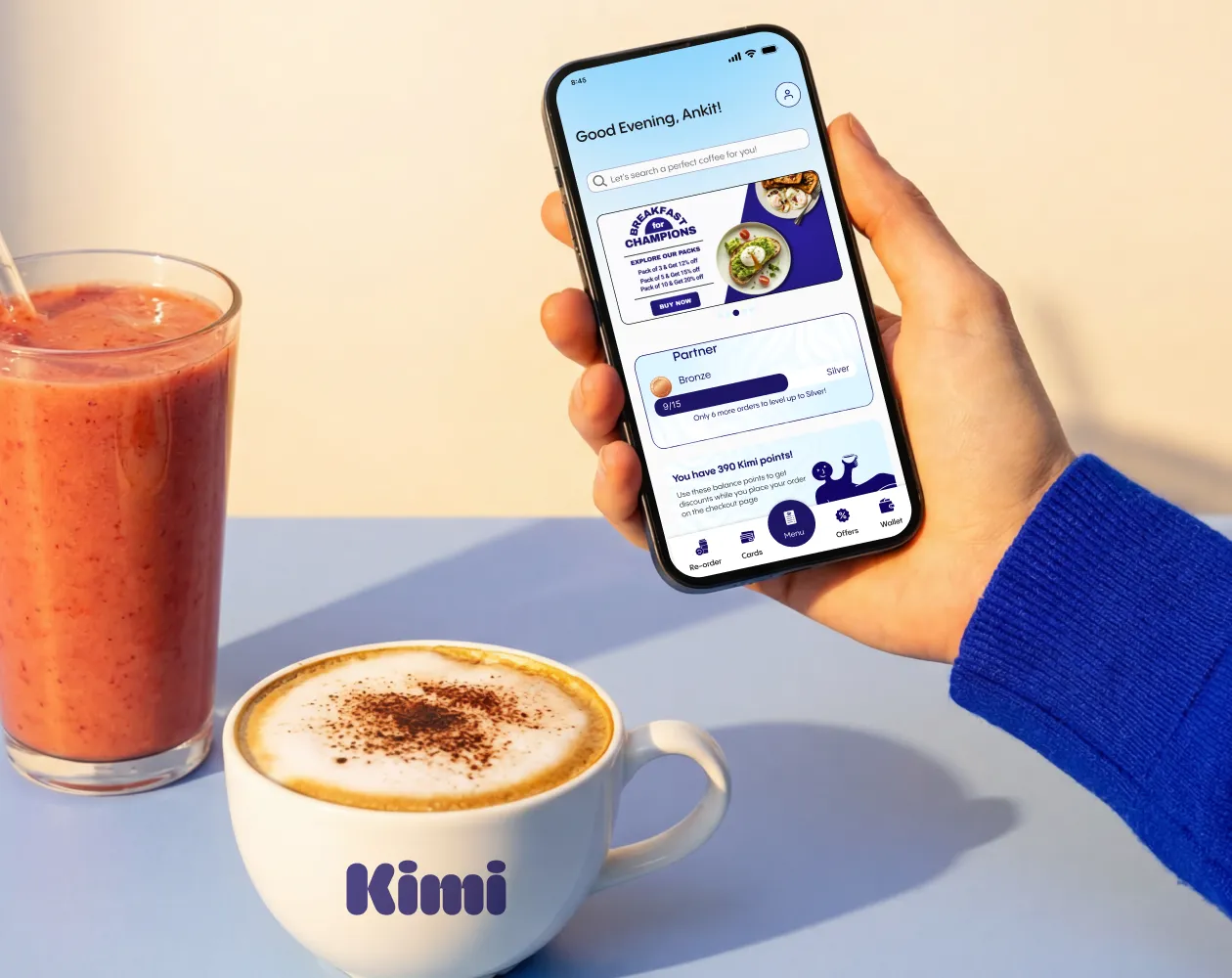
Kimi Cafe
We helped Kimi Cafe launch their Android & iOS app in Dubai to increase customer loyalty & market their new menu items
Build Your D2C Business The Right Way
Build It With Suplex.


