Daily Harvest
.avif)
Daily Harvest
Daily Harvest | Suplex’s Verdict ⭐⭐⭐⭐½
Suplex’s Website Audit for Daily Harvest at a Glance 📊
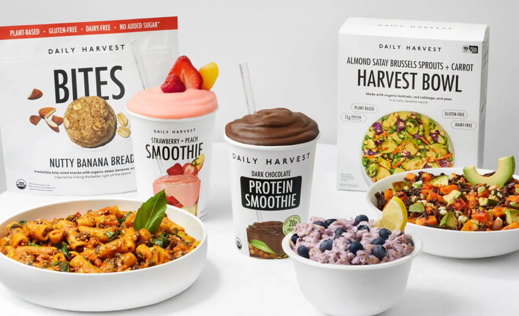
Founded in 2015, the brand has reached a USD 1.1 billion valuation as a unicorn in 2021, and was acquired by Chobani in May 2025 under current CEO Ricky Silver. The brand has since unbundled itself from its original subscription-only model, introduced GLP-1 companion meals and a clean pea protein powder, and rebuilt daily-harvest.com into one of the most thoughtfully educational food storefronts in D2C.
Suplex Design analysed daily-harvest.com across hero positioning, homepage education mechanics, category and Product Detail Page architecture, review depth, and mobile performance, and what follows is a breakdown of why this rebuild earns one of the strongest scores in this audit series, and the two additive fixes that would close the gap to a clean 5. This audit reflects the site as it stood in June 2026.
What Daily Harvest’s Website Gets Exceptionally Right ✅
1. The Banner Video States the Entire Thesis and Asks for One Thing 🎥
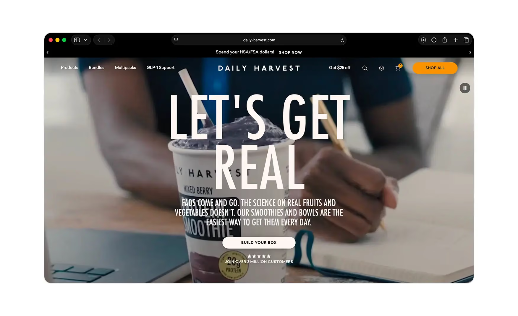
The homepage opens on a full-bleed blender video under a single headline, “Let's Get Real.”
Below it sits the line, “Fads come and go. The science on real fruits and vegetables doesn't. Our smoothies and bowls are the easiest way to get them every day”. One button follows, Build Your Box, alongside a five-star join over 2 million customers proof line.
In a category drowning in macro-claims and diet trends, leading with a science-over-fads argument is sharp positioning, and pairing it with exactly one call to action means the visitor is never unsure what the next step is.
The video does the work of a manifesto and a product demo at once. The navigation above it stays just as disciplined such as Products, Bundles, Multipacks, and GLP-1 Support on one side, a Get $25 off incentive, search, account, and cart on the other.
2. The First Scroll Segments the Visitor by Intent, Not by Product 🎯
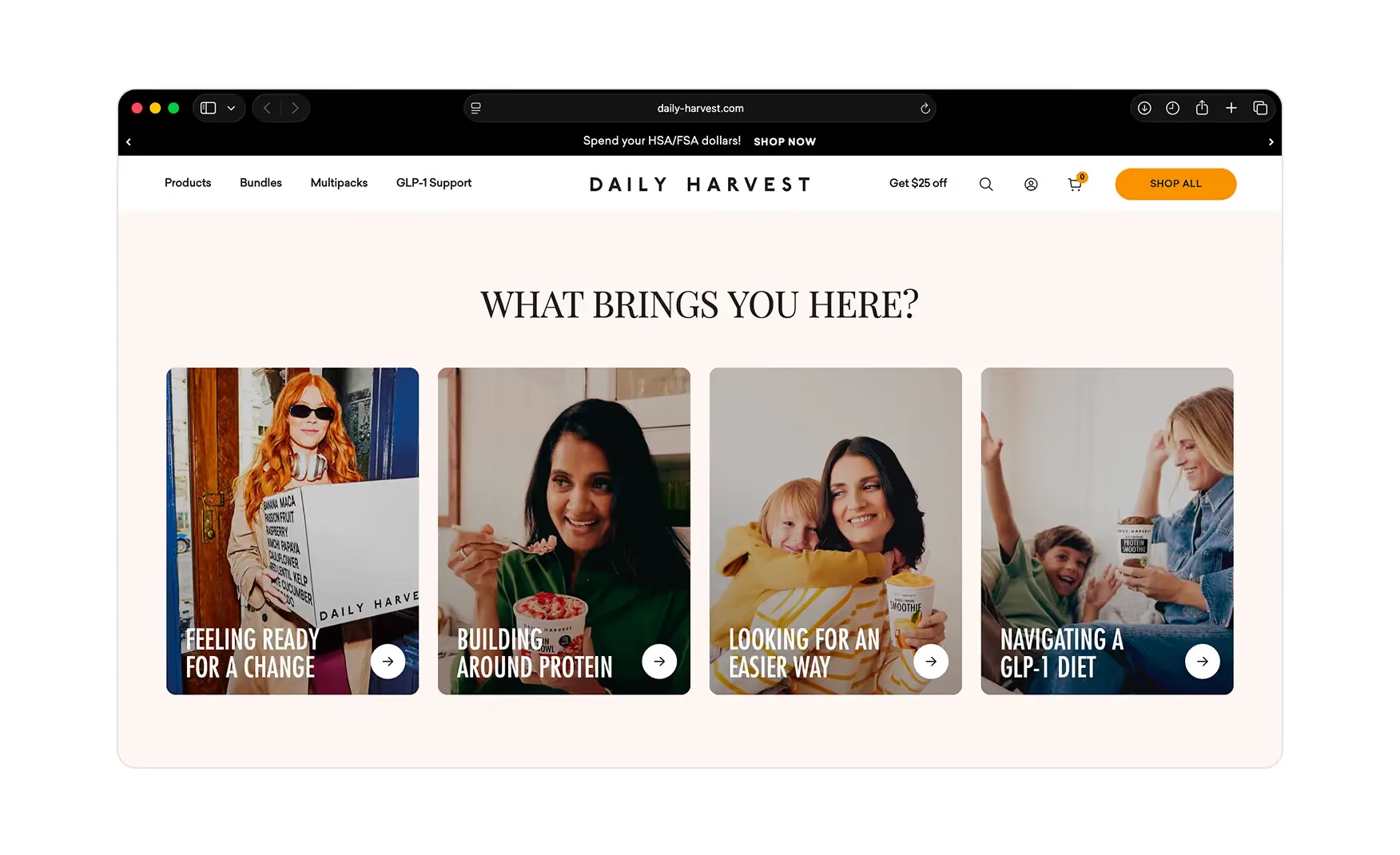
Immediately below the hero, a four-card row asks the visitor why they are really here like Feeling Ready for a Change, Building Around Protein, Looking for an Easier Way, and Navigating a GLP-1 Diet.
Rather than pushing a SKU, the site routes people by the motivation that brought them, which is a far more powerful way to start a food purchase where the underlying need is rarely a smoothie and almost always a change someone is trying to make. The GLP-1 card in particular shows the brand reading its 2026 customer correctly.
Directly beneath, a benefit strip compresses the proof into seven icons like High Protein, Certified Organic, Whole Ingredients, Ingredient Diversity, Ready in Minutes, High Fiber, and Frozen for Nutrients.
3. The What's in the Cup Section Teaches the Product as You Scroll 🥤
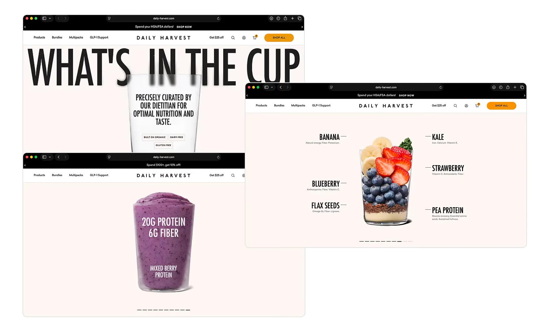
The main standout of the homepage is a scrollytelling block headed “What's in the Cup”.
It opens on an empty glass with the line precisely curated by our dietitian for optimal nutrition and taste and three tags such as Built on Organic, Dairy-Free, Gluten-Free.
As the visitor scrolls, the glass fills with the actual ingredients, pea protein, blueberry, strawberry, banana, flax seeds, each annotated with its benefit, and then resolves into a finished smoothie carrying its real macros, 20g of fibre and 6g of protein, on the cup.
It is a genuinely original way to answer what am I actually buying, and the dietitian-developed framing underneath converts a marketing claim into a credibility signal. Most food sites describe their product, however Daily Harvest lets the customer watch it get built.
4. The Category Pages Explain Each Product Through Its Own Ingredients 🔍
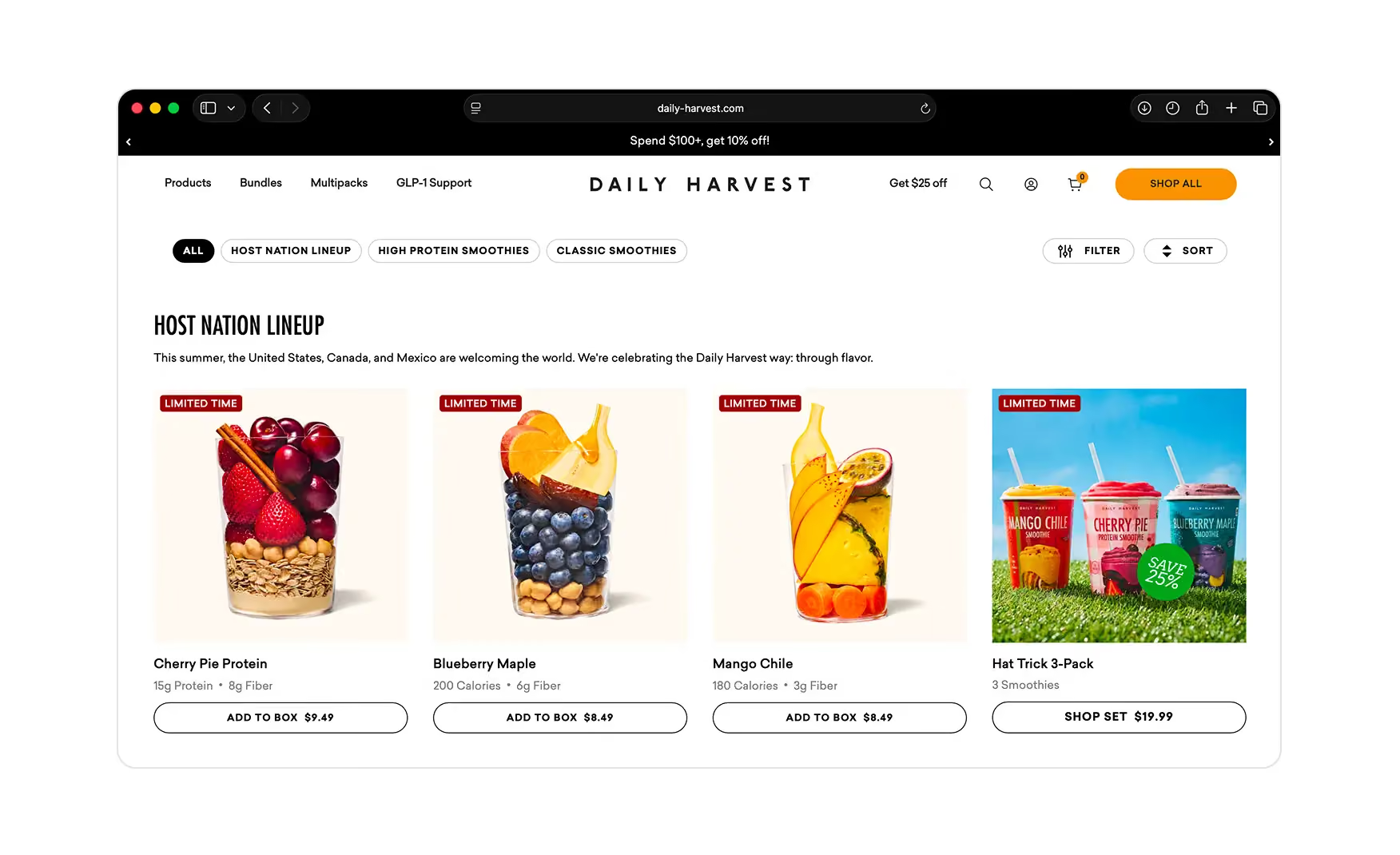
On the smoothies collection, the listing image for every product is the raw ingredients stacked inside the cup like strawberries over oats, blueberries over chickpeas, mango over carrots. The customer understands what is in each blend before reading a single word.
Underneath each card sit the two numbers that matter most to this buyer, protein and fibre or calories, alongside an Add to Box button with the price. Filter chips across the top, All, High Protein Smoothies, Classic Smoothies, and a Filter and Sort control let a goal-driven shopper narrow quickly.
Using the product photography itself as the explanation is exactly right for a category where the ingredient list is the value proposition.
5. The Product Page Removes Every Remaining Hesitation Before the Buy 🛒
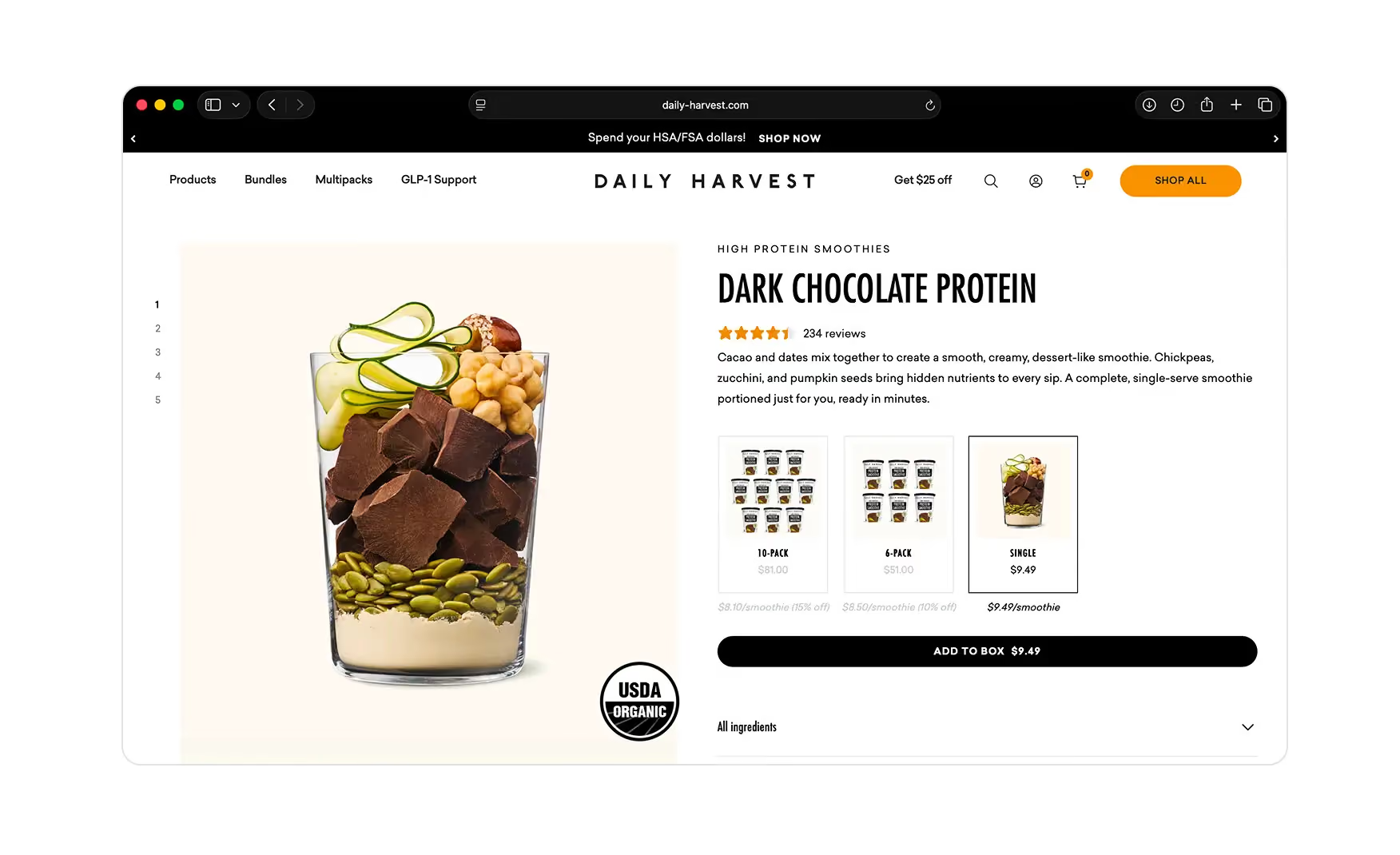
The Product Detail Page is built to answer questions in the order a buyer asks them.
A pack selector covers single, six, or ten units. The lead image again shows the raw ingredients resolving into the finished smoothie. The headline macros, 20g protein, 9g fibre, sit right under the name with the allergen line beside them.
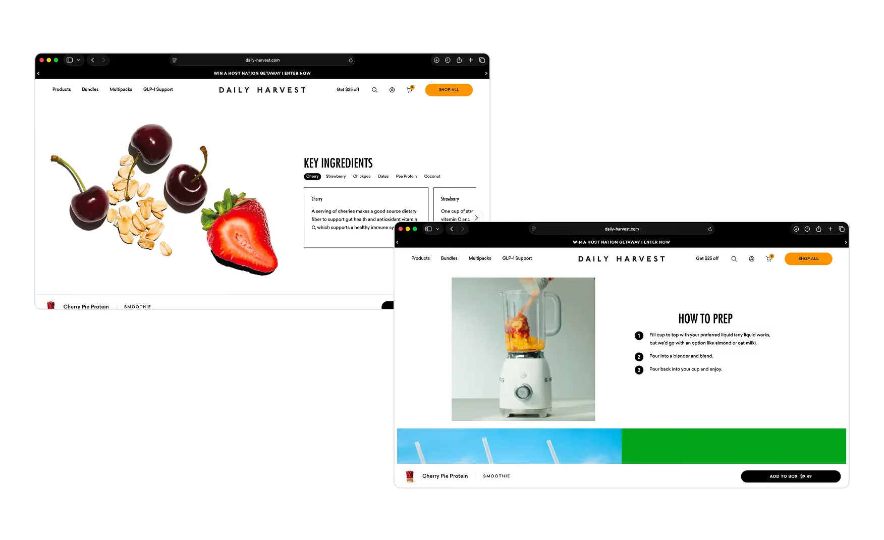
A key ingredients section explains what each component does. A Pairs Well With tray cross-sells the Seed and Fibre Blend. A Quick, Clean, No-Decision Fuel block walks through the three blend steps with a blender animation so a first-timer knows exactly how to make it.
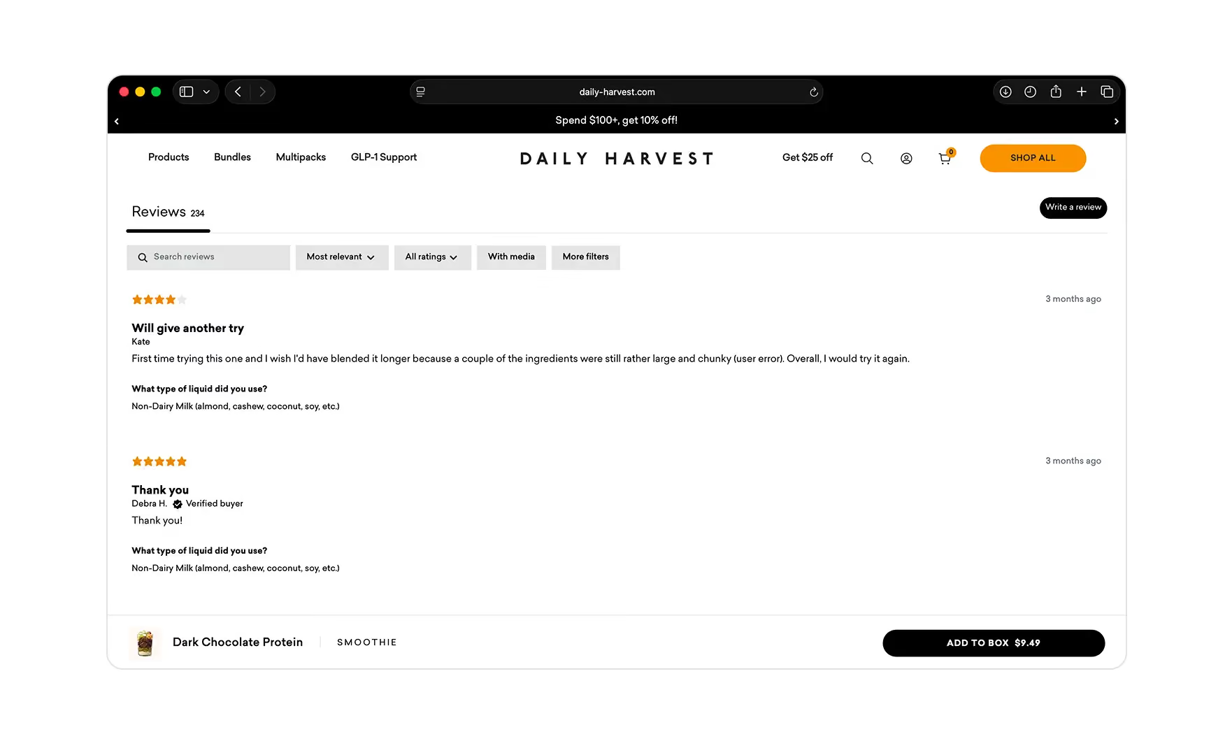
A full FAQ on delivery, freezing, storage, and dietary fit closes the page. The reviews go a step further than most, letting shoppers filter by the liquid each reviewer used, water, dairy milk, non-dairy milk, coconut water, juice, and showing the share of customers behind each star, which is unusually honest and genuinely useful for a product finished at home.
Where the Daily Harvest Experience Falls Slightly Short ⚠️
1. The Reviews Carry No Customer Photos 📸
The review system is smartly built and the liquid filter and the per-star distribution are ahead of the category. But the reviews themselves are text only.
For a product the customer assembles in their own blender, a wall of real customer photos showing how each smoothie actually turns out would be the single most persuasive trust asset on the page, and it is the one thing the current review module is missing. Adding a photo upload prompt and surfacing image reviews first would let the strongest social proof carry its full weight.
Text-only reviews leave the most convincing, most relatable proof, real customers' finished cups, off the page entirely.
2. The Product Listings Lean on Plain Ingredient Shots, Not A+ Creative 🖼️
The ingredient-in-cup photography is clear, but on the collection grid it is also the only creative working.
The listings would convert harder with the kind of A+ creative the brand already uses elsewhere like a macro callout, a texture or lifestyle frame, a best for tag layered onto the card, so each tile sells the outcome and not only the contents. The information is all there. The merchandising on the grid is doing less than the homepage and product page around it.
A flat listing grid asks the customer to do the imagining, softening the click-through on exactly the page where browsing turns into buying.
What Suplex Would Fix First 💡
Priority 1 - Add Customer Photos to the Review Module 🔧
Add a photo upload prompt to the review submission flow and surface image reviews first in the sort order.
The liquid filter and per-star breakdown are already ahead of the category. A photo grid is the one layer missing from a review system that is otherwise the strongest in food D2C, and for a product made at home, customer photos are the single most persuasive asset available.
Priority 2 - Lift Product Listing Creative to A+ Standard 📝
Layer a macro callout, a texture or lifestyle frame, or a best for tag onto every collection grid tile, using the same creative standard the homepage and Product Detail Page already carry.
This is a content production task, not a redesign. The brand already has the visual language. It simply has not been extended to the page where browsing turns into buying.
Final Scorecard 🏆
Suplex Verdict 📝
Daily Harvest has rebuilt its site into one of the clearest, most educational food experiences in D2C.
A thesis-led banner video, intent-based routing, a scroll animation that teaches the product, ingredient-first category pages, and a Product Detail Page that answers every question down to how to blend it. Few food brands at any scale have built a homepage that functions as a teacher rather than a menu, and Daily Harvest has done it while also rebuilding the entire commercial model away from subscription-only.
The gaps are small and additive rather than structural. Put customer photos into the reviews, lift the listing creative, and any one of them is a weekend of work, not a redesign.
Overall Rating: ⭐⭐⭐⭐½ 4.5 / 5.
Suplex Design works with D2C food, beverage, and wellness brands across India and the UAE on Product Detail Page architecture, conversion strategy, and website audits. If your brand is at a similar stage to Daily Harvest and you want an honest assessment of what is holding your site back, get in touch with our team of experts at Suplex Design.
Hi, I’m Rishabh Jain
I believe great design has the power to shape perception, build trust, and move businesses forward. That belief is what led me to found Suplex Design Studio, a global branding and packaging studio working with FMCG and D2C brands across markets.I started suplex at 25 with a clear intent, to create design that is strategic, thoughtful, and commercially meaningful. By 28, the studio had scaled globally, guided by a strong foundation in Integrated Design that I developed during my academic journey in London, where I was honoured with the Dean’s Award.
Over the years, I’ve had the opportunity to work with 100+ brands, from Fortune 500 organizations to family-run businesses, helping them build packaging and brand systems that create recall, relevance, and long-term value.
Suplex’s work has been recognized internationally, including the Manifest Award (2024), the Clutch Global Award (2025), and features on platforms such as Packaging of the World, The Dieline, and the World Brand Design Society.
None of this would be possible without the people behind the work. I’m deeply grateful to the suplex team, whose commitment, creativity, and attention to detail turn ideas into meaningful brand experiences every day.
At the heart of my work is a simple philosophy, design should be intentional, honest, and built to last, and that continues to guide everything we create at suplex.























Let’s Make It Happen
E-Commerce Success Stories

%201.avif)






.avif)
.avif)
Build Your D2C Business The Right Way
Build It With Suplex.


