Ritual
.webp)
Ritual
Ritual | Suplex’s Verdict ⭐⭐⭐⭐½
Suplex’s Website Audit for Ritual at a Glance 📊
Founded in 2016 by Kat Schneider in Culver City after she could not find a clean, science-backed prenatal vitamin during her first pregnancy, Ritual crossed USD 250 million in gross revenue in 2024, has sold over 25 million bottles, and is now stocked at Target, Whole Foods, and Amazon alongside its DTC storefront.
Suplex Design analysed the Ritual website across brand identity, traceability mechanics, scientific credibility, web performance, and international routing, and what follows is a breakdown of what the site does exceptionally well and the one fix that would take a 4.5 to a 5.
What Ritual’s Website Gets Exceptionally Right ✅
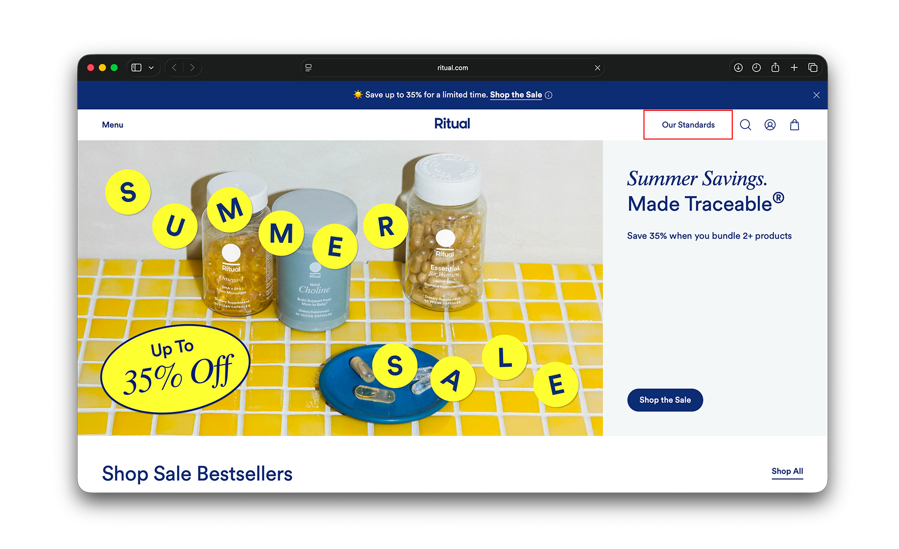
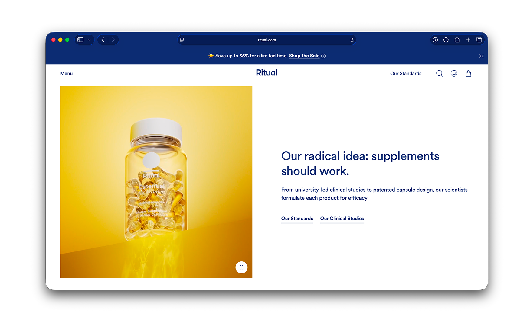
1. "Our Standards" Sits in the Primary Nav, Not Buried in a Footer Link 📋
The top navigation carries two text items, Menu on the left and Our Standards on the right.
For a supplements brand whose entire moat is ingredient traceability, putting the standards page directly in the primary nav signals that the brand wants this conversation at fold one. The visitor who came to find a multivitamin is being routed simultaneously to the page that explains why this multivitamin can be trusted.
Most supplement brands hide their sourcing under About. Ritual treats it as a navigation destination. Certification and traceability stamps then carry through the entire site, on the homepage, on the PDPs, alongside the reviews, so the trust signal does work at every scroll depth.
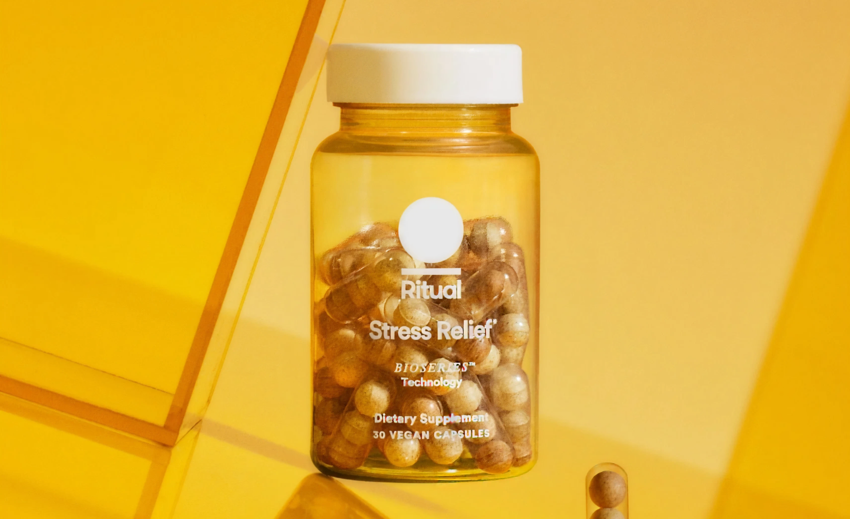
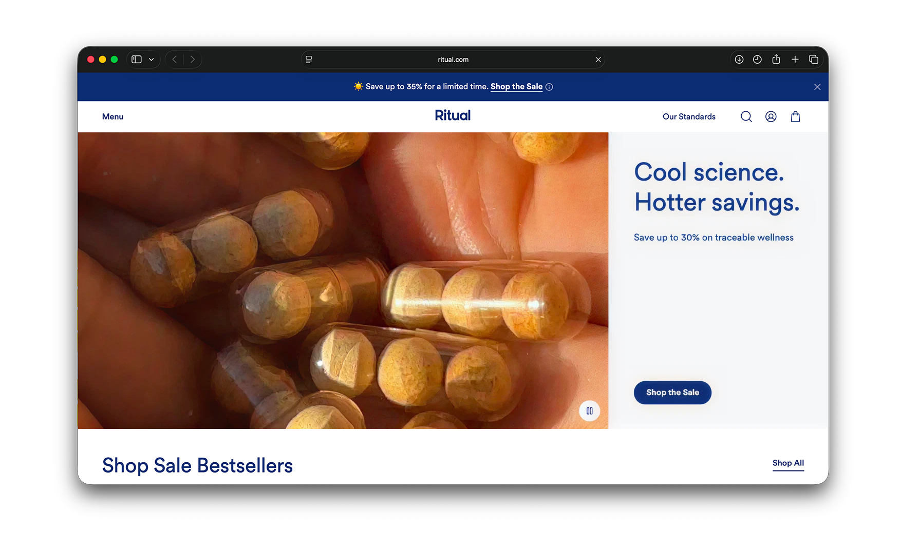
2. The Hero Shows the Capsule, Not the Packaging 💦
The homepage hero leads with a close-up of a yellow Ritual capsules bottle in someone's hand which turns into a video of the capsule.
The choice is a metaphor. Ritual is not selling a brand, a fad, or a mood. What they are selling is the contents. By stripping the visual down to the actual ingestible thing, the brand makes the point that the product is supposed to be evaluated on what is inside, not on the marketing wrapped around it.
For a category where most brands lead with celebrity endorsements, lifestyle imagery, or branded packshots, leading with the capsule is the boldest move on the page. It is also the move that gives every other element on the site permission to be confident. Once the brand has decided to show the product naked, everything else can stay quiet.
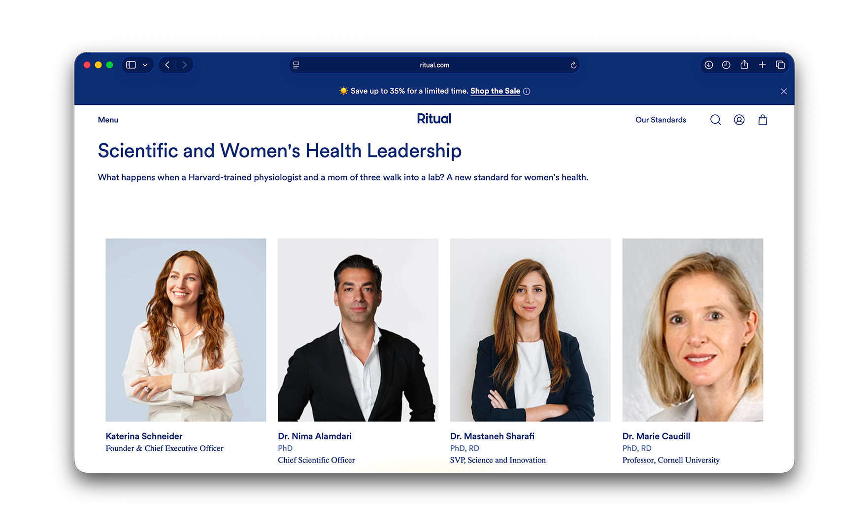
3. Scientist Credentials Sit on the Homepage With Names and Faces 🧑🔬
Midway down the homepage sits Scientific and Women's Health Leadership, a row of four scientist and physician profile cards with names, specialties, and institutional affiliations.
For a brand competing in a category where consumers have been burned by everything from snake oil to celebrity-endorsed gummies, displaying the actual scientists behind the formulas closes the credibility gap the rest of the homepage talks around.
The brand also conducts its own clinical studies and surfaces them in plain language across the site. The studies are translated for everyday readers without science backgrounds, which is a rarity in a category that either drowns the customer in jargon or hides the data entirely. Combined with the scientist profiles, the trust stack is one of the most complete in supplements.
4. Autoplay Video Across the Site Runs With Zero Lag 🎬
The Ritual homepage carries multiple autoplay videos, capsule transitions, ingredient close-ups, and lifestyle scenes, and every one plays cleanly without lag, pixelation, or stalled buffering.
For a content-heavy site running at this density, the smoothness is the marker of real performance engineering behind the design front. The brand has put as much investment into the tech stack as into the visual stack. In a category where most brands run static PDPs and basic imagery, this is a meaningful competitive advantage in time-on-site and conversion.
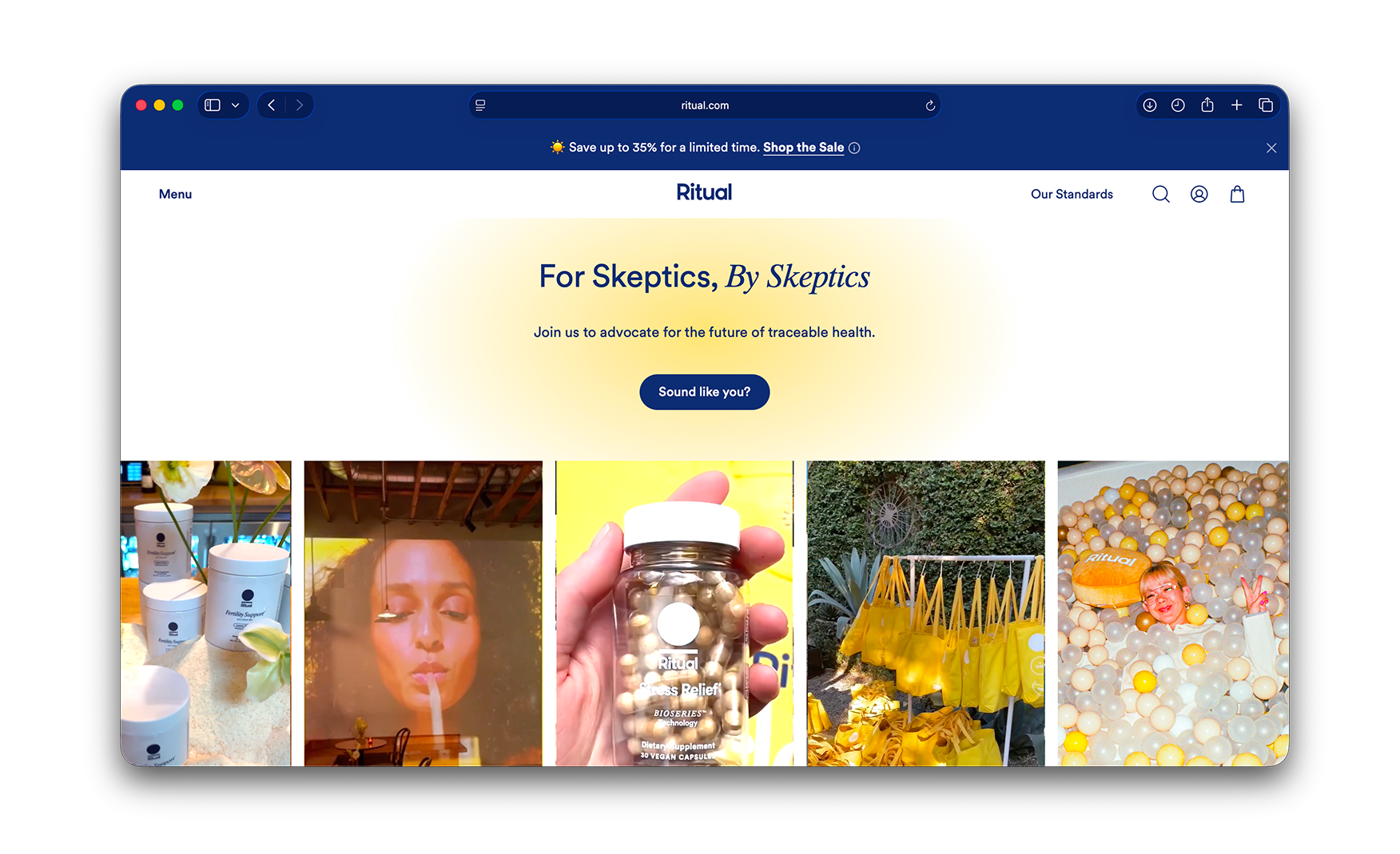
5. "For Skeptics, By Skeptics" Makes the Customer the Hero of the Positioning 💬
Toward the bottom of the homepage, a section labelled For Skeptics, By Skeptics carries a five-image UGC grid showing real customers using the products in their own kitchens, gyms, and offices.
The line itself is the meta-positioning. Ritual is telling the customer that we are designed for people who do not trust supplement brands, and the proof is that people like you bought it anyway. For a brand selling daily-use vitamins to an over-educated millennial audience, flattering the customer's skepticism is more powerful than another claim about purity.
Where the Ritual Experience Falls Short ⚠️
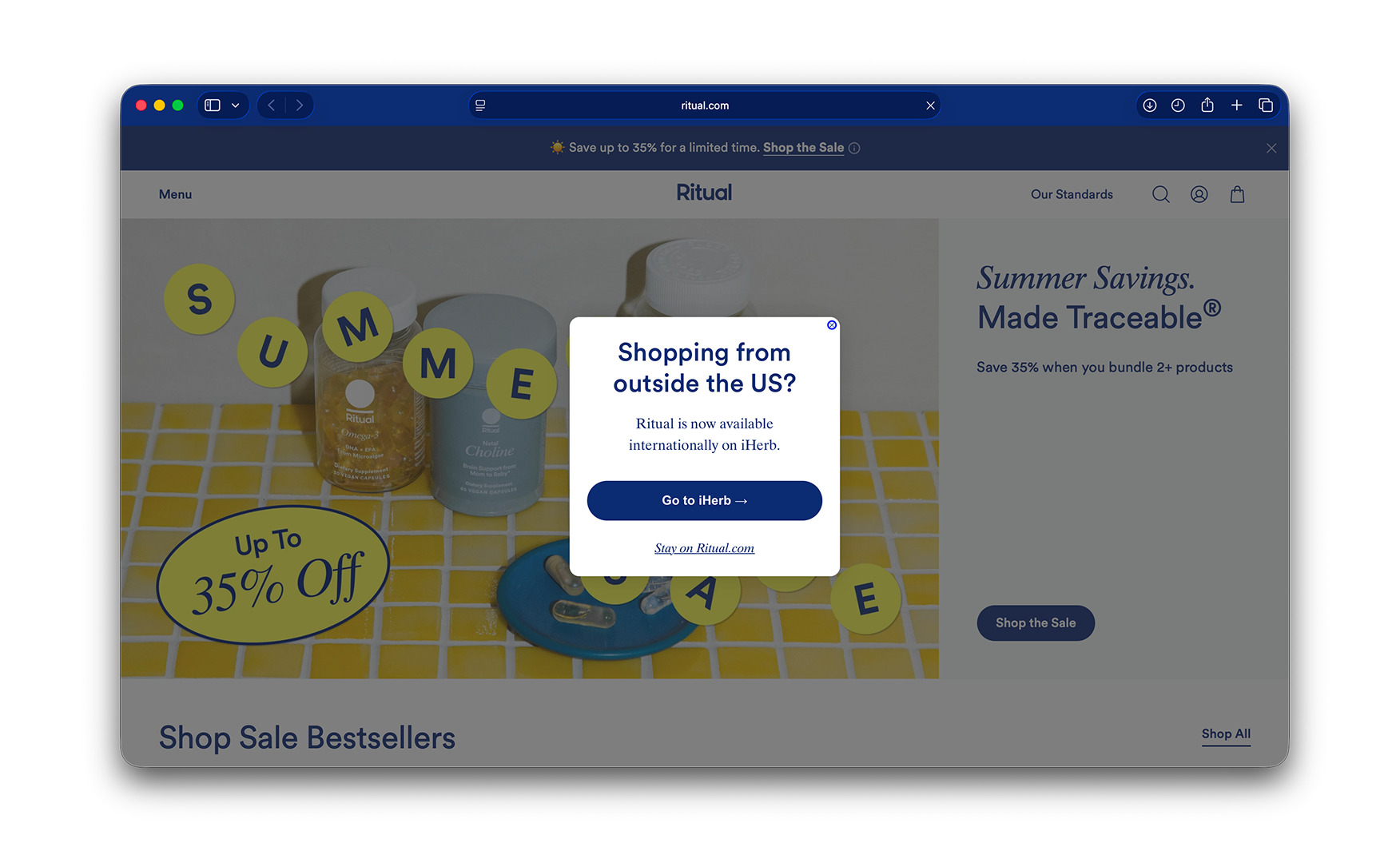
1. The Geo Modal Forces a Retail Choice Before the Visitor Has Seen the Brand 🚧
A visitor from outside the US lands on a modal covering the hero, shopping from outside the US? Ritual is now available internationally on iHerb. Go to iHerb or Stay on Ritual.com.
The international fulfilment partnership with iHerb is a real commercial win. But turning the first interaction into a binary choice between two retail destinations asks the visitor to commit before they have seen the product, the price, or any of the brand framing that the site does so well.
The cost is highest precisely because the rest of the site is so good. A visitor who lands, dismisses the modal, and actually sees the Ritual homepage will almost certainly convert. The modal is getting in the way of that first impression.
Geo Routing Options Compared 📊
What Suplex Would Fix First 💡
Priority 1 - Move the Geo Modal Off the First Paint 🔧
Replace the immediate landing modal with a delayed trigger. Fire it after 15 seconds, after the visitor scrolls below the hero, or after they add to cart.
Alternatively, detect the IP silently and surface a slim banner at the top of the screen offering the iHerb route as an option rather than a binary commitment. The international fulfilment story stays intact. The visitor gets to see the brand first. The routing happens at a moment when the customer actually has the information they need to choose.
Final Scorecard 🏆
Suplex Verdict 📝
Ritual has built the most disciplined brand and trust mechanics in the supplements category.
The capsule-first hero, the named scientist credentials, the plain-language clinical studies, and the traceability stamps that follow the visitor across every page are each the strongest execution of their kind in D2C wellness. A brand that leads the homepage with the actual capsule and closes it with a UGC section explicitly addressed to skeptics has resolved the trust problem in supplements in a way most brands in the category have not attempted.
The geo modal is the only thing holding this site back. A non-US visitor who dismisses the modal and sees the Ritual homepage will convert. The modal is getting in the way of that moment, and the fix is a single sprint.
Overall Rating: ⭐⭐⭐⭐½ 4.5 / 5. One routing fix lifts this to a 5.
Suplex Design works with D2C wellness, supplements, and lifestyle brands across India and the UAE on PDP architecture, conversion strategy, and website audits. If your brand is at a similar stage to Ritual and you want an honest assessment of what is holding your site back, get in touch with our team of experts at Suplex Design.
Hi, I’m Rishabh Jain
I believe great design has the power to shape perception, build trust, and move businesses forward. That belief is what led me to found Suplex Design Studio, a global branding and packaging studio working with FMCG and D2C brands across markets.I started suplex at 25 with a clear intent, to create design that is strategic, thoughtful, and commercially meaningful. By 28, the studio had scaled globally, guided by a strong foundation in Integrated Design that I developed during my academic journey in London, where I was honoured with the Dean’s Award.
Over the years, I’ve had the opportunity to work with 100+ brands, from Fortune 500 organizations to family-run businesses, helping them build packaging and brand systems that create recall, relevance, and long-term value.
Suplex’s work has been recognized internationally, including the Manifest Award (2024), the Clutch Global Award (2025), and features on platforms such as Packaging of the World, The Dieline, and the World Brand Design Society.
None of this would be possible without the people behind the work. I’m deeply grateful to the suplex team, whose commitment, creativity, and attention to detail turn ideas into meaningful brand experiences every day.
At the heart of my work is a simple philosophy, design should be intentional, honest, and built to last, and that continues to guide everything we create at suplex.


Let’s Make It Happen
E-Commerce Success Stories

%201.webp)


.webp)
.webp)
Build Your D2C Business The Right Way
Build It With Suplex.


