The Giving Movement
.avif)

The Giving Movement
The Giving Movement | Suplex’s Verdict ⭐⭐⭐⭐
Suplex’s Website Audit for The Giving Movement at a Glance 📊
Founded in Dubai in April 2020 by Dominic Nowell-Barnes with no formal business education and a starting capital of roughly AED 50,000, the brand has grown to an estimated USD 15 million in annual revenue, donated over AED 28.65 million to children's education and welfare, and built a two-hour delivery window that no premium fashion competitor in the UAE has matched.
Suplex Design analysed the site across brand identity, homepage flow, product detail page design, operational signalling, and merchandising strategy, and what follows is an honest account of where the experience excels and what a single focused sprint could fix.
What The Giving Movement's Website Gets Exceptionally Right ✅
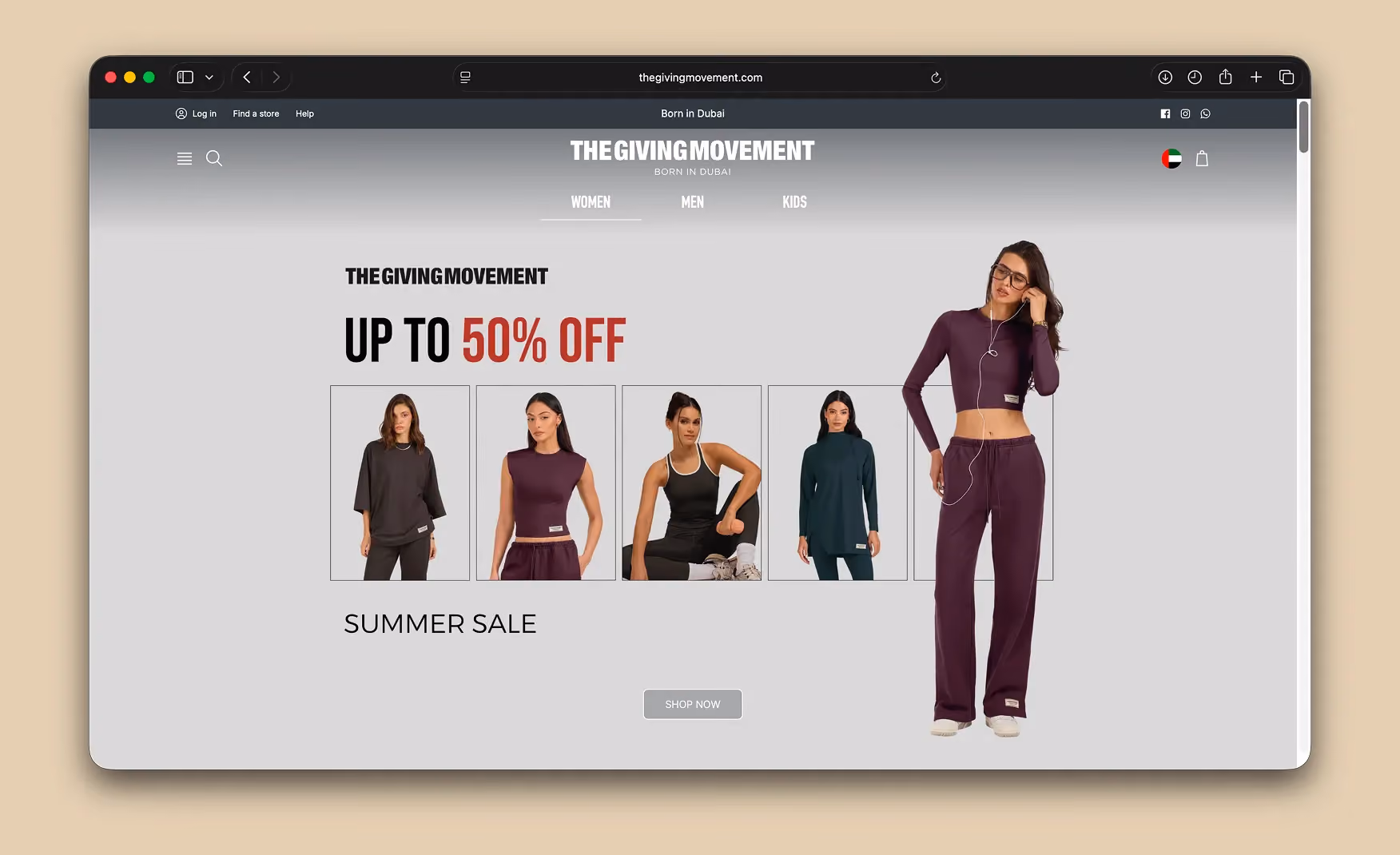
1. The Hero Immediately Splits Into Women, Men, and Kids 🎯
Three tokens sit directly under the wordmark in the homepage hero: Women, Men, and Kids. The Café Ballet campaign visual plays behind them, and a visitor knows exactly which path belongs to them before they have scrolled a single pixel.
Most apparel websites scatter their category routes across a mega nav, a secondary banner, and a footer. The Giving Movement puts the customer-segment split inside the first viewport, which is where it should have been on every fashion website that still hasn't done it.
The "Born in Dubai" tagline sitting under the wordmark doubles as a positioning statement, so the brand identity is anchored without needing a separate About section. Three customer paths, a one-line brand premise, and a campaign visual that earns its place. That is fold one working at full capacity.
Screenshot: Hero with the Women / Men / Kids tokens and the Born in Dubai tagline under the wordmark.
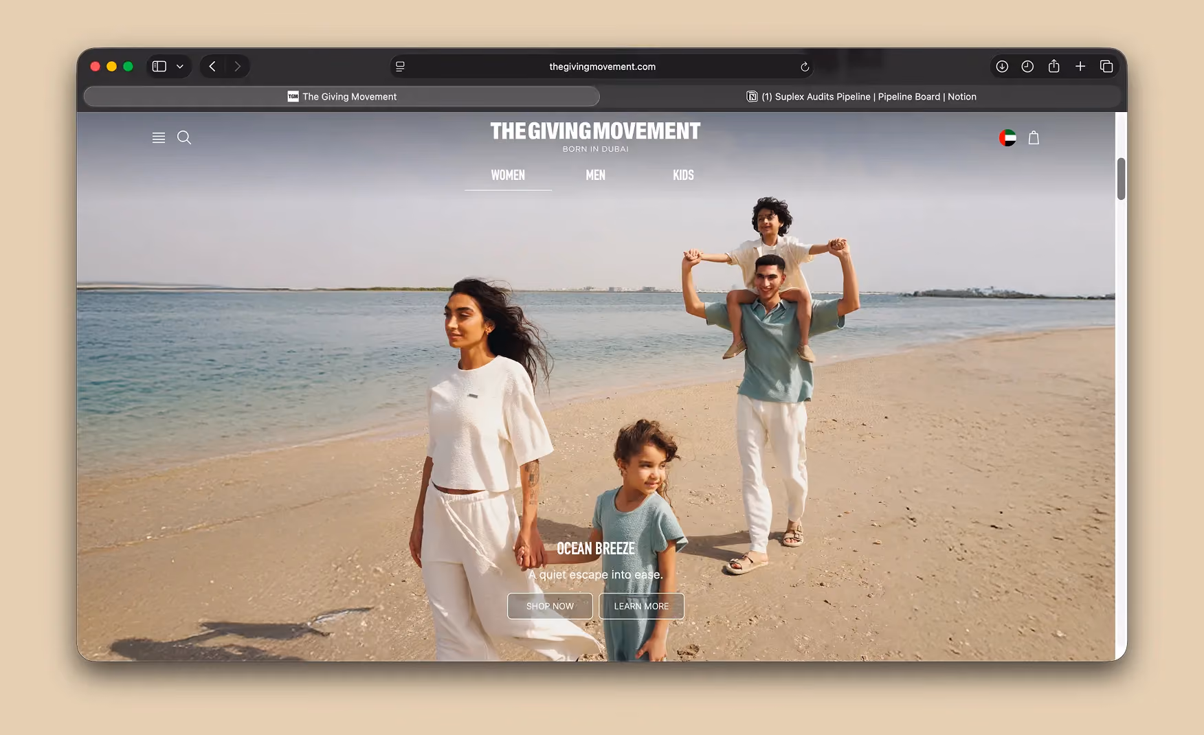
2. The Brand Looks Like Its Actual Customer 🌎
Scroll past the hero and an editorial spread shows a multicultural family on a Dubai beach. The faces are South Asian, Middle Eastern, and mixed-ethnicity, rather than the generic Western casting that most global apparel brands still default to in 2025.
The brand opens with a Burj Khalifa cityscape at the top of the page, closes with a desert hero at the bottom, and carries Arabic script alongside the wordmark across the range.
For a brand whose entire value proposition is being a UAE-first label, the casting and location decisions are not aesthetic choices. They are the brand.
Most fashion D2Cs use photography that could have been shot anywhere for anyone. The Giving Movement is unmistakably for one audience, in one city, and the website does not let you forget it.
Screenshot: Multicultural casting and Dubai-anchored editorial framing across the homepage.
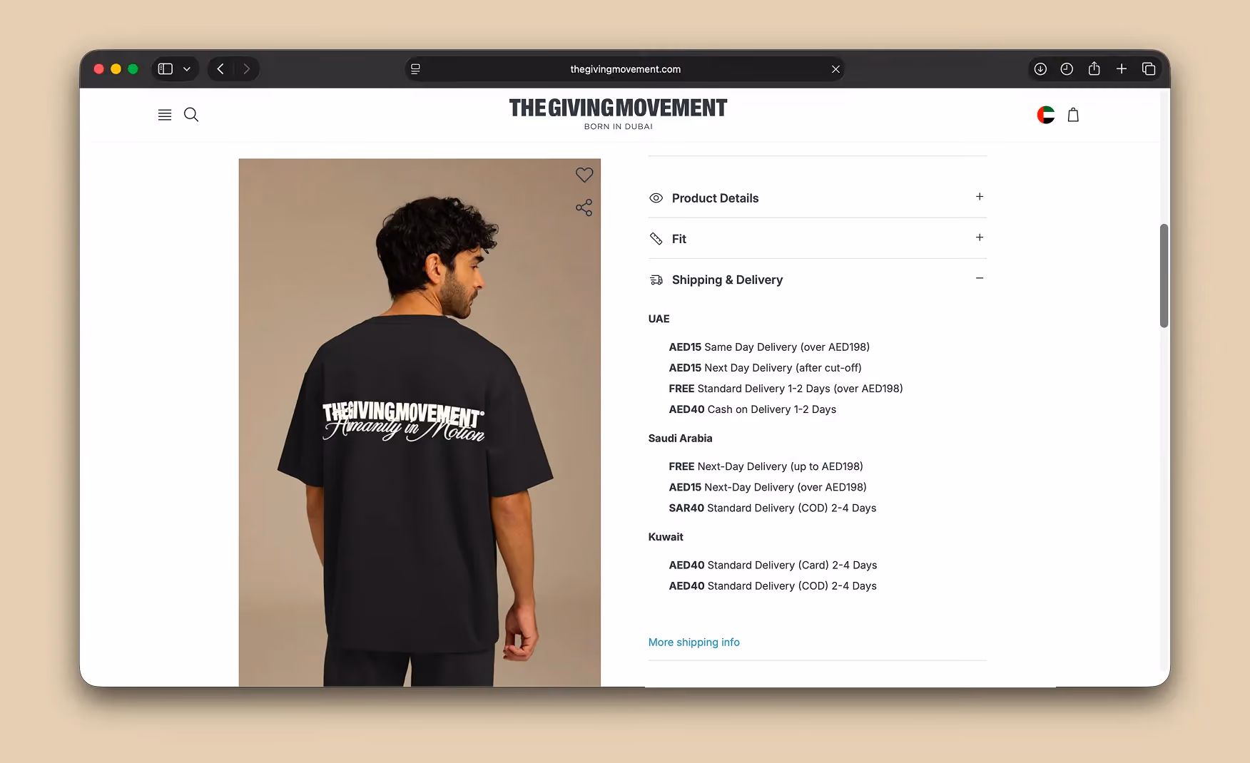
3. Two-Hour Delivery Inside the UAE 🚚
The product detail page carries a button promising two-hour delivery within the UAE.
This is operationally unheard of for premium fashion brands and it lands on the page at exactly the right moment: the consumer is already on the size selector, already considering whether to commit, and the delivery window removes the last meaningful reason to choose the mall instead.
The category norm for fashion D2C delivery in the UAE is five to seven working days. Even most fast-fashion operations take 24 to 48 hours. Two hours signals that the brand has solved something logistically that most competitors have not attempted, and it converts at the exact moment of highest purchase intent. The signal is doing commercial work, not just operational work.
Screenshot: Two-hour delivery button on the PDP. Capture from a UAE IP address to trigger the geo-specific display.
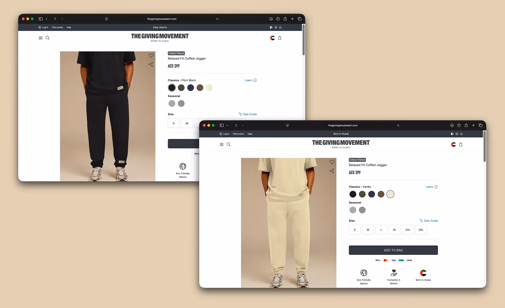
4. AI-Driven Swatch Swap That Lets the Brand Merchandise at Speed 🤖
The most quietly clever production decision on the site is the use of AI photography on the product page. When a visitor switches colourways using the swatches under the hero image, the model's outfit changes while everything else in the frame stays the same. The background, the lighting, the model's hair and skin: all of it remains consistent. Only the garment updates.
The execution is good enough that the swap does not look cheap, which is the specific failure mode most AI-product photography falls into. The commercial advantage is significant.
New colourways can be added to the catalogue without booking a separate photo shoot for each variant, which means the bottleneck on every drop becomes manufacturing rather than creative production. Speed of merchandising is one of the hidden costs of running a premium fashion brand online, and this is one of the smartest ways a brand has worked around it.
Screenshot: Two captures of the same PDP showing the model's outfit changing on colourway selection while the background stays the same. Label them Before and After.
Where the User Experience Needs Work ⚠️
1. The First Product Preview Arrives Far Too Late in the Scroll 📜
The homepage moves through five or more editorial sections before the first shoppable product row appears. The sequence is cityscape, beach family editorial, brand statements, image-only spreads, and then, eventually, a product grid near the bottom of the page. For a visitor who arrived intending to browse and buy, the path to a product card requires significant scrolling with no commercial destination in sight.
The product cards themselves are well designed when they finally appear. Colourways are previewable, prices are visible, and ratings are clear. That makes the buried placement more frustrating rather than less, because the brand clearly knows how to build a good product card. It just chose to put the brand story in front of it seven sections deep.
There is a version of this homepage where the editorial ambition and the commercial function coexist. The Café Ballet campaign visual is strong enough to anchor the hero without running for five sections. A product strip at fold two or three would not undermine the brand statement. It would serve the customer who has seen the editorial and is ready to act.
Screenshot: Full homepage scroll annotated to show the long editorial path before the first shoppable product row appears.
Homepage Scroll Depth vs. Commercial Action Points 📊
The pattern above describes a homepage that is asking a lot of a visitor who came to shop. An editorial homepage works when the brand has earned the consumer's patience.
The Giving Movement has earned it. The question is whether it should be asking for that patience five sections before showing a single product.
2. No Customer Reviews on the PDP 🔲
For a brand selling premium-priced clothing, the product detail page does not surface customer reviews at any point in the scroll. The expected social proof at this price tier is star ratings, written reviews with sizing notes, and customer photography showing the product on real bodies.
The Ordinary built a significant part of its conversion credibility on exactly this model. Glossier did the same. Both are now D2C category references partly because their PDPs gave first-time visitors a way to believe in the product before they bought it.
Apparel without reviews is asking the visitor to bet on the photography alone. For a customer who wears a size between standard options, or who is buying across an international size system, or who simply wants to know how the fabric feels against skin before committing at this price point, the absence of review content is the single largest trust gap on the page. Adding reviews to the PDP is the specific, bounded intervention that sits between The Giving Movement and a perfect score on this audit.
Screenshot: PDP scrolled to where reviews would normally appear, with the absence visible below the product description and fabric details.
What Suplex Would Fix First 💡
Priority 1 - Move a Product Strip to Fold 2 or 3 🔧
The fix for the buried product grid is structural rather than aesthetic. The homepage does not need to sacrifice editorial ambition to become more commercially functional.
A featured product strip positioned after the hero and before the brand storytelling sections would serve visitors who arrived ready to browse, without interrupting the campaign narrative for visitors who are reading the brand story first.
A well-designed product strip at fold two should show four to six products with colourway selectors, a price, and a clear add-to-cart path. It does not need to be a full grid. It just needs to exist high enough in the page that a visitor who scrolled past the hero does not have to commit to a significant scroll before they can engage commercially.
Priority 2 - Implement a Full Review Stack on the PDP 💬
The review system should sit between the product description and the shipping information on the PDP, which is the standard placement for high-performing fashion PDPs.
The stack should include a star rating summary, written reviews with verified purchase labels, a size-fit indicator, and customer photos. At this price tier, the review section is not a nice-to-have. It is the evidence layer that converts a visitor who is interested into a buyer who is confident.
Integrations like Yotpo, Okendo, or Stamped can be deployed across a Shopify stack in a sprint. The build is not the constraint. The constraint is prioritising the sprint, which is worth doing before anything else on the product page.
Final Scorecard 🏆
Suplex Verdict 📝
The Giving Movement's website is, in several respects, the most culturally precise fashion D2C site operating in the UAE market right now. The casting is right. The identity is right. The operational signal of two-hour delivery is a genuine conversion advantage. The AI swatch merchandising is clever and well-executed. These are not things most brands get right simultaneously, and they deserve acknowledgement.
Two things pull the experience back from its potential. A homepage that takes seven sections to show a product is a homepage that is working against its own commercial interests. A PDP without customer reviews is a PDP that is asking for trust it has not yet finished earning. Both are solvable in a single focused sprint.
Overall Rating: ⭐⭐⭐⭐ 4 / 5
Suplex Design works with fashion D2C and athleisure brands across the UAE and India on conversion-focused UX, product page architecture, and website audits. If your brand is at a similar stage to The Giving Movement and you want an honest assessment of what is holding your site back, get in touch with our team of experts at Suplex Design.
Hi, I’m Rishabh Jain
I believe great design has the power to shape perception, build trust, and move businesses forward. That belief is what led me to found Suplex Design Studio, a global branding and packaging studio working with FMCG and D2C brands across markets.I started suplex at 25 with a clear intent, to create design that is strategic, thoughtful, and commercially meaningful. By 28, the studio had scaled globally, guided by a strong foundation in Integrated Design that I developed during my academic journey in London, where I was honoured with the Dean’s Award.
Over the years, I’ve had the opportunity to work with 100+ brands, from Fortune 500 organizations to family-run businesses, helping them build packaging and brand systems that create recall, relevance, and long-term value.
Suplex’s work has been recognized internationally, including the Manifest Award (2024), the Clutch Global Award (2025), and features on platforms such as Packaging of the World, The Dieline, and the World Brand Design Society.
None of this would be possible without the people behind the work. I’m deeply grateful to the suplex team, whose commitment, creativity, and attention to detail turn ideas into meaningful brand experiences every day.
At the heart of my work is a simple philosophy, design should be intentional, honest, and built to last, and that continues to guide everything we create at suplex.


Let’s Make It Happen
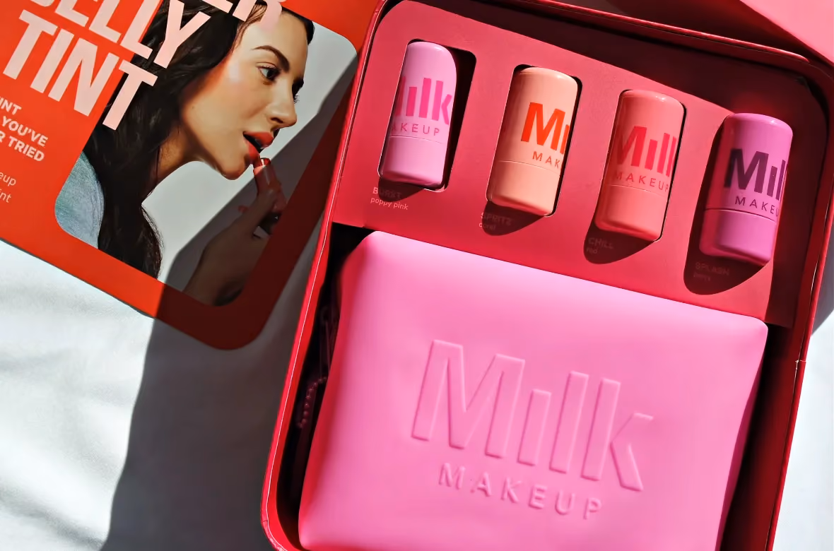
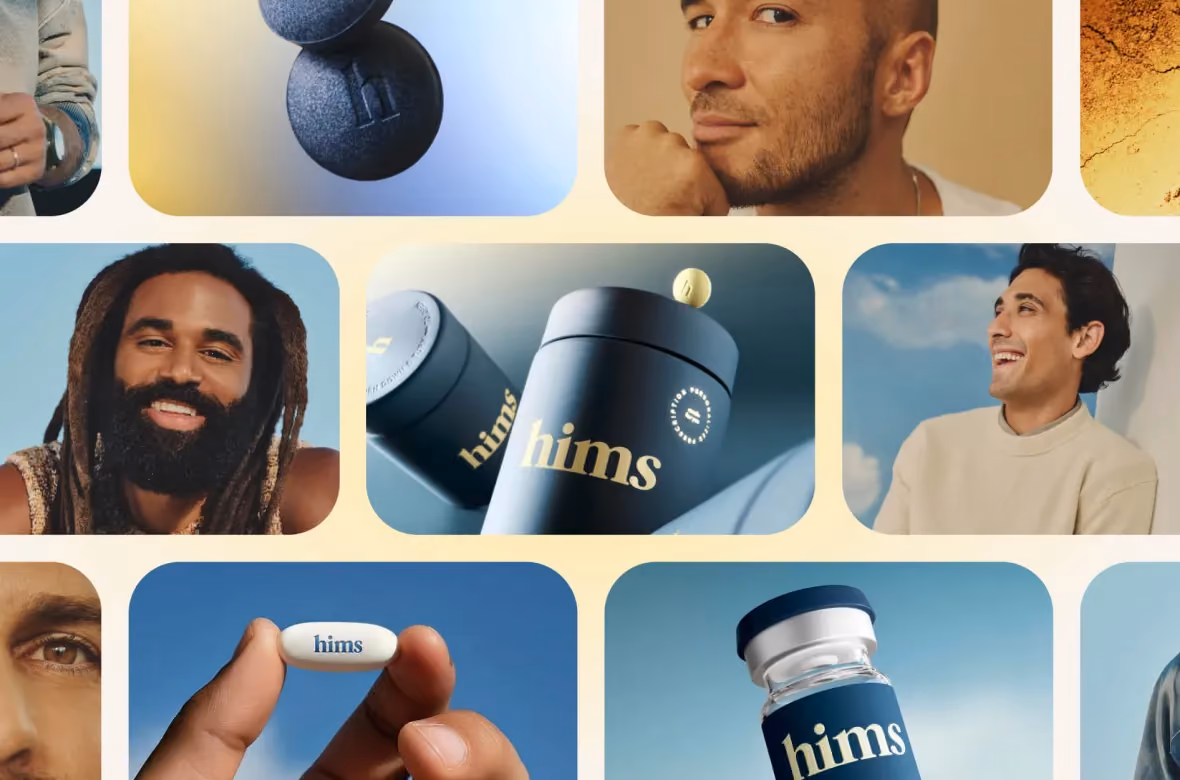
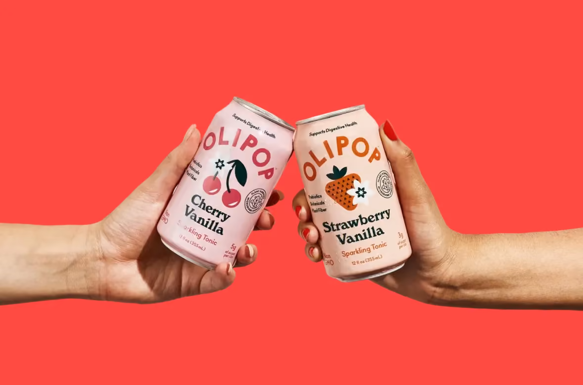
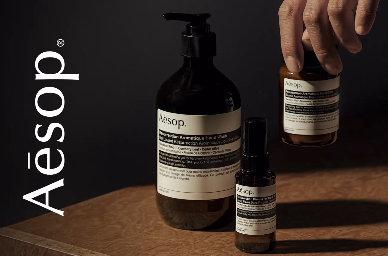
E-Commerce Success Stories
%201.avif)


.avif)
.avif)
Build Your D2C Business The Right Way
Build It With Suplex.


