The Sleep Company
.avif)
The Sleep Company
The Sleep Company | Suplex’s Verdict ⭐⭐⭐⭐½
Suplex’s Website Audit for The Sleep Company at a Glance 📊
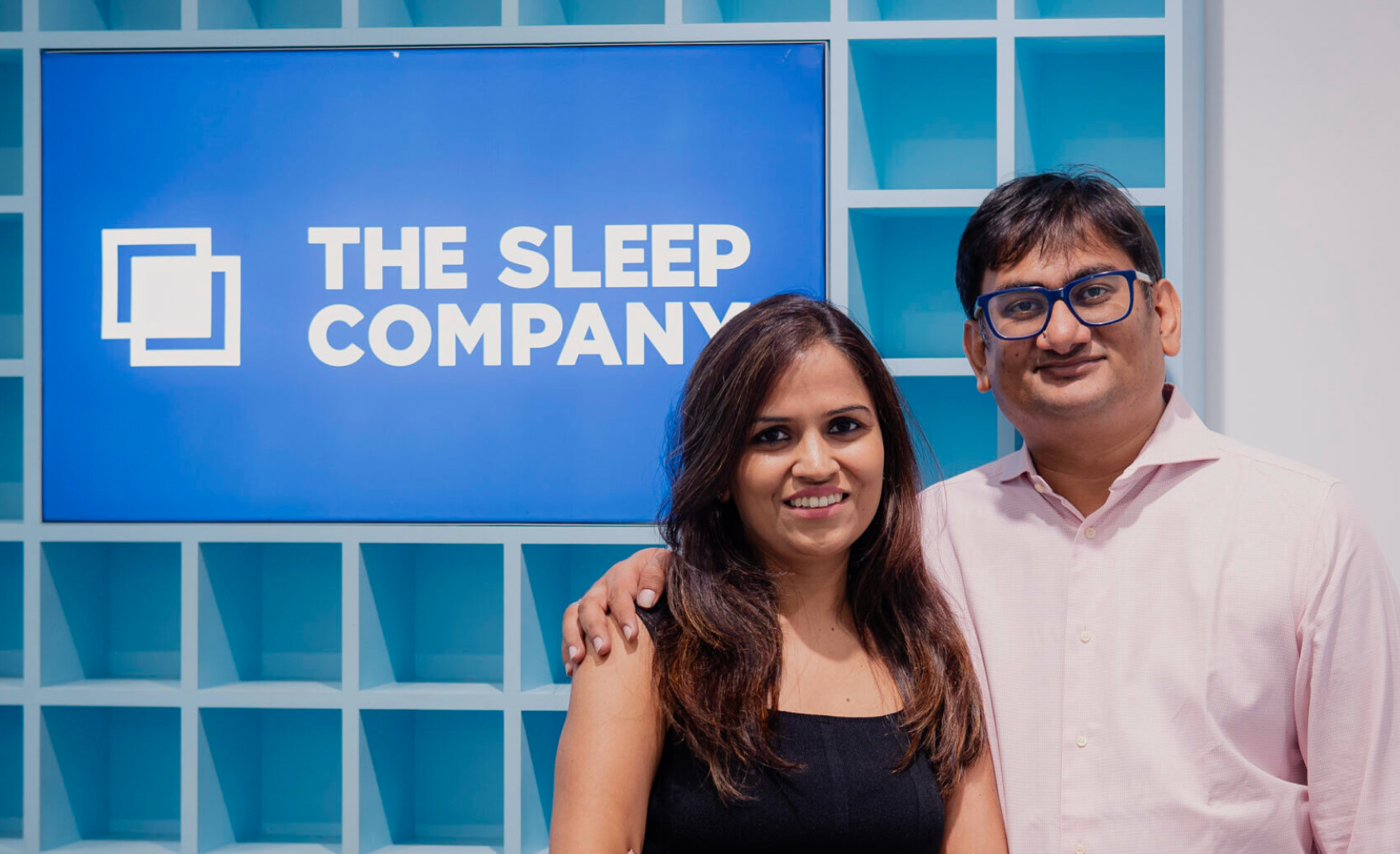
Founded in 2019 by Priyanka and Harshil Salot around SmartGRID, a proprietary support material that won India's National Award for Material Innovation, The Sleep Company closed FY25 with INR 499 crore in revenue, up 60% year on year, raised INR 480 crore in a Series D round in August 2025 at an 80% valuation step-up, and now runs more than 200 physical stores across 55-plus cities selling sleep, seating, and relaxation from a single catalogue.
Suplex Design analysed thesleepcompany.in across hero and first-screen trust, navigation architecture, homepage trust mechanics, category and Product Detail Page design, and mobile experience, and what follows is a breakdown of why this is one of the most complete commerce experiences in Indian home D2C, and the one fix that would lift it from very good to category-defining. This audit reflects the site as it stood in June 2026.
What The Sleep Company’s Website Gets Exceptionally Right ✅
1. The Hero Closes the Trust Gap Before the Visitor Scrolls 🎯
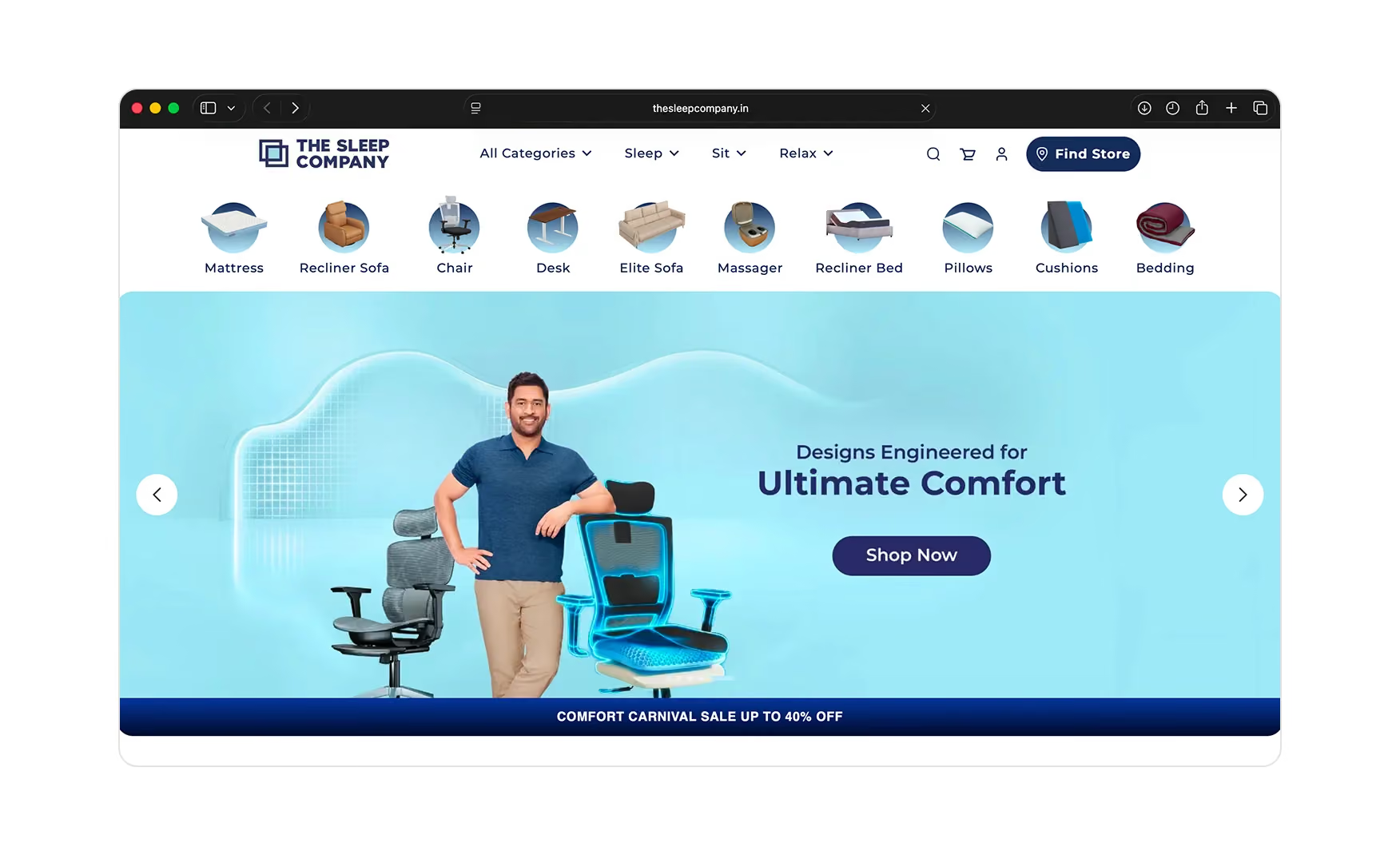
The first screen carries MS Dhoni, arguably the highest-trust celebrity face in India, seated on a SmartGRID mattress with the grid material exposed and zoomed rather than hidden inside the product.
The headline reads Sleep Peacefully, India's 1st and Only SmartGRID Mattress, and a Pre-Monsoon Sale ribbon sits directly beneath it. Celebrity validation, a proprietary IP claim, and a live promotion all share a single frame.
For a category where the customer is being asked to commit INR 30,000 to INR 80,000 to a product they cannot feel before buying, that triple stack does real work, it answers can I trust this brand, why is this different, and why now, all before the first scroll.
Putting the grid on display instead of burying it is the right confidence move for a tech-led positioning.
2. The Navigation Is Built Around Verbs the Customer Recognises 🧭
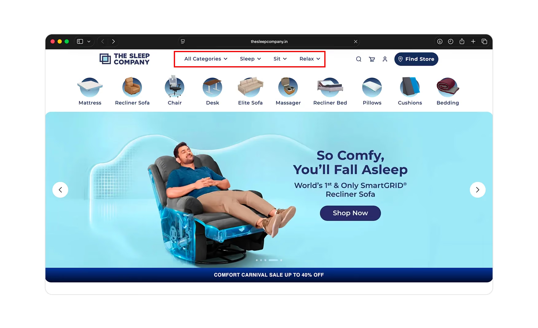
The primary nav reads All Categories, Sleep, Sit, Relax, with a category icon row beneath it covering the full range.
The customer is routed by what they want to do rather than by what each product is technically called, which is the correct call for a brand selling everything from mattresses to gaming chairs under one roof.
Most furniture sites force the visitor to translate I need a comfortable chair to work in into an office chair before they can click. The Sleep Company does that translation for them.
The verb-led structure also future-proofs the catalogue, since every new product launches inside Sleep, Sit, or Relax without forcing a nav redesign. The depth is holistic without being overwhelming, and it sets the tone for a site that consistently does the thinking on the customer's behalf.
3. The Homepage Runs a Complete Trust Sequence, Not a Single Badge 🏅
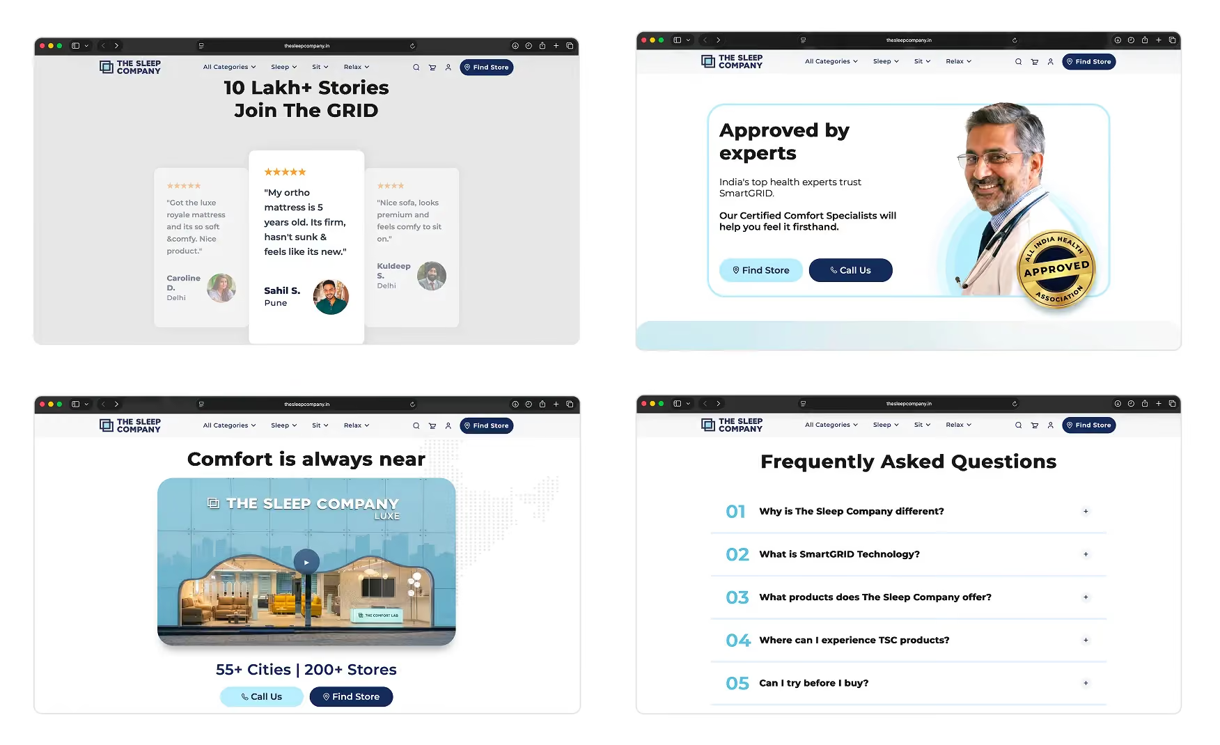
Past the hero, the homepage moves through trust in deliberate stages.
A Freedom of Comfort block pairs a short explainer video with supporting detail.
An Approved by Experts section places a doctor and an orthopaedic certification badge alongside a direct call to action.
A 55-plus Cities, 200-plus Stores line makes the physical footprint explicit.
A Comfort On Camera row hands the story to real customers speaking in their own faces and voices.
A detailed FAQ closes the page.
The physical store claim is the move most digitally native competitors cannot match. A first-time mattress buyer's biggest unspoken fear is being stuck with a product that does not work, and 200-plus stores answers that before the question is asked.
4. The Category Pages Merchandise as Hard as the Homepage 🛒
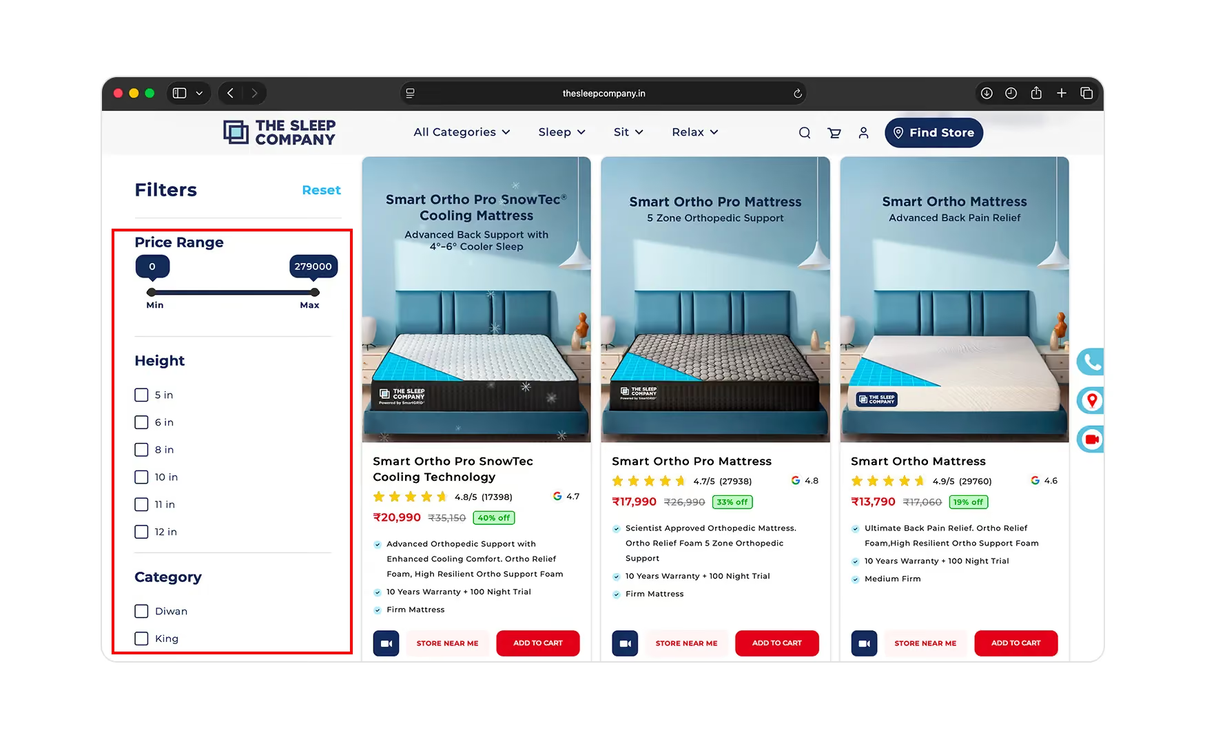
Each category page opens with banners and a moving feature strip that communicates the things a mattress buyer needs to hear in one pass like free shipping, non-toxic materials, customised sizes, a 100-night trial, while a left-rail filter set lets the visitor narrow by price range, height, and category immediately.
The product cards themselves carry a star rating with review count, the Smart Ortho Mattress shows 4.9 out of 5 across 29,760 reviews, a separate Google rating, the discounted price against MRP, two or three benefit bullets, and three actions, a video demo, Store Near Me, and Add to Cart, without forcing a click into the product page just to see basic information.
That is a grid built to genuinely convert browsers, not merely to list products.
5. The Product Page Is Built to Close, Not Just to Describe 🔑
The Product Detail Page is where the site is at its most considered.
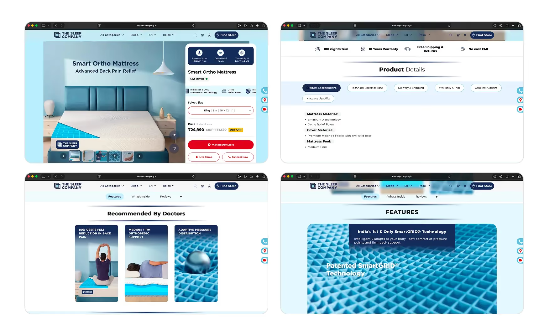
Above the title sit three decision icons, Firmness Score Medium Firm, Ortho Relief Foam, and Trusted By 10 Lakh Plus Indians, followed by the rating, a Recommended by Doctors at AIHA line, and the SmartGRID technology claim.
Below the Add to Cart button the brand offers a Live Demo and a Connect Now option, plus a pincode check for delivery and the nearest store, so an undecided buyer always has a human path forward instead of a dead end.
Scroll on and the page layers a what's inside breakdown, a feature section, A+ creative imagery, full product and technical specifications, warranty and trial terms, and care instructions.
Most valuable of all, the reviews are consolidated from the brand's own site alongside Amazon and Flipkart in one place, so the buyer does not have to leave to check whether the product holds up elsewhere.
Where the Experience Falls Slightly Short ⚠️
1. The Live-Shop Popup Blocks the Mobile Visitor Before the Brand Can Speak 🚧
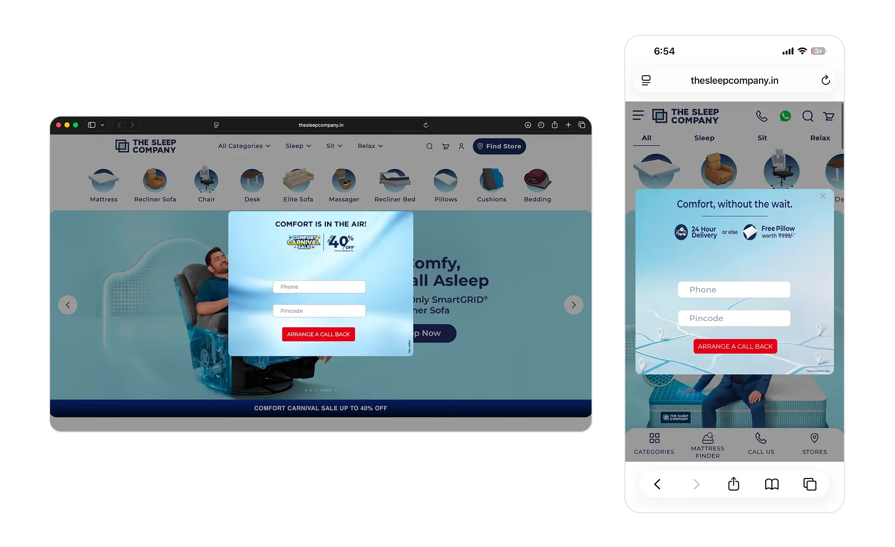
On a first mobile visit the site opens directly onto a Popin-powered Live Shop popup that asks for a phone number in exchange for joining a live video shopping session, and it covers the hero entirely.
The feature itself is genuinely strong for this category, and the popup claims 10,000-plus people have already used it to find their product, but making it the very first interaction, before the brand, the SmartGRID claim, or the Dhoni hero have been seen, asks for commitment the visitor has no reason to give yet. The same friction recurs as a call-back modal on the collection pages.
A first-time buyer needs to see the brand and the proof before accepting an invitation to video-call a sales rep, and the current order inverts that, spending the discovery moment the rest of the site has earned. The mobile cohort, the majority of Indian D2C traffic, loses its first impression to a form, and the brand's strongest first-screen assets never get seen.
First-Paint Mechanics Compared 📊
What Suplex Would Fix First 💡
Priority 1 - Move the Live Shop Invitation Off the First Paint 🔧
Move the Live Shop invitation behind a persistent Talk to a Sleep Expert button on the side or bottom of the screen, and trigger it again in-cart where intent is already high.
The feature itself does not need to change. The sequencing does. A first-time visitor should see the brand, the SmartGRID claim, and the Dhoni hero before being asked to commit a phone number to a live video session.
Final Scorecard 🏆
Suplex Verdict 📝
The Sleep Company has shipped one of the most complete commerce experiences in Indian home D2C.
A verb-led information architecture, a hero that closes the trust gap in one frame, a homepage that runs a full trust sequence, and category and Product Detail Pages that answer nearly every buyer question before it is asked. For a brand now selling across nine categories from a single catalogue, holding this much discipline across every surface is a genuinely difficult execution problem, and the site solves it.
The gaps are narrow and fixable. Move the Live Shop invitation out of the first-paint slot so the brand can introduce itself.
Overall Rating: ⭐⭐⭐⭐½ 4.5 / 5.
Suplex Design works with D2C home, furniture, and wellness brands across India and the UAE on Product Detail Page architecture, conversion strategy, and website audits. If your brand is at a similar stage to The Sleep Company and you want an honest assessment of what is holding your site back, get in touch with our team of experts at Suplex Design.
Hi, I’m Rishabh Jain
I believe great design has the power to shape perception, build trust, and move businesses forward. That belief is what led me to found Suplex Design Studio, a global branding and packaging studio working with FMCG and D2C brands across markets.I started suplex at 25 with a clear intent, to create design that is strategic, thoughtful, and commercially meaningful. By 28, the studio had scaled globally, guided by a strong foundation in Integrated Design that I developed during my academic journey in London, where I was honoured with the Dean’s Award.
Over the years, I’ve had the opportunity to work with 100+ brands, from Fortune 500 organizations to family-run businesses, helping them build packaging and brand systems that create recall, relevance, and long-term value.
Suplex’s work has been recognized internationally, including the Manifest Award (2024), the Clutch Global Award (2025), and features on platforms such as Packaging of the World, The Dieline, and the World Brand Design Society.
None of this would be possible without the people behind the work. I’m deeply grateful to the suplex team, whose commitment, creativity, and attention to detail turn ideas into meaningful brand experiences every day.
At the heart of my work is a simple philosophy, design should be intentional, honest, and built to last, and that continues to guide everything we create at suplex.























Let’s Make It Happen
E-Commerce Success Stories
%201.avif)






.avif)
.avif)
Build Your D2C Business The Right Way
Build It With Suplex.


