Olipop
.webp)
Olipop
OLIPOP | Suplex's Verdict ⭐⭐⭐⭐
Suplex’s Website Audit for OLIPOP at a Glance 📊
OLIPOP crossed USD 400 million in revenue in 2024, doubling year-on-year, turned down acquisition approaches from both Coca-Cola and PepsiCo in 2023, and raised a USD 50 million Series C at a USD 1.85 billion valuation in February 2025. All this while holding a 60% share of the global prebiotic soda category.
Suplex Design analysed the website across brand identity, catalogue architecture, retail integration, buying mechanics, and first-visit experience, and what follows is a breakdown of how this brand built one of the most distinctive D2C storefronts in food and beverage, and the one thing it still needs to fix.
What OLIPOP's Website Gets Exceptionally Right ✅
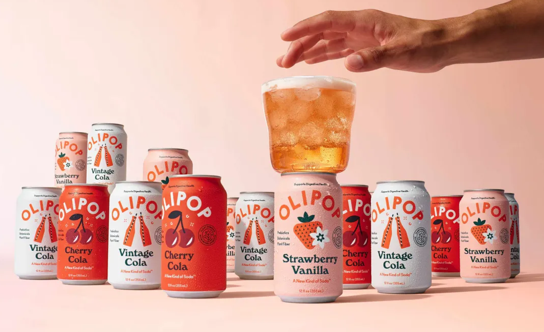
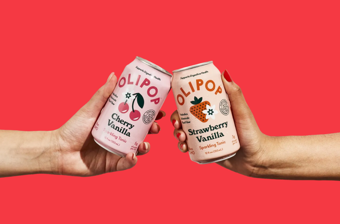
1. A Visual Identity That Refuses to Look Like Any Other Prebiotic Brand 🎨
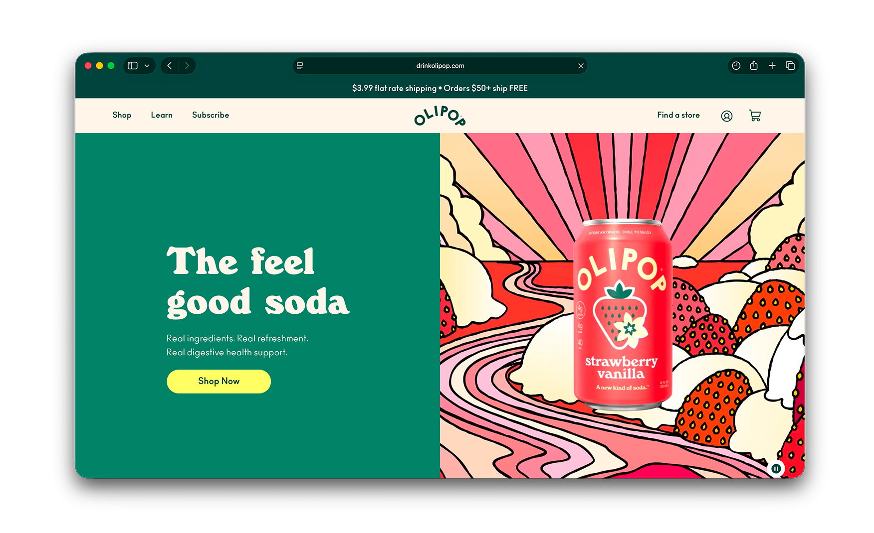
The homepage opens with a deep forest-green left half carrying the "feel good soda" headline and a Shop Now CTA. And on the right side, you will see a hand-drawn 70s sunset illustration with a rainbow sunburst and a Cream Soda can in someone's grip completes the frame.
The prebiotic category has flattened into a single visual language. Pastel cans, white backgrounds, and clinical health claims define almost every competitor in the space. OLIPOP has dressed the entire brand in the visual language of a craft brewery from 1976, and the illustration team is doing the differentiation work that the formulation team would normally have to do alone.
No other brand in functional beverages owns this visual territory. It is the kind of brand identity decision that looks obvious in retrospect and is almost never made in a category driven by health credibility.
2. Web Engineering That Matches the Design Ambition 💻
The motion layer across the homepage is exceptional. Hover states, scroll transitions, and micro-interactions stay sharp at every step, never lag, and never pixelate.
For a Shopify-built site, this level of motion polish is the marker of genuine web engineering investment working in sync with the design team.
Most D2C sites that invest heavily in visual identity end up with a beautiful design that the development layer cannot sustain at scale. But OLIPOP is not that site.
The animations our founder Rishabh Jain clocked across the homepage are the kind that make a visitor spend longer on the page than they intended to.
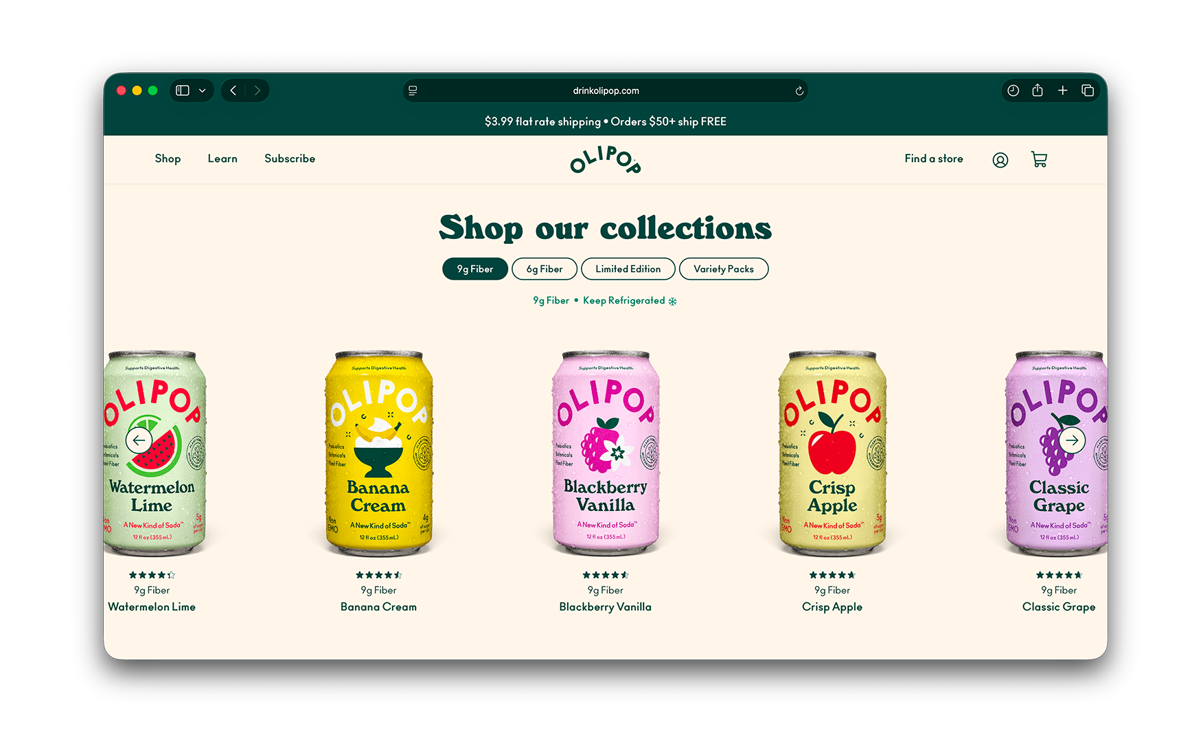
3. Shop by Fibre Line Reframes Soda as a Health Decision 🌿
Midway down the homepage sits a "Shop by fibre line" section. The entire catalogue is split into two product families, basically the 9g fibre line and the 6g fibre line. The customer is being asked to choose a soda based on how much prebiotic fibre they want, not which flavour they prefer.
For a brand whose underlying proposition is gut health, naming the dosage out loud and turning it into a navigation category is the correct move. The consumer who came in for a fizzy drink starts thinking like someone managing their fibre intake, and that mental shift is exactly what the brand needs to justify the price premium over a conventional soda.
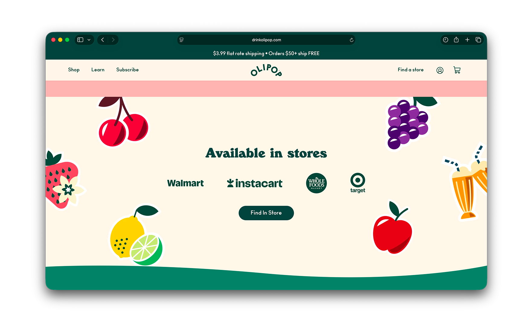
4. Retail Availability Surfaced on the Homepage as a Credibility Signal 🏪
Towards the bottom of the homepage, a panel adorned with illustrated cherries, grapes, lemons, and apples announces "Available in stores" with a Find a Store CTA.
OLIPOP now sits in nearly 50,000 US grocery stores including Whole Foods, Walmart, and Target. This footprint in itself is the single biggest credibility signal the brand can show any of their first-time visitors.
Surfacing the store locator on the homepage rather than burying it under an About or FAQ section turns a "wait, is this a real brand?" hesitation into "I can pick this up on my next grocery run."
For a D2C brand that also operates at mass retail scale, the homepage needs to serve both the online buyer and the offline browser. This section does exactly that.
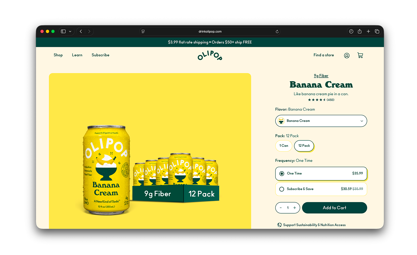
5. Pack Sizes Built for the Customer Who Already Knows They Like It 📦
The catalogue carries a 12-can single-flavour pack and a 12-can variety pack of four flavours, three cans each. Both pack configurations reflect a specific insight about the D2C beverage buyer.
A customer waiting two to three days for soda to be delivered is not browsing for novelty. They have already committed to the brand and want either bulk or breadth.
The variety pack is also the smartest acquisition mechanic on the site for a first-time visitor who wants to try before committing to a single flavour… maybe like four flavours, three cans each, one order, and the brand has converted a browser into a repeat customer before the first case runs out.
Where the User Experience Falls Short ⚠️
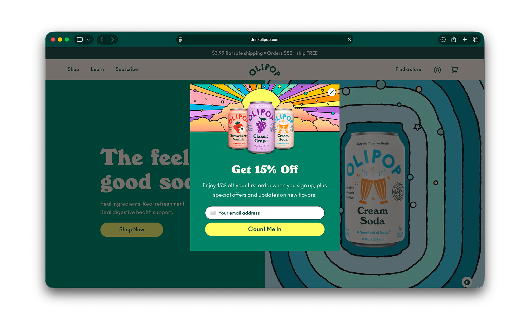
1. A First-Paint Popup Buries the Brand Impression on Arrival 🚧
The first thing a visitor sees on landing is a "Get 15% Off" email-capture popup covering the hero.
For a brand whose entire visual hook is an unusual illustration aesthetic that the rest of the homepage sustains beautifully, taking the visitor out of the brand frame within one second of arrival is a direct contradiction of the creative investment.
The discount offer itself is fine, however the placement of the same is wrong. The homepage hero is the single most expensive piece of brand-building real estate on the site, and the popup is cancelling it for every first-time visitor before they have seen a single pixel of the illustration.
A smaller exit-intent slide-out, a sticky bottom banner, or a delayed scroll trigger would capture the email without removing the brand moment that the homepage exists to create.
Popup Placement Options Compared 📊
What Suplex Would Fix First 💡
Priority 1 - Move the Email Capture Off the Hero 🔧
Replace the modal-on-landing with an exit-intent overlay, a sticky bottom slide-up, or a delayed scroll trigger carrying the same 15% offer.
Test the new mechanic against the current modal for two to three weeks to confirm that the email capture rate holds within an acceptable range. The brand-expression cost of the current placement is high enough that a small reduction in capture rate is worth absorbing to let the illustration system do the job it was built for.
Final Scorecard 🏆
Suplex Verdict 📝
OLIPOP has built a website that does the brand's most important job that is making a prebiotic soda feel like the most interesting thing in the cooler.
The 70s illustration system is genuinely distinctive, the motion engineering holds it at every scroll depth, the catalogue taxonomy ties the purchase decision to the health claim rather than to flavour preference, and the retail footprint is surfaced at exactly the right moment in the visitor journey.
One single mechanic stands between this storefront and a perfect score. Moving the email capture popup off the hero is a one-sprint task that would let the brand impression land before the discount ask, which is the sequence every D2C brand with this level of visual investment should be protecting.
Overall Rating: ⭐⭐⭐⭐ 4 / 5. One popup placement change from a 5.
Suplex Design works with D2C food, beverage, and lifestyle brands across the UAE, India, and the US on conversion strategy, homepage architecture, and website audits. If your brand is at a similar stage to OLIPOP and you want an honest assessment of what is holding your site back, get in touch with our team of experts at Suplex Design.
Hi, I’m Rishabh Jain
I believe great design has the power to shape perception, build trust, and move businesses forward. That belief is what led me to found Suplex Design Studio, a global branding and packaging studio working with FMCG and D2C brands across markets.I started suplex at 25 with a clear intent, to create design that is strategic, thoughtful, and commercially meaningful. By 28, the studio had scaled globally, guided by a strong foundation in Integrated Design that I developed during my academic journey in London, where I was honoured with the Dean’s Award.
Over the years, I’ve had the opportunity to work with 100+ brands, from Fortune 500 organizations to family-run businesses, helping them build packaging and brand systems that create recall, relevance, and long-term value.
Suplex’s work has been recognized internationally, including the Manifest Award (2024), the Clutch Global Award (2025), and features on platforms such as Packaging of the World, The Dieline, and the World Brand Design Society.
None of this would be possible without the people behind the work. I’m deeply grateful to the suplex team, whose commitment, creativity, and attention to detail turn ideas into meaningful brand experiences every day.
At the heart of my work is a simple philosophy, design should be intentional, honest, and built to last, and that continues to guide everything we create at suplex.


Let’s Make It Happen
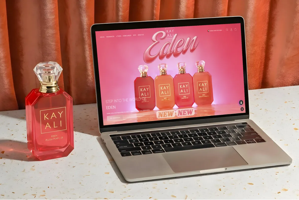
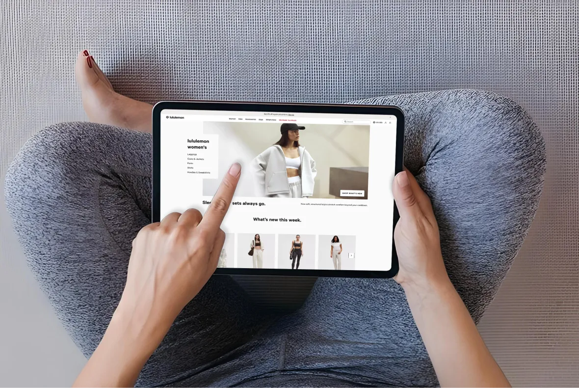
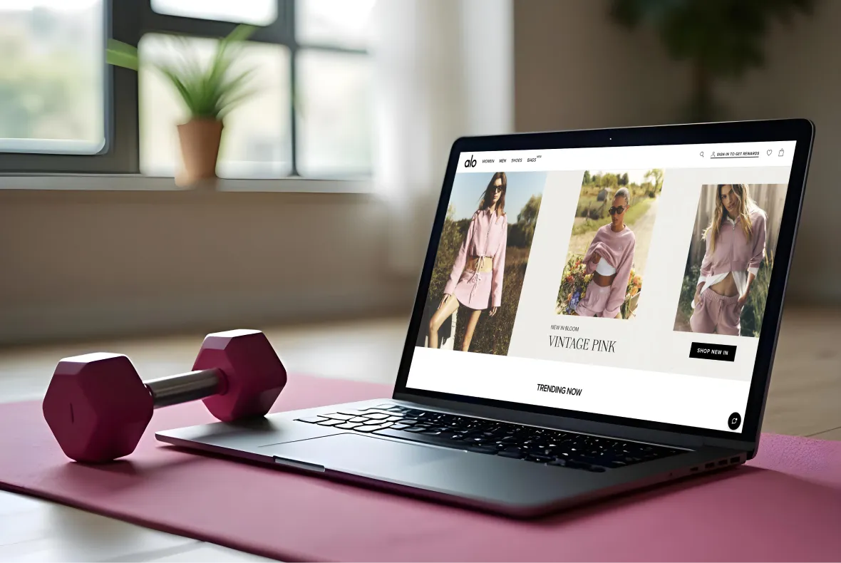
E-Commerce Success Stories

%201.webp)

.webp)
.webp)
Build Your D2C Business The Right Way
Build It With Suplex.


