BlendJet
.avif)
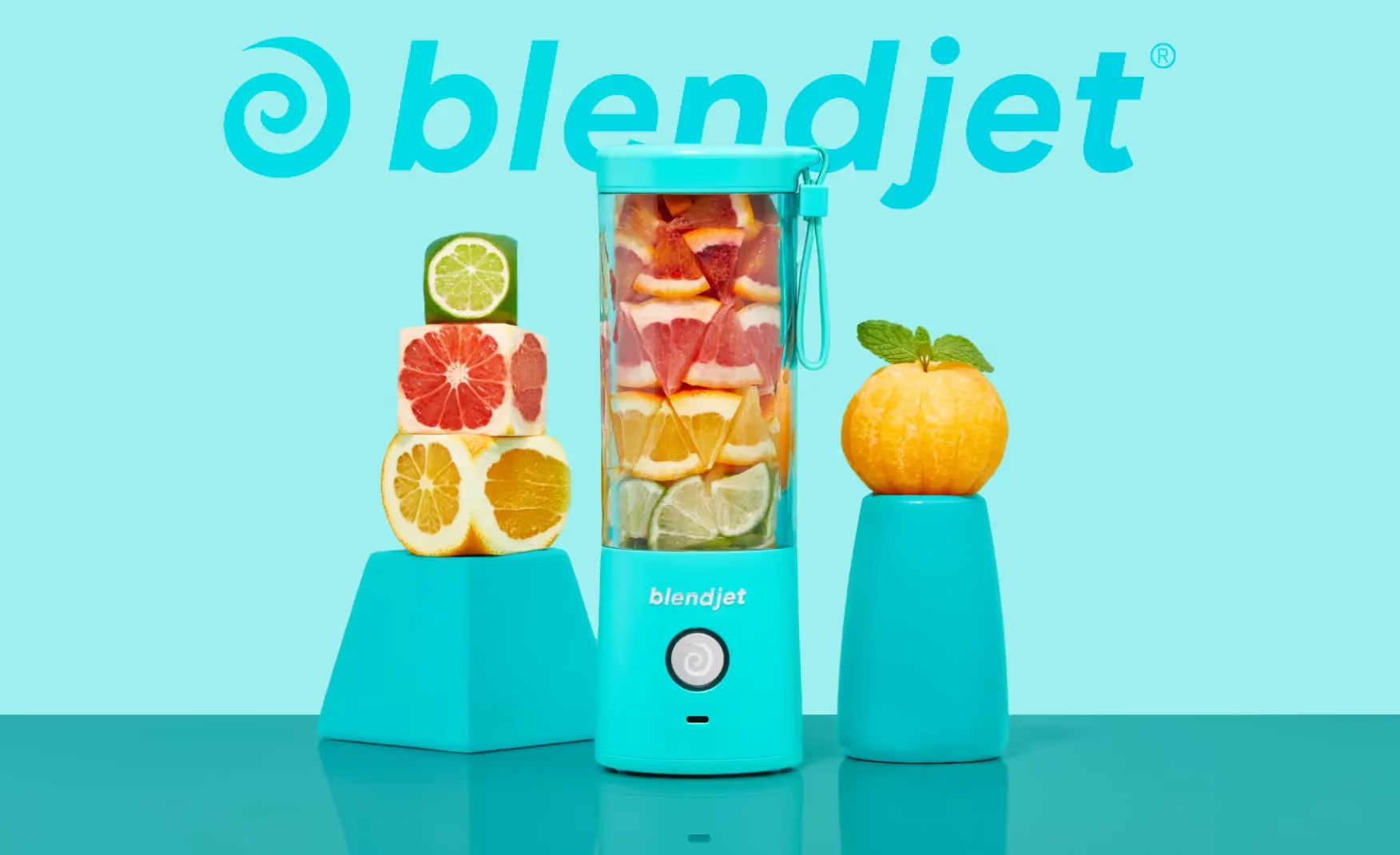
BlendJet
BlendJet | Suplex’s Verdict ⭐⭐⭐⭐⭐
Suplex’s Website Audit for BlendJet India at a Glance 📊
Founded in June 2018 by Ryan Pamplin and John Zheng after a personal health scare that made daily smoothies a survival habit, BlendJet created the portable blender category, crossed nine-figure revenues globally, and reached 10 million customers worldwide.
Suplex Design analysed blendjet.in across product focus, merchandising, Product Detail Page education, trust mechanics, and post-purchase retention, and what follows is a breakdown of why this site earns a clean 5 out of 5 and what the next two compounding moves would be. This audit reflects the site as it stood in July 2026.
What BlendJet India’s Website Gets Exceptionally Right ✅
1. One Product, One Decision, Everything Pointed at It 🥤
BlendJet India is really selling one thing, and the whole site is built to get you to that single decision.
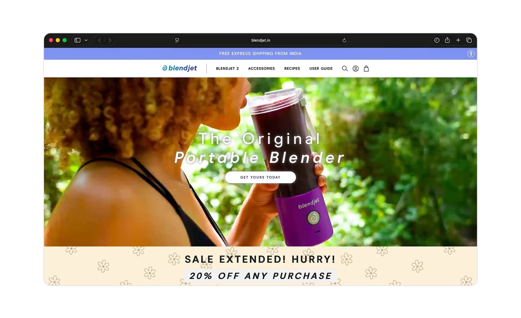
The navigation is just BlendJet 2, Accessories, Recipes, and User Guide. The hero leads with a colourful lineup of the blenders and The Original Portable Blender with a single Get Yours Today button, and directly below sits a clear 20 percent off sale with an end date and an As Seen On row of press logos such as Business Today, Financial Express, Livemint, and Yahoo.
Beneath that, an iconography strip explains the product in one pass, portable, powerful, USB-rechargeable, self-cleaning, alongside all the colours and prints. Within two folds the customer has the product, a reason to buy now, and third-party credibility.
2. The Homepage Keeps Selling After the Hero 📱
The page does not run out of ideas below the fold.
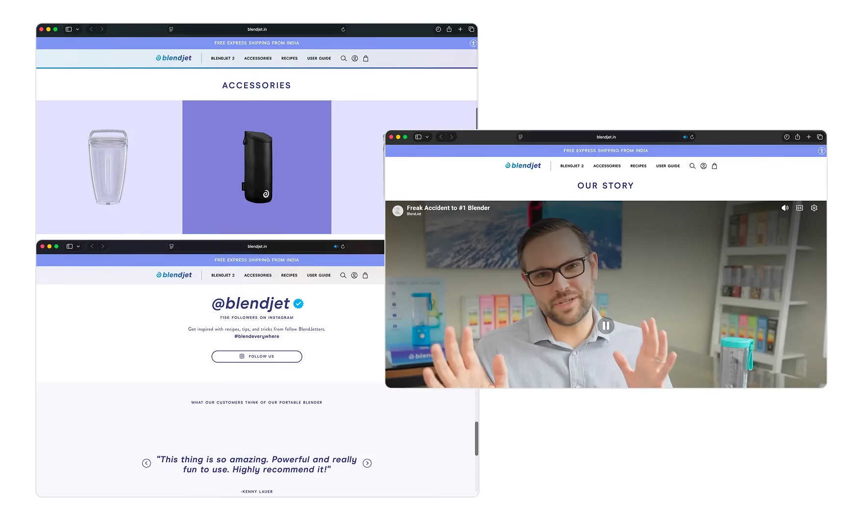
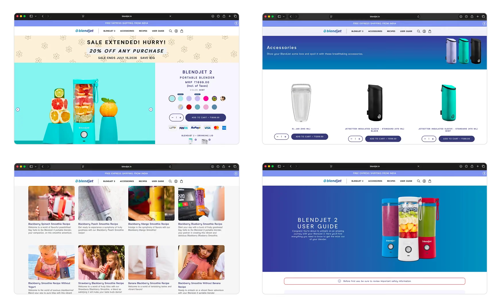
An accessories section surfaces the XL jar, the JetSetter insulated sleeve, and the Orbiter drinking lid, so the customer sees the whole system and not just the blender. An Our Story section leads to a YouTube film about the brand.
The page closes with an Instagram plug-in inviting the visitor to join a community of 715,000 followers under blendeverywhere. For an impulse product, showing that hundreds of thousands of people already blend everywhere is exactly the kind of momentum that converts a curious first-timer.
3. The Product Page De-Risks the Impulse Buy 🛡️
The Product Detail Page is built to remove every last hesitation before the buy.
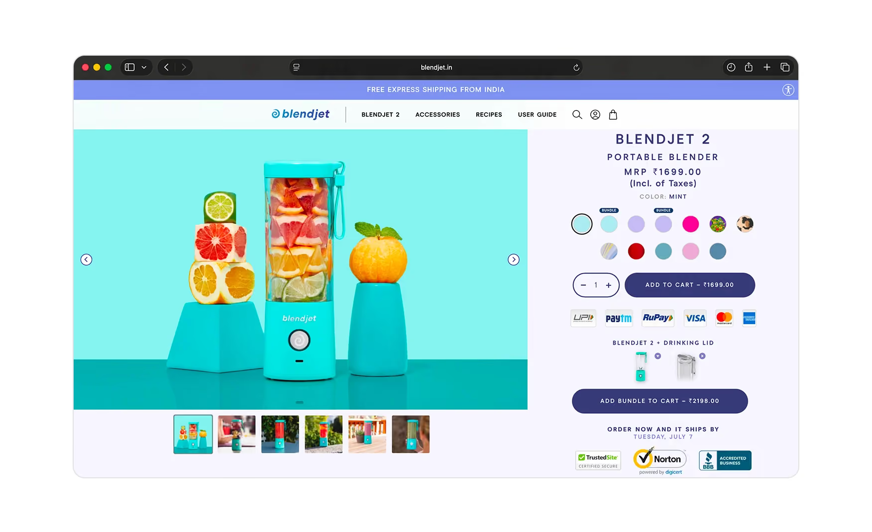
Below the add-to-cart the full set of payment methods is shown, there is an add the bundle to cart option pairing the blender with a drinking lid, and an order now and it ships by date line sets a concrete delivery expectation.
Trust icons from TrustedSite, Norton, and the BBB sit right at the decision point. A video section shows the blender in actual use, the features block explains the patented TurboJet technology and why it is perfect for everything, and the full specs, including the Red Dot Design Award, are laid out plainly.
4. The Reviews Carry Photos and Video and Almost All of Them Do ⭐
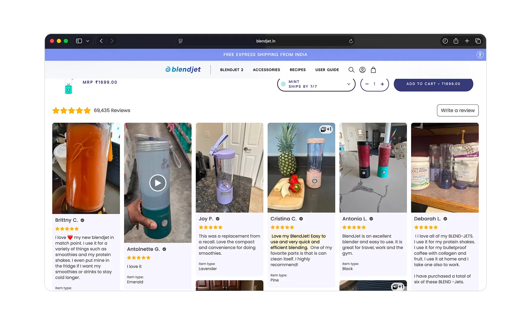
The review section is the trust engine, and it is full of reviews with images and video from real customers.
The notable thing is that almost every review carries a photo, so a shopper is not reading text testimonials but actually watching the product perform in other people's kitchens.
For a product bought on impulse and used daily, seeing it work in hundreds of real hands is the single most persuasive asset on the page, and BlendJet India has it in volume.
5. Recipes and a Real User Guide Keep the Customer After the Sale 📚
Two of the four nav items exist entirely for the post-purchase life of the product, and both do real work.
The Recipes section runs like a blog with a genuine library of things to make, which is what keeps a blender in daily use rather than sitting in a drawer.
The User Guide is thorough, walking through the anatomy of the jar, what to do on your first blend, how charging works, the different modes, how to troubleshoot, how to clean, and the important safety dos and don'ts. That guide quietly reduces returns and support tickets while making the customer feel looked after.
6. The Cart Upsells Without Friction 💰
The cart keeps working after the add.
Adding the blender surfaces a 20 percent off offer on a second unit, a natural gift or household add-on, and a tidy cross-sell of accessories and jar upgrades.
It is the right kind of upsell, relevant, discounted, and presented at the exact moment the customer has already committed, so it lifts the order value without getting in the way of checkout.
BlendJet India vs Single-Product Storefront Benchmarks 📊
Where BlendJet India Falls Slightly Short ⚠️
There are no material gaps to flag at this audit pass.
The single-product focus, the discount and press in the first folds, the accessories and community modules, the de-risked Product Detail Page, the photo-and-video reviews, the recipes-and-guide ecosystem, the cart upsell, and an active India-specific storefront together cover everything a single-product storefront needs. This is a complete build.
What Suplex Would Build Next 💡
Tie the Recipes Library Directly Into the Product Page 🔧
The Recipes section is excellent but currently lives in its own nav tab rather than surfacing on the Product Detail Page itself.
Tying a Make This in Your BlendJet section into the Product Detail Page, with a one-tap add of the matching ingredients or the relevant accessory, would turn post-purchase content into pre-purchase conversion and give a first-time buyer an immediate picture of the lifestyle they are buying into. This compounds the strength that already exists rather than repairing something that is broken.
Surface the Strongest Video Reviews Higher Up the Product Page 📝
The video reviews are the most persuasive trust asset on the site, but they sit at the bottom of the Product Detail Page in the review section where most visitors do not scroll.
A rotating strip of the three or four strongest video reviews placed between the features block and the full review section would let the social proof do its work before the customer has had to commit to scrolling that far. Neither move repairs a weakness. Both build on strength.
Final Scorecard 🏆
Suplex Verdict 📝
BlendJet India has done the hardest easy thing in commerce, taken a single product and built a site that leaves the customer no reason to hesitate.
The hero sells the product and the urgency. The homepage keeps selling with accessories and a 715,000-strong community. The Product Detail Page de-risks the buy with bundles, payment options, delivery dates, and security badges. The reviews are almost all photo and video. The recipes and user guide keep the customer engaged long after checkout. The cart upsells cleanly.
There is nothing here to fix. The two next moves are compounding ones, tying the recipe library into the Product Detail Page and surfacing the strongest video reviews earlier, and both build on strength rather than filling a gap.
Overall Rating ⭐⭐⭐⭐⭐ 5 / 5.
Suplex Design works with D2C consumer product and appliance brands across India and the UAE on Product Detail Page architecture, conversion strategy, and website audits. If your brand is building a single-product storefront and you want an honest assessment of how it compares to the best in the category, get in touch with our team of experts at Suplex Design.
Hi, I’m Rishabh Jain
I believe great digital experiences have the power to shape perception, build trust, and move businesses forward. That belief led me to found Suplex Design Studio, a global digital design and development studio helping FMCG and D2C brands build websites and digital experiences that are strategic, thoughtful, and commercially meaningful.
I started Suplex at 25 with a clear intent, to create digital experiences that look appealing, work seamlessly, and help D2C businesses grow. By 28, the studio had scaled globally, guided by a strong foundation in integrated design that I developed during my academic journey in London, where I was honoured with the Dean’s Award.
Over the years, I’ve had the opportunity to work with 100+ brands, from Fortune 500 organisations to family-run businesses, helping them build websites, e-commerce experiences, and digital products that create clarity, credibility, and long-term value.
Our work has been recognised internationally, including the Manifest Award (2024), the Clutch Global Award (2025), and features across platforms such as The Dieline, Packaging of the World, and the World Brand Design Society.
None of this would be possible without the people behind the work. I’m deeply grateful to the Suplex team, whose commitment, creativity, and attention to detail turn ideas into meaningful digital experiences every day.
At the heart of our work is a simple philosophy, digital design should be intentional, functional, and built to create real business value. That continues to guide everything we create at Suplex.






























Let’s Make It Happen
E-Commerce Success Stories
%201.avif)






.avif)
.avif)
Build Your D2C Business The Right Way
Build It With Suplex.


