Neutrogena
.webp)
Neutrogena
Neutrogena | Suplex’s Verdict ⭐⭐⭐½
Suplex’s Website Audit for Neutrogena at a Glance 📊
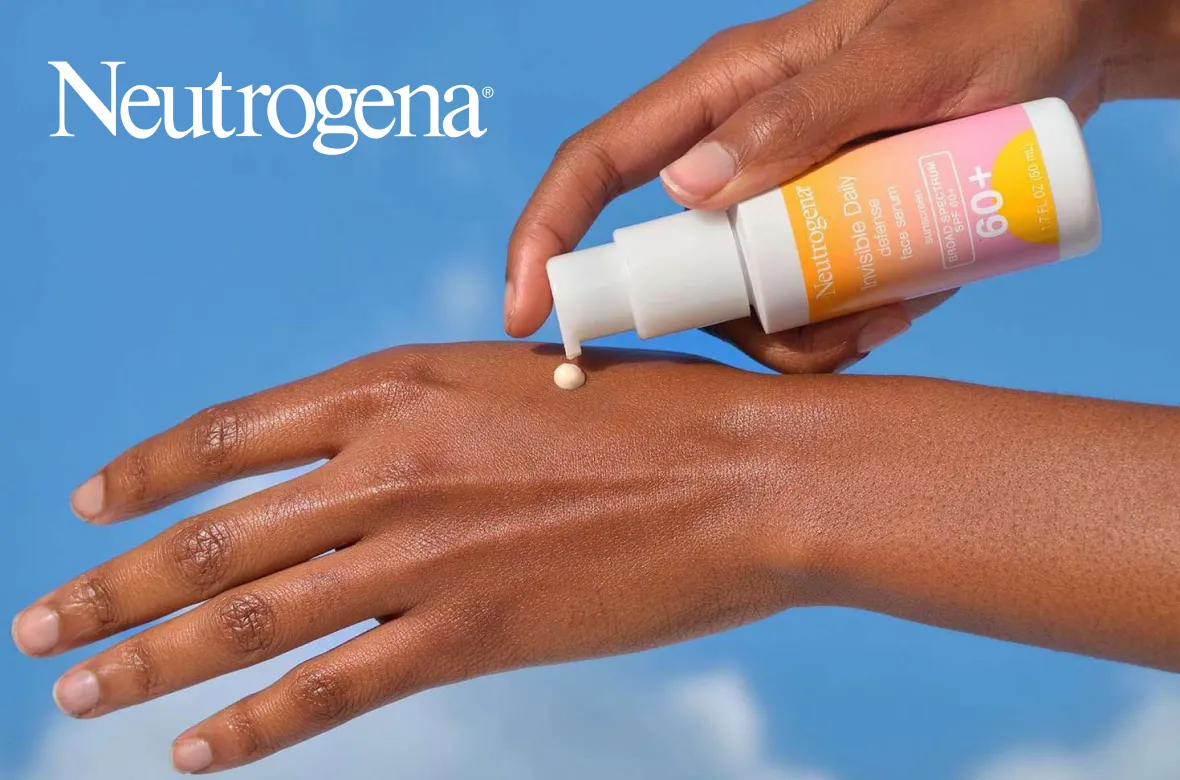
Founded in 1930 by Emanuel Stolaroff and acquired by Johnson and Johnson in 1994, Neutrogena now sits inside Kenvue, the consumer-health spin-off that listed on the NYSE in 2023 and agreed in November 2025 to be acquired by Kimberly-Clark in a deal worth approximately USD 40 billion. Neutrogena is one of the highest-volume skincare brands in the world and one of roughly ten Kenvue brands generating over USD 1 billion in annual revenue.
Suplex Design analysed neutrogena.com across AI tooling, editorial mechanics, product listing architecture, DTC checkout, brand storytelling, and mobile first-paint, and what follows is a breakdown of where the site is ahead of every legacy competitor and where three sprint-level fixes would take a 3.5 to a 4.5.
What Neutrogena’s Website Gets Exceptionally Right ✅
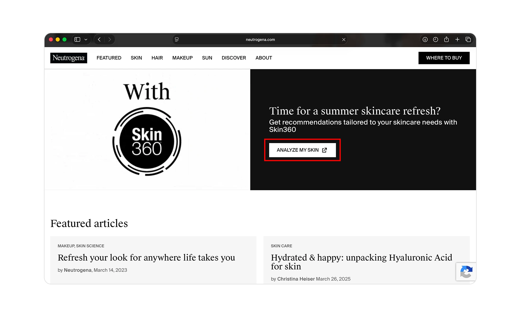
1. Skin360 Brings AI Skin Analysis to a 95-Year-Old Beauty Brand 🤖
Toward the bottom of the homepage sits Skin360, a dark card with an “ANALYZE MY SKIN” CTA that opens the brand's AI-driven facial diagnosis tool.
A visitor uploads a selfie then the system scans for wrinkles, dark spots, dark circles, hydration, and skin smoothness, and then recommends Neutrogena products from the resulting score. For a 95-year-old drugstore brand sitting next to D2C-native names like The Ordinary and Glossier, building a working AI diagnostic onto the homepage is exactly the kind of mechanism the legacy can deploy that newer upstarts cannot easily replicate.
Every Skin360 scan is also a customer-data event that feeds the brand's recommendation engine. The kind of compounding first-party data advantage that a 95-year-old shelf footprint, taken together with an AI layer, is uniquely positioned to build.
2. The Homepage Is Anchored to a Calendar Moment, Not an Evergreen Pitch 📅
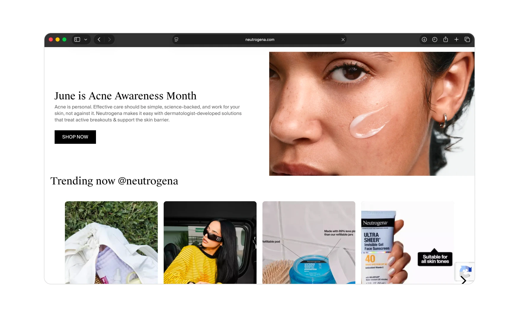
A full editorial section midway down the homepage is tied to a health-awareness calendar event rather than a generic evergreen claim.
When Rishabh audited the site in June 2026, the section announced June is Acne Awareness Month with a model photograph and a Shop Now CTA tied to the acne range. The approach is both editorial substance and conversion logic that the acne shopper and the awareness-month shopper are the same person, and Neutrogena is meeting them on a date they already care about.
Calendar-anchored editorials also give the brand a structural reason to update the homepage every month without putting strain on the creative team. The cadence is built into the format.
Note: the specific editorial panel will have rotated since this audit was conducted. The section header and the health-awareness category will reflect the current month. The screenshot below should be re-captured on the current homepage to show the live editorial panel in place.
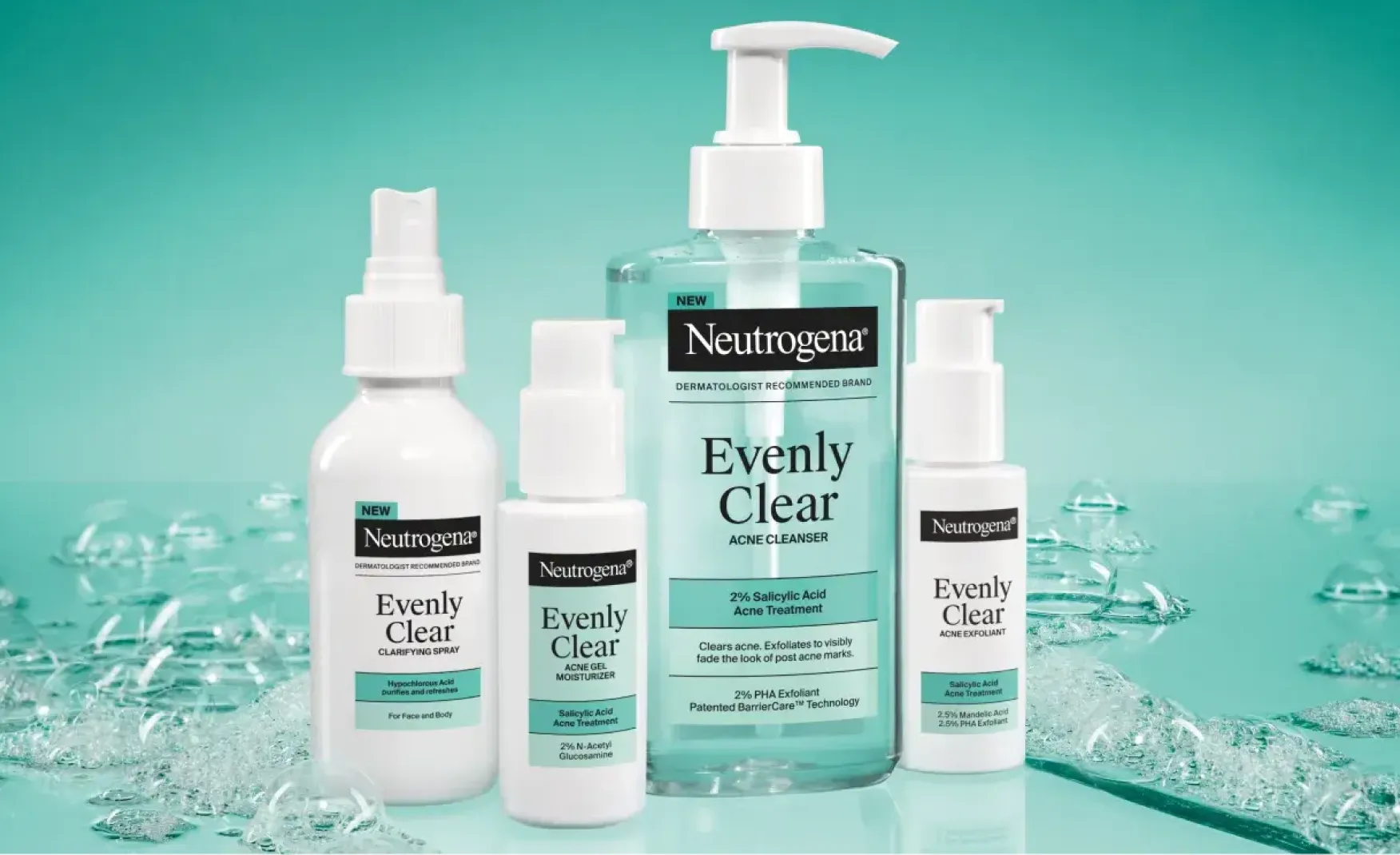
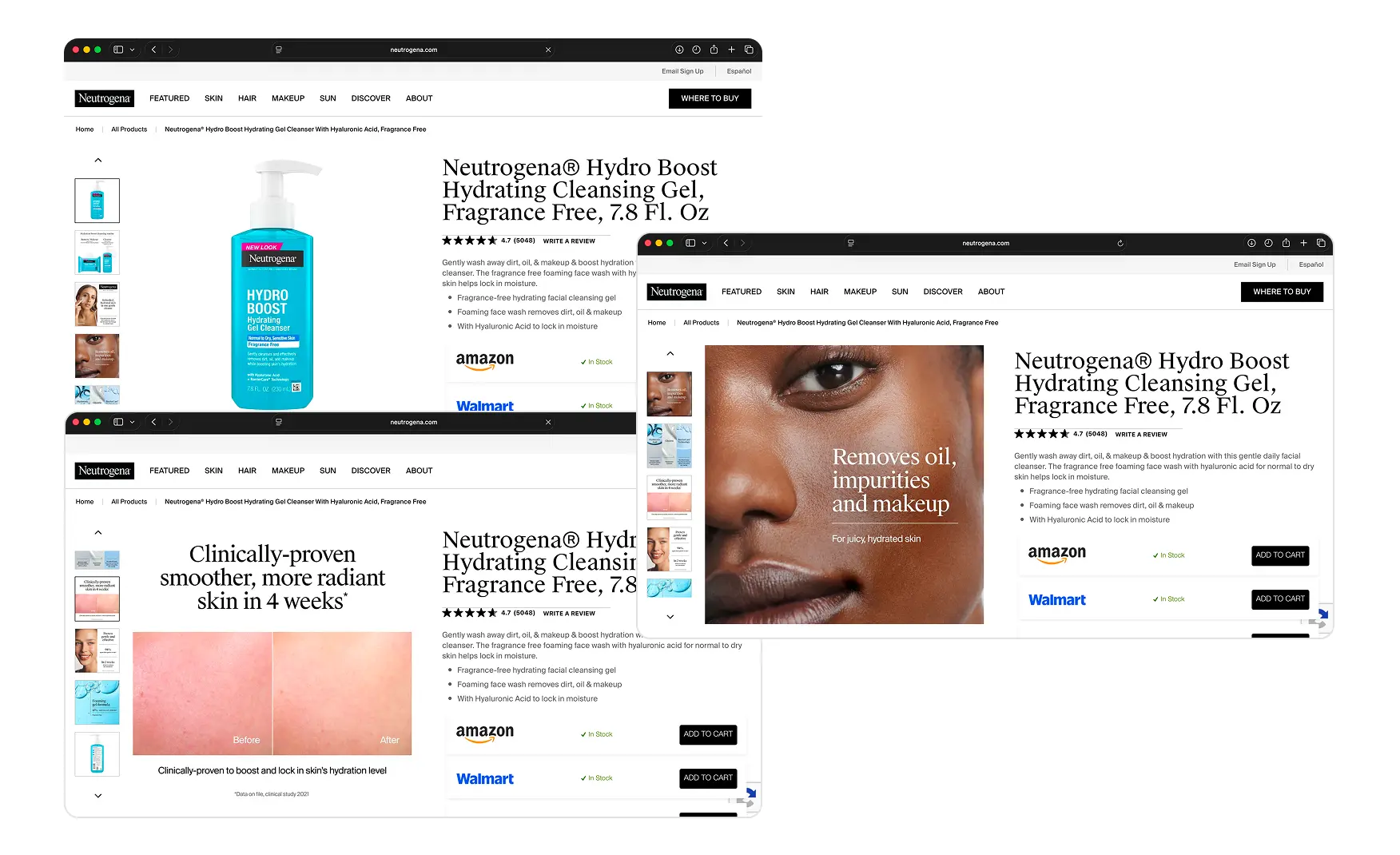
3. Product Listings Carry Detailed A+ Creative and Full Routine Suggestions 📸
Every product listing on neutrogena.com carries A+ creative like the application shots, results frames, packaging close-ups, and ingredient panels to name afew.
For a brand selling drugstore skincare at the volume Neutrogena operates, the A+ work raises the perceived premium of the SKU well above the shelf price. The visitor who found the product through a Google search or a Skin360 recommendation lands on a page that looks and reads like a prestige skincare listing.
The product pages also surface routine suggestions. A hydration product Product Display Page, for example, shows the full hydration range as a curated regimen rather than a generic you-may-also-like row. The customer who came to buy a moisturiser is being shown how to build a routine with the brand's own products. For a brand whose biggest current modernisation challenge is moving the customer from one SKU to four, this is exactly the right merchandising move.
Where the Neutrogena Experience Falls Short ⚠️
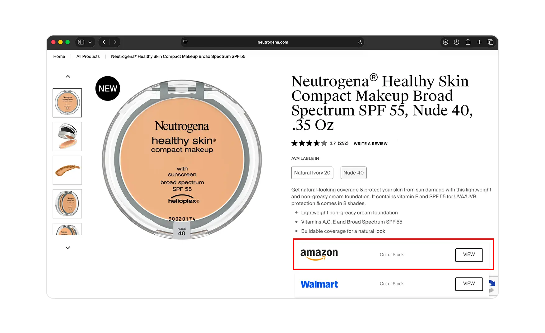
1. The Where to Buy Model Sends Every Direct Sale to Amazon 🚧
Every product card on the homepage carries a “Where To Buy” button instead of a working “Add to Cart”.
The model directs the customer to Walmart, Target, Amazon, and CVS rather than letting them check out on neutrogena.com. For a legacy brand whose retail footprint is its biggest distribution advantage, the choice is defensible. But for a customer trained on D2C checkout, the extra step costs the kind of impulse purchase a product page is supposed to capture.
The brand is also leaving something more valuable on the table than a single transaction. Every customer who checks out on neutrogena.com generates direct first-party data. Every customer routed to Amazon does not. At a moment when Kenvue is heading into a Kimberly-Clark acquisition and the strategic value of the brand's DTC customer relationship is being evaluated, that data gap is not a small thing.
DTC Checkout Model vs Category Benchmark 📊
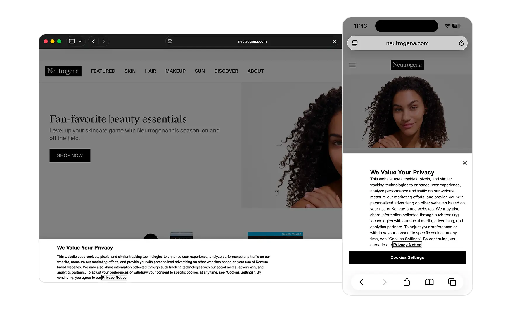
2. The Mobile Cookie Consent Block Covers Half the View 📱
On mobile, the visitor lands on a full-bleed We Value Your Privacy cookie consent block with a Cookies Settings CTA at the bottom.
The block consumes the entire fold one before the visitor can see the hero or the nav. For a brand whose value rests on instant recognition, burying the brand frame behind a multi-paragraph compliance notice is the wrong trade-off.
Compliance can be served by a slim bottom bar with Accept and Reject buttons. The current full-bleed treatment is over-engineered and costs the brand its strongest first-paint asset: the Neutrogena lockup against a clean editorial visual.
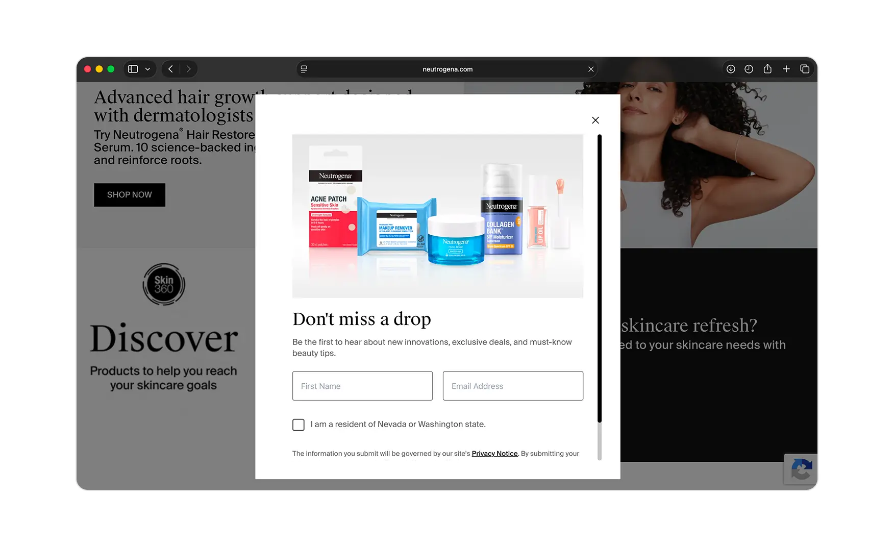
3. The Newsletter Popup Asks for the Email Without Offering Anything Back 📧
A newsletter signup popup appears on the homepage offering subscriptions to receive exclusive deals and upcoming launches, but without a first-purchase discount.
For a category where almost every D2C competitor offers 5 to 10 percent off the first order in exchange for the email, asking for the signup without the incentive asks the customer to trust the long-term value of the relationship before they have any evidence of it.
The popup hardware is already built. Adding a 5 or 10 percent first-order discount is a copy-and-CRM task. It ships in a single sprint and would meaningfully lift the opt-in rate.
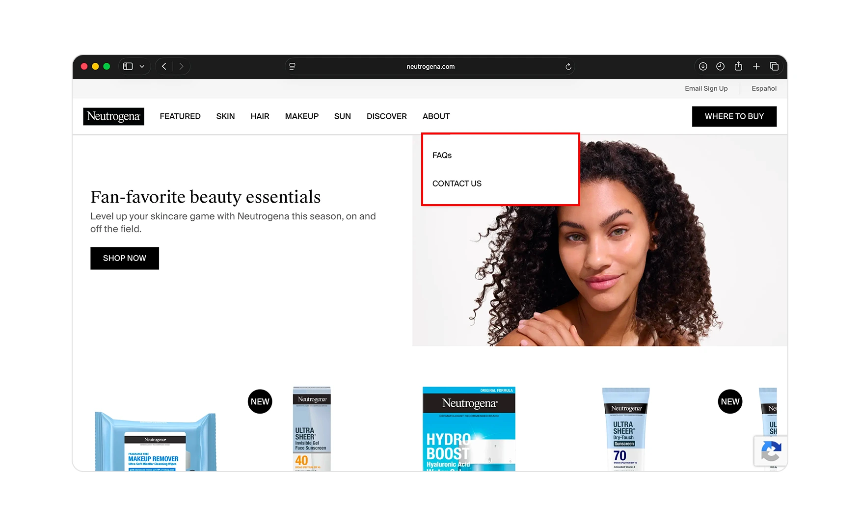
4. The About Section Carries No Brand Story for a Brand Approaching Its Centenary 📜
The About section on neutrogena.com surfaces FAQs and a contact form.
There is no founding narrative, timeline, dermatologist story, or history of the 1962 transparent soap that defined the category. For a brand approaching its centenary in 2030, the absence of a founding-to-now narrative is a real missed opportunity. The customer who arrived through paid social or editorial content and clicked About to learn more is being handed a service page rather than a story.
Most legacy beauty brands, La Mer, Estee Lauder, Clinique, anchor a significant chunk of their conversion to a brand mythology that newer D2C names cannot match. Neutrogena has 95 years of clinical, dermatologist-led history to draw from and is currently presenting none of it on the page customers visit specifically to find it.
What Suplex Would Fix First 💡
Priority 1 - Open a Working DTC Checkout Alongside the Retail Redirect 🔧
Add a working Add to Cart button on every product card on neutrogena.com and let the customer choose between Buy Here and Where to Buy. The retail footprint stays intact as a fulfilment channel. The brand captures the impulse purchases it currently routes to Amazon. And critically, it starts building direct first-party customer data at the moment when that data is most commercially valuable. This is a one-sprint decision, not a fulfilment restructure.
Priority 2 - Build a Brand Legacy Page Inside the About Section 📚
Replace the current FAQ-and-contact About page with a proper brand narrative: the 1930 founding by Emanuel Stolaroff, the rise of the brand through dermatologist endorsement, the 1962 transparent soap that defined accessible clinical skincare, the Johnson and Johnson acquisition, and the transition to Kenvue.
Anchor the story with archival imagery and modern editorial frames. The result is a customer who arrives through paid social and leaves invested in the legacy rather than evaluating the price. For a brand approaching a centenary, this is also a once-in-a-generation content opportunity.
Priority 3 - Add a First-Order Discount to the Newsletter Popup and Shrink the Cookie Block 📝
Update the existing newsletter popup to carry a 10 percent first-purchase incentive. Test against the current opt-in rate to measure the lift. The popup hardware is already built. In the same sprint, replace the full-bleed mobile cookie consent with a slim bottom bar carrying Accept and Reject buttons. The compliance obligation is met. The brand frame is visible from the first paint.
Final Scorecard 🏆
Suplex Verdict 📝
Neutrogena has shipped the modernisation tooling a legacy brand needs in 2026.
Skin360 is the smartest AI move any 95-year-old beauty brand has made on its own homepage. The calendar-anchored editorial gives the site a reason to exist that is tied to real consumer behaviour rather than marketing cycles. The A+ creative raises the SKU above the shelf. These are not superficial improvements. They are structural decisions that compound over time.
The checkout model is the single biggest gap. Every visitor Neutrogena converts with Skin360, with the editorial section, with the A+ creative, is then handed to Amazon to complete the sale. At a moment when Kenvue is heading into a USD 40 billion acquisition and the brand's direct customer relationship is a material asset, routing that customer off the site is the most expensive decision on the page.
The About page gap is quieter but strategically just as significant. Neutrogena is five years from its centenary. The founding story, the transparent soap, the 95 years of dermatologist-led history, none of it is currently on the page customers visit to find it. That is a missed opportunity that has a deadline.
Overall Rating: ⭐⭐⭐½ 3.5 / 5.
A working DTC checkout, a real brand legacy page, and a slim cookie consent bar would take this to a 4.5 and start using the 95-year history as a conversion asset rather than leaving it on the table.
Suplex Design works with legacy beauty and skincare brands across India and the UAE on DTC checkout strategy, Product Display Page architecture, and website audits. If your brand is modernising for direct-to-consumer and you want an honest assessment of what is holding your site back, get in touch with our team of experts at Suplex Design.
Hi, I’m Rishabh Jain
I believe great design has the power to shape perception, build trust, and move businesses forward. That belief is what led me to found Suplex Design Studio, a global branding and packaging studio working with FMCG and D2C brands across markets.I started suplex at 25 with a clear intent, to create design that is strategic, thoughtful, and commercially meaningful. By 28, the studio had scaled globally, guided by a strong foundation in Integrated Design that I developed during my academic journey in London, where I was honoured with the Dean’s Award.
Over the years, I’ve had the opportunity to work with 100+ brands, from Fortune 500 organizations to family-run businesses, helping them build packaging and brand systems that create recall, relevance, and long-term value.
Suplex’s work has been recognized internationally, including the Manifest Award (2024), the Clutch Global Award (2025), and features on platforms such as Packaging of the World, The Dieline, and the World Brand Design Society.
None of this would be possible without the people behind the work. I’m deeply grateful to the suplex team, whose commitment, creativity, and attention to detail turn ideas into meaningful brand experiences every day.
At the heart of my work is a simple philosophy, design should be intentional, honest, and built to last, and that continues to guide everything we create at suplex.

Let’s Make It Happen
E-Commerce Success Stories

%201.webp)


.webp)
.webp)
Build Your D2C Business The Right Way
Build It With Suplex.


