Magic Spoon
.avif)
Magic Spoon
Magic Spoon | Suplex's Verdict ⭐⭐⭐⭐⭐
Suplex's Website Audit for Magic Spoon at a Glance 📊
Gabi Lewis and Greg Sewitz built Magic Spoon on the same direct-to-consumer instincts that took their previous venture, cricket-protein bar company Exo, to a 2018 sale, and the site reflects a team that has done this before, a maximalist, animation-heavy visual identity that still keeps every path pointed at conversion rather than decoration.
Suplex Design analysed magicspoon.com across brand identity, navigation, merchandising, social proof and product education, and what follows is why this is one of the strongest proof-led storefronts Suplex has audited. This audit reflects the site as it stood in August 2026.
What Magic Spoon's Website Gets Exceptionally Right ✅
1. A Genuinely Maximalist Identity 🎨
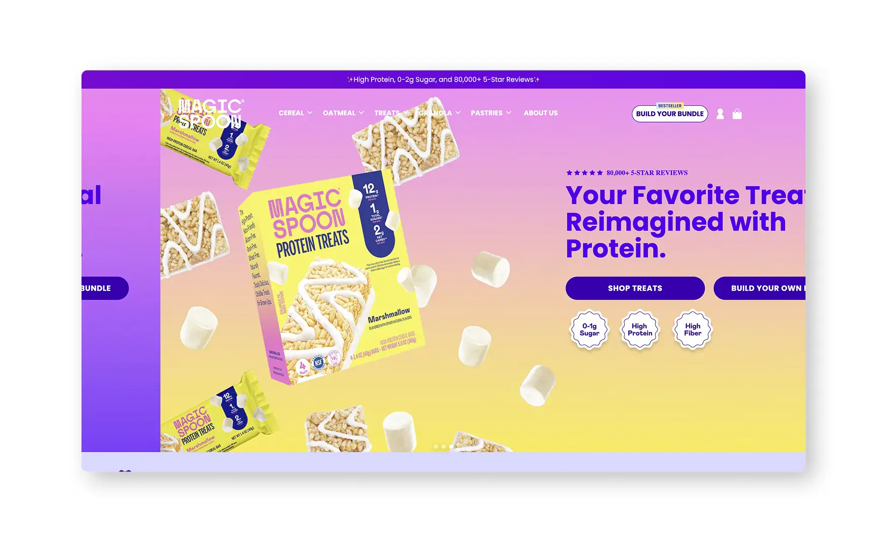
Rishabh noted the entire site commits to a maximalist visual language, animated cereal loops moving across the page, saturated brand colours and playful type, at a moment when most D2C food brands are converging on the same minimal template.
That maximalism never comes at the cost of clarity, the navigation still runs a clean Cereal, Oatmeal, Treats, Granola and Pastries structure, and every animated flourish sits around a consistent set of conversion paths rather than replacing them.
2. Proof Leads From the First Screen ⭐
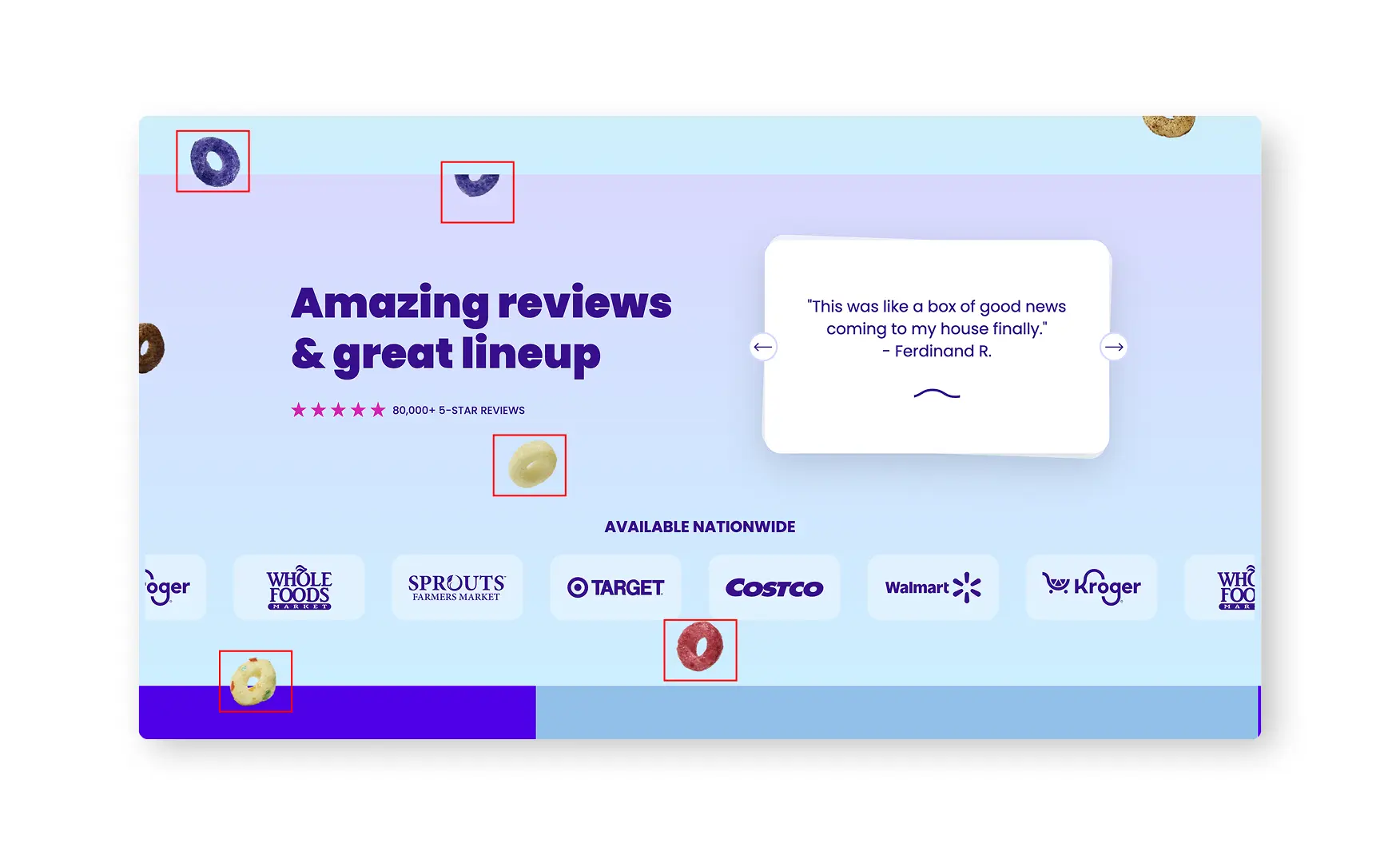
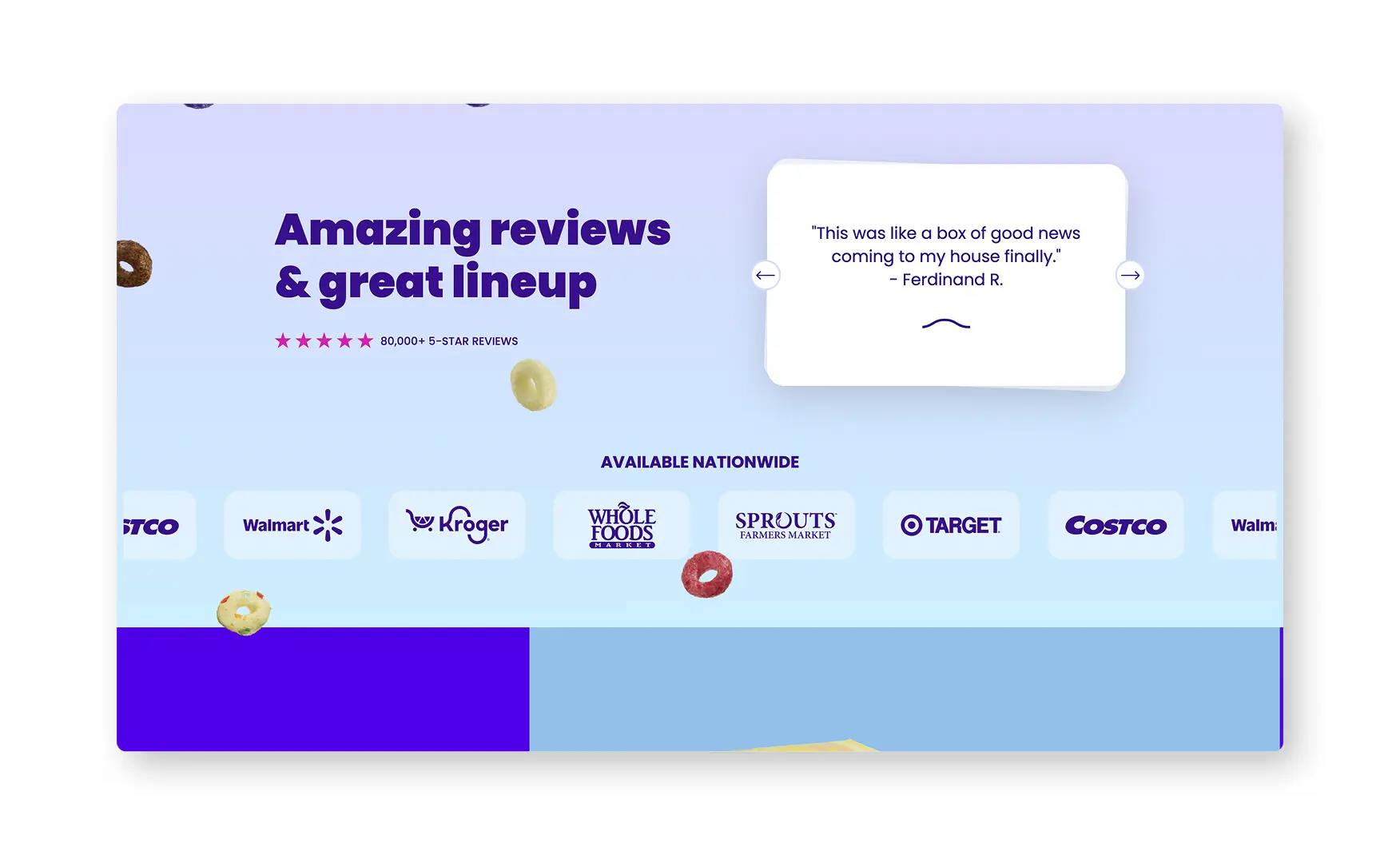
A persistent top strip states High Protein, 0 to 2 Gram Sugar, and 80,000-plus Five-Star Reviews before a visitor has scrolled at all, and that same strip rotates to surface live, time-bound offers, a free bag of granola on orders above USD 55, or a limited free bowl set for new subscribers.
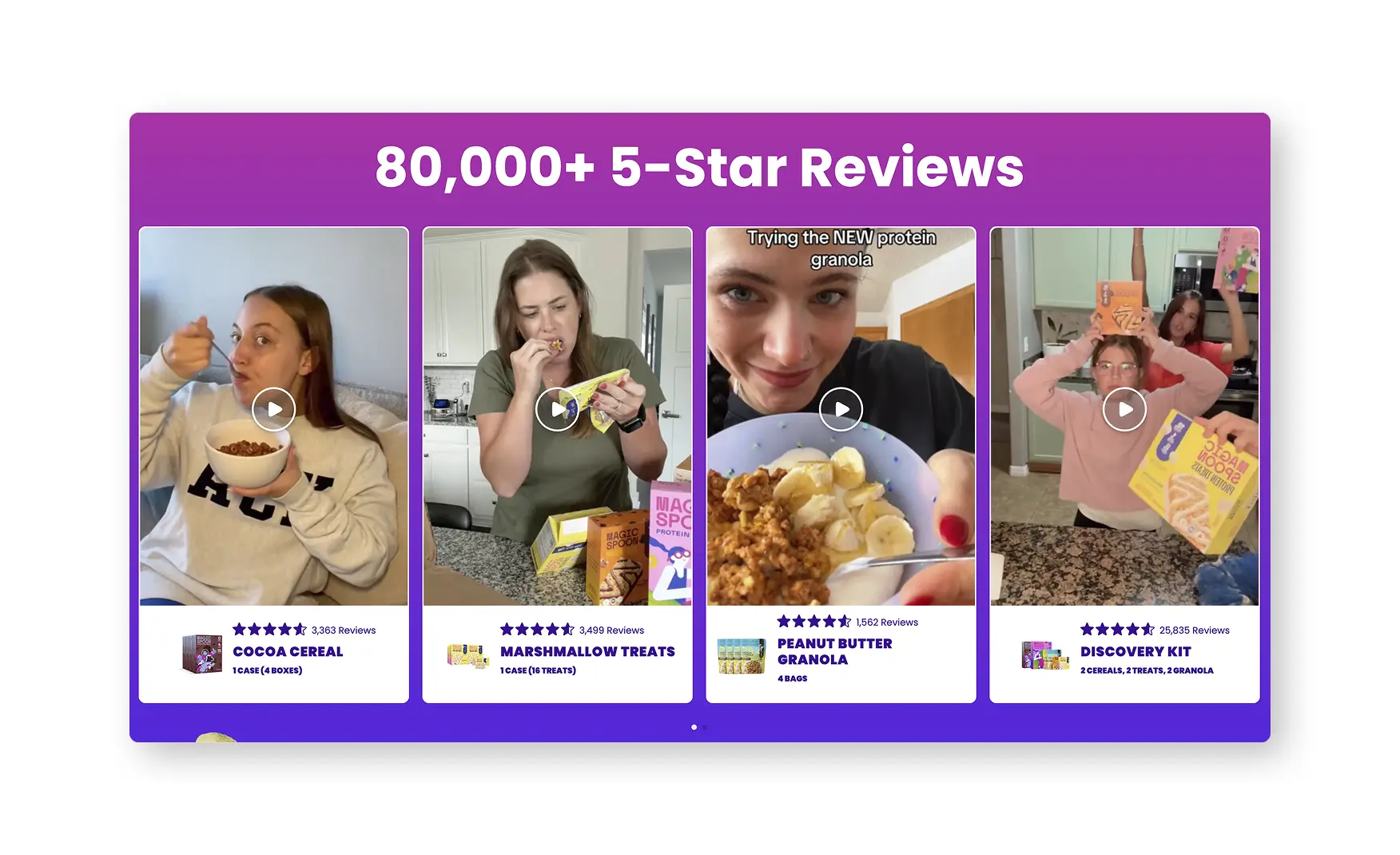
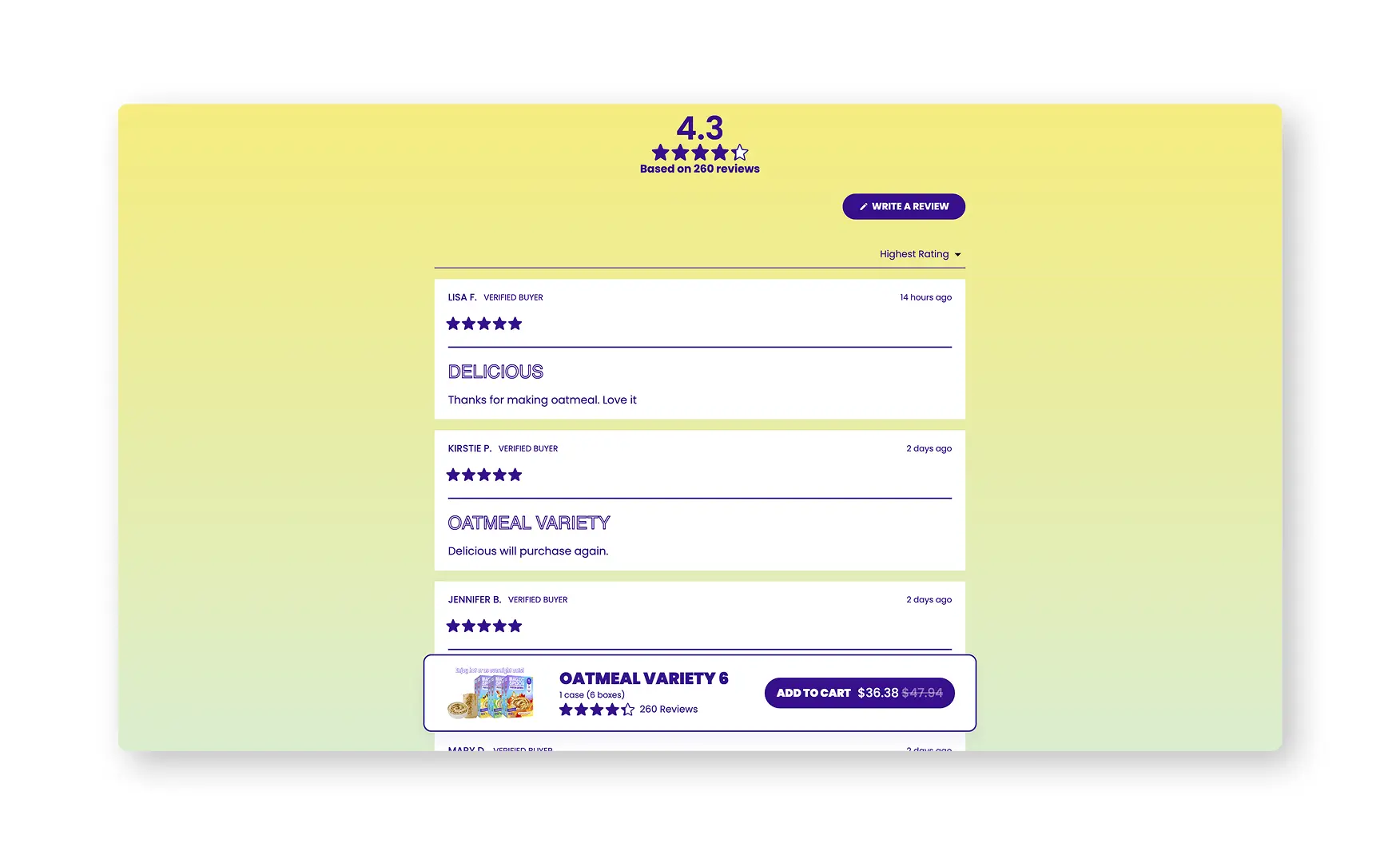
Product cards throughout the site carry both a star rating and a real review count, 4.6 to 4.7 stars against counts running from 1,534 up to 30,877 on individual SKUs, which is precise enough to read as genuine data rather than a rounded marketing figure.
3. The Bundle Builder Is Merchandised as Both a Subscription and a Discovery Tool 📦
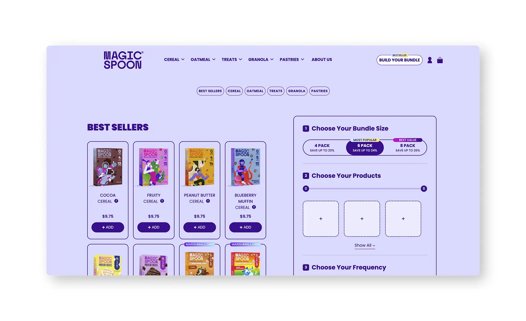
A Get Your Childhood Favourites Delivered to Your Door Monthly section frames the build-your-own bundle explicitly as a subscription model, VIP access, the ability to change flavours anytime, skip or cancel whenever, and a free bowl set with the first order, rather than a generic recurring-purchase toggle.
Letting a shopper mix flavours across cereal, granola and treats inside a single six-box bundle turns what could be a single-SKU purchase into a wider product discovery moment, which is a meaningfully different mechanic from a standard subscribe-and-save button.
4. Nutrition Does the Selling, Not Just the Labelling 💪
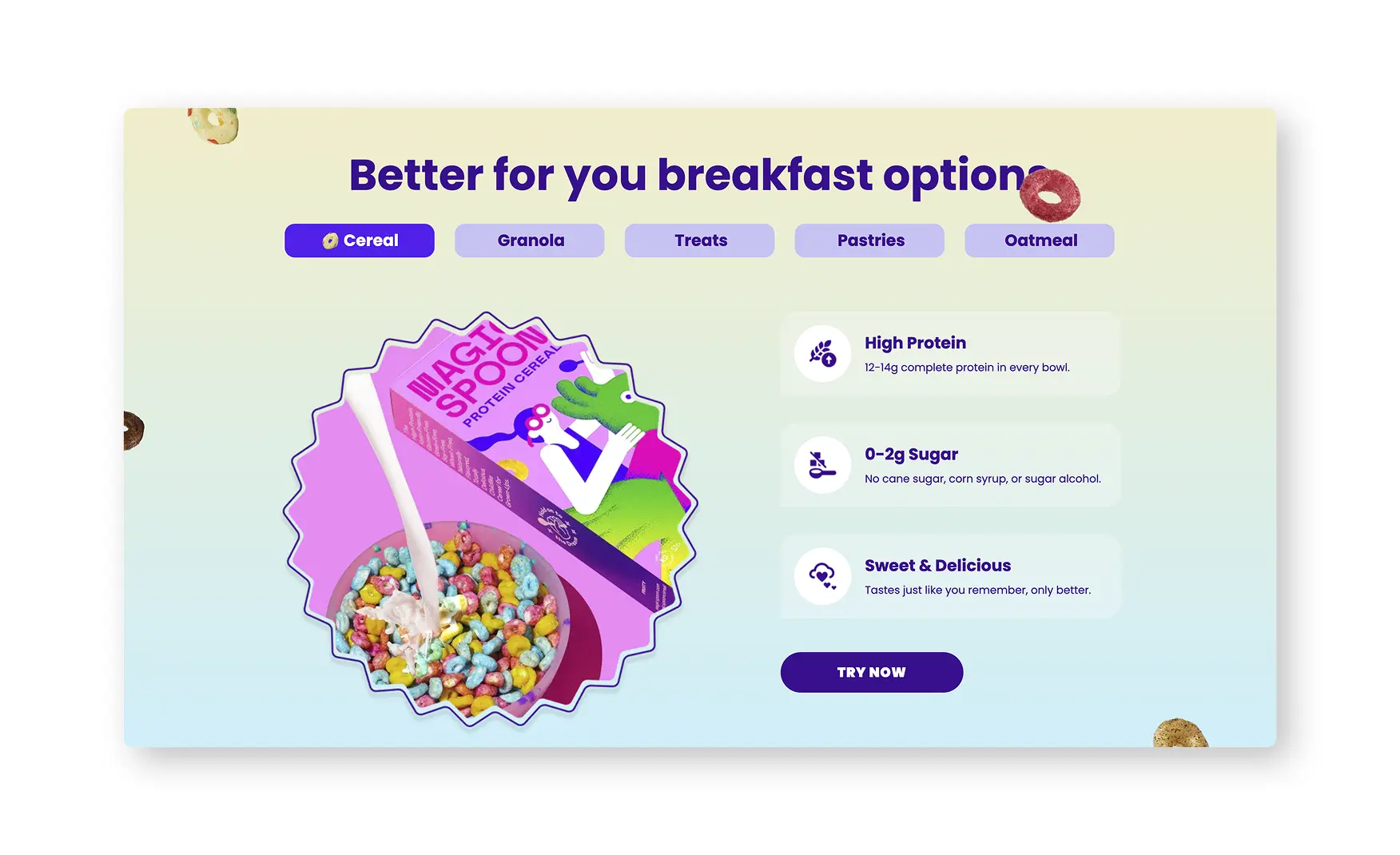
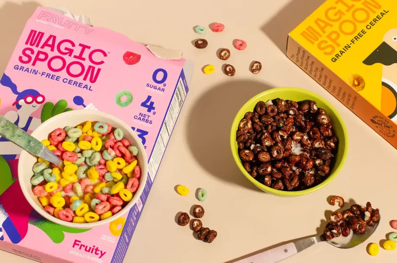
A Better for Your Breakfast section breaks the range down by category, cereal states 12 to 14 grams of complete protein and 0 to 2 grams of sugar with no cane sugar, corn syrup or sugar alcohols, while granola shifts the framing to fibre content, so the nutrition story adapts to what actually matters for each product type rather than repeating one blanket claim.
A moving strip beneath it names the exact retailers carrying the product nationwide, Target, Kroger, Whole Foods Market, Costco and Walmart among them, which backs the DTC nutrition claims with a retail footprint a shopper can verify in person.
5. The PDP Turns a Flavour Decision Into a Visual One 🍬
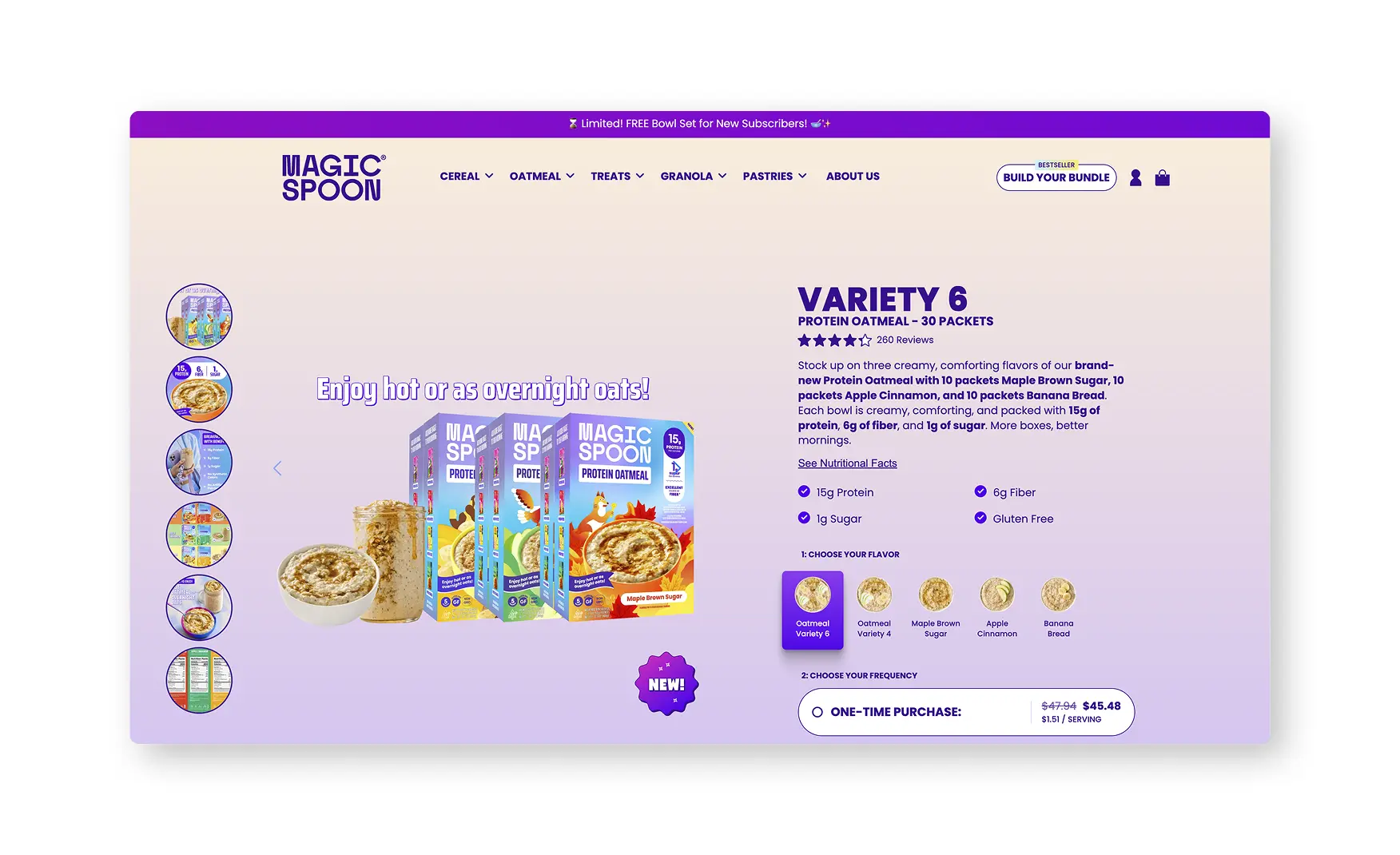
The Variety of Six product page states its review count precisely, 25,833 at time of review, alongside full nutrition figures, 4 to 5 grams net carbs, 12 to 14 grams complete protein, 140 to 170 calories and no artificial ingredients, before a shopper even reaches the flavour selector.
Every flavour and bundle option is shown with its own product image rather than a text label alone, Classic Protein, Protein Plus Fibre and Marshmallows each broken into their own named sub-varieties, so a shopper is choosing based on what the product actually looks like, not guessing from a name.
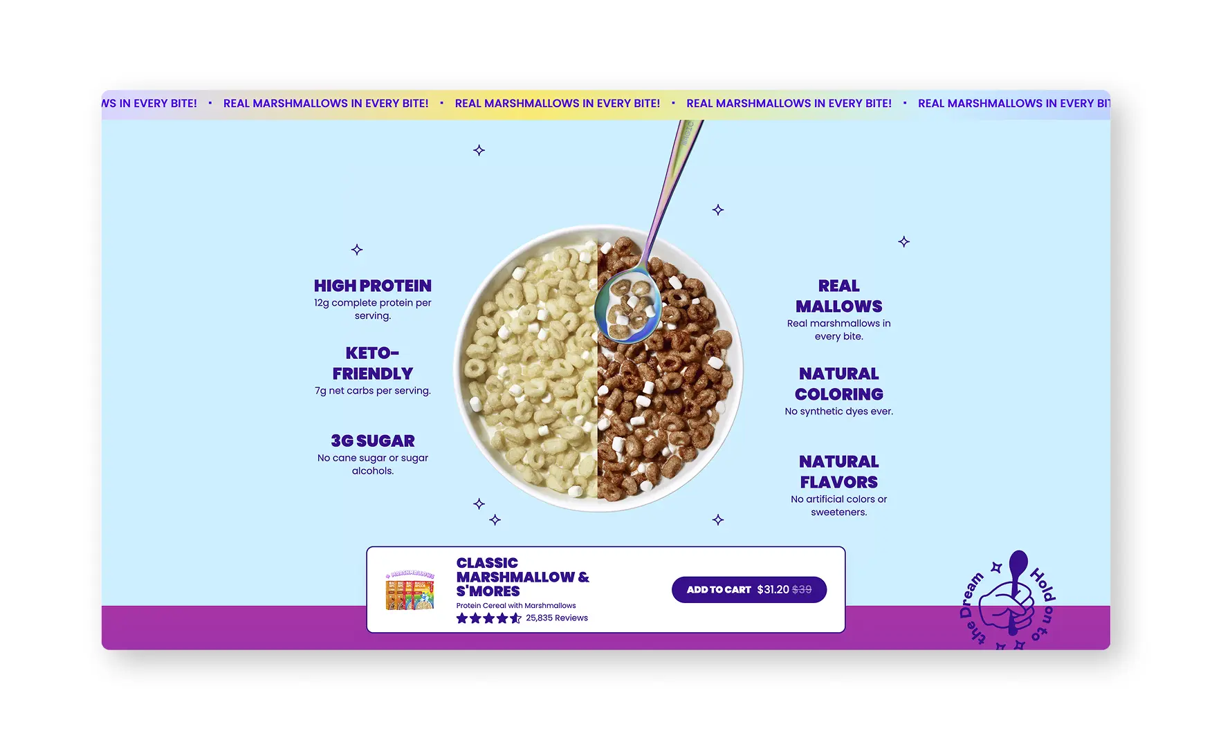
6. A Rotating 3D Animation Explains Six Product Benefits at Once 🌀
Below the buy box, a custom animation rotates a cereal bowl through 180 degrees while cycling through six benefit callouts, gluten free, grain free, natural flavour, zero grams sugar, keto-friendly and high protein, giving the page a genuinely distinctive way to communicate six claims without stacking six separate text blocks.
Rishabh singled this out as a standout piece of custom production work, the kind of detail that signals real investment in the Product Display Page rather than a templated benefit-icon row copied across every product.
7. A Direct Competitor Comparison Makes the Case Without Naming Names Defensively 📊
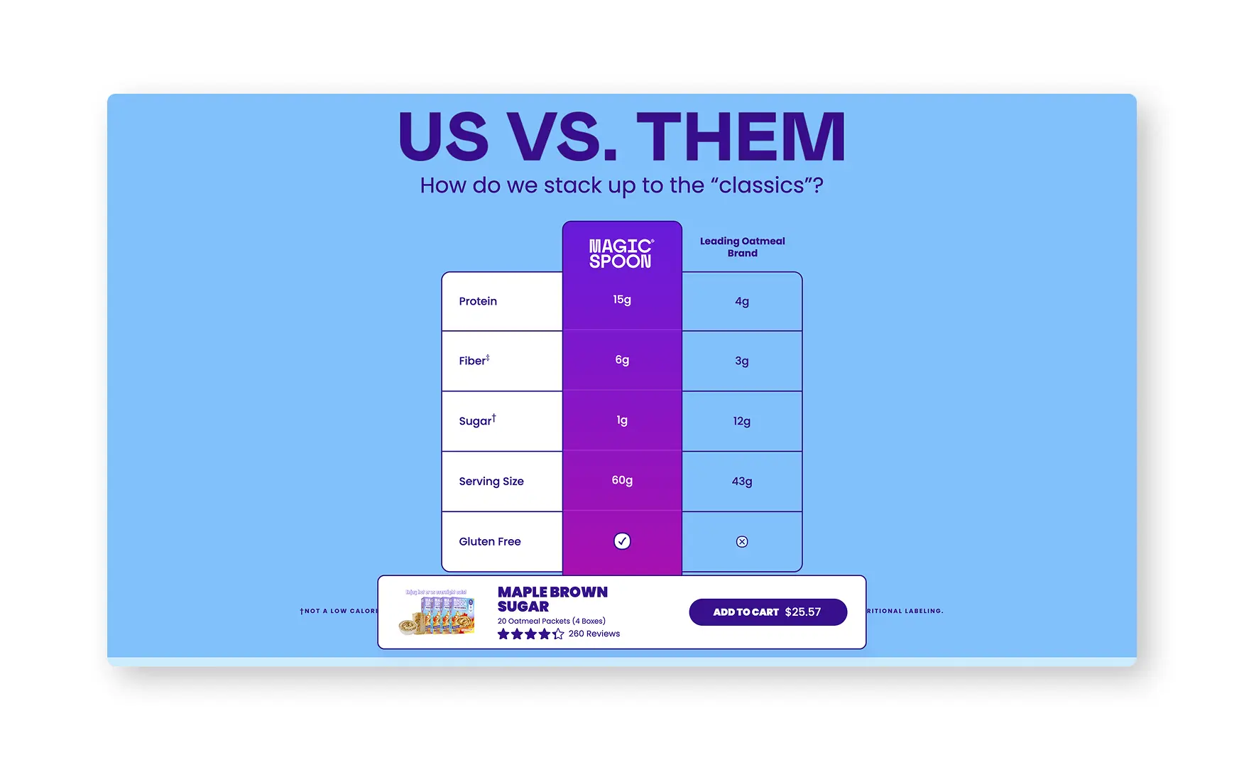
An Us Versus Them section compares Magic Spoon directly against Froot Loops, Trix, Frosted Flakes, Cocoa Puffs, Cinnamon Toast Crunch and Raisin Bran across protein, sugar, net carbs, serving size and gluten-free status, dated explicitly as of December 2022 rather than left unstated.
Naming the exact legacy cereals a shopper grew up on, rather than a vague better-for-you framing, makes the comparison concrete and lets a nostalgic buyer map their own memory directly onto the data.
8. The About Page Turns Two Founders Into a Real Origin Story 👥
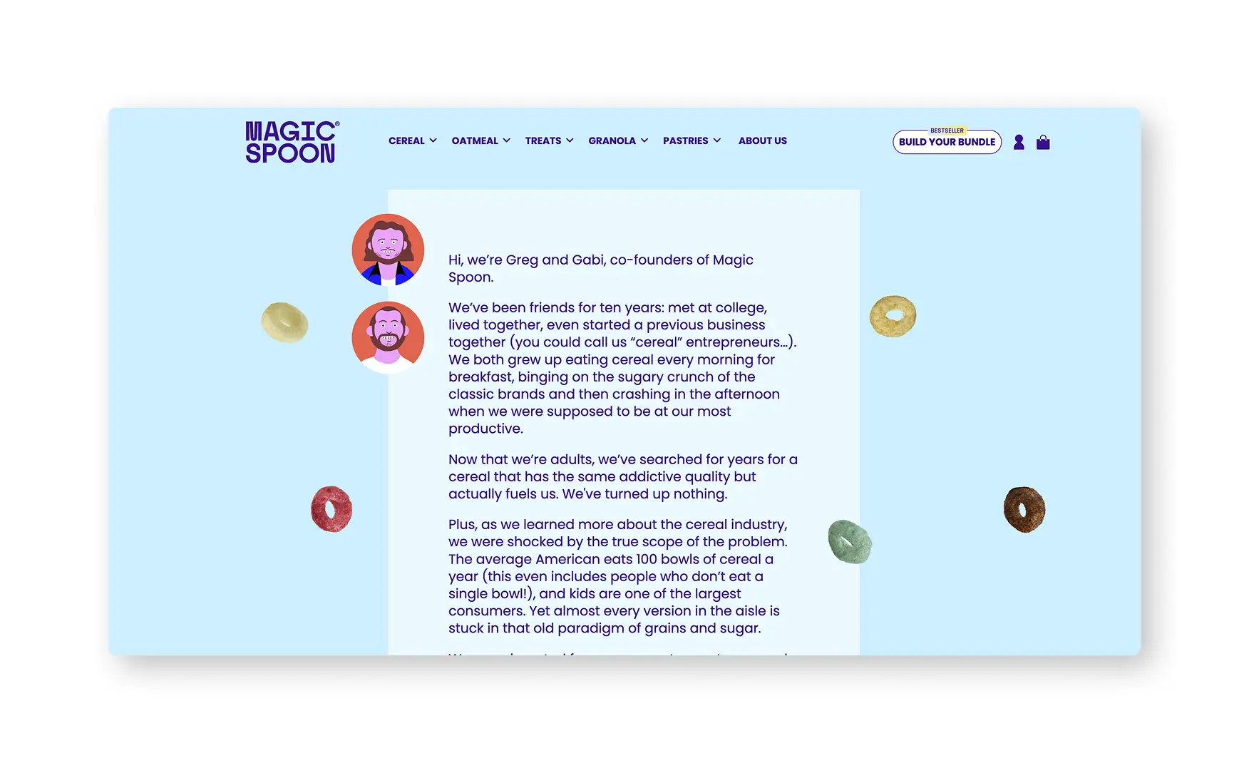
The About Us page runs the same animated cereal motion graphics as the homepage, then introduces Gabi and Greg directly on camera, explaining they have been friends for ten years and walking through how the idea for Magic Spoon actually began.
Rishabh described the page as genuinely warm rather than corporate, which matters for a brand whose entire pitch rests on nostalgia, a founder story told in the founders' own words does more of that emotional work than a written mission statement alone.
What Suplex Would Build Next 💡
There are no material gaps to flag at this audit pass, the storefront is distinctive, proof-led and consistent from the homepage through to the PDP. The one polish opportunity worth naming is minor and already partly addressed.
Priority 1 - Add Customer Photos to the Written Review Section 📸
Rishabh noted the written review section shows the customer's name and what they bought, but currently carries no customer photos, only the video reviews featured higher on the page fill that specific gap.
Adding a photo upload prompt to the written review flow would close this fully, though the existing video reviews already do meaningful work covering the same trust need in the meantime.
Final Scorecard 🏆
Suplex Verdict 📝
Magic Spoon proves a maximalist, nostalgia-led brand can still run one of the tightest conversion funnels Suplex has audited, animated cereal loops and a playful visual identity sit around a homepage that leads with proof, 80,000-plus reviews and real per-SKU review counts, on the very first screen.
The product education is genuinely adaptive, protein for cereal, fibre for granola, and the Us Versus Them comparison against named legacy brands turns nostalgia into a data point rather than leaving it as a feeling.
The rotating PDP animation and the founder-led About page both show a team investing in production quality rather than templating their way through the funnel, which is consistent with founders who have built and sold a DTC brand before.
Overall Rating ⭐⭐⭐⭐⭐ 5 / 5.
Suplex Design works with F&B and D2C brands on Product Detail Page architecture, trust signal placement, and full stack D2C website development. If your brand is at a similar stage to Magic Spoon and you want an assessment of what is holding your site back, get in touch with our team of experts at Suplex Design.
Hi, I’m Rishabh Jain
I believe great design has the power to shape perception, build trust, and move businesses forward. That belief is what led me to found Suplex Design Studio, a global branding and packaging studio working with FMCG and D2C brands across markets.I started suplex at 25 with a clear intent, to create design that is strategic, thoughtful, and commercially meaningful. By 28, the studio had scaled globally, guided by a strong foundation in Integrated Design that I developed during my academic journey in London, where I was honoured with the Dean’s Award.
Over the years, I’ve had the opportunity to work with 100+ brands, from Fortune 500 organizations to family-run businesses, helping them build packaging and brand systems that create recall, relevance, and long-term value.
Suplex’s work has been recognized internationally, including the Manifest Award (2024), the Clutch Global Award (2025), and features on platforms such as Packaging of the World, The Dieline, and the World Brand Design Society.
None of this would be possible without the people behind the work. I’m deeply grateful to the suplex team, whose commitment, creativity, and attention to detail turn ideas into meaningful brand experiences every day.
At the heart of my work is a simple philosophy, design should be intentional, honest, and built to last, and that continues to guide everything we create at suplex.



















Let’s Make It Happen
E-Commerce Success Stories
%201.avif)





.avif)
.avif)
Build Your D2C Business The Right Way
Build It With Suplex.


