Snitch
.avif)

Snitch
Snitch | Suplex's Verdict ⭐⭐⭐
Suplex's Website Audit for Snitch at a Glance 📊
Siddharth Dungarwal launched Snitch as a B2B apparel supplier in late 2019 before the pandemic forced a pivot to direct-to-consumer in 2020, and the brand has since grown revenue to Rs 520 crore in FY25, more than double the Rs 243 crore it posted the year before, while raising over USD 53 million and expanding past 55 physical stores across India. Snitch also featured on Shark Tank India's second season in 2023 getting an all sharks deal, a visibility moment Dungarwal has credited with accelerating the brand's growth.
Suplex Design analysed Snitch's website across navigation, collection filtering, homepage merchandising, Product Detail Page depth, brand storytelling and review architecture, and what follows is why a genuinely capable product and filtering experience sits inside a site with almost nothing distinctive around it. This audit reflects the site as it stood in August 2026.
What Snitch's Website Gets Exceptionally Right ✅
1. Plus-Size Sits in the Main Nav, Not Buried in a Filter 📐
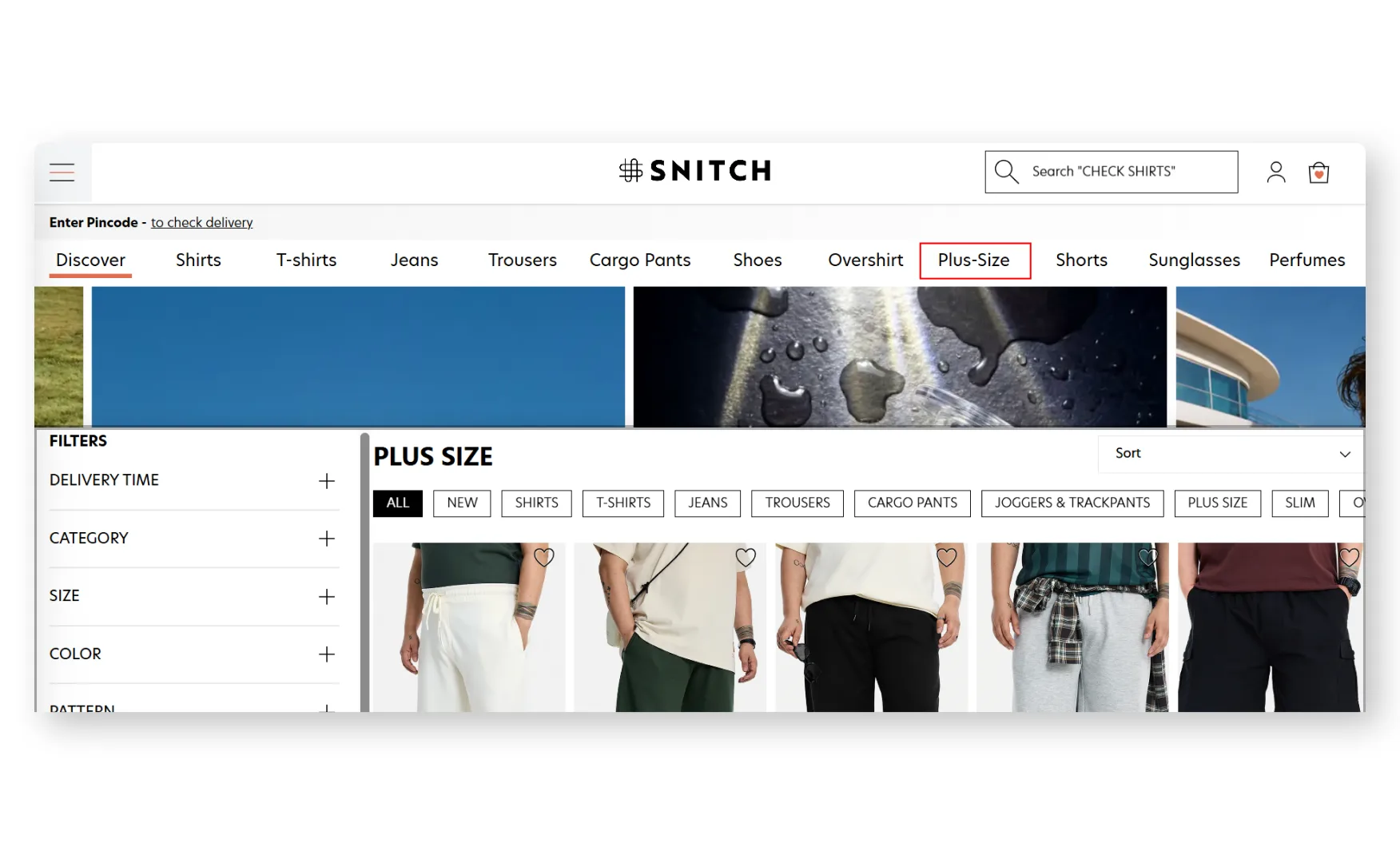
Snitch Plus, the brand's plus-size line, sits as its own entry in the primary navigation alongside T-Shirts, Jeans, Trousers and Cargoes, rather than being reachable only through a size filter buried inside a general category.
Giving an inclusive sizing line the same navigational weight as the brand's core categories is a genuine, structural inclusivity decision, not a token filter option, and it means a plus-size shopper never has to search for whether the brand caters to them at all.
2. Pincode Delivery Check and Smart Search Sit Right at the Top 📍
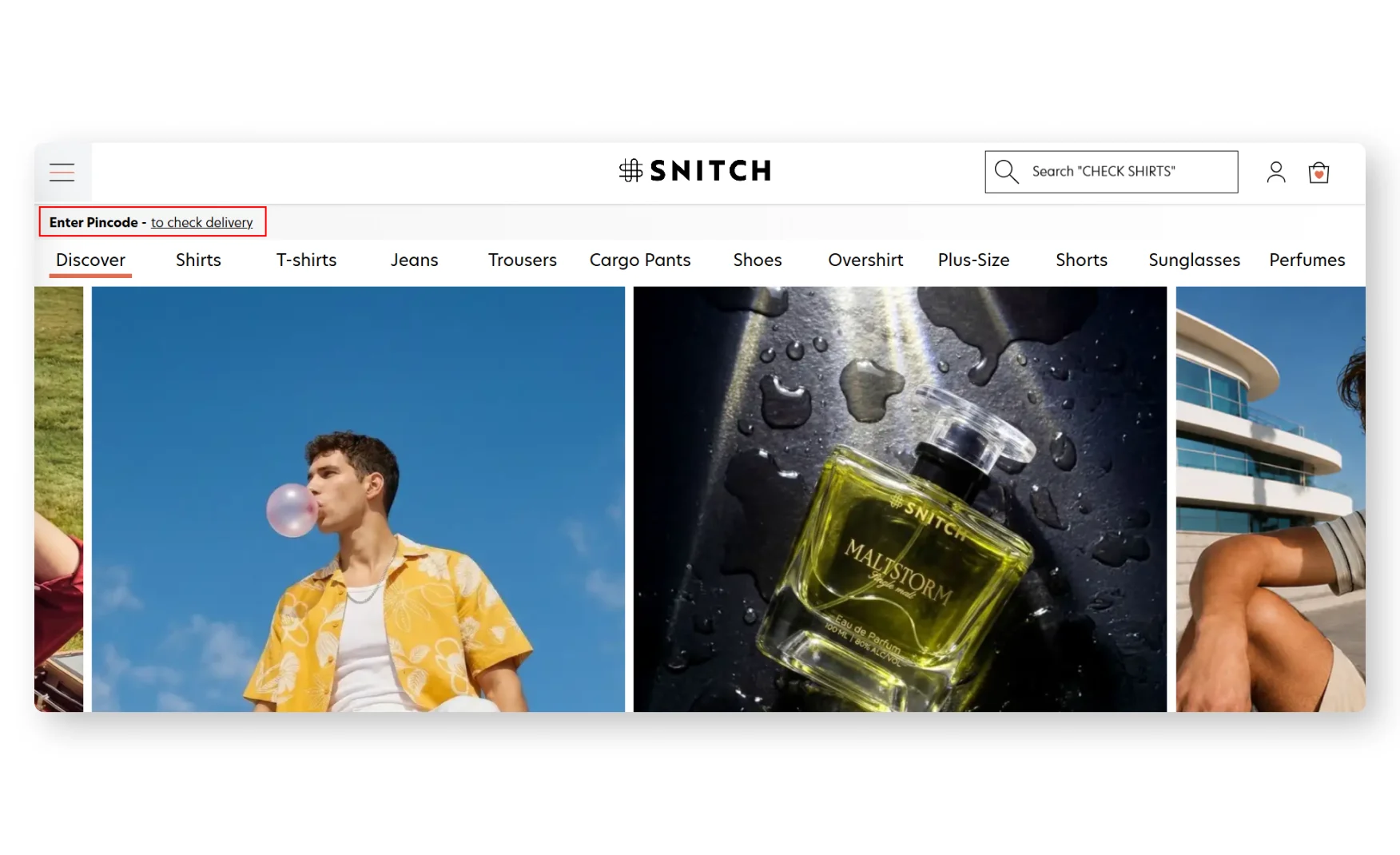
A persistent strip at the very top of the homepage lets a shopper enter their pincode to check delivery before they have browsed a single product, and the search bar itself surfaces smart suggestions as a shopper types.
Surfacing delivery confidence this early removes a real point of hesitation for a fast-fashion buyer who wants to know a piece will arrive in time before they commit to browsing further.
3. The Collection Grid Filters With Real Granularity Across 4,552 Products 🔍
The grid lets a shopper filter by size, colour, pattern, fit, material, collar, sleeve length and price simultaneously across a catalogue of 4,552 products, with model-shot cards showing the discount, available colour swatches, and a wishlist toggle on every card.
This is a genuinely deep filter set for a fast-fashion catalogue this size, and combining fit and collar and sleeve filters specifically caters to a shopper who already knows exactly what silhouette they want rather than browsing generically.
4. The Homepage Merchandising Is Functional, Even Without a Brand Voice 🛒
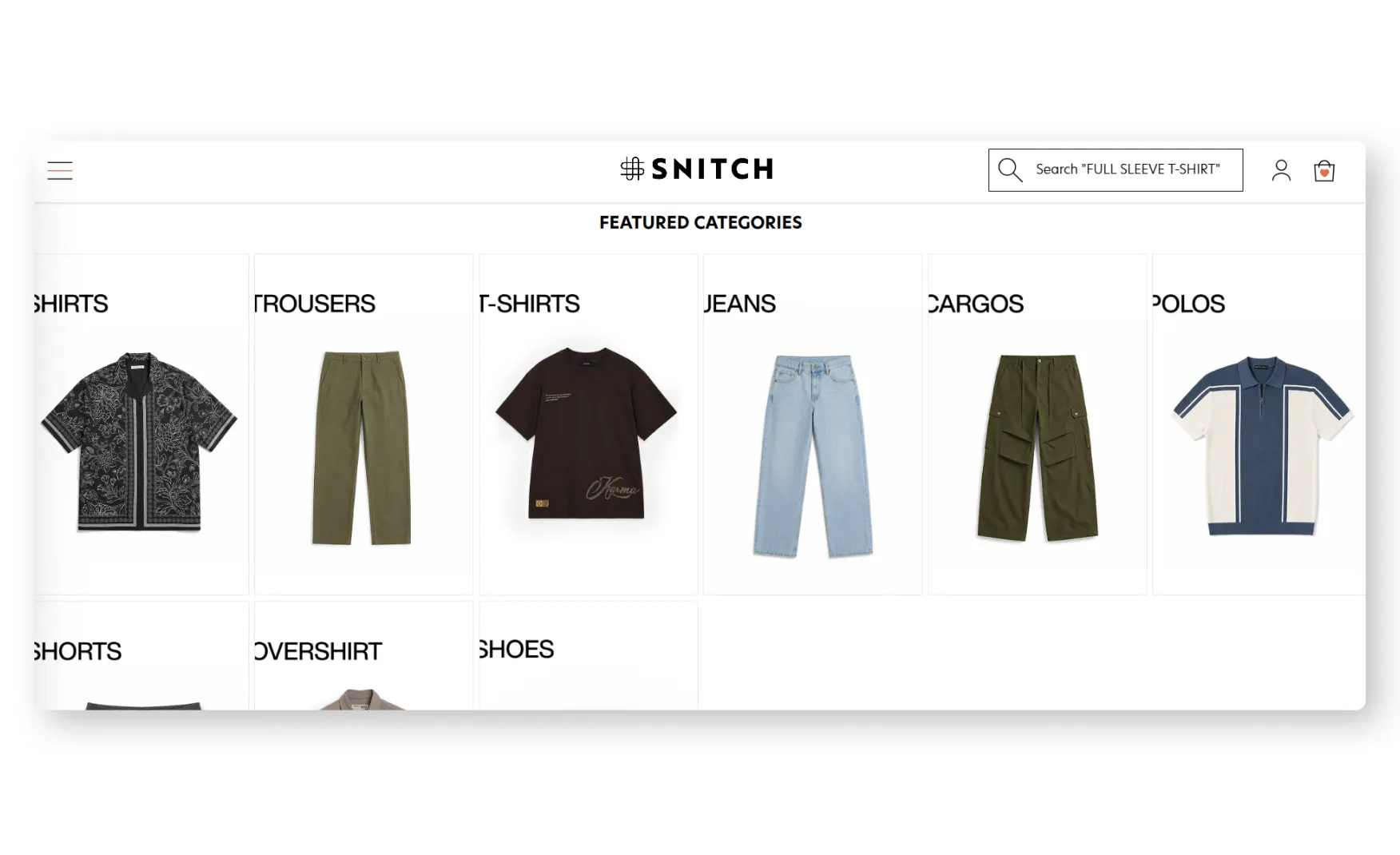
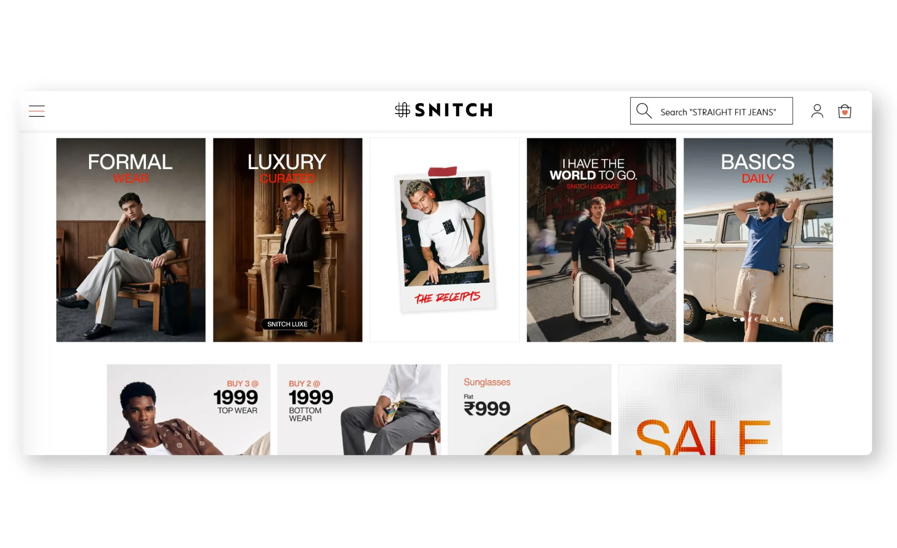
A moving multi-grid banner links directly to specific categories, cargoes or shirts among them, and a Match the Mood section splits the catalogue into Formal Wear, casual and going-out edits, Luxe for Fridays and Daily Basics, giving a shopper an occasion-based entry point alongside the standard category browse.
A Steals section runs clear, specific bundle pricing, buy three topwear pieces for Rs 999, two bottomwear pieces for Rs 999, sunglasses at a flat Rs 999, which is an easy, low-friction way to merchandise volume without requiring a shopper to hunt for a discount code.
5. The PDP Gives Real Fit Data Through a Style Spotlight 📏
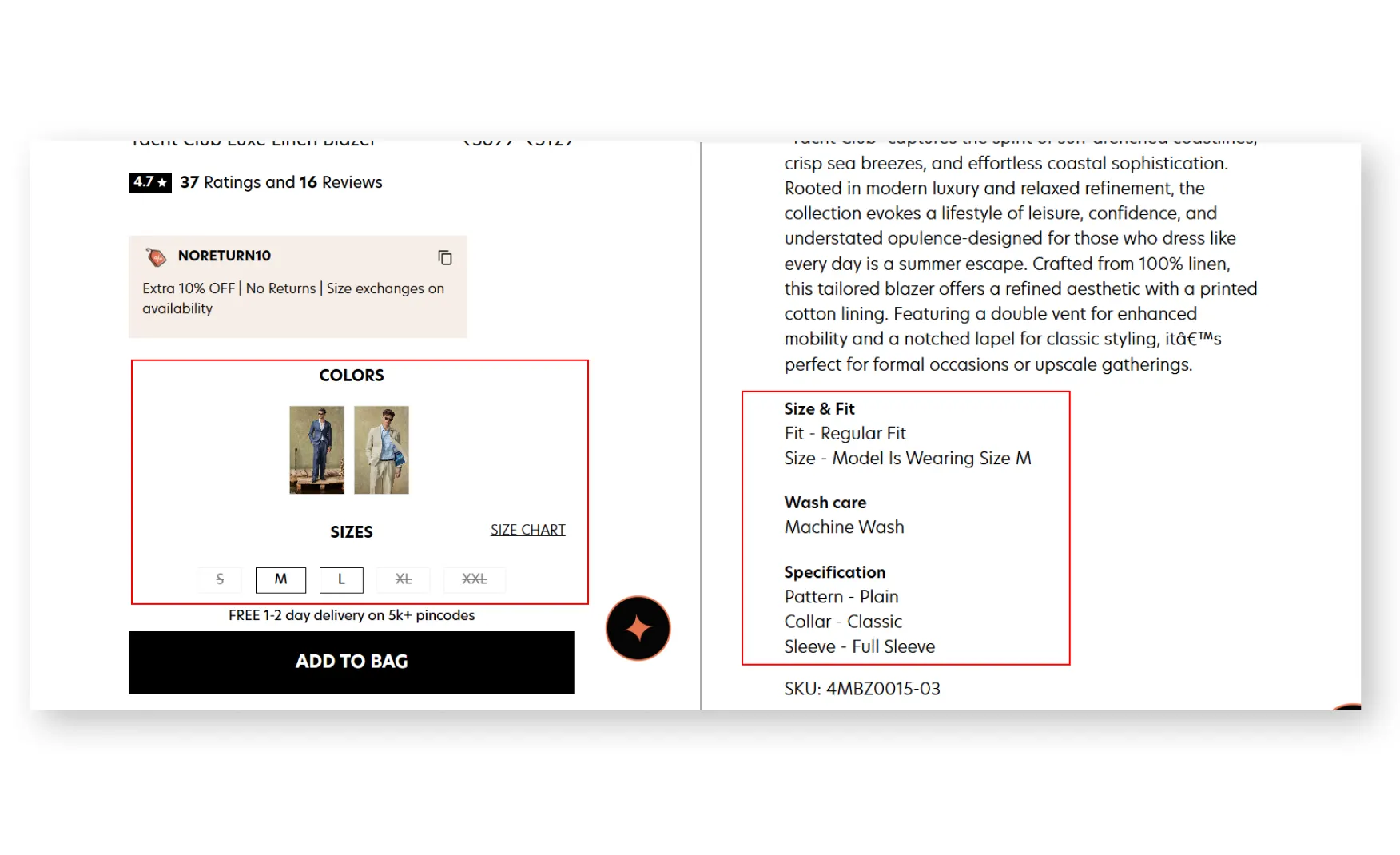
Each product page carries a Style Spotlight breaking down the exact fit, Straight Loose among the options Rishabh reviewed, the pattern, the primary colour, the material, and the precise size the model is shown wearing, which gives a shopper a concrete reference point beyond a generic size chart.
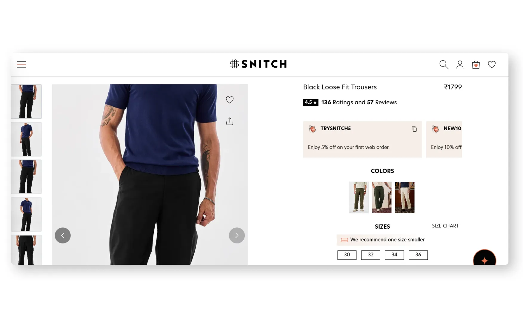
The size chart itself goes a step further, carrying a direct recommendation to size down by one on certain cuts, model thumbnails let a shopper preview each available colourway before selecting it, and stacked coupon codes plus a fast-delivery indicator sit right beside the Add to Cart button.
Where the Snitch Experience Falls Short ⚠️
1. There Is No Brand Story Anywhere on the Site 📄
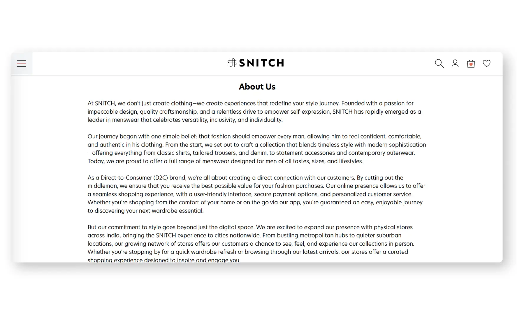
Rishabh was direct on this point, the About section is close to a wall of plain text, no founder photography, no imagery of the journey, nothing that reads as more than a black-and-white letter, for a founder and a growth story that is genuinely well documented in the press.
Across the rest of the site, the same gap repeats, the homepage is built almost entirely from product cards and category tiles with no section that explains what Snitch stands for, why it exists, or what separates it from any other men's fast-fashion storefront.
This matters more for Snitch specifically than for a generic catalogue site, the brand has raised over USD 53 million, crossed Rs 520 crore in revenue, and built a founder story starting from a B2B pivot during the pandemic, none of which currently appears anywhere a shopper would actually see it.
2. Product Cards and PDPs Carry No A+ Creative 🖼️
Collection cards show only the product name and price, with no rating visible, and the PDP itself runs product photography, the details tab, reviews and a delivery and returns section, with no visual explanation of fabric quality, construction detail or fit beyond the Style Spotlight callout.
For a fast-fashion brand competing on both speed and price, additional visual proof of quality, a fabric close-up, a construction detail shot, would help justify the purchase beyond the product photo alone.
What Suplex Would Fix First 💡
Priority 1 - Build an Actual Brand Story Page 🔧
Replace the current text-only About page with a real story, founder imagery, the B2B-to-D2C pivot during the pandemic, the growth to over 55 stores, told with the same specificity the brand already uses in press interviews.
This is the single highest-leverage fix on the site, everything else, the filters, the PDP depth, the fit guidance, works well, but none of it currently sits inside a brand a shopper has any reason to feel connected to.
Priority 2 - Grow Review Volume and Surface It by Default 📝
Add post-purchase review prompts, starting with best-selling SKUs, and expand the review section by default rather than collapsing it inside an accordion.
A brand at Snitch's revenue scale should have review counts that reflect that scale, and making the little proof that exists harder to find compounds the gap rather than closing it.
Priority 3 - Add Photo Reviews and Basic A+ Creative 📸
Add a photo upload prompt to the review flow so shoppers can see the garment on real bodies, and add at least one fabric or construction detail shot per product to give the PDP more visual proof beyond the standard gallery.
Both are incremental additions to a page structure that already works well, not a redesign.
Final Scorecard 🏆
Suplex Verdict 📝
Snitch has built a genuinely capable product and filtering experience, plus-size sized as a first-class category rather than an afterthought, a 4,552-product catalogue filterable down to collar and sleeve length, and a PDP that gives a shopper real fit data through the Style Spotlight and a direct sizing recommendation.
None of that capability is backed by a brand a shopper has any reason to remember, the About page is close to a wall of plain text for a founder story that is well told everywhere except on Snitch's own site, and the homepage itself is built almost entirely from product cards with no section that explains what the brand is or why it exists.
Review depth compounds the gap, a bestselling product carrying only 7 written reviews, collapsed by default, gives a shopper little to lean on beyond the product photography itself.
The fixes here are additive rather than structural, the filtering and fit infrastructure already work, they simply sit inside a site with no brand behind them yet.
Overall Rating ⭐⭐⭐ 3 / 5.
Suplex Design works with fashion and apparel D2C brands across India on brand identity, Product Detail Page architecture, and website audits. If your brand is at a similar stage to Snitch and you want an honest assessment of what is holding your site back, get in touch with our team of experts at Suplex Design.
Hi, I’m Rishabh Jain
I believe great digital experiences have the power to shape perception, build trust, and move businesses forward. That belief led me to found Suplex Design Studio, a global digital design and development studio helping FMCG and D2C brands build websites and digital experiences that are strategic, thoughtful, and commercially meaningful.
I started Suplex at 25 with a clear intent, to create digital experiences that look appealing, work seamlessly, and help D2C businesses grow. By 28, the studio had scaled globally, guided by a strong foundation in integrated design that I developed during my academic journey in London, where I was honoured with the Dean’s Award.
Over the years, I’ve had the opportunity to work with 100+ brands, from Fortune 500 organisations to family-run businesses, helping them build websites, e-commerce experiences, and digital products that create clarity, credibility, and long-term value.
Our work has been recognised internationally, including the Manifest Award (2024), the Clutch Global Award (2025), and features across platforms such as The Dieline, Packaging of the World, and the World Brand Design Society.
None of this would be possible without the people behind the work. I’m deeply grateful to the Suplex team, whose commitment, creativity, and attention to detail turn ideas into meaningful digital experiences every day.
At the heart of our work is a simple philosophy, digital design should be intentional, functional, and built to create real business value. That continues to guide everything we create at Suplex.























Let’s Make It Happen
E-Commerce Success Stories
%201.avif)






.avif)
.avif)
Build Your D2C Business The Right Way
Build It With Suplex.


