The Whole Truth
.avif)

The Whole Truth
The Whole Truth | Suplex's Verdict ⭐⭐⭐⭐½
Suplex's Website Audit for The Whole Truth at a Glance 📊
Founded in 2019 by former Unilever executive Shashank Mehta alongside co-founder Rachna Aggarwal, The Whole Truth built its early audience through Mehta's FITSHIT fitness blog before it sold a single protein bar, then converted that trust into revenue that grew 232 percent to INR 216 crore in FY25, up from INR 65 crore the year before.
Suplex Design analysed thewholetruth.in across brand storytelling, homepage education mechanics, navigation, Product Detail Page depth and review and trust signal placement, and what follows is why a brand built entirely on the promise of transparency backs that promise up on-site rather than leaving it as a tagline. Please note this was a short audit pass, and this audit reflects the site as it stood in July 2026.
H2: What The Whole Truth's Website Gets Exceptionally Right ✅
H3: 1. The Clean-Label Claim Is Actually Operationalised, Not Just Stated 🔍
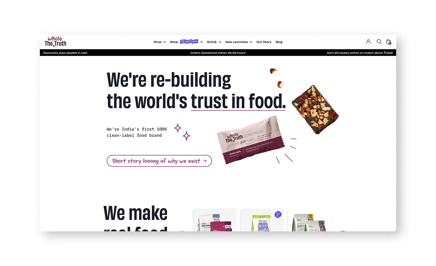
The hero opens on "We're re-building the world's trust in food" and "India's first 100% clean-label food brand," backed by a shot of the brand's transparent packaging printing the full ingredient list rather than a marketing render.
A "short story long" expandable section lets a visitor go from the one-line mission to the full founding story on demand, and a published protein lab-test report page and a "Why Prices Change" explainer give a sceptical shopper the receipts a clean-label claim needs to be believed rather than taken on trust.
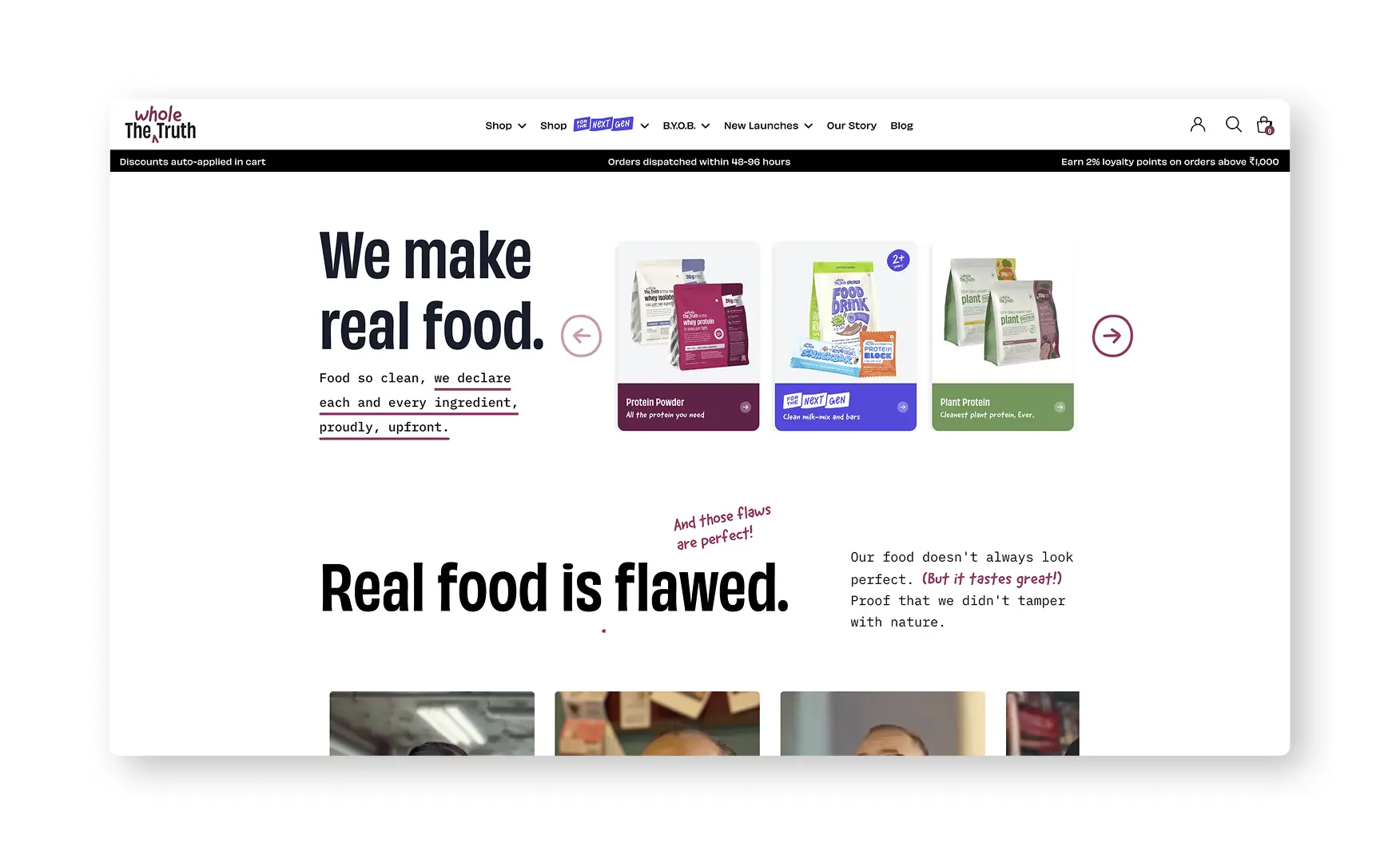
A section headed "real food is flawed, and those flaws are perfect" is paired with founder videos and Instagram Reels making the same argument in the founder's own voice, so the philosophy is not confined to copy, it is fronted by a named person saying it on camera.
H3: 2. The Homepage Doubles as a Food-Journalism Essay 📚
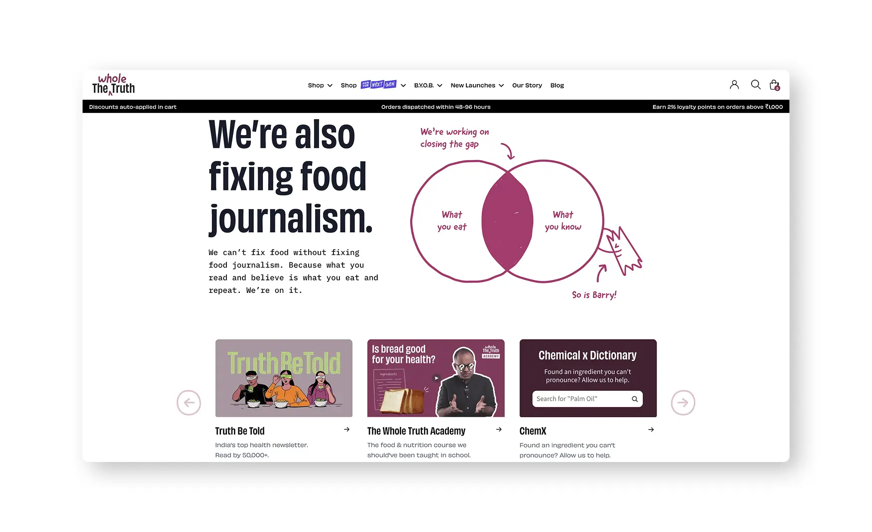
A dedicated section states plainly that the brand is also trying to fix food journalism, illustrated with a hand-drawn Venn diagram of what you eat against what you know, framed as a gap the brand is working to close.
Beneath it, a "real food made by real people" section shows the brand's own warehouse in a three-dimensional walkthrough view and names the facility as FSSC certified, turning a manufacturing credential most D2C sites bury in a footer into an actual visual proof point.
A linked YouTube video titled around revealing the brand's secret ingredient, and a moving strip of press logos from Times of India, Indian Express, YourStory, Business Insider and News18, sit directly beneath, so the educational claim is backed by both owned and earned media in the same scroll.
H3: 3. The Trust Bar and Navigation Are Honest and Properly India-Localised 🇮🇳
A persistent trust bar states an auto-applied discount, 24 to 48 hour dispatch, and 2 percent loyalty points on orders above INR 1,000, all visible before a visitor has clicked into a single product.
The primary navigation stays disciplined, Shop, B.Y.O.B., New Launches, Our Story and Blog, keeping the build-your-own-box mechanic, which supports mix-and-match trial and lifts basket size, sitting at the same level as the core Shop tab rather than buried inside it.
A testimonial section headed "real people, real love" and a row of celebrity and creator faces captioned to note the brand did not pay for the placements sit alongside an Instagram, YouTube and LinkedIn cross-link module, closing the homepage on earned rather than paid social proof.
H3: 4. The Bar Grid Filters by the One Number That Matters to This Buyer 💪
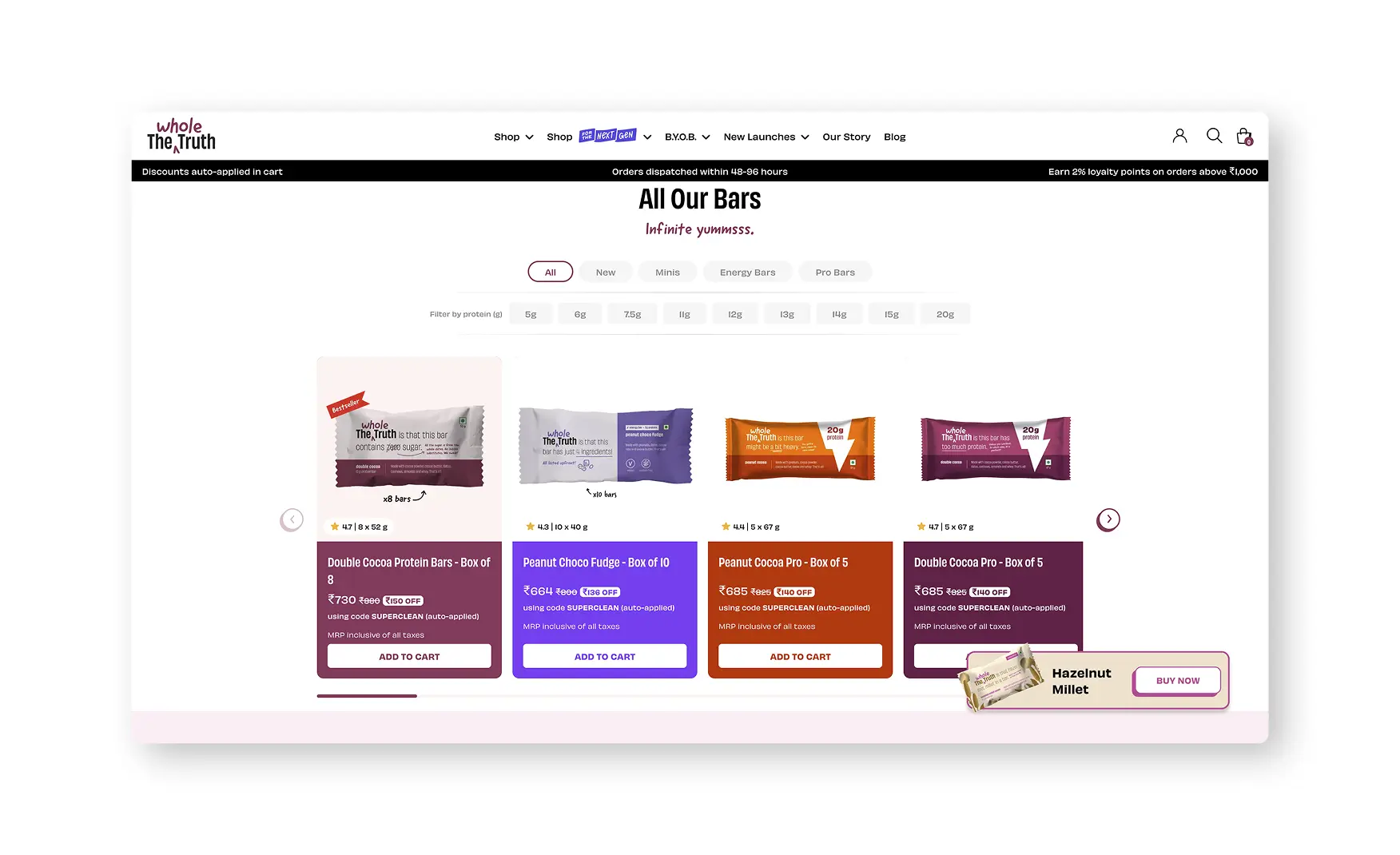
The collection grid runs category tabs, All, New, Minis, Energy and Pro, alongside a dedicated "filter by protein" slider running from 5g to 20g, which is the single spec a protein-bar shopper actually optimises for.
Each card carries a star rating, 4.7, 4.5 or 4.3 depending on the SKU, alongside pack size and a quick Buy Now button, and an onboarding tooltip walks a first-time visitor through the grid rather than assuming the filter logic is self-explanatory.
Letting a shopper filter directly by grams of protein, instead of by flavour or price the way most snack sites default to, shows the brand designed its own browse page around its own buyer rather than a generic food-and-beverage template.
H3: 5. The Hazelnut Millet PDP Is Honest, Complete and India-Localised 🛍️
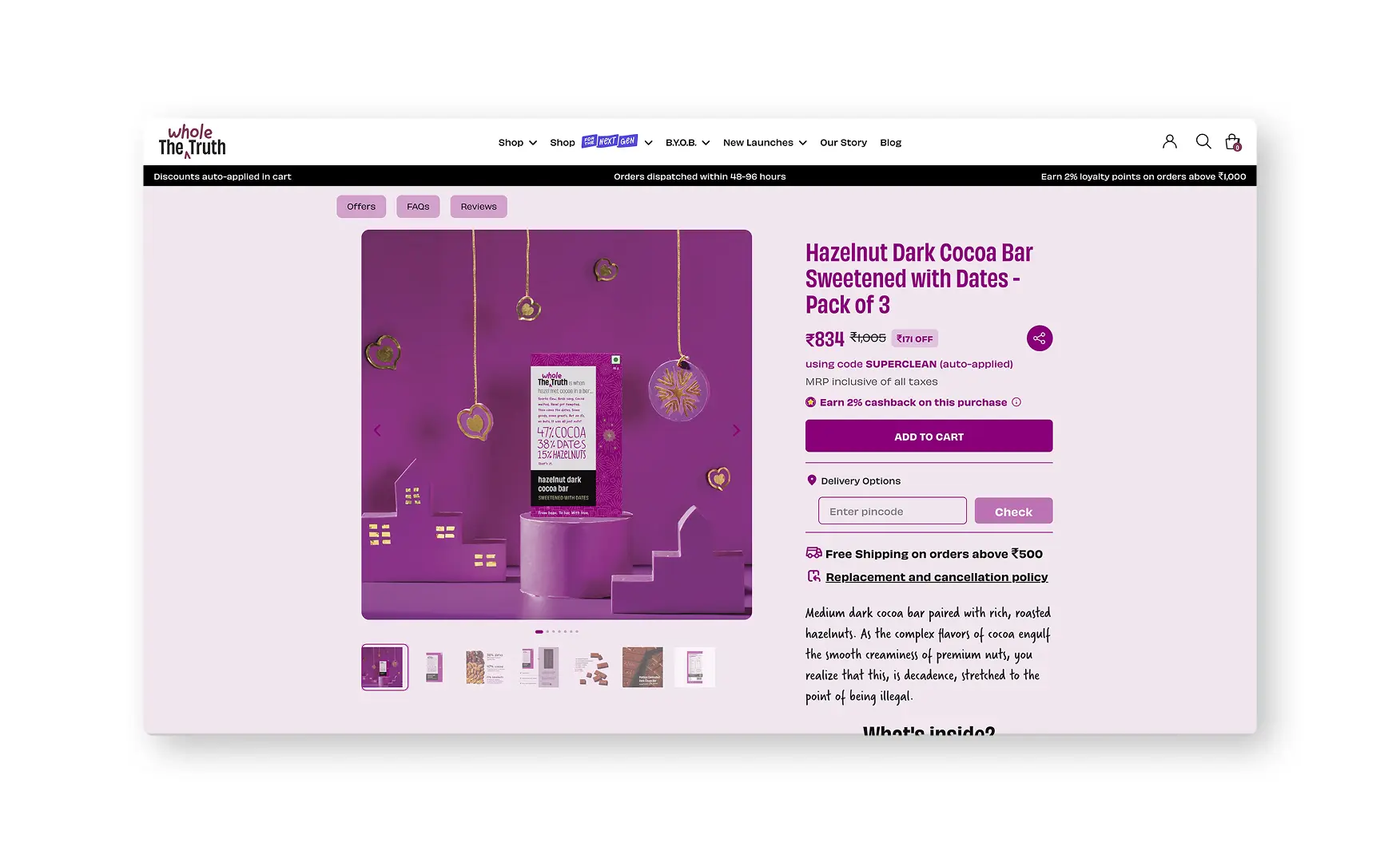
The Hazelnut Millet bar lists at INR 1,260 with INR 140 off auto-applied through the CLEANEST code, an MRP inclusive of taxes, a pincode delivery check, free shipping over INR 500, and 2 percent cashback, all visible without the shopper hunting for a coupon field.
The ingredient story stays as plain as the brand's positioning promises, "x8 bars, 12g protein, that's all," and the packaging shot in the gallery is the same transparent, full-ingredient-list packaging shown on the homepage, so the PDP does not contradict the promise made two clicks earlier.
Delivery options, a replacement and cancellation policy, and well-produced A+ creative sit alongside nutritional facts, product details and an FAQ, giving the page every standard trust element a food PDP needs, minus one, which the weaknesses section below covers.
H3: 6. The Food Drink Junior PDP Goes Further Than the Bars on Education 🧒
The Food Drink Junior page, a milk mix built for two to six year olds, carries more illustrated A+ creative than the bar PDPs, breaking down what sweetens the product, dates and palm jaggery, and stating plainly what it is made without, refined sugar, FOS or maltodextrin.
A section addresses height-growth marketing claims directly, stating there is no magic ingredient for height, and a "solving food marketing" module lists the exact tactics the category is known for, taller, smarter, stronger claims, 21 vitamins and 36 minerals, flashy toys and mascots, before explaining why the brand has chosen not to use them.
An "Uncle, I have doubts" section has the founder address parent scepticism directly on the page, and a "learn how to food for the next gen" module invites children aged seven to eleven to register as a food and beverage investigator, turning label literacy into something a child can opt into rather than something only a parent reads.

H3: The Whole Truth vs Clean-Label Peers on Trust Mechanics 📊
H2: Where The Whole Truth Falls Short ⚠️
H3: 1. The Strongest Proof Point Is Missing From the Buy Box 📜
The 4.6 star rating that shows on the collection grid cards disappears once a shopper reaches the product detail page, it is not shown next to the title or the price in the buy box, and reviews are pushed into a separate Reviews tab further down the page.
For a brand whose entire pitch is built on being believed, hiding its own social proof at the exact moment a shopper is deciding whether to trust the price is a real gap, not a minor styling choice, and it works against a rating the brand has clearly already earned.
The gap compounds a second, smaller inconsistency like the review sections carry customer photos on some SKUs, the energy bars, for instance, but the Food Drink Junior reviews run text only, so the review experience itself is not standardised across the catalogue.
H2: What Suplex Would Fix First 💡
H3: Priority 1 - Move the Star Rating Into the Buy Box 🔧
Surface the 4.6 star rating and its review count directly beneath the product title and beside the price, in the same place the collection grid cards already show it, rather than leaving it to appear only inside a separate Reviews tab.
The rating data already exists and is already trusted enough to show on the grid, this is a placement fix, not a build, and it is the single change most likely to close the gap between a 4.5 and a clean 5.
H3: Priority 2 - Standardise the Review Photo Experience Across SKUs 📸
Add the same photo and video upload prompt used on the energy bars to every product line, including Food Drink Junior, so a parent buying for a child gets the same visual proof a fitness buyer gets on a protein bar.
This is a content-operations fix rather than a design change, and it removes an inconsistency that currently makes one part of the catalogue look more trusted than another for no real reason.
H3: Priority 3 - Extend the Food Drink Junior Education Template Sitewide 📝
Roll the illustrated ingredient breakdowns, the claims-transparency module and the founder-addresses-doubts format built for Food Drink Junior out to the bar and nut butter PDPs, which currently carry a simpler nutritional-facts-and-FAQ treatment.
The brand has already built the strongest education template in its own catalogue, extending it is a production task using an existing playbook, not a new design brief.
H2: Final Scorecard 🏆
H2: Suplex Verdict 📝
The Whole Truth has built the rare D2C site where the brand promise and the on-site experience actually match, radical transparency is not a slogan here, it is printed on the packaging, published in lab reports, and explained in a dedicated pricing page.
The homepage works as a genuine piece of food-literacy content, the warehouse walkthrough, the founder videos and the direct rebuttal of category marketing tactics on the Food Drink Junior page all do real persuasion work that most clean-label brands only gesture at.
What holds the site back from a clean 5 is not the brand, it is a placement decision, a 4.6 star rating the brand has already earned is invisible at the exact moment a shopper is deciding whether to trust the price, and the review and creative experience is inconsistent across the catalogue rather than uniformly excellent.
None of the fixes here touch the brand system. Surface the rating in the buy box, standardise the review photo experience, and extend the Food Drink Junior education template sitewide, and this is a 5.
Overall Rating ⭐⭐⭐⭐½ 4.5 / 5.
Suplex Design works with D2C food, nutrition and wellness brands across India on Product Detail Page architecture, trust signal placement, and website audits. If your brand is at a similar stage to The Whole Truth and you want an honest assessment of what is holding your site back, get in touch with our team of experts at Suplex Design.
Hi, I’m Rishabh Jain
I believe great design has the power to shape perception, build trust, and move businesses forward. That belief is what led me to found Suplex Design Studio, a global branding and packaging studio working with FMCG and D2C brands across markets.I started suplex at 25 with a clear intent, to create design that is strategic, thoughtful, and commercially meaningful. By 28, the studio had scaled globally, guided by a strong foundation in Integrated Design that I developed during my academic journey in London, where I was honoured with the Dean’s Award.
Over the years, I’ve had the opportunity to work with 100+ brands, from Fortune 500 organizations to family-run businesses, helping them build packaging and brand systems that create recall, relevance, and long-term value.
Suplex’s work has been recognized internationally, including the Manifest Award (2024), the Clutch Global Award (2025), and features on platforms such as Packaging of the World, The Dieline, and the World Brand Design Society.
None of this would be possible without the people behind the work. I’m deeply grateful to the suplex team, whose commitment, creativity, and attention to detail turn ideas into meaningful brand experiences every day.
At the heart of my work is a simple philosophy, design should be intentional, honest, and built to last, and that continues to guide everything we create at suplex.
















Let’s Make It Happen
E-Commerce Success Stories
%201.avif)





.avif)
.avif)
Build Your D2C Business The Right Way
Build It With Suplex.


