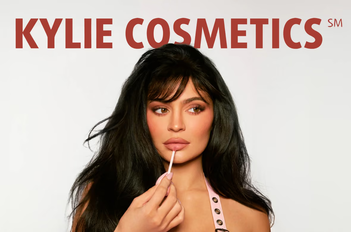
Kylie Cosmetics
.avif)
Kylie Cosmetics
Kylie Cosmetics | Suplex’s Verdict ⭐⭐⭐⭐
Suplex’s Website Audit for Kylie Cosmetics at a Glance 📊
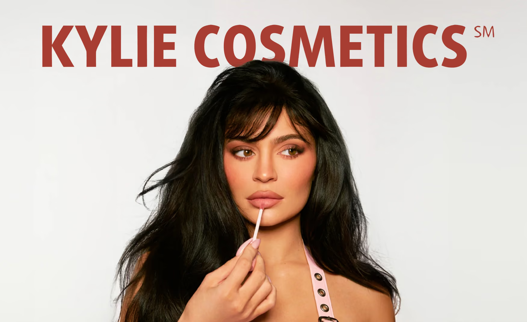
Founded in November 2015 by Kylie Jenner with a single lip kit that sold out in under a minute, Kylie Cosmetics scaled faster than almost any beauty brand in history on the back of the most-followed founder in the category. Coty acquired a 51% stake in 2019 for USD 600 million, valuing the brand at approximately USD 1.2 billion, and the brand now distributes in over 50 countries through retailers including Ulta Beauty, Harrods, Douglas, and Mecca, while also launching its debut fragrance, Cosmic Kylie Jenner, in 2026.
Suplex Design analysed kyliecosmetics.com across brand identity, navigation, virtual try-on, social commerce, Product Detail Page architecture, product creative, casting, and brand storytelling, and what follows is a breakdown of what the site does genuinely well and the three fixes that would take a 4 to a 5. This audit reflects the site as it stood in July 2026.
What Kylie Cosmetics’ Website Gets Exceptionally Right ✅
1. The Founder Fronts the Hero and the Taxonomy Runs Deep 👑
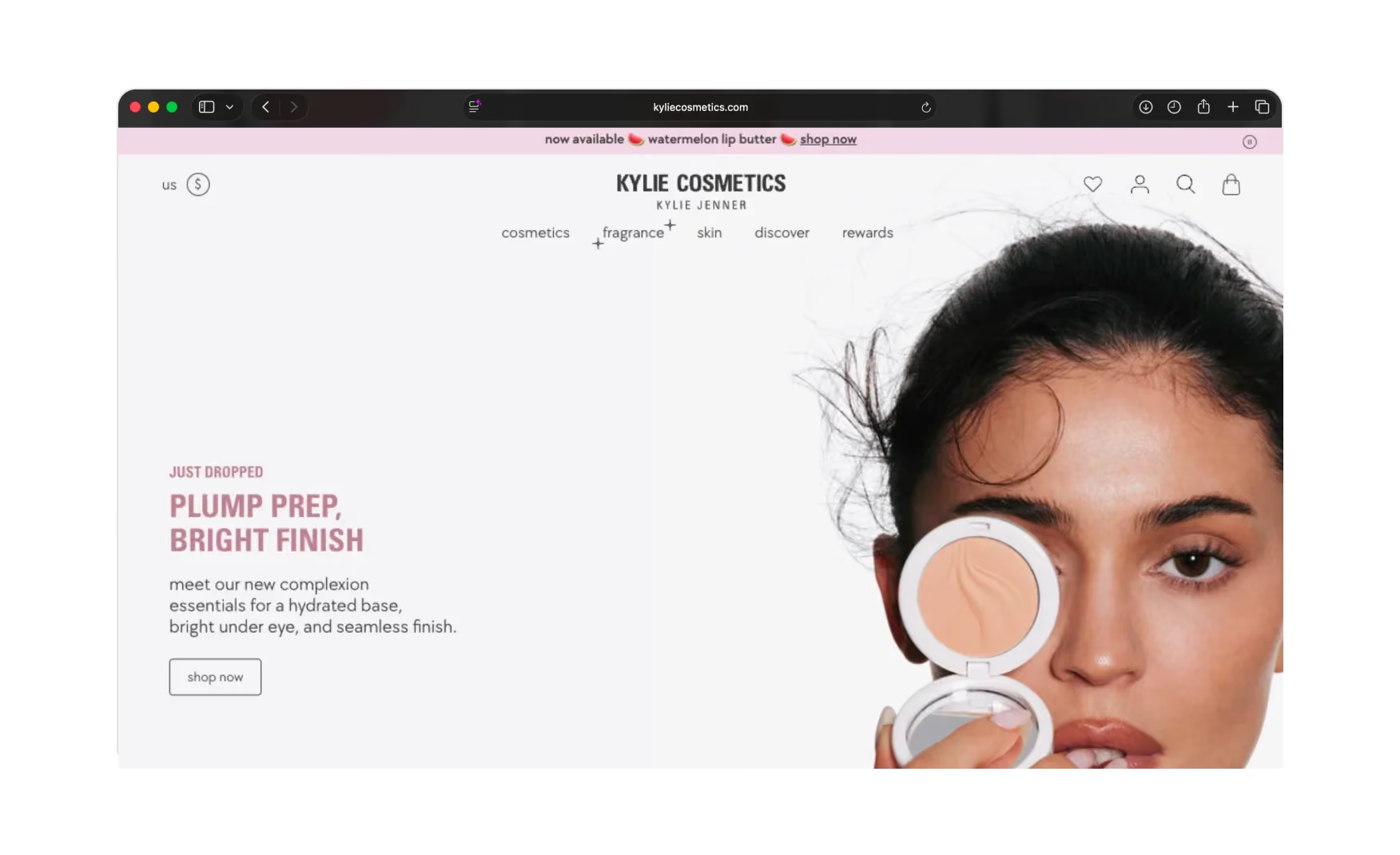
The homepage leans fully into the founder. Kylie Jenner is the face of every launch, which for a celebrity-built brand is exactly the right call.
Behind the hero the navigation is disciplined. Cosmetics splits into lips and face with real depth, so the customer can go straight to lip kits, liquid lipsticks, plumpers, stains, or tints, or across to skin tint, foundation, concealer, and primer, rather than digging through one giant grid. A rewards tab in the nav shows the brand is thinking past the first sale.
A fragrance category was added to the homepage category tiles in 2026 alongside the debut Cosmic Kylie Jenner launch, extending the commerce architecture into a new vertical without disrupting the existing taxonomy.
2. The Virtual Try-On Lets the Customer Wear the Shade Before Buying 💅
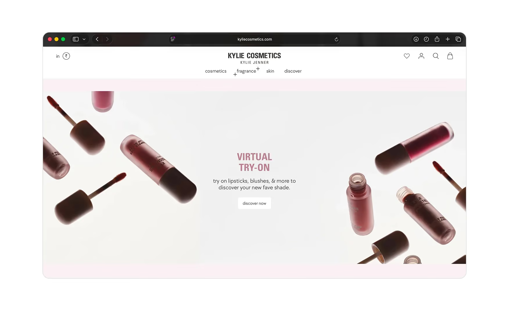
A Virtual Try-On module sits on the homepage and invites the customer to try on lipsticks, blushes, and more to discover their new favourite shade.
For makeup, where the single hardest thing online is imagining a colour on your own face, letting the visitor see the shade on themselves before committing is exactly the kind of tool that removes purchase hesitation.
It is a genuine plus that most celebrity beauty brands still do not offer, and the fact that it lives on the homepage rather than buried in a product page means a first-time visitor encounters it before they have had to decide what to buy.
3. The Shop Our Instagram Feed Closes the Social-to-Sale Loop 📱
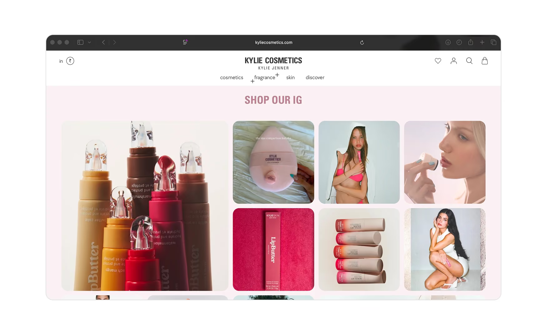
A Shop Our IG section pulls the brand's actual Instagram posts onto the homepage and makes them clickable straight through to the product.
For a celebrity brand whose customers are already following the founder and living in that feed, closing the gap between “I saw it on Instagram” and “I bought it on the same screen” is a smart, native integration.
The customer buys exactly what they were already looking at without having to search for it.
4. The Product Cards Do the Merchandising Work in the Collection Grid 🛒
Inside a collection the cards carry the product image, name, shade, a star rating with review count, and price, and flag new, award badges, out of stock, struck-through bundle prices, and how many sizes a product comes in.
Hover a card and the available shades preview without a click, so the customer can scan the whole colour range from the grid itself.
Real customer and video tiles of Kylie using the products are dropped into the grid too, so social proof lands while the visitor browses, not only on the product page.
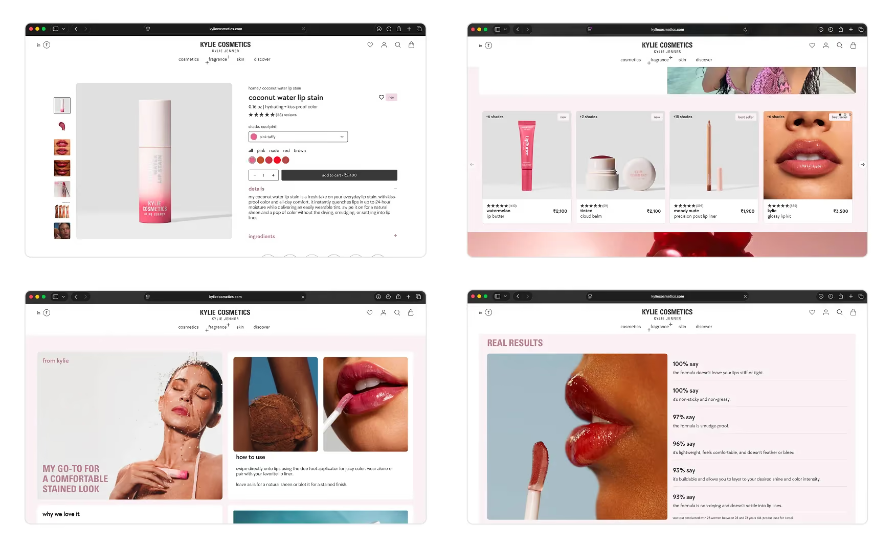
5. The Product Page Is Rich on Shades, Stats, and Reviews ⭐
The product page does a lot right.
The customer can sort shades by family, i.e. just pinks, just reds, and a row of ingredient iconography such as cream, cruelty-free, high-pigmented, non-drying, paraben-free, and vegan sits on the product with a try me on prompt layered onto the image.
Below that, a From Kylie note and a How to Use block carry real application photos and video, a The Reason We Love It section adds the brand's own voice, and a Real Results panel cites hard stats such as 91% of users agree the product does not settle into lines.
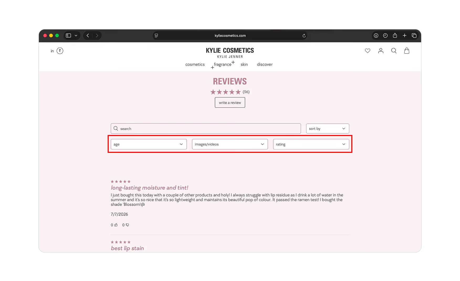
A You May Also Like row cross-sells, and the review section can be sorted by age and filtered to entries with images and video, so a shopper can find a real person their age wearing the product.
Where the Kylie Cosmetics Experience Falls Short ⚠️
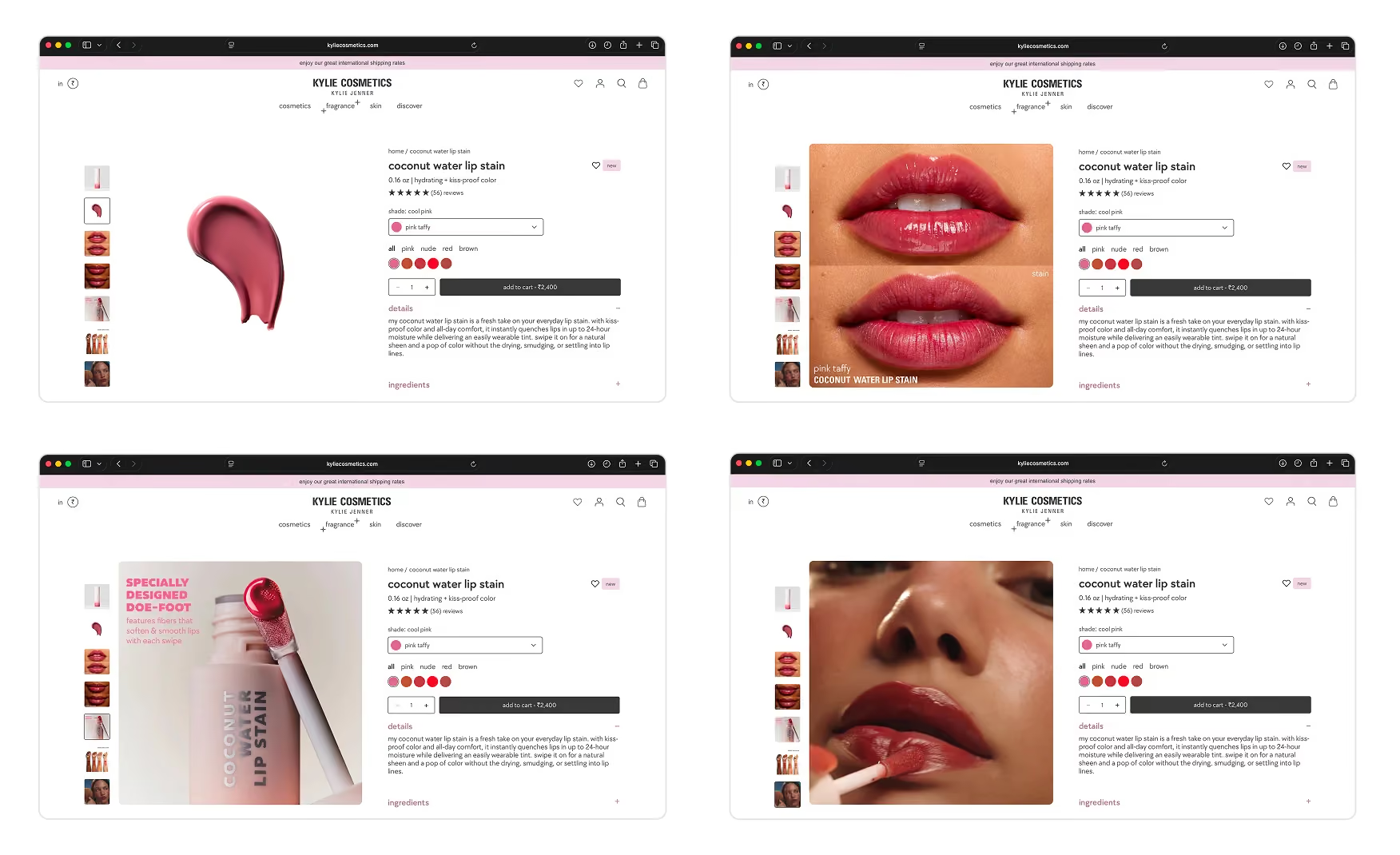
1. The Product Images Carry No A+ Creative 🖼️
For all the storytelling the reviews and try-on do, the product images themselves are plain packshots.
There is no A+ creative explaining texture, finish, wear time, or ingredients in visual form. A brand this visual is leaving its most persuasive real estate, the image gallery, doing the least work, when a few creative frames would carry the product story the way the rest of the page tries to.
The brand already has the creative standard, it appears in the From Kylie application videos and the UGC grid tiles. Extending that standard into the product gallery images would close the gap between where the page's best work sits and where the buyer's eye goes first.
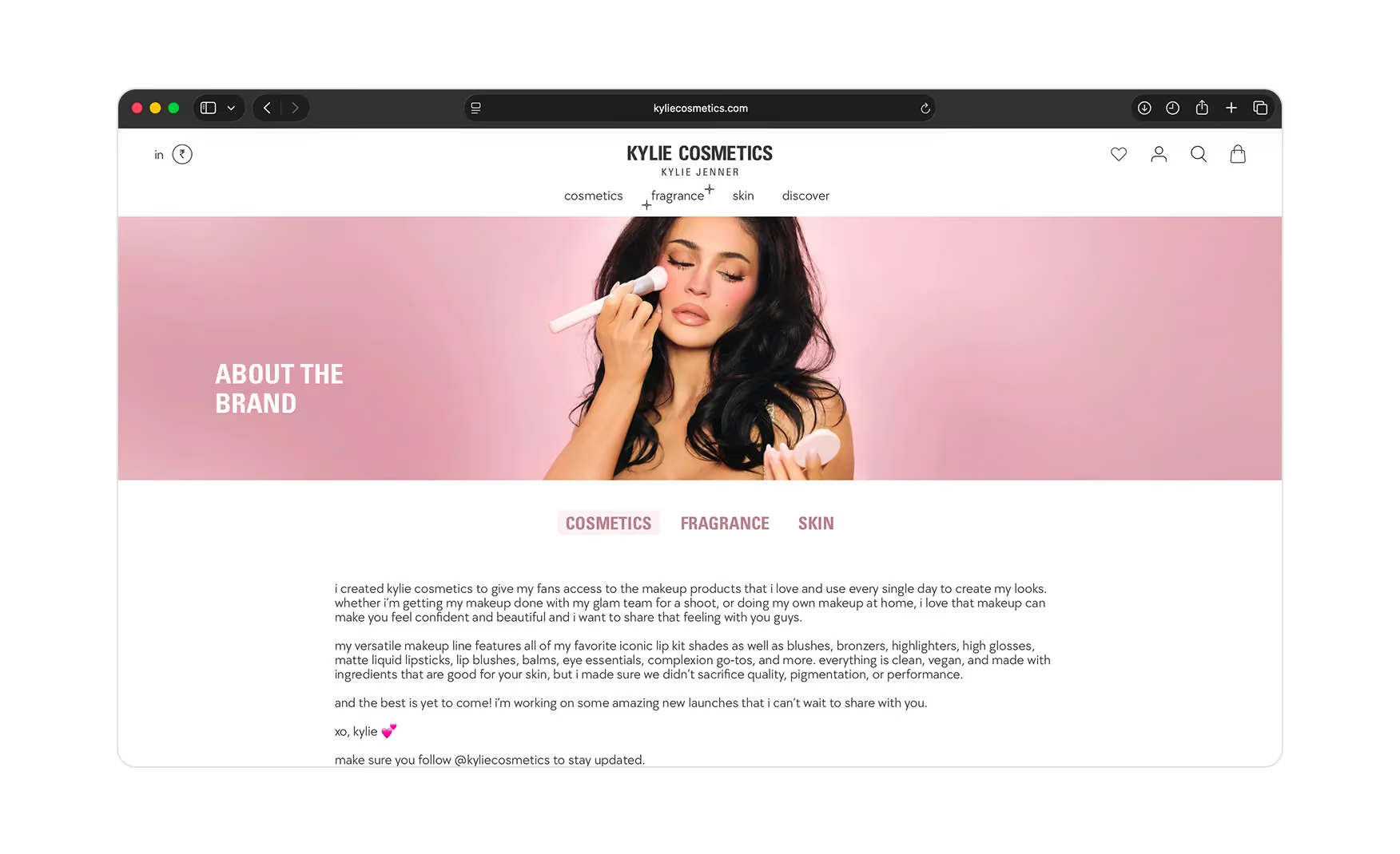
2. The Brand Barely Tells Its Own Story 📚
There is very little about us content on the site.
The founder carries the brand recognition, but a new customer who does not already live in Kylie's world gets almost no story about what the brand stands for, how it is made, or why it exists beyond the name.
For a brand with a decade of history, from the original sold-out lip kit through the Coty partnership and the 2026 fragrance launch, that thin narrative caps the trust the site can build with anyone outside the existing fanbase.
3. The Casting Fakes Diversity Instead of Showing It 👥
Almost no one other than Kylie appears on the site.
Where the brand needs to show how a shade reads on different skin tones, it lightens or darkens the same image rather than using actual diverse models.
For a global beauty brand selling colour that behaves differently on every complexion, this breaks the this could be me signal for every customer who is not Kylie.
Showing real, varied faces wearing the products is the single change that would most widen who feels the brand is for, and it is the difference between selling to the fanbase and selling to the market.
Celebrity Beauty Casting Benchmark 📊
What Suplex Would Fix First 💡
Priority 1 - Cast and Shoot Real Diverse Models Across the Range 🔧
Cast and shoot real diverse people wearing the range, on the homepage, in the grid, and especially in the shade demonstrations, so the products are shown on the customers who will actually buy them rather than on a digitally adjusted single model.
This is the fix that most changes who feels the brand is for, and it is the one with the biggest commercial upside. The fanbase already buys. The market beyond it is waiting for a reason to.
Priority 2 - Add A+ Creative Frames to the Product Image Gallery 📝
Add two or three A+ creative frames per product into the image gallery, showing texture, finish, wear time, and key ingredients visually rather than leaving the gallery as packshots.
The creative standard already exists in the From Kylie video blocks and the UGC tiles. This is an extension task, not a new brief. It closes the gap between where the page's best storytelling sits and where the buyer's eye goes first.
Priority 3 - Build a Brand Story Section Inside the About Page 📚
Replace the current minimal About page with a proper brand narrative covering the 2015 lip kit launch, the Coty partnership, the clean and vegan relaunch, and the 2026 fragrance entry into a new category.
A customer who arrives through paid social or editorial and clicks to learn more is currently handed a service page. For a brand with Kylie Cosmetics' history and cultural footprint, an editorial About page is a trust asset that costs nothing but time to build.
Final Scorecard 🏆
Suplex Verdict 📝
Kylie Cosmetics has built the celebrity commerce machine about as well as it can be built.
The founder anchors the hero, the taxonomy is clean, the try-on tool removes the biggest hesitation in makeup, the shoppable Instagram feed closes the social-to-sale loop, and the Product Detail Page stacks shade sorting, hard-stat proof, and age-filterable photo reviews. The commerce engine underneath is already a 5.
What holds it back is not the commerce, it is the presentation and the plumbing. Plain product images with no A+ story, a thin brand narrative, and photography that shows one person rather than the many people the brand actually sells to. These are not structural problems. They are creative and content decisions, and each of them is reversible.
Real, diverse casting and A+ creative on the product galleries are the two fixes that would take this from a fanbase storefront to a market storefront. The brand narrative is the third.
Overall Rating ⭐⭐⭐⭐ 4 / 5.
Real diverse casting and a faster load are the two fixes that would take this from a fanbase storefront to a clean 5.
Suplex Design works with D2C beauty and celebrity-founded brands across India and the UAE on Product Detail Page architecture, casting strategy, and website audits. If your brand is at a similar stage to Kylie Cosmetics and you want an honest assessment of what is holding your site back, get in touch with our team of experts at Suplex Design.
Hi, I’m Rishabh Jain
I believe great digital experiences have the power to shape perception, build trust, and move businesses forward. That belief led me to found Suplex Design Studio, a global digital design and development studio helping FMCG and D2C brands build websites and digital experiences that are strategic, thoughtful, and commercially meaningful.
I started Suplex at 25 with a clear intent, to create digital experiences that look appealing, work seamlessly, and help D2C businesses grow. By 28, the studio had scaled globally, guided by a strong foundation in integrated design that I developed during my academic journey in London, where I was honoured with the Dean’s Award.
Over the years, I’ve had the opportunity to work with 100+ brands, from Fortune 500 organisations to family-run businesses, helping them build websites, e-commerce experiences, and digital products that create clarity, credibility, and long-term value.
Our work has been recognised internationally, including the Manifest Award (2024), the Clutch Global Award (2025), and features across platforms such as The Dieline, Packaging of the World, and the World Brand Design Society.
None of this would be possible without the people behind the work. I’m deeply grateful to the Suplex team, whose commitment, creativity, and attention to detail turn ideas into meaningful digital experiences every day.
At the heart of our work is a simple philosophy, digital design should be intentional, functional, and built to create real business value. That continues to guide everything we create at Suplex.
















Let’s Make It Happen
E-Commerce Success Stories

%201.avif)






.avif)
.avif)
Build Your D2C Business The Right Way
Build It With Suplex.


