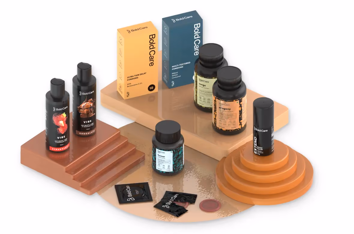
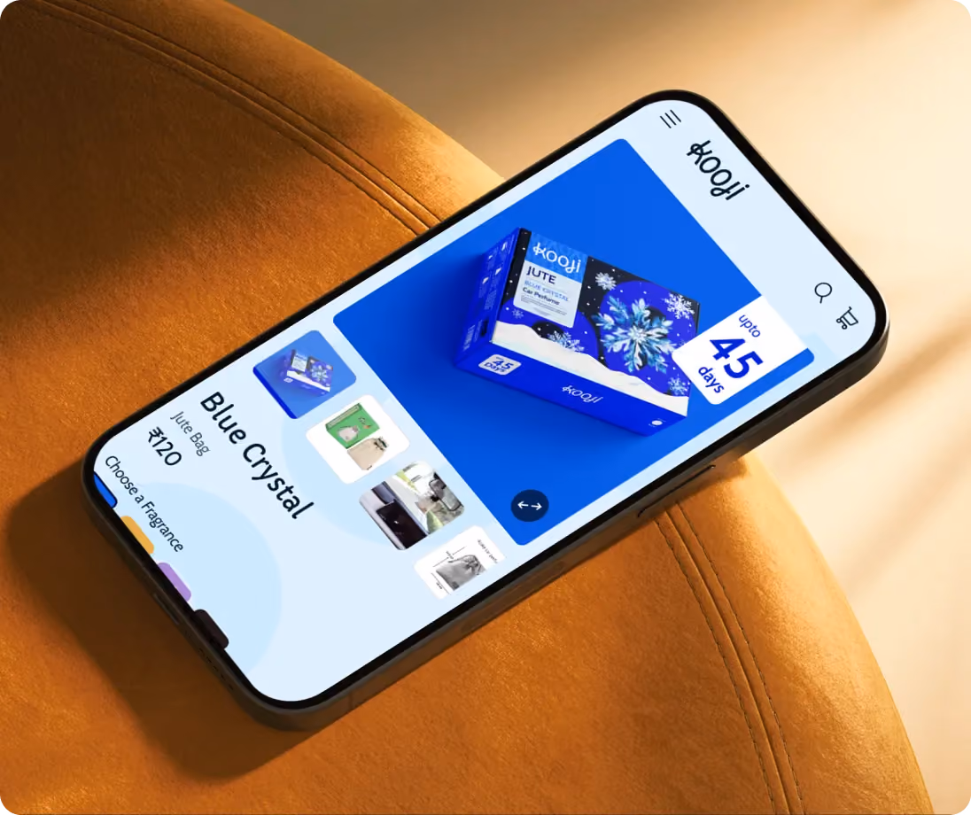
Bold Care
.avif)
Bold Care
Bold Care | Suplex's Verdict ⭐⭐⭐⭐
Suplex’s Website Audit for Bold Care at a Glance 📊
Bold Care crossed Rs 100 crore in annual recurring revenue in December 2024, raised a USD 5 million Series A in February 2025 led by Nithin Kamath's Rainmatter alongside the founders of CaratLane and Gruhas, and now claims 50 lakh-plus customers, with Ranveer Singh as a co-founder and the face of every product page.
Suplex Design analysed Bold Care's website across its conversion mechanics, information architecture, PDP depth, social proof strategy, and mobile experience, and what follows is a breakdown of how this brand built one of the sharpest D2C storefronts in India, and the two specific things it still needs to fix.
What Bold Care's Website Gets Exceptionally Right ✅
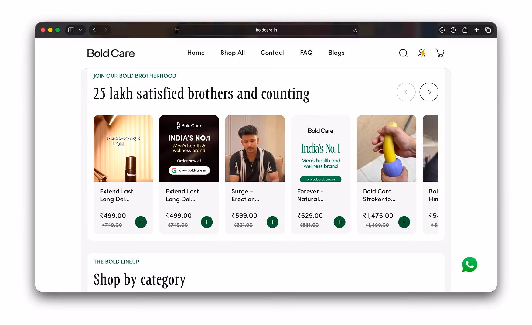
1. A Hero That Does Four Jobs at Once 🎤
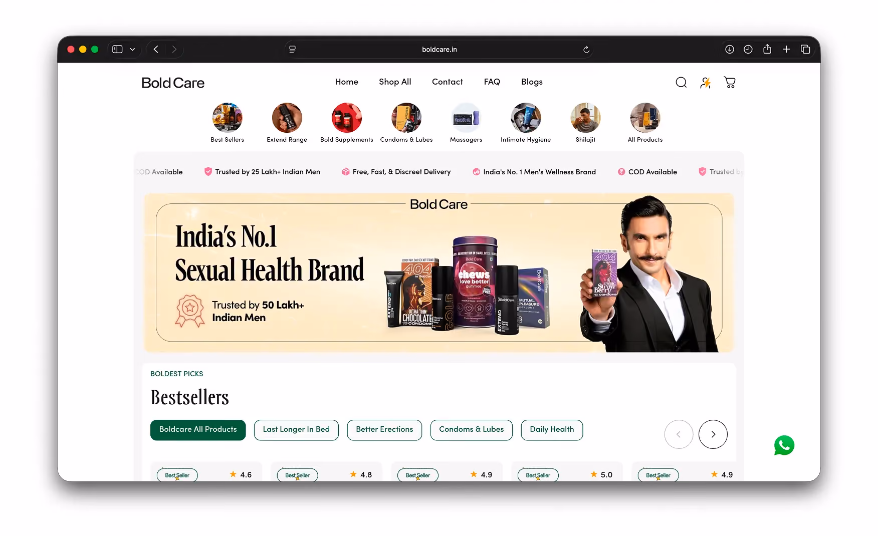
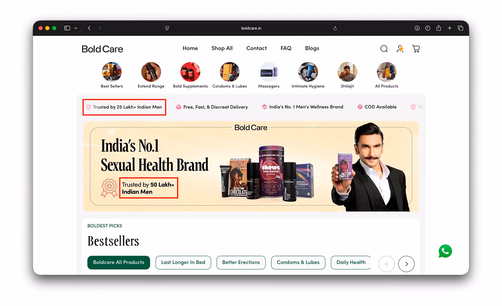
The homepage hero stacks every conversion element a first-time buyer needs.
Ranveer Singh holds a product, the full product family sits beside him, an "India's No.1 Sexual Health Brand" headline anchors the top, and a "Trusted by 50 Lakh+ Indian Men" badge closes the bottom of the frame.
Above the hero, eight round category tiles cover Best Sellers through to Shilajit and All Products. Below the tiles, a scrolling trust ticker carries COD Available, Discreet Delivery, and the No.1 claim continuously.
For a category where first-time buyers have historically needed three or four convincing factors before they commit, this hero delivers them all without a single scroll. Celebrity validation, social proof, catalogue access, and category reassurance are all present before the visitor's thumb has moved.
Screenshot: Bold Care homepage hero with Ranveer, the product family, the category tiles row, and the trust ticker. Re-capture boldcare.in at 1440 with the popup dismissed.
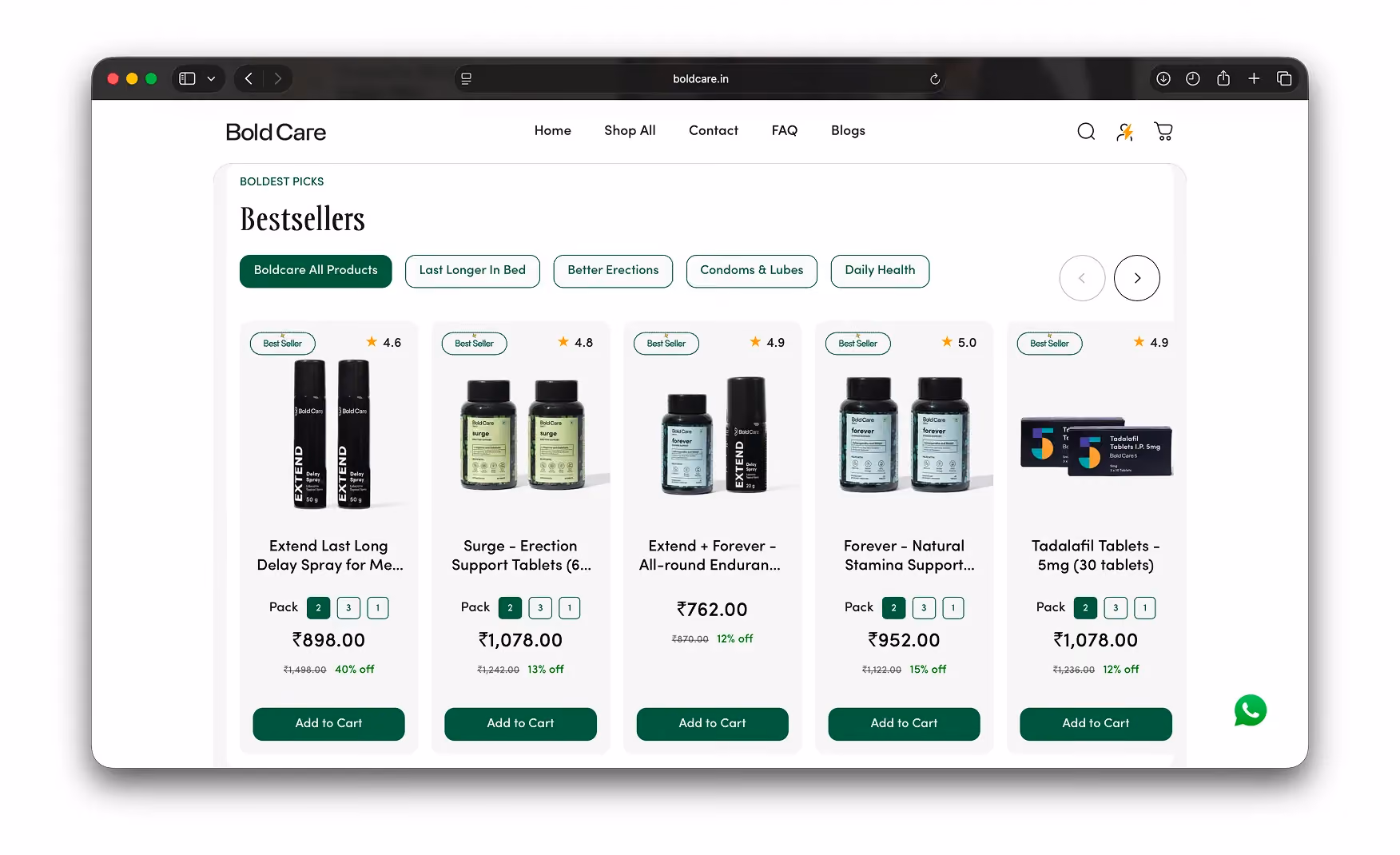
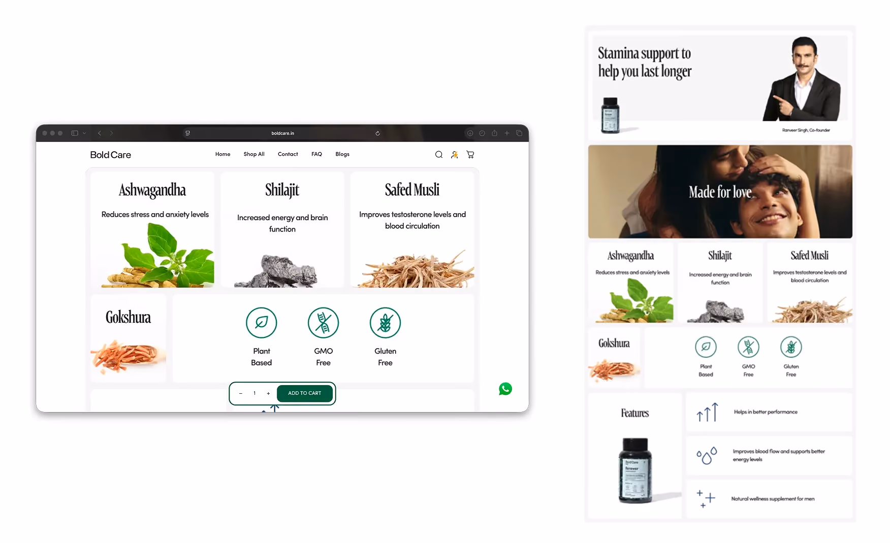
2. Shop-by-Need Taxonomy From Fold Two 📐
Bestsellers appear in fold two as a five-card row. Filter pills sit directly above them for Last Longer In Bed, Better Erections, Condoms and Lubes, and Daily Health.
This is shop-by-need, not shop-by-category.
A first-time visitor dealing with a specific issue does not need to know what an "Extend Range" is. He just taps the filter that matches his situation and the relevant products appear.
Every card in the row carries a Best Seller badge and a star rating between 4.6 and 5.0. The page is long, but every section that follows either sells or builds trust. There is no editorial filler between the visitor and the catalogue.
Screenshot: Bestseller row with the shop-by-need filter pills above it. Re-capture boldcare.in homepage at fold two.
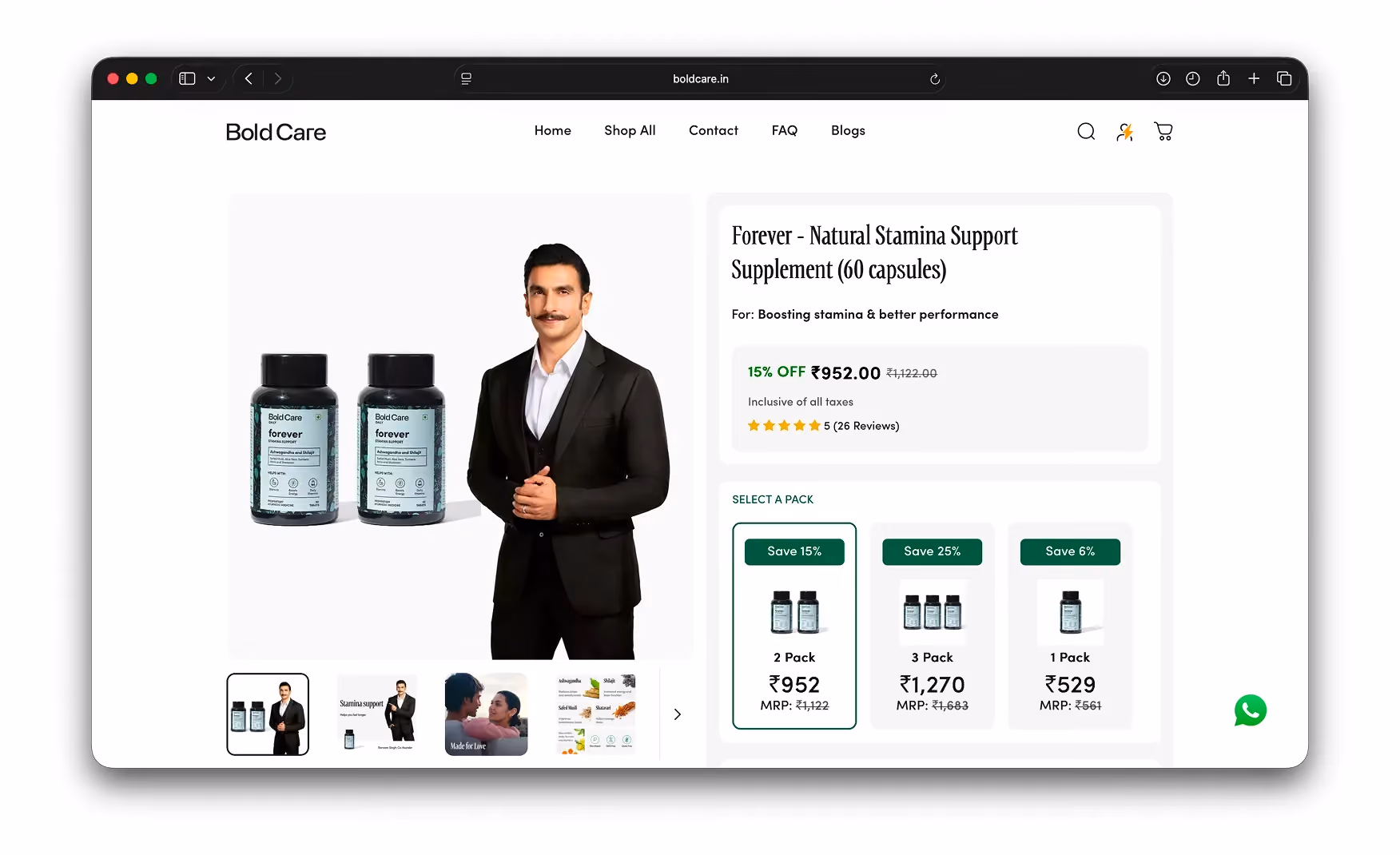
3. A PDP That Uses the Celebrity Deal the Way It Should Be Used 💼
Ranveer Singh appears on every product page, not only on the homepage.
Each PDP composites him with the specific product in a single hero shot, so the celebrity endorsement lands at the point of decision rather than only at the point of discovery.
The product name carries a use case label. "For: Boosting stamina and better performance" tells the buyer exactly what they are purchasing before they read a single ingredient.
The pack selector is the sharpest commercial move on the site. Single Pack at Rs 529, 2-Pack at Rs 952 with a 15% saving badge, and 3-Pack at Rs 1,270 with a 25% saving badge, with the 2-Pack pre-selected as the anchor, push the visitor towards the 3-Pack without a single upsell sentence.
Screenshot: Forever Stamina PDP hero with Ranveer, the star rating, and the 1-Pack / 2-Pack / 3-Pack pricing tiers. Re-capture boldcare.in/products/forever-natural-stamina-supplements-60-tablets at 1440.
4. Decision-Support Depth That Justifies the Price 🔬
The PDP does not end at the pack selector. Ashwagandha, Shilajit, Safed Musli, and Gokshura each get a one-line explanation so a buyer understands what they are putting in their body.
After the ingredient stack come benefit icons, a visual how-to-use section, a customer reviews section with photos, and a Better Together bundle cross-sell. The Bold Care vs other brands comparison table sits inside the PDP rather than on a separate landing page.
That placement matters. A buyer weighing up a Rs 1,270 purchase sees the competitive advantage in the same scroll as the add-to-cart button, which is where the comparison needs to be.
It is the kind of a psychological and marketing factor that turns "too expensive" into "I see exactly why".
Screenshot: PDP mid-scroll showing the ingredient breakdown, the Bold Care vs other brands comparison table, and the customer reviews with photos. Re-capture the Forever Stamina PDP, full-page or stitched.
5. UGC Video Testimonials From Creators the Customer Already Follows 🎥
Beyond the celebrity hero, the homepage layers in video testimonials from popular Indian content creators. For a category where most buyers will never recommend a product out loud, peer-influencer signal does the social-proof work that word of mouth normally would.
The visitor sees a creator they already follow on Instagram or YouTube endorsing the brand, and that reframes the purchase from a personal admission into an informed choice.
The "25 lakh satisfied brothers" video wall takes the same logic further with real customers on camera. On-camera honesty from real buyers is harder to fake than any written review, and for this category it is the most powerful trust signal on the page.
Screenshot: Homepage "25 lakh satisfied brothers" UGC video testimonial wall with creator thumbnails visible. Re-capture boldcare.in mid-scroll at the video wall section.
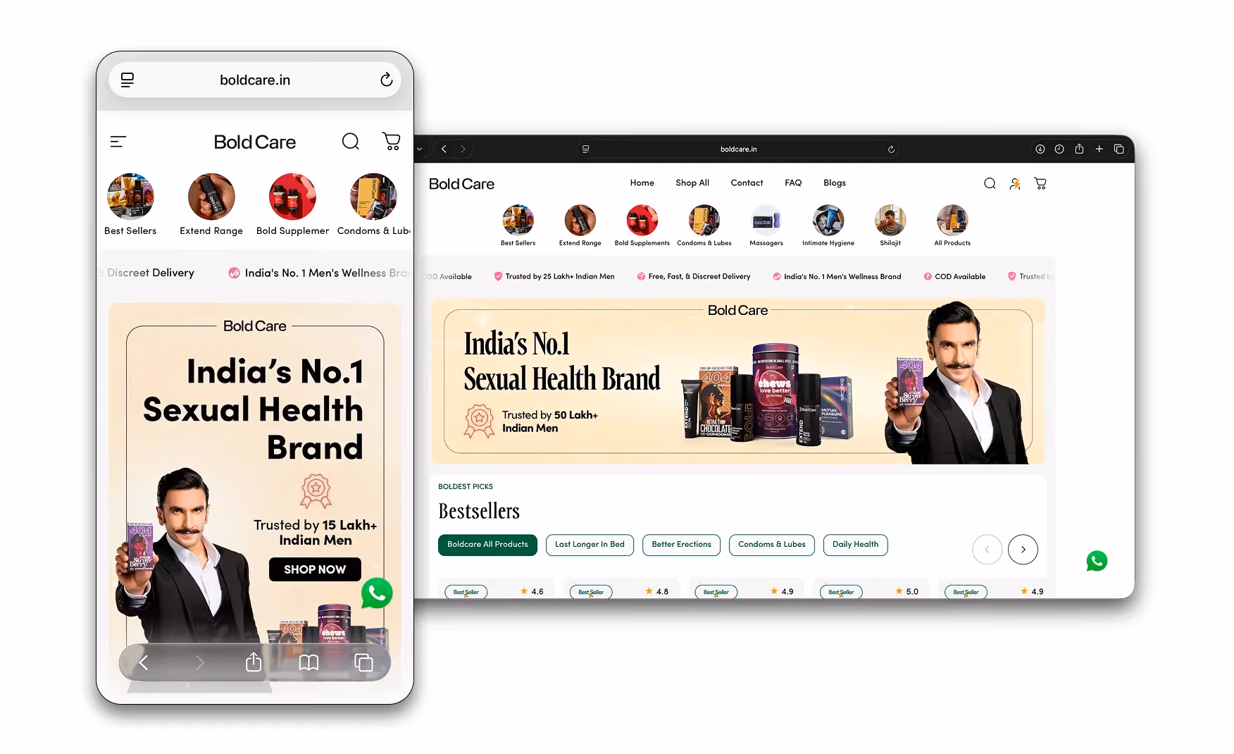
6. Mobile Experience That Holds the Full Conversion Flow 📱
The mobile build is solid throughout. The Ranveer hero reformats cleanly for a vertical screen, the "Trusted by 50 Lakh+" badge stays prominent, the SHOP NOW CTA stays centred and finger-sized, and the category circles scroll horizontally above the hero.
A WhatsApp chat icon sits in the bottom-right corner. That is exactly the right contact channel for this category in India, where many buyers would rather ask a question privately than navigate a support form.
Given that the majority of Bold Care's audience shops on mobile, the integrity of this build is what makes every other conversion mechanic on the site actually convert.
Screenshot: Bold Care mobile homepage at 390x844 showing the Ranveer hero, the 50 Lakh+ badge, the SHOP NOW CTA, and the category circles row.
Where the Experience Falls Slightly Short ⚠️
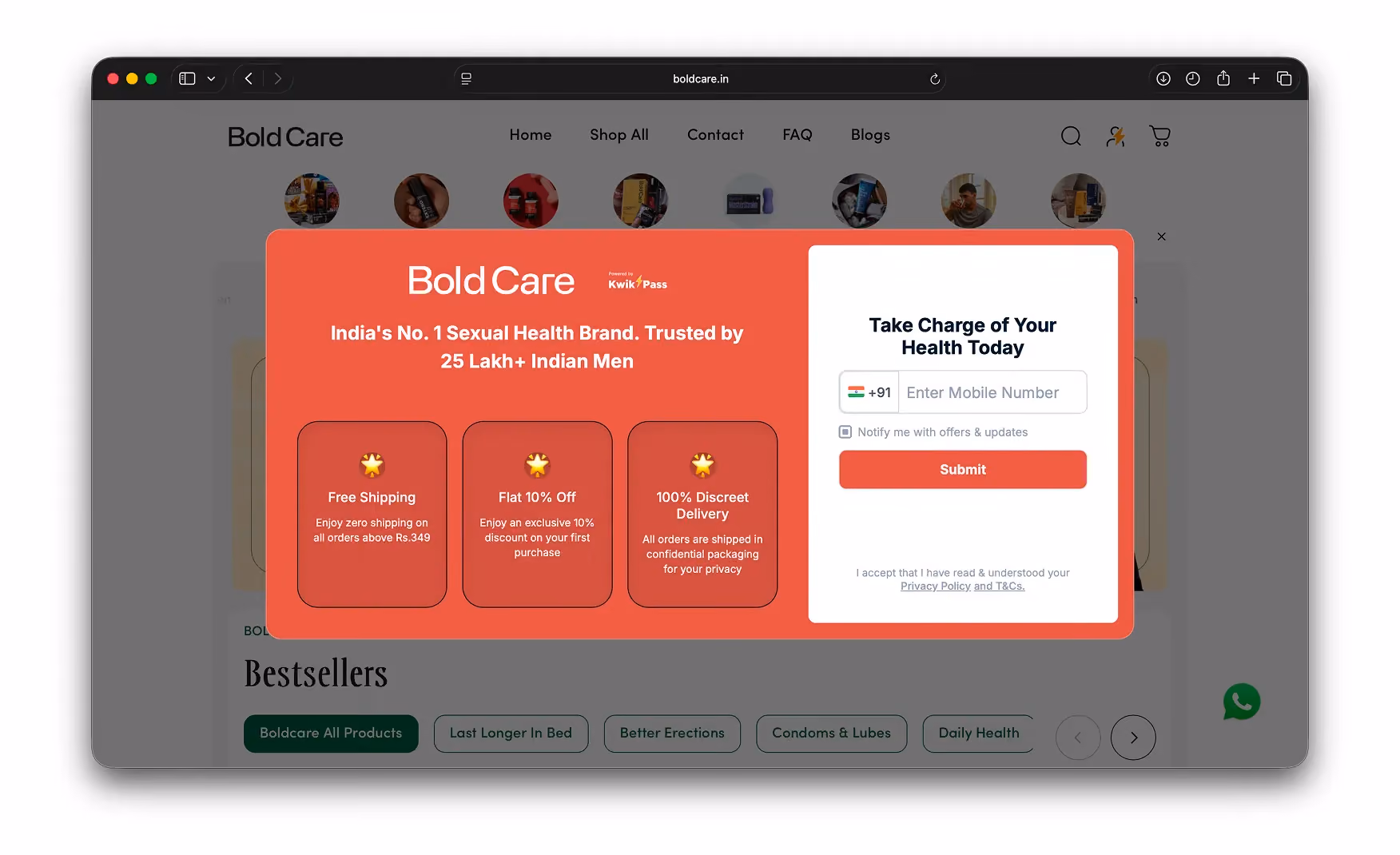
1. The Landing Popup Blocks the Hero on First Visit 🚧
The first thing a visitor sees is a Kwikpass popup. It takes over the full screen, asking for a phone number in exchange for Free Shipping, Flat 10% Off, and Discreet Delivery, before the visitor has seen a single product.
For most categories, a discount popup is a minor friction. For a category where first-time buyers specifically want to browse anonymously before they commit to anything, asking for a phone number before showing the product is the worst possible opening move.
The brand is asking a stranger for contact information before giving them a single reason to trust it. Moving this popup to appear after 30 seconds or after the first scroll would remove the friction entirely without sacrificing the lead-capture mechanic.
Screenshot: Kwikpass popup over the homepage hero on first load. Clear cookies, load boldcare.in, and capture the first paint with the popup live.
Landing Friction Analysis 📊
2. The Trust Number Contradicts Itself Across the Page 🔢
The trust ticker reads "Trusted by 25 Lakh+ Indian Men". The hero badge a few hundred pixels lower reads "Trusted by 50 Lakh+ Indian Men".
For a brand that uses this number as its primary trust claim, having two different figures on the same page is a careful-editing miss on the single most important sentence in its marketing.
A first-time visitor who notices both does not know which figure to believe. A visitor who is unsure of the number is unlikely to trust either version. Aligning both to one verified figure, whichever is accurate, closes the gap in a five-minute content update.
Screenshot: Composite or side-by-side showing the "25 Lakh+" trust ticker and the "50 Lakh+" hero badge in the same frame. Annotate the discrepancy if helpful.
What Suplex Would Fix First 💡
Priority 1 - Delay the Popup to After the First Scroll 🔧
The Kwikpass integration supports delayed triggers. Setting the popup to fire after the visitor has scrolled once, or after 30 seconds on the page, means the brand earns the trust request rather than leading with it.
The incentive, Free Shipping plus 10% off, is strong enough to convert a visitor who has already seen the product. It does not need to appear before the visitor has seen anything at all.
Priority 2 - Align the Customer Count to One Accurate Number 🔢
Pick the accurate figure, update both instances, and publish. This is honestly a content QA task, not a development task, and it is the highest-return five minutes of editing available to the brand right now.
Final Scorecard 🏆
Suplex Verdict 📝
Bold Care's conversion mechanics are genuinely great in our team of UX & UI experts at Suplex Design’s opinion. The celebrity endorsement is used correctly on every PDP, the pack pricing tiers do the upsell work without a single piece of upsell copy, and the competitor comparison table is built into the product page where it can actually influence the decision.
Two things hold this audit back from a perfect score are just the popup that blocks the hero before the visitor has seen the brand, and a trust number that disagrees with itself two sections apart, are both fixable in under an hour of combined effort.
Overall Rating: ⭐⭐⭐⭐ 4 / 5. Two fixes from a 5.
Suplex Design works with D2C health, wellness, and consumer brands across India and the UAE on conversion strategy, PDP architecture, and website audits. If your brand is at a similar stage to Bold Care and you want an honest assessment of what is holding your site back, get in touch with our team of experts at Suplex Design.
Hi, I’m Rishabh Jain
I believe great design has the power to shape perception, build trust, and move businesses forward. That belief is what led me to found Suplex Design Studio, a global branding and packaging studio working with FMCG and D2C brands across markets.I started suplex at 25 with a clear intent, to create design that is strategic, thoughtful, and commercially meaningful. By 28, the studio had scaled globally, guided by a strong foundation in Integrated Design that I developed during my academic journey in London, where I was honoured with the Dean’s Award.
Over the years, I’ve had the opportunity to work with 100+ brands, from Fortune 500 organizations to family-run businesses, helping them build packaging and brand systems that create recall, relevance, and long-term value.
Suplex’s work has been recognized internationally, including the Manifest Award (2024), the Clutch Global Award (2025), and features on platforms such as Packaging of the World, The Dieline, and the World Brand Design Society.
None of this would be possible without the people behind the work. I’m deeply grateful to the suplex team, whose commitment, creativity, and attention to detail turn ideas into meaningful brand experiences every day.
At the heart of my work is a simple philosophy, design should be intentional, honest, and built to last, and that continues to guide everything we create at suplex.


Let’s Make It Happen
E-Commerce Success Stories
%201.avif)


.avif)
.avif)
Build Your D2C Business The Right Way
Build It With Suplex.


