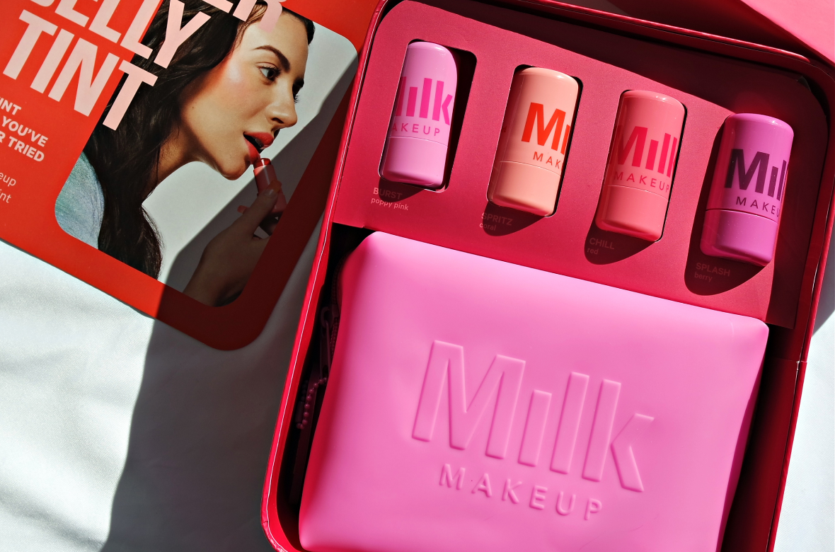
Milk Makeup
.webp)
Milk Makeup
Milk Makeup | Suplex’s Verdict ⭐⭐⭐
Suplex’s Website Audit for Milk Makeup at a Glance 📊
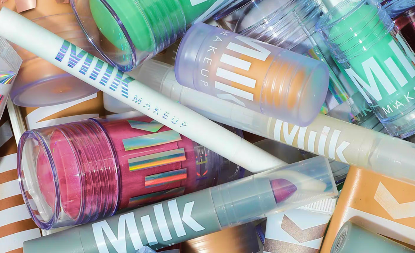
Milk Makeup defined the early clean beauty wave with vegan, cruelty-free, fragrance-free formulas and a documentary visual language no competitor has matched since. The brand was acquired by Waldencast plc in 2022 for approximately USD 376 million, expanded into Ulta Beauty stores and Amazon Premium Beauty in 2025, and re-appointed co-founder Mazdack Rassi as President in November 2025 to lead the brand's next stage of growth.
Suplex Design analysed the Milk Makeup website across Product Display Page architecture, brand identity, homepage structure, navigation consistency, and review mechanics, and what follows is a breakdown of where the site is best in its category and what is dragging a 5 stars worthy Product Display Page to a 3 overall.
What Milk Makeup’s Website Gets Exceptionally Right ✅
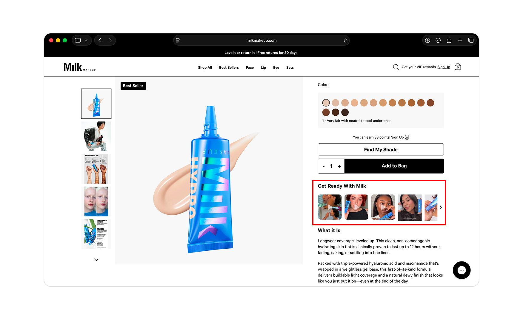
1. Get Ready With Milk Is the Single Smartest Conversion Mechanic on the Site 🎥
Every Product Display Page on milkmakeup.com carries a video block titled Get Ready With Milk sitting directly underneath the Add to Bag button.
The block plays short, focused videos of the actual product being applied across a range of skin tones, light, medium, and deep, with and without other layered makeup. The customer can see how the formula renders on someone whose skin looks like theirs before they even commit to buying the product.
For a category where the single biggest reason a first-time buyer abandons is I don't know what this will look like on me, putting that answer on a loop directly above the cart is a genius move to be honest. Most beauty brands are still relying on Sephora swatches or Instagram reels for their customers to find the right shade match. Milk Makeup has built the answer into the buy box, which is exactly where it belongs.
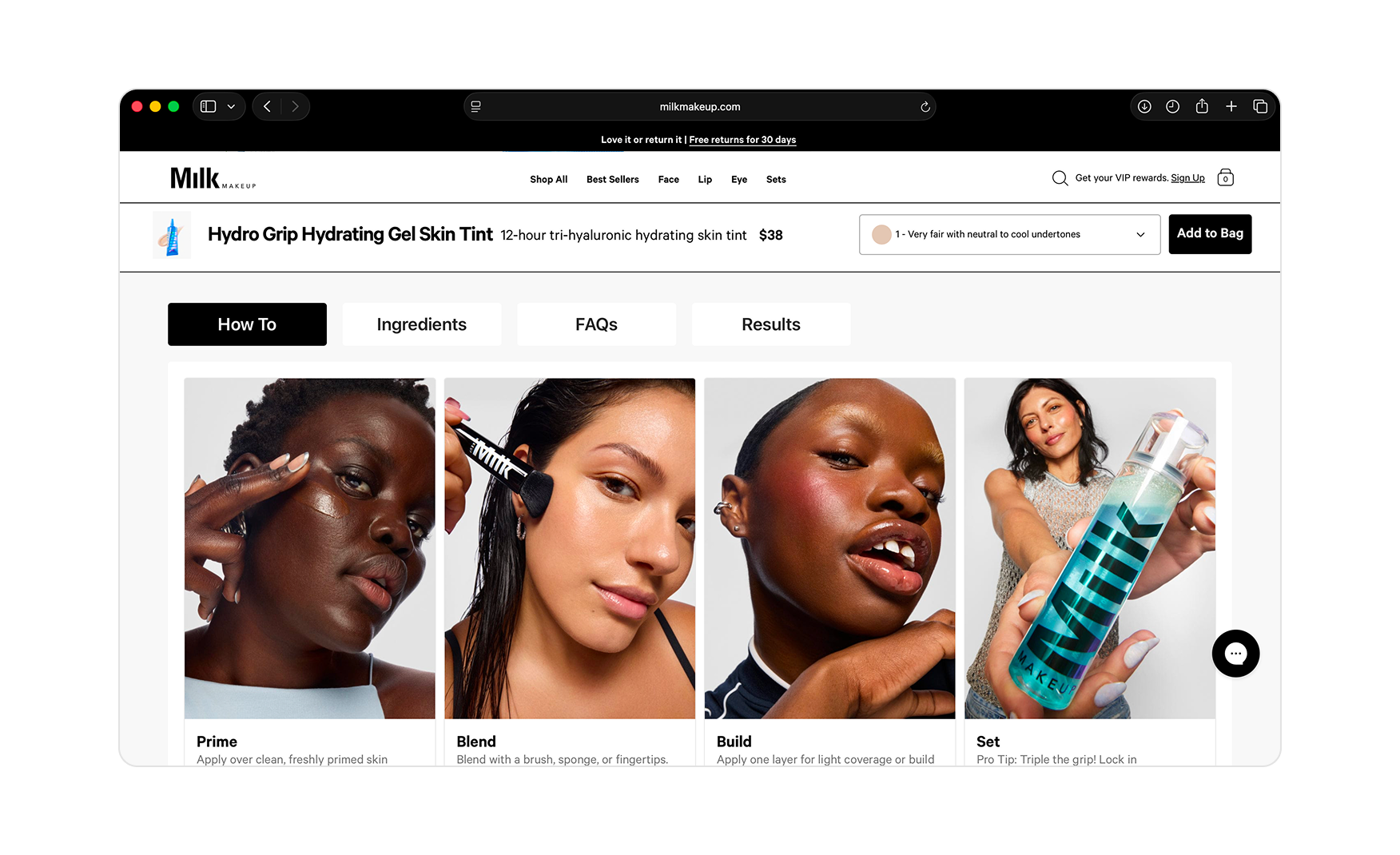
2. The Four-Module PDP Accordion Closes Every Objection Before the Visitor Reaches the Cart 📋
Below the buy box, every product page carries a stacked accordion of four modules such as; How To, Ingredients, FAQs, and Results.
Each one expands to a content-rich panel with supporting imagery rather than a flat text block. A first-time visitor on the Hydro Grip Gel Tint page can move from how do I apply this to what's in it to what other customers asked to what does it look like after 12 hours without leaving the page.
Most beauty Product Display Pages stop at hero plus description however, Milk Makeup's four-module architecture is what turns a single-product visit into a fully informed purchase decision.
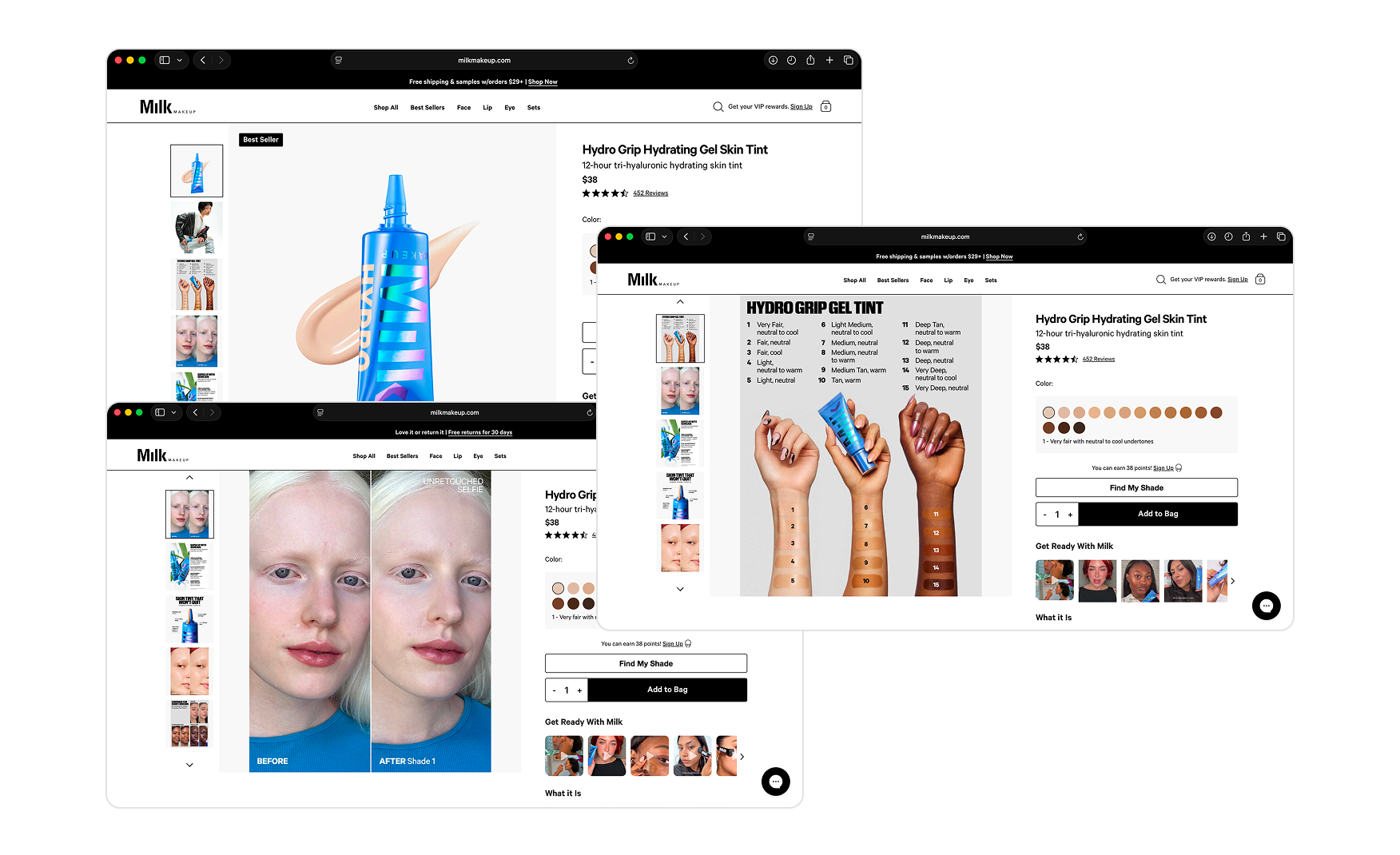
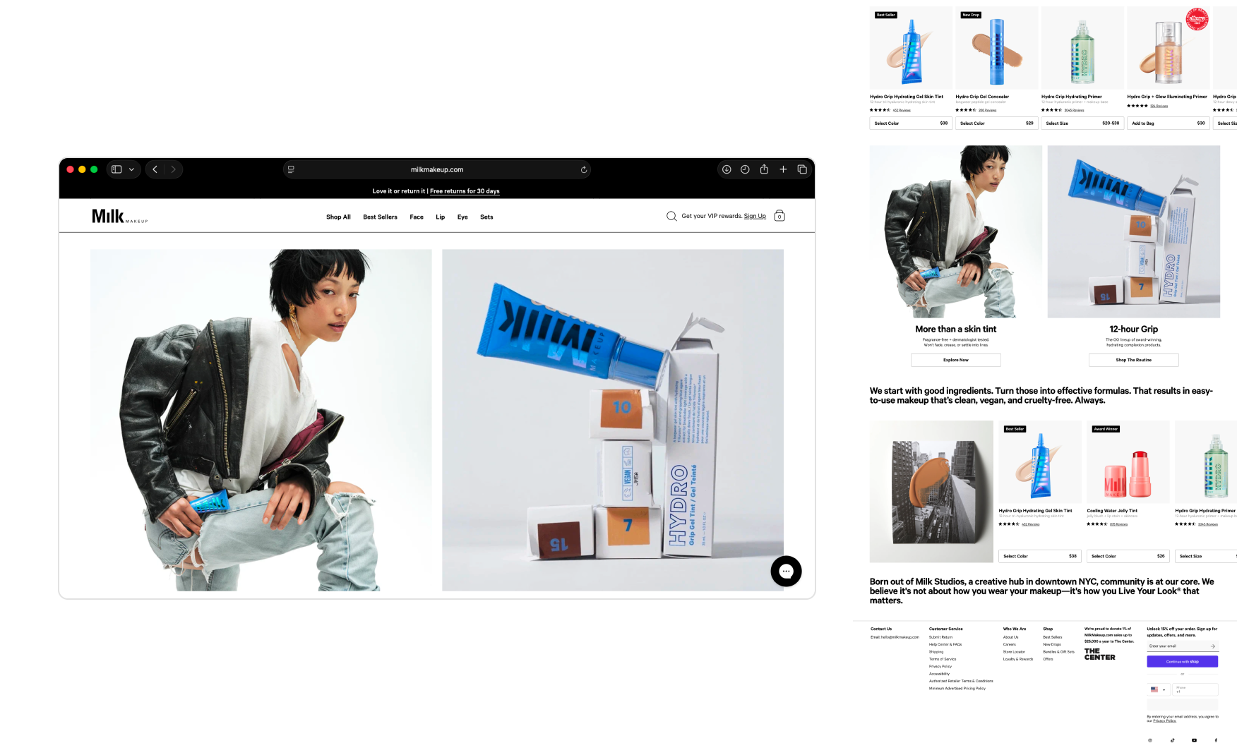
3. The A+ Creative on Product Listings Explains the Product Through Imagery Alone 📸
The product listings carry editorial A+ creative with all those close-up application shots, before-and-after frames, ingredient close-ups, and lifestyle photography.
Together they explain what each product is, who it is for, and what result to expect, without needing a body of marketing text. For a brand that has chosen to spend its words on cultural positioning rather than feature listing, this is the right division of labour.
The same standard runs through the rest of the brand expression like the NYC street photography hero, the documentary-style packshots, the editorial reuse across the storefront. The visual language is the most consistent thing on the site. The homepage structure, as we will come to, is where it falls apart.
Where the Milk Makeup Experience Falls Short ⚠️
1. The Homepage Skips Straight to Products Without Telling the Visitor What They Are Looking At 🚧
After the hero video, the page drops straight into a row of product cards with no section heading, campaign frame, or editorial context.
The visitor is asked to evaluate products without being told what the row is doing or why these specific SKUs were chosen. Most beauty homepages carry section labels like Best Sellers, New Drops, Customer Favourites, or Live Your Look Edits that orient the visitor before the merchandise. Milk has stripped all of that out and left the customer to interpret the homepage on instinct.
For a brand whose entire visual standard rests on editorial cadence, the structural gap is significant. The photography is doing the work but sadly the architecture underneath it is not.
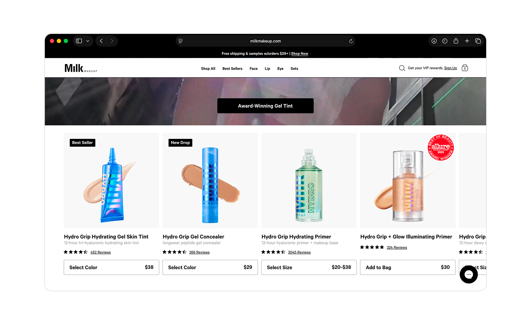
2. The Homepage Buries the Catalogue in Favour of One Product 🔍
The entire homepage frames around the Hydro Grip Gel Tint like the hero video, the secondary banners, the merchandising callouts.
The rest of the catalogue, the primers, the mascaras, the contour sticks, the lip and eye range, is reduced to a few frames at the bottom and treated as supplementary content. A visitor who came to find a setting spray or a lip colour has to navigate away from the homepage to find those categories.
For a brand with a full beauty range stocked at Sephora, Ulta, and Amazon, this single-product framing is leaving most of the catalogue invisible on the site's most-trafficked page.
Homepage Structure vs Category Benchmark 📊
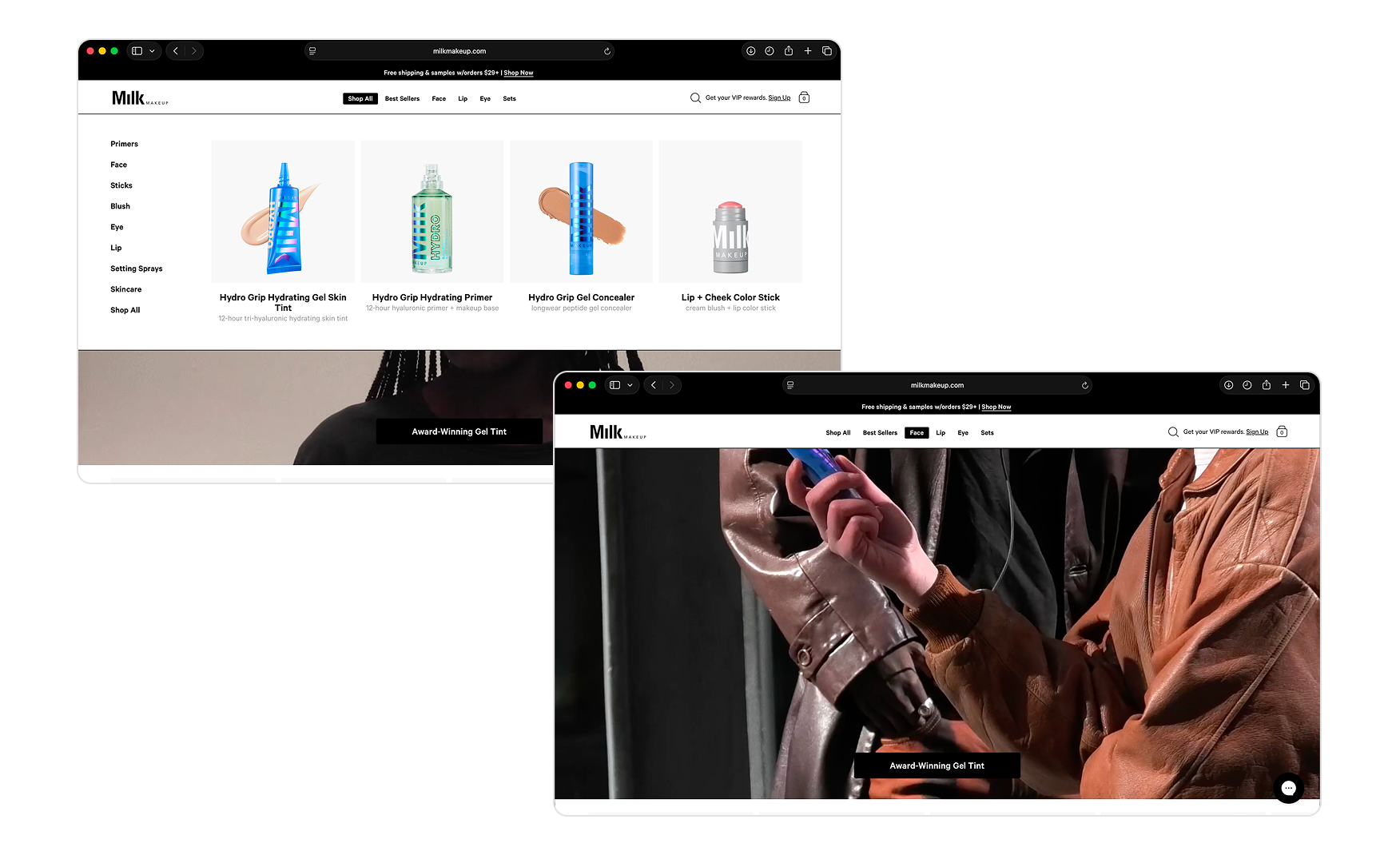
3. Navigation Consistency Is Still Only Half-Fixed 🗺️
The primary nav reads Shop All, Best Sellers, Face, Lip, Eye, and Sets.
Shop All, Best Sellers, and Sets carry hover dropdowns with subcategory links. Face, Lip, and Eye now link directly to collection pages, which is an improvement on the dead-end behaviour Rishabh observed during the audit. But the inconsistency remains like the three nav items open a dropdown experience, three go directly to a page, and nothing in the nav tells the visitor which is which.
The current state is still the worst of both options. Either every item gets a dropdown, or every item links flat. The mixed behaviour creates confusion at the most basic navigation moment in beauty.
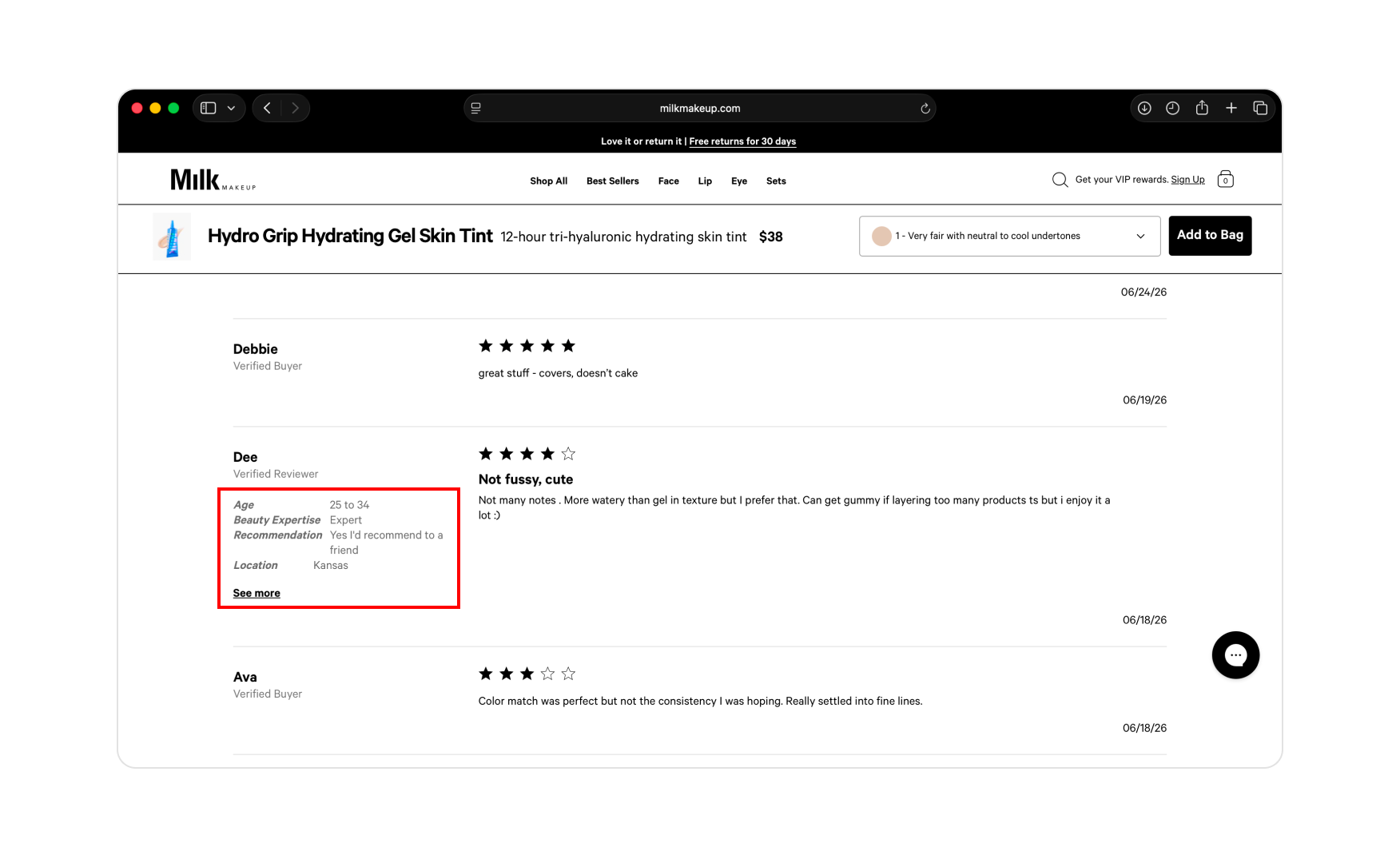
4. The Review Tagging Is Optional, Which Strips Context From Most Reviews 📝
Reviews on Milk Makeup Product Display Pages can include context tags such as age, beauty expertise, skin tone, and location.
But filling these in is optional. A large share of reviews across the site are plain star ratings with a written sentence and none of the context a first-time buyer needs to find a reviewer who looks like them. For a brand selling makeup across 15-plus skin tones, a review that says "love this product" without a skin tone or coverage note is close to useless for the customer evaluating a shade match.
Making the context fields mandatory at submission is a one-sprint fix and would meaningfully improve the conversion value of every review already on the site.
What Suplex Would Fix First 💡
Priority 1 - Restructure the Homepage Into Headlined Sections With a Multi-Slide Hero 🔧
Add section headlines above every product row like Best Sellers, New Drops, Award Winners, Live Your Look Edits.
Rebuild the hero into a three- or four-slide rotator covering the full product family, gel tint, primer, lip, eye, instead of staying on one product. Add a one-line copy anchor to each slide so the visitor knows what they are looking at.
The homepage stops feeling like a single-product landing page and starts working as a real brand storefront. This does not require changing any of the photography or the visual language. It is a structural decision.
Priority 2 - Fix the Nav Behaviour and Lock the Review Tagging 📝
Either build category dropdowns for Face, Lip, and Eye so all six nav items behave the same way, or reformat the working dropdowns to match the flat link behaviour of the other three.
In the same sprint, make the review-tagging fields mandatory at submission. Age, beauty expertise, skin tone, and location. Reviews without context are reviews most customers cannot use, and the current optional schema is leaving most of the trust signal from the site's reviews sitting unused.
Final Scorecard 🏆
Suplex Verdict 📝
Milk Makeup has built the strongest Product Display Page architecture in the clean beauty wave.
The Get Ready With Milk video block, the four-module content accordion, and the A+ creative on product listings are each the best execution of their kind in D2C makeup. A brand that answers I don't know what this will look like on me directly in the buy box has solved the biggest conversion problem in beauty in a way most competitors have not.
The homepage is costing the site its score. It is short, it is structured around one product, it has no section labels, and it asks the visitor to interpret the merchandising without any editorial frame. The photography is good enough to carry almost anything. The architecture underneath it is not doing the work.
The navigation inconsistency and the optional review tagging are two sprint-level fixes that together with the homepage restructure would take this site from a 3 to a 4.5 without changing a single piece of the photography or the cultural positioning the brand has already earned.
Overall Rating: ⭐⭐⭐ 3 / 5.
A restructured homepage with headlined sections, a rotating hero, consistent nav dropdowns, and mandatory review tagging would lift this to a 4.5.
Suplex Design works with D2C beauty, skincare, and lifestyle brands across India and the UAE on Product Display Page architecture, homepage structure, and website audits. If your brand is at a similar stage to Milk Makeup and you want an honest assessment of what is holding your site back, get in touch with our team of experts at Suplex Design.
Hi, I’m Rishabh Jain
I believe great design has the power to shape perception, build trust, and move businesses forward. That belief is what led me to found Suplex Design Studio, a global branding and packaging studio working with FMCG and D2C brands across markets.I started suplex at 25 with a clear intent, to create design that is strategic, thoughtful, and commercially meaningful. By 28, the studio had scaled globally, guided by a strong foundation in Integrated Design that I developed during my academic journey in London, where I was honoured with the Dean’s Award.
Over the years, I’ve had the opportunity to work with 100+ brands, from Fortune 500 organizations to family-run businesses, helping them build packaging and brand systems that create recall, relevance, and long-term value.
Suplex’s work has been recognized internationally, including the Manifest Award (2024), the Clutch Global Award (2025), and features on platforms such as Packaging of the World, The Dieline, and the World Brand Design Society.
None of this would be possible without the people behind the work. I’m deeply grateful to the suplex team, whose commitment, creativity, and attention to detail turn ideas into meaningful brand experiences every day.
At the heart of my work is a simple philosophy, design should be intentional, honest, and built to last, and that continues to guide everything we create at suplex.


Let’s Make It Happen
E-Commerce Success Stories

%201.webp)


.webp)
.webp)
Build Your D2C Business The Right Way
Build It With Suplex.


