Summer Fridays
.avif)
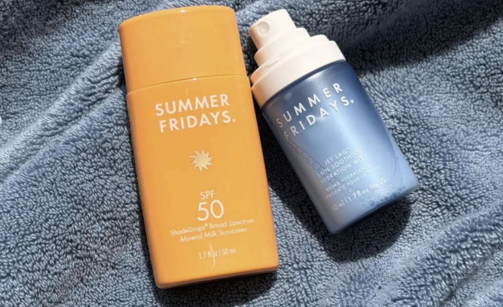
Summer Fridays
Summer Fridays | Suplex's Verdict ⭐⭐⭐½
Suplex's Website Audit for Summer Fridays at a Glance 📊
Marianna Hewitt and Lauren Ireland launched Summer Fridays in 2018 with a single product, the Jet Lag Mask, and built the brand on the strength of their own social followings, Hewitt with more than a million Instagram followers and Ireland with over 300,000 and their one Lip Butter Balm reportedly selling every two seconds.
Suplex Design analysed summerfridays.com across brand identity, navigation, merchandising, homepage storytelling and review depth, and what follows is why a genuinely strong Product Detail Page sits behind a homepage that wastes real screen space and a review system whose depth varies sharply by shade. This audit reflects the site as it stood in August 2026.
What Summer Fridays' Website Gets Exceptionally Right ✅
1. The Brand Identity Is Cohesive Without Feeling Templated 🌤️
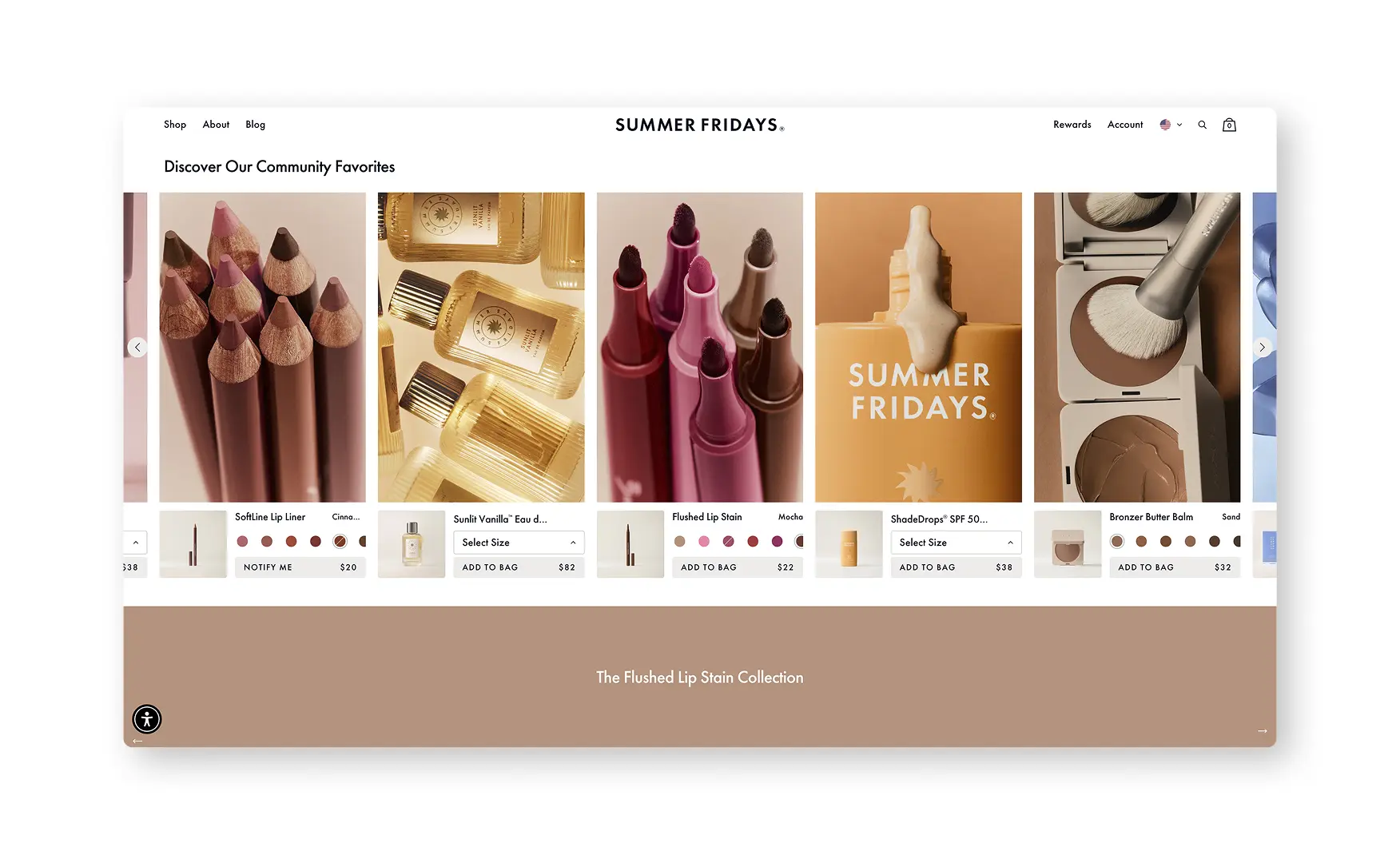
Rishabh noted the homepage is instantly on-brand, minimal, with a clear pop of colour and imagery that reads as unmistakably Summer Fridays rather than a generic beauty template.
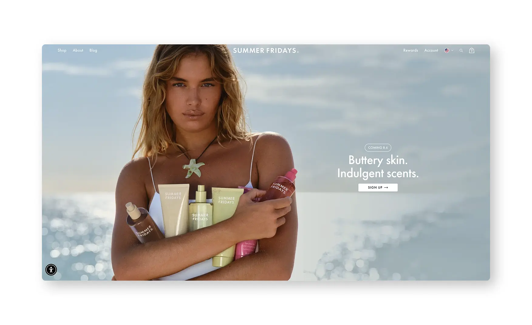
The navigation stays disciplined, Shop, About and Blog at the top level, which keeps the aspirational tone from tipping into clutter even as the underlying catalogue has grown well beyond the original Jet Lag Mask.
2. Navigation Lets a Shopper Self-Select by Skin Type, Ingredient or Quiz 🧭
The Shop menu bifurcates by skin type, Normal, Dry, Oily, Sensitive and Combination, and separately by ingredient, Hyaluronic Acid, Niacinamide, Tiger Grass and Vitamin C, so a shopper who already knows their skin concern never has to browse the full catalogue to find it.
A Skincare Quiz sits in both the primary navigation and the footer, promising "the perfect routine for your skin," which gives an undecided shopper a guided path instead of leaving them to compare products unassisted.
3. Community Favourites Pair Product Cards With Real UGC 🎥
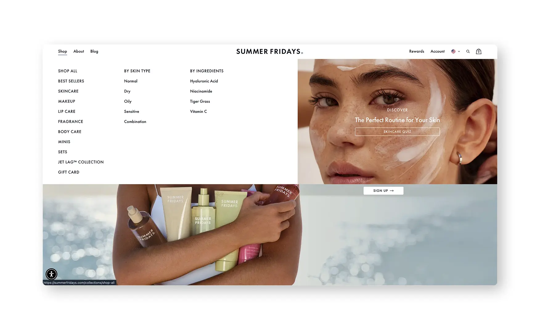
The Discover Our Community Favourites carousel shows bestselling cards, the Flushed Lip Stain, ShadeDrops SPF 50, Bronzer Butter Balm, among them, each with visible colour swatches and shade names, and hovering surfaces a UGC creator video talking about the product.
Pairing the product image directly with a creator video, rather than linking out to social separately, keeps a shopper's attention on the page while still drawing on Summer Fridays' influencer-built credibility.
4. The Category Pages Filter by Skin Concern and Routine Step 🔍
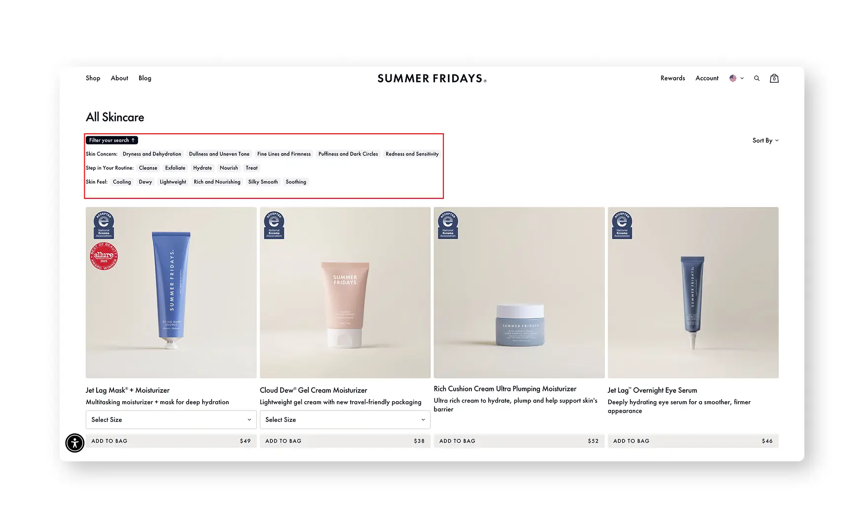
Category pages let a shopper filter by skin concern, dryness or dehydration, dullness, uneven tone, firmness, alongside routine and trend filters, exfoliate, cooling, lightweight, silky smooth.
Rishabh called this out directly as a great addition, since filtering by the actual skin problem a shopper is trying to solve, rather than just by product type, matches how a skincare buyer actually thinks through a purchase.
5. The PDP Leads With Its Review Count, Not Just Its Price ⭐
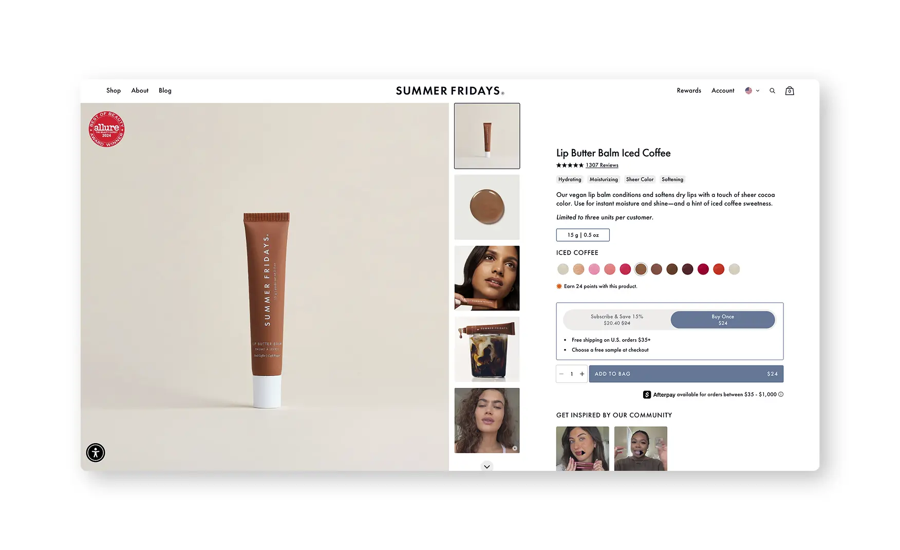
The Lip Butter Balm Iced Coffee page shows its review count, over 1,300 reviews, directly beneath the product title as a clickable link straight to the reviews section, ahead of the shade selector and the Subscribe versus Buy Once choice.
Surfacing that number at the very top of the page, on a bestselling shade, is a genuine trust signal for a social-first brand whose audience already expects proof, not just aesthetic imagery.
6. Consumer Study Stats and Full Ingredient Transparency Back the Claims 🧪
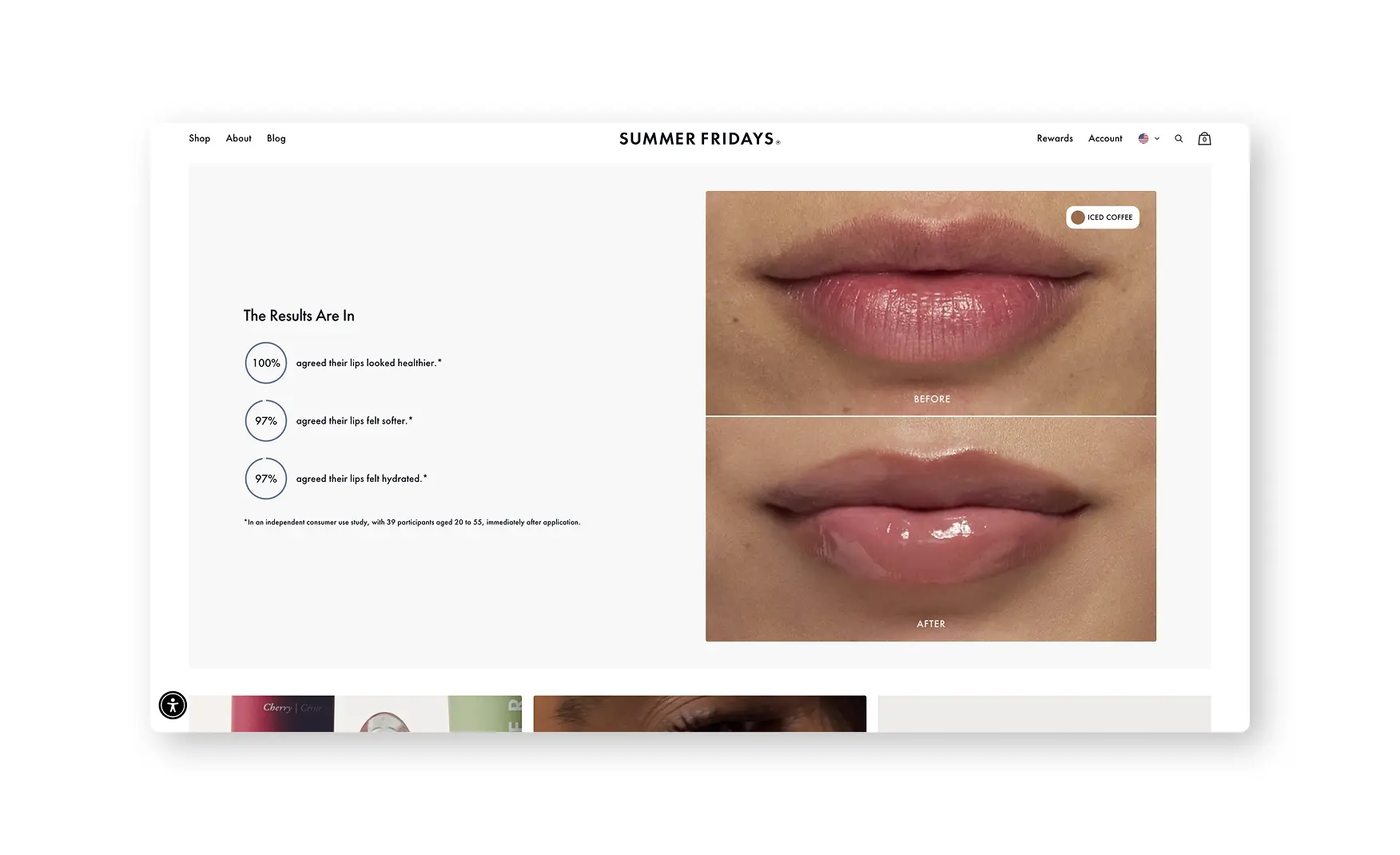
A Results Are In module states that 100 percent of an independent 39-person consumer study agreed the Lip Butter Balm made lips look healthier, with 97 percent agreeing on softer and hydrated lips, and a Key Ingredients section names Shea and Murumuru Seed Butters and a plant-based lipid complex before linking through to the full INCI ingredient list.
Naming the sample size and age range of the study, rather than just citing a bare percentage, is the kind of specificity that makes a claim checkable rather than merely asserted.
7. Our Story and Sustainability Pages Are Genuinely Well Built 📖
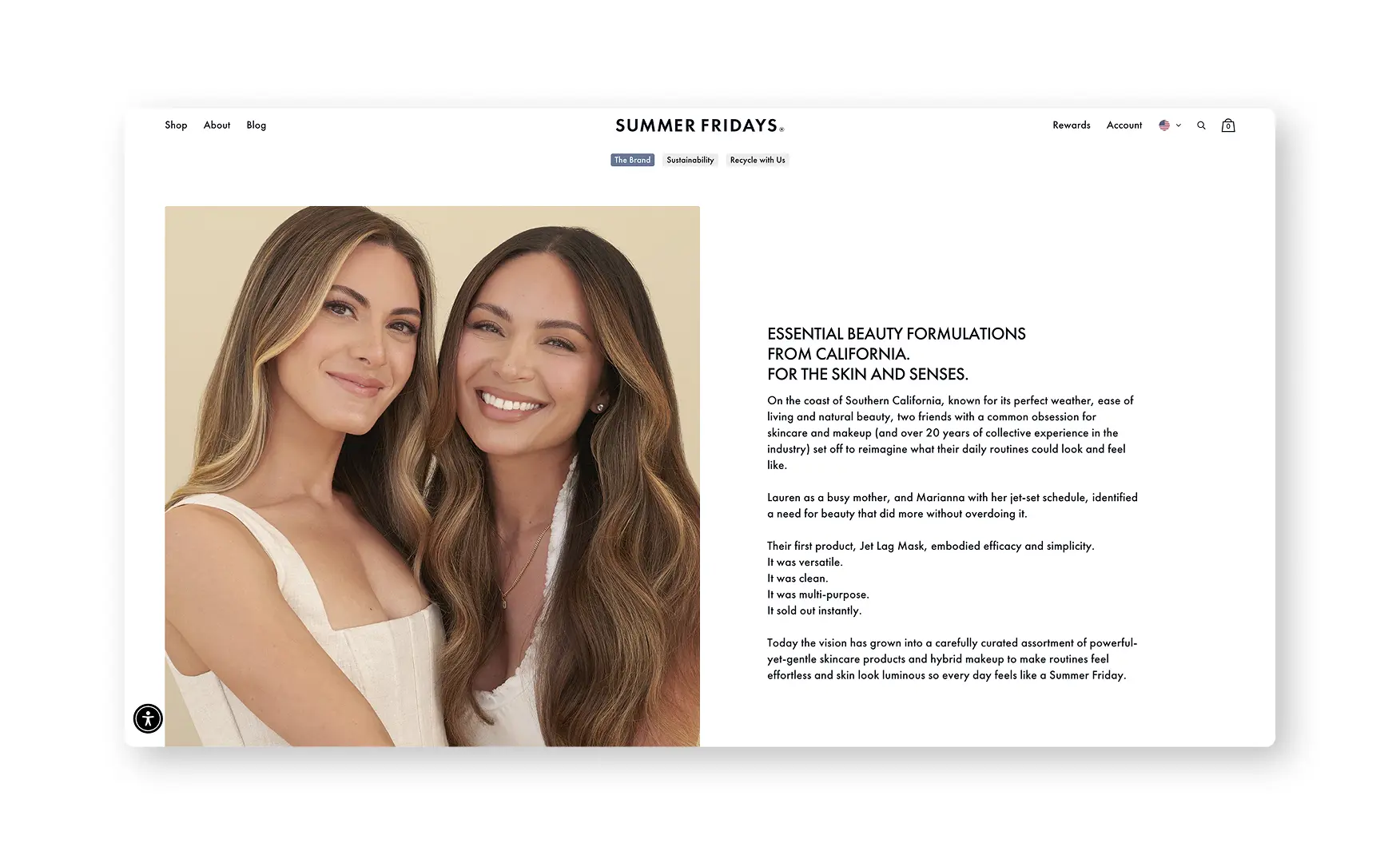
Rishabh described the About page as excellently done, with a founder image, the brand's vision and values, product imagery and press features from Vogue UK and Forbes all in one place, and a separate Sustainability and Impact page covering mindful materials, conscious ingredients and waste reduction alongside the Recycle With Us program.
This is real brand storytelling, done properly, and it makes the absence of any of it from the homepage itself, covered in the weaknesses below, a genuine missed opportunity rather than a capability gap.
Where the Summer Fridays Experience Falls Short ⚠️
1. Two Homepage Sections Have Carried Dead Weight When Stock Runs Out 📦
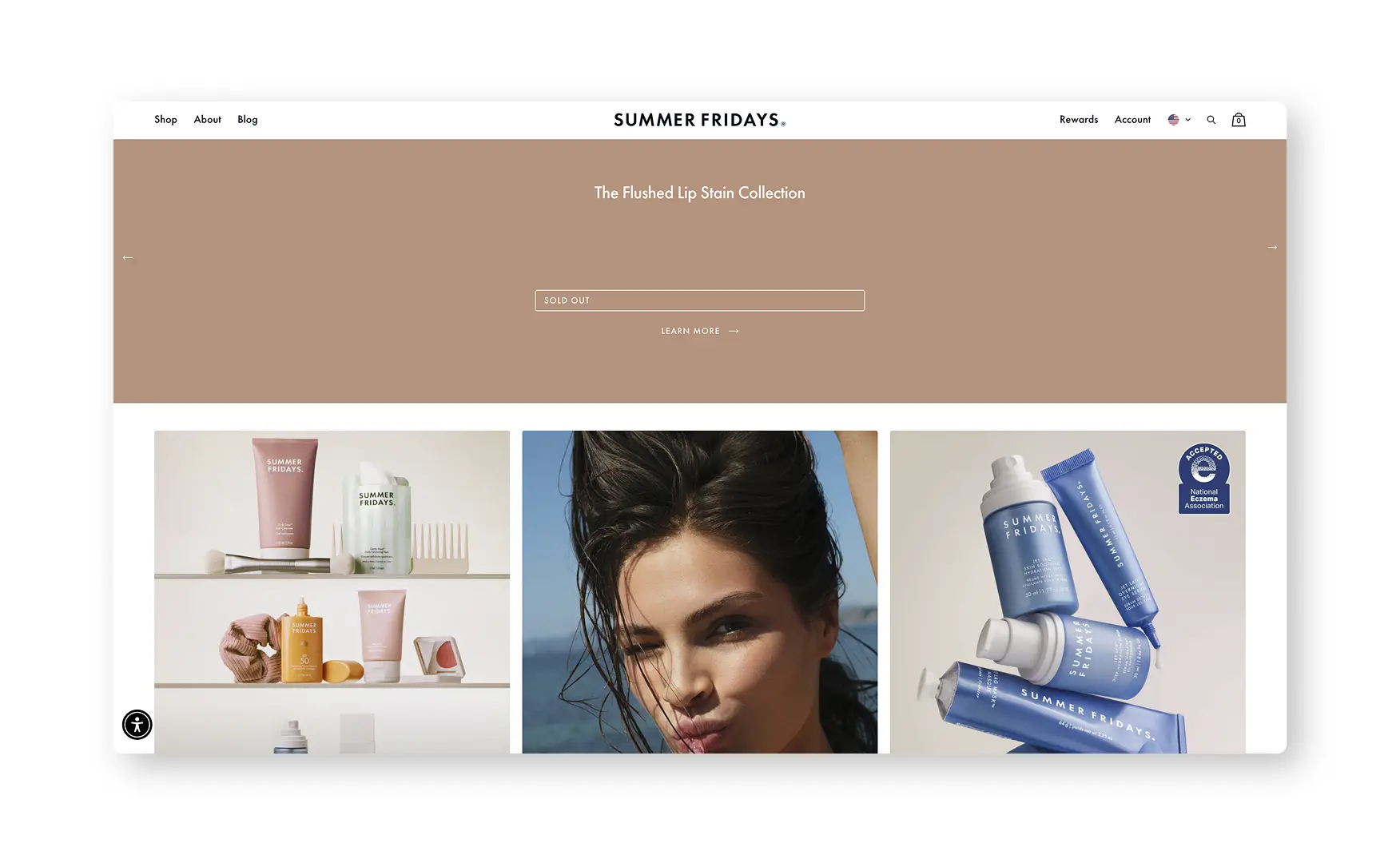
On Rishabh's pass, both the Flushed Lip Stain Collection and the Bronzer Butter Balm Collection sections, which together span close to half the homepage scroll, were showing as sold out with Learn More links that looped back to the top banner rather than to any product or waitlist information.
Both sections are populated with live, purchasable shades as of this write-up, so the specific instance has resolved itself, but the underlying design risk remains, a homepage template with no fallback state for an out-of-stock hero product can lose a large block of screen space to nothing at the exact moment a popular shade sells through.
2. Collection Cards Carry No Rating, Even Where the PDP Has Thousands 📜
Every card in the Community Favourites carousel and on the standard collection grids shows the product name, shade and price, but not one carries a star rating or review count, despite the Lip Butter Balm PDP one click away showing over 1,300 reviews.
For a social-first brand whose whole premise is community proof, hiding that exact proof until a shopper clicks into a product is the single clearest gap between what Summer Fridays has earned and what it currently shows.
Screenshot: Summer Fridays collection grid and Community Favourites carousel showing product cards with no star rating or review count. Re-capture summerfridays.com/collections/best-sellers at 1440.
3. Review Depth Swings Hard From One Shade Variant to the Next 🎯
The Iced Coffee Lip Butter Balm carries over 1,300 reviews, but Rishabh found a different product is sitting at just 12 reviews, a genuinely striking gap for what is, by unit count, one of the brand's best known products.
This is a coverage problem specific to newer or less prominent shade variants rather than a sitewide credibility issue, the review infrastructure itself works well, filterable by skin tone, skin type and age, but newer flavours launch with no reviews attached and no visible path to closing that gap quickly.
The review section also has no customer photos or videos anywhere, despite the filter and bifurcation logic being well built, which is a second, smaller gap sitting on top of the coverage issue.
4. The PDP Leans on Aesthetic Imagery Rather Than Explanatory A+ Creative 🖼️
Rishabh noted the Lip Butter Balm gallery runs heavily sensory, styled shots of the balm alongside the flavour's namesake ingredients, without an actual A+ module explaining the formula, the ingredients or the benefit story.
A separate shade-and-skin-tone swatch gallery does exist further down the page, but it carries no explanatory text, so a shopper has to piece together the shade range from images alone rather than from any integrated copy.
5. No First-Order Percentage Offer in the First Fold 🎣
The only offer visible in the homepage's first fold is free shipping on US orders above USD 35, there is no percentage-off first-order incentive presented before a visitor has to go looking for one.
For a brand whose traffic skews heavily toward cold social visitors landing on the homepage for the first time, this under-captures a first-purchase decision that a modest, well-timed incentive could convert.
What Suplex Would Fix First 💡
Priority 1 - Put Ratings and Review Counts on Every Collection Card 🔧
Surface the existing star rating and review count on every collection and homepage card, matching what the Lip Butter Balm PDP already shows prominently under its title.
The review data already exists in volume for the brand's bestsellers, this is a template change to expose data that is already being collected, not a new feature to build.
Priority 2 - Close the Review Gap on Newer Shade Variants 📝
Run a seeding push, sampling or early-access review requests, on any product variant currently sitting in single or low double digits, before it is promoted alongside a bestseller with over a thousand reviews.
Add a photo and video prompt to the existing review flow, the filter infrastructure already supports it, the content simply is not there yet.
Priority 3 - Build a Restock-Aware State for Featured Homepage Sections 🔧
Give the Flushed Lip Stain and Bronzer Butter Balm collection sections a designed fallback state, a waitlist signup or a restock notification, so a sold-out shade never leaves close to half the homepage doing nothing.
This protects the brand from repeating the exact gap Rishabh flagged the moment any popular shade next sells through.
Priority 4 - Add a First-Order Percentage Offer to the Homepage Fold 🎯
Introduce a modest, clearly stated first-order discount in the homepage's first fold, alongside the existing free shipping threshold, to better capture cold social traffic landing for the first time.
This is a straightforward addition given the Subscribe and Save mechanic, offering 15 percent off, already exists elsewhere on the site.
Final Scorecard 🏆
Suplex Verdict 📝
Summer Fridays has built a Product Detail Page that does real work for a social-first beauty brand, a review count in the thousands surfaced right under the title, a consumer study with a named sample size, and full ingredient transparency, all wrapped in a brand identity that reads as unmistakably Summer Fridays.
The About and Sustainability pages prove the brand can tell a genuinely good story when it commits to the space, which makes the homepage's missed opportunity, close to half a scroll given over to sold-out sections with dead links, a harder gap to excuse.
The deeper issue is unevenness rather than absence, review counts that swing from over a thousand to a dozen depending on the shade, ratings that exist on the PDP but never make it to the browse stage, and an offer strategy that stops at free shipping when a real first-order incentive would capture more of the brand's own social traffic.
None of these fixes touch what already works. Surface the ratings at browse, close the review gap on newer shades, and this is a 5.
Overall Rating ⭐⭐⭐½ 3.5 / 5.
Suplex Design works with beauty and social-first D2C brands across the US on Product Detail Page architecture, trust signal placement, and website audits. If your brand is at a similar stage to Summer Fridays and you want an honest assessment of what is holding your site back, get in touch with our team of experts at Suplex Design.
Hi, I’m Rishabh Jain
I believe great design has the power to shape perception, build trust, and move businesses forward. That belief is what led me to found Suplex Design Studio, a global branding and packaging studio working with FMCG and D2C brands across markets.I started suplex at 25 with a clear intent, to create design that is strategic, thoughtful, and commercially meaningful. By 28, the studio had scaled globally, guided by a strong foundation in Integrated Design that I developed during my academic journey in London, where I was honoured with the Dean’s Award.
Over the years, I’ve had the opportunity to work with 100+ brands, from Fortune 500 organizations to family-run businesses, helping them build packaging and brand systems that create recall, relevance, and long-term value.
Suplex’s work has been recognized internationally, including the Manifest Award (2024), the Clutch Global Award (2025), and features on platforms such as Packaging of the World, The Dieline, and the World Brand Design Society.
None of this would be possible without the people behind the work. I’m deeply grateful to the suplex team, whose commitment, creativity, and attention to detail turn ideas into meaningful brand experiences every day.
At the heart of my work is a simple philosophy, design should be intentional, honest, and built to last, and that continues to guide everything we create at suplex.




















Let’s Make It Happen
E-Commerce Success Stories
%201.avif)






.avif)
.avif)
Build Your D2C Business The Right Way
Build It With Suplex.


