Minimalist
.webp)
Minimalist
Minimalist | Suplex’s Verdict ⭐⭐⭐⭐⭐
Suplex’s Website Audit for Minimalist at a Glance 📊
Founded in 2020 by brothers Mohit Yadav and Rahul Yadav out of Jaipur, Minimalist built its reputation on a proposition the Indian skincare market had not seen before. The brand reached INR 347 crore in revenue in FY2024, crossed an ARR of INR 500 crore by December 2024, and remained the only Indian skincare startup to have been profitable every year since inception, before Hindustan Unilever acquired a 90.5% stake in January 2025 for INR 2,955 crore.
Suplex Design analysed beminimalist.co across brand identity, AI tooling, Product Display Page architecture, review mechanics, and loyalty infrastructure, and what follows is a breakdown of why this site earns the only perfect score in this audit series, and why a global brand at five times the scale could come here to study what a skincare storefront should look like in 2026.
What Minimalist’s Website Gets Exceptionally Right ✅
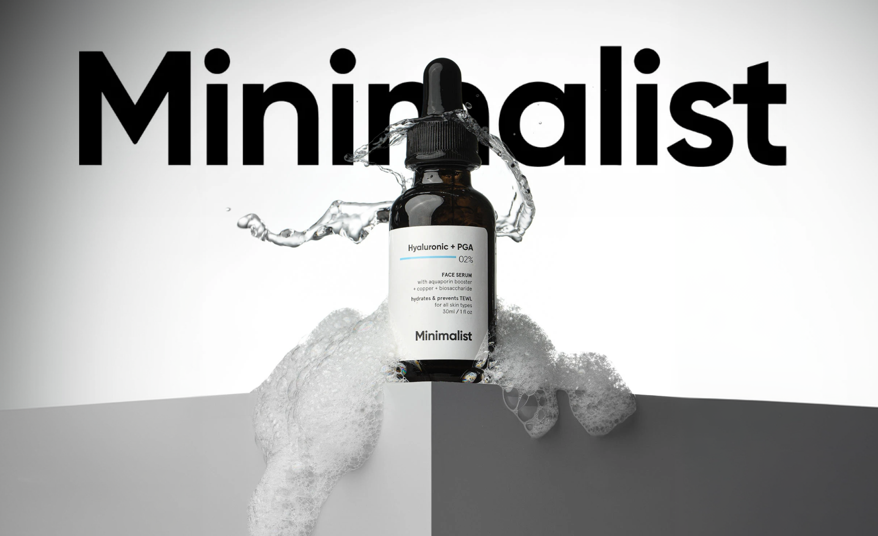
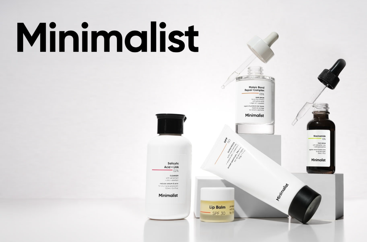
1. The Visual Language Lives Up to the Brand Name 🎨
The site design is what the brand name promises i.e. minimalist.
White backgrounds, generous spacing, restrained typography, and product photography centred on every section. The visual restraint is not aesthetic minimalism for its own sake but in fact a structural choice that lets a clinical-grade ingredient-percentage brand show its hand without the marketing camouflage other beauty brands rely on.
For a brand whose underlying proposition is we sell what is in the bottle, not how it makes you feel, the visual reduction is the brand strategy. Every other choice on the site follows from it. The amber dropper bottle on a white background communicates more trust than a lifestyle shoot of someone running through a field ever would.
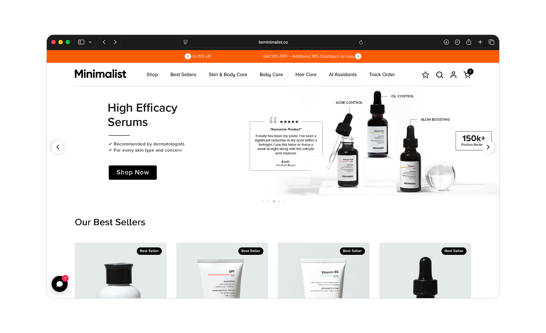
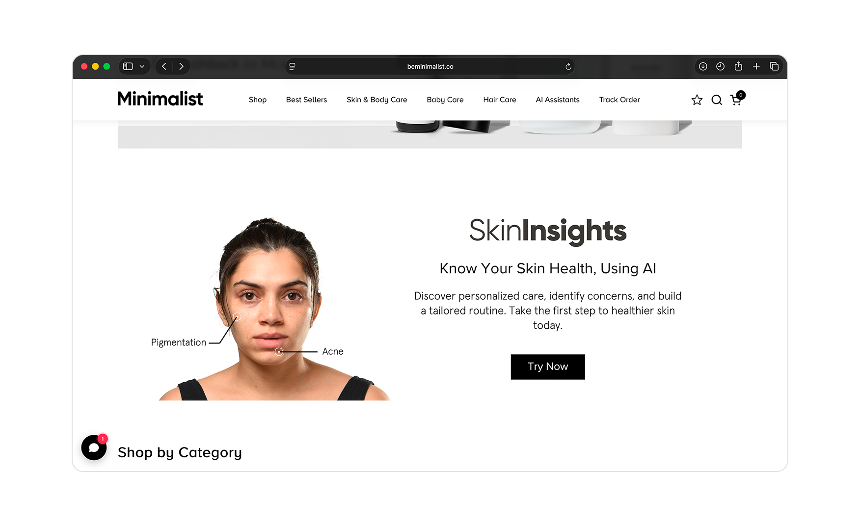
2. The Homepage Carries a Working AI Skin Scanner, Not a Wellness Quiz 🤖
Midway down the homepage sits SkinInsights with a real face with computer-vision overlay points mapped to acne, redness, and pigmentation zones.
The CTA reads Know Your Skin Health Using AI. The brand also carries an AI Assistants item directly in the primary navigation, which signals that this is a built capability, not a marketing word.
Most Indian skincare sites stop at merely a five question regimen quiz. Minimalist is running facial analysis on the homepage and using the scan to route the customer to ingredients that address what the scan flagged. The mechanism turns the homepage into a diagnostic instrument and the recommendation engine into a long-term customer-data asset.
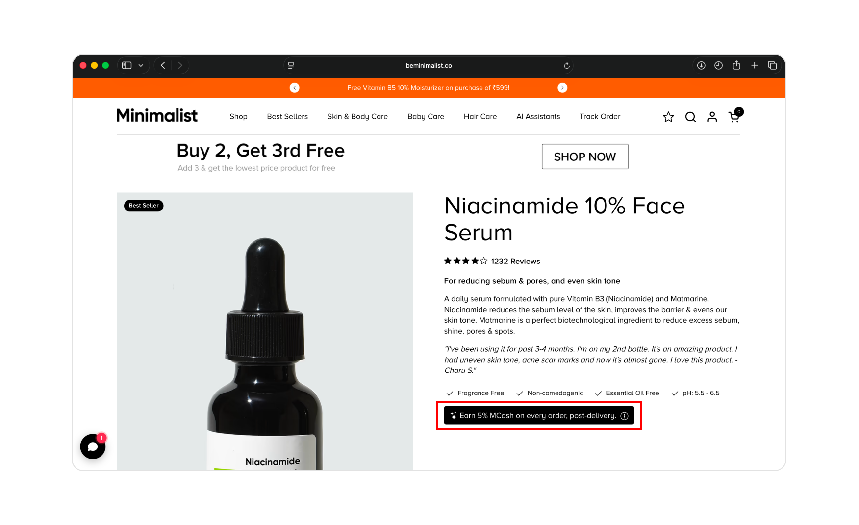
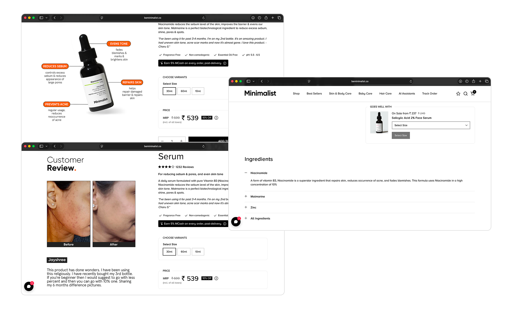
3. The Loyalty Reward Sits on Every PDP, Not on a Separate Rewards Tab 💰
Every product detail page carries a strip near the price line noting that the customer earns 5% MCash on the purchase, post-delivery, in their TrustCircle wallet.
Loyalty-driven brands typically lose this conversation by hiding the reward inside a separate Rewards menu. Minimalist puts it on the product card before the customer commits, which is exactly the moment where the decision between buying from beminimalist.co and buying from Nykaa, Myntra, Flipkart, Blinkit, Instamart, Tira or Amazon is actually made.
For a brand whose repeat-customer theory rests on regimen-led recurring purchase, the 5% reward visible at the price line is the structural choice that turns a single skincare purchase into a multi-cycle relationship. The customer is being shown the long-term value of the direct channel every single visit.
4. The PDP Architecture Turns a Single Product Page Into an Ingredient Education Portal 📖
Every product page carries A+ creative, an Ingredients section, and a curated pairing block working together.
The A+ imagery explains the product through visual layers like the percentage, the concern it addresses, the application context, and the result. No marketing text is actually needed. The Ingredients section lists every named ingredient as a click-to-expand card and just tap on the plus sign and a panel opens explaining what that ingredient does and why it is in the formula. The pairing block, when present, surfaces a curated complementary product from the Minimalist catalogue rather than a generic algorithmic recommendation.
The combination means a single Product Display Page visit covers the product, the science behind it, and the routine it belongs to. For a brand whose entire trust mechanism rests on ingredient honesty, putting the education on the page rather than linking away is the right decision.
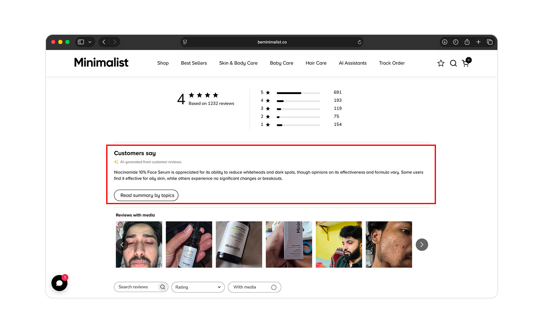
5. The Review Block Uses AI to Synthesise, Not Just to Collect 💬
The Multi-Vitamin SPF 50 Product Display Page carries a reviews block with star ratings, a photo grid of customer faces, individual written reviews ranging honestly from 5-star to 1-star, and an AI Generated Review Summary block beneath it that synthesises the themes reviewers raised.
For a sunscreen with hundreds of reviews, the AI summary does the reading the customer would otherwise skip. The reviews themselves are richly tagged, like if you notice how every reviewer carries age, skin type, skin concerns, and real customer photography alongside the star rating and written reaction.
Showing the honest 1-star and 3-star reviews alongside the AI summary reads as confidence, not curation. The brand has chosen to surface the negative feedback rather than filter it, which is the strongest possible signal that the average score is genuine.
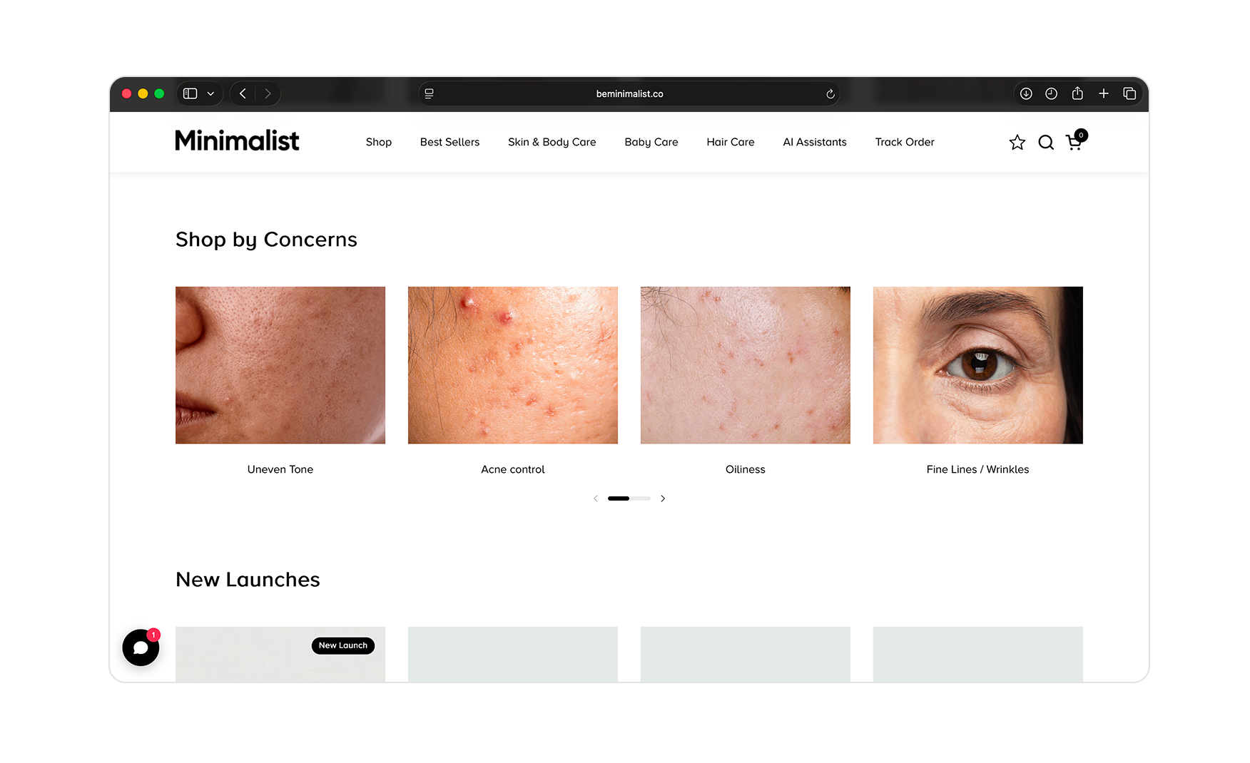
6. The Homepage Routes by Skin Concern Using Real Skin Photography 📸
Below the SkinInsights scanner sits a Shop by Concern row showing four close-up photographs of actual skin with actual concerns like acne, dark spots, dullness, and fine lines.
The visitor clicks the photograph of the concern that looks like theirs and lands on the products that address it. Most sites use stylised icons here that look like nothing the customer sees on their face. Minimalist uses photography, which is exactly the right decision for a brand selling actives at a price point that demands trust before the first purchase.
The choice also avoids the airbrushed-perfection trap that runs through most of Indian beauty. The skin in those cards looks like real skin, which is the precise opposite of what most brands at this price tier show on their homepage.
Where the Minimalist Experience Falls Short ⚠️
There are no material gaps to flag at this audit pass.
Every conversion mechanism the category currently uses is in production on beminimalist.co. Several mechanisms Minimalist has built, the AI skin scanner, the AI review summary, the in-cart loyalty visibility, the click-to-expand ingredient cards, are features that global brands at five times the scale have not yet shipped. The one area Rishabh noted as a potential improvement was expanding the curated pairing section to surface three complementary products per Product Display Page rather than one, where the feature exists. That is a content and merchandising decision, not a gap.
The work going forward is maintenance, ideally keeping the AI tooling current, keeping the review tagging schema locked as the review volume grows, and keeping the loyalty strip visible on every new product page as the catalogue expands.
What Suplex Would Build Next 💡
Expand the Curated Pairing Block to Three Products Per PDP 🔧
Where the curated pairing section exists, it currently surfaces one complementary product. Three would give the customer a more complete routine view without overwhelming the page.
This is a merchandising decision, not a design task. For a brand with 50-plus products across skin, body, hair, and lip, expanding the pairing logic to three curated suggestions per Product Display Page would meaningfully increase the average order basket size without changing anything about the page architecture.
Final Scorecard 🏆
Suplex Verdict 📝
Minimalist has built the most technically ambitious and structurally complete skincare storefront in Indian beauty.
The AI skin scanner, the loyalty mechanics, the click-to-expand ingredient education, the AI review summary, and the Shop by Concern photography are each individually best-in-category. The fact that all five are running in production on the same site, for a brand selling a sunscreen at INR 379, is what makes this audit result what it is.
Most brands aspire to ship one or two of the mechanisms this audit listed. Minimalist ships every one of them. The result is a storefront that a global brand at five times its scale could come to for a lesson in what ingredient-led beauty should look like online.
The HUL acquisition in January 2025 validates what the site already showed, that this is not a brand that got lucky with a product. It built a conversion architecture that makes every page a reason to buy directly, stay longer, and come back.
Overall Rating: ⭐⭐⭐⭐⭐ 5 / 5.
Suplex Design works with D2C beauty, skincare, and lifestyle brands across India and the UAE on Product Display Page architecture, AI tooling strategy, and website audits. If your brand is building toward the standard Minimalist has set and you want an honest read on how close you are, get in touch with our team of experts at Suplex Design.
Hi, I’m Rishabh Jain
I believe great design has the power to shape perception, build trust, and move businesses forward. That belief is what led me to found Suplex Design Studio, a global branding and packaging studio working with FMCG and D2C brands across markets.I started suplex at 25 with a clear intent, to create design that is strategic, thoughtful, and commercially meaningful. By 28, the studio had scaled globally, guided by a strong foundation in Integrated Design that I developed during my academic journey in London, where I was honoured with the Dean’s Award.
Over the years, I’ve had the opportunity to work with 100+ brands, from Fortune 500 organizations to family-run businesses, helping them build packaging and brand systems that create recall, relevance, and long-term value.
Suplex’s work has been recognized internationally, including the Manifest Award (2024), the Clutch Global Award (2025), and features on platforms such as Packaging of the World, The Dieline, and the World Brand Design Society.
None of this would be possible without the people behind the work. I’m deeply grateful to the suplex team, whose commitment, creativity, and attention to detail turn ideas into meaningful brand experiences every day.
At the heart of my work is a simple philosophy, design should be intentional, honest, and built to last, and that continues to guide everything we create at suplex.


Let’s Make It Happen
E-Commerce Success Stories

%201.webp)


.webp)
.webp)
Build Your D2C Business The Right Way
Build It With Suplex.


