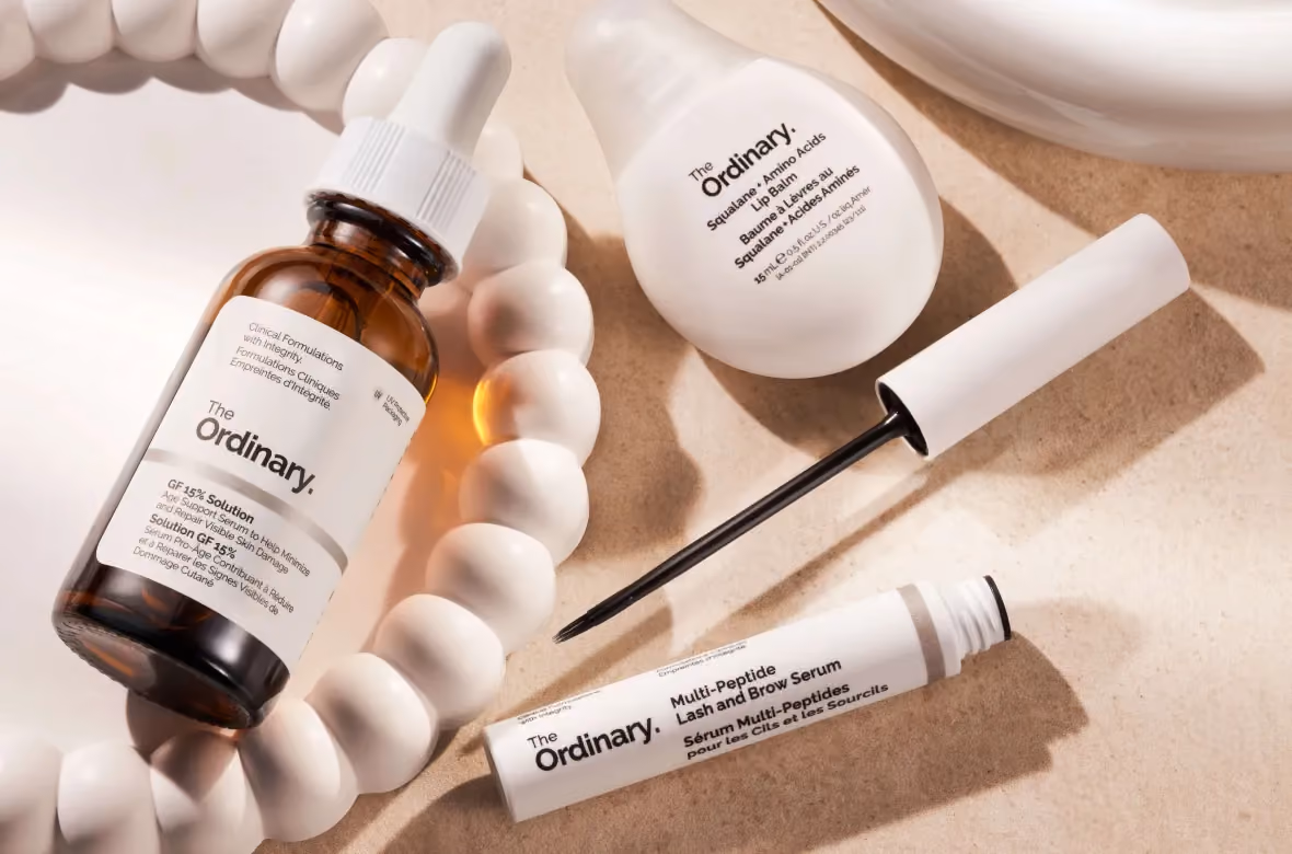
The Ordinary
.avif)
The Ordinary
The Ordinary | Suplex's Verdict ⭐⭐⭐⭐⭐
Suplex’s Website Audit for The Ordinary at a Glance 📊
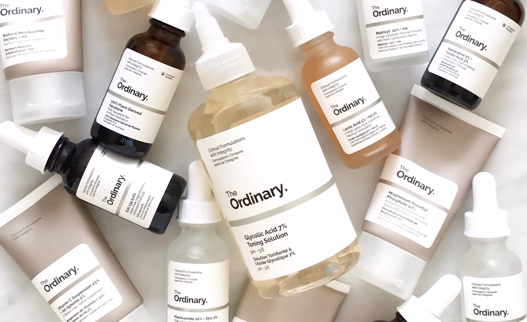
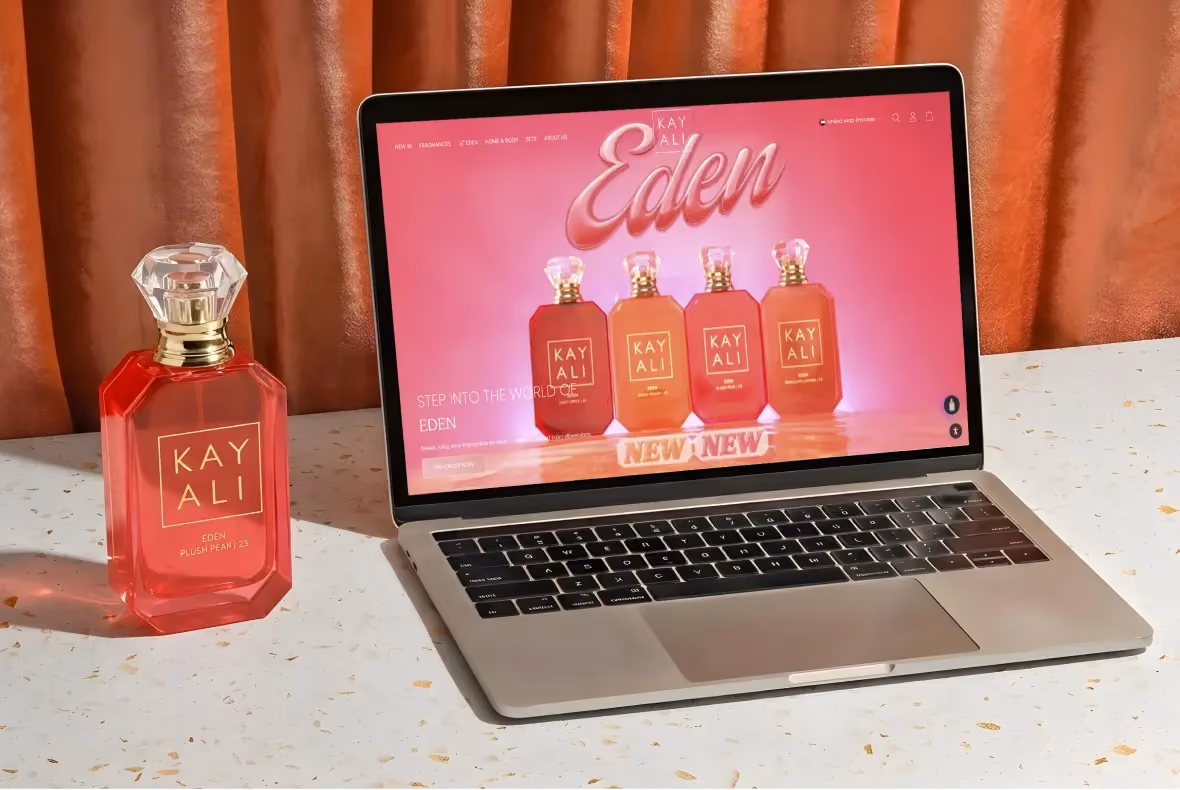
The Ordinary launched in Toronto in 2016 under Deciem and built a USD 400 million+ business by selling single-ingredient actives in plain dropper bottles, named for their contents, at prices that made most beauty industry margins look dishonest. The brand now ships to over 45 countries, with a product range that has grown to more than 60 SKUs priced between roughly USD 5 and USD 30.
Suplex Design analysed The Ordinary's site across information architecture, conversion strategy, content design, and social proof mechanics, and what follows is a record of how the brand built a D2C storefront that makes visiting any marketplace feel like a downgrade.
What The Ordinary's Website Gets Exceptionally Right ✅
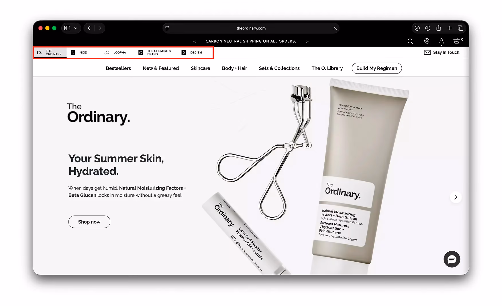
1. Sister-Brand Tabs That Turn a Brand House Into One Shopping Surface 🏠
Five tabs sit at the very top of the page. The Ordinary, NIOD, LOOPHA, The Chemistry Brand, and Deciem each get a tab in the first strip the visitor sees, before the hero image, before the navigation bar, before anything else.
Most multi-brand groups bury their sister brands in a footer link or a separate "our family" page that almost nobody finds.
Here, the full portfolio is at the top of the first viewport, which means a customer who arrived for a Niacinamide serum can step into NIOD for a more concentrated formula without leaving the site.
The result is a portfolio that compounds rather than fragments.
Every visit to one brand is a passive introduction to the other four, and every cart can hold products from any of them.
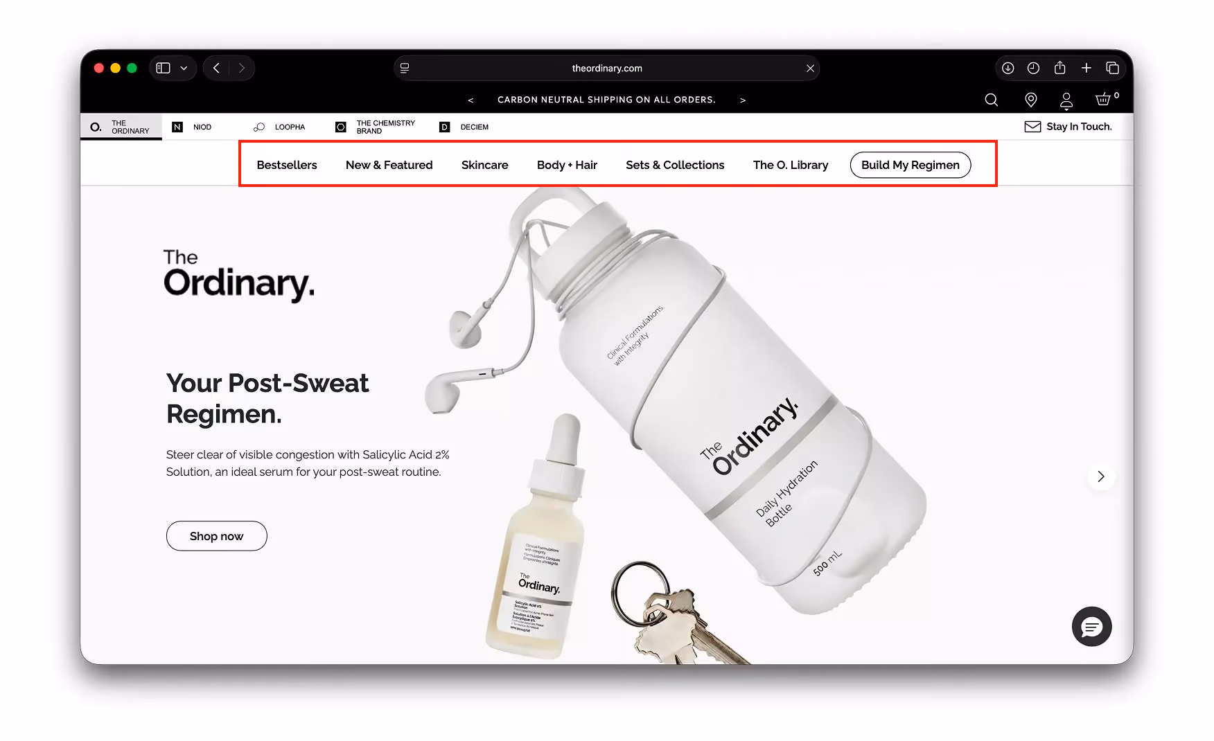
2. A Navigation Bar That Answers the Question Before the Visitor Asks It 🚦
The primary navigation leads with Bestsellers and New and Featured before moving into category pages.
That sequencing is deliberate. A first-time visitor who does not know what to buy is nudged to Bestsellers first, where the brand has already curated the decision for them.
The "Build My Regimen" pill sits as a persistent CTA in the nav bar rather than buried inside a category page. It is reachable from anywhere on the site, which means the guided routine-building path is always one tap away regardless of where the visitor has wandered.
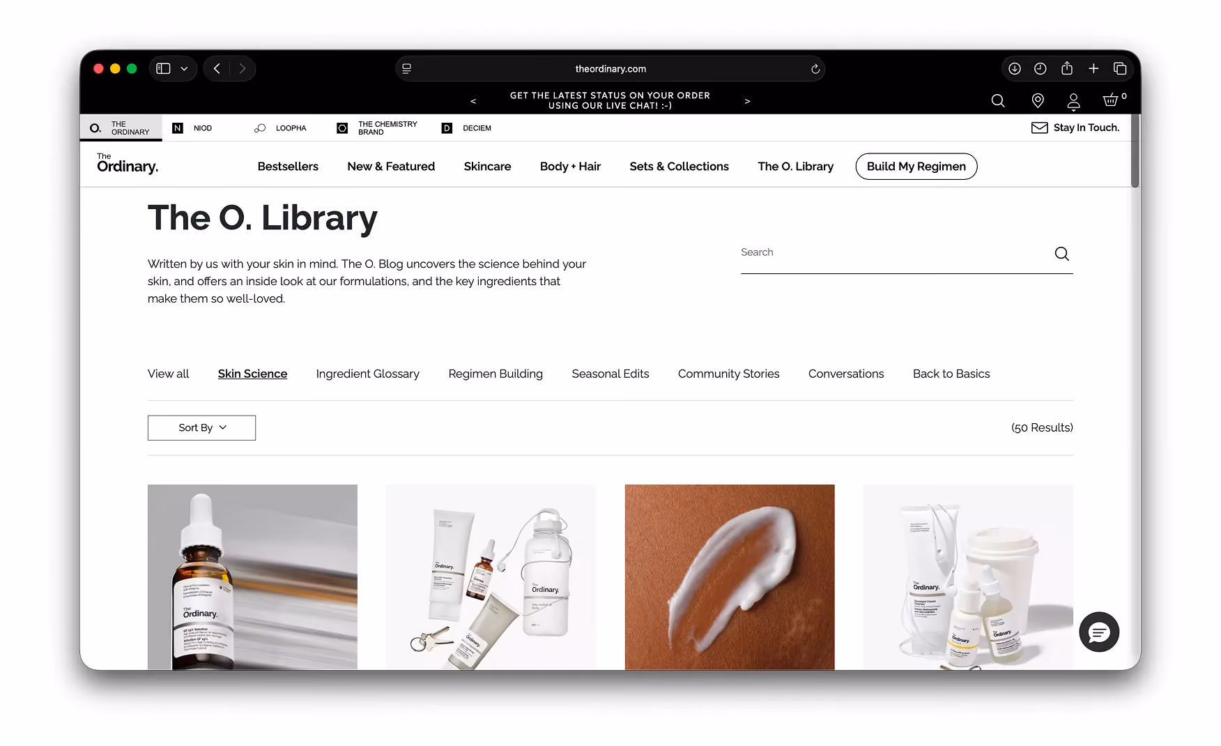
The O. Library also sits in the primary nav at equal weight to the shopping categories. Most brands hide their educational content in footers. The Ordinary puts it at the top level, which is a clear signal that the brand considers teaching part of the purchase journey rather than a separate content exercise.
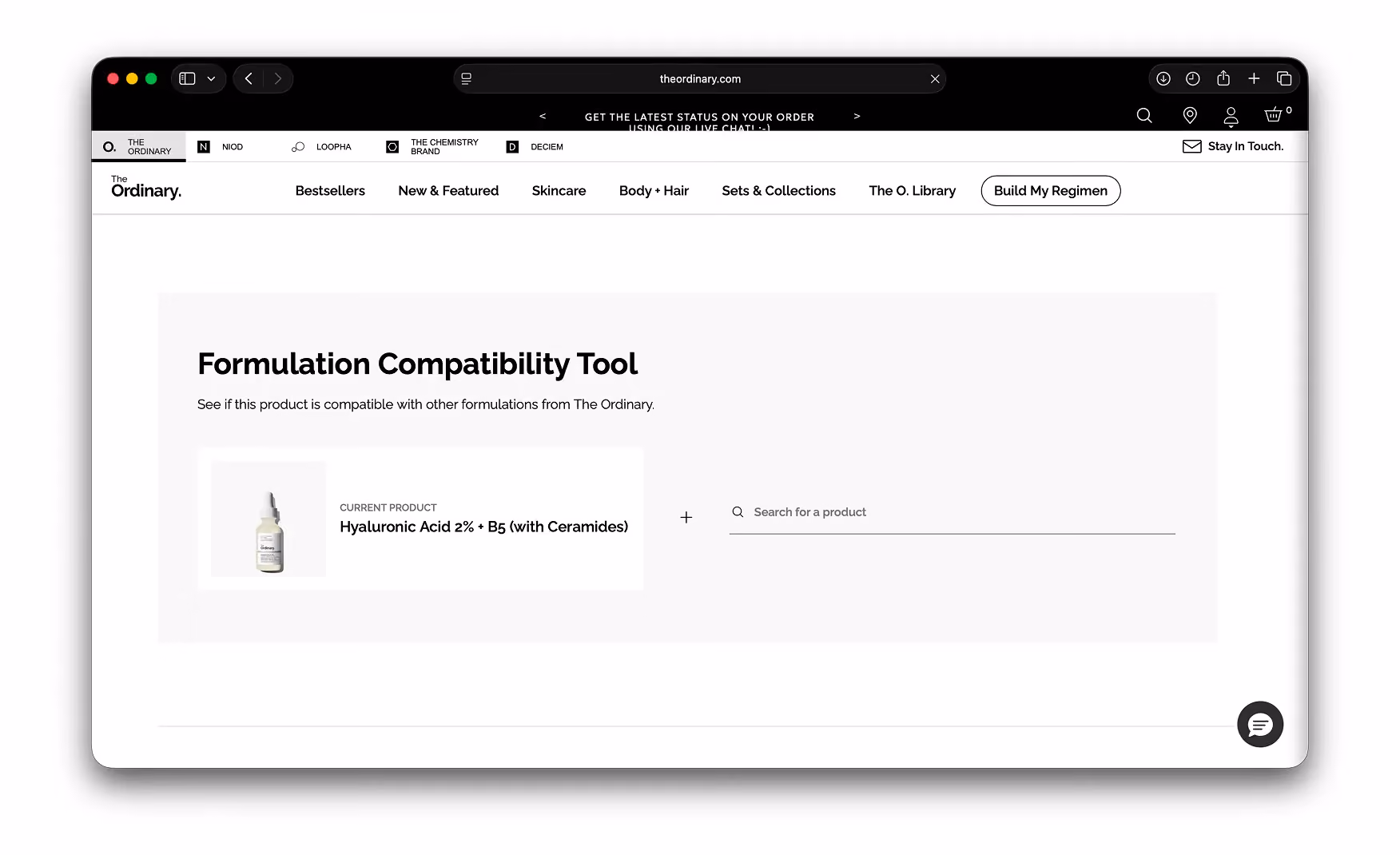
3. The Formulation Compatibility Tool That Makes the Website Irreplaceable 🧪
This is the single most important feature on the site.
Midway down every PDP sits a tool: the current product on the left, a "+" in the middle, and a search field on the right. Pick a second product and the tool tells the customer whether the two are safe to layer.
The biggest anxiety active-ingredient buyers carry is ingredient conflict.
Will my retinol cancel out my vitamin C? Will this AHA irritate the same skin I just treated with niacinamide? Most brands leave that question in a blog post.
The Ordinary built the answer into the product page. This is why Rishabh, who uses the brand personally, orders from theordinary.com rather than Amazon or Sephora. The website does something the marketplace cannot, and that makes it the only place that adds value on a return visit.
4. The O. Library Positions the Brand as the Customer's Teacher 📚
The O. Library is the brand's editorial section. With long-form ingredient guides, regimen breakdowns, and scientific reading that give a customer enough knowledge to make a genuinely informed decision.
Most beauty brands treat content as a sales tool. But The Ordinary treats it as the trust mechanism. A customer who feels taught rather than sold to is a customer who trusts the brand with their actual skin.
Once that trust is built, a USD 7 serum becomes an informed choice. The content investment justifies itself in basket expansion: a customer who understands their routine does not stop at one product.
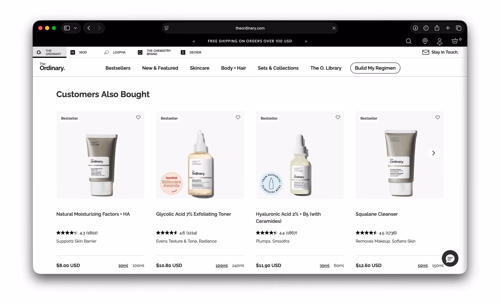
5. Social Proof Distributed Across Every Shopping Surface 🏅
The "Customers Also Bought" row beneath the compatibility tool carries four cross-sell cards. Every card wears a different badge: Bestseller, Team Favourite, Skincare Awards 2023, Trending.
Most skincare sites collect social proof into one review block at the bottom of the PDP. By the time a visitor scrolls there, they have already made their decision and social proof is doing nothing.
The Ordinary distributes trust signals across the full scroll.A badge near the top of the page reaches a visitor who has not yet decided, which is the visitor the badge actually needs to reach.
Where the Experience Falls Slightly Short ⚠️
The India Site Does Not Support Direct Purchase 🇮🇳
Indian visitors are redirected to a Find Us page rather than a shopping-enabled storefront.
This is a market and regulatory decision, not a UX one, but it is worth noting because The Ordinary has a significant Indian customer base.
Minor UI Friction Points on the Global Site 📊
Neither of the first two points is a UX failure. They are minor layers of UI that, in the context of everything else the site does correctly, barely register.
What Suplex Would Fix First 💡
Priority 1 - Enable a Purchase Path for Indian Visitors 🛠️
The India redirect is the only commercially meaningful gap on the site. A localised storefront or a grey-market third-party integration would address a significant demand signal that currently converts nowhere.
The Ordinary is one of the most-searched skincare brands on Nykaa and Amazon India. That demand exists whether or not the brand captures it directly, and the Find Us page is capturing none of it.
Priority 2 - Dismiss the Welcome Modal on Return Visits 🔔
The welcome modal is a small friction point but an avoidable one. Suppressing it after the first visit via a cookie flag is a 30-minute engineering task that removes one unnecessary interaction for every returning customer.
Final Scorecard 🏆
Suplex Verdict 📝
The Ordinary uses every conversion mechanism the category has invented, and one or two it invented itself, without losing the editorial confidence that makes it feel like a science brand rather than a retailer.
The Formulation Compatibility Tool alone justifies the website's existence as a direct channel. The O. Library turns first-time buyers into multi-product regimen customers without a single sales line. There is no redesign conversation here. There is only the India market gap and a modal.
Overall Rating: ⭐⭐⭐⭐⭐ 5 / 5
Suplex Design works with skincare, beauty, and D2C consumer brands across the UAE and India on information architecture, PDP design, and conversion strategy. If your brand sells a technically complex product and you want a website that educates as well as it converts, get in touch with our team of experts at Suplex Design.
Hi, I’m Rishabh Jain
I believe great design has the power to shape perception, build trust, and move businesses forward. That belief is what led me to found Suplex Design Studio, a global branding and packaging studio working with FMCG and D2C brands across markets.I started suplex at 25 with a clear intent, to create design that is strategic, thoughtful, and commercially meaningful. By 28, the studio had scaled globally, guided by a strong foundation in Integrated Design that I developed during my academic journey in London, where I was honoured with the Dean’s Award.
Over the years, I’ve had the opportunity to work with 100+ brands, from Fortune 500 organizations to family-run businesses, helping them build packaging and brand systems that create recall, relevance, and long-term value.
Suplex’s work has been recognized internationally, including the Manifest Award (2024), the Clutch Global Award (2025), and features on platforms such as Packaging of the World, The Dieline, and the World Brand Design Society.
None of this would be possible without the people behind the work. I’m deeply grateful to the suplex team, whose commitment, creativity, and attention to detail turn ideas into meaningful brand experiences every day.
At the heart of my work is a simple philosophy, design should be intentional, honest, and built to last, and that continues to guide everything we create at suplex.


Let’s Make It Happen
E-Commerce Success Stories
%201.avif)


.avif)
.avif)
Build Your D2C Business The Right Way
Build It With Suplex.


