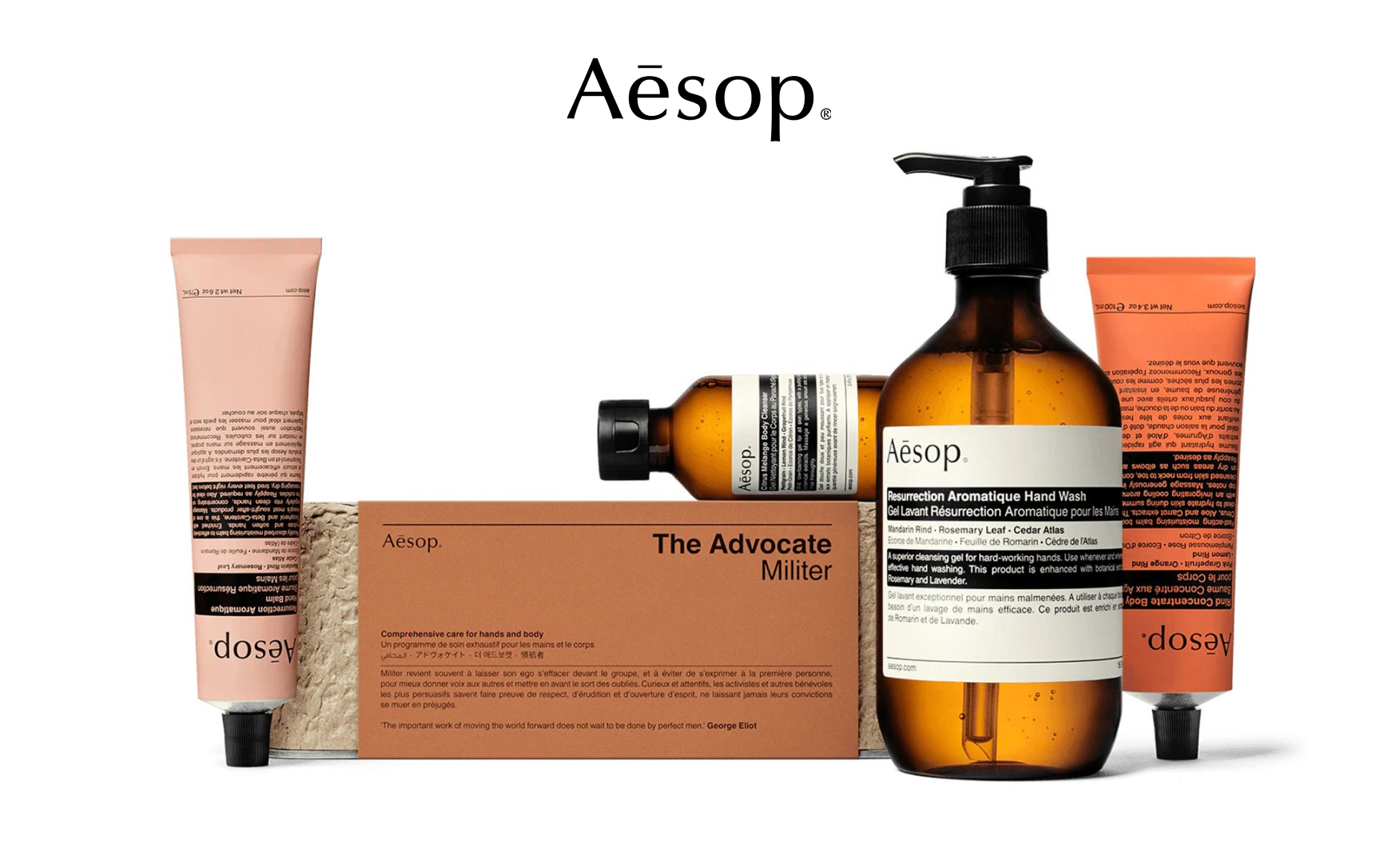
Aesop
.webp)
Aesop
Aesop | Suplex's Verdict ⭐⭐⭐
Suplex’s Website Audit for AESOP at a Glance 📊
Aesop was founded in Melbourne in 1987 by Dennis Paphitis and grew from a single salon to a EUR 537 million revenue brand operating across 29 markets and approximately 400 retail locations, before L'Oréal acquired it in August 2023 for USD 2.5 billion, the most expensive acquisition in L'Oréal's history.
Suplex Design analysed Aesop's website across homepage experience, product discovery, PDP architecture, social proof, and mobile performance, and what follows is a breakdown of why the most visually disciplined brand in premium beauty has built a storefront that earns a 4 out of 5.
What Aesop's Website Gets Exceptionally Right ✅
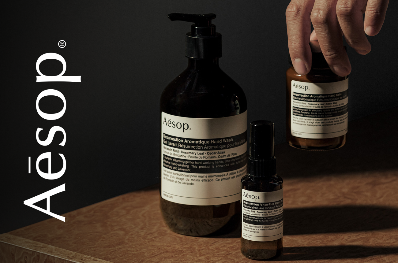
1. A New Editorial Hero That Replaces Spectacle With Confidence 🌿
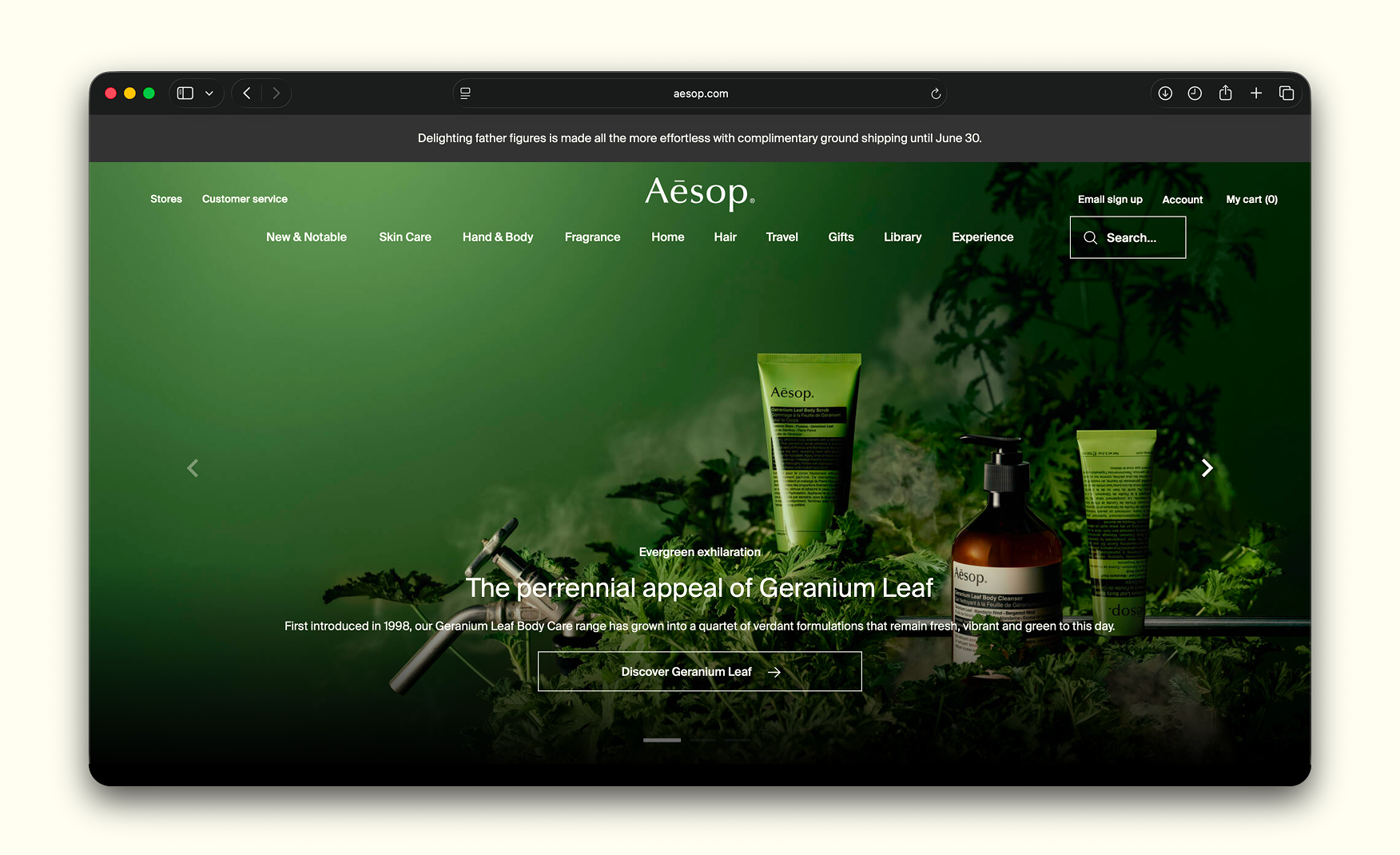
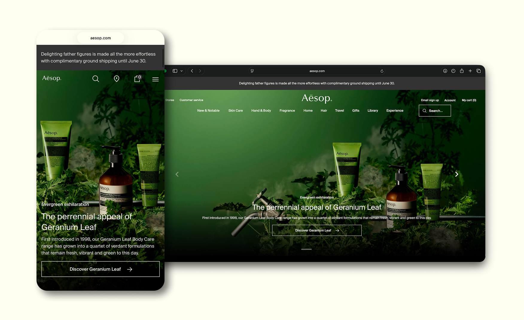
The homepage hero has been rebuilt entirely.
The previous cinematic dancers video has been replaced with a single still life of the Geranium Leaf Body Care quartet, the products nestled into real green geranium leaves on a deep green backdrop, with the eyebrow "Evergreen exhilaration" and a one-line history of the range.
There are no carousel banners, overlays, or maintenance ribbon. The brand has chosen the maturity move with a hero that trusts a 25-year-old product range to do the conversion work without performance.
For a brand whose visual standard is the entire premium positioning, this is exactly the right edit.
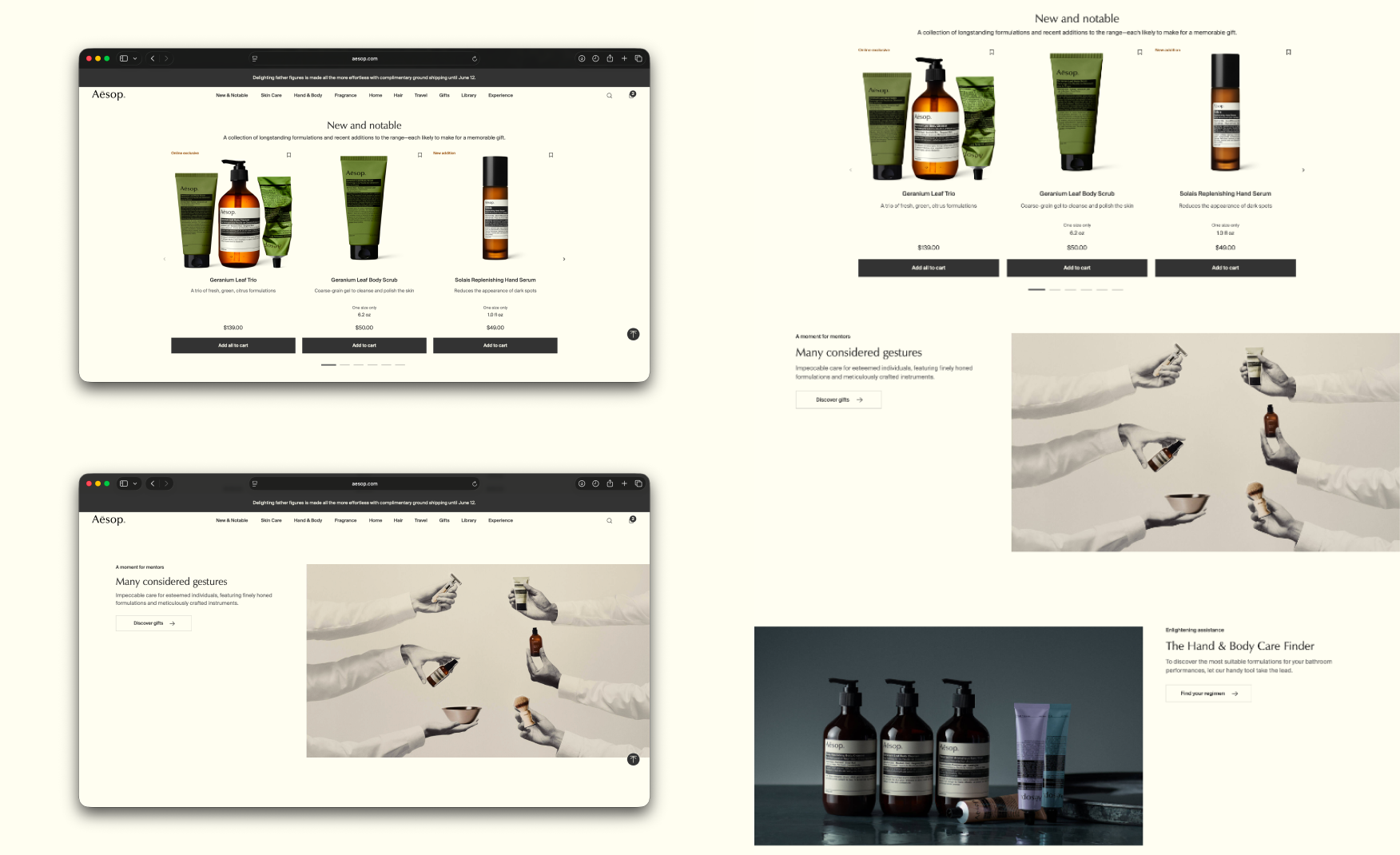
2. Editorial Cadence Sustained Through a Tighter Homepage Scroll 📖
Below the hero, the homepage continues to alternate between commerce and editorial content.
"New and Notable" surfaces three product cards in fold two with working prices and Add to Cart buttons, followed by a "Many Considered Actions" editorial spread, a fragrance gradient row with product names beneath each colour, and a "Recommended Reading" block leading into the Library.
The scroll is shorter and more focused than the previous version. Every section now carries a clear reason for the visitor to stay, which was not true of the earlier, longer homepage.
3. The Sitewide Add-to-Cart Bug Has Been Fixed 🔧
The most commercially expensive issue from the previous audit is gone. Every Add to Cart button across the category pages and cross-sell rows now loads and functions correctly, which means a visitor who wants to buy can buy.
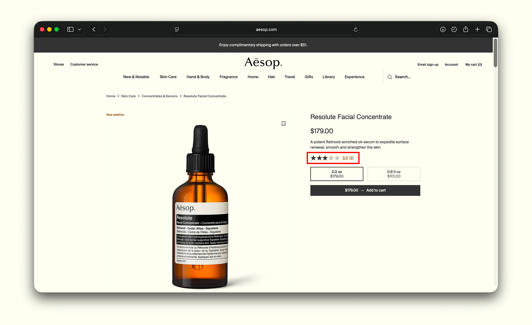
The Complete the Routine cross-sell row on the Resolute Facial Concentrate PDP now shows working Add buttons alongside the product cards. This single fix would have moved the previous audit's rating on its own.
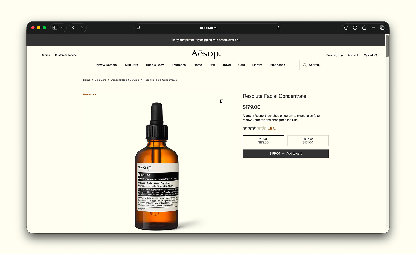
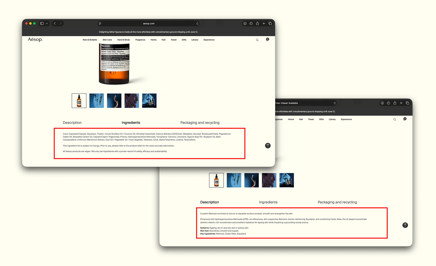
4. The PDP Architecture Still Sets the Bar for Editorial Commerce 📌
The Resolute Facial Concentrate PDP remains the strongest version of an Aesop product page. A clean breadcrumb, a single amber dropper bottle, the price, two size options, and a working Add to Cart all sit in the first viewport.
Below the fold, it layers in tabs for How It Works, Ingredients, and Shipping and Returns, followed by editorial videos, dropper close-ups, and the now-functional cross-sell row.
A Customer Reviews block with a star breakdown and the option to write a review now sits on the page. The architecture is doing the right things.
5. Mobile Holds the Brand's Visual Standard 📱
The mobile build adapts the new Geranium Leaf hero cleanly. The wordmark sits left, the nav icons group right, the still life centres with the same headline and CTA, and the chat bubble sits in the bottom corner without competing for attention.
There are absolutely no element overlaps, compressed assets, or broken layouts at common mobile widths. For a brand whose entire identity rests on visual control, the mobile execution continues to hold that standard.
6. The Three-Overlay Landing Experience Has Been Cleared ✅
The previous audit flagged three stacked overlays competing for attention in fold one on landing. The site-maintenance delivery banner, the geo-detect India modal, and the competing UI have all been removed from the landing experience. A visitor now lands on the Geranium Leaf hero with no UI between them and the brand.
Where the Experience Still Needs Work ⚠️
1. A Typo on the Brand's Most Visible Surface 🔤
The new hero headline reads "The perrennial appeal of Geranium Leaf."
The correct spelling is perennial, with one r, not two. For a brand whose visual and editorial standard is this high, on the single line that fronts the entire homepage, this is the most avoidable miss on the site.
The same misspelling appears on the mobile hero. It is a one-character fix that should go into production today.

Issues Resolved vs Issues Remaining 📊
2. The PDP Still Sells the Brand, Not the Solution 📌
Aesop's PDPs continue to say very little about who the product is for.
What skin concern it addresses, how it compares to other Aesop concentrates, or what specific ingredient story justifies USD 179: none of these questions are answered on the page.
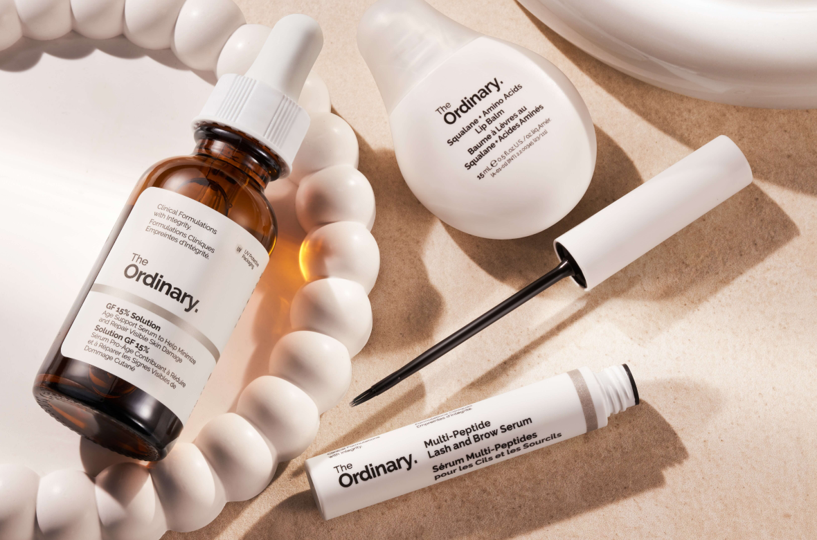
Compare this to The Ordinary's PDP, which this team audited separately, and which includes a Formulation Compatibility Tool, ingredient explanations, and concern-by-concern guidance.
Aesop sells a brand. The Ordinary sells a solution. A first-time buyer trying to justify USD 179 finds the brand easier to fall in love with than the product is to understand, and that gap costs conversions.
3. Thin Reviews on a High-Ticket Product 🔢
The Resolute Facial Concentrate still shows 3.0 stars from a thin handful of reviews.
For a USD 179 retinoid serum, the expected social proof is dozens of verified reviews with photos, the kind that The Ordinary and Glossier built their conversion credibility on.
A review system now exists on the PDP, which is a structural improvement from the previous audit. The issue is that the reviews have not yet been seeded or solicited at the volume the price point requires.
What Suplex Would Fix First 💡
Priority 1 - Fix the Typo Today ✏️
"Perrennial" to "perennial" is a one-character fix. It is on the brand's most visible surface, fronting the homepage for every global visitor, and it is the most avoidable issue on the site. It should be live within the hour.
Priority 2 - Build the PDP Into a Decision Tool, Not Just a Brand Canvas 📝
The PDP needs a skin-concern filter, an ingredient explainer that justifies the price in functional terms, and a review system actively solicited at scale. None of these require a redesign. They require content investment, a review solicitation campaign, and a product taxonomy update and together they are what close the gap between a visitor who admires the brand and a visitor who commits to USD 179.
Final Scorecard 🏆
Suplex Verdict 📝
Aesop has done a pretty good job on their website in our UX & UI expert team’s opinion here at Suplex Design, but just three things keep this audit at a 4 rather than a 5.
A typo on the homepage that takes one character to fix, a product page that sells the brand without answering the customer's purchase questions, and a thin review stack on the brand's highest-ticket SKUs.
Overall Rating: ⭐⭐⭐⭐ 4 / 5. Three specific fixes from a 5.
Suplex Design works with luxury beauty, skincare, and premium consumer brands across India and the UAE on PDP architecture, conversion strategy, and website audits. If your brand is at a similar stage to Aesop and you want an honest assessment of what is holding your site back, get in touch with our team of experts at Suplex Design.
Hi, I’m Rishabh Jain
I believe great design has the power to shape perception, build trust, and move businesses forward. That belief is what led me to found Suplex Design Studio, a global branding and packaging studio working with FMCG and D2C brands across markets.I started suplex at 25 with a clear intent, to create design that is strategic, thoughtful, and commercially meaningful. By 28, the studio had scaled globally, guided by a strong foundation in Integrated Design that I developed during my academic journey in London, where I was honoured with the Dean’s Award.
Over the years, I’ve had the opportunity to work with 100+ brands, from Fortune 500 organizations to family-run businesses, helping them build packaging and brand systems that create recall, relevance, and long-term value.
Suplex’s work has been recognized internationally, including the Manifest Award (2024), the Clutch Global Award (2025), and features on platforms such as Packaging of the World, The Dieline, and the World Brand Design Society.
None of this would be possible without the people behind the work. I’m deeply grateful to the suplex team, whose commitment, creativity, and attention to detail turn ideas into meaningful brand experiences every day.
At the heart of my work is a simple philosophy, design should be intentional, honest, and built to last, and that continues to guide everything we create at suplex.


Let’s Make It Happen
E-Commerce Success Stories

%201.png)

.webp)
.webp)
.webp)
.webp)
Build Your D2C Business The Right Way
Build It With Suplex.


