Comet
.webp)
Comet
Comet | Suplex's Verdict ⭐⭐⭐½
Suplex’s Website Audit for Comet at a Glance 📊
Comet reached Rs 31.7 crore in FY25 revenue, raised a Rs 42.3 crore Series A at a Rs 167 crore valuation in July 2024 led by Elevation Capital alongside Nexus Venture Partners, sold out a Santanu Hazarika collaboration in two hours, launched its first offline flagship in Bengaluru in April 2025, and debuted on Myntra in February 2026 with 40-plus styles, all inside a sneaker market projected to cross USD 3.1 billion in India alone.
Suplex Design analysed the website across brand identity, catalogue architecture, PDP depth, UGC mechanics, and homepage merchandising, and what follows is an honest breakdown of where Comet is building something genuinely distinctive, and the one section that still has a scope of improvement.
What Comet's Website Gets Exceptionally Right ✅
1. The Hero Splits the Audience Without Losing the Editorial Frame 📸
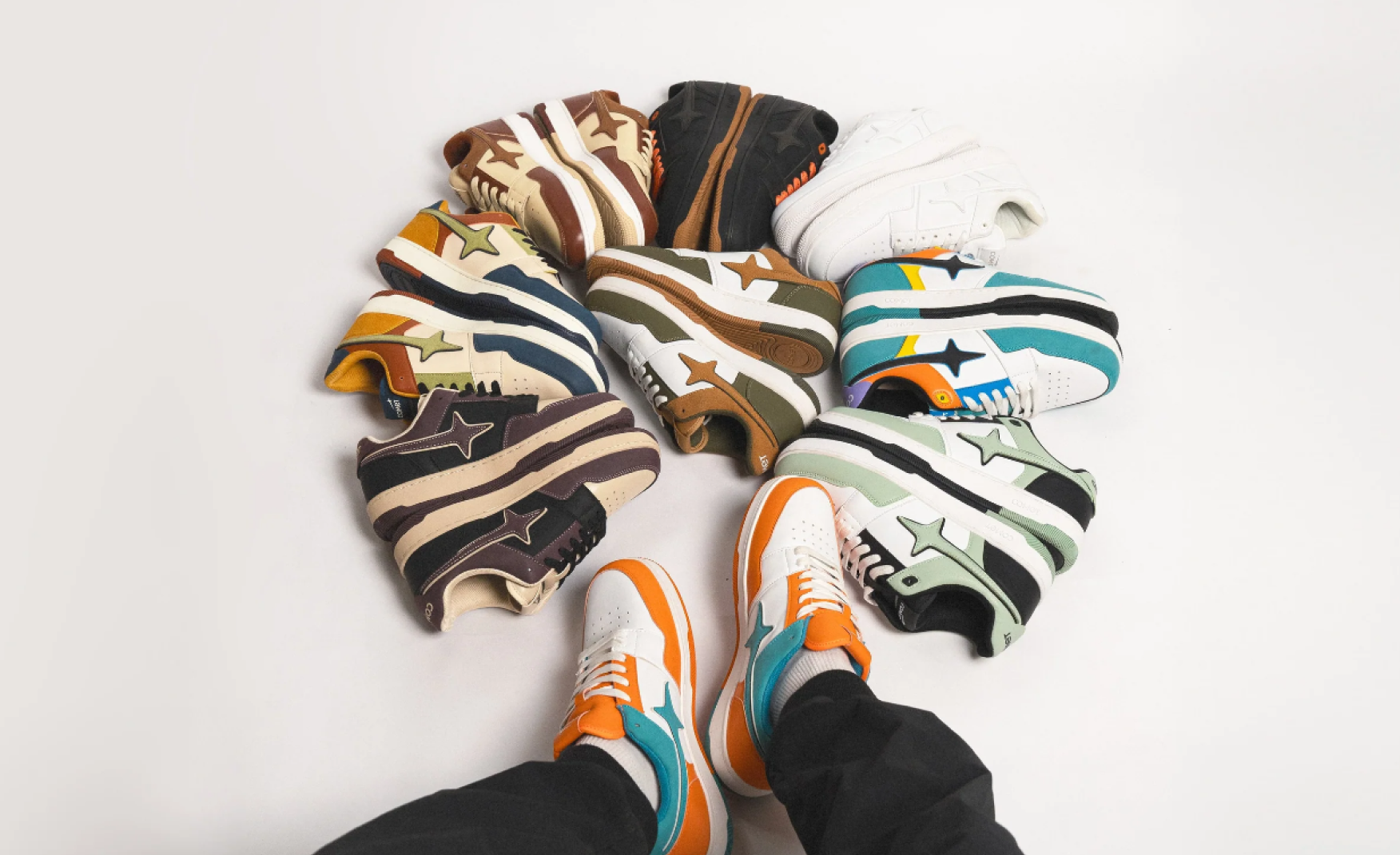
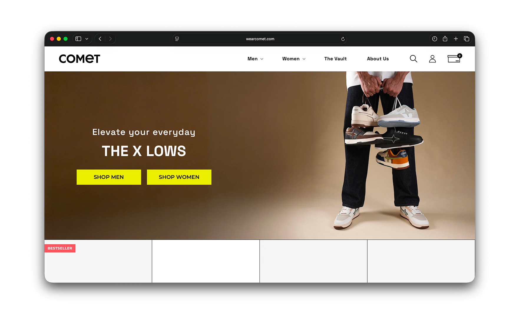
The homepage opens with a single editorial photograph of a person holding three pairs of Comet sneakers against a warm brown gradient.
"Elevate your everyday, THE X LOWS" runs on the left, and two bright yellow CTAs labelled SHOP MEN and SHOP WOMEN sit below it.
The visitor knows the brand, the current campaign, and which path belongs to them inside three seconds.
Most homegrown Indian sneaker brands force a banner carousel here. Comet keeps the page still and lets the photography do the work. The minimalism is intentional and consistent across the entire site. The brand sells shoes, and the website never asks the visitor to look at anything else.
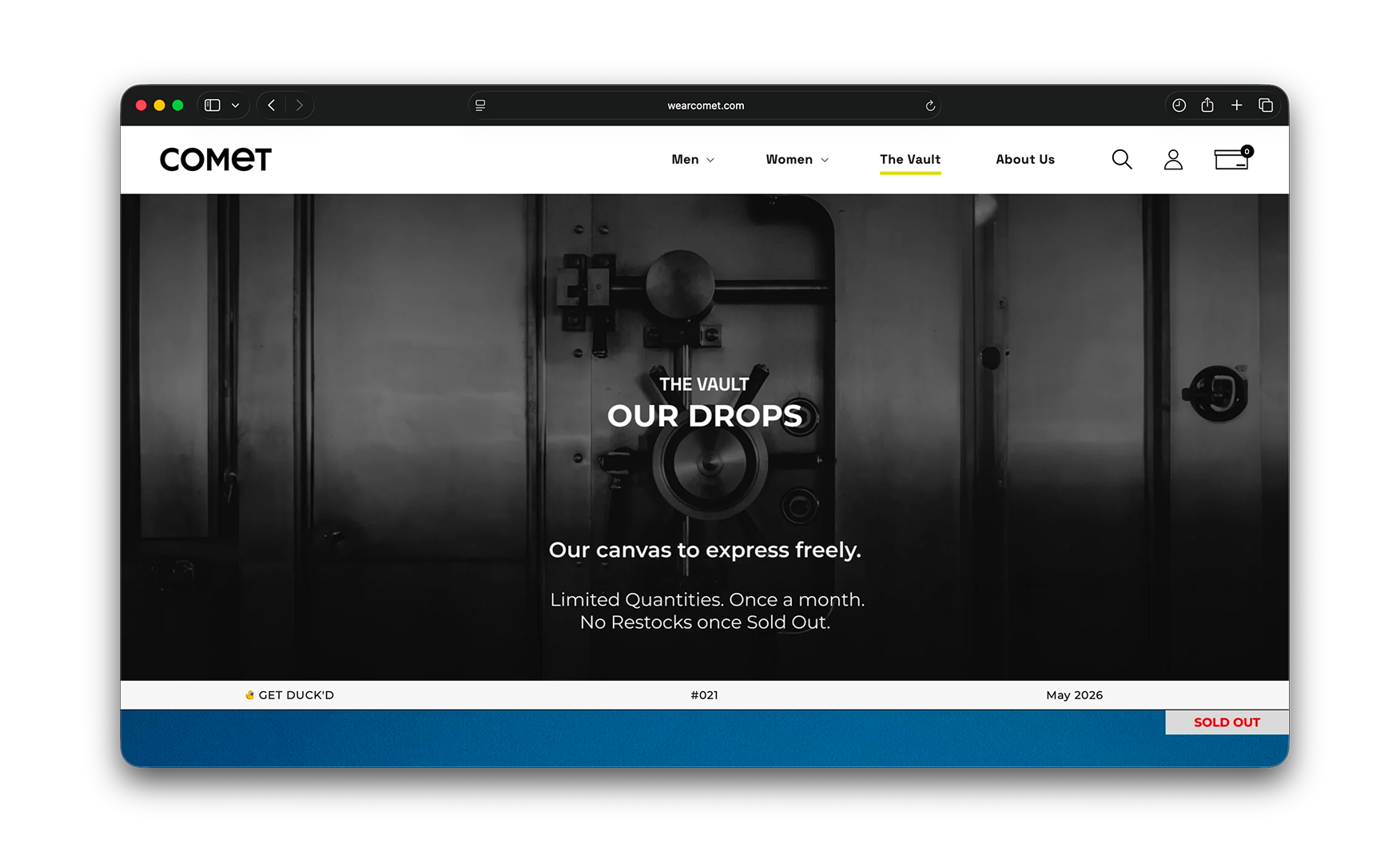
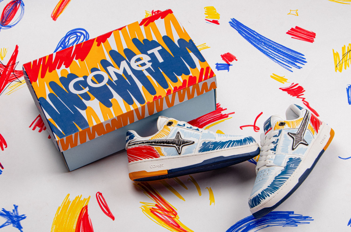
2. The Vault Anchors a Real Drop Culture in the Primary Navigation 📦
A separate nav item called "The Vault" holds the brand's monthly exclusive drops like the limited-edition silhouettes released in restricted quantities that genuinely hold resale value in the secondary market.
Comet is one of the only Indian sneaker labels to have built real drop culture, and the Santanu Hazarika collaboration selling out in two hours is the most concrete proof of it.
Surfacing The Vault inside the primary nav rather than burying it under a newsletter or a sub-menu tells the visitor immediately that this is a serious sneaker brand, not a fashion-adjacent label.
For a category where the consumer's perception of value is built almost entirely by scarcity, putting the scarcity story where the eye lands first is the correct structural decision.
3. The Tried and Tested Wall Carries the Most Believable Reviews in Indian Sneakers 🤝
Midway down every PDP sits a "Tried and Tested" section showing three customers in their actual daily lives, each labelled by profession such as athlete, artist, software developer.
Each card carries a real photograph of the buyer wearing the shoes in context and a genuine statement about both the product and the brand.
Most footwear brands hide UGC inside a star-rating block at the bottom of the page, where it arrives after the visitor has already made their decision and social proof is doing nothing.
Comet places it inside the buying decision zone, which means the trust signal is working at the point of highest purchase intent. The casting itself does additional work.
Couples, travellers, athletes, and creatives wearing the same silhouette show the range of lives the shoe belongs in, which is exactly the versatility argument a mid-premium brand needs to make in a market where Nike and Adidas own the aspirational and the mass ends simultaneously.
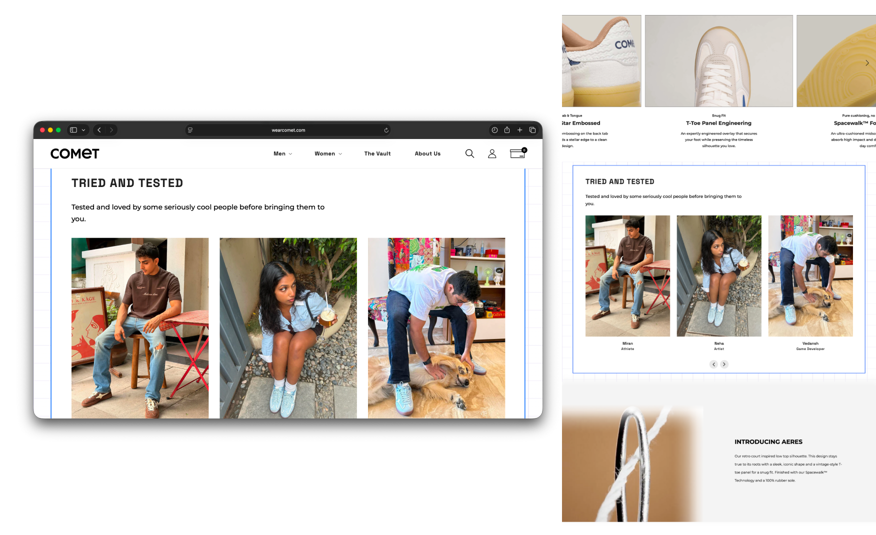
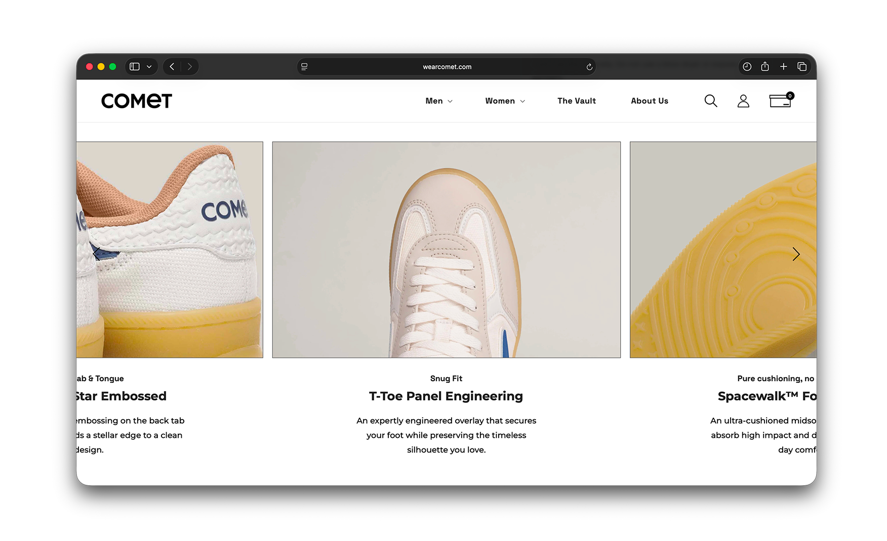
4. Engineering Callouts on the PDP Earn the Rs 5,299 Price Tag 🔧
The PDP carries a horizontal carousel of feature cards: Star Embossed, T-Toe Panel Engineering, Spacewalk Foam, each with a close-up shot and a one-line description.
For a brand operating in a category dominated by Nike, Adidas, and Puma globally and by budget knock-offs locally, this is how a young Indian label earns the right to charge Rs 5,299 for a pair of sneakers.
The customer is being told this shoe is engineered, not just designed. And that very distinction between "we made this deliberately" and "we made something that looks like what you already recognise" is the entire brand argument Comet needs to win, and the PDP makes it clearly.
Homepage Scroll Depth vs Commercial Content 📊
What Suplex Would Fix First 💡
Priority 1 - Merchandise the Mid-Page With Content the Brand Already Owns 📝
Comet does not need to create anything new to fix this section.
The Vault drop calendar with the next two or three upcoming releases, a campaign film from the most recent shoot, a styling lookbook from the brand's own photography, or a longer UGC wall drawn from the existing Tried and Tested pool would each fill the mid-page with content that reinforces the brand rather than undermining it.
The Vault calendar is the highest-value option. Surfacing upcoming drop dates mid-homepage creates urgency and keeps the visitor on the page longer, which is the exact commercial behaviour the brand needs from the audience that arrives already knowing what Comet is.
Final Scorecard 🏆
Suplex Verdict 📝
Comet has built the strongest brand frame and PDP architecture in homegrown Indian sneakers. The editorial hero, the Vault drop culture, the Tried and Tested UGC wall, and the engineering callouts are each individually the best execution of their kind in the Indian D2C footwear category.
A single missing layer of homepage merchandising stands between this 3.5 and a 4.5.
The fix requires no engineering and no new photography. It requires the brand to put content it already owns into a section that currently gives every mid-funnel visitor a reason to leave before they reach the PDP.
Overall Rating: ⭐⭐⭐½ 3.5 / 5. One editorial layer from a 4.5.
Suplex Design works with D2C footwear, apparel, and lifestyle brands across India and the UAE on homepage merchandising, PDP architecture, and conversion-focused UX. If your brand is at a similar stage to Comet and you want an honest assessment of what is holding your site back, get in touch with our team of experts at Suplex Design.
Hi, I’m Rishabh Jain
I believe great design has the power to shape perception, build trust, and move businesses forward. That belief is what led me to found Suplex Design Studio, a global branding and packaging studio working with FMCG and D2C brands across markets.I started suplex at 25 with a clear intent, to create design that is strategic, thoughtful, and commercially meaningful. By 28, the studio had scaled globally, guided by a strong foundation in Integrated Design that I developed during my academic journey in London, where I was honoured with the Dean’s Award.
Over the years, I’ve had the opportunity to work with 100+ brands, from Fortune 500 organizations to family-run businesses, helping them build packaging and brand systems that create recall, relevance, and long-term value.
Suplex’s work has been recognized internationally, including the Manifest Award (2024), the Clutch Global Award (2025), and features on platforms such as Packaging of the World, The Dieline, and the World Brand Design Society.
None of this would be possible without the people behind the work. I’m deeply grateful to the suplex team, whose commitment, creativity, and attention to detail turn ideas into meaningful brand experiences every day.
At the heart of my work is a simple philosophy, design should be intentional, honest, and built to last, and that continues to guide everything we create at suplex.


Let’s Make It Happen
E-Commerce Success Stories

%201.webp)


.webp)
.webp)
Build Your D2C Business The Right Way
Build It With Suplex.


