Hims
.webp)
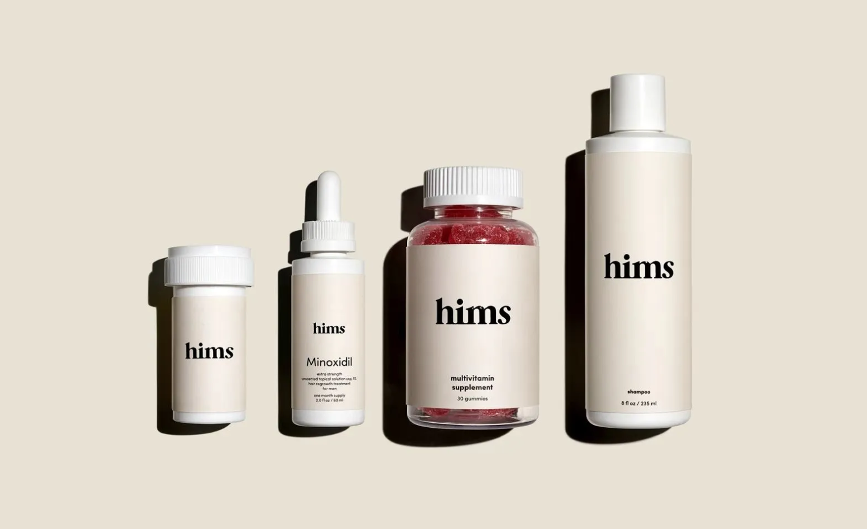
Hims
Hims | Suplex's Verdict ⭐⭐⭐⭐½
Suplex’s Website Audit for Hims at a Glance 📊
Hims reported USD 2.35 billion in full-year 2025 revenue at 59% year-on-year growth, serves approximately 2.5 million subscribers across weight loss, hair regrowth, sexual health, mental health, and biomarker testing, and currently offers seven FDA-approved or FDA-authorised GLP-1 products on a single subscription-led telehealth platform.
Suplex Design analysed the website across brand identity, category taxonomy, product education, trust mechanics, and homepage hierarchy, and what follows is a breakdown of how Hims built the most aesthetically confident telehealth site in the US market, and the one structural issue that is costing it every visitor who does not come for weight loss.
What the Hims Website Gets Exceptionally Right ✅
1. The Taxonomy Names the Problem Out Openly🗣️
Below the weight-loss hero, four condition tiles sit in a row.
"Have better sex", "Regrow hair", "Boost testosterone", "Get a health check", and honestly speaking every label names the thing the man came looking for and would not otherwise say out in the open.
The telehealth category has historically packaged itself in euphemism with men's wellness, vitality, performance enhancement, intimate health.
Hims abandoned all of it. The visitor who arrived by searching "ED treatment" or "hair loss medication" is met with exactly the words they typed into the search bar, which removes the first and most important conversion barrier in a stigmatised category which is basically the visitor's fear of naming the problem.
Most brands in this space are too nervous to be this direct. But Hims is not, and the directness is the entire conversion theory.
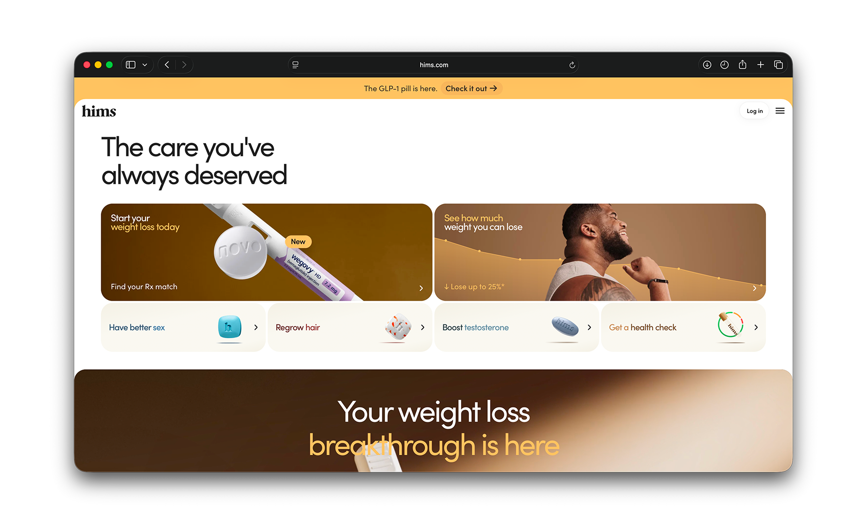
2. The Category Cards Show the Actual Medication, Not a Generic Icon 💊
Each condition tile carries the physical product the visitor will receive.
A blue pill sits beside "Have better sex." White capsules sit beside "Regrow hair." A testosterone tablet sits beside "Boost testosterone." A partially filled vial and lab results graphic sit beside "Get a health check."
Hims is not hiding the medication. It is instead the merchandising.
For a customer deciding whether to commit to a telehealth subscription, seeing the actual physical product answers the single largest question they are carrying, will I receive real medicine, or just another consultation that ends with a recommendation to see someone in person?
The product on the tile is the answer to that question. Showing it at the moment of first encounter is the difference between a brand that invites trust and one that defers it.
3. The Site Reads Like Apple, Not Like a Pharmacy 💻
The visual layer carries 3D product renders, scroll-triggered animations, full-bleed lifestyle photography, and a dark-toned design system that would be at home on apple.com.
For a category dominated by either clinical white-coat sites or guru-led wellness pages with stock photography and sans-serif anxiety, this Apple-meets-healthcare positioning is genuinely rare.
Hims is one of the only US wellness brands that has managed to land it without feeling either antiseptic or salesy.
The brand reads as contemporary and credible simultaneously, which is the hardest combination in healthcare UX and the one that makes a first-time visitor stay on the page long enough to convert.
The PDP layer matches the same standard. Each product page carries infographic-led education in place of blocky paragraph text, and the navigation is straightforward enough that a first-time visitor can absorb the clinical detail in under a minute.
4. The Built-In Product Comparison Tool Removes the Reddit Research Trip 🔍
The site carries a product comparison tool that lets the customer hold two Hims products side by side.
The Wegovy injectable pen against the Wegovy oral pill, for example, with both products' differences surfaced on the same screen.
Most brands in this category leave the customer to figure out the difference between their own products on a Reddit thread or a third-party review site.
Hims has built the comparison into the purchase journey, which means the customer who is unsure between two options gets the answer from the brand rather than from a stranger on the internet.
The transparency this represents is commercially significant. A brand that tells the customer which of its own products is right for them is a brand the customer trusts with the follow-on subscription.
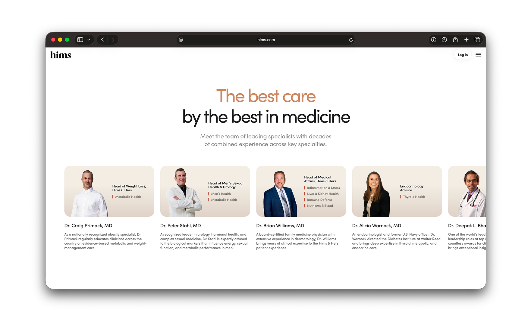
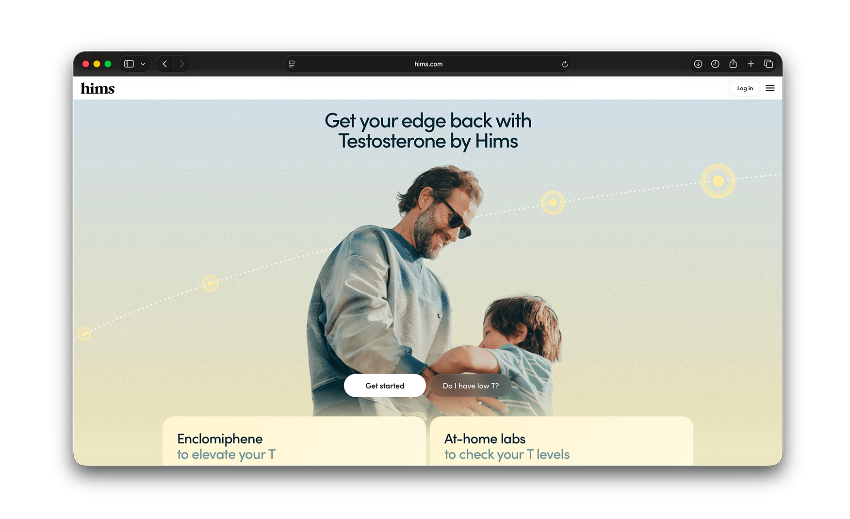
5. Doctor Credentials on the Homepage, Not on an About Page 👨⚕️
Midway down the homepage sits a "The best care by the best in medicine" section carrying doctor headshots, names, specialties, and institutional credentials.
For a brand prescribing Wegovy, finasteride, and testosterone protocols, the medical trust signal cannot live on a separate Medical Team page that 90% of visitors will never visit.
It has to sit where the customer is making the commitment, that is on the homepage, in the scroll, at the point where the decision is forming. Hims has placed it directly above the lead-capture email prompt, which is the correct sequence.
The visitor sees the credential before they are asked to give their email address. And honestly speaking that ordering matters more than most brands appreciate.
6. The Labs Section Is the Most Ambitious Product Extension on the Site 🧪
The labs section, launched in 2025, lets subscribers test 130-plus biomarkers from home and screen for 50-plus types of cancer.
The results feed into an app that generates a doctor-developed Action Plan, turning a lab result into a health optimisation programme rather than a number the customer does not know what to do with.
For a telehealth brand that has built its identity on making healthcare accessible, the lab's product is the most structurally ambitious execution of that premise on the site.
It moves the brand from "we treat the problem you already know you have" to "we find the problem before you know you have it. That is a meaningfully different brand proposition, and the site communicates it clearly.
Where the Hims Experience Falls Short ⚠️
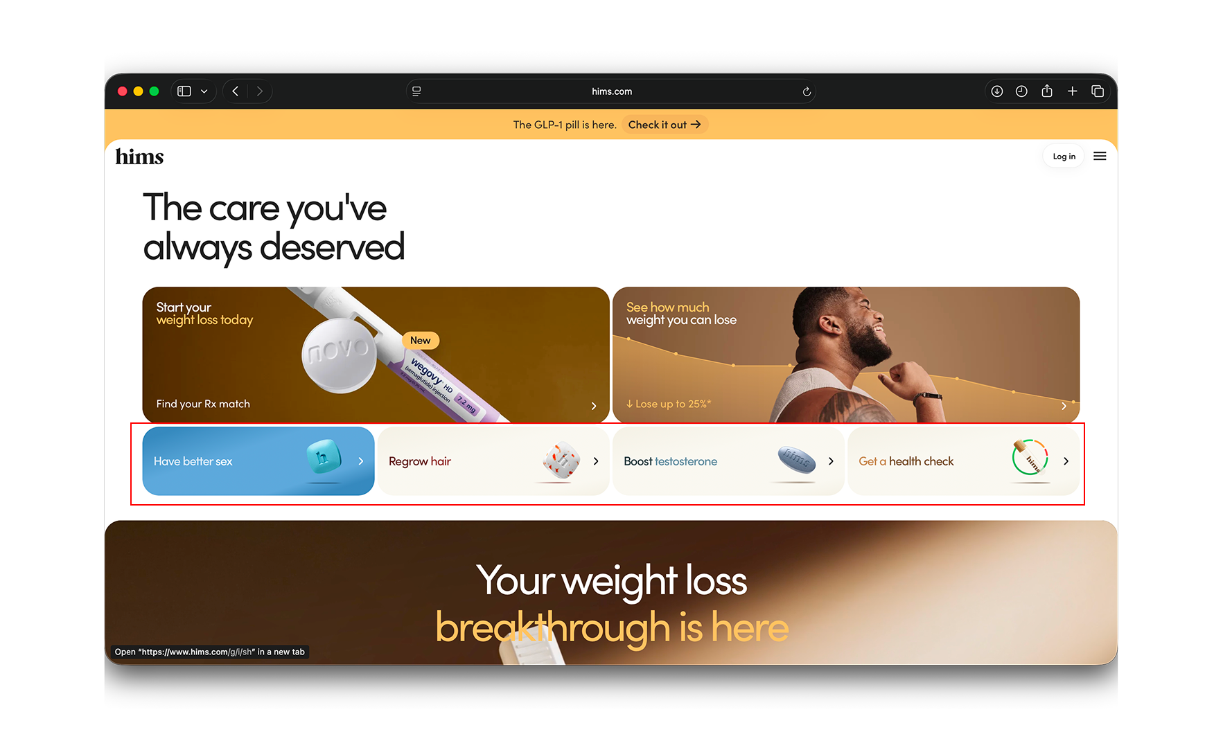
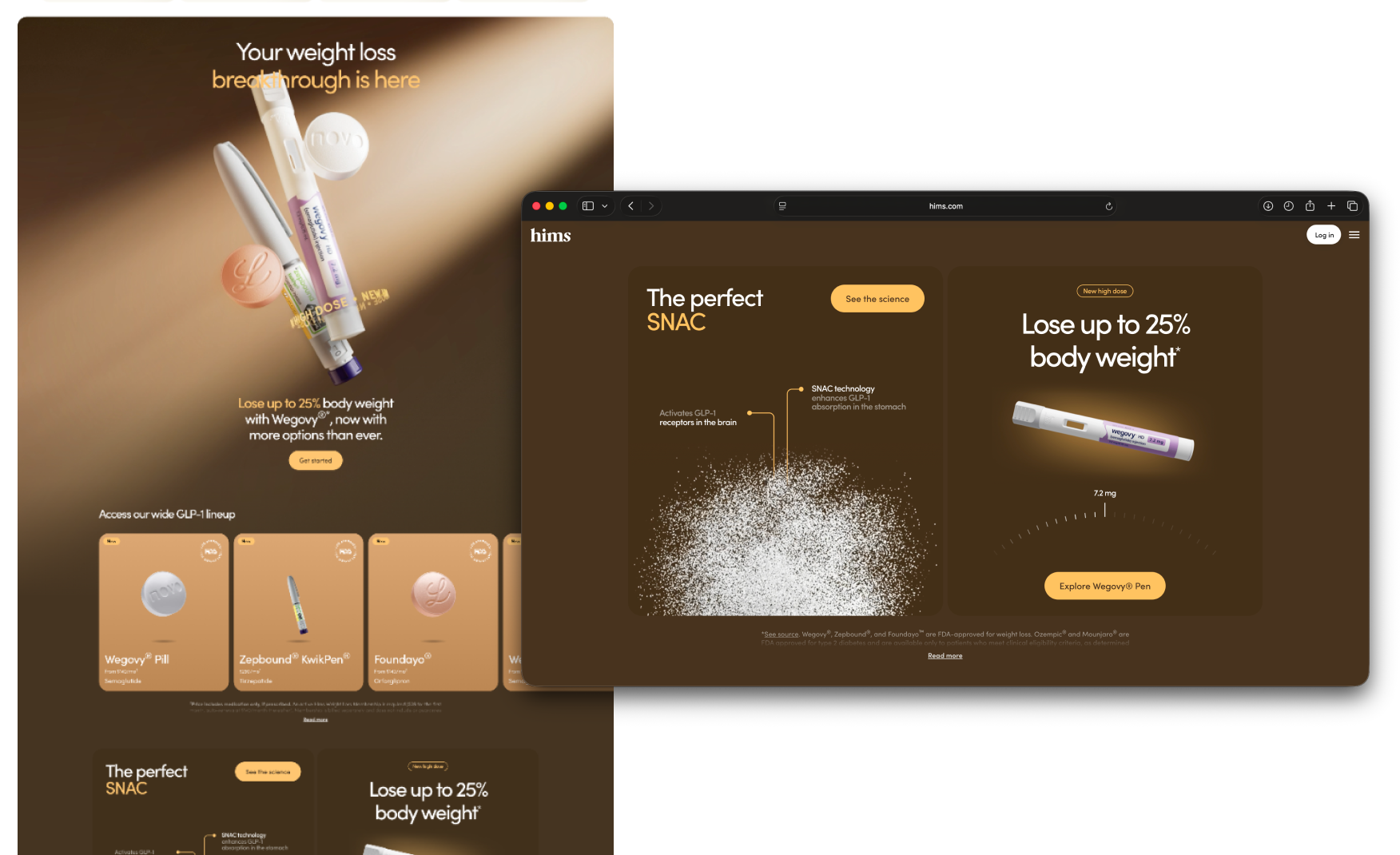
1. Weight Loss Occupies Four Consecutive Sections Before Any Other Category Appears 📜
After the four-tile condition row, the homepage runs four consecutive sections on weight loss.
The main weight-loss hero, a seven-product GLP-1 lineup grid, the SNAC pill section, and a Wegovy Pen high-dose section all appear before testosterone, and before any mention of the sexual health or hair categories that four of the six condition tiles point to.
The GLP-1 business logic is not in question.
Weight loss is the brand's largest and fastest-growing revenue line, and the site should lead with it. The problem is proportion: the visitor who arrived for hair regrowth, ED treatment, or testosterone support has to scroll through someone else's purchase journey before reaching their own.
The four-tile taxonomy sets up a promise of equal access. However the scroll that follows breaks it.
Homepage Scroll vs Category Representation 📊
What Suplex Would Fix First 💡
Priority 1 - Rebuild the Mid-Page Into a Four-Track Layout 🛠️
Replace the four-section weight-loss block with one featured weight-loss section plus three peer-sized blocks for hair, sexual health, and testosterone, each with its own hero, its own social proof, and its own CTA.
The weight-loss revenue line stays intact. The GLP-1 lineup grid stays intact. What changes is that the visitor who arrived for hair or for ED treatment no longer scrolls through someone else's entire purchase journey before reaching their own.
The four-track layout also opens a significant commercial opportunity that the current vertical scroll forecloses.
Cross-condition bundling, testosterone plus weight loss, hair plus health check, becomes structurally possible once all four categories have equal homepage real estate. At USD 2.35 billion in revenue, the incremental basket value of cross-condition subscriptions is a material revenue line.
Final Scorecard 🏆
Suplex Verdict 📝
Hims has built the most aesthetically confident telehealth site in the US market.
The naming, the visual system, the product education, the trust mechanics, and the labs expansion are each individually the best execution of their kind in American men's wellness D2C.
One structural decision is costing the site its perfect score.
The visitor who came for hair, or for sex, or for testosterone, has to scroll through four sections of someone else's weight loss purchase before reaching their own. The four-tile taxonomy at the top of the page promises equal access. The scroll that follows does not deliver it.
Overall Rating: ⭐⭐⭐⭐½ 4.5 / 5. One hierarchy restructure from a 5.
Suplex Design works with telehealth, wellness, and D2C healthcare brands across India, the UAE, and the US on homepage hierarchy, category taxonomy, and conversion-focused UX. If your brand is at a similar stage to Hims and you want an honest assessment of what is holding your site back, get in touch with our team of experts at Suplex Design.
Hi, I’m Rishabh Jain
I believe great design has the power to shape perception, build trust, and move businesses forward. That belief is what led me to found Suplex Design Studio, a global branding and packaging studio working with FMCG and D2C brands across markets.I started suplex at 25 with a clear intent, to create design that is strategic, thoughtful, and commercially meaningful. By 28, the studio had scaled globally, guided by a strong foundation in Integrated Design that I developed during my academic journey in London, where I was honoured with the Dean’s Award.
Over the years, I’ve had the opportunity to work with 100+ brands, from Fortune 500 organizations to family-run businesses, helping them build packaging and brand systems that create recall, relevance, and long-term value.
Suplex’s work has been recognized internationally, including the Manifest Award (2024), the Clutch Global Award (2025), and features on platforms such as Packaging of the World, The Dieline, and the World Brand Design Society.
None of this would be possible without the people behind the work. I’m deeply grateful to the suplex team, whose commitment, creativity, and attention to detail turn ideas into meaningful brand experiences every day.
At the heart of my work is a simple philosophy, design should be intentional, honest, and built to last, and that continues to guide everything we create at suplex.


Let’s Make It Happen
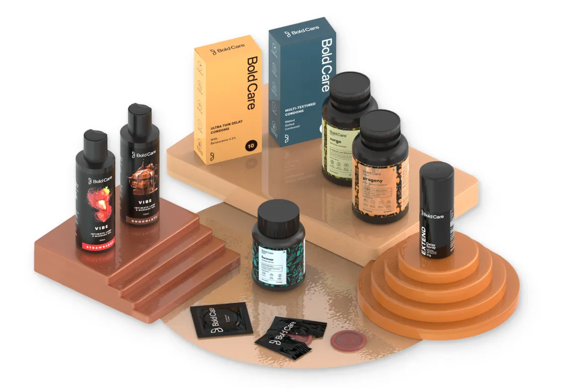
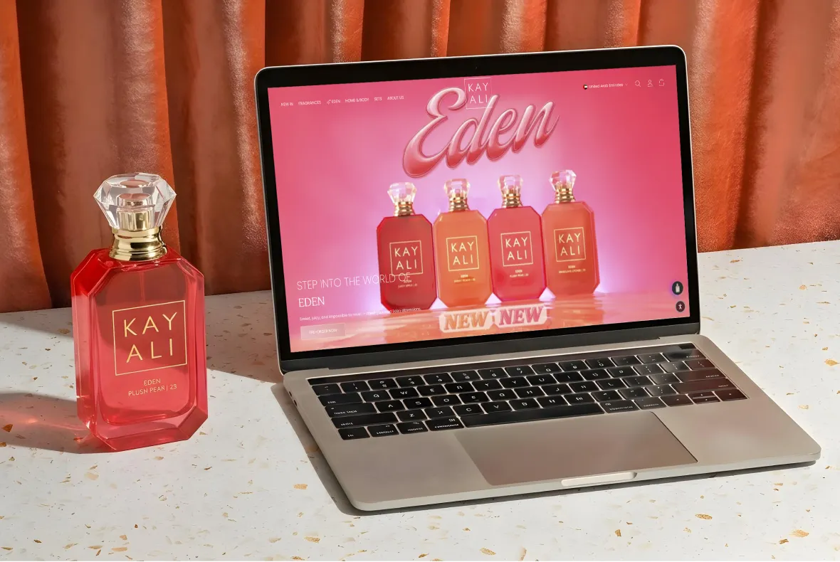
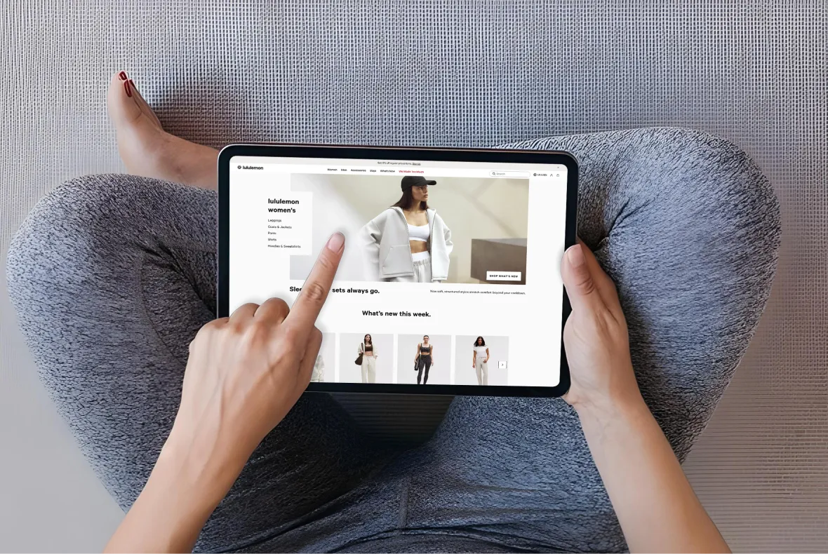
E-Commerce Success Stories

%201.webp)


.webp)
.webp)
Build Your D2C Business The Right Way
Build It With Suplex.


