Spanx
.avif)

Spanx
Spanx | Suplex's Verdict ⭐⭐⭐⭐
Suplex's Website Audit for Spanx at a Glance 📊
Sara Blakely started Spanx in 2000 with USD 5,000 in savings from selling fax machines door to door, cutting the feet off a pair of control-top pantyhose to solve her own visible-panty-line problem, and the company took no outside capital for the next two decades.
In October 2021, Blackstone acquired a majority stake at a USD 1.2 billion valuation, with Oprah Winfrey, Reese Witherspoon and Whitney Wolfe Herd joining as co-investors, and Blakely marked the close by giving every one of the company's roughly 500 employees two first-class plane tickets and USD 10,000 each, a moment that went viral in its own right.
Suplex Design analysed spanx.com across homepage brand identity, navigation, fit and size guidance, review depth and offer mechanics, and what follows is why a genuinely strong, fit-first Product Detail Page sits inside a homepage that does not carry any of Spanx's actual brand equity. This audit reflects the site as it stood in August 2026.
What Spanx's Website Gets Exceptionally Right ✅
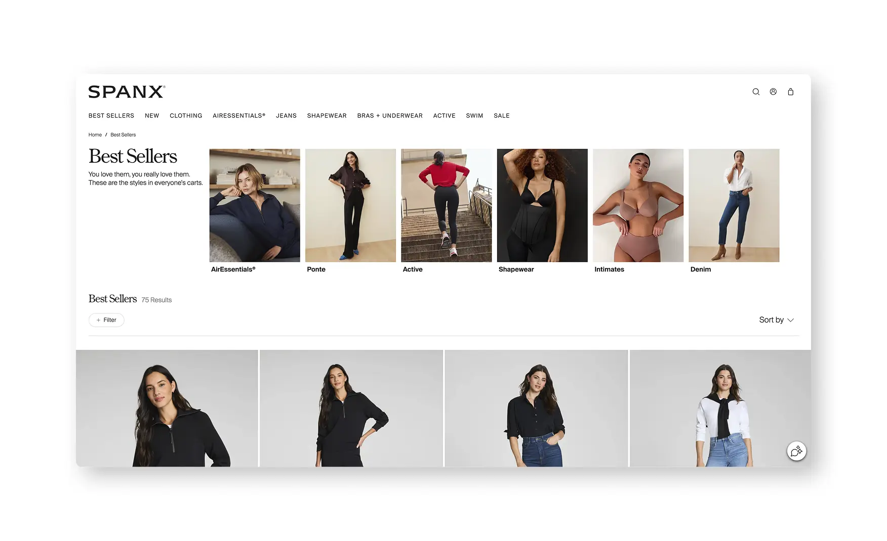
1. Category Filtering Is Built for How a Fit-Driven Shopper Actually Decides 🧭
Every category page opens on a Let's Get Dressed strip with clear entry points into pants, tops, jeans, loungewear, dresses and jumpsuits, and the filter panel beneath it runs color, size, type, length, collection and support level, a support-level filter that no comparable apparel brand offers.
Rishabh called this out directly as an outstanding addition, since support level is the one variable a shapewear buyer actually shops by and almost no other site lets a shopper filter on it directly.
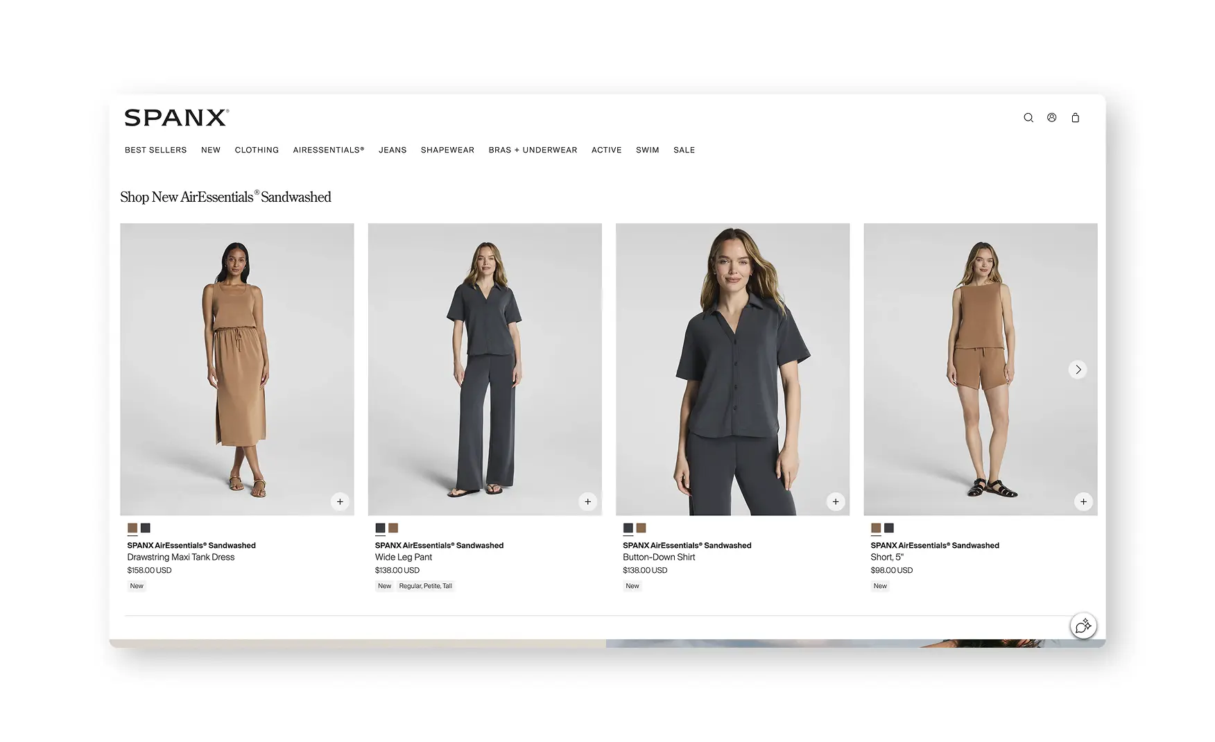
2. Card-Level Tags Carry Real Fit and Availability Information 🏷️
Product cards in the Shop New AirEssentials section show models on a clean white background, and hovering brings up a close-up view with tags reading New, Regular, Petite and Tall directly on the card, before a shopper has opened a single product.
Surfacing fit range at the card level, not just on the PDP, gives a shopper an early filter on whether a style even comes in their fit category, which matters more in shapewear than almost any other apparel vertical.
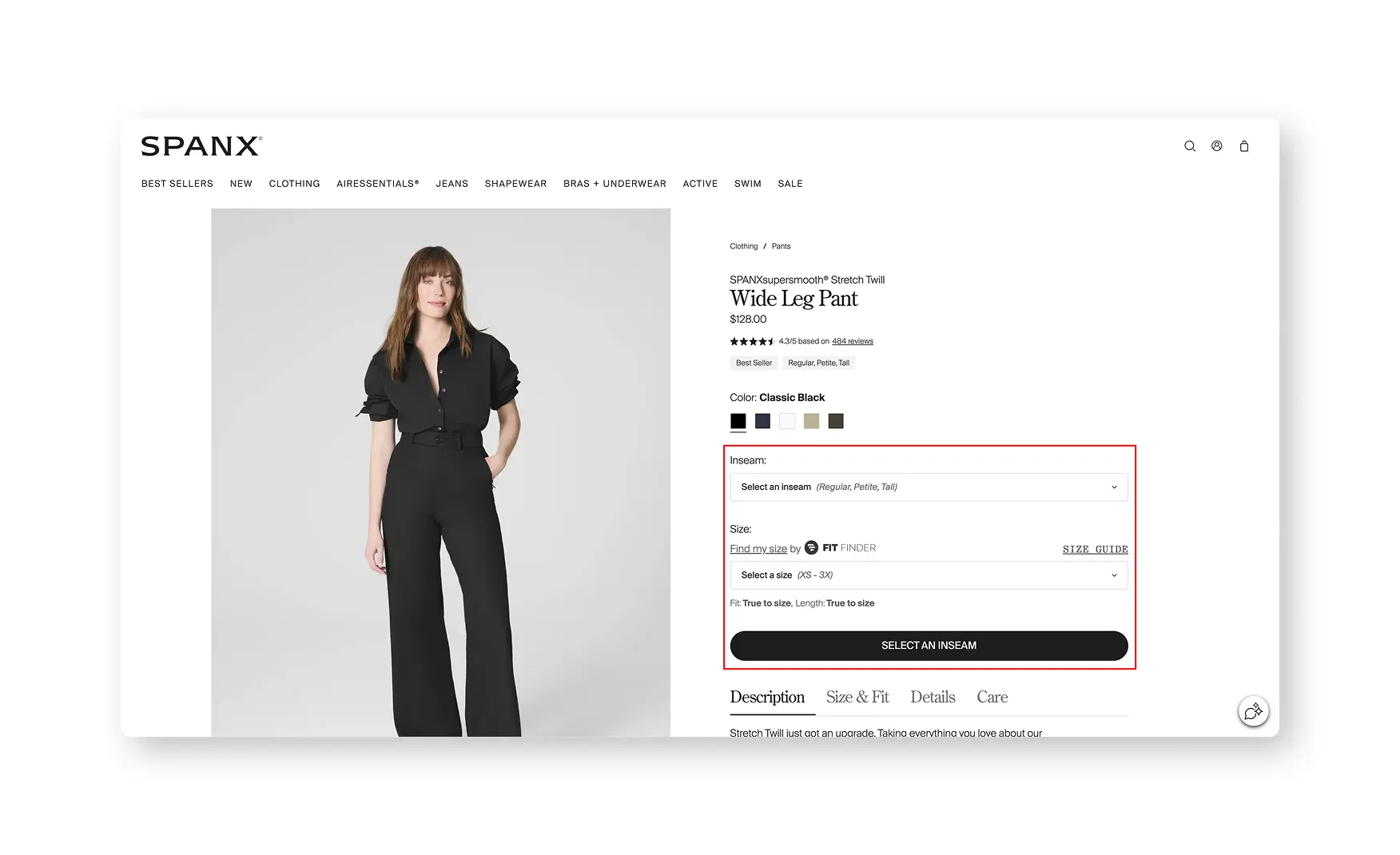
3. The PDP Fit Finder Solves the Exact Problem This Category Has 📐
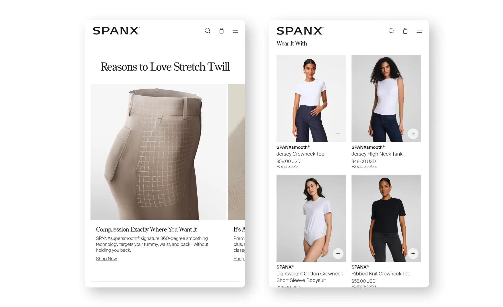
The SPANXsupersmooth Stretch Twill Wide Leg Pant page carries a Find My Size fit finder alongside a standard size guide, lets a shopper choose Regular, Petite or Tall inseam length directly as a variant, and states plainly that the fit and the length both run true to size.
Rishabh noted he had not seen inseam selection handled this directly on any other brand's PDP, and for a shapewear and denim brand specifically, replacing a vague size chart with an active fit finder and an explicit true-to-size claim is exactly the confidence-building mechanism this category needs to sell fit without a fitting room.
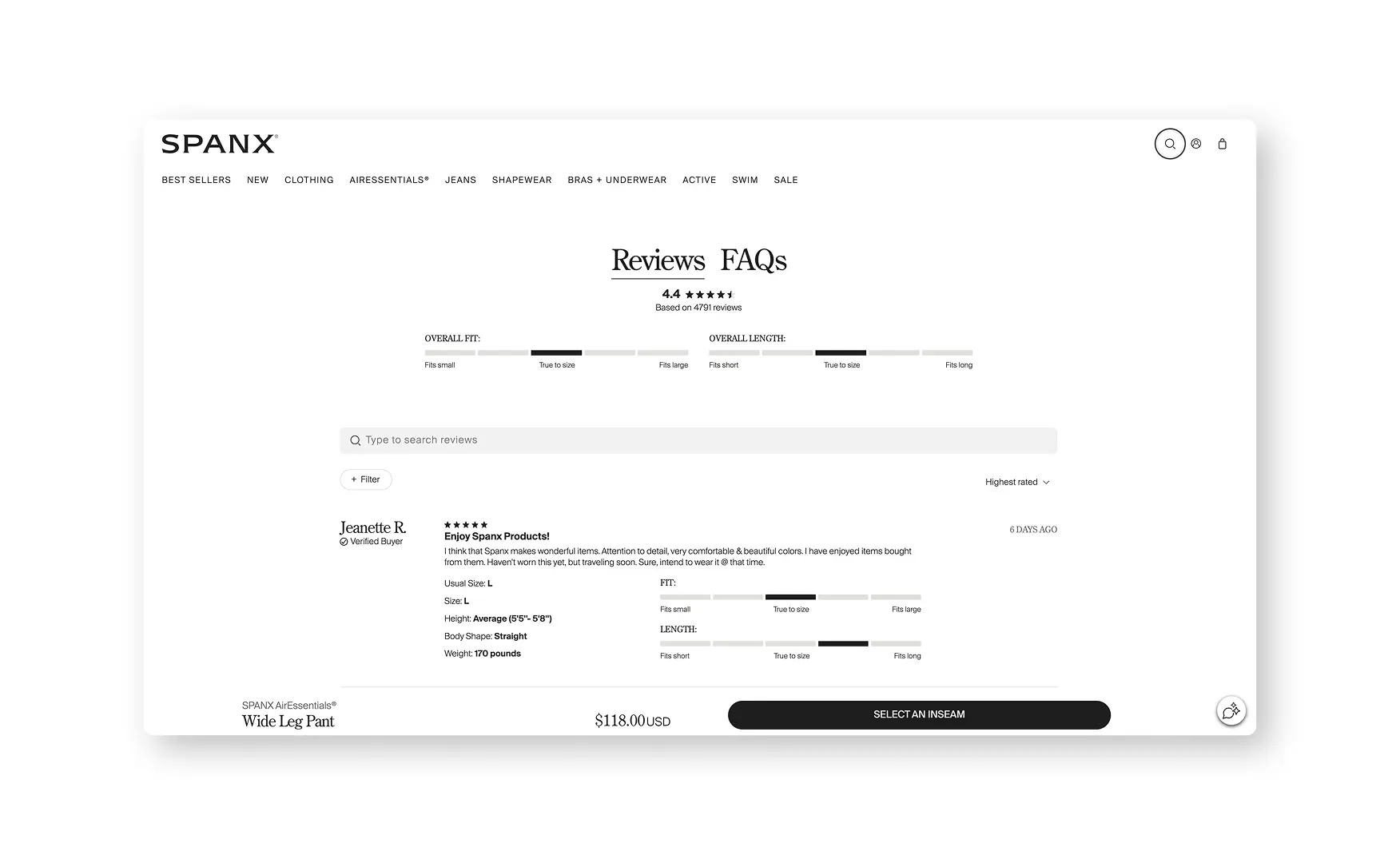
4. The Review Section Tells a Shopper Whether It Runs Small Before They Buy ⭐
The same PDP carries 471 reviews at a 4.3 out of 5 rating, and beneath the star average sits a visual bar showing whether the consensus is that the item runs small, fits true to size, or runs large, for both overall fit and overall length separately.
Individual reviews list the reviewer's usual size, the size they bought, their height, body shape and weight alongside their comments, and the whole set can be filtered by size, sale purchase, height, body shape or photos, then sorted by highest rated, most recent, most helpful or lowest rated.
Rishabh described this as amazingly done, and it is a genuinely rare level of granularity, the one gap he flagged is that despite a photo filter existing, no reviews currently carry customer photos.
5. The PDP Explains the Engineering, Not Just the Fabric 🎬
A Reasons to Love Stretch Well section runs video, likely CGI-assisted, showing how the compression technology and construction detailing actually work, positioned alongside a Wear It With module suggesting specific pairings, a button-up shirt, a scoop-neck tank, that match the garment's white leg band.
Explaining the mechanism behind the smoothing claim, rather than just asserting it works, is a stronger trust move for a shapewear brand than photography alone can achieve, since the entire premise of the category is a claim a shopper cannot verify by looking at a flat product shot.
Where the Spanx Experience Falls Short ⚠️
1. The Homepage Reads as Templated for a Brand With This Much Equity 📜
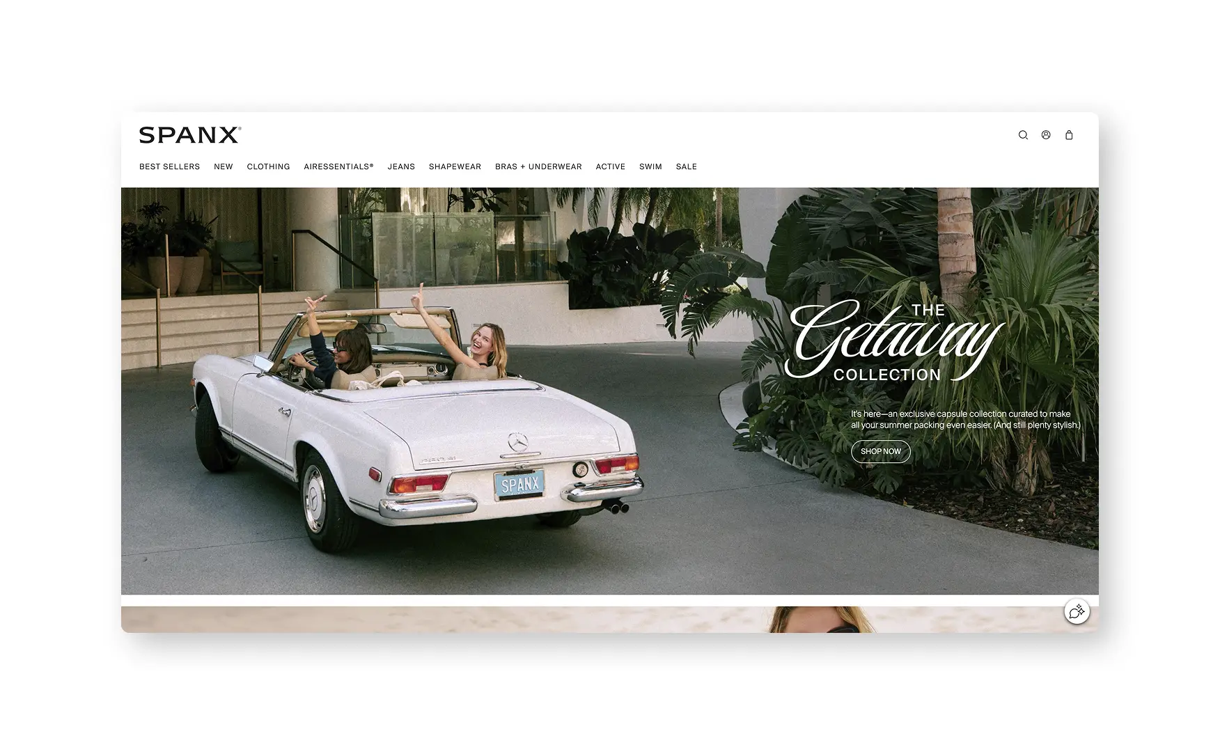
Rishabh was direct on this point, the homepage stacks one static banner after another, The Getaway Collection, Sun-Kissed AirEssentials, the Travel Edit, Swim, Seasonal Whites, Summer Shorts, Summer Shapewear, with Shop By Category appearing only once a visitor has scrolled past all of them.
None of that scroll signals anything specific to Spanx, in his words, any other brand could put up their own thing on it and it would be their brand, there is no originality or individuality that makes Spanx stand out despite the company being one of the most recognisable names in its category.
The stacked static banners would work harder as a single swipeable carousel, and a mission statement as strong as Spanx's, currently placed low on the page, deserves a position much closer to the top.
2. The Discount Popup Fires Before a Visitor Has Seen the Site 🎯
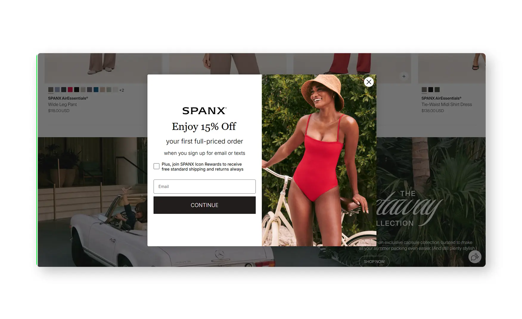
A 15 percent off popup appears within roughly ten seconds of landing on the homepage, before a first-time visitor has had a chance to actually look at the hero banner or the collection it is promoting.
This is a timing problem rather than a missing-offer problem, the incentive itself is reasonable, delaying it until a visitor has scrolled or spent more time on the page would let the homepage do its job before asking for an email address.
3. The About Us Page Undersells One of DTC's Most Famous Founder Stories 📖
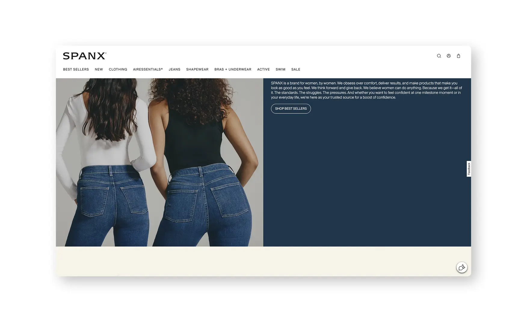
Rishabh found the About Us page split into two thin halves, a short paragraph on the brand's founding and a paragraph on The Spanx Effect technology, with no further story beyond that.
This is a real gap given who is telling it, Sara Blakely's own origin story, cutting the feet off a pair of control-top pantyhose with USD 5,000 in savings, is one of the most quoted founding stories in modern retail, and third-party retailers and press outlets currently tell it with more colour than Spanx's own site does.
What Suplex Would Fix First 💡
Priority 1 - Rebuild the Homepage Around a Distinct Spanx Identity 🔧
Replace the stacked seasonal banners with a single, deliberately Spanx-branded hero carousel, and move the mission statement and core category navigation significantly higher in the scroll.
This is the highest-leverage fix on the site, the brand equity Spanx has built over 25 years is not showing up on the one page every visitor lands on first, and that gap is a choice, not a limitation, given how distinctive the PDP experience already is.
Priority 2 - Delay the Discount Popup and Add Photos to the Review System 📸
Push the 15 percent off popup back to trigger on scroll depth or a longer time delay, and add a photo upload prompt to the review flow given the filter for photos already exists in the UI with nothing behind it.
Both are small, high-confidence fixes, the popup timing is purely a delay setting, and the photo filter proves the review platform already supports images, this is a content gap rather than a missing feature.
Priority 3 - Give the Founder Story Room to Breathe 📝
Expand the About Us page into a fuller telling of Sara Blakely's founding story and the Blackstone investment that followed it, with the same specificity and colour that press coverage and even third-party retailers currently use to tell it.
Spanx does not need to manufacture a brand story, it needs to stop underselling the one it already has.
Final Scorecard 🏆
Suplex Verdict 📝
Spanx has built the Product Detail Page a fit-driven category actually needs, a real fit finder, inseam selection, true-to-size messaging, and a review section that tells a shopper whether an item runs small before they commit, all backed by category filtering that goes further than almost any comparable brand.
None of that shows up on the homepage a first-time visitor actually lands on first, which currently reads as a stack of generic seasonal banners that could belong to any premium apparel site, with the brand's own mission statement pushed down near the bottom of the scroll.
The About Us page compounds the gap, Sara Blakely's founding story is one of the most recognisable in modern retail, and the site currently tells less of it than a third-party retailer page does.
None of the fixes here touch what already works. Give the homepage a distinct identity, delay the discount popup, and give the founder story room to breathe, and this is a 5.
Overall Rating ⭐⭐⭐⭐ 4 / 5.
Suplex Design works with apparel and fit-driven fashion brands across the US on Product Detail Page architecture, brand identity, and website audits. If your brand is at a similar stage to Spanx and you want an honest assessment of what is holding your site back, get in touch with our team of experts at Suplex Design.
Hi, I’m Rishabh Jain
I believe great design has the power to shape perception, build trust, and move businesses forward. That belief is what led me to found Suplex Design Studio, a global branding and packaging studio working with FMCG and D2C brands across markets.I started suplex at 25 with a clear intent, to create design that is strategic, thoughtful, and commercially meaningful. By 28, the studio had scaled globally, guided by a strong foundation in Integrated Design that I developed during my academic journey in London, where I was honoured with the Dean’s Award.
Over the years, I’ve had the opportunity to work with 100+ brands, from Fortune 500 organizations to family-run businesses, helping them build packaging and brand systems that create recall, relevance, and long-term value.
Suplex’s work has been recognized internationally, including the Manifest Award (2024), the Clutch Global Award (2025), and features on platforms such as Packaging of the World, The Dieline, and the World Brand Design Society.
None of this would be possible without the people behind the work. I’m deeply grateful to the suplex team, whose commitment, creativity, and attention to detail turn ideas into meaningful brand experiences every day.
At the heart of my work is a simple philosophy, design should be intentional, honest, and built to last, and that continues to guide everything we create at suplex.
























Let’s Make It Happen
E-Commerce Success Stories
%201.avif)






.avif)
.avif)
Build Your D2C Business The Right Way
Build It With Suplex.


