Glow Recipe
.avif)
Glow Recipe
Glow Recipe | Suplex's Verdict ⭐⭐⭐⭐
Suplex's Website Audit for Glow Recipe at a Glance 📊
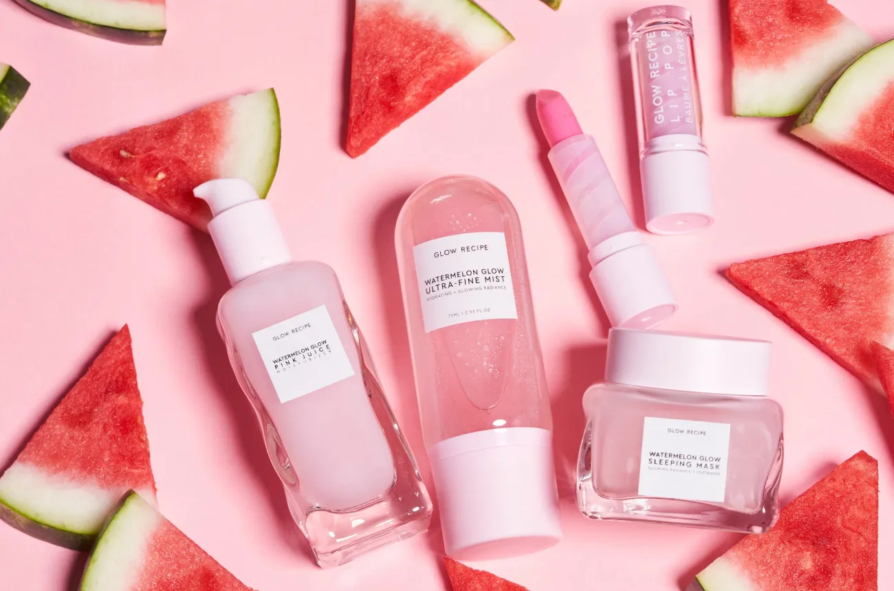
Sarah Lee and Christine Chang started Glow Recipe in 2014 with USD 50,000 of their own savings as a curation site importing Korean skincare into the US, pitched a version of that business on Shark Tank in 2015, and pivoted to their own in-house formulations in 2017, a shift that produced the Watermelon Glow line that remains the brand's signature product to this day.
Suplex Design analysed glowrecipe.com across brand identity, navigation, merchandising, product education and regional pricing, and what follows is why this is one of the most thoroughly educational skincare sites Suplex has audited, and where a real technical bug is undercutting that work for at least one regional audience. This audit reflects the site as it stood in August 2026.
What Glow Recipe's Website Gets Exceptionally Right ✅
1. A Fruit-Powered Identity That Stays Distinctive at Every Scroll 🍉
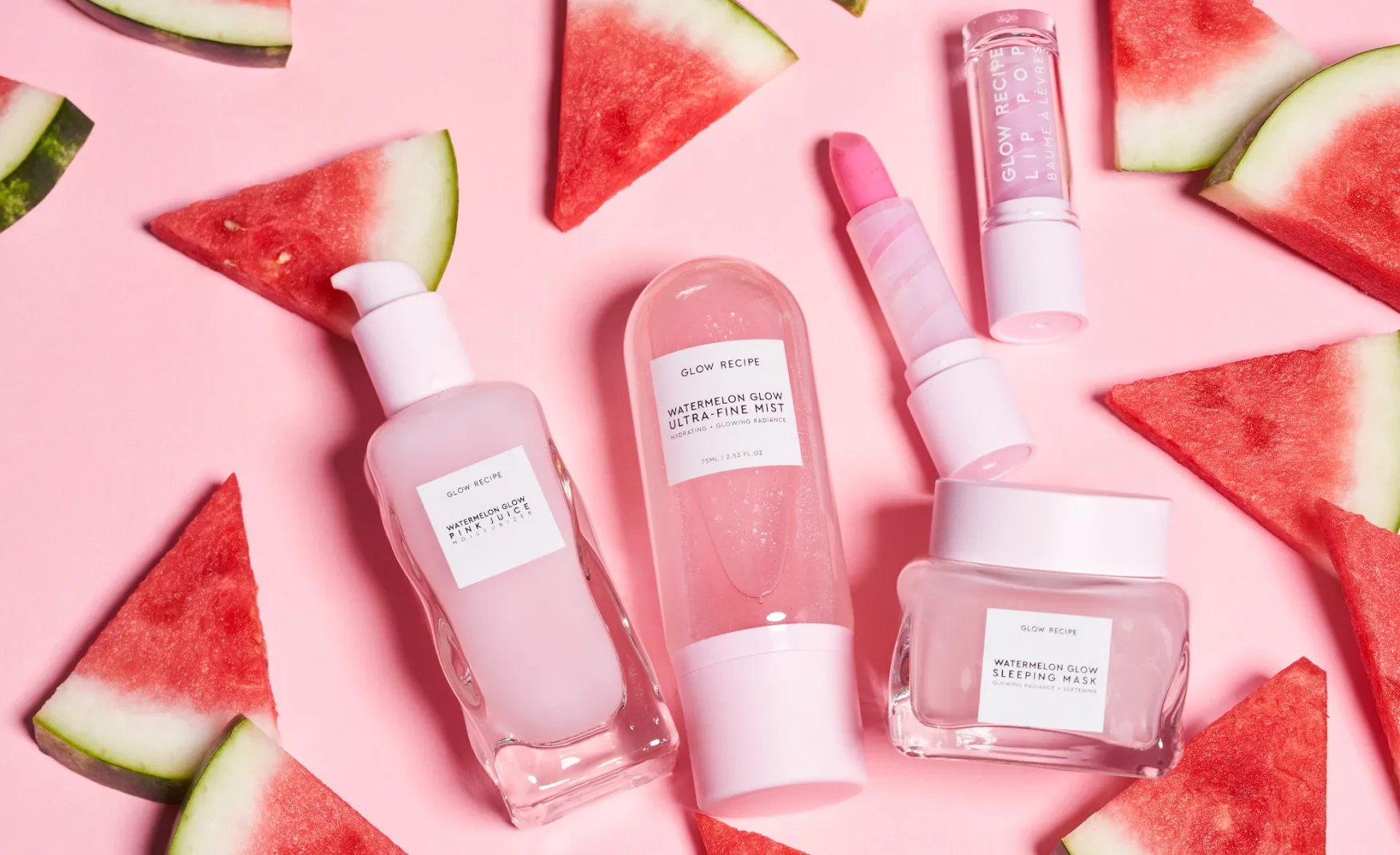
The Watermelon, Avocado and Banana product lines give Glow Recipe a visual and naming system no competitor can copy, and Rishabh noted the entire site reads as clean, minimal and consistently on-brand rather than templated, a difficult balance for a beauty brand with this many SKUs.
A rotating homepage banner keeps the identity current, cycling between the Banana Milk Kit and the Banana Glow Recipe Moisturizer Cream without ever breaking from the brand's established colour and photography system.
2. Navigation Lets a Shopper Self-Select by Concern, Ingredient or Routine Step 🧭
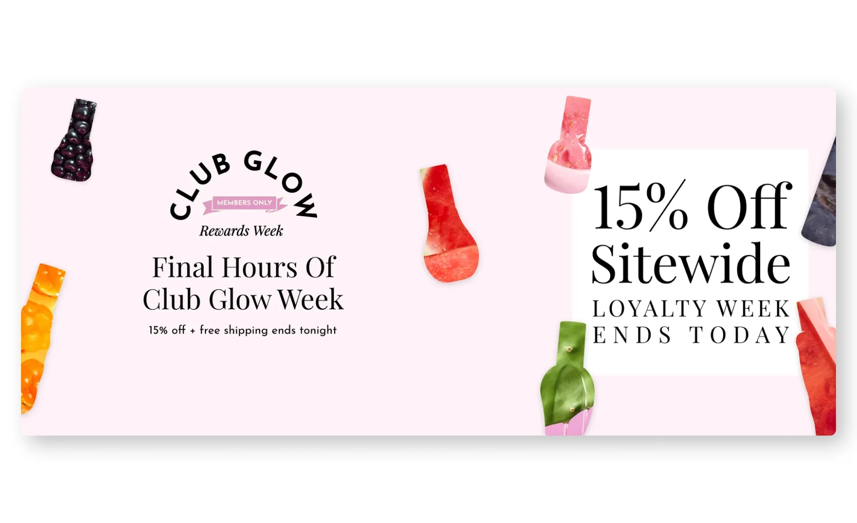
The primary navigation runs Shop All, New Arrivals, Best Sellers and Shop By, which opens into skin concern, Korean skincare routine step, and fruit, giving three distinct, genuinely useful ways into the catalogue rather than a single flat product grid.
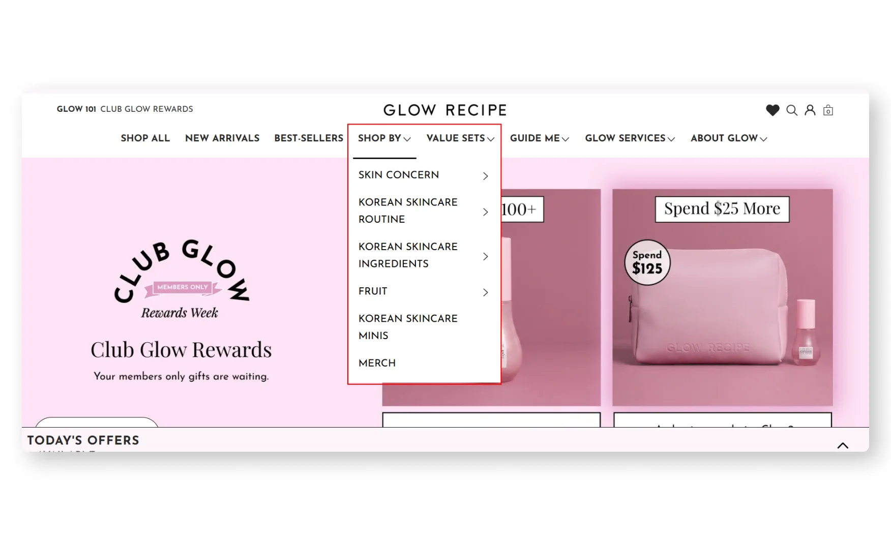
A separate Guide Me section houses the Skin Quiz and Glow 101 content, so a shopper who does not yet know what they are looking for has a clearly signposted path that sits apart from, rather than competing with, the standard shop navigation.
3. A 9 Question Skin Quiz and a Full Routine Guide De-Risk the Buy 🧴
The Skin Quiz runs roughly nine questions to profile a shopper's skin before recommending products, and the accompanying Routine 101 content lets a shopper build a path either by product step, cleanser, toner, eye cream, serum, moisturiser, sunscreen and enhancer, by skin concern, breakouts, pores, dryness, fine lines, dullness, redness or dark spots, or by ingredient, AHA, BHA, ceramides, niacinamide, polypeptides, vitamin C, salicylic acid, squalane or the triple retinoid blend.
A dedicated serum guide takes this further still, laying out a full comparison table of benefits, targets, clinically effective ingredients and claims across the entire serum range, which Rishabh singled out as something he had not seen many skincare brands attempt.
4. The PDP Backs Every Claim With a Specific Clinical Number 🧪
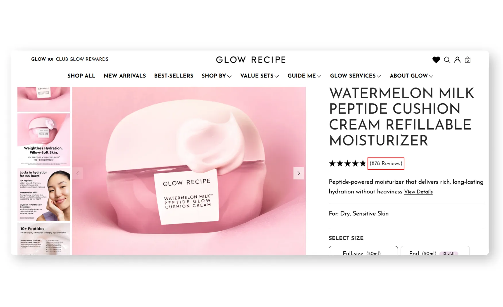
The Watermelon Milk Peptide Cushion Cream page states a 4.8 rating across 857 reviews, then backs its hydration claim with real figures, plus 484 percent immediate hydration, plus 307 percent even after 10 layers, and 34 percent hydration maintained at 100 hours after a single application, all drawn from a named 33-participant consumer use study.
A separate benefit strip states the formula delivers up to 100 hours of hydration, strengthens the skin barrier, and is both fragrance-free and silicone-free, while a clinical results module beneath it breaks out specific percentage improvements in crow's feet depth, skin plumpness and elasticity.
5. Video Content Shows the Product Being Made & In Use 🎥
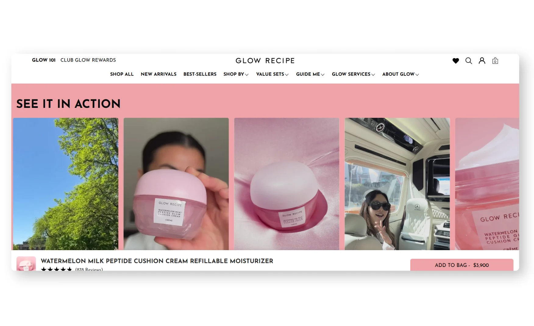
A See It In Action section on each PDP runs multiple videos, footage from the manufacturing process alongside people applying and using the product, which is a materially different trust mechanism than the styled lifestyle video most beauty brands rely on.
Showing manufacturing footage specifically is a strong, underused move for a brand whose entire positioning rests on formulation quality, it turns an abstract ingredient claim into something a shopper can watch happen.
6. The Review Section Is Genuinely the Best Suplex Has Audited ⭐
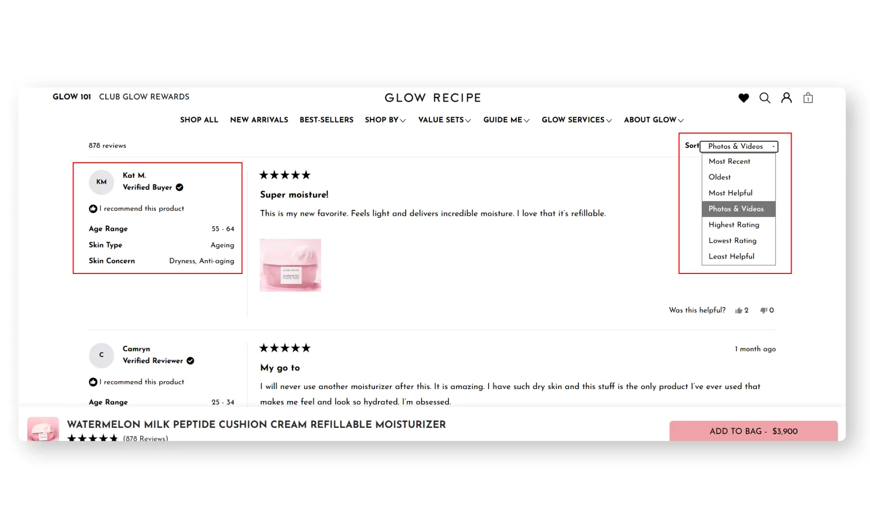
The Cushion Cream review section states its 4.8 rating across 857 reviews, then breaks out a review summary by theme, hydration, texture, glow, makeup and fragrance, before showing individual reviews with the reviewer's photo, age, skin type and specific skin concern attached to each entry.
Being able to filter reviews by rating, age range, skin type and skin concern simultaneously lets a shopper find someone who genuinely matches their own profile, rather than reading generically positive feedback with no context for whether it applies to them.
7. Retention Is Built Into a Real Points Economy, Not Just a Loyalty Badge 🎁
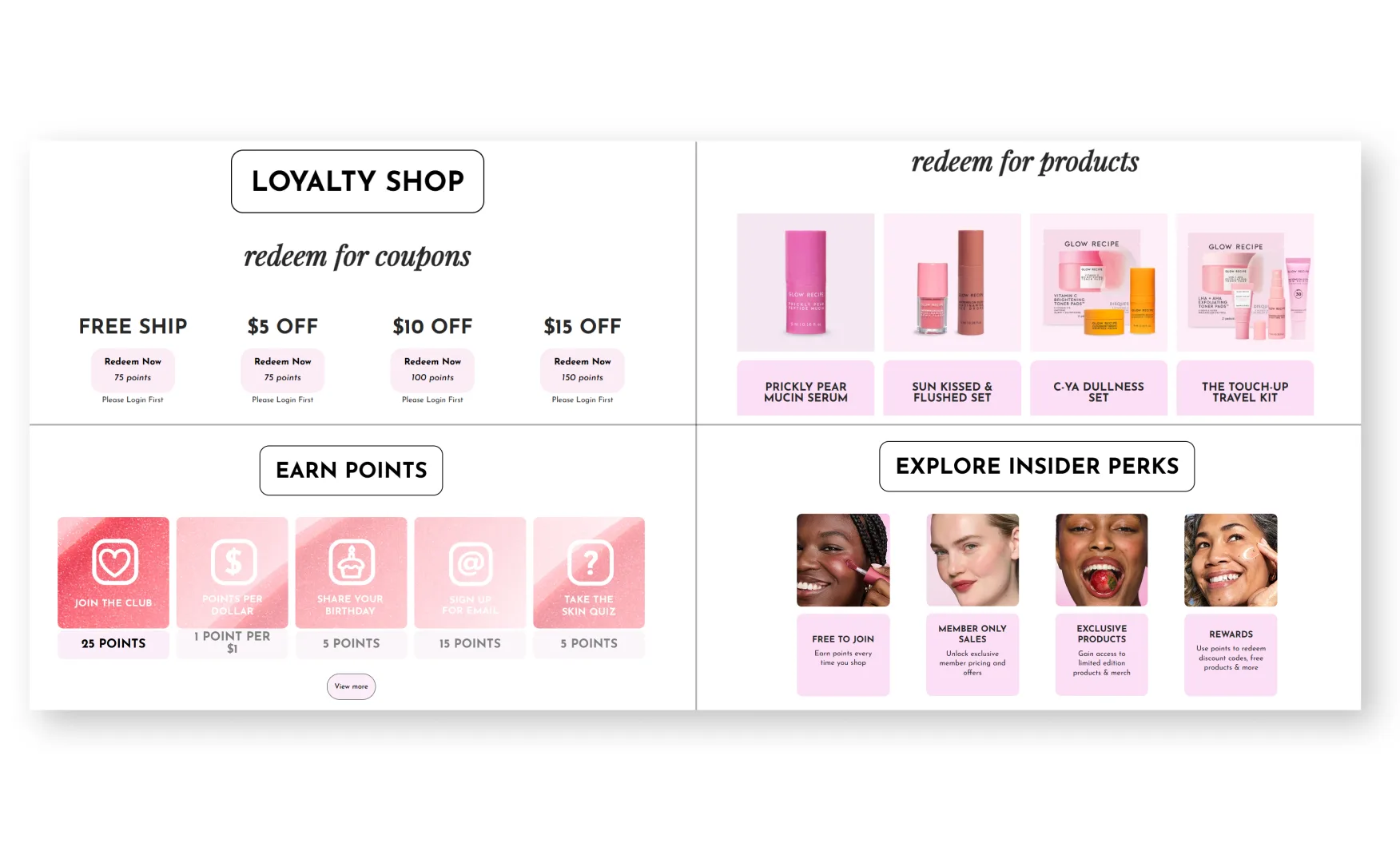
Club Glow Rewards lets a member redeem points against specific, named products, the Watermelon Glow Niacinamide Serum for 75 points, the Sun-Kissed and Flushed set for 100 points, the Touch-Up Travel Kit for 200 points, rather than the vague dollars-off-your-next-order mechanic most beauty loyalty programs default to.
An exclusive Stretch Tote welcome gift, free with a first order above USD 55 using a promo code, gives a first-time visitor a genuine, tangible incentive to complete a larger first purchase, and merchandising an actual physical item rather than a percentage discount reinforces the brand's identity at the same time it drives conversion.
Where the Glow Recipe Experience Falls Short ⚠️
1. Regional Pricing Displays in Mixed Currencies 🌐
Rishabh found that browsing the site from an India IP address, the Glow Recipe Experience kit and other bundle pages showed roughly half the prices on the page in US dollars and the other half in Indian rupees, on the same screen, at the same time.
This is a genuine functional bug rather than a design opinion, a shopper cannot reliably compare two products priced in different currencies on the same page, and it undercuts the trust the rest of the site works hard to build.
2. Collection Cards Carry No Rating Despite Excellent PDP Reviews 📜
Every card on the Best Sellers and New Arrivals grids shows the product image, name and price, but not a single card carries a star rating or review count, despite individual PDPs one click away showing detailed, highly credible review data.
For a brand whose review section is genuinely a category standout, hiding that exact proof until a shopper clicks into a product wastes the strongest trust signal Glow Recipe has at the one stage of the funnel, browse, where a shopper is actively comparing options.
Screenshot: Glow Recipe Best Sellers collection grid showing product cards with no star rating or review count. Re-capture glowrecipe.com/collections/best-sellers at 1440.
3. Multi-Product Kits Show One Combined Image and Nothing Else 🖼️
Rishabh noted the Glow Recipe Experience Kit page currently shows a single image of all the included products grouped together, with no individual product shots, ingredient callouts or A+ creative for any one item in the set.
A shopper considering a multi-product kit has to leave the page and search for each individual product separately to understand what they are actually buying, which adds real friction to what should be an easy, pre-bundled purchase decision.
What Suplex Would Fix First 💡
Priority 1 - Fix the Mixed-Currency Display for International Storefronts 🔧
Force a single, consistent currency across every page for a detected region, and add a manual currency selector as a fallback for any shopper the automatic detection gets wrong.
This is a trust-breaking bug rather than a design preference, and it should sit ahead of every other fix on this list given how directly it undermines a purchase decision.
Priority 2 - Surface Star Ratings on Every Collection Card 📝
Add the existing star rating and review count to every card on the Best Sellers and New Arrivals grids, matching the data already displayed prominently on each PDP.
The review content itself does not need to change, this is purely a template update to expose data the brand already has.
Priority 3 - Give Multi-Product Kits Individual Product Imagery 📦
Add individual product shots and a short ingredient or benefit callout for each item inside a kit page, rather than relying on a single combined image.
The brand has already produced this creative for each product individually elsewhere on the site, reusing it inside the kit page is a production task rather than a new design brief.
Final Scorecard 🏆
Suplex Verdict 📝
Glow Recipe has built the most thorough skincare education layer Suplex has audited, a genuine skin quiz, an ingredient-and-concern routine guide, and PDPs that back every hydration and elasticity claim with a specific percentage from a named consumer study.
The review section in particular is a category standard other beauty brands should study, reviewer photos, age, skin type and concern all attached to each entry, filterable in combination rather than one at a time.
What holds the score back is not a strategy gap, it is execution, a real currency display bug undermining trust for at least one regional audience, collection cards that hide the brand's best proof until a shopper clicks in, and kit pages that ask a shopper to do research the brand has already done elsewhere on the site.
None of these fixes touch the education or the science, which are both already excellent. Fix the currency bug, surface the ratings, and give kits their own imagery, and this is a 5.
Overall Rating ⭐⭐⭐⭐ 4 / 5.
Suplex Design works with beauty and skincare D2C brands on Product Detail Page architecture, trust signal placement, and website audits. If your brand is at a similar stage to Glow Recipe and you want an honest assessment of what is holding your site back, get in touch with our team of experts at Suplex Design.
Hi, I’m Rishabh Jain
I believe great design has the power to shape perception, build trust, and move businesses forward. That belief is what led me to found Suplex Design Studio, a global branding and packaging studio working with FMCG and D2C brands across markets.I started suplex at 25 with a clear intent, to create design that is strategic, thoughtful, and commercially meaningful. By 28, the studio had scaled globally, guided by a strong foundation in Integrated Design that I developed during my academic journey in London, where I was honoured with the Dean’s Award.
Over the years, I’ve had the opportunity to work with 100+ brands, from Fortune 500 organizations to family-run businesses, helping them build packaging and brand systems that create recall, relevance, and long-term value.
Suplex’s work has been recognized internationally, including the Manifest Award (2024), the Clutch Global Award (2025), and features on platforms such as Packaging of the World, The Dieline, and the World Brand Design Society.
None of this would be possible without the people behind the work. I’m deeply grateful to the suplex team, whose commitment, creativity, and attention to detail turn ideas into meaningful brand experiences every day.
At the heart of my work is a simple philosophy, design should be intentional, honest, and built to last, and that continues to guide everything we create at suplex.





















Let’s Make It Happen
E-Commerce Success Stories

%201.avif)






.avif)
.avif)
Build Your D2C Business The Right Way
Build It With Suplex.


