Best Ecommerce Website Design: What Makes Stores Convert
.avif)
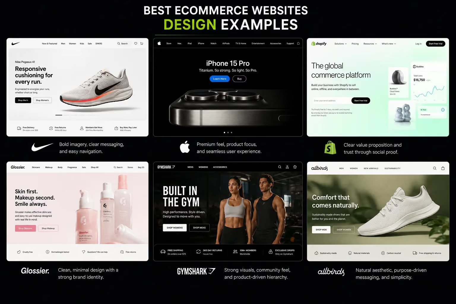
Best Ecommerce Website Design: What Makes Stores Convert
The best ecommerce website design is not the one that wins a design award. It is the one that converts strangers into buyers, retains their trust through checkout and makes them come back.
Most articles on this topic show you screenshots of visually impressive stores without explaining what is actually working commercially.
This blog does both, the principles behind high-converting ecommerce design, real examples by category, the mistakes that kill conversions and the commercial logic connecting every design decision to revenue.
What the Best Ecommerce Website Design Actually Achieves
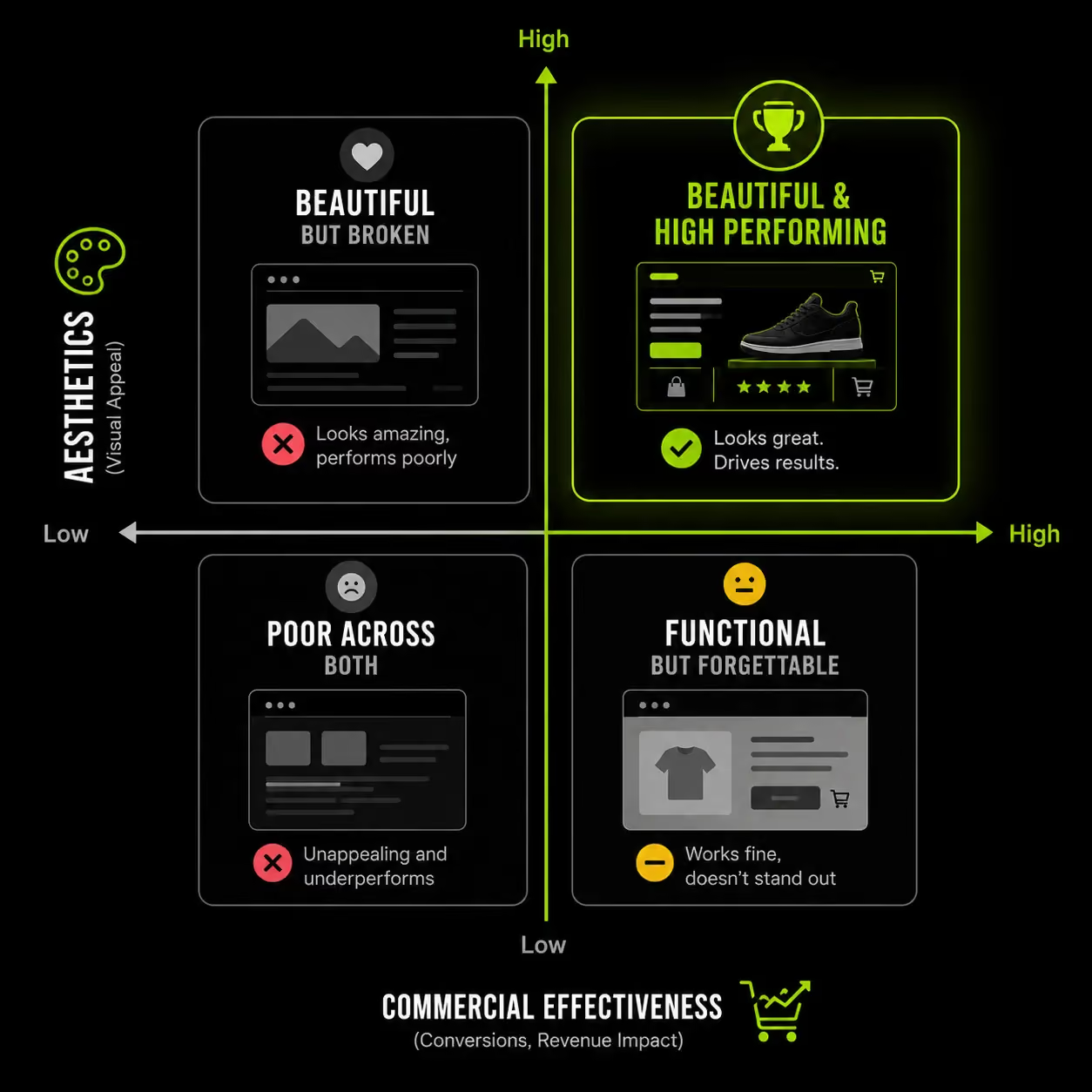
The real question in ecommerce design is not “how does it look?” but “what does it do?” Every design decision either moves a customer closer to purchase or creates friction that drives them away.
Award-winning design and high-converting design are often very different. Many visually impressive ecommerce stores rely on heavy animations, experimental layouts, and slow-loading assets that hurt mobile performance and conversion rates.
If a store takes too long to load, most visitors leave before the design is even seen. Strong ecommerce design is not just visually appealing.
It must also load fast, communicate clearly, build trust, and guide customers smoothly toward checkout. The best ecommerce stores achieve all four at the same time.
The TCMB Framework: Four Outcomes That Define Ecommerce Design Excellence
The best ecommerce design achieves four outcomes at the same time:
- Trust: Does the store make a new visitor feel confident spending money? Design builds trust through visual quality, social proof, professionalism, and clear credibility signals.
- Clarity: Can customers immediately understand what the brand sells and who it is for? Strong hierarchy and communication matter more than visual complexity.
- Momentum: Does the experience guide users smoothly toward purchase? Confusing layouts, too many CTAs, and unnecessary friction reduce conversions.
- Brand Fit: Does the visual language match the product positioning and customer expectations? A luxury skincare brand and a functional supplement brand require completely different design signals.
Great ecommerce design is driven by business strategy, customer psychology, and purchase behavior, not just aesthetics. Many redesigns fail because they improve visuals without fixing friction in the buying journey.
With average cart abandonment close to 70%, most conversion losses come from friction introduced at the wrong stage of the customer experience.
7 Design Principles Behind Every High-Converting Ecommerce Website
These are not visual preferences. They are behavioural triggers rooted in how purchase decisions are made online. Each one has a commercial rationale and a measurable consequence when ignored.
1. Mobile-First Is Not a Feature: It Is a Foundation
Mobile now drives the majority of ecommerce traffic globally, and in markets like the UAE and Gulf region, smartphone usage is even higher. Mobile is no longer a secondary experience. For most ecommerce brands, it is the primary sales channel.
There is a major difference between mobile-responsive and mobile-first design. Responsive design shrinks a desktop experience onto a smaller screen.
Mobile-first design builds the experience around mobile behavior from the start. That changes everything from navigation structure and tap target sizing to image loading and checkout usability.
A strong mobile-first store prioritizes fast-loading pages, thumb-friendly navigation, clear product discovery, and checkout flows that work smoothly without zooming or excessive typing. Small UX failures on mobile compounds quickly into lost revenue.
A simple test: can a customer on a 6-inch screen find a product, select a variant, add to cart, and complete checkout in under 60 seconds without friction? If not, the mobile experience is actively costing sales.
2. Homepage Design: Answering Three Questions in 5 Seconds
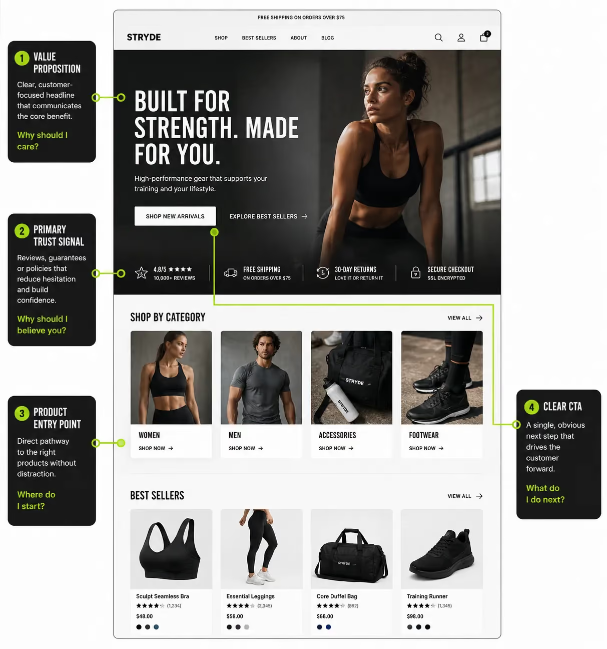
Every ecommerce homepage must answer three questions immediately: What do you sell? Who is it for? Why should customers trust you? These are not copywriting questions. They are design hierarchy decisions.
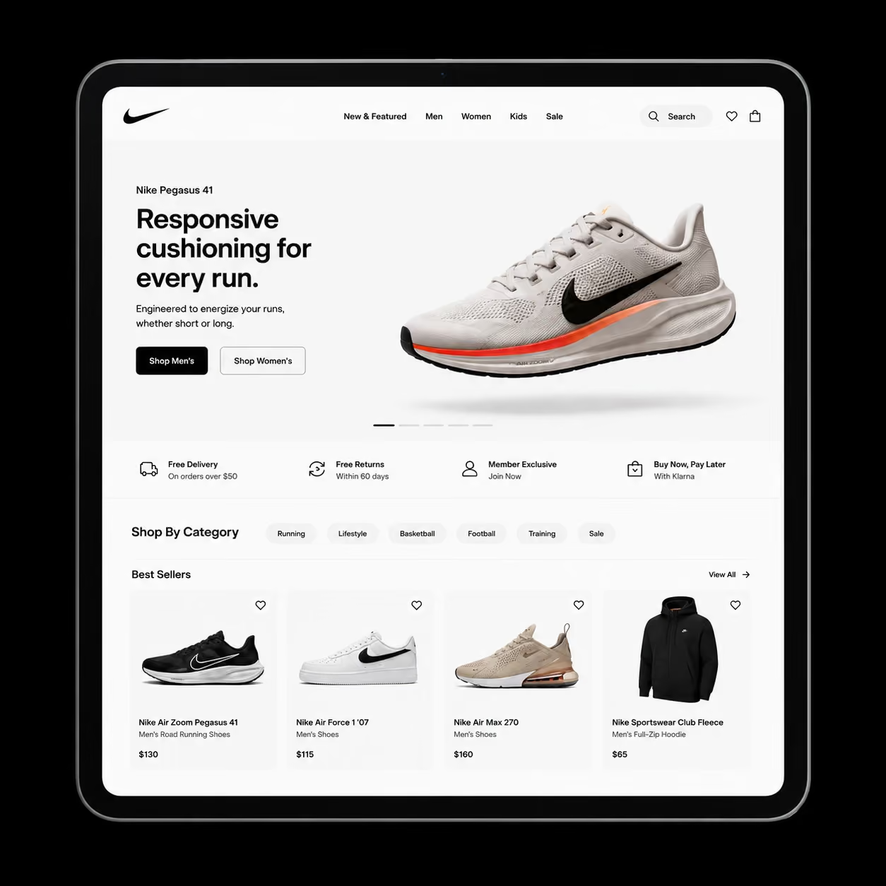
Visitors decide within seconds whether to stay or leave. The hero section should clearly communicate the product and value proposition, not rely on abstract branding or oversized lifestyle imagery that hides what is actually being sold.
A strong homepage flow usually follows this structure: hero section → social proof → featured categories or products → trust signals → deeper navigation for users ready to explore further.
For UAE and Gulf ecommerce brands, homepage design also needs to account for bilingual layouts, RTL support for Arabic, and trust signals that resonate with regional audiences rather than generic Western ecommerce patterns.
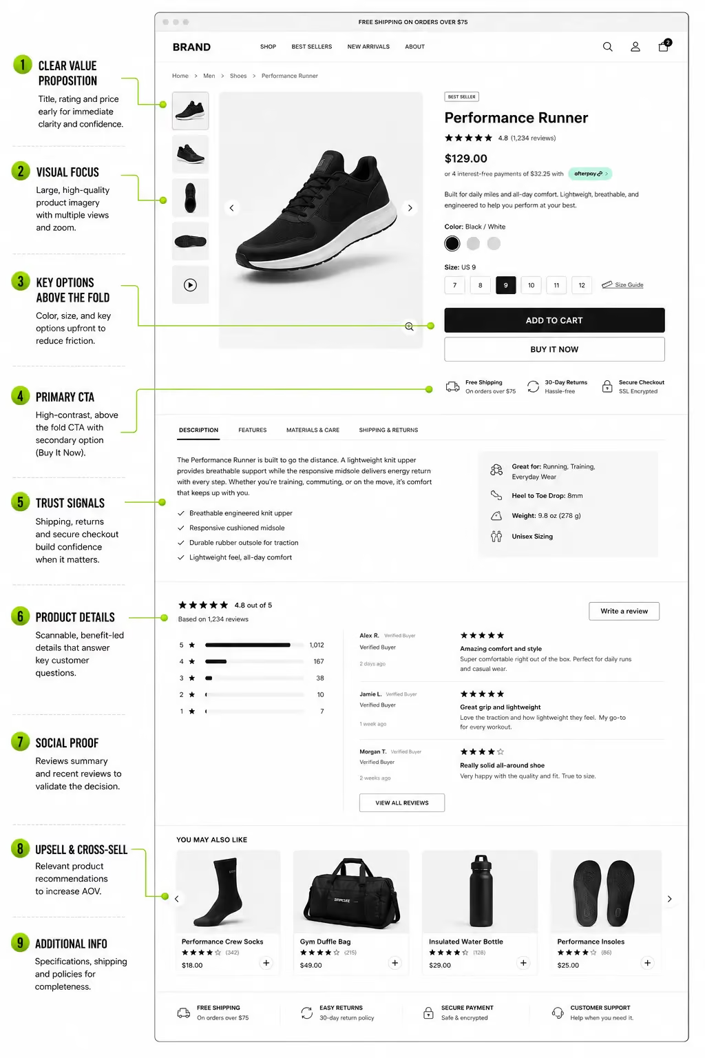
3. Product Page Design Is Where Purchase Decisions Happen
Most ecommerce brands over-invest in homepage design and under-invest in product pages. The homepage attracts visitors. The product page drives revenue.
High-converting product pages follow a clear hierarchy: product title and value proposition → price and variants → primary CTA above the fold → trust signals → product imagery → detailed benefits → FAQs → upsells and cross-sells.
Product imagery is one of the strongest conversion drivers. Multi-angle photos, lifestyle shots, zoom functionality, and short videos reduce hesitation far more effectively than copy alone, especially for fashion, supplements, beauty, homeware, and food brands.
The Add to Cart button also matters more than most brands realize. Placement, contrast, size, and CTA wording all influence click-through rates and completed purchases. Small UX improvements on product pages can produce major conversion gains without increasing traffic.
For D2C health and supplement brands, trust presentation is critical. Ingredient transparency, certifications, reviews, and clinical claims must be visually structured in a way that builds credibility quickly.
Customers do not just evaluate the product. They evaluate whether the product feels trustworthy enough to buy.
4. Navigation and Information Architecture: The Invisible Revenue Driver
Poor navigation quietly reduces conversions. If customers cannot find products quickly, they leave. Navigation is not a cosmetic detail.
It is the structure that determines whether paid traffic reaches a product page or exits the store.
Strong ecommerce navigation minimizes friction through clear category structures, intuitive menus, effective search, and zero dead-ends.
Categories should reflect how customers shop, not how products are stored internally.
Common mistakes include overcrowded menus, confusing category labels, missing breadcrumbs, and weak search functionality that cannot handle slight keyword variations.
For brands with large catalogs such as fashion, FMCG, supplements, or homeware, navigation and filtering become commercially critical.
A well-organized 500-product store will consistently outperform a poorly structured one, even with identical products.
The navigation model should also match catalog complexity. Smaller stores with fewer SKUs often benefit from simple, flat navigation.
Larger catalogs with multiple buying factors like size, ingredients, or use cases require layered navigation and progressive filtering. Using the wrong structure creates friction and lowers conversion rates.
5. Page Speed Is a Design Decision
Performance is not a technical layer added after design. It is shaped by design decisions from the start: image formats, font usage, animation weight, video behavior, and third-party scripts all affect loading speed.
Every visual choice has a performance cost. High-converting ecommerce stores are designed with speed in mind from the first wireframe because slow sites lose both rankings and revenue.
Google’s Core Web Vitals benchmarks LCP under 2.5 seconds, CLS under 0.1, and INP under 200ms. Most ecommerce stores fail at least one of these metrics on mobile, which directly impacts user experience and search visibility.
Practical optimizations include using WebP images, limiting custom font weights, avoiding autoplay video on mobile, and lazy loading below-the-fold assets while prioritizing hero and product imagery.
For Shopify stores, the biggest performance issues usually come from heavy themes, excessive app scripts and uncompressed images. Even a few unnecessary apps can significantly slow mobile load times without changing the visual design at all.
6. Trust Signals: The Design of Conviction
A first-time visitor has no reason to trust your brand. Ecommerce design builds that trust through visible proof: reviews, certifications, refund policies, verified purchase badges, press mentions, and credible brand presentation.
Placement matters as much as the trust signal itself. A badge hidden in the footer has little impact, while the same badge beside the Add to Cart button can directly influence conversion. Visible review ratings at the top of the product page also shape buying intent before customers read product details.
For UAE and Gulf ecommerce brands, regional trust signals often perform better than global ones. Payment methods like Tabby, Tamara, and Cash on Delivery reduce friction because customers instantly recognize them. Arabic-language support and local partnerships further strengthen credibility.
Execution quality is critical. Blurry badges, outdated widgets, or poorly integrated review sections can reduce trust instead of building it. Trust signals only work when they look trustworthy themselves.
7. Brand Cohesion: Design as Commercial Communication
Brand cohesion is not just about matching colours or fonts. It is about creating a visual language that instantly communicates positioning, audience, and perceived value.
A luxury skincare brand should feel premium before customers see the price. A supplement brand should communicate credibility and effectiveness before any clinical claim is read.
These impressions are shaped through typography, spacing, photography style, colour palette, whitespace, and micro-copy.
Inconsistency quickly damages trust. If a brand’s Instagram or TikTok presence feels polished but the website looks generic or disconnected, customers immediately notice the gap. The website stops feeling like a natural extension of the brand.
For D2C brands especially, the ecommerce experience must continue the visual identity already built across social channels. Customers expect consistency when moving from social media to the website. When that continuity breaks, confidence and purchase intent decline.
Best Ecommerce Website Design by Category: What Works in Each Vertical
There is no universally "best" ecommerce design. What drives conversion for a luxury fragrance brand actively undermines a functional supplement brand. Category context determines design priorities.
D2C Brands: Storytelling Meets Speed-to-Purchase
D2C ecommerce design must achieve two goals at the same time: build brand belief and drive fast purchasing decisions. The best D2C stores balance both by separating storytelling from conversion architecture.
The homepage acts as the brand narrative: visual, emotional, and identity-driven. The product page shifts into conversion mode with clear structure, strong trust signals, and a frictionless path to checkout.
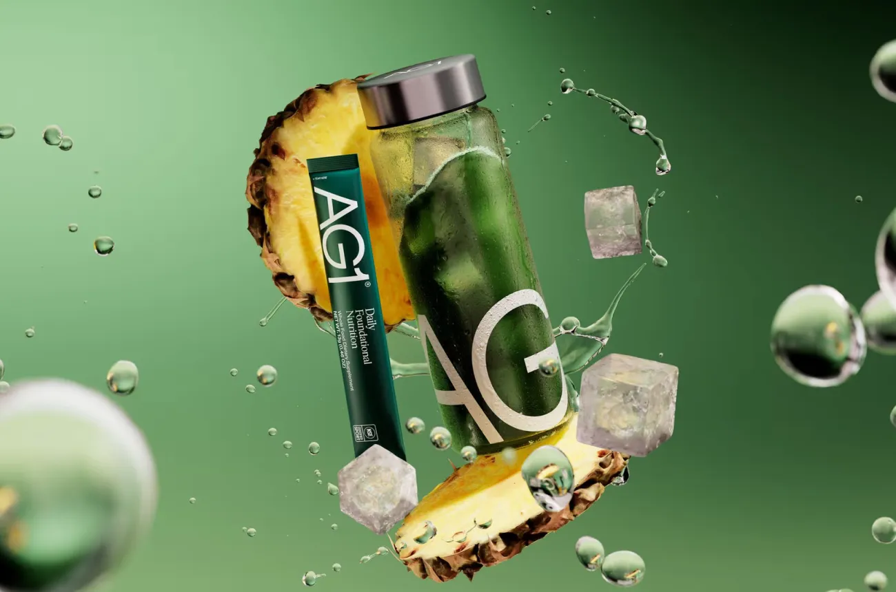
High-performing D2C brands like Glossier, Allbirds, and AG1 reinforce a single core positioning across every design element. Navigation stays simple, photography feels intentional, copy remains clear, and the path from landing to checkout is kept short.
The most common mistake is over-prioritizing storytelling while weakening the purchase journey. Beautiful branding alone does not convert if customers struggle to find products, understand pricing, or move quickly to checkout.
Supplement and Health Brands: Trust Is the Design Problem
In supplement and health ecommerce, trust is the primary conversion driver. Customers are not just buying a product. They are deciding whether they trust what they are putting into their body.
The strongest-performing supplement stores use design to reinforce credibility through ingredient transparency, clinical imagery, founder credibility, certifications, and specific customer reviews tied to real outcomes rather than generic ratings.
High-converting product pages typically lead with the transformation or benefit first, followed by how the product works, supporting trust signals, and then the purchase decision.
For supplement brands, design is not only about aesthetics. It is about reducing skepticism and making the product feel credible enough to buy.
Food, Beverage, and FMCG: Desire Must Be Immediate
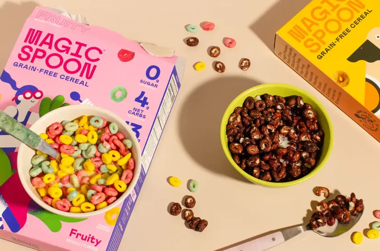
In food and beverage ecommerce, design must create instant appetite appeal. Photography, lighting, colour temperature, and ingredient close-ups all shape the emotional response that drives purchase decisions.
For FMCG brands with large product catalogs, navigation becomes just as important as visual identity. Stores selling hundreds of SKUs need clear category structures, effective filtering, and well-planned bundle mechanics before visual design even begins.
Subscription UX is also critical for food and beverage brands. Subscribe-and-save flows should communicate convenience, savings, and repeat purchase value during the first buying decision, not only after checkout.
In these categories, the best ecommerce design combines sensory appeal with fast product discovery and frictionless repeat purchasing.
Fashion and Lifestyle: Where Aesthetic Is the Product
For fashion and lifestyle brands, ecommerce design is part of the product itself. The website communicates price point, audience, and brand identity before customers even interact with a product page.
Photography quality, typography, whitespace, model styling, and layout all influence how customers perceive the brand.
High-performing fashion stores combine editorial-quality imagery with smooth browsing, intuitive variant selection, and exploration-focused category pages.
Simple UX details also matter. Size guides placed beside variant selectors reduce hesitation, while clearly visible return policies help address fit uncertainty before checkout.
In fashion ecommerce, customers are not just buying products. They are buying into a lifestyle and identity, and the website design is what makes that positioning believable.
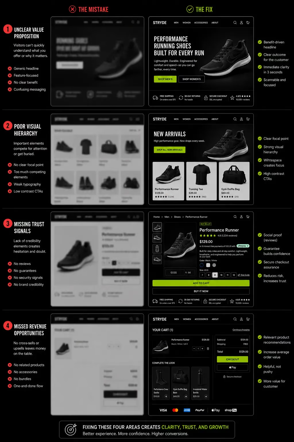
Ecommerce Design Mistakes That Kill Conversions (And How to Spot Them)
Most design articles show you what works. Understanding what fails is equally valuable; it makes the principles concrete and helps decision-makers evaluate existing stores and agency proposals with more precision.
The Cluttered Homepage That Tries to Say Everything
Five competing CTAs, three sale banners, eight category highlights, and a newsletter popup within three seconds of arrival.
Every additional element on a homepage is a decision the visitor has to make. More decisions mean more cognitive load. More cognitive load means higher bounce rate.
The consequence: visitors scan the page, find no clear starting point, and leave. Scroll depth on cluttered homepages is consistently lower than on focused ones which means the social proof, product highlights and brand story below the fold are never seen.
The fix: one primary message, one primary action, and supporting context positioned below the fold for visitors who want to explore further.
The Product Page Without a Clear Purchase Path
A product page with strong photography, compelling copy and detailed specifications but an Add to Cart button positioned below the fold, visually weak against the background or competing with three other CTAs loses buyers who have already decided to purchase.
The design fails at the exact moment the commercial outcome was within reach.
The consequence: users who intended to buy leave to find the product on a marketplace where the purchase path is frictionless. Amazon converts them.
The fix: a sticky add-to-cart mechanism that remains visible as users scroll, a CTA with high colour contrast against its background, and a single primary action per viewport.
The Mobile Experience No One Tested
Designing exclusively on desktop creates major mobile usability problems. Stores approved in desktop previews often launch with tiny tap targets, overlapping text, horizontal scrolling, and navigation that is frustrating to use on real devices.
The result is poor user experience for the majority of visitors, leading to higher bounce rates, shorter sessions, and lower mobile conversion rates.
The solution is a true mobile-first process: designing for small screens first, testing continuously on real devices, and reviewing tap target sizing, thumb-friendly CTA placement, and responsive layouts before launch.
The Checkout That Builds Doubt Instead of Removing It
A multi-step checkout with no progress indicator, no trust signal near the payment fields, surprise shipping costs revealed only at the final step and no guest checkout option.
The customer made it to checkout the hardest part of the purchase journey. Then the design introduces doubt at the last possible moment.
Baymard Institute's 69%+ average cart abandonment rate is not primarily a traffic problem. It is a design problem at the checkout stage.
The final step before payment is the highest-anxiety moment in ecommerce. Design that adds friction instead of removing it at this moment is the most expensive design failure a store can have.
The fix: guest checkout visible as an equal option to account creation, shipping costs disclosed before checkout entry or estimated on the cart page, a clear progress indicator for multi-step flows, and a trust badge positioned adjacent to the payment fields.
Ecommerce Design in 2025 – 2026: Trends With Commercial Logic
Most design trend articles list aesthetic fads. This section covers only shifts that have demonstrable commercial impact on conversion, trust, or customer experience.
AI-Powered Personalization at the Design Layer
Stores that surface personalized product recommendations based on browsing history, quiz completion, or location data consistently outperform stores with static product grids.
The design implication is structural: layouts need to be modular and data-responsive rather than static pages built once and left. Shopify's AI-powered product recommendation blocks and quiz-to-product-page flows are the practical entry points for most D2C brands.
Video-First Product Presentation
Short-form product video between 15 and 30 seconds on product pages reduces return rates and increases conversion particularly in fashion, beauty, and supplement categories where how the product looks in use is a primary purchase driver.
The design constraint: video must load fast, autoplay silently on mobile, and be positioned so it does not block the purchase path or delay the above-the-fold CTA from loading.
Social Proof as a Design System
The best stores do not just "have reviews" they design the display of social proof as a primary conversion element. Photo reviews with verified purchase badges, specific outcome claims ("helped me sleep better in 3 days"), and UGC galleries with shoppable links all convert at higher rates than anonymous text reviews.
This shift treats social proof as a design architecture decision, not a plugin configured once and forgotten.
Minimalist Design Is Winning For a Commercial Reason
Brands reducing visual noise, fewer promotional banners, less animation, cleaner navigation, more whitespace are reporting measurable conversion improvements. The commercial logic is not aesthetic preference.
Less visual competition means more attention directed at the product and the purchase decision. Every non-essential element removed from the purchase path is a source of friction eliminated.
How We Approach Ecommerce Design at Suplex
At Suplex, ecommerce design starts with commercial goals, not visual direction. Before designing anything, we analyze the audience, conversion objectives, purchase journey, and competitive landscape to understand what the store actually needs to achieve.
Every project is evaluated through our TCMB framework: Trust, Clarity, Momentum, and Brand Fit. Every design decision must support conversion, improve usability, and align with the brand’s positioning.
For D2C, FMCG, and supplement brands, the website is the primary sales channel. The highest-performing stores are built around the purchase journey first, with design supporting the buying experience rather than replacing it.
Most ecommerce redesigns fail because they improve aesthetics without fixing navigation, product pages, or checkout friction. At Suplex, we solve the conversion architecture first, then design around it.
We work across Shopify, custom ecommerce development, Webflow, and mobile apps, choosing platforms based on business requirements, not agency preference.
If you are evaluating a redesign or starting a new build, a design and platform consultation with Suplex starts with the commercial audit before any brief is written or any visual reference is shared.
Frequently Asked Questions
What makes an ecommerce website design "the best"?
The best ecommerce website design is defined by commercial outcomes, not visual awards. It builds trust, communicates clearly, removes friction from the purchase path, and matches brand identity to customer expectations. A store that looks exceptional but converts at 0.8% is not well-designed; it is well-decorated. Design quality in ecommerce is measured by conversion rate, revenue per visitor, and repeat purchase behaviour.
What are the most important elements of ecommerce website design?
The highest-impact elements are: mobile-first layout, page load speed under 2.5 seconds LCP, clear product page hierarchy with above-the-fold CTA, trust signals placed adjacent to the purchase action, and a frictionless checkout. Navigation structure and homepage messaging are close behind. Most ecommerce stores fail at least two of these simultaneously which is where conversion is being lost.
How does website design affect ecommerce conversion rates?
Significantly and measurably. Baymard Institute research shows that optimized checkout UX alone can improve conversion by up to 35%. Product page design, trust signal placement, mobile usability, and page speed each independently affect conversion. Combined, the difference between a poorly designed and a well-designed store at the same traffic level can be the difference between a 1% and a 4% conversion rate, a fourfold revenue difference.
What is the difference between ecommerce UI and UX design?
UX user experience design is the structural layer: how information is organized, how users navigate from entry point to checkout, how the purchase path flows. UI user interface design is the visual layer: colours, typography, button styles, spacing. A beautiful UI on a broken UX still loses sales. Most ecommerce design failures are UX failures, not UI failures. The structure has to work before the visual treatment makes it commercially valuable.
What ecommerce platform gives the best design results?
Platform choice depends on business requirements. Shopify is the dominant choice for D2C and mid-market ecommerce because of its checkout optimization, app ecosystem, and scalability. Custom development suits brands with unique UX requirements that no platform natively supports. The platform is a foundation and the design and architecture built on top of it determine commercial performance. The best platform is the one that fits the brand's scale, integration requirements, and growth trajectory.
How do I know if my ecommerce website needs a redesign?
Key signals: conversion rate below 1.5%, mobile bounce rate above 70%, average session duration under 90 seconds, checkout abandonment above 80%, or customer feedback citing navigation confusion. A structured website audit covering speed, UX, mobile experience, and purchase path is the most objective way to diagnose whether a redesign is the right investment or whether targeted fixes to specific friction points would deliver faster returns.
What does good ecommerce website design cost?
A custom Shopify theme build from a specialist agency ranges from $5,000 – $25,000+. A full ecommerce redesign including UX strategy, information architecture, and development runs $15,000 – $80,000+ depending on complexity and platform. The more commercially relevant question is the cost of not redesigning. A 1% improvement in conversion rate on a store doing $500,000 in annual revenue is $5,000 in recovered revenue per month at unchanged traffic levels.
Hi, I’m Rishabh Jain
I believe great digital experiences have the power to shape perception, build trust, and move businesses forward. That belief led me to found Suplex Design Studio, a global digital design and development studio helping FMCG and D2C brands build websites and digital experiences that are strategic, thoughtful, and commercially meaningful.
I started Suplex at 25 with a clear intent, to create digital experiences that look appealing, work seamlessly, and help D2C businesses grow. By 28, the studio had scaled globally, guided by a strong foundation in integrated design that I developed during my academic journey in London, where I was honoured with the Dean’s Award.
Over the years, I’ve had the opportunity to work with 100+ brands, from Fortune 500 organisations to family-run businesses, helping them build websites, e-commerce experiences, and digital products that create clarity, credibility, and long-term value.
Our work has been recognised internationally, including the Manifest Award (2024), the Clutch Global Award (2025), and features across platforms such as The Dieline, Packaging of the World, and the World Brand Design Society.
None of this would be possible without the people behind the work. I’m deeply grateful to the Suplex team, whose commitment, creativity, and attention to detail turn ideas into meaningful digital experiences every day.
At the heart of our work is a simple philosophy, digital design should be intentional, functional, and built to create real business value. That continues to guide everything we create at Suplex.






























Let’s Make It Happen
E-Commerce Success Stories
%201.avif)






.avif)
.avif)
Build Your D2C Business The Right Way
Build It With Suplex.


