D2C Homepage Design Best Practices For UAE Brands
.avif)
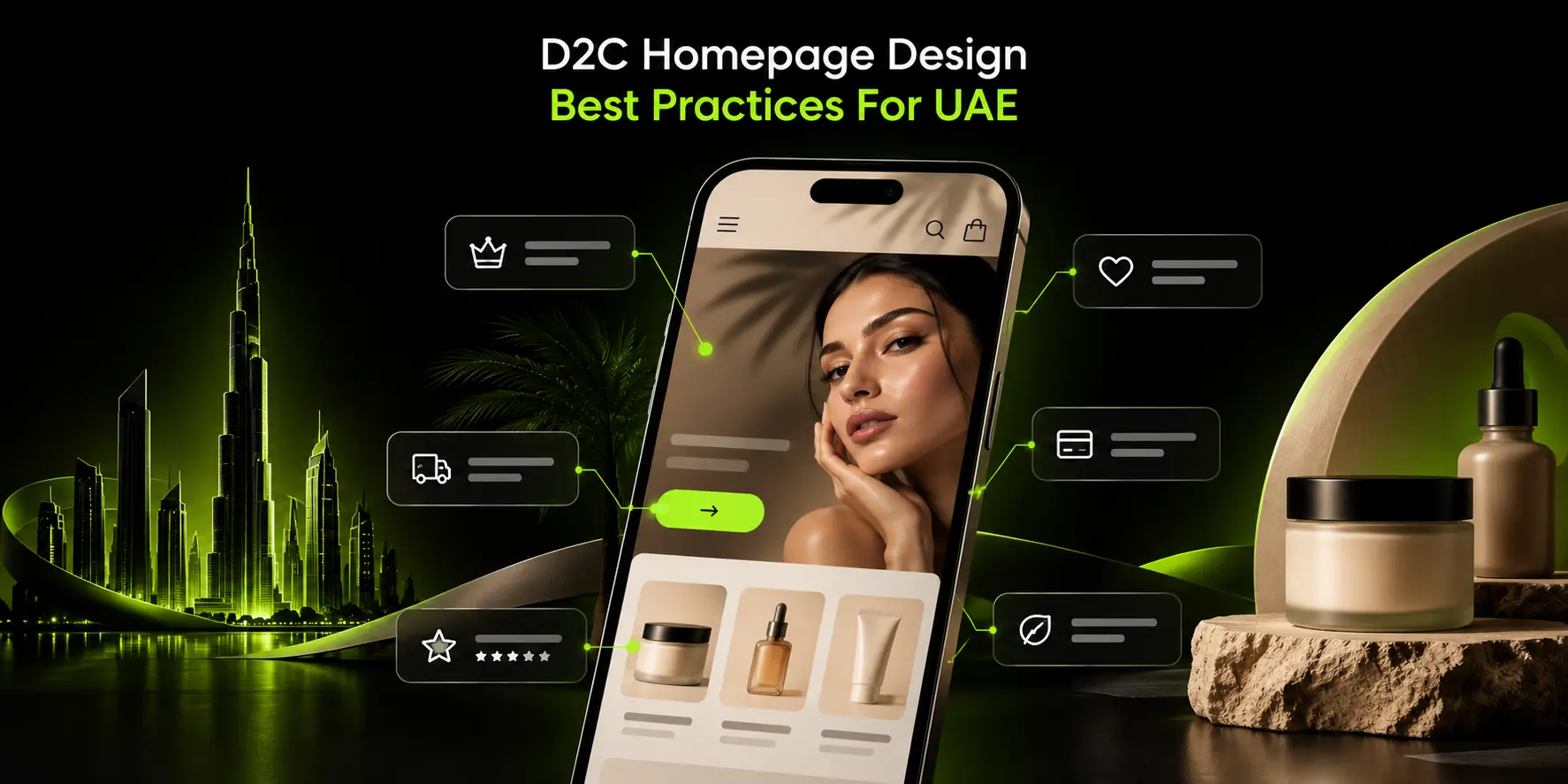
D2C Homepage Design Best Practices For UAE Brands
D2C homepage design best practices for UAE brands come down to making four things clear on the first mobile screen: what you sell, why it's worth buying, how fast it arrives, and how easy it is to pay.
In practice, that means a product-led hero with one clear call to action, a slim bar with delivery and payment reassurance, an easy-to-find Arabic/English switch and social proof high on the page.
Design mobile-first, since most UAE D2C traffic arrives on phones from Instagram, TikTok, and WhatsApp, and plan to change the homepage for key seasons such as Ramadan, Eid, and White Friday.
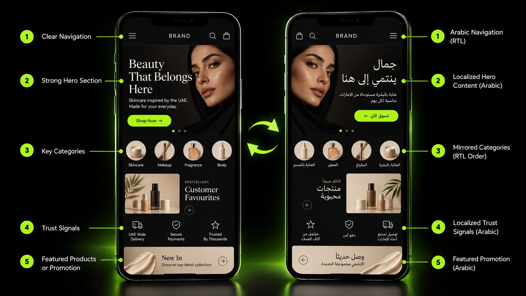
What A D2C Homepage Actually Needs To Do
Before redesigning anything, understand what job the homepage is actually doing for your specific traffic.
Traffic Sources And What Visitors Want
A visitor arriving from a paid social ad already has a product in mind and wants a fast path to buy it.
A visitor arriving through organic search or a direct visit is often earlier in their decision and wants more context.
A returning customer clicking a WhatsApp link wants to get straight back to what they were looking at. These are different jobs, and a homepage built for only one of them underserves the others.
The Homepage As A Trust Check, Not The Main Landing Page
For most UAE D2C brands, the homepage is not the first page a visitor sees; the product page from an Instagram or TikTok ad is.
The homepage's real job, for a meaningful share of its traffic, is answering "can I trust this brand?" once someone clicks the logo to check.
Design decisions should follow from this, not from an assumption that every visitor arrives at the homepage first and browses from there.
Before redesigning, check your own analytics: what share of sessions actually start on the homepage versus a product page and what do homepage visitors do next.
The answer changes your priorities meaningfully, and a redesign built on assumptions rather than your own data risks solving the wrong problem.
Above The Fold: What UAE Shoppers Should See First On Mobile
The first screen, with no scrolling, does most of the work.
Product-Led Hero
Show the actual product, not an abstract lifestyle image with no clear connection to what you sell, paired with a one-line value proposition that states plainly what the brand offers and why it matters.
A visitor deciding whether to trust you in three seconds needs to see the thing they might buy, not interpret a mood board.
One Primary Call To Action
A single, clear action, "Shop Bestsellers" or "Shop [Category]", outperforms three competing buttons that force a decision before the visitor has even seen what you sell.
Every additional call to action dilutes the one you actually want taken.
Announcement Bar
A slim bar communicating the delivery promise, your free delivery threshold in AED, and any current offer, rotated across at most two or three messages, gives immediate reassurance without demanding attention the hero should be getting.
Header Essentials
Search, cart, account, and the language switch all need to be present and thumb-reachable on mobile, not buried in a hamburger menu three taps deep.
First Mobile Screen Checklist
☐ Product visible in the hero, not an abstract lifestyle shot alone
☐ One clear value proposition line
☐ One primary call to action, not several competing ones
☐ Announcement bar with delivery/offer messaging
☐ Search, cart, and account icons reachable without scrolling
☐ Language switch visible in the header
UAE-Specific Trust Signals That Belong On The Homepage
This is the section no competing page on this topic actually covers, and it is where a generic homepage template consistently falls short for this market.
Delivery Speed And Coverage
State delivery speed clearly, same-day or next-day in Dubai, realistic timing to other emirates, and GCC-wide shipping if you offer it.
Vague language like "fast delivery" reassures nobody; a specific timeframe does.
Payment Reassurance
Apple Pay, cards, Tabby or Tamara for buy-now-pay-later, and cash on delivery should all be visible near the top of the page, in the trust strip or announcement bar, not only as small icons in the footer where a first-time visitor never scrolls to see them.
Our guide to choosing a payment gateway for UAE ecommerce and our piece on localizing Shopify checkout for UAE customers both go deeper into the payment side of this specifically.
Returns And Exchanges, Stated Plainly
State the return window, who pays for return shipping, and how to actually start a return, in plain language on the homepage or one click away.
Vague or hidden returns policies are a common reason a first-time UAE shopper hesitates at checkout.
Prices Shown In AED, VAT-Inclusive
Prices should display in AED with VAT included, matching what the customer will actually be charged at checkout, not a pre-tax figure that changes unexpectedly later in the funnel.
WhatsApp Contact
A visible, human support option, a floating WhatsApp button or a clear header link, meets UAE shoppers where they already expect to reach a business directly, rather than routing every question through a contact form nobody wants to fill out.
Local Social Proof
Reviews, user-generated content from actual UAE customers, and press or retailer logos, if genuinely true, build trust more effectively for this audience than generic global testimonials with no local context.
Business Legitimacy Details
Company name, contact details, and any required licence information belong in the footer at minimum. Confirm the current UAE consumer protection requirements for what online sellers must display directly rather than assuming a generic standard, since specific legal requirements should be verified rather than stated as fixed fact here.
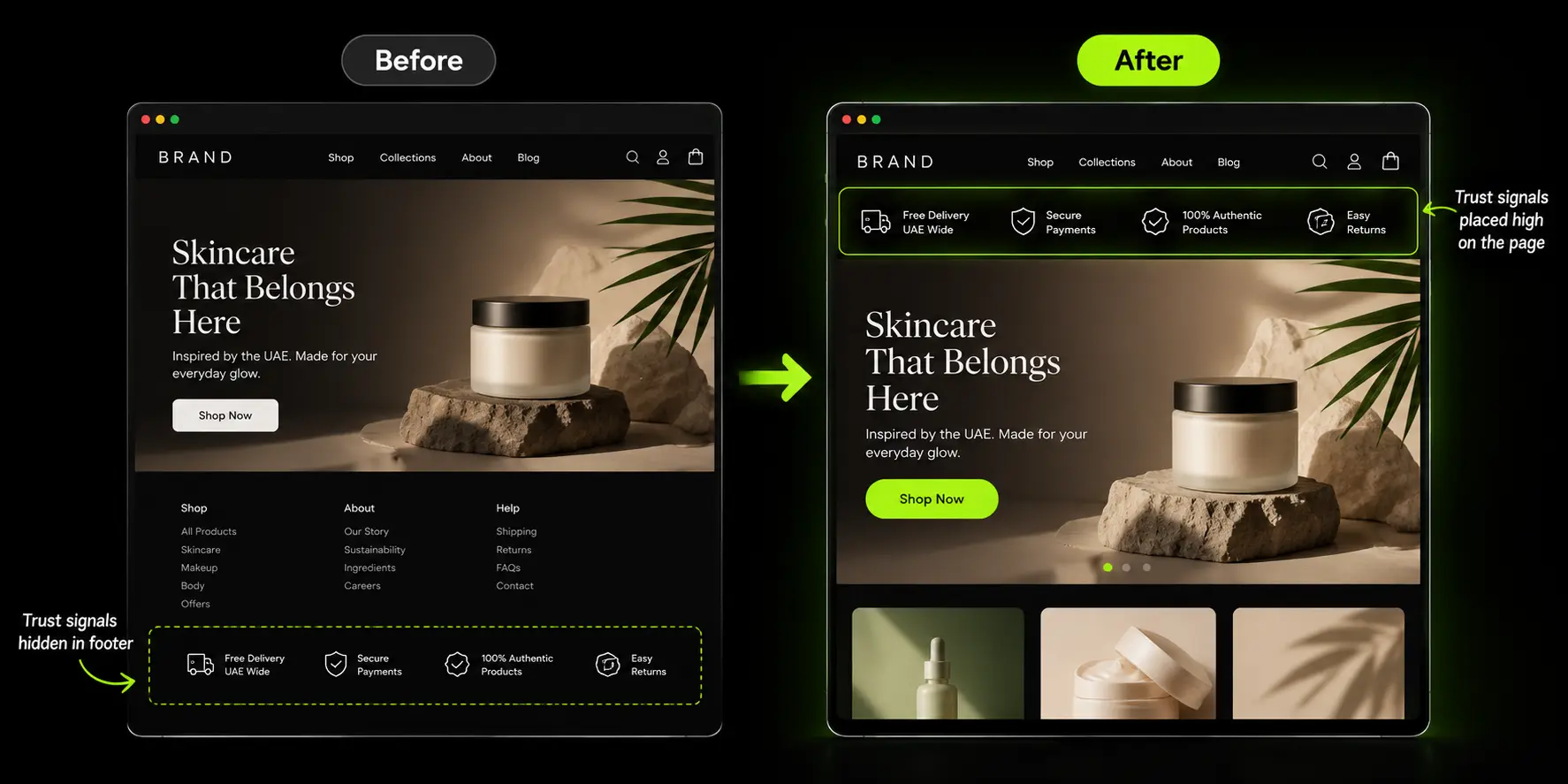
Bilingual Homepage Design: Arabic And English
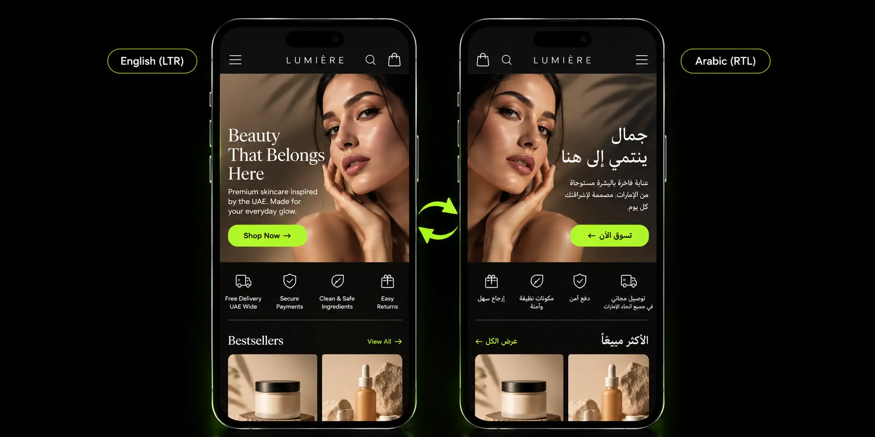
A bilingual homepage is a structural design decision, not a translation task layered on afterward.
Where The Language Switch Goes
Place it in the header, labeled with the language name itself, "العربية" or "English", not a flag, since flags represent countries, not languages, and can genuinely confuse or offend when used as a language proxy.
The Arabic Homepage Is A Mirrored Layout, Not A Translation
Hero image direction, carousel navigation direction, and icon direction all need to mirror correctly for the Arabic version, not just the text.
A homepage that translates the copy but keeps every visual element in its English left-to-right position reads as unfinished to an Arabic-speaking visitor, even if every word is grammatically correct.
Arabic Typography
Choose a proper Arabic typeface paired deliberately with your brand's English font, not a system fallback that renders Arabic text as an afterthought.
The UAE Government Design System's Arabic typography guidance, the top-ranking result for this general topic, is a genuinely useful reference point even though it is built for government services rather than retail.
Separate Arabic Headlines
Write Arabic headlines for the audience directly rather than translating English slogans word for word. A slogan that works as a pun or a rhythm in English rarely survives translation with the same impact and a literal translation often reads flatly or strangely to a native Arabic reader.
Our guide to D2C localization for the Middle East covers the full localization strategy in more depth, and our piece on bilingual Shopify store setup for the UAE covers the technical implementation side.
Mobile-First Homepage Design For Social Traffic
Since most UAE D2C traffic arrives on phones, design decisions need to start there, not get adapted there afterward.
Design At 390px Width First
Start the design process at a standard mobile viewport width and expand outward to desktop, rather than designing desktop-first and shrinking it down.
This single sequencing decision changes what actually gets prioritized on the page.
Thumb-Friendly Navigation And Tap Targets
Buttons, menu items, and interactive elements need to be sized and positioned for a thumb, not a mouse cursor, with enough spacing that a fast-scrolling visitor doesn't miss-tap.
Speed: Hero Image Weight, Video, And App Scripts
A heavy hero image, autoplay video running on mobile data, and an accumulating stack of app scripts all slow load time in ways that cost conversions before a visitor even sees the page fully render.
Mobile traffic makes up close to 59% of UAE web traffic as of mid-2026, and every one of those visitors is more sensitive to load speed than a desktop visitor on a stable connection.
Keep It Short On Mobile
Every section on the mobile homepage has to earn its place. A homepage that reads fine on a wide desktop screen can feel exhausting to scroll through on mobile if sections are simply stacked without editing for the smaller format specifically.
Recommended Homepage Section Order For A UAE D2C Brand
A logical, tested order for most UAE D2C homepages looks like this:
- Announcement bar (delivery/offer)
- Header (logo, search, cart, account, language)
- Product-led hero with one call to action
- Trust strip (delivery, COD/BNPL, returns, ratings)
- Shop by category or concern
- Bestsellers
- Brief brand story and what makes the product different
- Social proof/UGC
- Offer, bundle, or new launch
- WhatsApp/help section
- Footer (policies, payment icons, company info, language)
This order shifts for different brand types. Luxury or premium brands typically lead more with story and craft before offers, giving points 3 and 7 more visual weight relative to promotional content.
High-volume or value-focused brands typically move categories and offers earlier, since their visitors are more likely arriving ready to browse by need rather than to be persuaded by narrative first.
Seasonal Homepage Planning: Ramadan, Eid, White Friday, And DSF
A UAE D2C homepage that never changes looks out of step with how shopping actually happens in this market.
Build A Seasonal Calendar
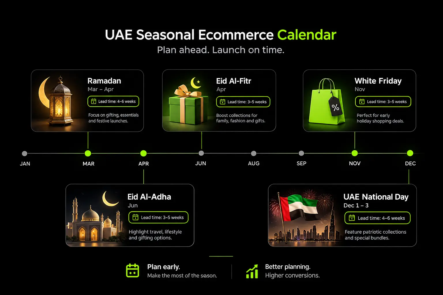
Plan homepage changes around Ramadan, Eid al-Fitr, Eid al-Adha, National Day, White Friday, and the Dubai Shopping Festival, treating each as a planned design change rather than an afterthought layered on once a campaign is already live.
Ramadan Shopping Behaviour
Ramadan shifts shopping patterns meaningfully, with evening and late-night browsing and buying, gifting occasions and family or bundle purchasing all becoming more prominent.
Confirm current-year specifics against a credible, current source before building campaign assumptions around them, since patterns can shift year to year.
Build Swappable Sections
Structure the homepage in Shopify using swappable, modular sections your own team can update for a campaign without needing a developer for every change.
Seasonal readiness is ultimately a design system decision made well before the season itself; if the homepage can't change quickly, campaigns end up living only in paid ads while the store itself looks perpetually out of date.
Common D2C Homepage Mistakes In The UAE
A handful of patterns show up repeatedly on underperforming UAE D2C homepages.
Auto-Rotating Hero Carousels That Hide The Main Message
Widely cited UX research, including a long-running study from the University of Notre Dame, found that only around 1% of visitors click a homepage carousel at all, with roughly 84% to 89% of those clicks landing on the first slide alone.
A carousel splitting your message across three or four slides is, in practice, showing most visitors only the first one.
Payment And Delivery Reassurance Hidden In The Footer
Trust signals that only appear after a long scroll do nothing for the visitor deciding whether to trust you in the first few seconds, which is exactly when that decision gets made.
English-Only Homepage With A Half-Translated Arabic Toggle
A language switch that leads to a partially translated page, some sections in Arabic, others still in English, damages trust more than not offering Arabic at all, since it signals the bilingual effort was incomplete or an afterthought.
Desktop-First Layouts Squeezed Onto Mobile
A layout designed for a wide desktop screen and then compressed to fit mobile, rather than designed mobile-first, tends to show exactly the priorities in the wrong order for how most visitors actually experience the page.
Too Many Pop-Ups At Once
Newsletter signup, discount code, cookie consent, and a WhatsApp widget all competing for attention within the first few seconds overwhelms a visitor before they've seen anything you actually sell.
Old Seasonal Campaigns Left Live
A White Friday banner still running in January signals the site isn't actively maintained, undermining exactly the trust the rest of the homepage is trying to build.
How We Design D2C Homepages For UAE Brands
Our process at Suplex starts from analytics, where homepage visitors actually come from and what they do next, before any design work begins, since a homepage built on assumptions about traffic rather than real data tends to solve the wrong problem well.
We design the mobile screen first, build bilingual layouts that genuinely mirror rather than simply translate, and set up swappable Shopify sections so your own team can run seasonal campaigns without waiting on a developer every time Ramadan or White Friday approaches.
If you're planning a homepage redesign and want it built around how UAE shoppers actually arrive and decide to trust a brand, Suplex offers a homepage audit or redesign consultation to start from your real data rather than a generic template.
UAE D2C Homepage Checklist
☐ First mobile screen shows product, one clear value proposition, and one primary call to action
☐ Delivery speed, payment methods (including COD/BNPL), and returns policy visible near the top, not just in the footer
☐ Prices shown in AED, VAT-inclusive
☐ WhatsApp contact visible and easy to find
☐ Language switch in the header, labeled by language name, not a flag
☐ Arabic version properly mirrored (layout, icons, imagery), not just translated text
☐ Homepage designed mobile-first at a standard phone width, then expanded to desktop
☐ Swappable sections in place for seasonal campaigns (Ramadan, Eid, White Friday, DSF)
Frequently Asked Questions
What should a D2C ecommerce homepage include?
A D2C homepage should include a product-led hero with one clear call to action, a short trust strip (delivery, payment options, returns, ratings), easy category navigation, bestsellers, a brief brand story, social proof, and a footer with policies and contact details. For UAE brands, add visible payment options such as COD and BNPL, delivery times by emirate, and an Arabic/English switch.
Should a UAE ecommerce homepage be in Arabic?
It depends on your audience, but it usually helps, especially for brands targeting Emirati and wider Arab customers. If you add Arabic, do it properly: a mirrored right-to-left layout, Arabic-appropriate typography, and headlines written for Arabic readers rather than translated word for word. A half-translated Arabic homepage can hurt trust more than having none.
Where should the language switch go on a bilingual website?
Put it in the header where it's visible on mobile without opening a menu, usually next to the cart or account icons. Label it with the language name ("العربية" / "English") rather than a flag, since flags represent countries, not languages. On the Arabic version, the header layout mirrors, so the switch moves to the opposite side.
Are homepage carousels bad for conversions?
Auto-rotating carousels often perform poorly because most visitors see only the first slide, and moving content makes the message harder to take in, especially on mobile. A single strong hero with one clear message and call to action usually works better. If you use a carousel, keep it manual, limit it to two or three slides, and put the most important message first.
How often should a D2C brand update its homepage?
Update key sections for each major campaign and season. In the UAE that means Ramadan, the two Eids, National Day, White Friday, and the Dubai Shopping Festival, plus product launches. Review the overall layout every six to twelve months using analytics. Building swappable sections in Shopify lets your team make seasonal changes without a developer.
Should COD be shown on the homepage?
If you offer cash on delivery, say so early, usually in the announcement bar or trust strip. COD still reassures many UAE shoppers, particularly first-time buyers who don't know the brand yet. Show it together with card, Apple Pay, and BNPL options so the page doesn't suggest COD is the only choice, and state any COD fee clearly.
What is the most important part of a D2C homepage on mobile?
The first screen. Within it, a visitor should understand what you sell, see a clear way to start shopping, and spot at least one reason to trust you, such as delivery speed, payment options, or ratings. Everything else supports that first screen, so test it on a real phone, not just a desktop browser at a narrow width.
Final Thoughts
The UAE D2C homepage is a trust check for mobile visitors, most of whom already saw a product before they saw the homepage at all.
Delivery, payment, language and proof matter more here than clever design flourishes, and getting the UAE-specific details right, COD and BNPL visible near the top, Arabic that's genuinely mirrored rather than translated, a mobile-first section order, seasonal readiness built in from the start, is what separates a homepage that converts social traffic from one that just looks good in a portfolio.
If you're planning a redesign and want it built around how your specific customers actually arrive and decide to trust you, Suplex is happy to walk through an audit before you start.
Hi, I’m Rishabh Jain
I believe great design has the power to shape perception, build trust, and move businesses forward. That belief is what led me to found Suplex Design Studio, a global branding and packaging studio working with FMCG and D2C brands across markets.I started suplex at 25 with a clear intent, to create design that is strategic, thoughtful, and commercially meaningful. By 28, the studio had scaled globally, guided by a strong foundation in Integrated Design that I developed during my academic journey in London, where I was honoured with the Dean’s Award.
Over the years, I’ve had the opportunity to work with 100+ brands, from Fortune 500 organizations to family-run businesses, helping them build packaging and brand systems that create recall, relevance, and long-term value.
Suplex’s work has been recognized internationally, including the Manifest Award (2024), the Clutch Global Award (2025), and features on platforms such as Packaging of the World, The Dieline, and the World Brand Design Society.
None of this would be possible without the people behind the work. I’m deeply grateful to the suplex team, whose commitment, creativity, and attention to detail turn ideas into meaningful brand experiences every day.
At the heart of my work is a simple philosophy, design should be intentional, honest, and built to last, and that continues to guide everything we create at suplex.


















Let’s Make It Happen
E-Commerce Success Stories
%201.avif)






.avif)
.avif)
Build Your D2C Business The Right Way
Build It With Suplex.


