Ecommerce Homepage Optimization: Tips and Full Checklist
.webp)
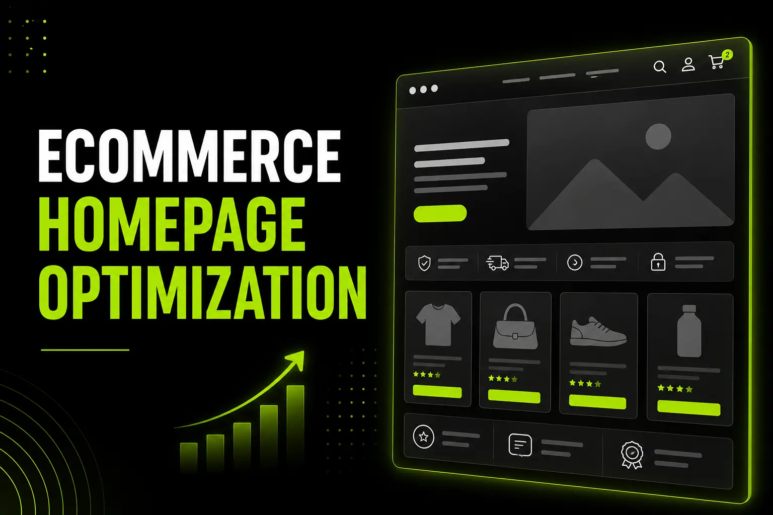
Ecommerce Homepage Optimization: Tips and Full Checklist
Ecommerce homepage optimization tips help turn more visitors into customers by improving trust, navigation, speed and user experience.
While the average Shopify store converts at 1.4%, top-performing stores exceed 4.7% through better homepage execution.
This guide introduces the Homepage Conversion Zone Model (HCZM), a practical framework for auditing every homepage section with actionable checklists, including UAE and Gulf-specific best practices.
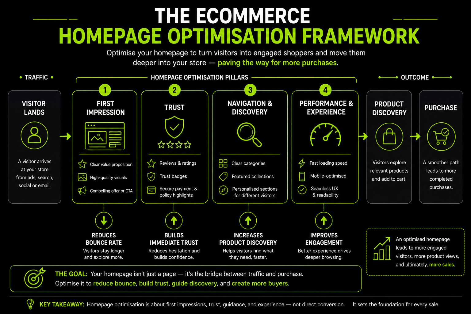
What Your Ecommerce Homepage Is (and Isn't) Responsible For
The most damaging misunderstanding in the homepage CRO is treating the homepage as a direct conversion page. It is not.
It is a routing and credibility page responsible for sending the right visitor to the right place, fast enough that they do not leave first.
Three types of visitors land on your homepage with different needs:
Brand Aware Visitors: (returning customers, email click-throughs, branded search) need fast access to what is new or a specific category. They already trust you. Do not make them read a brand story they have seen before.
Discovery Visitors : (paid social traffic, generic search, referral links) need orientation: who are you, why should they stay, where do they start. They arrived without intent to buy a specific product.
High Intent Visitors (branded search with a product in mind) need the fastest possible path to checkout or a specific product. Every section that delays them is a friction point.
The homepage's actual jobs are five:
- Establish credibility in under 3 seconds
- Route the three visitor types efficiently
- Build enough trust to prevent an immediate bounce
- Surface signals that reduce purchase anxiety (reviews, returns, delivery)
- Load fast enough that none of the above is undermined on mobile
Understanding these jobs changes which elements matter and which are visual noise that wastes render time.
For more on this, our ecommerce website UX best practices guide and features of a high-converting ecommerce website guide cover the full product page and checkout layers that the homepage feeds into.
The Homepage Conversion Zone Model
Before the checklist, the framework. The HCZM divides the homepage into five sequential conversion zones, each with a specific commercial job. Every checklist item in this guide maps to its zone.
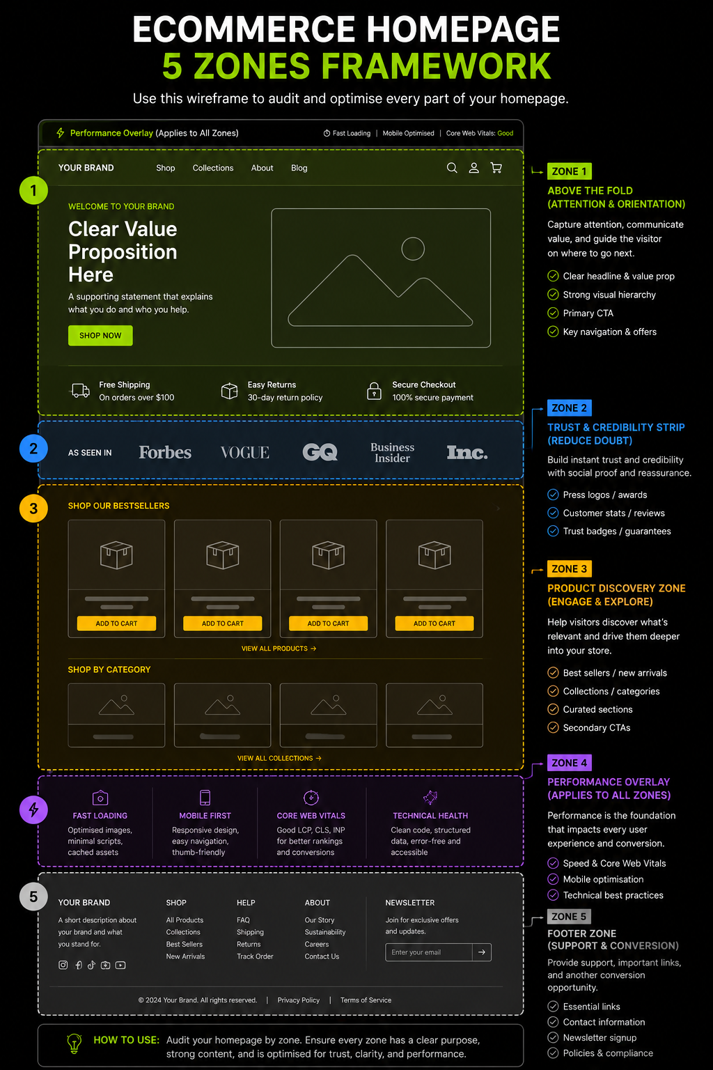
Zone 1 The First 3 Seconds: Optimising Your Hero Section
Everything above the fold on mobile and desktop. This is where the bounce rate is won or lost. A visitor who does not understand what your store sells and whether it is for them within 3 seconds will not scroll further.
What Your Hero Section Must Communicate Immediately
Every visitor subconsciously asks one question upon landing: "What is this store, and is it for me?" The hero section must answer it before the visitor makes any active decision to stay or leave.
1. Value Proposition the H1 on the page
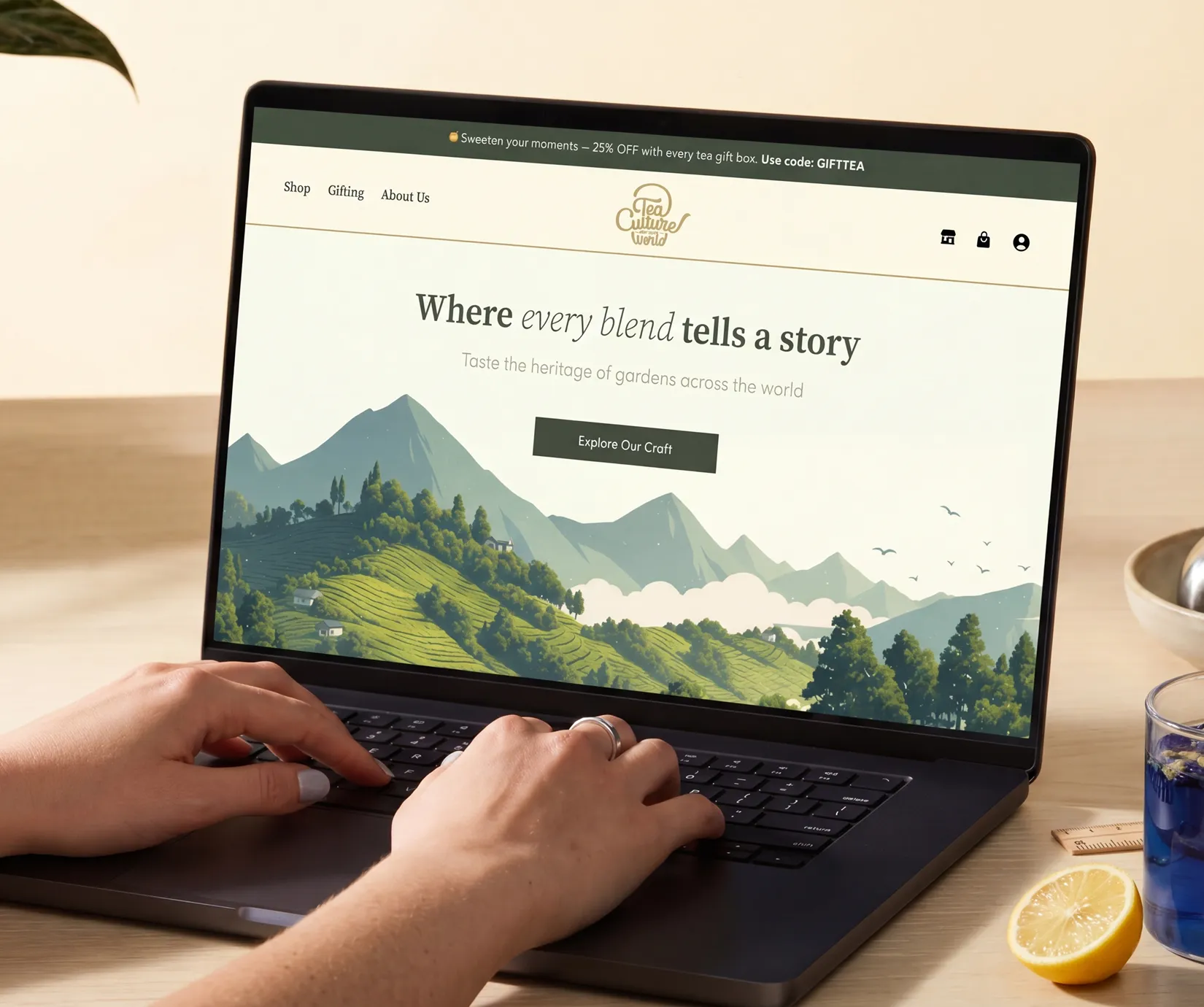
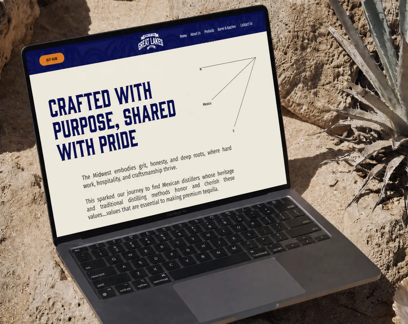
The value proposition is not your brand name. It is what you sell, who it is for, and what makes you different ideally in under 10 words. "Quality you can trust" is not a value proposition. It is a placeholder.
A workable structure: [Product type] for [audience] [differentiator]. "Skincare for sensitive skin, no nasties, no compromise." "UAE-designed abayas for the modern woman." Specific beats generic every time.
Benefit-led CTAs consistently outperform action-led ones in ecommerce contexts. "Find My Size" outperforms "Submit."
"Build My Box" outperforms "Click Here." "Shop Ramadan Edits" outperforms "Shop Now."
2. Hero Image or Visual
Must be high-resolution and load in under 1.5 seconds on mobile. Use WebP format; compress without quality loss.
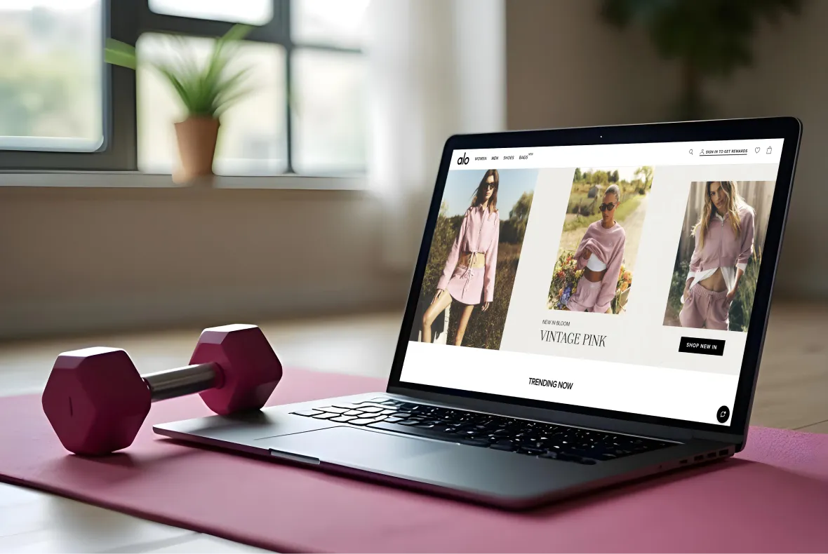
Lifestyle imagery outperforms product-only shots for brand differentiation. Catalogue shots outperform for high-intent visitors who arrived looking for a specific product.
The visual hierarchy must draw the eye toward the CTA to ensure contrast between the image and the button.
A white CTA button on a light image disappears. A navy button on a warm lifestyle photograph converts.
3. Primary CTA
Visible above the fold on the desktop. Visible without scroll on mobile, test this on a real mid-range Android device on a 4G connection, not in Chrome DevTools. One primary CTA above the fold. Secondary CTAs below it.
4. Value Strip or Announcement Bar
Free shipping threshold, return policy, delivery speed reduce purchase anxiety before a visitor has scrolled once.
Free shipping alone lifts conversion by 20%. 75% of shoppers expect it even on orders under $50. An announcement bar that communicates this is one of the highest-ROI single elements on any homepage.
UAE and Gulf Specific Zone 1
Bnpl Signal Above The Fold:
Showing "Pay in 4 with Tabby" or "Split into 3 with Tamara" in the hero section or announcement bar is a proven conversion lever for UAE audiences on higher-AOV products.
Stores not offering Tabby or Tamara risk losing 15–25% of potential revenue. BNPL can increase AOV 20–40% when positioned correctly and the announcement bar is the highest-visibility position available.
Whatsapp Icon In Header:
UAE shoppers prefer WhatsApp to live chat. A visible WhatsApp CTA in the header reduces pre-purchase anxiety before a visitor has read a product description. It signals that a real team is accessible.
Arabic/English Toggle In The Header:
Arabic RTL is a trust signal for Arabic-speaking UAE consumers and expands your addressable audience.
If you have bilingual content, the language toggle must be in the header not buried in the footer where most visitors will never find it.
COD Signal:
"Cash on Delivery Available" in the hero strip or announcement bar addresses a significant share of UAE buyers who still prefer COD 30–40% in some categories.
Signalling it early removes a purchase barrier before it has a chance to cause abandonment at checkout.
Zone 1 Checklist
☐ Value proposition is visible without scrolling on mobile
☐ Hero image uses WebP format and loads in under 1.5 seconds
☐ Primary CTA copy is specific and benefit-driven
☐ Announcement bar features free shipping, returns, or delivery time
☐ One primary CTA above the fold; secondary CTAs below it
☐ [UAE] BNPL instalment messaging (Tabby/Tamara) visible above the fold
☐ [UAE] WhatsApp CTA visible in the header
☐ [UAE] Arabic/English language toggle visible in the header
☐ [UAE] COD availability signal present in the announcement bar
Zone 2 The Trust Layer: Social Proof and Brand Signals
Visitors who scroll past the hero are interested but not convinced. Zone 2 must answer "Can I trust this store?" before they reach any product.
Social Proof Elements
1. Customer Reviews and Star Ratings
Display aggregate rating ("4.8/5 from 2,340 reviews") in a dedicated homepage section. 72% of customers are more likely to trust an ecommerce site with visible reviews.
59% of UAE online shoppers read reviews before purchase which means a store without visible review counts is losing a majority of UAE visitors at this decision point.
UGC user photos, Instagram content and customer-submitted imagery increases trust more than text-only testimonials for fashion, beauty and lifestyle brands.
A grid of real customers using real products converts better than a carousel of pulled quotes.
2. Press Mentions and "As Seen In"
Press logos from coverage, awards, or major stockists act as authority signals. Even a single recognizable logo ("As seen on Vogue Arabia" or "Stocked in Carrefour UAE") transfers credibility in a way that any amount of brand copy cannot replicate.
Credibility borrowed from known entities is more efficient than credibility built from scratch.
3. Trust Badges
Secure payment icons (Visa, Mastercard, Apple Pay), SSL badge, satisfaction guarantee, and return policy icon.
For UAE stores, Tabby and Tamara logos function as trust signals as much as payment method indicators UAE shoppers associate them with legitimate, established merchants.
A brand new store displaying Tabby and Tamara logos is communicating that it has been vetted by a known BNPL provider.
4. Brand Story or Founding Narrative
One or two sentences about why the brand exists converts better with first-time discovery visitors than with returning customers.
D2C brands with a clear mission "built by a UAE mother who couldn't find modest activewear that actually performed" create an immediate identity resonance that generic brand copy does not.
UAE and Gulf Specific: Zone 2
Local courier logos as trust signals;
Aramex, Shipa, and DHL logos near your trust section reduce purchase hesitation specifically in the UAE and GCC.
These are recognised, trusted logistics brands. Displaying them signals that orders will actually arrive, from a carrier the customer knows.
WhatsApp Supports Callout:
A visible WhatsApp support signal in the trust layer reinforces that a real team is accessible, not just a chatbot that escalates to a ticket system.
Zone 2 Checklist
☐ Aggregate review count and rating visible on homepage
☐ UGC or customer photo section present
☐ Press and "As seen in" logos displayed
☐ Secure payment icons visible
☐ Return and refund policy linked or summarised
☐ [UAE] Tabby and/or Tamara logos displayed as trust signals
☐ [UAE] Local courier logo (Aramex, DHL, Shipa) visible
☐ [UAE] WhatsApp support CTA present in trust section
Zone 3 The Discovery Engine: Navigation and Product Sections
Once a visitor trusts the store, they need to find what they want quickly. A confused visitor is a bounced visitor.
Zone 3 is where category structure, product section sequencing, and search capability determine whether browsing traffic converts.
Navigation Architecture on the Homepage
Header Navigation:
should have a maximum of two dropdown levels. Hover-only dropdowns fail on mobile. Mega menus work for stores with 10+ categories. Simple navigation works for focused stores.
The most important categories belong on the left; eye-tracking patterns move left to right for LTR readers; adjust accordingly for RTL Arabic layouts.
The search bar must be visible on desktop and tap-accessible on mobile without extra interactions.
Every store with 20+ products benefits from a visible search bar. Every store with 100+ products needs autocomplete and intelligent search.
Our navigation design best practices guide covers the full navigation architecture decision.
Homepage Product Sections Which to Use and When
Most Shopify stores should sequence: Best Sellers → Category Tiles → Featured Collection.
New Arrivals only if returning visitor traffic is meaningful. Best Sellers first because they reduce decision fatigue for new visitors who do not know where to start social proof through popularity is the lowest-friction product discovery path.
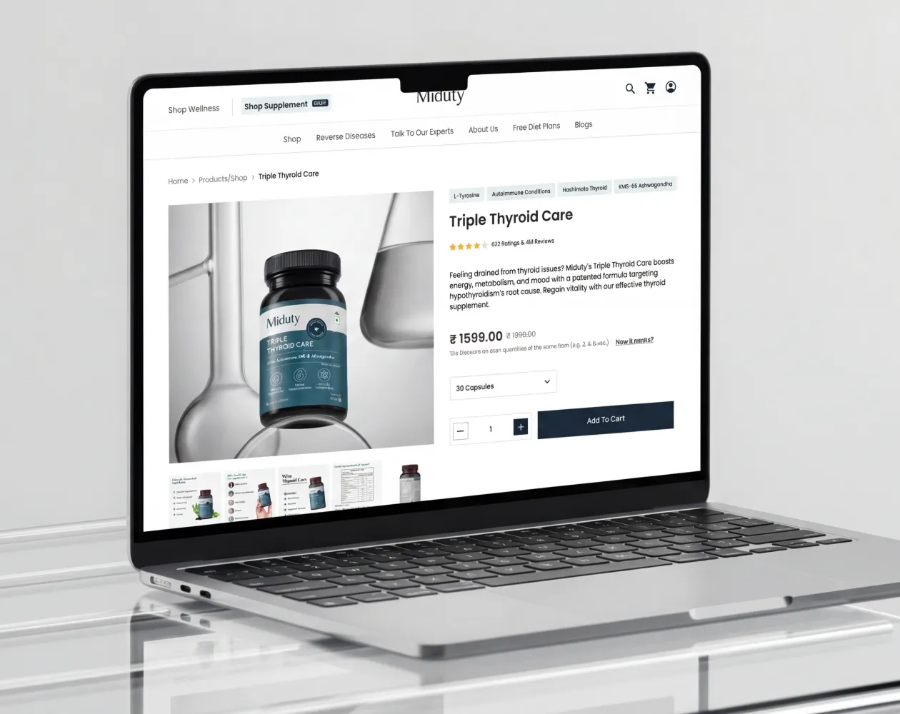
Featured Product Tiles:
should lead with a lifestyle shot rather than a white-background catalogue image. Show price and any discount prominently on the tile.
For higher-AOV products, show BNPL instalment maths directly on the product tile ("4 × AED 75 with Tabby").
Quick-add-to-cart or quick-view functionality reduces friction for browse-intent visitors who want to add without leaving the homepage flow.
UAE and Gulf Specific: Zone 3
Category naming should reflect local terminology where relevant. "Abayas" not "Long Robes." "
Oud" not "Oriental Fragrances." "Abaya and Modest Wear" not "Maxi Dresses Full Cover."
The naming signals cultural understanding and reduces the browse friction of a visitor who does not see their category language reflected in the navigation.
Ramadan and Eid seasonal collection sections should activate 3–4 weeks before each event earlier for Ramadan, which involves significant pre-season purchasing.
Dubai Shopping Festival (DSF) and National Day are additional seasonal triggers for UAE-first brands.
Zone 3 Checklist
☐ Navigation has a maximum of two dropdown levels; no hover-only menus on mobile
☐ Best Sellers section is above the fold or immediately below the hero
☐ Category tiles are visually distinct and clearly labelled
☐ Product tiles show price and any discount clearly
☐ Lifestyle photography leads on product tiles
☐ Search bar is visible on mobile without extra taps
☐ [UAE] Category labels use locally relevant terminology
☐ [UAE] Seasonal sections (Ramadan, Eid, DSF) activate on schedule
Zone 4 The Friction Removers: Speed, Mobile, and Payment Signals
None of the work in Zones 1–3 matters if the page is slow, broken on mobile, or does not signal the payment methods your audience expects.
Zone 4 addresses the invisible barriers that prevent conversion after the visitor has already decided to engage.
Page Speed
The performance benchmarks are specific and consistent:
- Sites loading in 1 second convert at 3× the rate of sites taking 5 seconds
- Every 1-second mobile delay reduces conversions by approximately 7%
- 63% of visitors abandon pages that take over 4 seconds to load
- Targets: LCP under 2.5s, INP under 200ms, CLS under 0.1
Practical Speed Wins For Shopify Homepages:
Use WebP images throughout. Compressing hero images to under 200KB, most unoptimised hero images run 1–4MB and are the single largest LCP contributor.
Lazy-load all below-fold sections. Limit the homepage to 10–12 Shopify sections each section adds render weight.
Avoid autoplay video in the hero on mobile; it destroys LCP scores and consumes cellular data before the visitor has seen a product.
Custom fonts and third-party analytics scripts are the most common remaining culprits for slow Shopify homepages after image optimization.
Run the Shopify Web Performance Dashboard monthly. Our page speed and Core Web Vitals guide covers the full technical optimisation process.
Mobile Optimisation
With 65–75% of ecommerce traffic arriving on mobile:
Test on a real mid-range Android device on a 4G connection not Chrome DevTools, which simulates throttling but not the full mobile rendering behaviour.
Sticky Add-to-Cart bar for featured products on mobile. Thumb-friendly tap targets of minimum 44×44px throughout filter checkboxes, navigation icons, and CTA buttons all apply.
No hover-dependent elements. Minimum 16px body text. No horizontal scroll. The hero CTA must be visible without scroll on a 375px viewport which represents the smallest common iPhone screen size.
Payment Method Visibility on the Homepage
Showing payment logos on the homepage not only at checkout is one of the most underused conversion levers available.
Displaying accepted payment logos in the announcement bar or footer (Visa, Mastercard, Apple Pay, Google Pay) reduces cart abandonment even before a visitor has added anything to cart.
The signal communicates security and accessibility before the purchase anxiety of checkout arrives.
UAE and Gulf Specific: Zone 4
UAE smartphone penetration is 97%. Mobile-first is not a preference, it is the baseline operating assumption for any UAE ecommerce store.
Arabic RTL mode must be tested on mobile specifically, because RTL layout bugs occur most commonly in navigation dropdowns and hero sections.
Where the transition between LTR and RTL content introduces rendering inconsistencies that desktop testing does not surface.
Apple Pay lifts mobile checkout conversion 10–25% in the UAE by eliminating card entry entirely. Surface Apple Pay in the announcement bar alongside Tabby and Tamara.
For industry conversion rate benchmarks by category, our benchmark guide covers the UAE-specific context that global CVR data does not address.
Zone 4 Checklist
☐ LCP under 2.5 seconds (verified with Google PageSpeed Insights)
☐ Homepage has 10 or fewer Shopify sections
☐ Hero image is WebP format, under 200KB
☐ No autoplay video in hero on mobile
☐ CTA button visible without scroll on 375px mobile viewport
☐ Tap targets are minimum 44×44px throughout
☐ Payment logos visible in announcement bar or footer
☐ [UAE] Apple Pay displayed prominently in payment logos
☐ [UAE] Arabic RTL layout tested on a real mobile device
☐ [UAE] Tabby/Tamara instalment messaging shown on product tiles where applicable
Zone 5 The Safety Net: Footer and Recovery Elements
A visitor who scrolls to the footer has not found what they needed. This is a second chance, not an afterthought.
Zone 5 converts visitors who are about to leave into subscribers, future customers or immediate buyers who finally found the information they were looking for.
Footer Must-Haves
Contact information (email, phone, WhatsApp), returns and refund policy link, shipping information link, order tracking link, social media handles, newsletter signup with a one-field form, featured category quick links and trust badges and payment icons repeated from the header.
The footer repetition of trust signals catches visitors who scrolled past Zone 2 without registering them.
Email Capture on the Homepage
An email capture mechanism converts otherwise-lost traffic into a retargetable audience. Offer value for the signup 10% off first order, early access to new arrivals or a relevant free guide.
Keep the form to one field (email only). Position it below the fold, not as an entry popup blocking the hero. Entry popups degrade the first impression before it has been made.
UAE and Gulf Specific Zone 5
Whatsapp Number In The Footer : Not just a chat widget icon, but a visible WhatsApp number UAE shoppers can initiate a conversation directly. Many UAE consumers open WhatsApp from a contact number rather than from an embedded chat widget, particularly for pre-purchase queries on higher-value items.
Arabic Language Link Accessible From The Footer : as a fallback if the language toggle is not in the header. Some bilingual stores omit the header toggle to reduce visual complexity; the footer link ensures Arabic-preferring visitors can still access the correct experience.
VA-Inclusive Pricing Note: where applicable, UAE shoppers expect AED prices to include 5% VAT. A note confirming that displayed prices are VAT-inclusive reduces checkout surprise and the associated abandonment.
Zone 5 Checklist
☐ Footer includes contact info, returns link, and shipping information link
☐ Order tracking link in footer
☐ Email capture present with a value incentive
☐ Payment logos repeated in footer
☐ [UAE] WhatsApp number (not just icon) visible in footer
☐ [UAE] VAT-inclusive pricing note present
☐ [UAE] Arabic language link accessible from footer
Ecommerce Homepage SEO Checklist
CRO and SEO are distinct but interdependent for the homepage. A page optimised for conversion that ranks poorly will receive no traffic to convert.
A page that ranks well but does not convert produces no revenue from the traffic it earns.
On-Page SEO Elements
- H1: must contain the primary keyword and describe what the store sells, not just the brand name. "Suplex" is not an H1. "Shopify Ecommerce Agency in Dubai D2C Brand Design and Development" is.
- Meta Title (55–60 characters): brand name plus primary category or value proposition.
- Meta Description (150–160 characters): include a CTA and primary keyword naturally.
- Schema Markup: Organisation schema and WebSite schema (which enables the Sitelinks search box in Google SERPs).
- Internal Links: the homepage should link to top category pages, key landing pages, and high-value blog content every homepage link passes significant PageRank to the pages it points to.
- Canonical Tag: handle trailing slash consistency (suplex.design vs suplex.design/) inconsistency here creates duplicate content signals.
Technical SEO for Homepage
Core Web Vitals (LCP, INP, CLS) must pass Google uses these as ranking signals for mobile-first indexing.
Every homepage image needs descriptive alt text ("black linen abaya UAE front view") not filename strings ("image1.webp").
If a FAQ section is present, implement FAQ schema to enable rich results in SERPs.
UAE and Gulf SEO Specifics
Hreflang Tags: if running Arabic and English versions: hreflang="ar-AE" and hreflang="en-AE". Without them, Google may serve the wrong language version to the wrong audience.
Include "Dubai" or "UAE" in the meta description for locally targeted stores. Connect your Google Business Profile to and from your homepage for local SEO signals.
SEO Checklist
☐ H1 contains primary keyword and describes the store
☐ Meta title under 60 characters, includes brand and category
☐ Meta description 150–160 characters with CTA
☐ Organisation and WebSite schema implemented
☐ Homepage internally links to key category and service pages
☐ All images have descriptive alt text
☐ Core Web Vitals pass (LCP, INP, CLS)
☐ Canonical tag set correctly
☐ [UAE] hreflang tags implemented for Arabic and English versions
☐ [UAE] "UAE" or "Dubai" present in meta description for locally targeted stores
Homepage Priority by Store Type
The Full Ecommerce Homepage Optimization Checklist
All checklist items consolidated across all five zones and the SEO layer. UAE-specific items are tagged [UAE].
Zone 1: The First 3 Seconds
☐ Value proposition visible without scrolling on mobile
☐ Hero image in WebP format, under 200KB, loads under 1.5 seconds
☐ Primary CTA copy is specific and benefit-driven
☐ Announcement bar features free shipping, returns, or delivery time
☐ One primary CTA above the fold; secondary CTAs below
☐ [UAE] BNPL instalment messaging visible above the fold
☐ [UAE] WhatsApp CTA visible in header
☐ [UAE] Arabic/English language toggle in header
☐ [UAE] COD availability signal in announcement bar
Zone 2: The Trust Layer
☐ Aggregate review count and rating visible on homepage
☐ UGC or customer photo section present
☐ Press and "As seen in" logos displayed
☐ Secure payment icons visible
☐ Return and refund policy linked or summarised
☐ [UAE] Tabby and/or Tamara logos displayed as trust signals
☐ [UAE] Local courier logo (Aramex, DHL, Shipa) visible
☐ [UAE] WhatsApp support CTA present
Zone 3: The Discovery Engine
☐ Navigation has maximum two dropdown levels; no hover-only menus
☐ Best Sellers section above the fold or immediately below hero
☐ Category tiles visually distinct and clearly labelled
☐ Product tiles show price and discount clearly
☐ Lifestyle photography leads on product tiles
☐ Search bar visible on mobile without extra taps
☐ [UAE] Category labels use locally relevant terminology
☐ [UAE] Seasonal sections (Ramadan, Eid, DSF) activate on schedule
Zone 4: The Friction Removers
☐ LCP under 2.5 seconds (verified with PageSpeed Insights)
☐ Homepage has 10 or fewer Shopify sections
☐ Hero image is WebP, under 200KB
☐ No autoplay video in hero on mobile
☐ CTA visible without scroll on 375px viewport
☐ Tap targets minimum 44×44px throughout
☐ Payment logos visible in announcement bar or footer
☐ [UAE] Apple Pay prominent in payment logos
☐ [UAE] Arabic RTL layout tested on real mobile device
☐ [UAE] BNPL instalment messaging on product tiles
Zone 5: The Safety Net
☐ Footer includes contact info, returns, and shipping links
☐ Order tracking link in footer
☐ Email capture with value incentive present
☐ Payment logos repeated in footer
☐ [UAE] WhatsApp number visible in footer
☐ [UAE] VAT-inclusive pricing note present
☐ [UAE] Arabic language link accessible from footer
SEO Layer
☐ H1 contains primary keyword and describes the store
☐ Meta title under 60 characters
☐ Meta description 150–160 characters with CTA
☐ Organisation and WebSite schema implemented
☐ Homepage links to key category and service pages
☐ All images have descriptive alt text
☐ Core Web Vitals pass
☐ Canonical tag set correctly
☐ [UAE] hreflang tags for Arabic and English
☐ [UAE] "UAE" or "Dubai" in meta description
If you want Suplex to run this audit on your Shopify store, our homepage CRO audit service covers every zone above with specific findings and prioritised fixes for your store, not a generic report. Book a free homepage audit.
How Often Should You Review and Update Your Homepage?
Review conversion performance quarterly. Run structural redesigns only when data not aesthetics indicates a need.
Cosmetic refreshes more than once per quarter consume resources without moving the conversion needle.
Homepage Review Triggers:
- Seasonal campaigns: Ramadan, Eid, Black Friday Cyber Monday, Dubai Shopping Festival activate dedicated homepage sections 2–3 weeks in advance
- New product category launches requiring navigation or section changes
- Core Web Vitals fail appearing in Google Search Console
- Bounce rate increases 5+ percentage points month-over-month
- A/B test reveals an underperforming section
- Major shift in traffic source mix (e.g., paid social now driving 60% of traffic vs. 30% previously)
The review should start with data: Google Analytics homepage bounce rate, Shopify Analytics add-to-cart rate from homepage traffic and PageSpeed Insights scores.
If all three are healthy, a redesign is cosmetic, not commercial.
Frequently Asked Questions
What Is The Most Important Element On An Ecommerce Homepage?
The value proposition, the benefit-led headline above the fold that communicates what you sell, who it is for, and why it is different. Everything else on the page amplifies or undermines the first impression it creates. A visitor who does not understand your store's offer in 3 seconds will not stay long enough to be converted by trust signals, product sections, or price promotions.
What Is A Good Ecommerce Homepage Conversion Rate?
The average Shopify store converts at 1.4%. Stores in the top 20% convert at 3.2% or above; top 10% hit 4.7%+. Benchmarks vary significantly by industry; food and beverage can exceed 6%, while luxury goods typically sit below 1.2%. Compare your rate against your sector's median, not the global average. Our industry conversion rate benchmarks guide covers category-specific CVR ranges in detail.
How Do I Reduce Homepage Bounce Rate?
Reduce page load time below 2.5 seconds (LCP). Ensure your value proposition is visible without scrolling on mobile. Add a trust signal within the first scroll aggregate reviews, press logos, or a satisfaction guarantee. Ensure the CTA is specific and links to a page that delivers on the hero's promise. A CTA that says "Shop New Arrivals" and links to a homepage section rather than a collection page creates a credibility gap that increases bounce rate.
What Homepage Elements Matter Most For Shopify Stores In The UAE?
For UAE-specific Shopify stores, the elements with the highest conversion impact beyond global best practices are: Tabby or Tamara BNPL instalment messaging visible above the fold, WhatsApp CTA in the header, Cash on Delivery signal in the announcement bar, Arabic/English language toggle in the header, and local courier logos (Aramex, DHL) near trust signals. These address buying behaviour patterns unique to GCC consumers that global homepage checklists do not cover.
Do I Need A Different Homepage For Mobile And Desktop?
Not separate pages but your homepage must be designed mobile-first. Over 65–75% of ecommerce traffic arrives on mobile, yet mobile converts at roughly half the rate of desktop. Every section should be designed and tested on real mobile devices first, then adapted for desktop. UAE smartphone penetration of 97% makes this even more critical for Gulf market stores.
How Many Sections Should An Ecommerce Homepage Have?
For Shopify stores, limit to 8–12 sections. Each section adds render weight and scroll depth. A focused homepage hero, trust strip, best sellers, social proof, featured collection, newsletter typically outperforms a longer, busier page. Only add sections that have a clear job in the visitor journey. If you cannot articulate what a section does for one of the three visitor types (brand-aware, discovery, high-intent), it should not be on the page.
Hi, I’m Rishabh Jain
I believe great design has the power to shape perception, build trust, and move businesses forward. That belief is what led me to found Suplex Design Studio, a global branding and packaging studio working with FMCG and D2C brands across markets.I started suplex at 25 with a clear intent, to create design that is strategic, thoughtful, and commercially meaningful. By 28, the studio had scaled globally, guided by a strong foundation in Integrated Design that I developed during my academic journey in London, where I was honoured with the Dean’s Award.
Over the years, I’ve had the opportunity to work with 100+ brands, from Fortune 500 organizations to family-run businesses, helping them build packaging and brand systems that create recall, relevance, and long-term value.
Suplex’s work has been recognized internationally, including the Manifest Award (2024), the Clutch Global Award (2025), and features on platforms such as Packaging of the World, The Dieline, and the World Brand Design Society.
None of this would be possible without the people behind the work. I’m deeply grateful to the suplex team, whose commitment, creativity, and attention to detail turn ideas into meaningful brand experiences every day.
At the heart of my work is a simple philosophy, design should be intentional, honest, and built to last, and that continues to guide everything we create at suplex.


Let’s Make It Happen
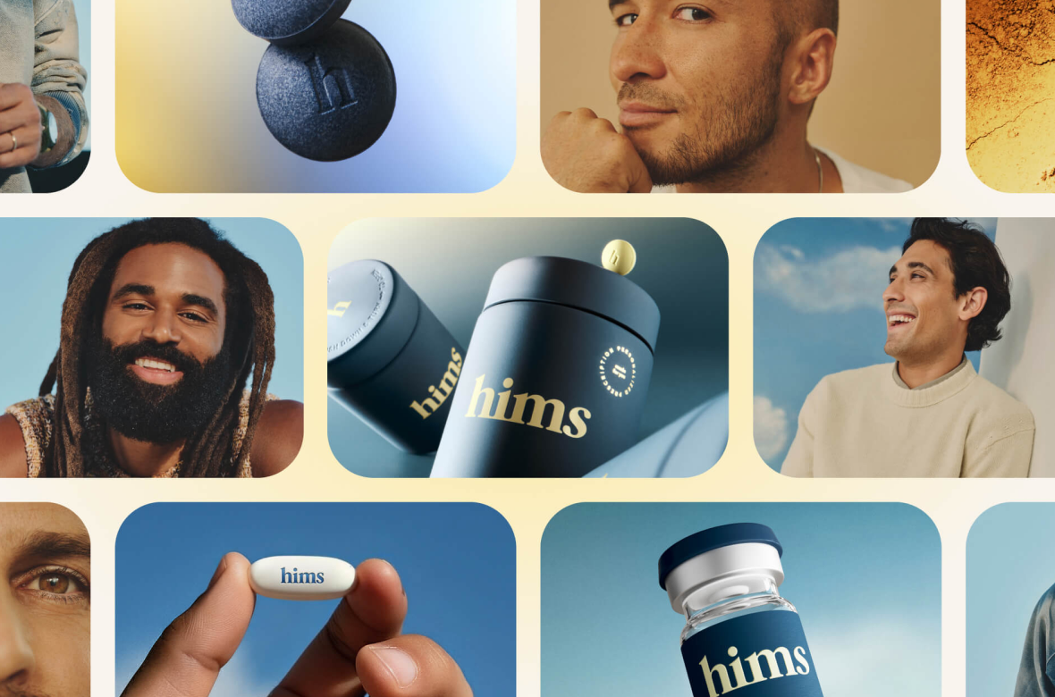
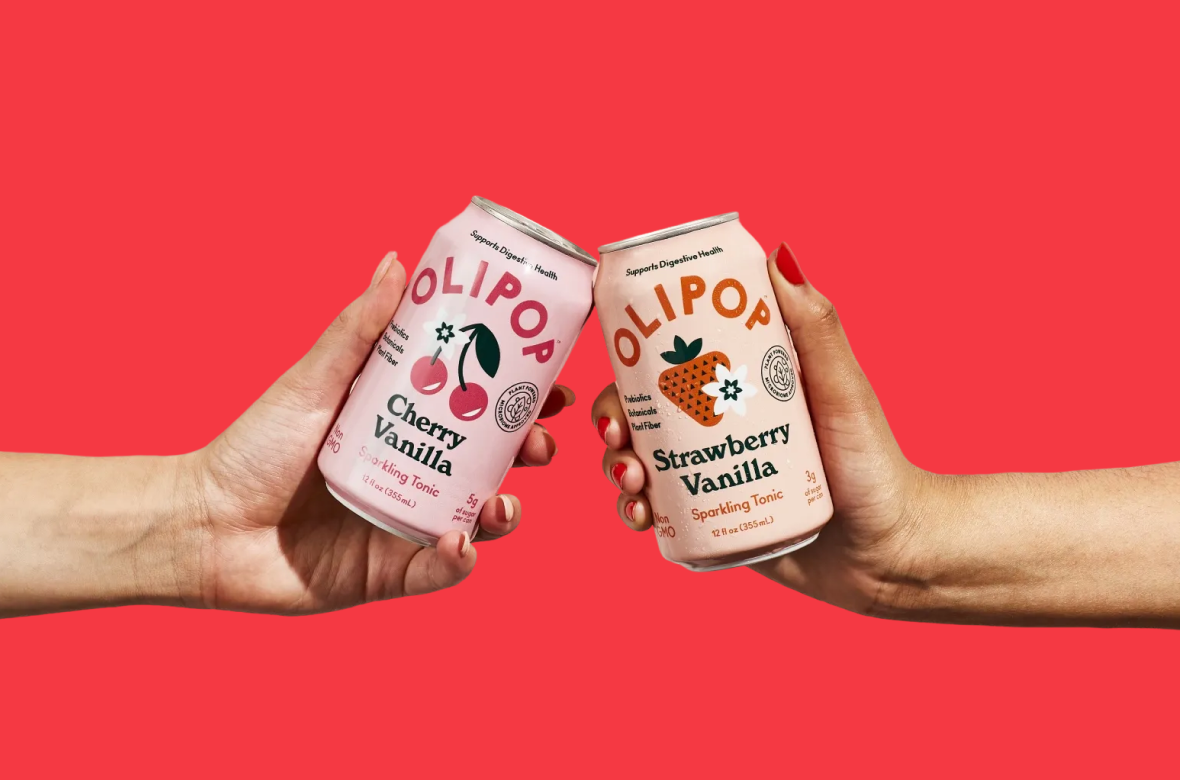
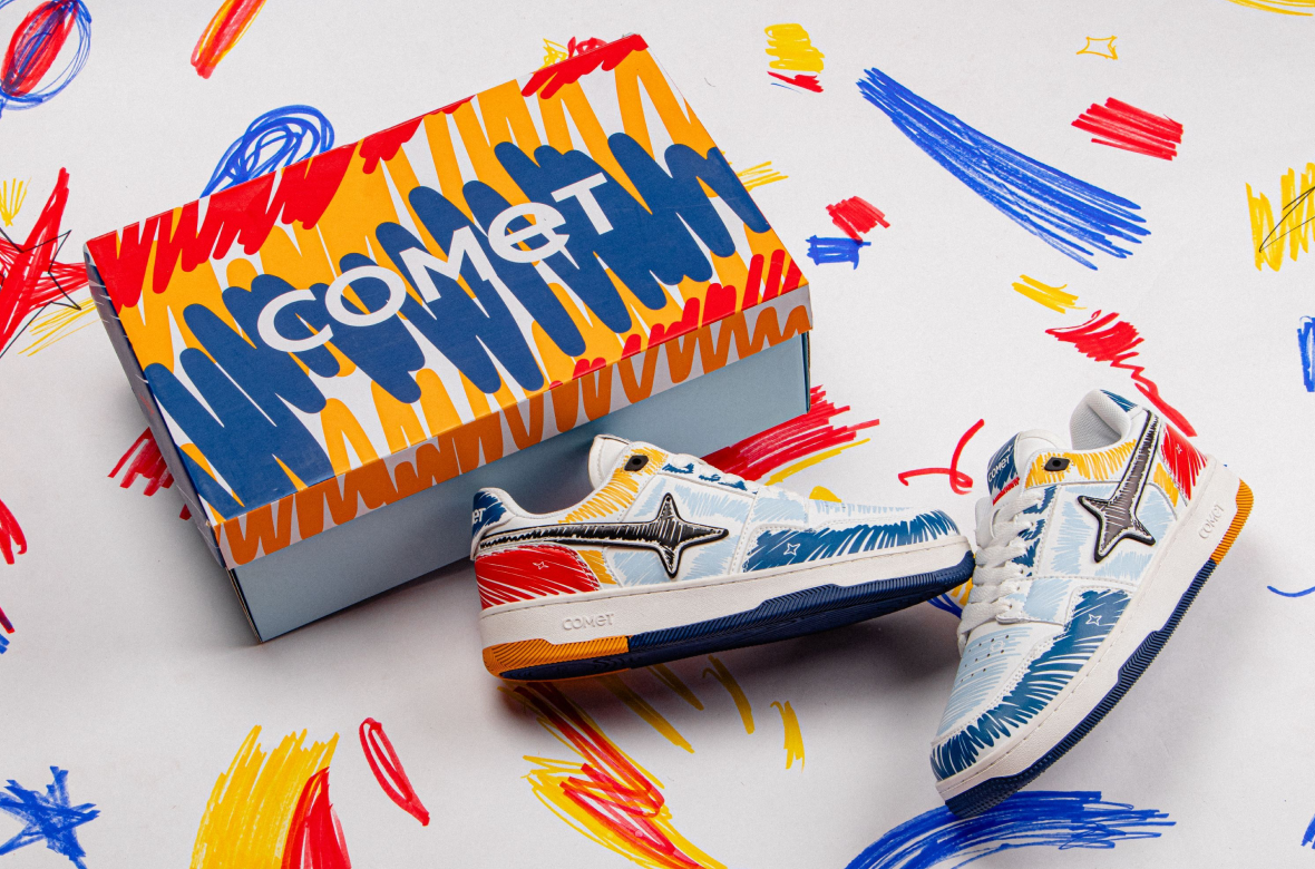
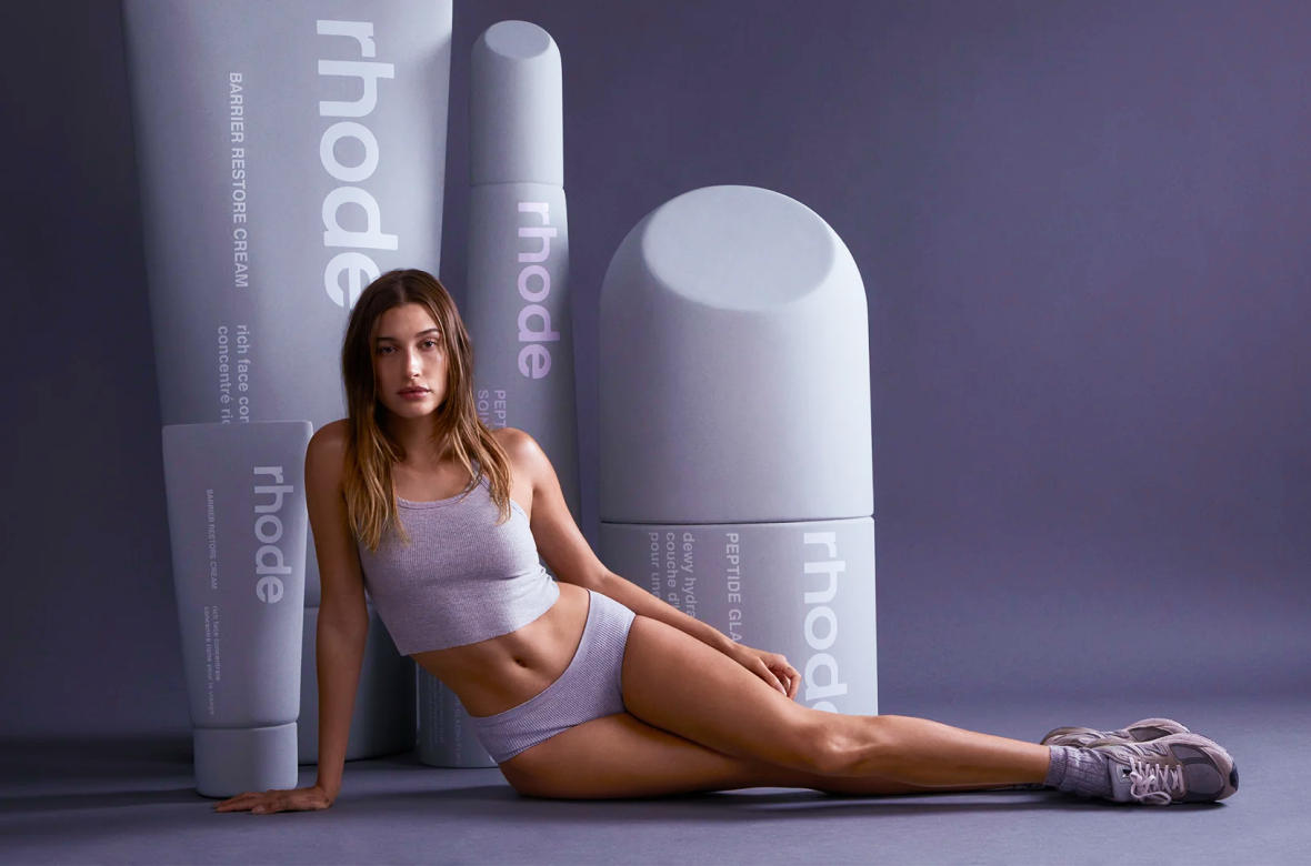
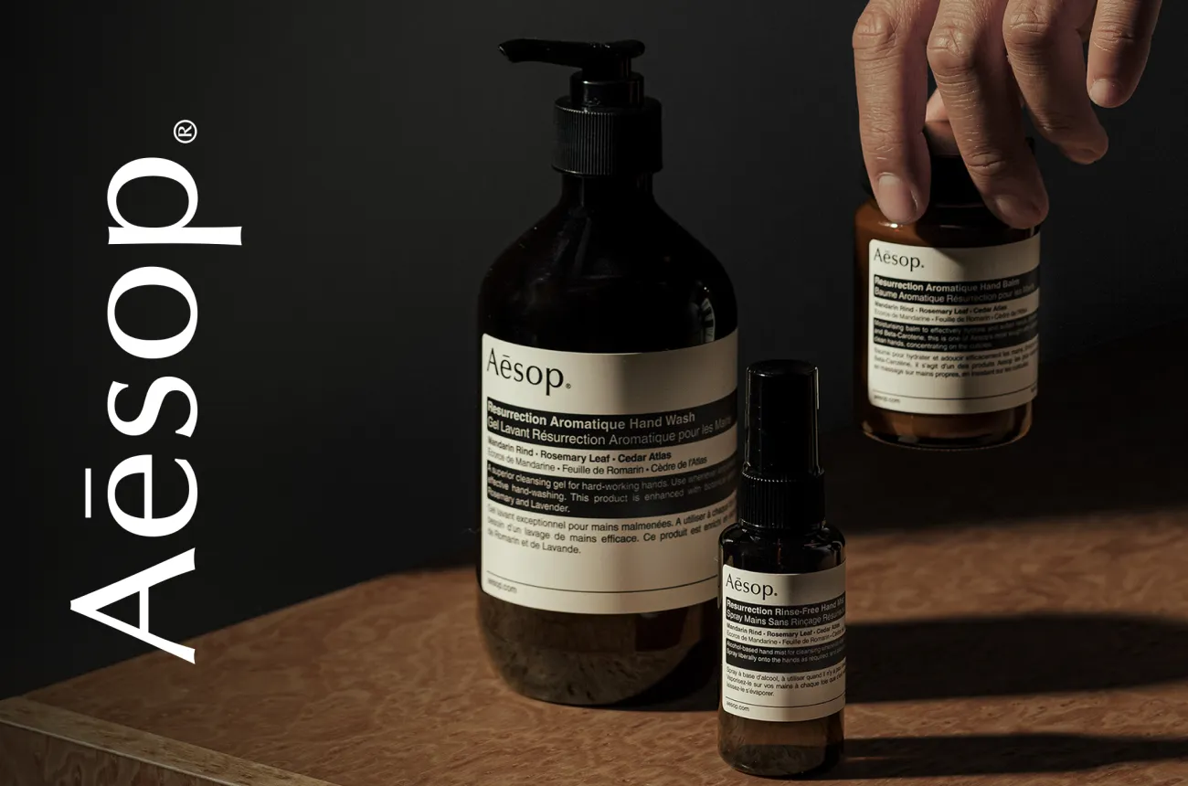
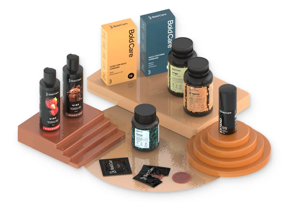
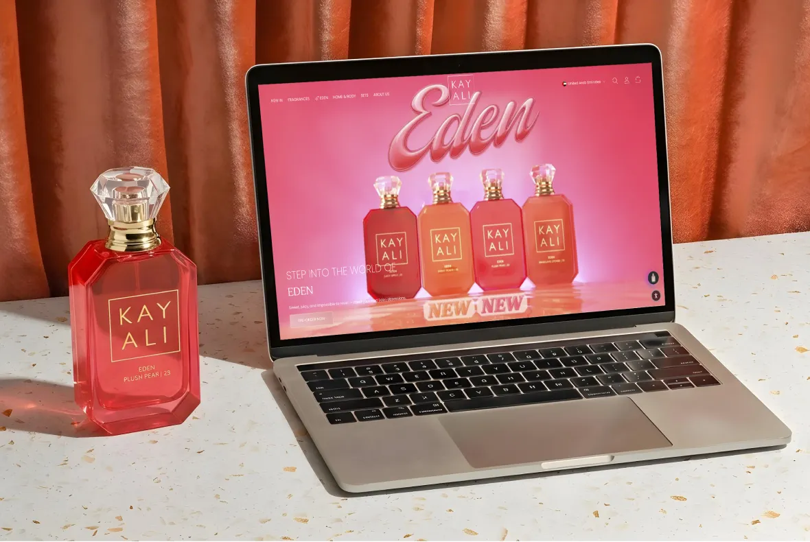
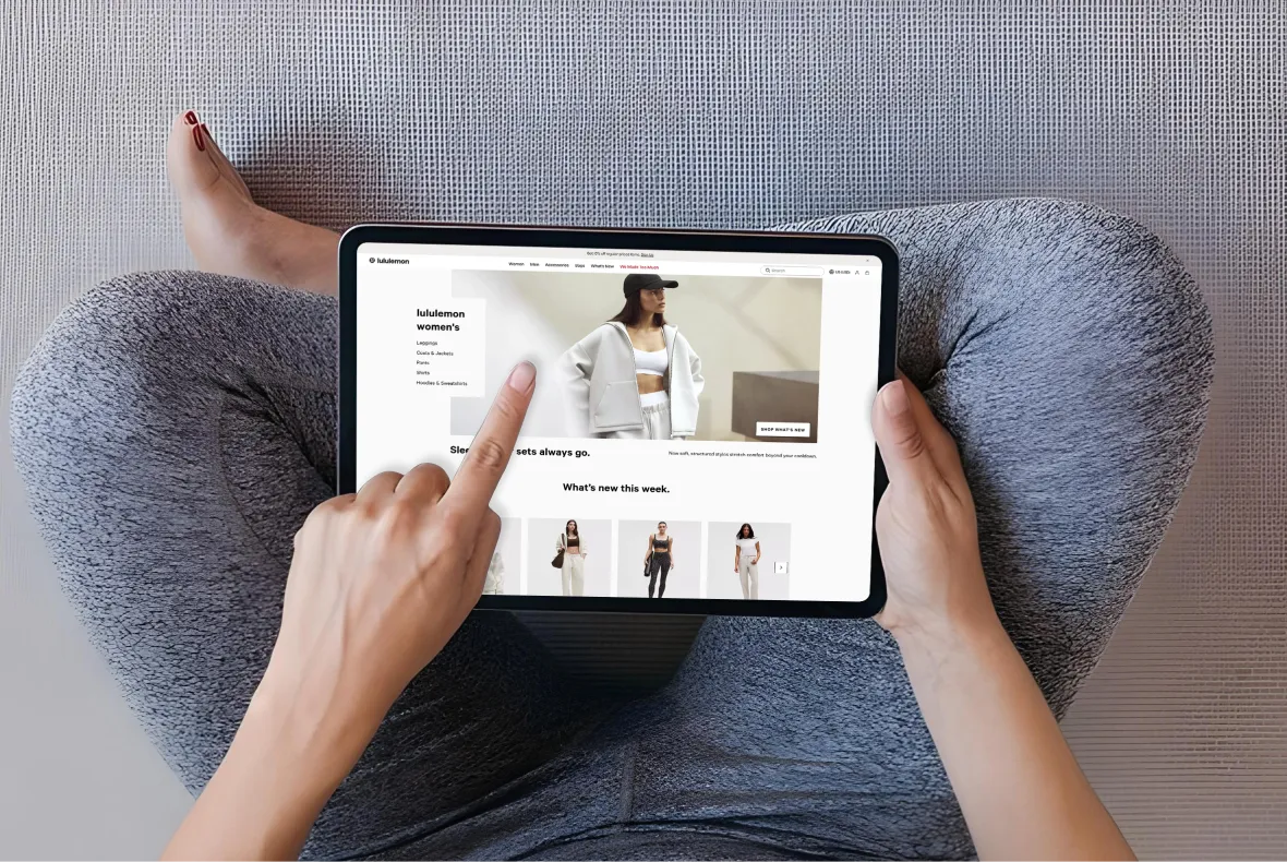
E-Commerce Success Stories

%201.webp)


.webp)
.webp)
Build Your D2C Business The Right Way
Build It With Suplex.


