Shopify Navigation Design Best Practices: The Complete Guide for 2026
.webp)
Shopify Navigation Design Best Practices: The Complete Guide for 2026
Shopify navigation design best practices start with a sobering number.
Baymard Institute's 2025 benchmark of 180+ leading ecommerce sites found that 58% of desktop sites and 67% of mobile sites have navigation rated "mediocre" or "poor."
These are professionally designed, well-funded stores. Two-thirds of them are losing visitors before those visitors reach a product.
Navigation often fails because it's treated as a visual feature instead of a store architecture decision.
The result is generic menus, weak category structures, poor mobile usability, and missed SEO opportunities.
This guide covers menu structure, navigation types by catalogue size, mobile navigation, breadcrumbs, search placement, footer navigation and best practices for bilingual Arabic-English Shopify stores in the UAE and Gulf.
95% of ecommerce sites fail to highlight the user's current location in the main navigation, according to Baymard. A visitor who does not know where they are in a store is already considering leaving.
Why Shopify Navigation Is a Revenue Decision, Not a Design Decision
Navigation is rarely treated with the commercial weight it deserves. It determines conversion, SEO authority, and brand trust at the same time, which is exactly why getting it wrong is so costly.
The Three Commercial Functions of Navigation
Most Shopify store owners conflate these into one decision. They are three separate functions, each with its own failure mode.
- Conversion path: Getting a visitor from their arrival point to the right product in the minimum number of interactions. Every unnecessary click is an abandonment opportunity. Poor navigation is a conversion leak that operates invisibly. Visitors who cannot find what they want do not ask for help. They leave.
- SEO architecture: Your navigation is also your internal linking architecture. It determines how Google discovers pages, how PageRank flows from the homepage to collection and product pages, and which keyword intent each URL can rank for. UX decisions here have direct SEO consequences, and vice versa.
- Brand credibility: Navigation is the first signal of organisational competence. A menu with 15 top-level items and generic labels signals chaos. A clean, purposeful navigation tells the customer the brand knows its products and respects their time. This matters most for first-time visitors arriving from paid social with no prior trust in the brand.
What the Data Says About the Current State
Baymard Institute's 2025 benchmark covers 16,000+ manually reviewed UX scores across 180+ leading US and European ecommerce sites.
These are sites with significant development budgets. The failures are not caused by limited resources.
They are caused by treating navigation as a visual exercise instead of an architectural one. If category-leading retailers get this wrong at this rate, the opportunity for a well-executed Shopify store to differentiate on navigation quality alone is real.
Getting the fundamentals right puts a brand in the top 35–42% of all ecommerce sites by navigation performance.
For a broader audit of where your store's navigation and funnel sit today, Suplex's information architecture service and user flow design service both start with this kind of diagnostic.
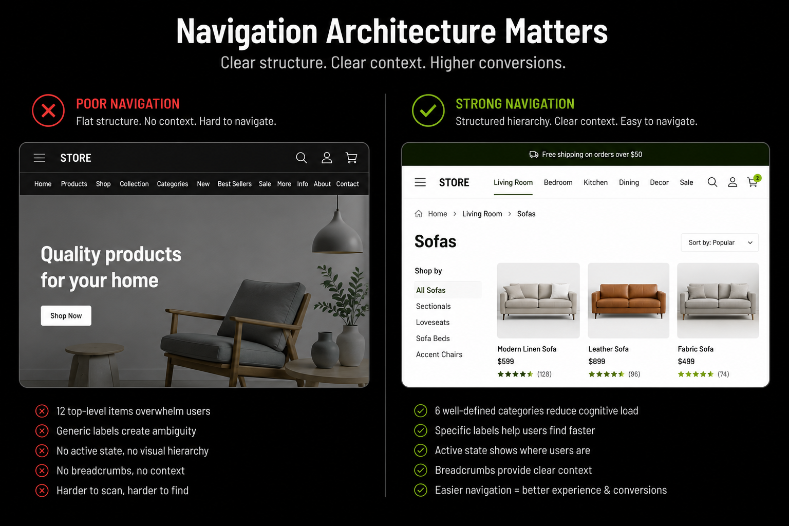
Navigation Architecture, Decisions That Precede Design
These structural decisions determine how navigation performs before a single visual element gets designed. Most brands skip this step entirely, which is the root cause of most navigation problems.
How Many Top-Level Items?
Research from Baymard, Nielsen Norman Group, and conversion studies consistently recommends 5–7 top-level menu items for most Shopify stores.
This keeps navigation easy to scan, reduces cognitive load, and helps shoppers find products faster. Too many top-level items create clutter, slow decision-making, and dilute the importance of your key categories.
If your current navigation exceeds 7 items, consolidate by:
- Merging closely related categories under one label with subcategories
- Moving secondary destinations (About, Blog, FAQ) to the footer
- Treating "Sale" or "New Arrivals" as a promotional label inside a mega menu rather than a top-level item
How Deep Should the Hierarchy Go?
Navigation depth should match catalogue complexity, not personal preference. The table below is a practical starting framework.
The 3-click rule applies regardless of catalogue size: every product should be reachable from the homepage in three clicks or fewer (homepage → category → product).
Each additional level introduces a new decision point and a new abandonment risk. Stores with 4–5 click depth to products are typically over-categorised for their actual catalogue size.
A deeper hierarchy is justified when the distinction between levels is genuinely meaningful to a purchase decision.
A supplement brand with "By Goal → Weight Management → Fat Burners → Stimulant-Free" has a commercially justified 4-level hierarchy because each level meaningfully narrows the decision.
A fashion brand with "Women → Tops → T-Shirts → Crew Neck T-Shirts" is probably one level too deep for a 200-SKU catalogue.
Category Naming: Use Customer Language, Not Internal Labels
Category names should reflect how customers search, not how your business organises products.
Labels like "Collection A" or "SS26 Range" mean little to new visitors, while names like "Men's Running Shoes" or "Protein & Supplements" are clear and searchable.
Review your navigation labels in Google Search Console. If no one searches for your category names, you're missing both SEO and conversion opportunities.
Clear, descriptive labels help shoppers find products faster and can significantly reduce bounce rates.
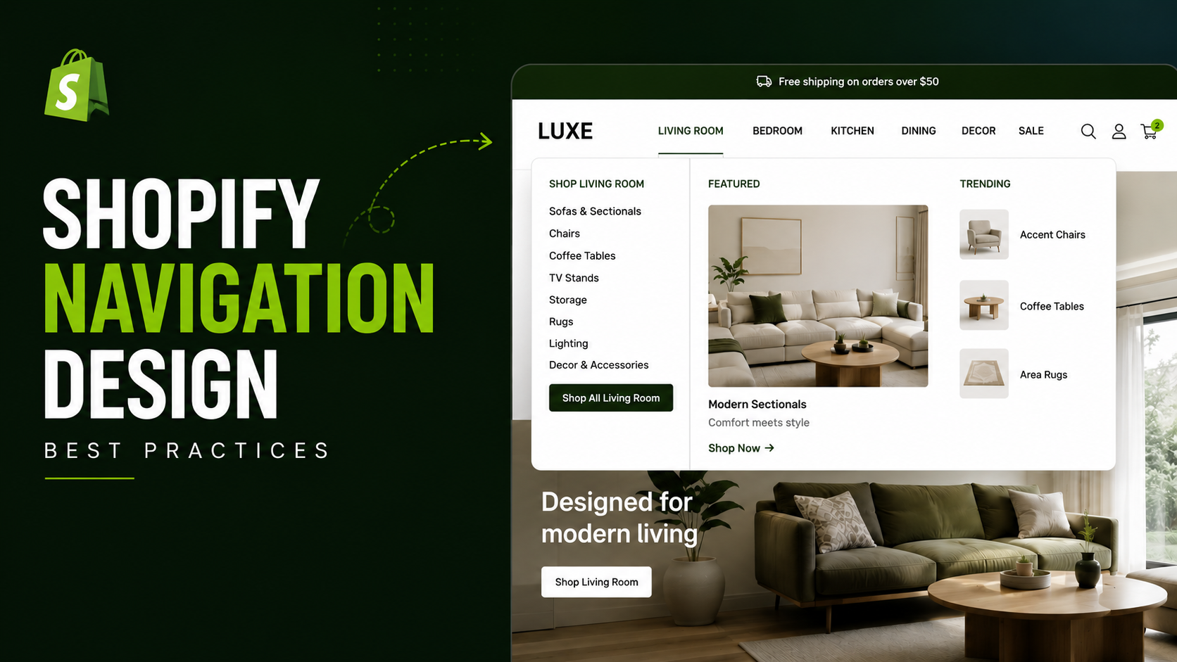
Navigation Type Selection Which Menu Format Fits Your Store
This is the most-asked question in Shopify navigation, and most guides answer it vaguely. Here is a specific decision framework.
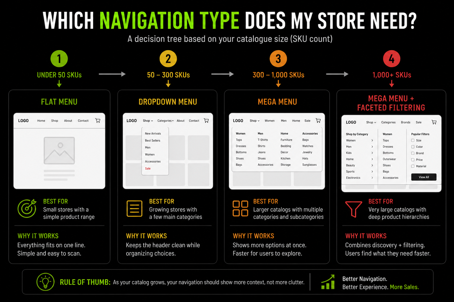
The Four Shopify Navigation Types and When Each Applies
Type 1 : Simple Horizontal Menu (Flat)
Best for stores with under 100 SKUs and 5–7 clearly distinct product categories. A flat horizontal menu with direct links to collection pages and key static pages, no dropdowns.
Fast to render and easy to implement in any theme. Avoid it if a visitor arriving at a category label could reasonably be confused about what products they will find there.
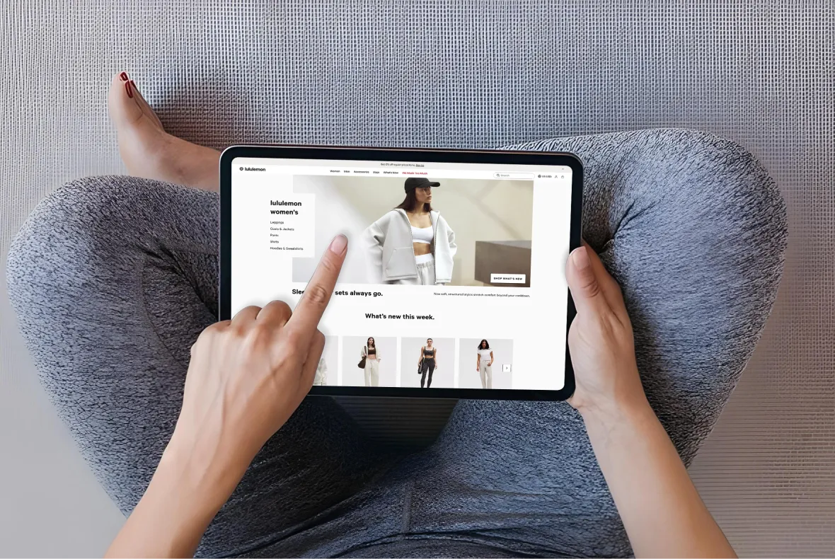
Type 2 : Dropdown Menu
Best for stores with 50–300 SKUs and 2–3 meaningful subcategory levels. Dropdowns reveal subcategories on hover (desktop) or tap (mobile), letting visitors drill down without leaving the current page.
A visitor selecting "Women's Running Shoes" directly from a dropdown saves two interactions and two page loads compared to clicking through three separate pages.
The most common failure: a dropdown showing a flat list of 15 subcategories in a single column, which recreates the exact cognitive problem of an oversized top-level menu.
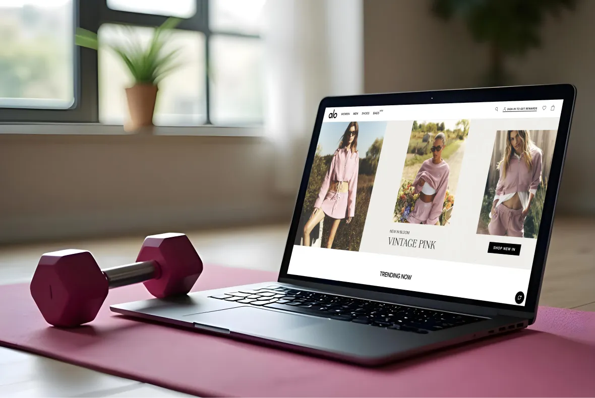
Type 3: Mega Menu
Best for stores with 300+ SKUs, multiple category dimensions, or a catalogue where discovering subcategories is part of the shopping behaviour itself.
Mega menus display a large, often full-width panel showing multiple columns of subcategories, featured images and promotional content at once.
They let a visitor see the full category map of a section in one glance and navigate there in a single interaction.
Mega menus specifically help:
- Fashion brands with multiple gender × product type dimensions (Men's/Women's/Kids × Tops/Bottoms/Footwear)
- Multi-category FMCG or supplement brands with "By Goal" and "By Product Type" as parallel dimensions
- Home and lifestyle brands where category images help visitors understand what each section contains
A poorly executed mega menu with 40 subcategory links, inconsistent visual hierarchy, and no differentiation between primary and secondary destinations performs worse than a clean dropdown.
Mega menus require genuine design work, not just more links added to a dropdown template.
Type 4: Hamburger / Collapsed Mobile Menu
This is not a separate navigation type. It is the mobile manifestation of any of the three above.
The hamburger menu is the expected mobile pattern, but the implementation decisions matter: item order in the expanded menu, how deep the mobile tree can go before becoming unusable, and whether category images aid quick comprehension. Shopify's own UX research found that simplified mobile menu layouts boost engagement by 30%.
For large-catalogue stores, surfacing top-selling categories directly in the mobile menu bar, rather than hiding everything behind the hamburger, significantly improves discovery.
See Suplex's custom Shopify themes service for navigation type implementation across all four formats.
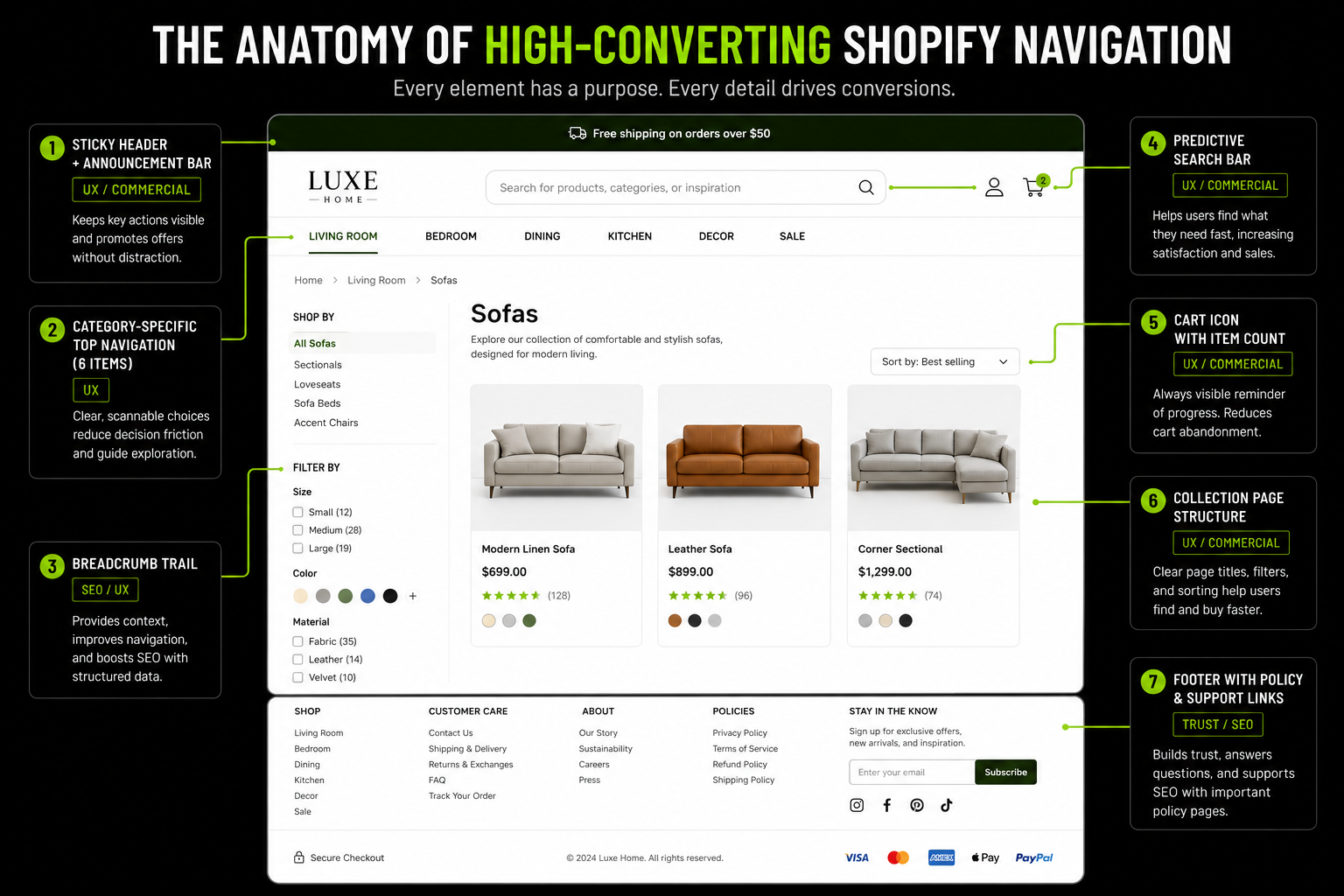
Sticky Navigation The Persistent Header That Converts
This is one of the highest-documented conversion features in Shopify navigation, and most guides treat it as optional. It should not be.
Why Sticky Headers Lift Conversion
A sticky header keeps navigation, search, and the cart visible as visitors scroll, making it easier to move around the store or add products without scrolling back to the top.
Studies show sticky headers can increase conversions by 3–7%, with larger gains when they include key actions like the cart and primary CTA.
By removing unnecessary scrolling, they reduce friction and keep shoppers moving toward checkout.
Shopify Sticky Header Implementation
Most Shopify themes in 2026 include sticky header options as a built-in setting, typically under theme customisation "Header" settings.
Themes without native support need a small JavaScript snippet to handle the static-to-sticky transition on scroll, which requires development involvement.
- The sticky version should be lighter and thinner than the full-height header so it does not occupy excessive vertical space on mobile
- The cart icon with item count should always be visible in the sticky state this is the primary conversion element in the header
- Search should remain accessible in the sticky state
- On mobile, the sticky header should show the category trigger and cart only, not the full desktop navigation
A full-width sticky header (same size as the default) works well on desktop. A condensed sticky header showing only logo, cart, and search is the better mobile implementation.
On a 6-inch screen, a sticky header consuming 80px of height permanently occupies 10–15% of the visible viewport.
Mobile Navigation Designing for the Device Serving Most of Your Traffic
Mobile navigation guidance usually stops at "use a hamburger menu." That is incomplete. The interaction patterns are fundamentally different from desktop.
The Mobile Navigation Problem
More than 70% of Shopify traffic comes from mobile, yet mobile navigation still lags behind desktop because it requires a different interaction model.
Since hover doesn't exist on mobile, menus must use tap-to-expand accordions instead of dropdowns.
Limited screen space also means prioritising key categories, while navigation should be designed for comfortable thumb reach to reduce friction and improve usability.
Mobile Navigation Best Practices for Shopify
- Surface Top Revenue Categories Directly: Avoid relying solely on the hamburger menu for large-catalogue stores. Show the top 3–5 highest-converting collection links directly in the mobile header or as sticky tabs, not hidden behind the hamburger.
- Use Accordion Expansion/Collapse For Subcategories: When a visitor taps a top-level category, subcategories should expand below the tapped item rather than navigating to a new page, keeping the visitor inside the menu for comparison.
- Minimum Tap Target: 44×44px on all menu items, anything smaller causes tap errors, which is an immediate trust and confidence signal that the store was not built for the device.
- Keep Search Visible in The Mobile Header at All Times: Site search users convert at 2–4× the rate of browsing visitors. Burying search inside the hamburger menu requires two interactions to reach it.
Mobile is not just a significant traffic channel here. It is the primary shopping device for a majority of consumers, and many UAE shoppers exclusively browse and buy on mobile.
A navigation that requires multiple taps and has poorly sized touch targets is not a minor inconvenience for this market. It is a primary conversion barrier.
Breadcrumbs Navigation Feature With Both UX and SEO Returns
Breadcrumbs are one of the most commercially dual-purpose navigation elements available. They carry direct UX impact and documented SEO impact at the same time, and almost no competing guide explains the SEO mechanics with any real specificity.
What Breadcrumbs Do (and Why They Matter)
Breadcrumbs show a page's location in your store hierarchy, helping shoppers return to parent categories with a single tap.
They're essential for stores with multiple navigation levels, yet many Shopify stores still omit or misuse them.
On mobile, breadcrumbs reduce reliance on the browser back button, making navigation easier and lowering bounce rates by helping visitors stay oriented.
The SEO Case for Shopify Breadcrumbs
Every breadcrumb link is an internal link with descriptive anchor text pointing from product pages up through collection pages to the homepage. This has three direct SEO consequences.
- PageRank distribution: Breadcrumbs pass link equity from product pages to category pages, helping key collection pages rank better in search.
- Crawl efficiency: They provide Google with a clear site hierarchy, making pages easier to discover and crawl.
- Better search results: Adding BreadcrumbList schema allows Google to display breadcrumb trails instead of URLs, improving search appearance and increasing organic click-through rates.
Google removed breadcrumbs from mobile search results in January 2025, displaying cleaner URL formats instead.
Breadcrumb structured data remains fully valuable regardless: it still shows on desktop SERPs, it helps Google understand site hierarchy as an internal ranking signal, and it improves crawl efficiency.
The mobile SERP change does not reduce the internal SEO value of implementing breadcrumbs.
Shopify Breadcrumb Implementation
Most Shopify themes include breadcrumbs as a built-in feature, but the configuration details matter.
- Display breadcrumbs on both collection and product pages.
Many themes show them on product pages only. Collection page breadcrumbs matter for visitors landing directly on a subcategory from search or a paid ad they need orientation too.
- Set a canonical breadcrumb path for products in multiple collections.
If a product sits in both "Women's Tops" and "Sale," the breadcrumb should show one consistent primary collection path, not alternate based on how the visitor arrived. Inconsistent breadcrumbs send mixed hierarchy signals to Google and confuse returning visitors.
- Add BreadcrumbList JSON-LD schema.
Some themes include this automatically; many do not. This is a small Liquid template edit or a structured data app installation. Validate it afterward in Google's Rich Results Test.
Suplex's Shopify audit checks breadcrumb implementation and schema as part of every technical review.
Navigation and SEO The Architecture Connection Most Shopify Guides Miss
This section connects navigation decisions to SEO outcomes through specific, actionable mechanisms: PageRank flow, crawl budget, anchor text, and collection page authority.
How Shopify Navigation Distributes PageRank
Navigation is one of the strongest sources of internal links on a Shopify store. Because the header appears on every page, top-level collection pages receive the most internal authority after the homepage.
Pages linked directly from the main menu generally carry more SEO value than those buried deeper in the navigation. Use descriptive labels like "Women's Running Shoes" instead of generic text such as "Products" to provide stronger relevance signals to search engines.
A well-structured navigation improves both user experience and internal linking, helping important category pages rank higher in search.
Collection Page Hierarchy as SEO Architecture
Shopify's URL structure (/collections/[handle]) places all collections at the same URL depth, whether they are top-level categories or deep subcategories.
This means Shopify does not inherently signal hierarchy through URL depth the way traditional site architectures do.
The practical workaround is signalling hierarchy through navigation structure and internal links instead of URLs:
- Top-level category collections should receive menu links from the main navigation
- Subcategory collections should receive internal links from their parent category page, through "Shop by category" sections or cross-linking in collection descriptions
- BreadcrumbList schema should reflect the intended hierarchy regardless of URL structure
- Internal links within blog content should target collection pages with descriptive anchor text
This creates a hierarchy signal Google understands, even though Shopify's flat URL structure makes /collections/womens-tops and /collections/womens-formal-tops look equally deep to a URL parser. Suplex's guide on product catalog structure for ecommerce covers this in more depth.
Site Search as Navigation The High-Intent Discovery Path
Search is navigation for the roughly 30% of visitors who use it instead of browsing. A navigation strategy is incomplete without addressing where the search bar lives and how it behaves.
Why Search Placement Is a Navigation Decision
These visitors arrive knowing roughly what they want and search for it rather than browsing categories and they convert at 2–4× the rate of browsing visitors because of that specific purchase intent.
The placement of the search bar is therefore a direct conversion variable. A search bar buried inside the hamburger menu, shown only as a tiny magnifying glass icon, or absent from sticky navigation is actively suppressing conversions from your highest-intent visitors.
Search Bar Navigation Best Practices on Shopify
- Desktop: The search bar should be prominent in the header, either as an open text field or a clearly visible icon that expands immediately on click. Position it on the right side or centred for search-heavy catalogues.
- Mobile: The search icon must be visible in the sticky mobile header at all times, not inside the hamburger menu. On mobile, where category browsing is more friction-heavy, search is the preferred discovery path for high-intent visitors.
- Predictive search: Shopify's native search with the Search & Discovery app supports predictive search, showing relevant products in a dropdown as the visitor types. Enable this on any store with more than 50 products visitors who see their intended product appear before completing their query convert at notably higher rates.
- Search bar label text: Use "Search products," "Search our store," or simply "Search...", not a placeholder that vanishes the moment the field is focused. The label confirms to the visitor that the function searches products, not just blog posts or pages, which reduces hesitation about using it.
Suplex's information architecture service includes search configuration as part of full navigation builds.
Footer Navigation Secondary Discovery and Trust Architecture
The footer is almost always treated as boilerplate. It is not. It is the destination for a specific, commercially important segment of visitor intent.
What the Footer Actually Does Commercially
Baymard's research identifies that visitors actively use footers to find information significant to their buying decision: return policies, shipping details, contact information, and live chat access.
Visitors who need this information and do not find it in the footer do not search elsewhere. They abandon. The footer is the destination for the pre-purchase verifier who wants to confirm the brand is trustworthy before completing a transaction.
Shopify Footer Navigation Structure
Also include secondary navigation: links to key collections not in the main menu (sale, gift guides, bestsellers) and the account/login link.
Avoid duplicating main navigation links, adding social icons that navigate visitors away without purchase value, or stuffing promotional content into the footer that belongs in the page body.
Include a WhatsApp Business contact number as the primary customer service channel for Gulf consumers, your UAE trade licence number to build trust and demonstrate local legitimacy, a physical address if relevant to the brand's positioning, and Arabic-language footer links if you operate a bilingual store.
Shopify Navigation for UAE and Gulf Markets RTL, Bilingual, and Regional Specifics
This is the section missing from every competing guide on this topic. Genuine RTL navigation implementation, not a paragraph acknowledging it exists.
Why Arabic RTL Navigation Is Not a CSS Flip
The most common mistake in Shopify Arabic RTL implementation is applying direction: rtl to the body element and calling the navigation done.
The result reads right-to-left technically but navigates left-to-right in practice, because the dropdown logic, icon placement, hover behaviour and tap targets were all built for left-to-right interaction patterns.
A genuinely RTL navigation requires several reversals working together:
- Icon direction: The hamburger menu should open from the right on mobile, since RTL users expect the panel to slide in from the right. Back arrows in expanded menus should point right, not left. Cart and search icons should sit on the left side of the header, which is visually the starting point of right-to-left reading.
- Dropdown direction: Dropdowns triggered on hover or tap should expand to the left of the trigger item, not the right. A right-expanding dropdown in an RTL layout opens against the reading direction, which is visually disorienting.
- Breadcrumb direction: Breadcrumbs in Arabic read right to left (الصفحة الرئيسية › النساء › الفساتين), and the separator chevron should point left rather than right.
- Mega menu column order: With multiple subcategory columns, order should reverse for Arabic, with the most important category in the rightmost column, the starting point of RTL reading.
Bilingual Navigation Parity for UAE Shopify Stores
A bilingual Shopify store should provide the same navigation structure in both Arabic and English. One language should never offer fewer categories or a simpler browsing experience than the other.
Maintain equal hierarchy, category depth, and product discovery across both versions. Consistent navigation creates a better user experience and ensures Arabic-speaking customers receive the same level of accessibility as English-speaking shoppers.
Navigation parity requirements:
- Same number of top-level items in both languages
- Same subcategory depth in both languages
- Same collection pages available in both languages
- Language switcher visible in the header, not the footer
- Consistent category order and promotional page access across both versions
Menus should stay structurally parallel across languages so users never feel they have entered a different store.
Category order, promotional pages, and product discovery paths should remain familiar in both versions.
The conversion impact of getting this wrong is measurable and severe: brands with half-implemented Arabic navigation consistently lose 30–50% of their potential conversion rate from Arabic-preferring shoppers compared to stores with genuine RTL implementation.
Measuring Navigation Performance What to Track and How
Brands cannot improve navigation they are not measuring. This section covers the specific metrics that reveal where navigation is leaking revenue.
The Navigation Metrics That Reveal Revenue Leaks
- Click map data (Hotjar, Microsoft Clarity, Lucky Orange): Which navigation items get clicked most, and least? A top-level item receiving 0.5% of all navigation clicks is either a category with no relevant audience or a label so unclear visitors are not recognising it as relevant both fixable, with different fixes.
- Menu item click-through rate: The share of visitors who interact with navigation versus those who land on a page and navigate using something else entirely (search, footer, back button). A low desktop interaction rate suggests the navigation is unclear or intimidating. On mobile, it may simply mean search is doing the discovery work, which is fine if search is converting well.
- Category page exit rate: Visitors landing on a collection page and leaving immediately, without clicking into a product or subcategory, are signalling a navigation problem either the category is too broad or the products visible do not match what the navigation label suggested.
- Search exit rate: Visitors who search and leave without clicking any result are your highest-intent visitors experiencing the most acute discovery failure. This data lives in Shopify Analytics under Online Store → Live View → Search, and in GA4 under Explore → Site Search.
- Zero-results search queries: These reveal either catalogue gaps (products you do not carry that visitors expect) or vocabulary mismatches (visitors using different terms for products that exist but are categorised differently). Both are actionable.
- Breadcrumb click rate: A high rate indicates visitors are actively using breadcrumbs to navigate back, meaning the navigation supports browse behaviour correctly. A zero rate on mobile may mean breadcrumbs are not visible or not rendering at a tappable size.
Navigation A/B Testing on Shopify
The highest-value tests to run, in rough priority order:
- Category label copy: Does "Women's Shoes" or "Women's Footwear" produce a higher click-through rate from navigation? Wording affects click rate and downstream SEO alignment together.
- Number of top-level items: Does reducing from 9 items to 6 improve conversion by reducing cognitive load? This is directly testable.
- Mega menu vs. dropdown: For stores near the 200–300 SKU boundary, does a mega menu improve category reach and conversion compared to a simpler dropdown?
- Sticky header presence: The documented 3–25% conversion lift is an average. Your store's specific number is discoverable through a 2–4 week A/B test.
Suplex's D2C data analytics service sets up this kind of navigation-level tracking as standard.
How We Approach Navigation Design at Suplex
Navigation is one of the first architectural decisions we make on every Shopify project and one of the first things we audit on underperforming stores.
The most common issue is navigation designed for appearance instead of usability. The result is attractive menus that make products harder to find, especially on mobile and for first-time visitors.
For UAE brands, we focus on three areas often overlooked: true Arabic RTL navigation, equal discovery across Arabic and English and mobile menus that surface high-converting collections instead of hiding everything behind a hamburger menu.
For supplement and FMCG brands, we organise navigation around customer goals rather than product taxonomy, helping shoppers find products faster and improving conversion.
Relevant case studies:
- Loomsona fashion brand UAE; bilingual Arabic-English navigation architecture and mega menu implementation for a multi-SKU fashion catalogue
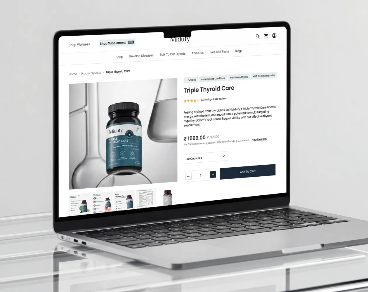
- Miduty D2C supplement brand; goal-based navigation taxonomy and collection hierarchy for health products
If your Shopify navigation is something you set up at launch and have not reviewed since, or if your mobile navigation is a noticeably different and worse experience than your desktop navigation, Suplex's Shopify audit starts with navigation and funnel architecture before anything else.
Frequently Asked Questions
What are Shopify navigation design best practices?
Limit top-level navigation to 5–7 items, use customer-friendly category names, keep products within 3 clicks, add sticky navigation and breadcrumbs, and design mobile navigation separately from desktop.
How many menu items should a Shopify store have?
Most stores perform best with 5–7 top-level menu items. Move pages like About, FAQ, Blog, and Returns to the footer, and combine categories if your menu becomes too large.
What is a Shopify mega menu and when should I use it?
A mega menu displays multiple categories in one dropdown. It's best for stores with 300+ SKUs and several product categories, making products easier to find.
How do breadcrumbs work in Shopify and why do they matter for SEO?
Breadcrumbs show a page's location within your store, helping users navigate and improving internal linking. Adding BreadcrumbList schema can also enhance your appearance in Google search results.
How should I design mobile navigation for my Shopify store?
Use a hamburger menu, keep search visible, highlight key collections, use 44×44px tap targets, and display subcategories in expandable accordions instead of loading extra pages.
Hi, I’m Rishabh Jain
I believe great design has the power to shape perception, build trust, and move businesses forward. That belief is what led me to found Suplex Design Studio, a global branding and packaging studio working with FMCG and D2C brands across markets.I started suplex at 25 with a clear intent, to create design that is strategic, thoughtful, and commercially meaningful. By 28, the studio had scaled globally, guided by a strong foundation in Integrated Design that I developed during my academic journey in London, where I was honoured with the Dean’s Award.
Over the years, I’ve had the opportunity to work with 100+ brands, from Fortune 500 organizations to family-run businesses, helping them build packaging and brand systems that create recall, relevance, and long-term value.
Suplex’s work has been recognized internationally, including the Manifest Award (2024), the Clutch Global Award (2025), and features on platforms such as Packaging of the World, The Dieline, and the World Brand Design Society.
None of this would be possible without the people behind the work. I’m deeply grateful to the suplex team, whose commitment, creativity, and attention to detail turn ideas into meaningful brand experiences every day.
At the heart of my work is a simple philosophy, design should be intentional, honest, and built to last, and that continues to guide everything we create at suplex.


Let’s Make It Happen
E-Commerce Success Stories
%201.webp)


.webp)
.webp)
Build Your D2C Business The Right Way
Build It With Suplex.


