Ecommerce Website UX Best Practices: What the Data Actually Says
.webp)
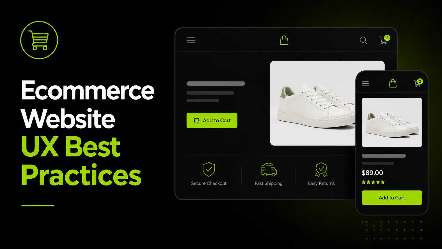
Ecommerce Website UX Best Practices: What the Data Actually Says
Ecommerce website UX best practices directly influence conversion rates, revenue, and customer retention.
While most stores focus on adding features, top-performing brands optimise the user journey across navigation, product discovery, checkout, mobile experience, and site search.
This guide explores the UX decisions that separate average stores from high-converting ecommerce websites and shows how to identify the areas creating the biggest revenue leaks.
What Ecommerce UX Actually Means and Why Most Sites Get It Wrong
User experience in ecommerce is the quality of every interaction between a visitor and a store from the first page load to the post-purchase conf
irmation email.
It encompasses information architecture, interaction design, copy, performance, trust signals, and checkout flow. Most brands treat it as one of these things. It is all of them simultaneously.
UX Is Not Design It Is the Sum of Every Friction Point
A visually beautiful store can convert at 0.8% because checkout is friction-heavy: too many fields, surprise shipping costs and mandatory account creation.
An average-looking store can convert at 4%+ because it answers purchase questions, offers guest checkout, and shows delivery dates upfront.
UX is not aesthetics. It is removing every reason a buyer might abandon a purchase.
The biggest mistake is investing in a redesign when the real problem is checkout or mobile UX. Diagnosis must come before prescription, which is why this guide starts with measurement.
The Five UX Areas That Drive Conversion
Every ecommerce store has five primary UX areas, each with a distinct role in the path to purchase:
- Navigation and site structure getting visitors to the right product in the fewest clicks
- Product pages answering every purchase question and building the confidence to buy
- Checkout flow removing every friction point between add to cart and order confirmed
- Mobile experience serving the 68–72% of visitors arriving on a smartphone
- Site search capturing the 30% of high-intent visitors who already know what they want
Each is measurable. Each has known benchmarks. Each has specific fixes with documented conversion impact. The rest of this guide addresses them in order of typical revenue impact, starting with where the most money is being lost.
Our user flow design service and information architecture service both start with funnel data not wireframes for exactly this reason.
Navigation UX Getting Buyers to the Right Product Without Making Them Think
Navigation determines whether a visitor with purchase intent successfully reaches the right product. Every failed navigation path is a lost sale not because the product does not exist, but because the visitor could not find it.
The 3-Click Rule and Why It Still Matters
Every product in your catalogue should be reachable from the homepage in three clicks or fewer: homepage to category to product. This is not an arbitrary design principle. It reflects how visitor attention operates.
Each additional click requires a decision. Each decision introduces drop-off risk. Catalogue architecture that forces four or five clicks before reaching a product page silently bleeds sessions before they ever see a price.
The practical implementation: 5–8 top-level navigation categories, 3–8 subcategories per level, and products reachable within the 3-click depth. Anything beyond this requires structural remediation not cosmetic navigation redesign.
Mega Menus When They Help and When They Hurt
Mega menus (dropdown panels showing full category and subcategory structure) improve discoverability for large catalogues but only when implemented correctly.
When mega menus improve UX:
- Catalogues with 200+ SKUs across multiple distinct categories
- When subcategory structure meaningfully helps a visitor narrow from broad intent to a specific need
- Fashion, home, and FMCG brands where category browsing is a significant discovery behaviour
When mega menus hurt UX:
- Stores with under 100 SKUs where a mega menu creates false complexity
- When category names use internal product classification rather than customer language
- When the mobile implementation collapses poorly a mega menu that breaks on a 6-inch screen eliminates its own value
Breadcrumb Navigation: Undervalued and Underpowered
Breadcrumbs do more than help users navigate. They improve orientation, provide quick back-navigation to categories, and support SEO by helping search engines understand site hierarchy.
Every product and subcategory page should include clickable breadcrumbs that accurately reflect the catalogue structure.
For UAE and Gulf ecommerce stores, breadcrumbs should be fully localized in both Arabic and English.
Arabic breadcrumbs must follow native RTL conventions, including correct arrow direction, to create a trustworthy and familiar shopping experience.
Filters and Faceted Navigation: The Highest-Leverage Discovery Tool for Large Catalogues
Filters help shoppers narrow large catalogues using attributes such as price, size, colour, brand, or material.
For stores with 200+ SKUs, they are often the primary product discovery tool, enabling visitors to find relevant products faster and reducing catalogue friction.
Common filter UX failures:
- Showing all filter options simultaneously, creating cognitive overload rather than reducing it
- Filters that do not show how many results each selection returns before selection (zero-result states destroy confidence and trust)
- Filters that reset when the visitor navigates back to the category page after viewing a product
Correct filter UX:
- Show only relevant filters per category a fashion category needs size and colour; a supplement category needs goal and form
- Display result count next to each filter option before selection
- Persist filter state when a visitor views a product and returns
- Implement AJAX filtering or canonical controls to prevent SEO crawl budget problems from URL proliferation
The intersection of filter UX and SEO is covered in detail in our product catalog structure guide, specifically the faceted navigation section on crawl budget management.
Product Page UX Where Purchase Decisions Are Actually Made
Baymard Institute's benchmark across 155+ sites found 52% of desktop and 62% of mobile product pages have "mediocre or worse" UX.
This is the single largest category of fixable conversion loss across the ecommerce industry and most of it traces to information gaps, not design problems.
The Product Page as a Purchase Decision Interface
A product page is not a display surface. It is a decision interface. A visitor arrives with purchase intent and a set of open questions.
The product page's job is to answer every one of them before the visitor reaches the Add to Cart button.
For most product categories, the open questions are consistent: Is this the right product for my needs? Is the quality what I expect?
Will it fit or work for me? Can I trust this brand? What will it actually cost me, including shipping? What happens if I change my mind?
A product page that fails to answer any of these questions has an unnecessary conversion bottleneck. The fix is almost never a redesign. It is information completeness and correct placement.
Product Photography: The Highest-Impact Element on Product Pages
Product photography is the closest substitute for an in-store experience. Since shoppers cannot physically inspect a product, images become the primary indicator of quality and trust.
Products with five or more images from multiple angles consistently outperform single-image listings.
Lifestyle photography showing the product in real-world use often converts better than product-only shots, while images featuring people can improve performance in categories such as apparel, fitness, and beauty.
For higher-value products, zoom functionality is essential, allowing shoppers to examine details closely before making a purchase decision.
Mobile Photography Consideration:
On mobile, product images must load fast and display correctly within the viewport without horizontal scrolling. A 4MB JPEG that looks stunning on desktop is a 4-second load on a mobile cellular connection and at 4 seconds, 40%+ of mobile visitors have already left.
The Above-the-Fold Checklist for Mobile Product Pages
On a mobile device, what a visitor sees without scrolling determines whether they continue or bounce. The commercial hierarchy for mobile product pages above the fold:
- Product image the primary visual; takes most of the viewport
- Product name clear, descriptive, keyword-appropriate
- Star rating and review count visible immediately, before scrolling; the single most influential trust signal for new visitors
- Price clear, VAT-inclusive (UAE requirement), without ambiguity
- Primary CTA (Add to Cart or Buy Now) visible above the fold on mobile without scrolling
Everything else description, specifications, detailed reviews, related products belong below the fold.
The above-the-fold area is for purchase confidence, not information delivery. Baymard's benchmark shows 52% of desktop and 62% of mobile product pages fail on at least one of these five elements.
Reviews Placement, Volume and Format
Reviews are the most commercially powerful trust signal on a product page. Placement matters more than most brands realise.
What works:
- Star rating and total count immediately below the product title not below the fold
- Ability to filter reviews by rating, attribute, or use case
- Review recency a visible date on each review reassures visitors that quality has been consistent
- Photo and video reviews UGC imagery reduces the quality uncertainty that prevents purchase
What does not work:
- Reviews only at the bottom of the page most visitors never scroll there before deciding
- Aggregate star rating without review count "4.8 stars" means little without "from 847 reviews"
- Only displaying 5-star reviews visitors are suspicious of perfect scores; a range of 3–5 star reviews builds more trust than filtering for only the best ones
Our conversion rate optimisation service addresses review placement as a first-priority product page fix because it is the single highest-leverage trust signal change available without a design rebuild.
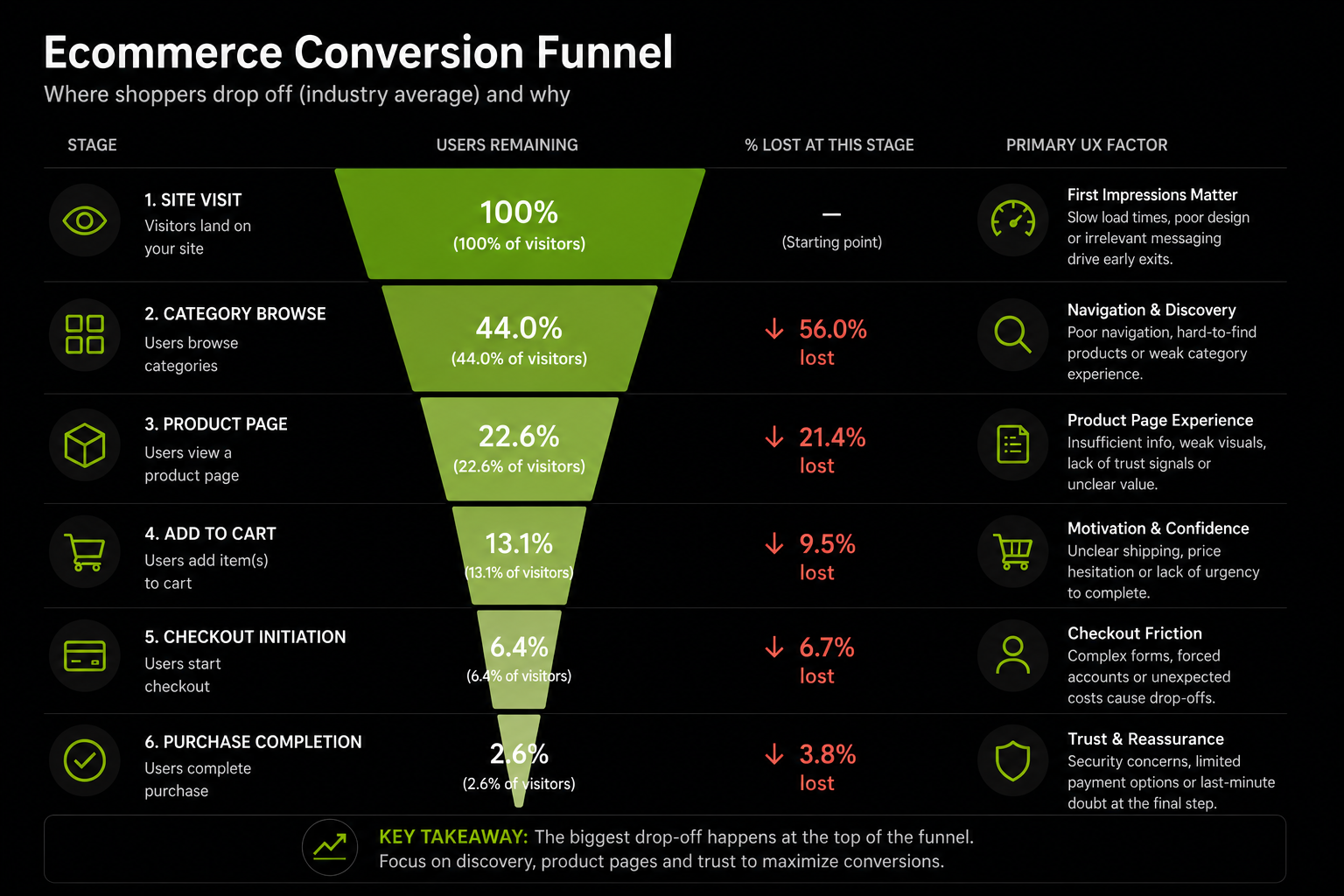
Checkout UX Where $260 Billion in Revenue Is Lost Every Year
More recoverable revenue lives in checkout UX than in any other area of ecommerce. The data is precise, the causes are known, and the fixes are specific.
Why 70% of Carts Are Abandoned and What Is Fixable
Baymard Institute's 2026 meta-analysis of 50 studies places average cart abandonment at 70.19%. On mobile this rises to 76–80%.
Source: Baymard Institute, 4,500+ US shoppers surveyed, 2026
The critical insight: the top two reasons unexpected costs and forced account creation together account for 74% of abandonment and are entirely fixable through UX decisions.
This is not a product problem, a pricing problem, or a brand problem. It is an information and architecture problem.
Baymard calculates that addressing these fixable causes could recover up to 35.26% of abandoned carts or $260 billion annually in the US and EU.
The Checkout Flow Principles That Actually Move Conversion
- Guest checkout by default: 24–26% of shoppers abandon when forced to create an account. Make guest checkout the primary option and offer account creation after purchase.
- Show costs early: 48% of abandonment is caused by unexpected costs. Display shipping fees, taxes, and other charges on the product or cart page before checkout begins.
- Reduce form fields: The average checkout has 11.3 fields, while Baymard recommends a maximum of 8. Remove non-essential fields to minimise friction.
- Prioritise express checkout: Place Apple Pay, Google Pay, and Shop Pay buttons prominently at the top of the cart to accelerate mobile conversions.
- Use a progress indicator: Simple step labels such as "Shipping → Payment → Confirmation" reduce uncertainty and improve completion rates.
UAE-Specific Checkout Requirements
- Offer Cash on Delivery (COD) as a visible payment option.
- Display VAT-inclusive pricing throughout the shopping journey.
- Make Tabby and Tamara visible at checkout, not hidden within payment options.
- Support UAE address formats, including building name, area, and emirate.
The most common conversion-killing checkout issues in Gulf ecommerce are hidden shipping costs, missing COD, and mandatory account creation. Fixing these issues typically requires Shopify configuration and theme updates rather than a full site rebuild.
Our Shopify Plus service covers Checkout Extensibility, the Plus-exclusive feature enabling custom checkout fields, dynamic discount logic, and BNPL display natively within the checkout flow. Read our ecommerce website audit checklist for the full checkout audit process.
Mobile UX Designing for the Device That Drives Most of Your Traffic
Mobile is not a secondary experience to be adapted from desktop. For most ecommerce stores in 2026, it is the primary experience and UX decisions that ignore this are leaving significant conversion on the table.
The Mobile Traffic Reality in 2026
Mobile accounts for 68–72% of ecommerce traffic globally. In the UAE, smartphone penetration is among the highest globally, and mobile's share of ecommerce sessions exceeds global averages.
Dynamic Yield's 2026 data shows mobile converting at 2.75–2.87% versus desktop at 2.47–3.09% nearly at parity for well-optimised stores. For unoptimised stores, the mobile-to-desktop conversion gap remains 40–50%.
The difference between stores at parity and stores with that gap is explained by four factors: checkout friction, page speed, CTA visibility, and form usability on small screens. All four are fixable.
Mobile-First Design Principles for Ecommerce
Thumb-zone first:
On a standard smartphone held in one hand, the thumb reaches comfortably to the centre and bottom of the screen.
The top corners are uncomfortable. Design primary actions Add to Cart, filters, navigation in the thumb's natural reach zone. Navigation icons requiring a second hand reduce interaction completion.
Progressive disclosure for product information:
On a 6-inch screen, displaying a full specification table, size guide, ingredient list, shipping policy, and review set simultaneously creates cognitive overload.
Use collapsible sections, tabs, or accordions to reveal secondary information on demand. The primary information image, name, rating, price, CTA is always visible. Everything else is available but not forced on the visitor before they are ready for it.
Sticky Add to Cart button. On mobile product pages where the primary CTA scrolls out of view when a visitor reads the description, a sticky "Add to Cart" button anchored to the bottom of the screen maintains purchase accessibility throughout the product page visit.
This single change has documented conversion lift of 10–20% on mobile product pages.
Touch target sizing:
Minimum interactive element size: 44×44px (Apple standard) or 48×48dp (Google standard).
Buttons, filter checkboxes, radio buttons and quantity selectors below this threshold create tap errors that introduce friction.
Tap errors on checkout forms where a visitor selects the wrong option and must re-enter are among the most abandonment-generating patterns on mobile.
One-tap payment options are table stakes:
Typing a 16-digit card number, expiry, CVC, and two addresses on a phone keyboard is friction.
Apple Pay, Google Pay and Shop Pay compress this to a single biometric confirmation. Stores without these enabled are accepting a structural mobile conversion deficit.
Page Speed Is a Mobile UX Issue:
On a cellular connection, a 4-second load is where most mobile visitors begin abandoning. The data is specific: ecommerce sites loading in 1 second have 3× higher conversion rates than 5-second sites. A 1-second delay reduces conversions by 7%.
Mobile page speed is determined primarily by image size, app count, and render-blocking scripts. On Shopify specifically: images should be WebP format, correctly sized for mobile viewport and lazy-loaded.
App count should be audited quarterly every app installed adds JavaScript. Render-blocking scripts should be deferred where possible.
Our mobile-first design service, performance optimisation service, and Shopify speed optimisation guide cover these in full technical detail.
Site Search UX The Highest-Intent Feature Most Stores Under-Invest In
Site search serves the visitors most likely to buy and most stores fail them.
Why Site Search Is the Highest-Converting Surface on Your Store
Approximately 30% of ecommerce visitors use the site search bar rather than navigating through categories. These visitors have already decided they want something specific. The conversion impact is documented: site search users convert at 2–4× the rate of browsing visitors. Walmart's conversion moves from 1.1% to 2.9% when visitors use search. Amazon's conversion rate is 6× higher for search users than browsing visitors.
Despite this, Baymard Institute found 72% of ecommerce sites completely fail to meet site search UX expectations. 42% fail across multiple search query types. Optimising site search typically produces faster conversion improvement per unit of investment than any other UX area because it serves the visitors most likely to complete a purchase.
What Good Site Search UX Requires
Visibility: The search bar in the header, always visible, is accessible only via a magnifying glass icon. For stores where 30%+ of visitors use search as their primary navigation, the search bar belongs prominently in the header on every page.
Predictive Search With Instant Results:
Search results should appear in a dropdown panel within 100ms of typing onset. Visitors who see a relevant product in the predictive dropdown immediately know their query will succeed and convert without ever reaching a full results page.
Tolerance For Typos, Synonyms and Natural Language:
"Moisturiser" and "moisturizer" should return the same results. "Women's running shoes size 8" should produce filtered results, not a no-results error. Most basic search implementations are keyword-literal and fail on a significant proportion of real queries.
No-results Page design:
When search returns nothing, most stores display a blank page. A well-designed no-results state offers: suggested alternative queries, popular categories, or featured products. The goal is to redirect the visitor rather than terminate the session.
Search Analytics as a Catalogue Diagnostic:
Zero-results queries are product catalogue gap signals. High-volume searches for products you do not carry are demand validation data.
Search exit rate visitors who search, find nothing suitable, and leave is the clearest signal that search is underperforming. Both metrics are available in Shopify Analytics and GA4 with basic configuration.
AI-Powered Search: AI search using natural language processing and vector matching understands intent rather than matching keywords to product titles.
Forrester research attributes a 43% average conversion increase to AI-powered site search optimisation. For stores with large catalogues or diverse customer language patterns, AI search is a material conversion lever.
Our information architecture service covers search configuration as part of every large-catalogue build.
Trust Signals The UX Layer That Converts Sceptical First-Time Visitors
Trust is a placement and architecture problem before it is a content problem. Most stores have trust-building information return policies, reviews, security badges. It is in the wrong place.
What Trust Signals Actually Are
A return policy buried in the footer does not reduce purchase anxiety at the moment of decision. A return policy displayed adjacent to the Add to Cart button does.
A security badge that appears only at the final payment step arrives too late for visitors who abandoned the cart stage.
Trust signals reduce purchase hesitation at the moment of hesitation not before it, and not after the visitor has left.
Trust Signal Hierarchy Placement by Purchase Stage
On the product page:
- Star rating and review count: immediately below the product name
- "Free returns" or "30-day guarantee": immediately adjacent to the price or CTA
- Delivery date estimate: below the CTA ("Order before 3pm, arrives Thursday")
- Payment method icons: below the CTA showing the accepted methods
- Secure checkout badge: small but visible near the CTA not in the footer
On the cart page:
- Order summary with all costs visible (subtotal, shipping, taxes, total)
- Return policy reminder
- Express checkout trust icons (Apple Pay logo, Shop Pay logo recognisable at a glance)
- Security indicator (SSL padlock or secure checkout messaging)
At checkout:
- Payment security indicator at the payment step
- VAT breakdown line item (UAE requirement and consumer confidence signal)
- Delivery estimate confirmation at the shipping selection step
The most common trust signal error we find in audits is placement, not absence. A brand has a money-back guarantee, a verified review platform and a clear returns policy but none of it appears on the product page.
It lives on a "Trust" page that 2% of visitors ever open. Moving trust signals to the point of decision is a layout change.
It typically takes a developer half a day and produces measurable conversion improvement within the first week.
The UX Metrics That Actually Matter Measuring Before You Optimise
Every competing piece on ecommerce UX gives advice without a measurement framework. This section corrects that. Diagnosis before prescription is the correct order.
Why Conversion Rate Is a Lagging Indicator
Sitewide conversion rate tells you whether you have a problem. It does not tell you where the problem is or how to fix it. The leading indicators reveal the location of friction before conversion rate movements make it visible.
You can combine the benchmark and warning threshold into a single "Target / Warning" column to keep it within 3 columns:
The second version works particularly well for blog posts and mobile-responsive tables.
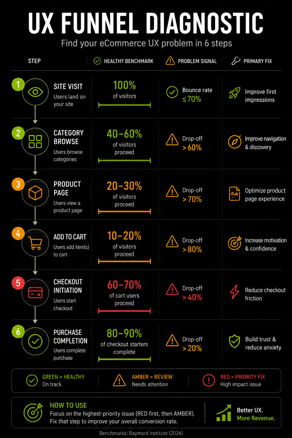
The UX Funnel Diagnostic How to Find Your Biggest Problem in 15 Minutes
Using Shopify Analytics and GA4, follow this sequence:
Step 1: Check your checkout completion rate:
If below 45%, start with checkout. That is where the most revenue is being lost.
Step 2: If checkout is healthy (45%+), check your cart-to-checkout rate:
If below 65%, the problem on the cart page likely cost surprise or missing trust signals.
Step 3: If the cart is healthy, check your add-to-cart rate:
If below 3.5%, the problem is on the product page photography, pricing confidence, or missing information.
Step 4: Check your mobile vs desktop conversion gap:
If mobile is more than 25% below desktop, mobile UX is a priority intervention.
Step 5: Check your search exit rate:
If above 35%, site search is underperforming for high-intent visitors.
Step 6: The area with the highest drop-off or the widest gap from benchmark is your highest-priority UX investment.
This treats UX optimisation as diagnosis before prescription the correct order, and the one most often skipped.
Our Shopify audit service runs this diagnostic sequence on every store audit and identifies the highest-revenue-impact fix before any design recommendations are made.
D2C data analytics service builds the measurement infrastructure that makes ongoing funnel monitoring operationally manageable.
UX for the UAE and Gulf Market: What Standard Guides Miss
Most ecommerce UX guides overlook the requirements of Gulf consumers. For brands operating in the UAE and GCC, localisation extends far beyond language translation.
Arabic RTL Is a Design System Decision, Not a Translation Setting
Effective Arabic localisation requires a fully native right-to-left experience. Navigation, directional icons, image carousels, form fields, and page layouts should all follow RTL conventions rather than simply translating English content into Arabic.
Typography also matters. Arabic-specific fonts, spacing, and alignment create a more natural reading experience and strengthen trust with Arabic-speaking shoppers.
Poor RTL implementation signals that a store was not built for the local market, while a properly localised experience can significantly improve engagement and conversion among Arabic-preferring customers.
UAE-Specific Trust Signals
The trust signals that work in Western markets do not map directly to the Gulf. UAE consumer trust is built through:
Local business presence: A .ae domain, a visible UAE phone number, and a UAE address in the footer signal genuine market commitment. A foreign brand with Arabic text but no local presence signals does not carry the same trust weight.
COD availability as a trust signal: Even for consumers who ultimately pay by card, the visible presence of COD as an option signals that the brand is confident enough in its product to accept payment on delivery. Its absence creates the opposite implication.
Regional payment logos: Displaying Telr, PayTabs, or Tabby logos is more trust-building for UAE consumers than displaying PayPal, which has low penetration in the Gulf. Logo recognition translates directly into payment confidence at checkout.
Arabic customer service access: A WhatsApp Business button with Arabic language support signals genuine market investment and reduces purchase anxiety for Arabic-preferring shoppers who will not fill out a contact form.
WhatsApp as a UX Element
In the UAE and broader GCC, WhatsApp is the primary customer communication channel. For ecommerce UX, WhatsApp Business integration is not a customer service feature it is a purchase confidence feature.
A floating WhatsApp button on product pages and at checkout with the message "Questions? Chat with us in Arabic or English" reduces purchase hesitation for visitors who have a product question but will not submit a contact form.
For high-AOV products in particular luxury items, furniture, supplements in large quantities conversational commerce via WhatsApp bridges the gap between "interested but unsure" and "purchased."
Our mobile-first design service, international ecommerce setup service, and global aesthetic audit service all incorporate UAE-specific UX requirements as standard not as optional add-ons.
UX in the Age of AI What Ecommerce Stores Need to Prepare For
Every competing piece on ecommerce UX was written before AI product discovery became a revenue channel. In 2026, it is.
Personalisation as UX Infrastructure
McKinsey research attributes 10–15% revenue lift to effective ecommerce personalisation. Product recommendations account for up to 31% of total ecommerce revenue (Barilliance). 56% of shoppers become repeat buyers following personalised experiences.
Personalisation as a UX layer means the experience adapts to individual visitor behaviour, recently viewed products, purchase history, browsing patterns, and explicitly stated preferences.
In 2026, this is not a premium feature for large brands. It is table-stakes UX for any store competing at above-average conversion rates.
First-party data is the asset. Post-iOS 14 and with third-party cookies deprecated, personalisation depends on data the brand owns: cart behaviour, product views, purchase history, and preferences collected through quiz tools, loyalty programmes and post-purchase surveys.
Conversational Commerce AI That Converts at 4x
AI-powered chat assistants configured as guided product discovery tools, not customer service bots convert at 12.3% versus 3.1% for standard browsing. A 4× conversion difference from a single UX element is among the largest documented conversion levers in the industry.
The distinction matters: customer service chatbots handle order queries and returns. Conversational commerce AI guides visitors through product selection asking questions, understanding needs and recommending specific SKUs.
For stores with complex catalogues (supplements, skincare, technical products), this reduces the paralysis of choice that causes browsing sessions without purchase.
Agentic Commerce and Structured Product Data as UX
The emerging frontier is agentic commerce AI shopping agents (ChatGPT Shopping, Perplexity Buy with Pro, Google's Universal Cart) acting on behalf of shoppers to discover, compare, and complete purchases. These agents parse structured product data to understand and recommend products.
From a UX perspective, this introduces a new requirement: your product pages must be readable by AI agents, not just human visitors.
Product schema markup, rich attribute data (material, use case, fit, certification), and accurate Merchant Center feeds determine whether your products appear in AI-powered recommendations.
AI-referred traffic converted 42% better than non-AI traffic in March 2026 (Adobe). A store with thin product data is invisible to this channel. Our AI for Shopify service covers the structured data and schema implementation that AI discoverability requires.
How We Approach UX at Suplex
At Suplex, every UX project starts with data, not design. We analyse the conversion funnel to identify where revenue is being lost, then prioritise the highest-impact fixes before making design recommendations.
Across UAE and Gulf ecommerce audits, the most common issues are poor checkout UX, weak mobile product pages, and misplaced trust signals. These problems often reduce conversion more than visual design quality.
Our process focuses on diagnosing the root cause first, whether it's checkout friction, search performance, mobile usability, or trust gaps. The goal is measurable conversion improvement, not simply a more attractive website.
From bilingual RTL ecommerce experiences for UAE brands to conversion-focused Shopify stores and loyalty-driven mobile apps, our approach remains the same: identify the problem, implement the right solution, and measure the impact.
If you want to know where your store is losing revenue, our Shopify UX audit starts with funnel data and customer behaviour, not a redesign proposal.
Book a call directly with our founders to discuss your store's UX. Slots are limited.
Frequently Asked Questions
What are ecommerce UX best practices?
Ecommerce UX best practices are design and content decisions that reduce friction across the customer journey from navigation and product pages through to checkout and mobile experience. The highest-impact areas are: removing unexpected costs from checkout, enabling guest checkout, optimising mobile product page CTA placement, improving site search quality, and placing trust signals adjacent to purchase decisions rather than in the footer.
How does UX affect ecommerce conversion rates?
UX quality is the primary driver of the gap between average and top-performing stores. Average ecommerce conversion sits at 1.6–2.5%. Top performers reach 4.7%+. Baymard Institute's research attributes $260 billion in annual lost revenue in the US and EU alone to poor checkout UX. Forrester Research quantifies UX ROI at $100 for every $1 invested, a 9,900% return.
What is the most common ecommerce UX mistake?
The most costly and most common is displaying unexpected costs, shipping fees and taxes for the first time at the final checkout step. This accounts for 48% of all cart abandonments (Baymard Institute, 2026). Shipping costs and estimated taxes should be visible on the product page or at the cart stage. Their surprise appearance at payment is the single largest fixable cause of lost revenue in ecommerce.
How important is mobile UX for ecommerce?
Critical. Mobile accounts for 68–72% of ecommerce traffic globally. In the UAE, this share is even higher. While mobile conversion rates have converged significantly with desktop in well-optimised stores (Dynamic Yield 2026: mobile at 2.75–2.87% versus desktop at 2.47–3.09%), stores with poor mobile checkout and product page UX still see 40–50% lower mobile conversion rates. One-tap payment options and sticky CTAs are the highest-impact mobile fixes available without a full redesign.
How do you improve ecommerce UX without a full redesign?
By diagnosing the highest-revenue-impact problem first. Check checkout completion rate if below 45%, add guest checkout, show costs earlier, and reduce form fields. Check cart-to-checkout rate if below 65%, shipping cost visibility and trust signals need attention. Check add-to-cart rate if below 3.5%, the product page needs more complete information. Most UX improvements are configuration and content changes, not redesigns.
Hi, I’m Rishabh Jain
I believe great design has the power to shape perception, build trust, and move businesses forward. That belief is what led me to found Suplex Design Studio, a global branding and packaging studio working with FMCG and D2C brands across markets.I started suplex at 25 with a clear intent, to create design that is strategic, thoughtful, and commercially meaningful. By 28, the studio had scaled globally, guided by a strong foundation in Integrated Design that I developed during my academic journey in London, where I was honoured with the Dean’s Award.
Over the years, I’ve had the opportunity to work with 100+ brands, from Fortune 500 organizations to family-run businesses, helping them build packaging and brand systems that create recall, relevance, and long-term value.
Suplex’s work has been recognized internationally, including the Manifest Award (2024), the Clutch Global Award (2025), and features on platforms such as Packaging of the World, The Dieline, and the World Brand Design Society.
None of this would be possible without the people behind the work. I’m deeply grateful to the suplex team, whose commitment, creativity, and attention to detail turn ideas into meaningful brand experiences every day.
At the heart of my work is a simple philosophy, design should be intentional, honest, and built to last, and that continues to guide everything we create at suplex.


Let’s Make It Happen
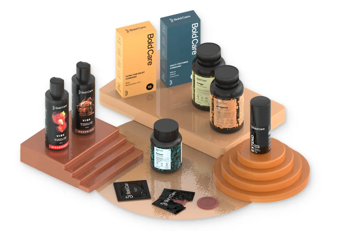
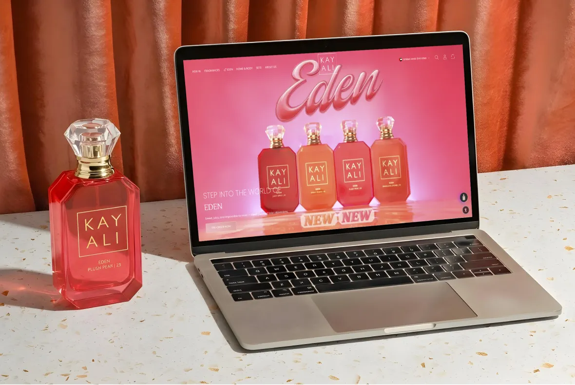
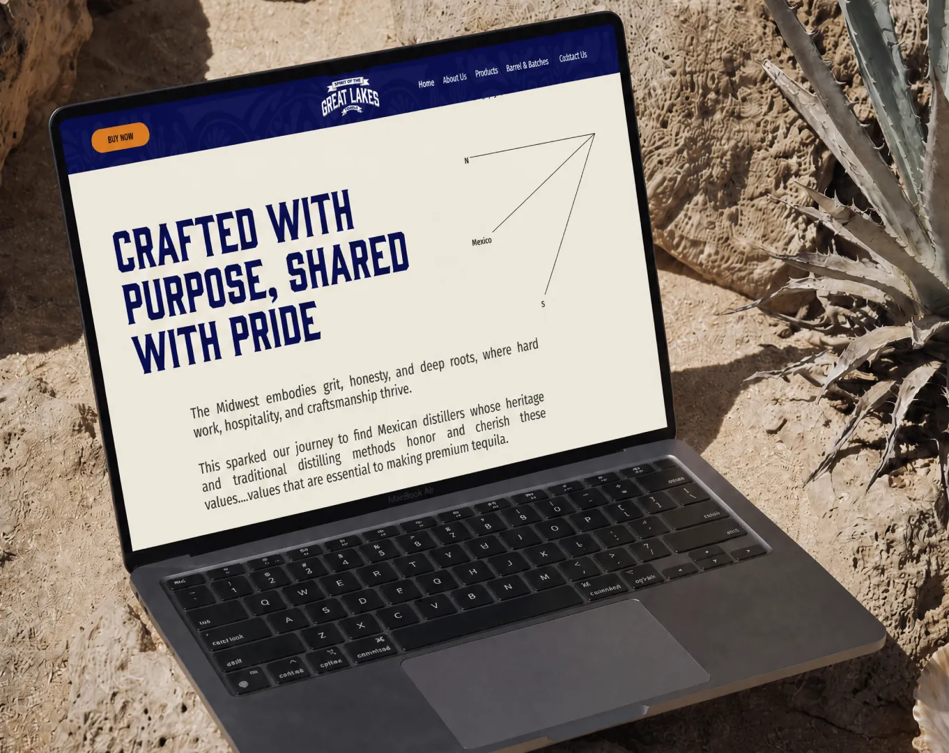
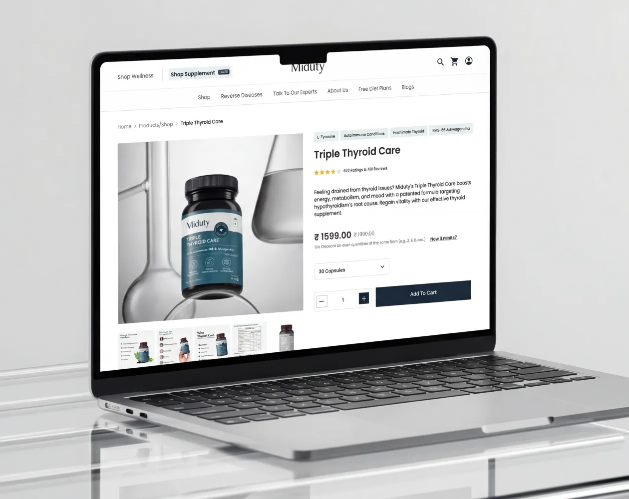
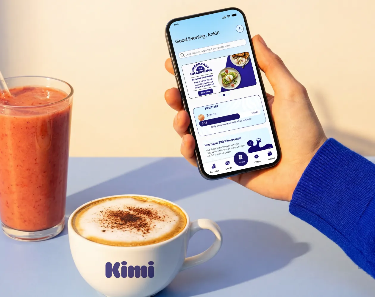
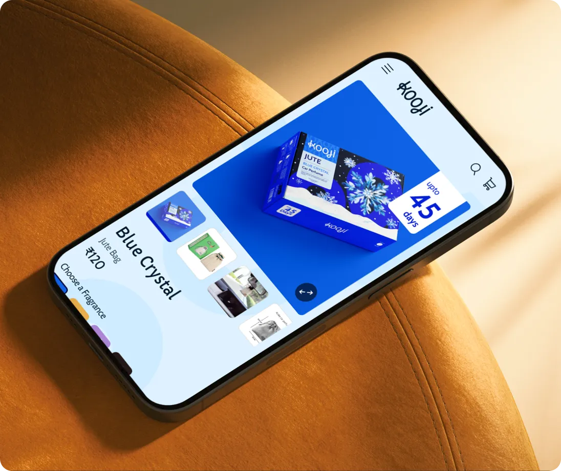
E-Commerce Success Stories

%201.webp)


.webp)
.webp)
Build Your D2C Business The Right Way
Build It With Suplex.


