D2C Food and Beverage Website Design: A Practical Guide for Brands That Sell Online
.avif)
D2C Food and Beverage Website Design: A Practical Guide for Brands That Sell Online
Search for food and beverage website design and most advice is for restaurants. Menus, reservations, locations. A D2C brand selling packaged food and drinks online has a different job.
Restaurant websites and D2C food websites get confused constantly. They share a category but nothing else. A restaurant site answers "what is on the menu tonight and can I book a table.
"A D2C food site answers "what is in this pack, will it arrive fresh, and can I reorder it easily." The design decisions follow from that difference.
This Suplex guide covers how to design a D2C food and beverage website that actually converts. It covers product-type-specific design, visual identity, product pages, subscriptions, shipping messaging, content, and the UAE and GCC essentials that most global guides ignore.
D2C Food Website vs Restaurant Website: Why the Design Is Different
This distinction is the starting point. Most design advice for "food websites" actually addresses restaurants.
A restaurant website sells an experience. A D2C food website sells a product that will arrive in a box. The design priorities are different from the first wireframe.
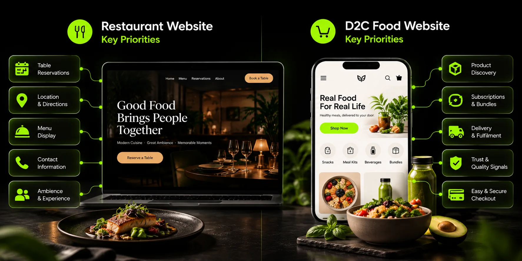
Design Priorities by Product Type
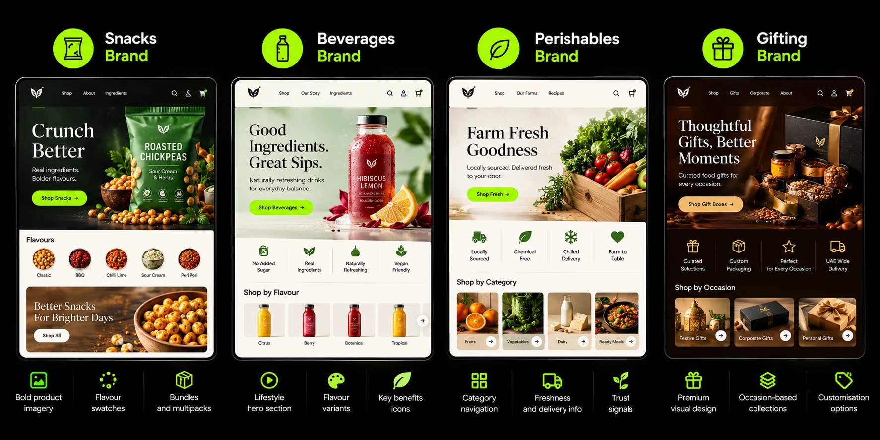
Not all food and beverage brands need the same design. The product type determines what the website must prioritise.
Shelf-Stable Snacks and Pantry Goods
The core design priorities are variety discovery and bundle purchasing. Shoppers want to try multiple flavours without committing to a full case of one. A variety pack or build-your-own box solves this.
- Most Important Page Feature: Flavour selector with visual swatches, not a dropdown
- Main Purchase Driver: Discovery and trial
- Repeat-Purchase Tool: Subscription with flexible flavour rotation
- Biggest Design Risk: Hiding the variety pack options below the fold
Beverages (Functional Drinks, Coffee, Tea, Juices)
Beverages are subscription-led. The product is consumed on a predictable cycle. The website should make the subscription option as prominent as the one-time purchase.
- Most Important Page Feature: Clear pack-size selection with quantity pricing
- Main Purchase Driver: Taste and functional benefit
- Repeat-Purchase Tool: Subscribe-and-save with 10% to 15% discount
- Biggest Design Risk: Making the subscription option hard to find or unclear on pricing
Fresh, Chilled, and Perishable
Perishable brands have the most complex design requirements. Delivery logistics are not a checkout detail. They are the core of the experience.
- Most Important Page Feature: Delivery-day selection and order cut-off timer
- Main Purchase Driver: Freshness and convenience
- Repeat-Purchase Tool: Subscription with delivery-day lock
- Biggest Design Risk: Vague delivery information that creates anxiety before purchase
Gifting and Specialty (Dates, Sweets, Hampers)
Gifting brands have a seasonal revenue pattern. The website needs to support gift options, messages, and corporate orders without complicating the standard purchase flow.
- Most important page feature: Gift message and delivery date selection
- Main purchase driver: Occasion and presentation
- Repeat-purchase tool: Seasonal collections and corporate accounts
- Biggest design risk: Making the gifting flow harder than the standard checkout
Visual Identity: Making Food Look Worth Buying Online
Food is bought with the eyes. The first design decision on every page is whether the imagery makes someone hungry or thirsty. Everything else is second.
Appetite-Led Photography
The pack shot answers "what arrives." Clean, front-on, label legible. It carries into collection grids, search results, and ads.
The appetite shot answers "what it tastes like." The poured glass, the broken bar, the sauce mid-drizzle. Texture at close range is the nearest a screen gets to flavour.
The context shot answers "how it is used." A breakfast table or a cocktail sets a portion, occasion, and audience in one frame.
The scale shot answers "how much is this?" A hand holding the product, or the product next to a familiar object, sets expectations before the shopper reads the weight.
Most F&B product pages need all four. A pack shot alone is not enough to sell a product the shopper cannot taste.
Flavour-Coded Colour Systems
Tie each flavour's colour to its pack. A strawberry flavour uses the same pink on the website as on the packaging. A mango flavour uses the same orange.
This sounds obvious. Most brands do not do it. The result is a product page where the shopper has to read every flavour name to find what they want. With flavour-coded colours, they scan.
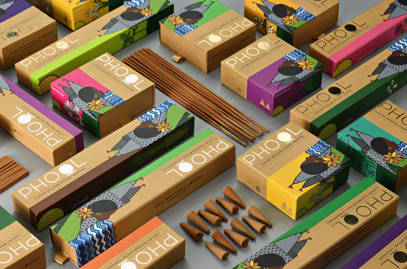
Packaging as the Brand Hero
The physical pack is the most consistent brand asset the customer sees. The website should mirror it. Same colours, same typography, same visual language. A shopper who sees the pack in a supermarket should recognise the website immediately.
Strategic insight: Budget for photography before custom animation. A well-shot product image converts better than a beautifully animated page with weak images. Most F&B brands underinvest in photography and overinvest in motion design.
Read Suplex guide on D2C homepage design best practices for UAE brands for the broader visual identity framework.
Product Page Design for Food and Beverage
The product page is where the sale happens. For food and beverage, it needs to answer specific questions in a specific order.
Flavour and Pack-Size Selection
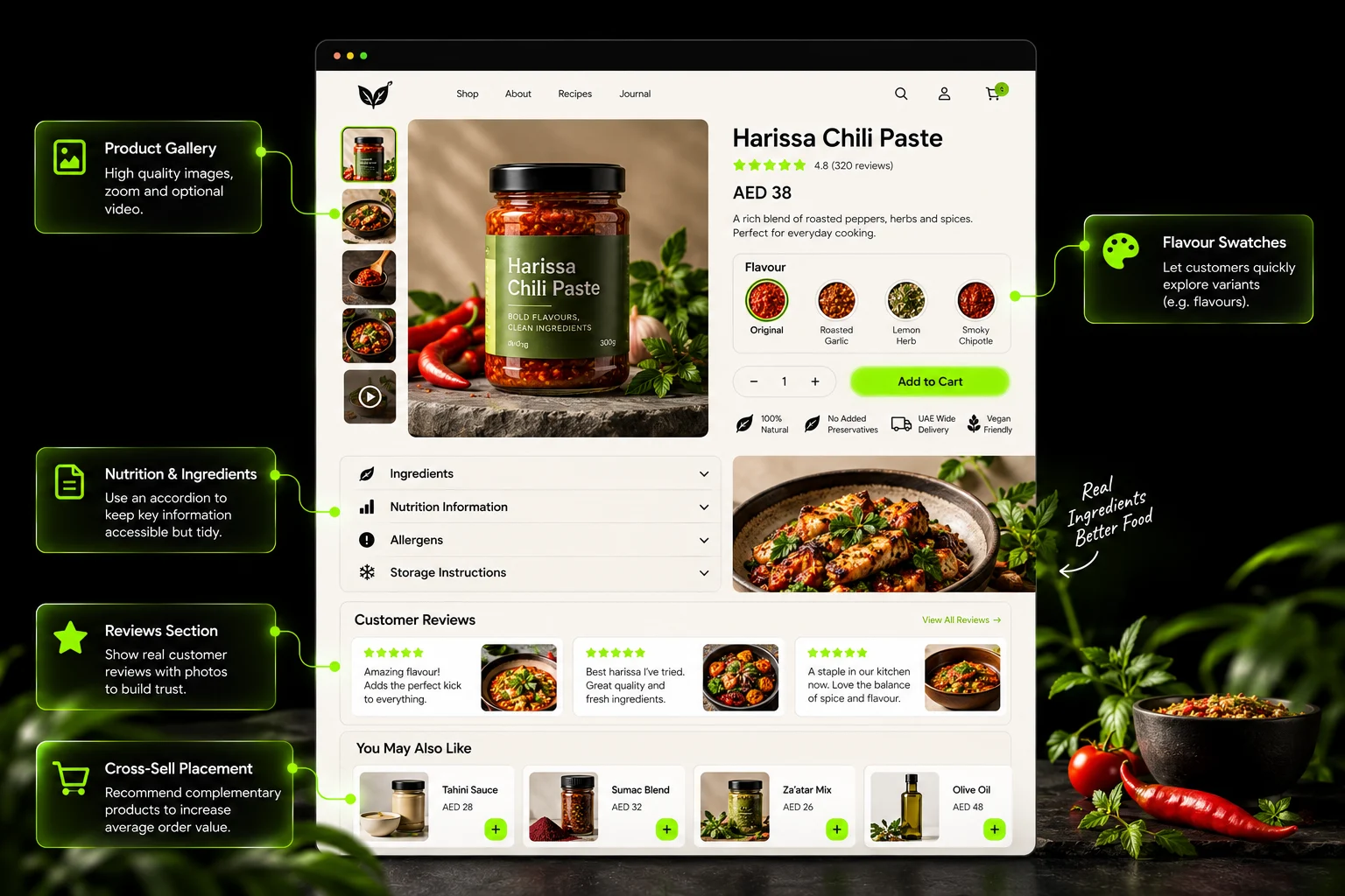
Use visual cards or swatches for flavour selection, not dropdowns. A dropdown requires the shopper to remember what they selected. A swatch grid lets them see all options at once.
Show price per unit or per pack where possible. A shopper comparing a 6-pack to a 12-pack needs to know which is better value without doing mental math.
Nutrition, Ingredients and Allergens
Put this information near the add-to-cart button, not buried at the bottom of the page. Shoppers with allergies, dietary restrictions, or religious requirements read labels first. If the information is not visible, they leave.
Use tabs or accordions to keep the page clean. Key claims (vegan, gluten-free, no added sugar) should appear as badges. The full ingredient and nutrition panel should be one click away.
Show ingredients as readable text, not only inside images. Search engines and AI systems cannot read text inside an image. A shopper using a screen reader cannot either.
How to Use, Serve and Store
Recipes, serving ideas, storage instructions, and shelf life. This section answers the question "what do I do with this after it arrives."
It also creates internal linking opportunities between recipes and products.
Reviews Focused on Taste
Generic star ratings are less useful for food. Reviews that mention taste, texture, and flavour convert better. If your review app supports flavour-specific filtering, enable it.
Cross-Sell
"Pairs with" recommendations and "try the variety pack" prompts. For a snack brand, the variety pack is the highest-value cross-sell because it increases the first order value and introduces the customer to multiple flavours.
Subscriptions, Bundles and Repeat Orders
Food and beverage is a replenishment category. The customer buys the product, consumes it, and buys it again. The design should make the second order easier than the first.
Subscribe-and-Save UX
Make the subscription option prominent on the product page. Show the discount clearly. Set a sensible default frequency.
The subscription retention benchmarks for food and beverage sit between 5.6 and 12.5 months on monthly billing.
Replenishment subscriptions run at 5% to 8% monthly churn. The month-3 cliff is universal: 60% to 70% of subscribers are lost between order one and order three.
The design implication: make it easy to skip, pause, swap, or cancel. Subscribers who feel trapped churn faster and leave negative reviews. Subscribers who feel in control stay longer.
Bundles and Build-Your-Own Boxes
Variety packs for discovery. Mix-and-match for loyal customers. A first-time buyer who wants to try three flavours should not have to buy three full-size products.
Build-your-own boxes also increase average order value. A shopper building a six-item box spends more than a shopper buying one item.
Quantity Breaks and Multi-Pack Pricing
Show the price per unit at each quantity level. A shopper buying 12 units should see the per-unit savings compared to buying one. This is standard in B2B pricing. It works for D2C food too.
Reorder Shortcuts
In the customer account, show a "buy again" button for previous orders. In email and WhatsApp messages, include direct reorder links. The easier the reorder, the higher the repeat purchase rate.
Strategic insight: In F&B, customer value comes from the second and third order, not the first. Design for reordering from the start. A homepage and product page optimised only for first purchase will underperform a design that treats the first order as the beginning of a relationship.
Shipping and Delivery Messaging for Food Brands
For perishable products, delivery is part of the product. The delivery promise shapes whether the shopper buys at all.
Order Cut-Off Times and Countdowns
Show a countdown: "Order in 3h 20m for delivery tomorrow." This creates urgency and sets accurate expectations. For chilled products with limited delivery windows, this is essential.
Delivery Zone and Delivery-Day Selection
Let customers check whether you deliver to their area before they add to cart. For chilled products, let them select a delivery day. A customer who orders on Friday for Monday delivery knows what to expect.
Free Delivery Threshold
Set a free delivery threshold that encourages larger orders. For low average order value products, bundles help customers hit the threshold. Show the threshold in the announcement bar and in the cart.
Packaging and Freshness Reassurance
Explain how the product is packed to stay fresh. Insulated packaging, cold packs, temperature-controlled couriers.
In hot climates like the UAE, this reassurance is especially important. A shopper in Dubai in August needs to know the chocolate will not arrive melted.
Read our guide on localizing Shopify checkout for UAE customers for the full delivery and payment configuration.
Content That Sells Food Online
Content serves two purposes for F&B brands: it ranks in search and it converts on the product page.
Recipes and Serving Ideas
Recipes are both SEO pages and conversion tools. A recipe that uses your product links back to the product page. A shopper searching for "tahini brownie recipe" finds your recipe and discovers your tahini.
Build a recipe library with internal links to the products used. This creates a content moat that competitors without recipe content cannot match.
Origin and Sourcing Stories
Short stories about where the product comes from and how it is made. Supported by photos, not paragraphs. A coffee brand's origin story is a differentiator. A chocolate brand's sourcing story builds trust.
Honest Benefit Claims
Functional drinks and health foods need to be careful with claims. Unsupported health claims create regulatory risk and erode trust. State what the product does, not what it might do. Read our guide on bilingual Shopify store setup for UAE brands for the Arabic content workflow.
B2B, Wholesale, and "Where to Buy"
Many D2C food brands also sell through retailers, cafes, and distributors. The website should support both.
A Separate Route for Wholesale
A wholesale enquiry form or a B2B portal for cafes, retailers, and distributors. Do not force wholesale buyers through the D2C checkout. Their pricing, quantities, and delivery requirements are different.
Retailer Locator
If your product is sold in supermarkets or specialty stores, a retailer locator builds trust. A shopper who sees "available at Waitrose and Spinneys" knows the brand is established. This trust transfers to the D2C store even when the sale happens elsewhere.
Designing F&B Websites for the UAE and GCC
The GCC adds requirements that global guides ignore. These are not optional for brands selling in the region.
- Halal Certification: Display the certifying body and the National Halal Mark clearly on product pages. The UAE operates a national halal certification scheme through MoIAT.
Products must be certified through an approved body and registered with MoIAT. The halal mark should appear on the product page near the ingredients and nutrition information.
- Arabic and English Product Content: All food labels in the UAE must be in Arabic, with additional languages permitted if identical to the Arabic. Ingredient lists, allergen information, and nutrition panels all need Arabic versions.
This is not just a translation exercise. The Arabic content should be written for Arabic readers, not machine-translated. Ingredient names have standard Arabic terms that machine translation often gets wrong.
- Delivery in Summer Heat: UAE summers are extreme. Chilled delivery windows, heat-safe packaging, and cold-chain messaging are essential. A chocolate brand selling in Dubai in July needs to explain how the product will arrive intact.
- Fast Delivery Expectations: Dubai shoppers expect same-day or next-day delivery. Abu Dhabi and Sharjah are similar. Other emirates typically accept 2 to 3 days. State delivery times by emirate so expectations are accurate.
- Ramadan and Eid: Ramadan shifts shopping patterns. Evening and late-night shopping peaks. Gifting and hampers become more important. Plan seasonal collections and delivery timing around iftar.
- Payments: UAE food brands need cash on delivery, Apple Pay, Tabby and Tamara for BNPL and card payments. Shopify Payments became available to UAE merchants on the Advanced plan in August 2026, which simplifies the card and wallet layer. COD and BNPL still require third-party gateways or apps.
What Good D2C F&B Websites Have in Common
The best D2C food and beverage websites share patterns. These are not the most visually experimental sites. They are the ones that make buying easy.
Bold flavour-coded design: Each flavour has its own colour that carries from the website to the packaging. A shopper recognises the strawberry flavour by its pink before reading the label.
Clear subscription offers: The subscribe-and-save option is visible on the product page, with the discount shown and the default frequency set. Customers can skip, pause, or swap without contacting support.
Variety packs for discovery: First-time buyers can try multiple flavours without committing to full-size products. The variety pack is the highest-converting entry point for snack and beverage brands.
Nutrition information near the add-to-cart button: Ingredients, allergens, and key claims are visible without scrolling. The full panel is one click away.
Honest delivery messaging: Cut-off times, delivery zones, and packaging reassurance are stated before checkout. The shopper knows exactly what to expect.
Recipe and serving content: The website gives the shopper ideas for how to use the product, not just what the product is.
Common D2C Food Website Design Mistakes
- Restaurant-style layouts on an ecommerce store: Menus, reservations, and location pages instead of product pages. This is the most common mistake because most design templates for “food websites” are built for restaurants.
- Nutrition and allergen information hidden or only in images: Search engines cannot read text inside images. Shoppers with allergies need readable text. Put this information directly on the page, not inside a graphic.
- Dropdown flavour selectors with no visuals: A shopper cannot see the difference between “Mango Habanero” and “Mango Sriracha” from a dropdown. Use visual swatches instead.
- No subscription or reorder path: If the product is consumed and replenished, the website should make reordering easy. A brand without a subscription option is leaving repeat revenue on the table.
- Vague delivery information for perishables: “Ships in 3 to 5 days” is not enough for a chilled product. State cut-off times, delivery days, and packaging. A shopper who is unsure whether the product will arrive fresh will not buy.
- Heavy video and animation that slows down mobile pages: A beautiful hero video that takes 8 seconds to load on mobile is a conversion killer. Optimise for speed first.
How We Design D2C Food and Beverage Websites
We start from the product type. A snack brand and a chilled meals brand need different website architectures. We map the repeat-purchase model before we design a single page.
We design product pages around flavour selection and what is inside the pack. The flavour swatch grid, the nutrition accordion, the allergen badges. These are not afterthoughts. They are the first wireframes.
We set up subscriptions, bundles, and delivery logic in Shopify. Recharge and Appstle handle the subscription layer. Delivery-day selection and cut-off timers are configured for perishable brands. Quantity breaks are set for multi-pack pricing.
We build bilingual and halal-aware stores for UAE and GCC brands. Arabic content is written, not machine-translated. Halal certification is displayed on product pages. Delivery messaging accounts for summer heat and Ramadan timing.
Review our services page and our case studies for D2C brands like Miduty and Celesti.
D2C Food and Beverage Website Checklist
Use this checklist before launching or redesigning a D2C food brand website.
Product Type Design
□ Product-type design priorities identified (snacks, beverages, perishables, gifting)
□ Delivery-day selection configured for perishables
□ Variety packs and build-your-own boxes available
□ Quantity breaks and multi-pack pricing set
Visual Identity
□ Pack shots, appetite shots, context shots, and scale shots captured
□ Flavour-coded colour system applied across website and packaging
□ Photography budget allocated before animation
Product Pages
□ Flavour selection uses visual cards or swatches, not dropdowns
□ Nutrition, ingredients, and allergens visible near add-to-cart
□ Key claims (vegan, gluten-free) shown as badges
□ Recipes and serving ideas linked to products
□ Reviews focused on taste and texture
Subscriptions and Repeat Orders
□ Subscribe-and-save option visible on product pages
□ Discount clearly shown and default frequency set
□ Skip, pause, swap, and cancel options available
□ Reorder shortcuts in customer account and email
Shipping and Delivery
□ Order cut-off times with countdown
□ Delivery zone checker
□ Free delivery threshold displayed
□ Packaging and freshness reassurance
Content
□ Recipe library with product links
□ Origin and sourcing stories
□ Honest benefit claims
B2B and Retail
□ Wholesale enquiry route
□ Retailer locator
UAE and GCC
□ Halal certification displayed on product pages
□ Arabic and English product content
□ Summer heat delivery messaging
□ Ramadan and Eid collections planned
□ COD, Apple Pay, Tabby/Tamara configured
Frequently Asked Questions
What Is the Best Website Design for a Food Brand?
The best design depends on what you sell. Strong D2C food websites share a few traits: appetite-led photography, clear flavour and pack-size selection, visible ingredients and nutrition information, easy subscription or reorder options, and clear delivery information. Design choices should follow your product type. A chilled-meals brand needs delivery-day selection. A snack brand needs bundles and variety packs.
What Are Some Good Examples of Food and Beverage Websites?
Good examples are usually D2C brands with strong product pages rather than the most visually experimental sites. Look for bold flavour-coded design, clear subscription offers, variety packs for discovery, and nutrition information near the add-to-cart button. Galleries like Awwwards show visually striking sites, but check whether an example makes buying easy, not just whether it looks impressive.
Is Shopify Good for Food and Beverage Brands?
Yes. Shopify is widely used by D2C food and beverage brands. It handles variants (flavours, pack sizes), subscriptions through apps like Recharge or Apostle, bundles, and delivery-date selection. It scales from small brands to large ones. Perishable brands may need extra apps or custom work for delivery zones and cut-off times. Choose a theme with a strong product page and filtering features.
Should a Food Website Offer Subscriptions?
If your product is used up and reordered, such as coffee, drinks, snacks, or supplements, subscriptions are usually worth offering. Make the discount clear, pick a sensible default frequency, and let customers skip, pause, or swap flavours easily. Hard-to-cancel subscriptions damage trust and cause chargebacks. Flexibility tends to keep customers longer.
How Should Nutrition and Allergen Information Be Shown Online?
Show it as readable text, not only inside images, in a clearly labelled section near the add-to-cart button. Highlight key claims such as vegan or gluten-free as badges, supported by the full ingredient and nutrition panel. Check your market's labelling rules with the relevant authority, since requirements differ by country. In the UAE, all food labels must be in Arabic.
How Do I Design a Website for Perishable Food Delivery?
Make delivery the centre of the experience. Show order cut-off times, let customers check whether you deliver to their area, and offer delivery-day or time-slot selection. Explain how products are packed to stay fresh. In hot climates like the UAE, reassurance about chilled packaging and delivery windows is especially important.
What Should a UAE Food Brand Website Include?
Beyond the basics, UAE food websites should show halal certification clearly, offer Arabic and English product information, support local payment methods including cash on delivery and BNPL, and give fast, accurate delivery information by emirate. Plan seasonal collections for Ramadan and Eid, when gifting and hamper demand rises.
Final Thoughts
Sell the taste through visuals. Answer "what is in it" instantly. Make reordering easy. Be honest about delivery.
That is the job of a D2C food and beverage website. The design serves those four goals. Everything else is decoration.
A restaurant website sells an experience. A D2C food website sells a product that arrives in a box. The design priorities are different. Get the product pages right. Make the subscription path obvious. State the delivery promise clearly. The rest follows.
Hi, I’m Rishabh Jain
I believe great design has the power to shape perception, build trust, and move businesses forward. That belief is what led me to found Suplex Design Studio, a global branding and packaging studio working with FMCG and D2C brands across markets.I started suplex at 25 with a clear intent, to create design that is strategic, thoughtful, and commercially meaningful. By 28, the studio had scaled globally, guided by a strong foundation in Integrated Design that I developed during my academic journey in London, where I was honoured with the Dean’s Award.
Over the years, I’ve had the opportunity to work with 100+ brands, from Fortune 500 organizations to family-run businesses, helping them build packaging and brand systems that create recall, relevance, and long-term value.
Suplex’s work has been recognized internationally, including the Manifest Award (2024), the Clutch Global Award (2025), and features on platforms such as Packaging of the World, The Dieline, and the World Brand Design Society.
None of this would be possible without the people behind the work. I’m deeply grateful to the suplex team, whose commitment, creativity, and attention to detail turn ideas into meaningful brand experiences every day.
At the heart of my work is a simple philosophy, design should be intentional, honest, and built to last, and that continues to guide everything we create at suplex.




















Let’s Make It Happen
E-Commerce Success Stories
%201.avif)





.avif)
.avif)
Build Your D2C Business The Right Way
Build It With Suplex.


