Features of a High-Converting Ecommerce Website (2026 Data Guide)
.webp)
Features of a High-Converting Ecommerce Website (2026 Data Guide)
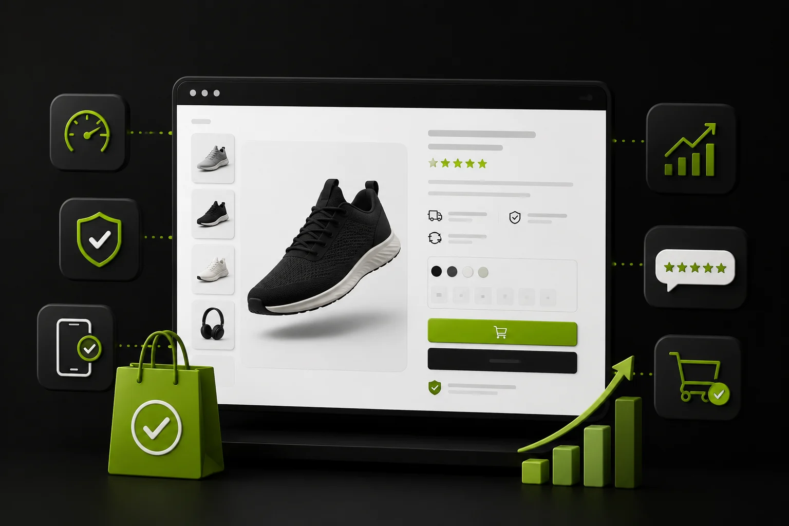
Features of a high converting ecommerce website are not simply the features every store already has. The difference lies in how well those features are implemented.
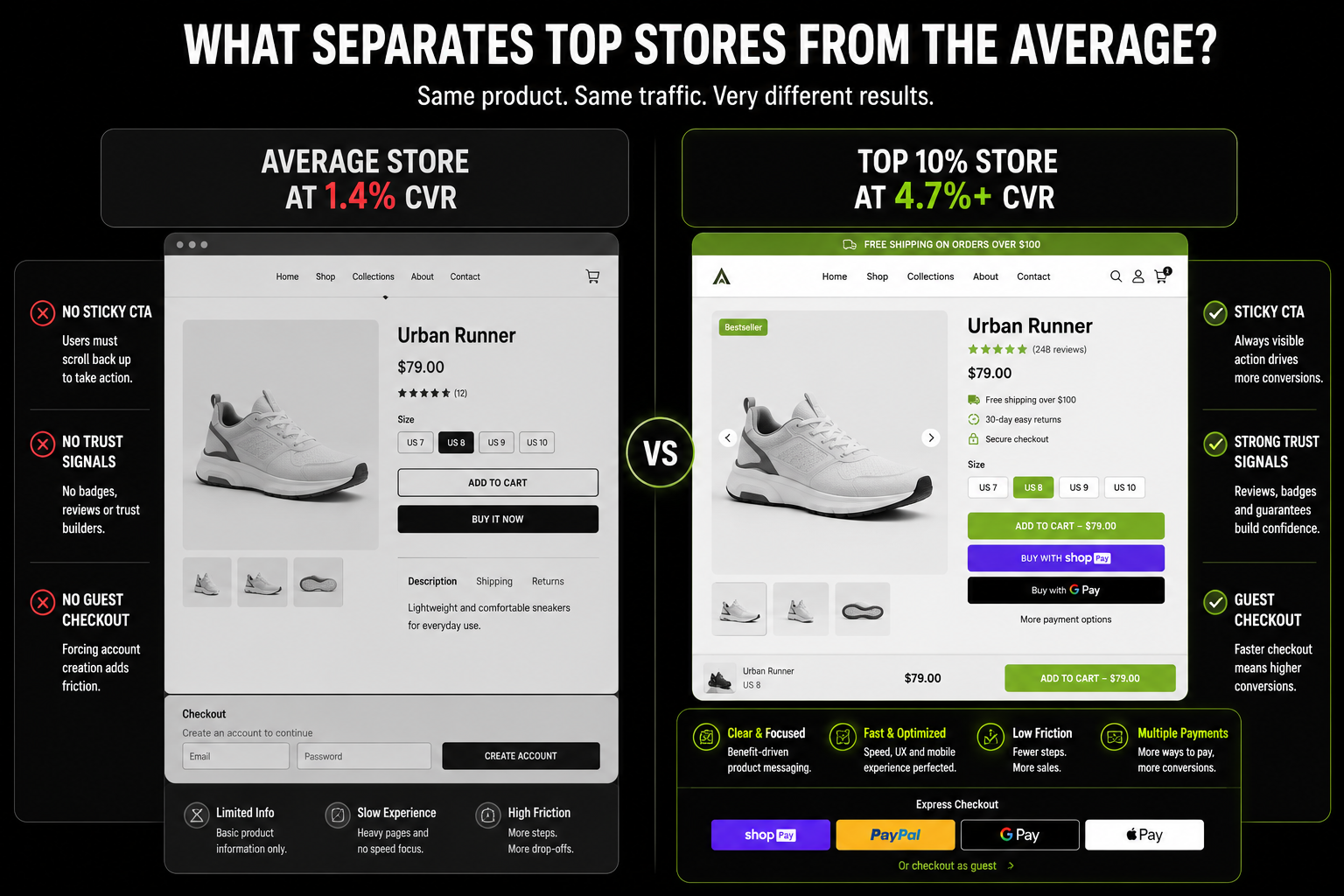
While the average Shopify store converts at 1.4%, top-performing stores achieve 4.7%+ conversion rates by optimizing UX, trust signals, personalization and checkout experiences.
With 70.19% of ecommerce carts abandoned before purchase, the gap between average and high-converting stores is often the quality of execution, not the feature list itself.
How to Read This Guide, Features Ranked by Revenue Impact, Not Alphabetically
Most ecommerce feature guides list everything at the same priority level. That is commercially useless.
Not all features have equal conversion leverage and the order in which you implement or fix them determines how quickly revenue responds.
Table-Stakes vs. Performance Features
This guide organises features into two tiers.
Table-Stakes Features: are the baseline. Every competitive ecommerce store must have them to avoid losing customers to competitors who do.
Missing a table-stakes feature is a conversion floor problem. You cannot compete without them, and fixing them produces the largest immediate conversion improvement for the lowest investment.
Performance Features: are the differentiators. Implemented correctly by the top-quartile stores, poorly or not at all by average stores. These are where the gap between 1.4% and 4.7%+ lives.
The order in this guide reflects commercial priority: features that fix the most revenue leakage first, followed by features that build the compounding advantages of retention and lifetime value.
Most brands invest in performance features before their table-stakes features are correctly implemented. Adding AI personalisation to a store with a broken mobile checkout is spending money on the wrong problem.
Feature 1: Mobile-First Design That Converts, Not Just Displays
Every Shopify theme in 2026 is mobile responsive. That means the layout adjusts to a small screen.
It does not mean the experience is designed for the specific interaction patterns, thumb zones and patience levels of a mobile user. These are different things, and the conversion data shows the gap clearly.
Why "Mobile Responsive" Is Not Mobile Optimised
73% of ecommerce traffic arrives on mobile. 58% of purchases happen on mobile. The gap between traffic share and revenue share on mobile is not a device problem. It is a design problem specific to how mobile visitors interact with product pages and checkout.
Sticky Add-to-Cart Button: A CTA that scrolls with the user always visible without requiring scroll-back to the product title. This single implementation change has documented conversion lift of 10–20% on mobile product pages. The visitor never has to remember where the button is or scroll back to find it.
Thumb-Zone CTA Placement: Primary interactive elements Add to Cart, filter selections, navigation triggers positioned in the central-to-lower viewport where the thumb reaches comfortably on a handheld device. Top-corner elements require awkward hand repositioning and reduce interaction completion.
Touch Target Sizing: Minimum 44×44px for all tappable elements (Apple's accessibility standard). Buttons, filter checkboxes, and quantity selectors below this size create tap errors that introduce friction at every product interaction. This applies to every interactive element on every page, not just the primary CTA.
Product Image Gallery With Swipe Gestures.:Mobile users navigate product images by swiping, not tapping arrows. An image gallery requiring arrow taps loses the natural interaction mobile users expect. Pinch-to-zoom on mobile or a tap-to-expand full-screen view handles the closer inspection that higher-AOV products require before purchase.
Progressive Disclosure: Collapsible product description sections, tabbed specifications, and accordion-style policy text reduce visual density without hiding information. The mobile visitor sees the CTA without scrolling through a 600-word product description first. The details are available but not blocked.
Smartphone penetration in the UAE is among the highest globally. Mobile-first is not an optimisation here, it is the primary experience.
A store designed for desktop that adapts to mobile will always underperform a store designed for mobile from the ground up in this market.
Our mobile-first design service and responsive design service both treat mobile as the primary design surface, not the secondary one.
Feature 2; Page Speed That Retains Visitors Before They See a Product
Speed is a revenue feature, not a technical requirement. The data is specific, consistent, and causal.
The Revenue Arithmetic of Speed
- A 0.1-second improvement in page load time increases conversion by 8.4%
- Ecommerce sites loading in 1 second convert at 3× the rate of 5-second sites
- A 1-second delay reduces conversions by 7%
- Pages with LCP above 2.5 seconds fail Core Web Vitals affecting both Google ranking and conversion rate simultaneously
Every 100ms of additional load time is a measurable revenue event. The visitor who leaves because the page has not loaded has not seen a product, read a description, or evaluated a price. They are gone before the store has made any case for itself.
The Speed Features That Actually Move the Needle
Image optimization: Images account for 50–80% of page weight on most ecommerce stores. WebP format reduces file size by 25–35% compared to JPEG at equivalent quality. Lazy loading ensures images below the fold do not delay above-the-fold render.
Correct src set implementation serves appropriately sized images per viewport rather than delivering a 2,000px desktop image to a mobile screen.
App Stack Discipline: Every Shopify app adds JavaScript and increases load time. Many growing stores accumulate 20+ apps, including unused or overlapping tools that slow performance without adding value.
In our audits, app bloat is a more common speed issue than the theme itself. An app stack audit often delivers 40–60% of available speed improvements at a fraction of the cost of a full rebuild.
Core Web Vitals as a conversion target, not a technical metric:
- LCP (Largest Contentful Paint) under 2.5 seconds the product image load time on product pages
- INP (Interaction to Next Paint) under 200ms the responsiveness of filter selections and Add to Cart
- CLS (Cumulative Layout Shift) under 0.1 preventing layout jumps that cause mistaken clicks and page disorientation
Shopify CDN and Edge Hosting: Shopify's global CDN via Fastly serves cached content from edge nodes geographically close to each visitor.
For Shopify Plus brands on Hydrogen/Oxygen, edge-rendered pages achieve sub-150ms TTFB globally.
For standard Shopify, the CDN handles image and asset delivery, the remaining variable is page-level JavaScript and third-party scripts.
Our performance optimisation service and Shopify speed optimisation guide cover the full technical implementation of each of these levers.
Feature 3: Product Pages That Answer Every Purchase Question Before the CTA
Product pages are where the majority of conversion decisions are made and where 52% of desktop sites and 62% of mobile sites are performing "mediocre or worse" according to Baymard Institute research.
The features below are not design preferences. Each one has a specific commercial mechanism.
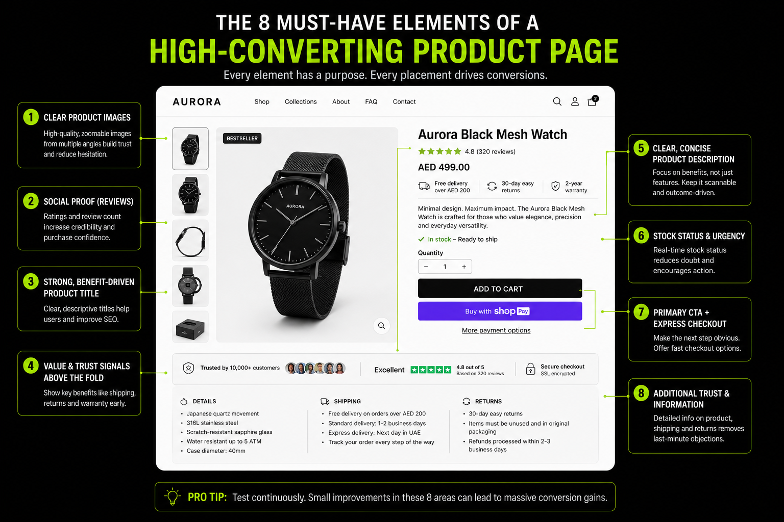
The 8 Elements of a High-Converting Product Page
Element 1: Benefit-led product title
"Vitamin C Serum" is a feature label. "Brightening Vitamin C Serum for Hyperpigmentation SPF Compatible" is a benefit-and-specification statement that answers "is this for me?" before the visitor reads anything else.
The title is the first thing a visitor reads and the first conversion decision point on the page.
Element 2: Star rating and review count immediately below the title
Not at the bottom of the page. Immediately below the product name the first piece of social proof a visitor sees after the product name itself.
Review visibility above the fold reduces purchase hesitation for first-time visitors before they have read a word of description.
Review volume matters as much as rating: a product with 847 reviews at 4.6 stars converts better than a product with 3 reviews at 5.0 stars.
Element 3: Multiple lifestyle images with zoom functionality
A minimum of 5 images: hero lifestyle shot, product-only detail shots, in-context lifestyle photography, scale reference, and for apparel, a model shot showing fit.
60%+ of product page visitors use image zoom before purchasing higher-AOV items. On mobile, pinch-to-zoom or tap-to-expand.
Supplier stock photos do not substitute for lifestyle photography; they signal catalogue, not brand.
Element 4: Delivery date and shipping cost on the product page
Not "calculated at checkout." An actual estimated delivery date or range ("Order before 3pm, arrives Thursday" or "Standard delivery: 3–5 business days, AED 15") displayed on the product page.
This is the single most impactful information transparency change for reducing checkout abandonment.
48% of cart abandonment is caused by unexpected costs appearing at checkout. Surfacing them earlier removes the surprise and the same shipping cost shown at the product page converts better than the same cost shown at the payment step.
Element 5: Return policy adjacent to the CTA
"Free 30-day returns" or "30-day no-questions return policy" displayed immediately adjacent to or below the Add to Cart button not in the footer, not on a policy page accessible via a link.
Return policy proximity to the purchase decision point directly reduces purchase risk perception at the moment of highest hesitation.
Element 6: Benefit-led product description, length matched to AOV
For impulse and sub-$50 products: 3–5 benefit bullets outperform long-form copy. For complex and high-AOV products above $100: descriptions up to 1,000 words convert better because they address more purchase questions than bullets can.
Match description length and format to the consideration cycle of the specific product, not to a site-wide template.
Element 7: Legitimate urgency and scarcity signals
Legitimate meaning factually accurate urgency elements lift conversion 8–32% in A/B tests:
- Low stock indicator: "Only 4 left in stock" when inventory is genuinely below 10 units
- Countdown timer for genuinely time-limited offers
- "47 people viewing this" when the session data is real
Fake urgency (false low-stock claims, manufactured countdown timers reset to zero) produces short-term lift and permanent trust destruction when discovered. The distinction matters commercially and ethically.
Element 8: Cross-sell and complementary product recommendations
Product recommendations on product pages account for up to 31% of total ecommerce revenue (Barilliance). "Frequently bought together," "Customers also viewed," and "Complete the look" are not decorative features. Position them below the fold so they do not compete with the primary CTA, but ensure they are visible before the visitor leaves the page.
Our conversion rate optimisation service audits all 8 of these elements on existing product pages and prioritises fixes by revenue impact.
Feature 4: A Checkout That Removes Every Reason to Leave
Baymard Institute's $260 billion recoverable revenue figure lives in this section. Checkout is where purchase intent already established is either completed or abandoned. The specific features below address the specific reasons abandonment happens.
The Checkout Features That Close the Most Revenue Gaps
Guest Checkout by Default: Make guest checkout the primary option and offer account creation after purchase. Requiring account creation is one of the biggest causes of checkout abandonment.
Express Payments First: Place Apple Pay, Google Pay, Shop Pay, and PayPal Express at the top of the cart. These options reduce form-fill friction and speed up mobile purchases.
Checkout Progress Indicator: Show clear checkout steps such as "Shipping → Payment → Confirmation" or "Step 2 of 3" to reduce uncertainty and drop-off.
Upfront Shipping Costs: Display estimated shipping costs and delivery dates in the cart. Early transparency prevents surprise costs later in checkout.
Minimal Form Fields: Remove unnecessary fields such as title, company name (for B2C stores), and redundant address confirmations. Fewer fields mean less friction.
Inline Form Validation: Validate fields in real time instead of after submission. Immediate feedback helps customers correct errors quickly and complete checkout faster.
Our Shopify Plus service covers Checkout Extensibility, the Plus-exclusive feature that enables custom checkout fields, dynamic discount logic, and BNPL display natively within the checkout flow.
Feature 5: Trust Architecture That Converts First-Time Visitors
Trust signals fail when they are in the wrong place. Most stores have the content reviews, policies, security badges but position them where they have no impact on the moment of purchase hesitation. Trust is a placement problem before it is a content problem.
Why Trust Signals Fail When Poorly Placed
A return policy that lives only in the footer has zero impact on a visitor deciding whether to add to cart.
A security badge that appears only at the final payment step arrives too late for visitors who abandoned the cart stage. Trust signals reduce purchase hesitation at the moment of hesitation not before it, and not after the visitor has already left.
The Trust Signal Hierarchy
Social Proof Reviews and Ratings: Trust badges and clear return policies reduce cart abandonment by up to 28%. Reviews reduce it further. The placement rules are specific:
- Star rating and total review count: immediately below the product title, above the price
- Featured review snippet: below the Add to Cart CTA on the product page
- Full reviews section: below the fold, with filter capability by star rating and topic
- Aggregate star rating per product: visible on category page product tiles, not just on product pages
Policy Transparency: Returns policy adjacent to the CTA on product pages not linked, displayed. Delivery expectation on the product page, not at checkout. SSL visible throughout. Payment security badge at cart and checkout, not just at the final payment step.
Certification and verification signals category-specific:
- Supplements: Informed Sport, NSF, Halal certification badges displayed at product level
- Beauty/skincare: cruelty-free, vegan, dermatologist-tested at product level, not on a separate claims page
- Fashion: model sizing details ("Model is 5'8", wearing size M") directly reduce return anxiety for the most common sizing uncertainty
- Luxury: provenance information, authenticity certification, material sourcing detail the signals that justify the price before the visitor commits
Feature 6: Site Search That Captures High-Intent Visitors
Site search is the most consistently underinvested feature relative to its commercial impact. The data justifies it as a standalone section.
The Site Search Revenue Opportunity
30% of ecommerce visitors use site search rather than browsing through categories. These visitors convert at 2–4× the rate of browsing visitors because they arrive at the search bar already knowing what they want. Site search is the highest-intent surface on any ecommerce store.
72% of ecommerce sites completely fail site search expectations (Baymard Institute). 42% fail across multiple search query types. A feature used by 30% of your highest-intent visitors is underperforming on 72% of stores. The commercial cost is compounding every session.
What High-Converting Site Search Requires
Persistent, Prominent Placement: The search bar in the header, always visible, not accessible only via a magnifying glass icon that requires an extra tap. For stores where search is the primary discovery path (large catalogues, specific-need products), search bar prominence is a homepage decision with direct conversion impact.
Predictive Search With Instant Results: Results appearing in a dropdown panel within 100ms of typing onset. A visitor who sees a relevant product in the predictive dropdown immediately knows their query will succeed and convert without ever seeing a full results page. This eliminates the friction of a full search-results browse.
Typo and Synonym Tolerance: A visitor searching "moisturizer" should find "moisturiser." A visitor searching "womens trainers" should find "women's sneakers." Keyword-literal search fails on a significant proportion of real queries. Shopify's Search and Discovery app, and platforms like Algolia, handle this with fuzzy matching and synonym mapping.
Intelligent No-Results Handling: When search genuinely returns nothing, show: popular products in the most relevant category, suggested alternative search terms, and a "contact us" option. A blank no-results page terminates sessions that could have been recovered with one additional prompt.
Search Analytics as a Catalogue Diagnostic: Zero-results queries are product catalogue gap signals. High-volume searches for products you do not carry are demand validation data. Search queries that return results but have high exit rates indicate relevance problems. Site search data is one of the richest, most underused commercial intelligence sources on any ecommerce store.
Our product catalog structure guide covers how to act on this data structurally.
Feature 7: Personalisation That Makes the Store Feel Built for Each Visitor
Personalisation is a documented revenue driver with specific implementation requirements not a luxury add-on for enterprise brands.
The Personalisation Revenue Case
McKinsey research shows personalisation drives 10–15% revenue lift. Product recommendations account for up to 31% of total ecommerce revenue (Barilliance).
56% of shoppers become repeat buyers following personalised experiences (Twilio Segment).
These are not marginal improvements; personalisation is a structural revenue layer that compounds over time as the behavioural data set grows.
The Four Personalisation Layers That Move Conversion
Layer 1: Behaviour-Based Recommendations
Show recently viewed products, "customers also bought," and complementary product suggestions across product, cart, and post-purchase pages.
Layer 2: Returning Visitor Recognition
Display products visitors previously viewed instead of generic homepage content. Returning shoppers respond better to relevant products than broad marketing messages.
Layer 3: Personalised Email and SMS
Use first-party browsing and purchase data to tailor email and SMS campaigns. Personalised retention marketing consistently outperforms generic messaging.
Layer 4: Traffic Source Personalisation
Match landing page content to the source that brought the visitor. Ad clicks should lead to relevant products, and sale campaigns should highlight promotional pricing immediately.
UAE/Gulf Opportunity:
Personalised WhatsApp messages in the customer's preferred language, combined with product recommendations based on purchase history, have become one of the most effective retention channels for Gulf ecommerce brands.
Our D2C data analytics service covers the first-party data infrastructure that makes personalisation at this level operationally manageable.
Feature 8: Post-Purchase Experience That Turns Buyers Into Repeat Customers
This is the most underinvested feature category relative to its commercial impact and the one most completely absent from competing guides on this topic.
Why Post-Purchase Is the Most Undervalued Conversion Feature
65% of company revenue comes from repeat buyers. Repeat customers spend 67% more than new customers (Bain and Company). A 5% increase in customer retention correlates with a 25–95% increase in profitability. Yet most ecommerce investment is concentrated at the acquisition and first-conversion end of the funnel.
The post-purchase window from order confirmation to second purchase is the highest-intent moment a customer will ever be in. They just bought it.
Their satisfaction is at its peak. Their resistance to further engagement is at its lowest. This is the moment where repeat purchase behaviour is either established or not.
Post-Purchase Features That Build Retention
Order Confirmation Upsells
Use the confirmation page to recommend complementary products while customer trust and purchase intent are highest.
Proactive Delivery Updates
Keep customers informed with shipping and delivery notifications via email or SMS. This reduces support requests and improves the post-purchase experience.
Second-Purchase Incentives
Include a discount or offer for the next order in post-purchase emails to encourage repeat purchases while satisfaction is highest.
Loyalty Programme Integration
Automatically reward customers with points after purchase and show progress toward rewards. This drives stronger participation than standalone loyalty sign-up pages.
Timed Review Requests
Request reviews a few days after delivery, when customers have had time to use the product. This generates more authentic feedback and stronger social proof.
For many Gulf consumers, WhatsApp is the preferred post-purchase channel. Personalised delivery updates and follow-up messages in Arabic or English often outperform email for engagement and customer satisfaction.
Feature 9: Navigation That Removes Every Obstacle Between Homepage and Product
Navigation is revenue architecture. Every failed navigation path is a lost sale not because the product does not exist, but because the visitor could not find it.
Navigation as Revenue Architecture
Category Naming in Customer Language, Not Internal Product Classification:
Categories named after how customers think about their needs "Women's Athletic Shoes" not "Category 4B: Footwear Performance" reduce category browse drop-off by immediately confirming to the visitor they are in the right place.
The naming test: can a first-time visitor identify which category their intended product belongs to in under 5 seconds?
Mega Menu or Dropdown For 200+ SKU Stores:
A flat top-level navigation with no subcategory structure forces visitors into category pages with too many products to browse efficiently. A mega menu with subcategory display helps visitors self-select into the most specific relevant category with one interaction rather than two.
Breadcrumbs on Every Product and Category Page:
Navigation back from a product page to its parent category is a conversion-supporting feature. Visitors who want to compare multiple products within a category need a one-click return path. Visitors without this path use the browser back button and are at higher risk of leaving the store entirely rather than returning to browse.
Persistent Search Bar:
For stores where 30%+ of visitors use search, search bar visibility throughout the browsing session is a navigation feature with direct conversion impact.
A search bar that disappears after the homepage is a navigation dead-end for high-intent visitors at the moment they most need it. Our information architecture service covers navigation structure as a first-priority design decision on every build.
Feature 10: Email, Loyalty and Referral Infrastructure
The retention features that make each conversion more valuable over time. Without this infrastructure, every new customer acquisition is a one-time transaction.
The Retention Features That Compound
Email Capture and Automation:
Email converts at 4–5× the rate of paid social. The capture mechanism determines list size; the automation determines yield. Abandoned cart email flows recover 5.9% of abandoned orders on average and a 3-email series performs 69% better than a single abandoned cart email.
For a store doing $500,000 monthly revenue at 70% abandonment, a 5.9% recovery rate represents approximately $20,000+ in monthly recovered revenue from a single automated flow.
Loyalty Programme Visible at Checkout and Post Purchase:
Loyalty programmes generate 5.2× average ROI. Members generate 12–18% more revenue than non-members. Programme visibility matters most at checkout and in post-purchase communications not on a dedicated loyalty page that 3% of visitors ever open.
Referral Programme on the Confirmation Page:
Referred customers are 4× more likely to purchase and carry a 16% higher LTV than non-referred customers.
A referral programme visible on the order confirmation page when customer satisfaction is highest converts satisfied buyers into active acquisition channels at the lowest possible cost per referred customer.
Our D2C data analytics service covers the measurement infrastructure to track which retention features are generating the highest incremental revenue per cohort.
The Feature Priority Matrix What to Build or Fix First
Every competing guide lists features at equal priority. This section is different. It tells you which to implement or fix based on where your store is now the most commercially actionable structure possible.
The Three-Stage Implementation Priority
Stage 1: Fix the Floor (Conversion Rate Below 1.5%)
Foundational table-stakes features are underperforming. Fix in this order:
- Mobile-first layout and sticky CTA on product pages
- Page speed LCP below 2.5 seconds
- Guest checkout enabled and set as the default option
- Shipping cost and delivery expectation displayed on product pages
- Trust signals reviews and return policy adjacent to the CTA
These five changes address the structural causes of the majority of abandonment below 1.5% CVR. They are implementation changes, not redesign projects.
Stage 2: Raise the Average (Conversion Rate 1.5%–3.2%)
The floor is functional. The gap to the top 20% (3.2%+) is in the performance features:
- Site search quality predictive results, typo tolerance, analytics review
- Product page completeness lifestyle photography, review volume, urgency signals
- Express checkout buttons Apple Pay, Google Pay, Shop Pay at the top of cart
- Checkout form reduction audit and remove every unnecessary field
- Basic personalisation product recommendations on product page, cart, and confirmation
Stage 3: Build the Ceiling (Conversion Rate 3.2%+, Focused on LTV)
Above 3.2%, conversion rate optimisation has diminishing returns relative to retention investment:
- Post-purchase email sequences thank-you discount, delivery tracking, review request
- Loyalty programme visible at checkout and in post-purchase communications
- Referral programme on the order confirmation page
- Advanced personalisation returning visitor recognition, source-based landing page content
- WhatsApp CRM for UAE/Gulf market customers
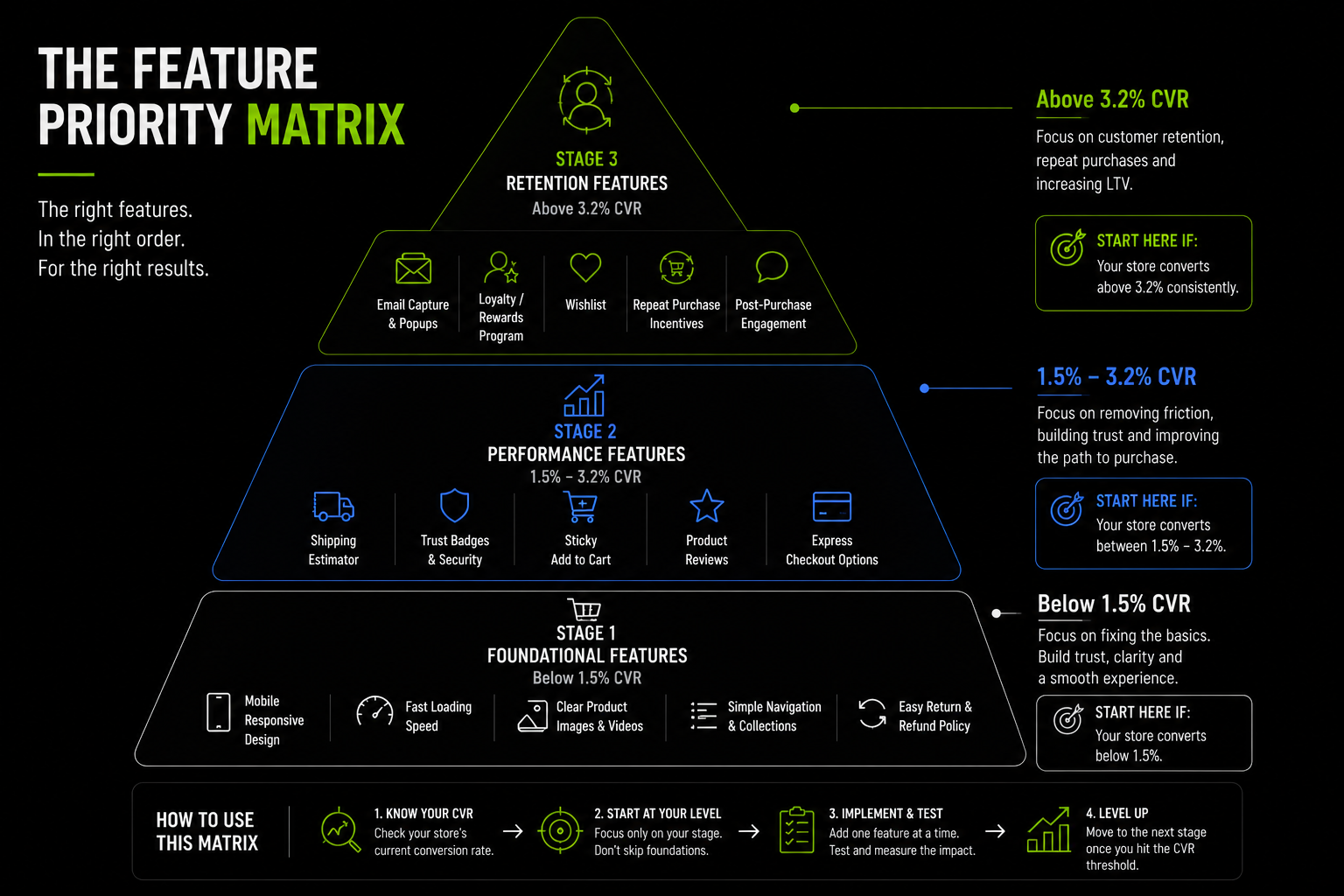
For a precise picture of which stage your store is at and which specific features are underperforming. Our average ecommerce conversion rate by industry guide gives you the industry-specific benchmarks to calibrate where your current CVR sits relative to your category.
How We Build High-Converting Stores at Suplex
At Suplex, we build Shopify stores for D2C, FMCG, fashion, supplement, and luxury brands across the UAE, Gulf, and UK. Every project begins with a simple question: what is preventing this store from converting better?
Rather than following generic ecommerce design trends, we build around customer behaviour. A supplement store prioritises ingredients, certifications, and dosage information. A UAE fashion brand prioritises Arabic-English UX, COD, and mobile-first checkout.
Our process focuses on the highest-impact conversion opportunities first. For retention-driven brands like The Daily Bean, that means loyalty and repeat-purchase systems from day one. For Gulf fashion brands such as Loomsona, it means native Arabic RTL experiences that feel built for local customers.
The fastest conversion gains rarely come from a full redesign. More often, they come from fixing high-friction areas such as guest checkout, shipping transparency, and express payment options changes that can deliver measurable results without rebuilding the entire store.
If you want to know which features are underperforming on your current store and what fixing them would be worth commercially, our Shopify audit starts there.
Our global aesthetic audit is the starting point for brands that want a conversion-focused review of their visual and trust architecture specifically. And for brands building from scratch, our e-commerce store setup service and custom Shopify themes service implement all 10 features in this guide at the quality level the top 10% of stores operate at.
Book a call directly with our founders to discuss your store's conversion performance. Slots are limited.
Frequently Asked Questions
What features make a high-converting ecommerce website?
The highest-impact features are: mobile-first design with sticky CTAs, page speed under 2.5s LCP, product pages with lifestyle photography and transparent shipping costs, guest checkout with express payment options, and trust signals adjacent to the purchase CTA. Beyond these table-stakes features, personalisation, site search quality, and post-purchase retention infrastructure separate top-quartile stores from average ones.
What makes a good ecommerce website?
A good ecommerce website answers every purchase question before the Add to Cart button, removes every friction point between cart and confirmation, and builds the retention infrastructure that turns one-time buyers into repeat customers. The technical markers: LCP under 2.5s, checkout completion rate above 45%, mobile CVR within 20% of desktop CVR, and an add-to-cart rate above 4.6% (Shopify platform average).
What are the most important ecommerce website features for conversion?
Ranked by revenue impact: transparent shipping costs visible on product pages addresses 48% of cart abandonment; guest checkout as default addresses 26% of abandonment; mobile-first product page design; page speed under 2.5s; express payment options. These five features address the structural causes of the majority of preventable abandonment. All other features compound on this foundation.
How many products do you need for a high-converting ecommerce store?
Product count is not a conversion variable. A 5-SKU store can convert at 5%+. A 5,000-SKU store can convert at 0.8%. What determines conversion is whether the store's navigation, product pages, checkout, and trust signals match the complexity of the catalogue. Larger catalogues need faceted navigation, strong site search, and organised category structures. Smaller catalogues need exceptionally well-executed product pages and checkout.
Does website design affect ecommerce conversion rates?
Yes, but design is not the primary lever. Baymard Institute research shows most major ecommerce sites fail on functional dimensions checkout transparency, mobile usability, form field count before they fail on aesthetic ones. A well-designed store with poor checkout UX will consistently underperform a less designed store with frictionless checkout. Design supports conversion. It does not substitute for functional implementation of the core conversion features.
Hi, I’m Rishabh Jain
I believe great design has the power to shape perception, build trust, and move businesses forward. That belief is what led me to found Suplex Design Studio, a global branding and packaging studio working with FMCG and D2C brands across markets.I started suplex at 25 with a clear intent, to create design that is strategic, thoughtful, and commercially meaningful. By 28, the studio had scaled globally, guided by a strong foundation in Integrated Design that I developed during my academic journey in London, where I was honoured with the Dean’s Award.
Over the years, I’ve had the opportunity to work with 100+ brands, from Fortune 500 organizations to family-run businesses, helping them build packaging and brand systems that create recall, relevance, and long-term value.
Suplex’s work has been recognized internationally, including the Manifest Award (2024), the Clutch Global Award (2025), and features on platforms such as Packaging of the World, The Dieline, and the World Brand Design Society.
None of this would be possible without the people behind the work. I’m deeply grateful to the suplex team, whose commitment, creativity, and attention to detail turn ideas into meaningful brand experiences every day.
At the heart of my work is a simple philosophy, design should be intentional, honest, and built to last, and that continues to guide everything we create at suplex.


Let’s Make It Happen
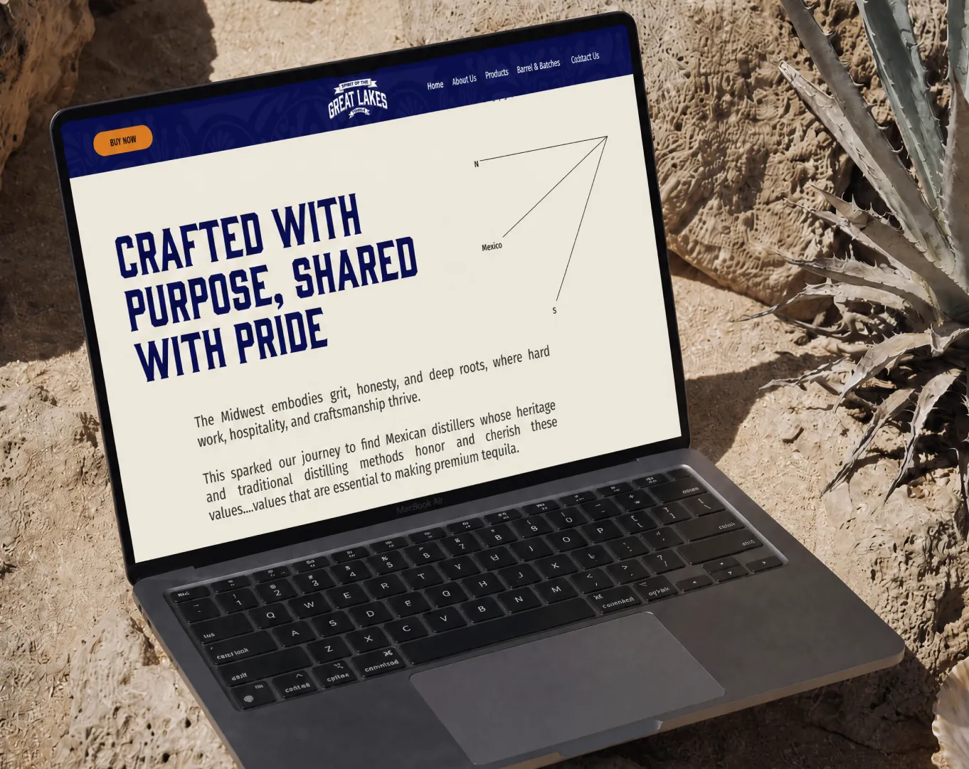
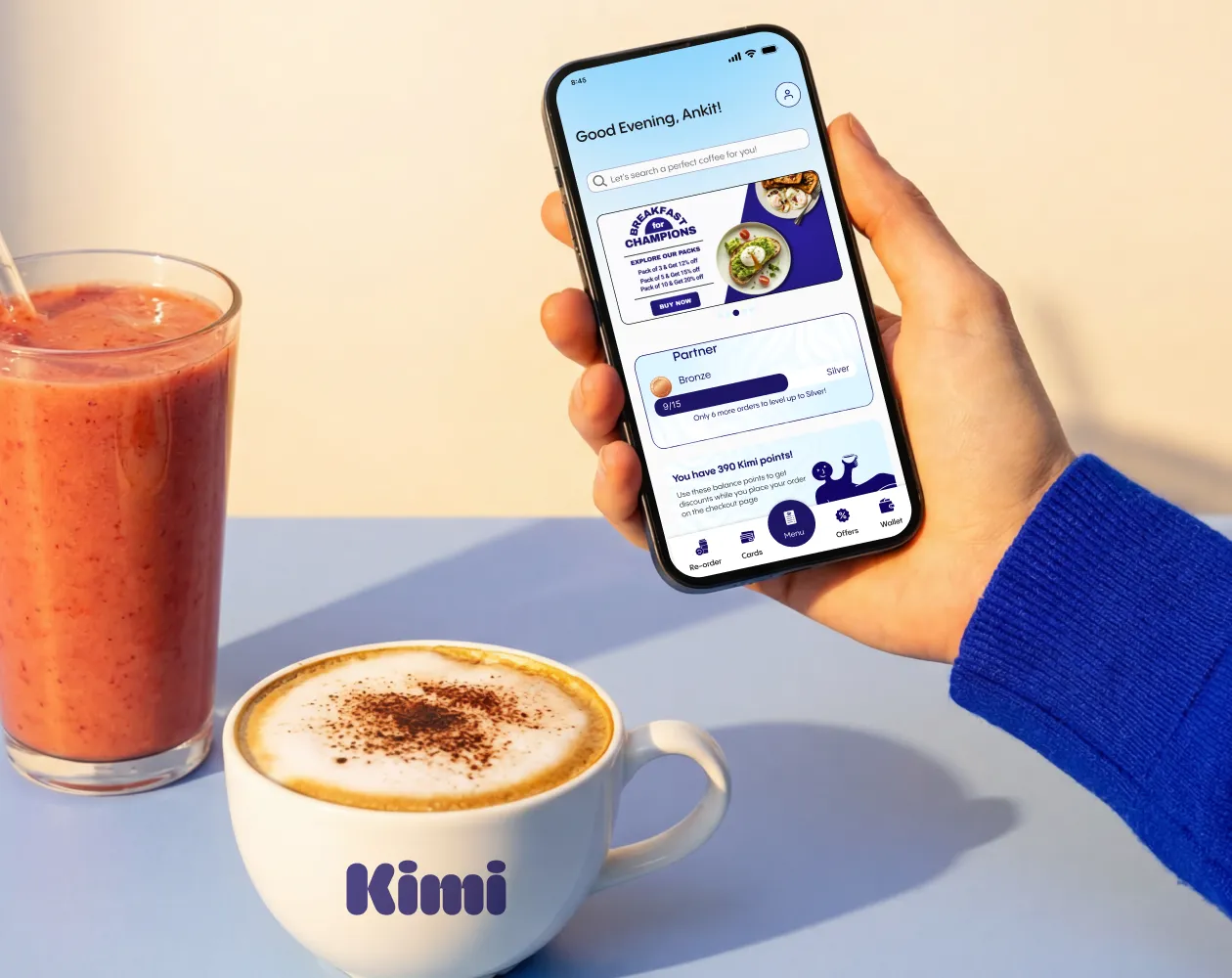
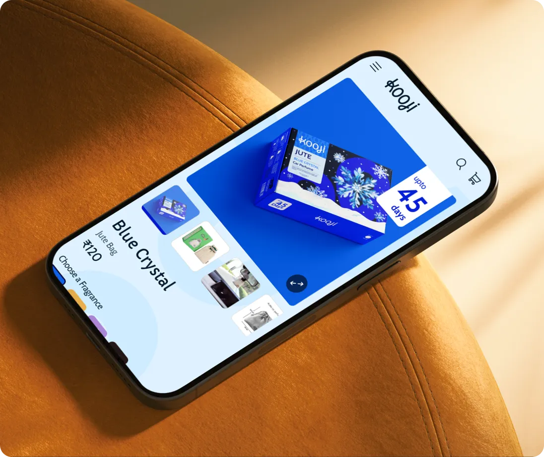
E-Commerce Success Stories

%201.webp)


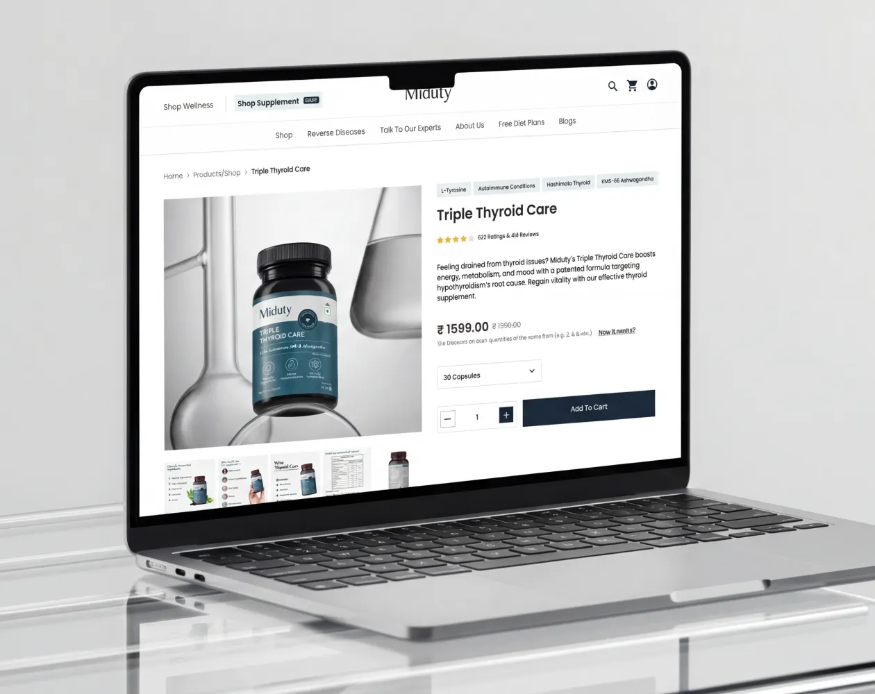

.webp)
.webp)
Build Your D2C Business The Right Way
Build It With Suplex.


