Product Listing Page Best Practices: UX, SEO & Conversion (2026 Guide)
.webp)
Product Listing Page Best Practices: UX, SEO & Conversion (2026 Guide)
Product listing page best practices are the most commercially under-invested area in ecommerce. 70% of users rely on category navigation as their primary way to find products not search, not homepage banners.
Well-optimised category pages typically generate 3–5× more organic revenue than individual product pages because they rank for high-volume head terms and capture shoppers earlier in the purchase journey.
Most stores treat the PLP as a product grid with a title. That is the gap this guide addresses.
Sites with poorly designed product listing pages can see abandonment rates between 67–90%.
A well-optimised PLP can significantly outperform a default product grid, making it one of the highest-impact and most overlooked ecommerce improvements.
This guide covers every aspect of PLP optimisation, from layout, filters, sorting and product cards to Shopify SEO, mobile UX, technical implementation and UAE/Gulf-specific best practices.
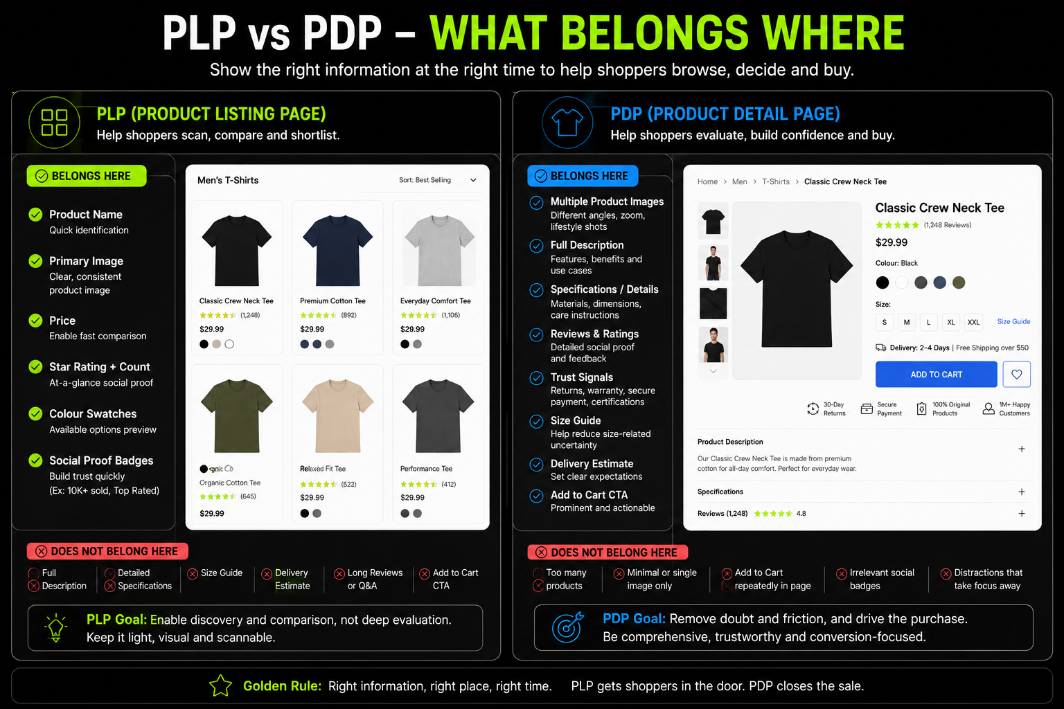
PLP vs PDP: Why the Distinction Matters Before You Optimise Anything
The most common PLP mistake comes from confusing the jobs of two fundamentally different page types.
Getting this distinction clear before any design or SEO work begins prevents the most frequent and expensive errors.
The Two Pages, Two Different Jobs
Product Listing Page (PLP): displays multiple products across category, collection, search and sale pages.
Its job is discovery, helping shoppers find the right product quickly through filters, sorting and navigation.
Product cards should provide just enough information to qualify a product and encourage a click to the PDP. SEO focuses on high-volume category keywords.
Product Detail Page (PDP): showcases a single product. Its job is conversion answering every remaining question before purchase.
Detailed descriptions, images, reviews and trust signals remove buying hesitation. SEO targets product-specific and long-tail keywords, with the goal of driving Add to Cart or Buy Now.
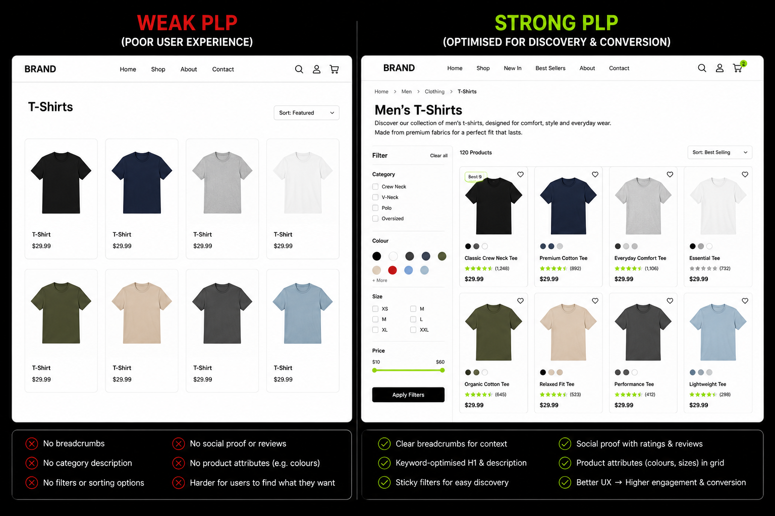
The biggest PLP mistake is treating product cards like mini PDPs by adding long descriptions, specifications and excessive trust badges. This increases cognitive load and slows product discovery.
Another common mistake is viewing the PLP only as a UX page while neglecting its SEO architecture.
For most ecommerce stores, category and collection pages generate the majority of organic traffic and often deliver far more revenue than individual product pages.
For the full architectural context, see Suplex's guides on product catalog structure for ecommerce and the information architecture service that underlies these decisions.
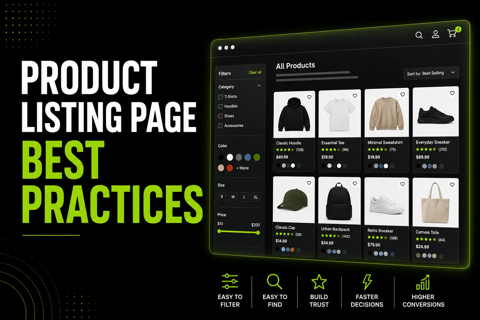
PLP Layout: Grid Design, Column Count and Product Density
The foundational visual decisions determine whether a browsing visitor can efficiently identify, compare, and click through to products.
Getting these wrong undermines every other optimisation on the page.
Grid vs List When Each Works
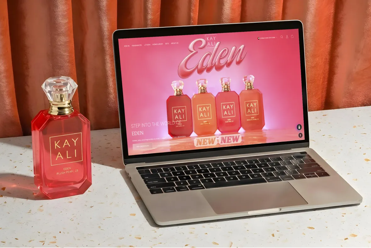
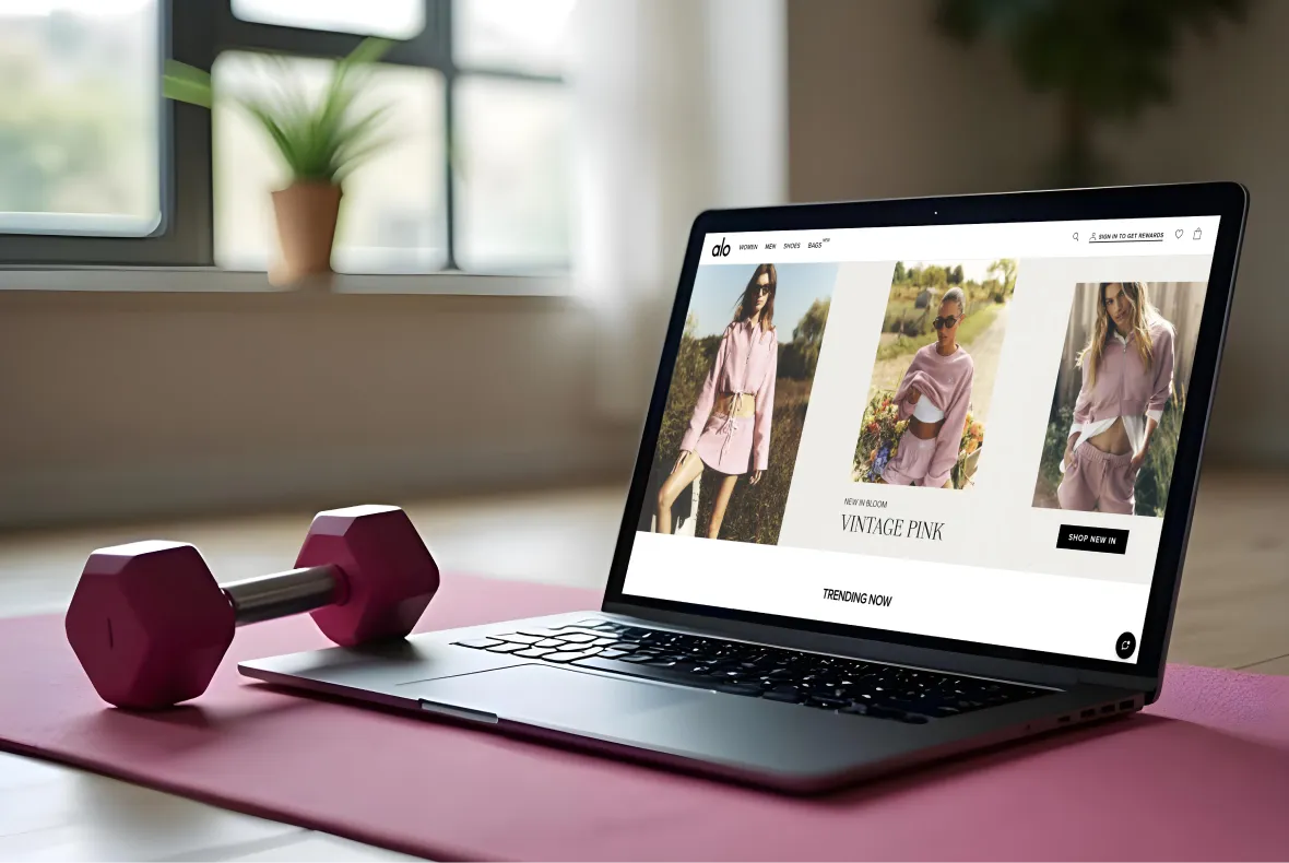
Grid layout product images as the primary element, arranged in rows and columns is the correct default for products where visuals are the primary purchase driver: fashion, beauty, home décor, accessories, food, and lifestyle products.
List layout each product occupying a horizontal row with more specification detail visible suits products where comparing technical specifications drives the decision: electronics, components, B2B tools, software.
The practical recommendation for most D2C and FMCG brands on Shopify: grid as default, with an optional list view toggle.
Best-in-class ecommerce sites have moved away from offering column count selectors in favour of choosing the optimal configuration and implementing it consistently.
Do not make the shopper choose their column count and make that decision for them based on product type.
Column Count The Data-Backed Recommendation
Baymard Institute recommends no more than 4 items per row for optimal customer experience. More than 4 products per row creates cognitive overload and reduces engagement. The specific recommendations by context:
- Desktop: 3–4 columns. Three columns for brands where larger images improve product evaluation luxury, fashion, high-detail photography. Four columns for higher-density catalogues where simultaneous comparison between more products is useful.
- Mobile: 2 columns standard for most product categories. Single column appropriate only for products requiring significant visible information at browse level. Three columns only for very simple, highly visual products.
The mobile column count matters more than desktop for most ecommerce brands in 2026, given 60–72% of traffic arrives on mobile.
Optimising the desktop grid without verifying the mobile experience on an actual device produces an asymmetric result improving the experience for 30% of visitors while leaving the majority underserved.
Products Per Page The Right Number and Why
Most ecommerce stores perform best with 24–48 products per page. Enough variety to feel substantial; not so many that shoppers hit decision paralysis and leave.
- Niche stores with 20–50 total SKUs: show all products on one page; pagination creates a false impression of a smaller catalogue
- Mid-sized catalogues with 100–500 SKUs: 24–36 products per page with clear pagination or load more
- Large catalogues with 500+ SKUs: 24–48 with robust filtering to reduce the effective product count before pagination
Pagination vs Infinite Scroll The 2026 Verdict
Infinite scroll was popular in 2020–2022. It has since fallen out of favour for ecommerce for two specific reasons.
First, SEO: infinite scroll makes it difficult for Googlebot to crawl below-the-fold products. Products that only load via JavaScript scroll events may not be indexed, a serious commercial problem on pages responsible for 50% of organic traffic.
Second, UX: infinite scroll removes the shopper's ability to navigate back to a specific position in the catalogue. A shopper who clicked into a product from position 47 on an infinite scroll page cannot return to that position if they restart from the top.
The current recommendation is paginated pages with a "Load More" option as a hybrid. Shoppers who want to browse further click Load More; shoppers who want page numbers can use pagination controls. Both are crawlable.
For navigation architecture decisions that affect PLP browsing, see Suplex's guide on Shopify navigation design best practices.
Filter and Sorting Architecture The Highest-Impact PLP Feature
Filters are the GPS of the PLP. A poorly designed filter system is the primary reason shoppers abandon category pages without finding what they want.
The commercial impact of getting this right is larger than almost any other PLP optimisation.
Filter Taxonomy Think Like Your Shopper, Not Your Database
The most common filter failure: filters that reflect how the product database is organised rather than how shoppers think about products. The shopper's decision vocabulary should determine the filter taxonomy entirely.
- Fashion: Size, Colour, Price, Style (casual/formal/athleisure), Occasion, Material
- Health and supplements: Goal (weight loss, muscle gain, energy, immunity), Form (capsule, powder, drink), Dietary suitability (Halal, vegan, gluten-free)
- Beauty and skincare: Skin Type, Skin Concern, Key Ingredient, Price, Formulation, Certification (Halal, vegan, cruelty-free)
- Home and living: Room, Style, Material, Price, Colour, Size
The practical audit: check your store's internal site search query logs. The terms shoppers type into site search are the vocabulary they expect your filters to speak.
A filter system using different terminology than the search queries creates an invisible disconnect between intent and available tools.
Filter UX Implementation The Best Practice Stack
Display: Show filter options with result counts in parentheses "Cotton (24)" rather than "Cotton" alone. This tells the shopper how many products match before they select, eliminating the frustration of selecting a filter and finding one product.
Placement: Left sidebar on desktop where eyes naturally begin scanning. Full-screen panel on mobile triggered by a sticky "Filter" button with the current active filter count displayed in the button label when active "Filter (2)" communicates that refinement is active.
Progressive Disclosure: Show the 3–5 most commonly used filter dimensions expanded by default. Less-used filter dimensions should be collapsed under expandable sections available but not creating visual noise for shoppers who do not need them.
AJAX Filtering: Filter selections should update the product grid without a full page reload. Every page reload on filter selection adds 1–3 seconds of waiting time.
At the scale where each second reduces conversion by 7%, this is a meaningful commercial cost that AJAX filtering eliminates.
Sticky Filter Bar: On desktop, the filter sidebar should scroll with the page disappearing off-screen when the shopper has scrolled deeply into the product grid removes access to filters at the exact moment refinement is needed.
On mobile, a sticky bottom "Filter" button maintains filter access throughout the scroll.
Clearing Filters: Always display active filter selections at the top of the filter panel and in a visible "Active Filters" area above the product grid. One-click removal of individual active filters, and a "Clear All" option.
These prevent the common frustration of not knowing how to undo a filter combination that has returned too few results.
Sorting The One Default That Consistently Wins
Setting default sort to "Bestselling" consistently outperforms every other option in A/B testing. It gives shoppers confidence that the first products they see are the ones most validated by peer purchases, an immediate social proof signal at the category level.
The minimum required sort options:
- Bestselling (default for most stores)
- Price: Low to High
- Price: High to Low
- Newest
- Rating / Most Reviewed
What to Avoid: "Relevance" as a default sort on category pages. Unlike search results, category pages have no query to be relevant to.
"Relevance" as a category default communicates nothing to the shopper and typically surfaces products by creation date or SKU order, which is the worst possible default from a conversion standpoint.
At Suplex, default sort order is among the first three configuration decisions made on every Shopify collection page build.
Bestselling as the default creates an immediate social proof signal the first products a shopper sees are the ones most other customers have chosen.
For new brands with limited review depth, this is particularly valuable because it directs browsers toward the products most likely to convert based on actual purchase data rather than editorial decision.
Product Card Design: What Belongs on the Grid and What Doesn't
The product card determines whether a shopper can identify, qualify, and click through to the right product. Every element on the card either aids or slows this decision. Overloading the card is as damaging as underinforming it.
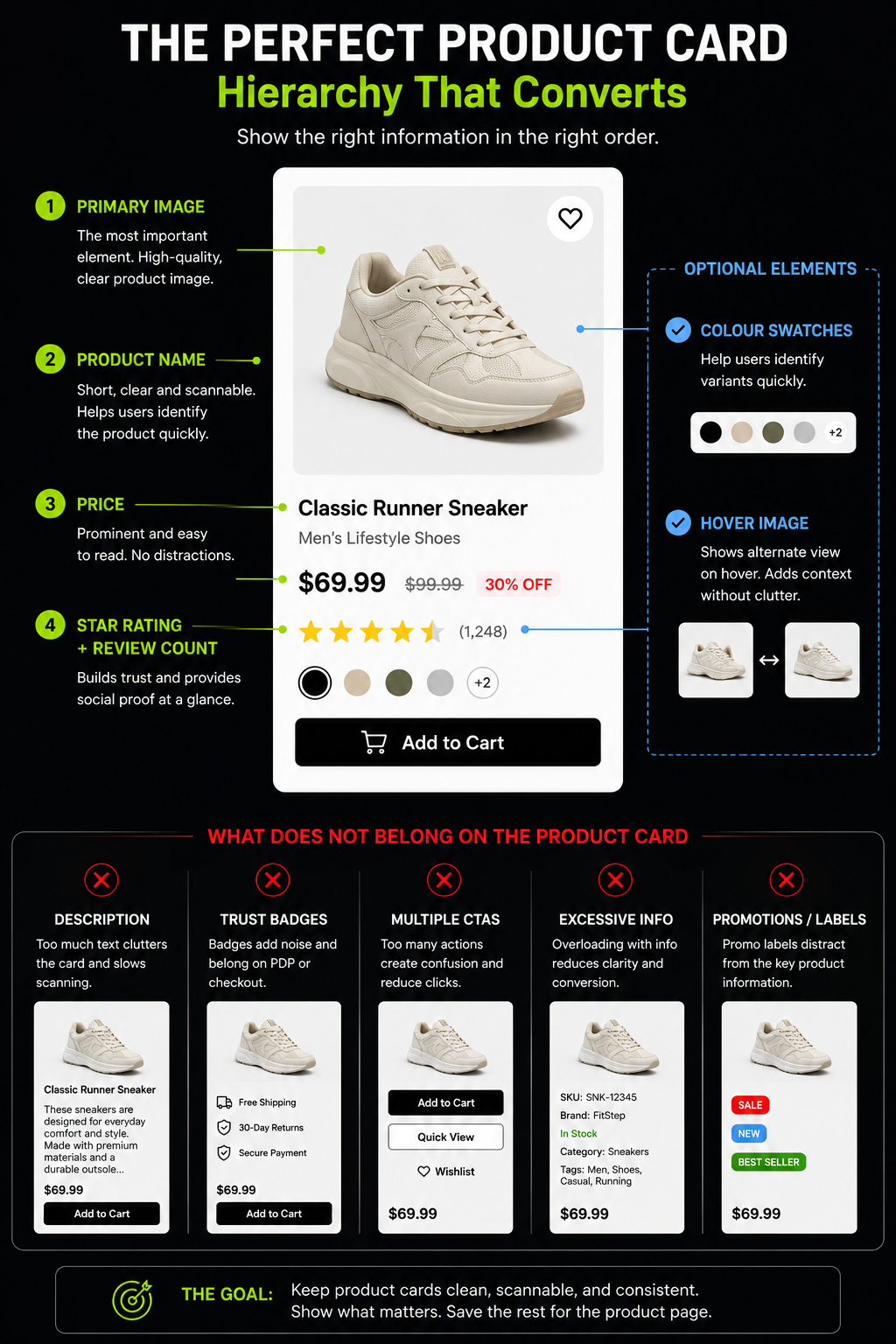
The Product Card Hierarchy
A high-performing product card contains exactly the information required to identify the product and make a click-through decision, nothing more.
Essential Card Elements (Always Present):
- Primary Product Image: The highest-quality asset on the card. Consistent background across the catalogue typically white or off-white for most categories, lifestyle background for premium and fashion brands. Large enough to identify the product and any important detail. The image is the primary reason a shopper clicks or scrolls past.
- Product Name: Clear, descriptive, keyword-appropriate. Not truncated at two words. "Women's Linen Midi Dress" communicates; "Style 4B" does not.
- Price: Bold, immediately readable. Where there is a sale price, the original price crossed out with the discount percentage visible "~~AED 280~~ AED 196 (-30%)" communicates value more clearly than either price alone.
- Star Rating and Review Count: Below the product name, small but visible. These allow shoppers to pre-qualify products without clicking through. If a product has zero reviews, show no star element at all, not zero stars, not "No reviews."
Optional Card Elements (Test Before Implementing):
- Colour Swatches: For fashion, accessories, and products with meaningful colour variants, swatches in the product card allow colour selection at browse level reducing the number of click-throughs required to find the right product-colour combination. Among the highest-ROI PLP card additions for fashion brands.
- Secondary Image on Hover (Desktop Only): Showing an alternate image on cursor hover gives additional context without requiring a click-through. Worth testing for fashion (on-model vs flat lay); impact is neutral for commodity products.
- Social Proof Badges: "Bestseller," "New," "Low Stock," "-30%" used sparingly on 10–20% of products where the badge is genuinely meaningful. "Bestseller" on every product in a collection is not social proof. It is visual noise.
What Does Not Belong On The Plp Card:
- Product descriptions: any copy beyond the product name belongs on the PDP
- Multiple trust badges per card: certifications and guarantee badges belong on the PDP and at checkout, not on every tile in a 40-product grid
- Visible Add-to-Cart by default: Quick Add-to-Cart on every product card in a 36-product grid creates 36 simultaneous CTAs and reduces the visual focus on the discovery behaviour identifying the right product. Reserve direct-to-cart for replenishment scenarios, not first-time discovery
For the full trust signal architecture that covers where certifications and badges belong (and do not belong), see Suplex's guide on ecommerce trust building design elements.
PLP SEO Why the Collection Page Is Your Most Valuable Organic Asset
The dimension most competing PLP guides handle superficially. Collection page SEO is responsible for 50% of organic traffic and 3–5× the revenue of product pages.
Yet most Shopify stores have collection pages with no category description, no schema, and filter URLs creating thousands of near-duplicate pages.
Category Pages Are the Highest-Value Organic Pages in Your Store
Category-level keywords "women's linen dresses," "protein powder UAE," "sustainable yoga mats" have significantly higher search volume than product-specific keywords.
A well-optimised collection page ranking for its category keyword captures this high-volume intent upstream, before the shopper has committed to a specific product. A product page ranking change is attributable to that specific product.
A collection page ranking improvement produces traffic across every product in the collection and the aggregate commercial impact is substantially larger.
Most Shopify stores underinvest in PLP SEO because the impact is less immediately visible. That is exactly why it is the highest-ROI opportunity available.
The PLP SEO Architecture What Every Collection Page Needs
Keyword-Optimised H1:
The collection page H1 should contain the primary category keyword not "Our Collection" or "Shop Now" or the brand name.
"Women's Linen Dresses" or "Protein Powder UAE" or "Sustainable Yoga Mats" are the exact phrase shoppers search for. One H1 per collection page.
Category Description The Most Missed PLP SEO Opportunity:
Google's John Mueller has stated explicitly: "When ecommerce category pages don't have any other content at all, other than links to the products, it's really hard for us to rank those pages."
A collection page with only a product grid and an H1 gives Google minimal content to understand and rank.
The correct implementation: 100–150 words of unique, keyword-relevant description above the product grid and 200–300 words of FAQ-type content below the grid. Shoppers see products first; Google gets text context at both positions.
Meta Title and Meta Description:
Meta title format: "[Category Name] [Store Name] | [Brief differentiator]." Example: "Women's Linen Dresses Loomsona | UAE & GCC Delivery."
Under 60 characters. Meta description: 100–155 characters with the collection value proposition and primary keyword naturally included.
Breadcrumbs: Visible, clickable breadcrumb navigation at the top of every collection page.
BreadcrumbList schema in JSON-LD to enable breadcrumb display in SERPs. Both the UX function and the SEO function signalling hierarchy to Google, creating internal links with descriptive anchor text make this non-negotiable.
Internal Links to Related Collections:
Below the product grid, link to related subcategories, sibling categories, and complementary collections.
These distribute PageRank to other high-value collection pages and create a topically related network that strengthens the domain's category-level authority.
Shopify-Specific PLP SEO Collection Pages and the Faceted Navigation Problem
On Shopify, collection pages live at /collections/[handle]. Filters applied by shoppers generate URL parameters ?filter.p.m.color=black&filter.p.m.size=medium that create new URLs without generating new content.
If these filter URLs are indexed, they dilute the collection page's authority across thousands of near-duplicate pages.
The Correct Implementation For Shopify:
Ensure your theme applies canonical tags to all filtered collection pages pointing back to the base collection URL.
Shopify's Search & Discovery app should apply canonical tags to filtered pages by default in 2026 but be verified in Google Search Console by checking for filter URL indexation.
For filter combinations with genuine search demand "black linen midi dress UAE" or "vegan protein powder chocolate" do not canonicalise these away.
Make them real subcategory pages with their own title tags, H1s, and canonical URLs. These are legitimate long-tail ranking opportunities.
ItemList Schema on Collection Pages:
Adding ItemList structured data to Shopify collection pages helps Google understand and display your catalogue in search results and in AI Overviews.
Google AI Overviews appeared in roughly 14% of shopping queries as of March 2026 a 5.6× jump from 2.1% in November 2025. Collection pages with structured category descriptions, FAQ sections with FAQPage schema, and rich structured data are the most likely to be cited.
A collection page with only a product grid and no text content cannot be cited by an AI Overview there is nothing for it to extract.
Suplex's Shopify audit covers collection page SEO as a standard audit module. For the broader catalog architecture that determines which collection pages to prioritise, see product catalog structure for ecommerce.
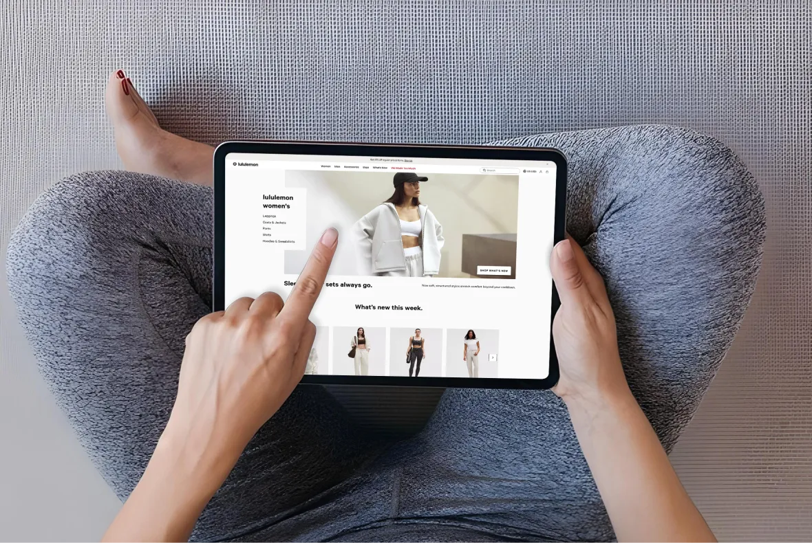
Mobile PLP: Designing for the Device Serving Most of Your Traffic
The mobile PLP is not a responsive version of the desktop PLP. It is a different context with different interaction patterns, different screen real estate, and different cognitive constraints.
Why Mobile PLP Design Requires Separate Decisions from Desktop
On the desktop, a shopper simultaneously sees the filter sidebar, the full product grid, the sort options, and the breadcrumb navigation.
On mobile, only the product grid is visible by default filters, sorting, and navigation are behind additional interactions.
This means mobile PLP design must prioritise explicitly.
The Mobile PLP Priority Stack:
- Product grid: always visible; the dominant element on mobile
- Sticky "Filter & Sort" button: always accessible, floating above the product grid; shows active filter count when applied "Filter (2)" communicates that refinement is active without consuming grid space
- Two-column grid as default: 2 columns is research-backed for most product categories on mobile; single column for high-detail products; 3 columns only for simple, highly visual products
- Full-screen filter panel: filters on mobile should open as a full-screen overlay, not a sidebar that takes half the screen, with clear Apply and Clear buttons at the bottom accessible without scrolling
- 44×44px minimum tap targets: on all filter checkboxes, sort options, and swatch selectors; misclicks on undersized mobile filter options are among the highest abandonment-generating interactions on mobile PLPs
Product Image on Mobile The Performance Decision
A 2-column grid of 24 products at 300×300px per image is 24 image requests loading simultaneously.
Without lazy loading and WebP optimisation, this produces a 3–5 second load time on mobile cellular and 53% of shoppers leave before that load completes.
Technical requirements for mobile PLP performance:
- WebP format for all product thumbnails 25–35% smaller file size than JPEG at equivalent quality
- Lazy loading for images below the fold only the first 4–6 visible products load on initial page render
- Correct srcset implementation mobile receives appropriately sized images, not desktop-sized images scaled down in CSS
- Preconnect to image CDN origins in the page head eliminates DNS lookup latency for the first image request
UAE context: 67% of UAE consumers use smartphones to make purchases, the highest rate in the world according to the 2025 Global Digital Shopping Index.
The UAE mobile PLP is not a secondary experience. It is the primary one for two-thirds of UAE shoppers.
A mobile PLP that loads in 3+ seconds or has inaccessible filter controls is the primary UX barrier between a UAE shopper and a product purchase.
Social Proof and Merchandising on the PLP
Trust signals at the PLP level allow shoppers to pre-qualify products before clicking through, reducing total decision time and increasing the quality of traffic that reaches the PDP.
Star Ratings on Product Cards Non-Negotiable for Established Catalogues
Star ratings and review counts on PLP cards allow shoppers to identify "high review count + high rating = worth investigating further" in milliseconds.
The implementation rule: only display star ratings when a product has a minimum of 10 reviews.
Below 10, the sample is too small to signal genuine validation. For products with zero reviews, no star element, not zero stars, not "Be the first to review."
PLP Merchandising Signals Badges That Work and Badges That Don't
Badges That Earn Their Space:
- "Bestseller" on genuinely top-selling products; effective when applied to 10–15% of products, not 90%
- "New" for products added within the last 30–60 days; shoppers actively look for new arrivals
- "Low Stock" / "Only X left" only when inventory is genuinely below a defined threshold; false scarcity is among the fastest trust destroyers in ecommerce
- "-30%" sale badge communicates discount magnitude more clearly than crossed-out prices alone
Badges That Undermine Rather Than Build:
- "Award winning" without specifics unverifiable and therefore ignored
- "Staff Pick" applied to 40% of a collection when everything is a staff pick, nothing is
- Multiple badges on the same product card one high-impact badge outperforms three medium-impact badges consistently
Personalisation on the PLP
76% of shoppers are more likely to purchase from websites that personalise the shopping journey (McKinsey).
For PLPs, personalisation at the browse stage means surfacing products relevant to the individual shopper's behaviour, previously viewed items, category affinity, purchase history signals.
For brands above $500K annual revenue with enough traffic to generate meaningful behavioural signals, personalised product ranking on PLPs produces measurable conversion improvement.
The practical starting point without advanced personalisation: ensure default sort is Bestselling and implement "Recently Viewed" for return visits to PLPs the shopper has already browsed.
Both are achievable through Shopify's Search & Discovery app without custom development.
PLP Conversion: The Metrics That Reveal What's Wrong
Optimisation without measurement is guesswork. These specific metrics reveal where PLP performance is leaking and which intervention to prioritise.
The PLP Metrics That Matter
Buy-to-Detail Rate (BDR):
The percentage of shoppers who view a product card and click through to the PDP. Fashion typically sees BDRs of 1–3%.
A low BDR on a PLP with adequate traffic signals is one of four problems: product images are not differentiated enough for shoppers to identify something worth investigating; product names are insufficiently descriptive.
Grid density is too high (4+ columns cramping images); or the products in the collection are mismatched with the traffic arriving.
Filter Interaction Rate:
The percentage of PLP visitors who use the filter system. A low filter interaction rate (below 15%) on a large catalogue suggests either the filters are not visible enough on mobile.
The most common cause or the filter options do not match how shoppers think about products.
Sort Interaction Rate:
The percentage of PLP visitors who change the sort order. A high sort interaction rate suggests the default sort is not serving shoppers well.
They are arriving and immediately seeking a different product ordering. Test Bestselling vs Newest vs Rating as default sort to identify the correct configuration.
Heatmap Analysis:
Hotjar or Microsoft Clarity heatmaps on PLP pages reveal scroll depth (how far down the grid shoppers browse before leaving), filter interaction patterns (which filters are used and which are ignored), and mobile filter access patterns (whether shoppers find the mobile filter trigger).
Zero-results filter rate: The percentage of filter selections returning zero products. Zero-results states are conversion dead-ends.
If a significant percentage of filter combinations return nothing, either filter options need constraining to available inventory or out-of-stock handling needs to surface alternative products rather than an empty grid.
Suplex's D2C data analytics service sets up funnel-level tracking for these PLP-specific metrics as standard, making optimisation testable rather than anecdotal.
PLP Best Practices for Shopify Collection Page Implementation
Shopify-specific implementation guidance that most competing PLP guides do not address with this level of specificity.
Collection Page Configuration on Shopify
Collection Handle as SEO URL:
The collection handle becomes the URL slug /collections/womens-linen-dresses not /collections/collection-4b.
Set the handle explicitly during collection creation; Shopify defaults to the collection title as a slug, which is correct when the title is the primary category keyword. Never use internal codes or abbreviations.
Collection Title as H1: On most Shopify themes, the collection title renders as the H1. This means the collection title determines both the H1 content and the URL slug, making it the primary category keyword in plain language.
Collection Description Field:
Available in Shopify admin for every collection. This is where the 100–150 word SEO-relevant category description lives.
Most Shopify stores leave this blank. Adding unique, useful content here is the single highest-ROI SEO addition to a Shopify collection page; it requires no development work, only content.
Product Sort Within The Collection:
Shopify allows setting the default product sort per collection. Set Bestselling as the default for most collections.
Manually sorted is correct for curated or editorial collections where the sequence has brand logic.
Automated vs Manual Collections:
Most D2C brands benefit from a hybrid approach automated collections for standard categories (auto-includes all products tagged "women" + "dresses"), manual curation for featured collections, hero launches and seasonal edits where sequence matters.
Shopify Search & Discovery App The Native Filter Solution
Shopify's Search & Discovery app is the recommended filter implementation for most Shopify merchants.
It handles filter definition per collection, AJAX filtering, filter URL parameter generation with canonical tag handling, and basic product recommendations.
The primary limitation: the Search & Discovery app's filter UI is theme-dependent. Themes with well-designed filter sections (Impulse, Prestige, Stiletto) implement the filters more attractively than themes with minimal filter styling (Dawn, basic themes).
For brands prioritising filter UX, theme selection and filter integration capability should be evaluated together.
For brands requiring more sophisticated filter behaviour, visual filter thumbnails, filter dependency, or highly custom filter UI a custom filter implementation via Shopify's Storefront API or a third-party app (Boost Commerce, SearchPie) may be appropriate.
PLP Design for UAE and Gulf Market Stores
Regionally specific guidance absent from every competing PLP guide. The UAE market has concrete requirements that change both the design and SEO approach to collection pages.
Arabic RTL Filtering and Grid Layout
The most significant UAE-specific PLP consideration is the directional design of filter systems in Arabic RTL mode.
In a standard LTR design, the filter sidebar sits on the left where the eye's natural left-to-right scanning begins. In Arabic RTL, the filter sidebar belongs on the right where the Arabic eye's natural right-to-left scanning begins.
A filter sidebar on the left in an RTL layout is visually counterintuitive and creates cognitive friction for Arabic-preferring shoppers.
The practical implementation on Shopify requires either a theme with native RTL support where direction-dependent elements flip correctly based on the active language or custom CSS targeting the Arabic locale.
The explicit check to perform: in Arabic mode, do filter selections open from the right side of the screen (correct) or the left (wrong)?
Bilingual Category Descriptions
UAE collection pages targeting both English-speaking and Arabic-speaking shoppers should carry category descriptions in both languages not as separate pages but as language-switched content on the same URL, using Shopify's Translate & Adapt app or Weglot.
The SEO implication: a UAE collection page with a keyword-relevant description in English will rank for English-language searches.
The same page with an Arabic-language description will rank for Arabic-language searches which convert at significantly higher rates for many product categories among Arabic-speaking Gulf consumers.
Machine-translating English category descriptions into Arabic produces text that is grammatically functional but commercially inert.
Native Arabic category copy, written by someone who understands Gulf consumer vocabulary for the product category, outperforms machine translation for both search ranking and on-page conversion. This is not a cost-cutting area.
COD and Local Payment Method Signals on the PLP
UAE shoppers frequently check payment method availability before clicking through to a PDP.
Displaying COD availability and BNPL options (Tabby, Tamara) at the PLP level either in the collection page header or as persistent elements reduces a pre-click trust barrier specific to the Gulf market.
In markets where 20–25% of purchases still use COD and BNPL adoption exceeds 37%, visible payment method signals at the browse stage are trust elements, not just UX features.
How We Approach PLP Design at Suplex
Collection pages are one of the first commercial priorities in every Shopify build at Suplex and one of the biggest weaknesses we find in store audits.
Many brands invest heavily in their homepage and PDP while leaving collection pages on Shopify's default layout, with poor filtering, no category content and products sorted by newest instead of bestselling.
Most improvements don't require a redesign. We optimise collection pages by adding SEO-friendly category descriptions, configuring filters around shopper language, setting the right default sort order, implementing ItemList schema and enabling bilingual content for UAE stores.
For larger catalogues or advanced requirements, we build custom filter interfaces, optimise faceted navigation, and improve mobile performance through targeted Liquid development.
Relevant Case Studies:
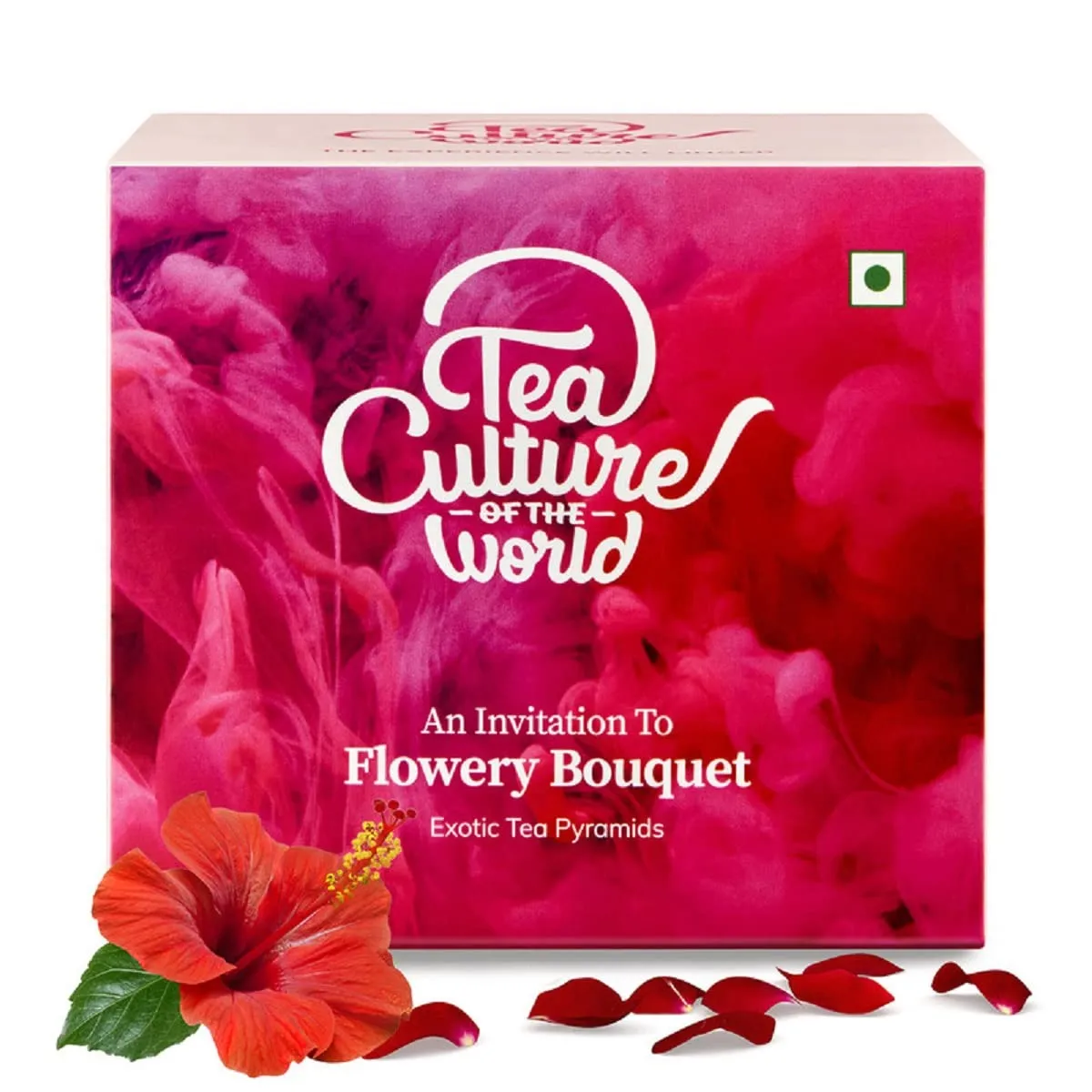
- Loomsona UAE fashion brand; Arabic bilingual collection pages, modest fashion filter taxonomy, and RTL filter layout
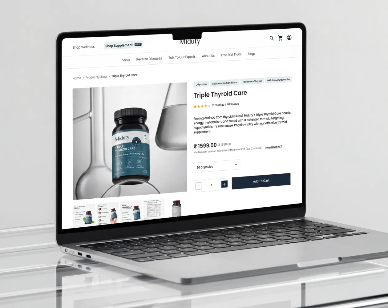
- Miduty D2C supplement brand; goal-based filter taxonomy on supplement PLPs, collection SEO for health category keywords
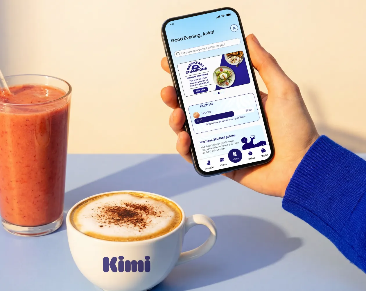
- Kimi UAE lifestyle brand; lifestyle product grid design and bilingual collection page architecture
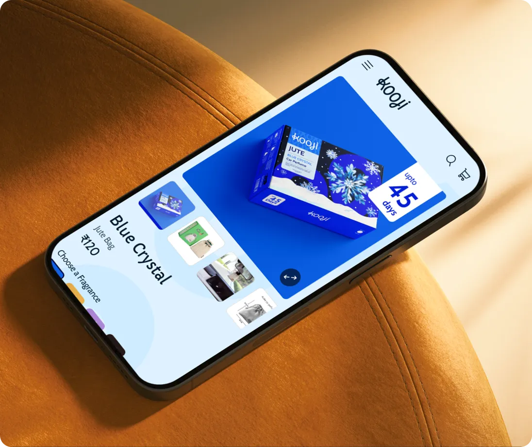
- Kooji multi-SKU D2C; large catalogue PLP architecture and filter system configuration
If your collection pages are receiving traffic but not converting it or if they are invisible in organic search despite being your most commercially important page type, Suplex's Shopify audit starts with the collection page architecture before anything else.
Frequently Asked Questions
What Is A Product Listing Page In Ecommerce?
A Product Listing Page (PLP) displays multiple products, including category, collection, search, and sale pages. Its purpose is to help shoppers discover, filter, and compare products before visiting a product detail page. For most ecommerce stores, PLPs generate around 50% of organic traffic and 3–5× more organic revenue than individual product pages.
How Many Products Should Be Displayed On A Product Listing Page?
Show 24–48 products per page, the range research identifies as optimal for balancing choice and usability. Smaller catalogues can display all products on one page, while larger catalogues should combine 24–48 products per page with strong filtering and pagination.
How Many Columns Should A Product Grid Have?
Use 3–4 product columns on the desktop. Four columns maximise browsing efficiency for most stores, while three columns suit premium products that benefit from larger images. On mobile, 2 columns is the standard. Avoid giving users a grid-size selector—choose the optimal layout and keep it consistent.
What Filters Should Be On A Product Listing Page?
Build filters around shopper language, not your internal database. Prioritise the 3–5 most-used filters, show product counts beside each option, collapse secondary filters, and use AJAX filtering so results update instantly without reloading the page.
What Is The Best Default Sort Order For A Product Listing Page?
Set Bestselling as the default sort it consistently performs better than other options by surfacing proven products first. Offer Price (Low–High), Price (High–Low), Newest, and Rating as alternatives. Avoid Relevance on category pages, as it usually defaults to creation order without a search query.
Hi, I’m Rishabh Jain
I believe great design has the power to shape perception, build trust, and move businesses forward. That belief is what led me to found Suplex Design Studio, a global branding and packaging studio working with FMCG and D2C brands across markets.I started suplex at 25 with a clear intent, to create design that is strategic, thoughtful, and commercially meaningful. By 28, the studio had scaled globally, guided by a strong foundation in Integrated Design that I developed during my academic journey in London, where I was honoured with the Dean’s Award.
Over the years, I’ve had the opportunity to work with 100+ brands, from Fortune 500 organizations to family-run businesses, helping them build packaging and brand systems that create recall, relevance, and long-term value.
Suplex’s work has been recognized internationally, including the Manifest Award (2024), the Clutch Global Award (2025), and features on platforms such as Packaging of the World, The Dieline, and the World Brand Design Society.
None of this would be possible without the people behind the work. I’m deeply grateful to the suplex team, whose commitment, creativity, and attention to detail turn ideas into meaningful brand experiences every day.
At the heart of my work is a simple philosophy, design should be intentional, honest, and built to last, and that continues to guide everything we create at suplex.


Let’s Make It Happen
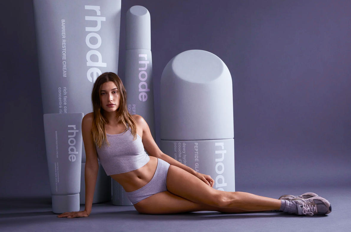
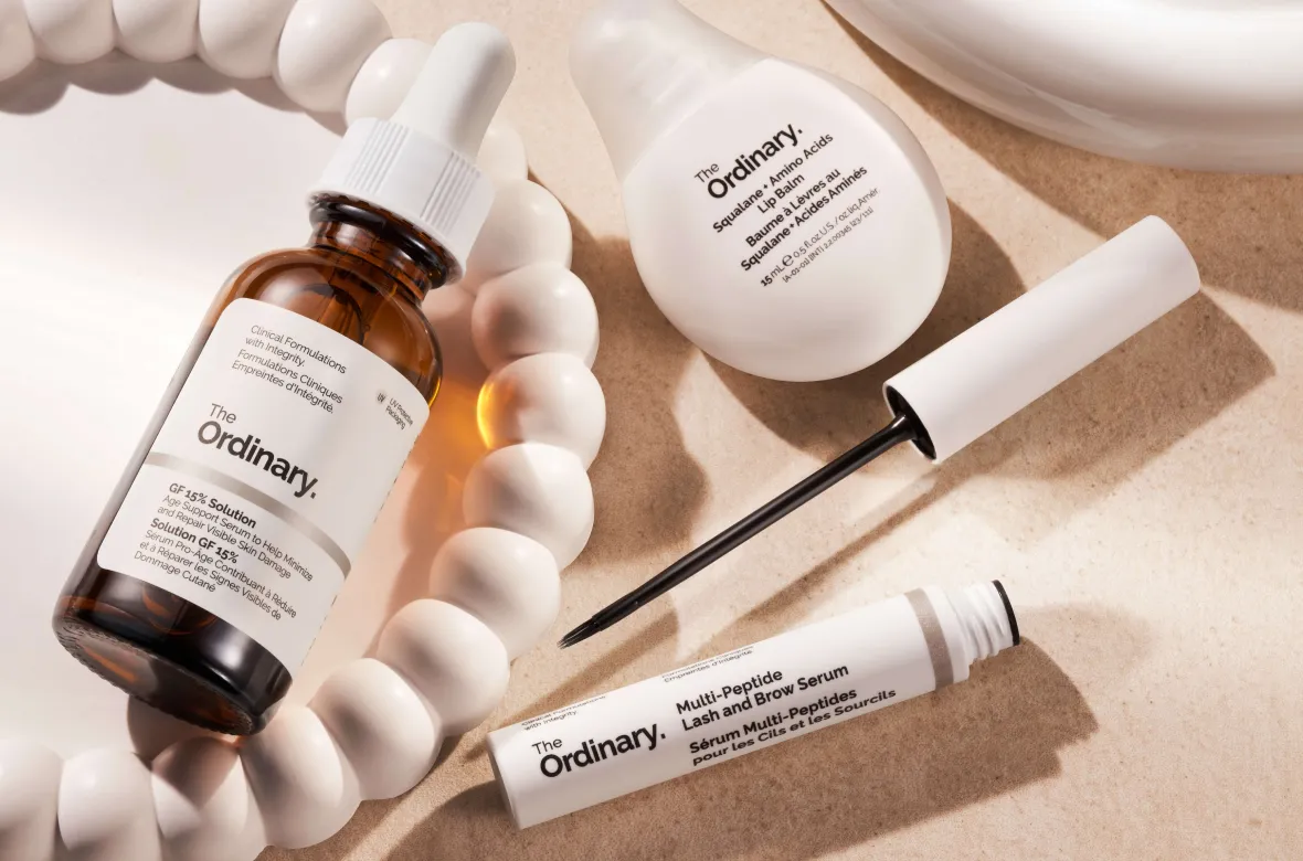
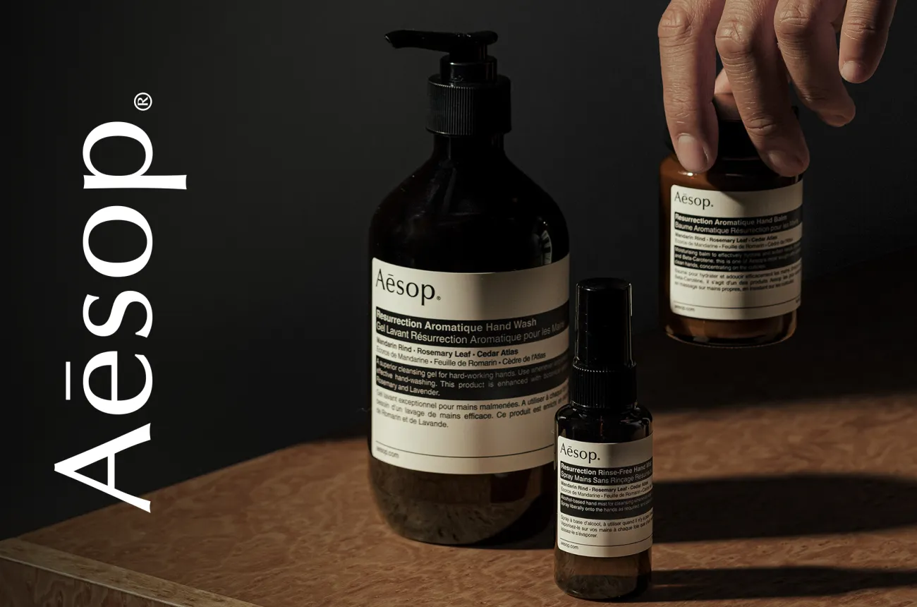
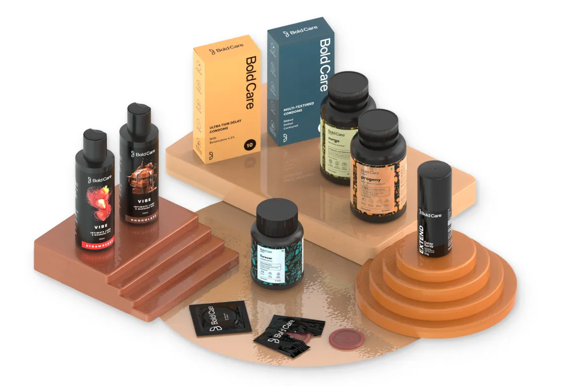
E-Commerce Success Stories

%201.webp)

.webp)
.webp)
Build Your D2C Business The Right Way
Build It With Suplex.


